What is Airtable Spreadsheet-Rainbow?什么是 Airtable Spreadsheet-Rainbow?
Airtable turned the spreadsheet into a celebration — structured white grids alive with saturated rainbow tag-pills and a signature warm-yellow call-to-action that made database work feel like play.Airtable 把电子表格变成了一场庆典——结构化的白色网格里,饱和的彩虹标签跳跃涌动,标志性的暖黄按钮让数据库操作变得像游戏一样轻盈。
Airtable Spreadsheet-Rainbow in briefAirtable Spreadsheet-Rainbow 速览
Airtable Spreadsheet-Rainbow is the visual design language pioneered by Airtable — the no-code database platform founded in San Francisco in 2012 — in which clean white grids of structured rows and columns are punctuated by brightly saturated, rounded tag-pills spanning the full color spectrum. These pills are not decoration; they are the primary mechanism by which users categorize, filter, and make sense of data. The result is a workspace aesthetic that feels organized yet alive, structured yet warm.Airtable Spreadsheet-Rainbow 是 Airtable 所开创的视觉设计语言。Airtable 是一家 2012 年在旧金山创立的无代码数据库平台,其核心视觉语言将整洁的白色行列网格与贯穿全色谱的高饱和圆角标签并置。这些标签并非装饰——它们是用户进行分类、筛选和理解数据的主要视觉机制。最终呈现出一种既有条理又充满生气、既结构化又温暖的工作区美学。
At the center of the system sits a signature golden-yellow — the 'Airtable yellow' that appears on primary buttons and brand marks — acting as the visual anchor around which a full rainbow of category colors orbits. Red, orange, green, teal, blue, purple, pink, and several intermediate hues are all available as tag colors, giving any base an immediately legible, color-coded vocabulary. The white ground and the modern humanist typeface used throughout ensure that this abundance of color never collapses into chaos; instead, the chromatic richness reads as informational clarity.整个视觉系统的核心是一种标志性的金黄色——出现在主要按钮和品牌标识上的「Airtable 黄」——它充当视觉锚点,围绕它运转的是一套完整的彩虹类别色。红、橙、绿、青、蓝、紫、粉以及若干中间色调都可作为标签颜色,赋予每张表格一套直观可读的色彩编码词汇。白色底面与贯穿全局的现代人文主义无衬线字体确保了这种色彩丰富性不会崩溃为混乱——相反,多彩的视觉密度被读解为信息的清晰度。
The aesthetic belongs squarely to the 2020s wave of warm, friendly productivity software — a deliberate reaction against the cold grays and corporate blues that had dominated enterprise software for decades. Where older spreadsheet tools communicated efficiency through austerity, Airtable Spreadsheet-Rainbow communicates capability through celebration. Work is still rigorous, but the surface signals that rigor can be joyful.这种美学属于 2020 年代那波温暖、友好的生产力软件浪潮,是对数十年来主导企业软件领域的冷灰色调与公司蓝的刻意反拨。旧有的电子表格工具用简朴传达效率,Airtable Spreadsheet-Rainbow 则用庆典感传达能力。工作依旧严谨,但视觉表层在告诉你:严谨可以是快乐的。
See the Airtable Spreadsheet-Rainbow design system查看 Airtable Spreadsheet-Rainbow 完整设计系统
Where does Airtable Spreadsheet-Rainbow come from?Airtable Spreadsheet-Rainbow 从何而来?
Airtable was founded in 2012 by Howie Liu, Andrew Ofstad, and Emmett Nicholas with the ambition of collapsing the distance between a spreadsheet and a relational database — making it possible for non-engineers to build structured, relational data systems without writing a line of code. The product launched publicly in 2015 and gained traction quickly among creative teams, project managers, and small organizations that needed more flexibility than a traditional spreadsheet but lacked the resources for custom database development.Airtable 由 Howie Liu、Andrew Ofstad 和 Emmett Nicholas 于 2012 年创立,立志消弭电子表格与关系型数据库之间的鸿沟——让非工程师无需写一行代码,也能构建结构化的关系数据系统。产品于 2015 年公开上线,迅速在创意团队、项目管理者以及需要比传统电子表格更大灵活性却又缺乏定制数据库开发资源的小型组织中赢得口碑。
The visual identity that would become Airtable Spreadsheet-Rainbow coalesced over the period roughly from 2020 to 2024, as the platform matured and the broader no-code movement gained cultural momentum. During this period, the design team settled on the core pillars of the system: the white grid as an organizing canvas, the golden-yellow as brand signature, and the full-spectrum rainbow of tag colors as the functional heart of the user interface. The rounded pill shape for tags — a form that signals approachability and categorization simultaneously — became an industry-recognized motif, widely imitated by competing tools and design systems.那套后来被称为 Airtable Spreadsheet-Rainbow 的视觉语言,大约在 2020 至 2024 年间随着平台的成熟与无代码运动的文化势头而逐渐成形。在这一时期,设计团队确立了系统的核心支柱:白色网格作为组织性画布,金黄色作为品牌标志,全色谱彩虹标签色作为用户界面的功能核心。标签的圆角药丸形状——一种同时传达亲和力与分类感的形态——成为业界公认的视觉母题,被众多竞争工具和设计系统广泛借鉴。
The colorful tag aesthetic did not appear from nowhere. It drew on earlier traditions in consumer software design — the colored label systems in Apple's Finder, the colored calendars in Google Calendar, and the label chips used in Gmail — but Airtable pushed the concept further by making color the primary data-classification mechanism rather than a secondary organizational nicety. Each cell in a single-select or multi-select field became a stage for a colored pill, and the cumulative effect across a populated base created a visual density that felt rich rather than cluttered.这种多彩标签美学并非凭空而来。它汲取了消费者软件设计中更早的传统——苹果 Finder 的彩色标签系统、Google 日历的彩色日历分区、Gmail 的标签 Chip——但 Airtable 将这一概念推进得更远:颜色不再是次要的组织性便利,而是首要的数据分类机制。单选字段或多选字段中的每一个单元格都成为彩色药丸的舞台,而一张填充完整的表格所累积的视觉密度,给人的感受是丰富而非拥挤。
The choice of a warm, inclusive visual register was also a strategic product decision. Airtable's market positioning from the mid-2010s onward emphasized that powerful database tools should not be the exclusive province of engineers. The warm yellow, the rounded shapes, the celebratory chromatic range — all of these communicated openness and accessibility. The aesthetic told first-time users that they were not looking at arcane software but at something built for them, regardless of technical background. This democratizing ambition embedded in the visual language helped Airtable distinguish itself in a crowded field of project management and data tools.选择温暖、包容的视觉语调也是一个战略性的产品决策。Airtable 自 2010 年代中期以来的市场定位始终强调:强大的数据库工具不应是工程师的专属领地。暖黄色、圆角造型、庆典感的多彩色域——这一切都在传达开放与可及。这套美学语言告诉初次使用者:他们面对的不是晦涩的专业软件,而是无论技术背景如何都为他们而建的东西。这种嵌入视觉语言深处的平民化抱负,帮助 Airtable 在拥挤的项目管理与数据工具市场中确立了鲜明的差异化身份。
What defines the Airtable Spreadsheet-Rainbow look?Airtable Spreadsheet-Rainbow 的视觉特征是什么?
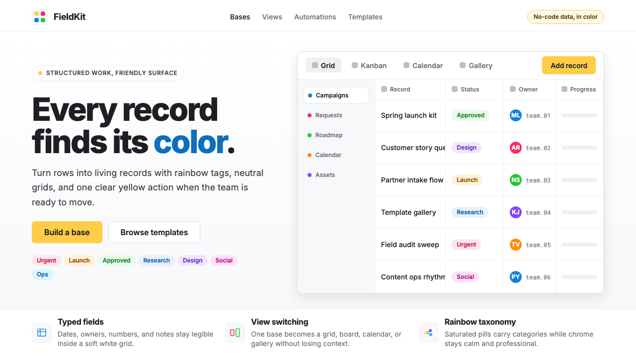
Rainbow Tag-Pills彩虹标签药丸
The defining element of the system is the rounded pill-shaped tag that carries a saturated, fully opaque background color drawn from across the color spectrum. These tags appear in single-select and multi-select fields, and their chromatic range — spanning warm reds and oranges through midrange greens and teals to cool blues, purples, and pinks — is the primary visual signature of any Airtable-influenced design. The pill shape is deliberately soft and approachable, chosen over rectangular chips or plain text labels to signal categorization rather than command.这套系统最具定义性的元素是圆角药丸形标签——带有饱和、完全不透明背景色的标签,颜色取自全色谱。这些标签出现在单选和多选字段中,其色彩跨度——从暖调的红色和橙色,经过中性调的绿色和青色,直至冷调的蓝色、紫色和粉色——是任何受 Airtable 影响的设计最首要的视觉标志。药丸形刻意柔和而亲切,相对于矩形标签或纯文字标签,它被选中正是为了传达分类而非命令的语义。
White Grid Canvas白色网格画布
The structural backbone of the aesthetic is the clean white or near-white grid that underlies all data presentation. Rows are separated by fine, low-contrast dividing lines; columns are defined by subtle vertical boundaries. This grid is never decorative — it is a data-holding structure, and its restraint is precisely what allows the rainbow tags and yellow accents to carry visual weight without overwhelming the layout. The relationship between the quiet grid and the vivid tags is the central visual tension of the style.这种美学的结构骨架是承载所有数据呈现的整洁白色或近白色网格。行与行之间由纤细、低对比度的分隔线隔开,列由微妙的垂直边界界定。这个网格从不用于装饰——它是承载数据的结构,而正是它的克制,让彩虹标签和黄色强调色得以在不压倒版面的情况下承载视觉重量。安静的网格与鲜活的标签之间的关系,是这种风格的核心视觉张力。
Signature Warm Yellow标志性暖黄
A specific warm, deeply saturated yellow functions as the brand anchor for the entire system. This yellow appears on primary call-to-action buttons, product logos, and key interactive states. It is warm enough to feel inviting rather than cautionary — unlike the sharp warning yellows common in alert design — and saturated enough to be unmistakable. When used alongside the cooler tones in the rainbow tag spectrum, the warm yellow creates a chromatic focal point that reliably draws the eye to the most important action on any given screen.一种特定的、高度饱和的暖黄色充当整个系统的品牌锚点。这种黄色出现在主要行动号召按钮、产品标识和关键交互状态上。它足够温暖,令人感到受邀而非警示——有别于警告设计中常见的刺眼警告黄——且足够饱和,辨识度无可置疑。当它与彩虹标签色谱中的冷色调并置时,这种暖黄形成一个色彩焦点,可靠地将视线引向任意界面上最重要的操作。
Humanist Sans-Serif Type人文主义无衬线字体
The typographic register of Airtable Spreadsheet-Rainbow relies on a modern humanist sans-serif — a category of letterforms that combines the geometric clarity of modernist type with the warmth and legibility of forms derived from calligraphic tradition. This kind of typeface is used consistently across interface labels, cell content, navigation, and marketing materials. Type size and weight vary to establish hierarchy, but the family stays unified; the effect is professional readability without stiffness or clinical coldness.Airtable Spreadsheet-Rainbow 的字体语调依赖于现代人文主义无衬线字体——这类字形将现代主义字体的几何清晰度与源自书法传统的温暖感和可读性融为一体。这类字体一致地用于界面标签、单元格内容、导航和营销材料。字号和字重因层级而异,但字体家族保持统一;效果是专业的可读性,不带僵硬感或冷峻的临床感。
Layered Color Density分层色彩密度
A distinctive quality of the aesthetic is what happens when a fully populated base or dashboard is viewed as a whole: multiple colored tags across many rows create a layered visual texture that reads as informational richness rather than visual noise. This density is possible because each tag is self-contained — a closed, bounded color form — and because the white ground between tags provides consistent breathing room. The system tolerates high color density in a way that unstructured color use never could, because the grid gives every element a precise address.这种美学的一个独特品质,出现在整体查看一张填充完整的表格或仪表板时:多行中分布的多个彩色标签创造出分层的视觉肌理,被读解为信息的丰富性而非视觉噪音。这种密度之所以可行,是因为每个标签都是自足的——一个封闭、有边界的色彩形态——以及因为标签之间的白色底面提供了一致的呼吸空间。这个系统能够容纳无组织的色彩使用所无法实现的高色彩密度,因为网格给了每个元素一个精确的坐标。
Softness and Roundness柔软与圆润
Every interactive element in the system — tags, buttons, input fields, modal dialogs — carries a notably rounded profile. Corners are never sharp or square; the consistent use of generous border-radius across components creates a visual vocabulary of softness and approachability. This roundness distinguishes the aesthetic from harder-edged productivity tools and reinforces the message that the interface is friendly and forgiving. The rounding is applied consistently enough to feel like a design principle rather than a stylistic flourish.系统中的每一个交互元素——标签、按钮、输入框、模态对话框——都带有明显的圆角轮廓。没有任何尖锐或方形的角;在各个组件上一致使用的慷慨圆角半径,创造出一套柔软与亲切的视觉词汇。这种圆润感使这套美学有别于边角更硬朗的生产力工具,强化了界面友好、宽容的信息。这种圆角处理足够一致,让人感受到的是一种设计原则,而非风格上的花饰。
Minimal Decorative Hierarchy极简装饰层级
Outside of the tag colors themselves, the system maintains deliberate visual restraint. Section headers, navigation labels, and column titles are set in regular or medium weight at a modest size increase over body content — hierarchy is communicated through scale and subtle weight, not through color floods, background fills, or decorative rules. This restraint is what makes the rainbow tags legible as data markers: they exist against a background of structured quietness, which amplifies their signal.在标签颜色本身之外,这套系统保持着刻意的视觉克制。区域标题、导航标签和列标题以常规或中等字重呈现,字号仅比正文内容略有提升——层级通过尺度和微妙字重传达,而非依赖色彩大面积填充、背景底色或装饰性线条。正是这种克制使彩虹标签作为数据标记清晰可辨:它们置身于结构化的安静底层之上,这种安静放大了它们的信号。
See the Airtable Spreadsheet-Rainbow design system查看 Airtable Spreadsheet-Rainbow 完整设计系统
Who shaped Airtable Spreadsheet-Rainbow?谁塑造了 Airtable Spreadsheet-Rainbow?
Liu co-founded Airtable and served as its CEO, articulating the company's central thesis: that powerful data tools should be accessible to people without engineering backgrounds. His product vision — fusing the familiar vocabulary of the spreadsheet with the structural power of a relational database, and wrapping it in an interface designed for non-technical users — created the conceptual and aesthetic brief from which the Spreadsheet-Rainbow visual system emerged. Liu's emphasis on friendliness and approachability as genuine product values, not merely marketing claims, drove the team's decision to make color central rather than peripheral.刘是 Airtable 的联合创始人兼 CEO,清晰阐述了公司的核心主张:强大的数据工具应当对没有工程背景的人开放。他的产品愿景——将电子表格熟悉的词汇与关系型数据库的结构性力量融合,并包裹在为非技术用户设计的界面中——形成了 Spreadsheet-Rainbow 视觉系统得以生长的概念与美学土壤。刘将友好感和亲切感视为真正的产品价值而非单纯的营销话语,这一立场驱动团队做出了让颜色居于核心而非边缘的决定。
Ofstad co-founded Airtable with a background in design and product, having previously worked on Google Maps. His design sensibility influenced the platform's early visual direction — the commitment to clean white surfaces, the emphasis on the grid as a trustworthy structure, and the choice to invest in a polished, consumer-grade visual identity rather than the utilitarian plainness typical of enterprise database tools of the era. Ofstad's Google Maps experience brought a geographic literacy of layered, color-coded information that resonates with the tag-color system Airtable would develop.Ofstad 是 Airtable 的联合创始人,拥有设计和产品背景,此前曾在 Google 地图工作。他的设计感性影响了平台的早期视觉方向——对干净白色表面的坚守、对网格作为可信结构的强调,以及选择投入经过打磨的、消费者级视觉标识,而非那个年代企业数据库工具典型的功利性朴素感。Ofstad 在 Google 地图的经历带来了对分层色彩编码信息的地理学式理解,与 Airtable 后来发展出的标签色系统形成深层呼应。
Nicholas co-founded Airtable as its third founder and contributed to the technical architecture that made the flexible field-type system — the very system that would generate the visual rainbow of tags — possible at scale. The multi-select and single-select field types, with their configurable color arrays, are the product features most directly responsible for the Spreadsheet-Rainbow aesthetic. Without the technical flexibility to support an arbitrary number of color-coded categories per field, the visual language would have remained far more constrained.Nicholas 是 Airtable 的第三位联合创始人,参与构建了灵活字段类型系统的技术架构——正是这套系统,使视觉上的彩虹标签得以在规模化场景下成为可能。多选和单选字段类型及其可配置的色彩数组,是最直接缔造 Spreadsheet-Rainbow 美学的产品功能。如果缺少每个字段支持任意数量色彩编码类别的技术弹性,这套视觉语言将会受到远为严格的约束。
The refinement of the Spreadsheet-Rainbow visual system into a coherent, exportable design language was the collective work of Airtable's in-house design organization across the period when the no-code movement went mainstream. This team made consequential decisions about tag pill geometry, the color palette composition for the rainbow spectrum, the button treatment that established the warm yellow as the brand's primary interactive color, and the type system choices that kept the interface readable under high chromatic load. Their work produced a design system legible enough to spawn an entire category of imitators.将 Spreadsheet-Rainbow 视觉系统打磨成一套连贯、可输出的设计语言,是 Airtable 内部设计团队在无代码运动走向主流的那段时期集体完成的工作。这个团队做出了若干决定性选择:标签药丸的几何形态、彩虹色谱的色彩组合、将暖黄确立为品牌首要交互色的按钮处理方式,以及在高色彩负载下保持界面可读性的字体系统选型。他们的工作产出了一套足够清晰可辨的设计系统,并催生了整整一批模仿者。
How do you use Airtable Spreadsheet-Rainbow today?今天怎么用 Airtable Spreadsheet-Rainbow?
Airtable Spreadsheet-Rainbow is a style that earns its richness through structural discipline — the color abundance works because the underlying grid is scrupulously neutral. Applying it successfully means investing in the grid first and the color second. Before adding any tag color or warm-yellow accent, establish the white or near-white background, the fine dividing lines, and a clean typographic hierarchy. The structure makes the color legible; without it, the same palette reads as garish rather than celebratory.Airtable Spreadsheet-Rainbow 是一种通过结构纪律赢得其丰富性的风格——色彩的丰盛之所以成立,恰恰是因为底层网格保持着严格的中立。成功应用它意味着先投入网格,再引入颜色。在添加任何标签颜色或暖黄强调之前,先确立白色或近白色的背景、纤细的分隔线以及干净的字体层级。结构让颜色变得可读;没有结构,同样的色板只会显得俗艳而非欢庆。
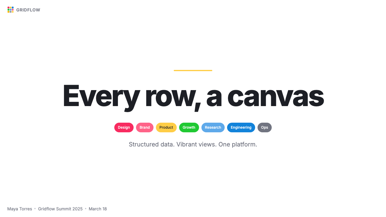
For presentation slides, the style has two natural registers. Cover slides benefit from a bold, minimal treatment: a dominant warm-yellow form or a single large colored shape against a white ground, with a clean humanist title in strong contrast. The effect should feel like an invitation rather than an announcement. Content slides lean on the grid metaphor directly — arrange information in structured rows or columns, introduce tag-pill annotations for categories or status indicators, and keep chart and data visualizations in the rainbow palette. The discipline here is resisting the urge to use every available color on a single slide; three or four tag colors per content page produce clarity, while eight or nine produce confusion.对于演示文稿,这种风格有两种自然的表现模式。封面页适合大胆、简洁的处理:一个主导性的暖黄形态或一个单一的大型彩色形状置于白色底面上,搭配强对比度的干净人文主义标题。效果应当像一份邀请,而非一则公告。内容页则直接借用网格隐喻——将信息排列成结构化的行或列,为类别或状态标识引入标签药丸注释,图表和数据可视化保持在彩虹色板范围内。这里的纪律是抵制在单张幻灯片上使用所有可用颜色的冲动;每页内容页三至四种标签颜色产生清晰度,八至九种则产生混乱。
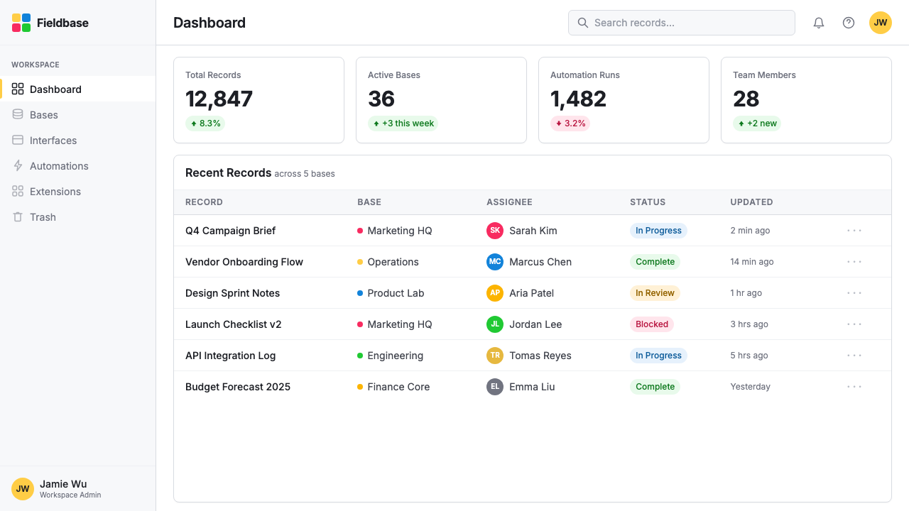
For web UI, the style is especially at home in dashboards, data management interfaces, and pricing pages. A dashboard built in this language should have a white or very light gray surface, with colored status badges and category indicators doing the categorical work that icons or text labels might do in a more conventional system. Navigation should be typographic and restrained — the color budget is spent in the data layer, not the chrome. Pricing tiers differentiate naturally through a single assigned accent color per tier, without requiring background floods or heavy borders.对于网页界面,这种风格在仪表板、数据管理界面和定价页面中最为自如。用这套语言构建的仪表板应当有白色或非常浅的灰色表面,彩色状态徽章和类别指示器承担在更传统的系统中由图标或文字标签完成的分类工作。导航应当是字体性的、克制的——色彩预算花在数据层,而非界面框架上。定价等级通过每个等级分配一种强调色自然区分,无需依赖大面积背景填充或粗重边框。
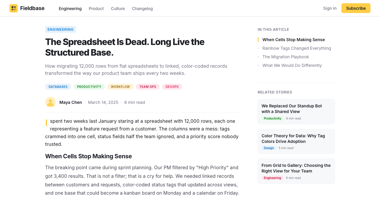
For editorial and marketing work, the style supports a clear and friendly information hierarchy. Article or report layouts can use colored pull-quote backgrounds or category-tagged headlines in a way that reads as organized rather than chaotic, provided the white ground is maintained between colorful elements. Marketing pages leverage the warm-yellow for primary calls to action and introduce the rainbow spectrum selectively — perhaps one feature-highlight color per section — to create a sense of visual progression without chromatic exhaustion. The brand equity of the style comes from its association with productive, organized work; marketing applications that feel playful and structured simultaneously are the most authentic.对于编辑与营销内容,这种风格支持清晰友好的信息层级。文章或报告版面可以使用彩色引用块背景或带有类别标签的标题,在维持彩色元素之间白色底面的前提下,整体感受是有条理而非混乱。营销页面将暖黄用于主要行动号召,并有选择地引入彩虹色谱——或许每个版块一种功能高亮色——以制造视觉递进感而不造成色彩疲劳。这种风格的品牌价值来自于它与高效、有组织的工作之间的关联;那些同时传达出趣味性和结构性的营销应用,才是最为真实的表达。
The most common mistake when working in this style is treating the rainbow palette as permission to use all colors simultaneously at full saturation. Airtable's own interfaces succeed precisely because each tag color appears in the context of categorical data, where it carries meaning — this base uses orange for 'In Review,' teal for 'Approved,' and red for 'Needs Revision.' When the same colors appear as decoration rather than data, they lose the informational logic that makes them legible. The second common mistake is softening the white ground — introducing off-white background fills, subtle colored washes, or shadow gradients under panels. These moves undermine the contrast between grid and tag that defines the style. Keep backgrounds genuinely white, and let the tags carry all the chromatic weight.使用这种风格时最常见的错误,是将彩虹色板理解为同时以全饱和度使用所有颜色的许可。Airtable 自身的界面之所以成功,恰恰是因为每种标签颜色出现在分类数据的语境中,承载着意义——这张表格用橙色代表「审核中」、青色代表「已通过」、红色代表「需修改」。当同样的颜色以装饰而非数据的姿态出现时,它们便失去了使其清晰可辨的信息逻辑。第二个常见错误是软化白色底面——引入米白背景填充、微妙的彩色色调,或面板下方的阴影渐变。这些做法削弱了网格与标签之间定义这种风格的对比关系。保持背景真正的白色,让标签承担所有的色彩重量。
See the Airtable Spreadsheet-Rainbow design system查看 Airtable Spreadsheet-Rainbow 完整设计系统
Airtable Spreadsheet-Rainbow — FAQAirtable Spreadsheet-Rainbow · 常见问题
How is Airtable Spreadsheet-Rainbow different from other colorful productivity-tool aesthetics?Airtable Spreadsheet-Rainbow 与其他色彩丰富的生产力工具美学有何不同?
The key distinction is that in this style, color functions as structured data — each tag color encodes a category, a status, or a group membership — rather than as decoration or brand differentiation. Tools like Trello use color primarily on card labels and backgrounds for visual organization; Notion uses color sparingly for page accents. Airtable concentrates its entire chromatic energy into the tag-pill field, making color the semantic core of the interface. This gives the style a peculiar legibility: even complex, densely populated views remain parseable because the color vocabulary is bounded and systematic.关键区别在于:在这种风格中,颜色作为结构化数据发挥功能——每种标签颜色编码一个类别、一个状态或一种群组归属——而非作为装饰或品牌差异化手段。Trello 这类工具主要在卡片标签和背景上使用颜色进行视觉组织;Notion 则克制地将颜色用于页面点缀。Airtable 将所有色彩能量集中在标签药丸字段中,使颜色成为界面的语义核心。这赋予了这种风格一种奇特的可读性:即便是复杂、填充密集的视图依然可以被解析,因为色彩词汇是有边界且系统化的。
Can this style work for products that have nothing to do with data or spreadsheets?这种风格能用于与数据或电子表格毫无关联的产品吗?
Yes, but with caveats. The style's core elements — white ground, rounded colored pills, warm-yellow accent, clean humanist type — are abstracted enough to function as a general-purpose visual language. A marketing landing page, a portfolio site, or an editorial layout can borrow the aesthetic without any grid or tag-field present. The risk is that the association with productivity software is strong enough that applying the full palette to, say, a food brand or a wellness product may feel incongruous. The style signals 'organized work' and 'friendly data.' If a product's values do not include those associations, the aesthetic can feel borrowed rather than native.可以,但有前提。这种风格的核心元素——白色底面、圆角彩色药丸、暖黄强调色、干净的人文主义字体——抽象程度足以作为通用的视觉语言。一个营销落地页、作品集网站或编辑版面可以借用这种美学,而无需呈现任何网格或标签字段。风险在于:与生产力软件的关联足够强烈,以至于将完整的色板应用于食品品牌或健康产品可能会显得格格不入。这种风格传达的信号是「有组织的工作」和「友好的数据」。如果一个产品的价值观不包含这些联想,这套美学就会显得借来而非原生。
How should tag colors be selected and managed in a real design project?在实际设计项目中,标签颜色应如何选取和管理?
The guiding principle is that each color must earn its place by encoding a distinct, stable category — not by filling visual space. Begin by listing all the categories a given field will need, then assign colors so that perceptually distinct hues go to semantically distinct categories. Warm and cool colors should not be assigned arbitrarily; a warm red for a 'Blocked' status and a cool green for an 'Approved' status uses natural color associations to reinforce meaning. Keep the total number of tag colors per view manageable — the system tolerates richness, but somewhere beyond eight or nine simultaneous hues in a single grid, the categorical logic begins to break down for most viewers.指导原则是:每种颜色必须通过编码一个明确、稳定的类别来赢得其位置——而非用于填充视觉空间。首先列出某个字段需要的所有类别,然后分配颜色,使感知上有区别的色调对应语义上有区别的类别。暖色与冷色不应随意指派;用暖调红色代表「已阻塞」状态、冷调绿色代表「已通过」状态,是在用自然的颜色联想强化语义。保持每个视图中标签颜色的总数在可管理范围内——这个系统可以承载丰富性,但当单个网格中同时出现八种或九种以上色调时,分类逻辑对大多数观看者而言就开始瓦解。
Is the style suited to dark-mode interfaces?这种风格适合深色模式界面吗?
The canonical Airtable Spreadsheet-Rainbow is a light-mode system — its visual logic depends on a bright white or near-white ground that sets the stage for the chromatic tag pills. A dark inversion is technically possible, but it significantly changes the aesthetic character. On a dark ground, the same saturated tag colors either glow aggressively or require desaturation to feel comfortable, and the warm yellow accent can appear harsh. Dark-mode applications of this style work best when the background is a very deep neutral — close to black but slightly warm — and tag colors are shifted to slightly muted, medium-brightness versions of their light-mode counterparts. The celebratory, open feeling of the original does not transfer fully to dark mode.经典的 Airtable Spreadsheet-Rainbow 是一套浅色模式系统——其视觉逻辑依赖于明亮的白色或近白色底面,那是为彩色标签药丸搭建的舞台。深色反转版本在技术上可行,但会显著改变美学性格。在深色底面上,同样饱和度的标签颜色要么发出攻击性的光芒,要么需要降低饱和度才能令人舒适,而暖黄强调色也可能显得刺眼。这种风格的深色模式应用在以下条件下效果最佳:背景是极深的中性色——接近黑色但略带暖意——而标签颜色则调整为浅色模式对应色的略微消饱和、中等亮度版本。原版的庆典感与开放感无法完全移植到深色模式中。
How does Airtable Spreadsheet-Rainbow relate to the broader no-code design movement?Airtable Spreadsheet-Rainbow 与更广泛的无代码设计运动有何关联?
Airtable's visual language is both a product and a driver of the no-code aesthetic that emerged prominently in the early 2020s. Alongside tools like Notion, Webflow, and Coda, Airtable helped establish a new visual grammar for software that positions itself as powerful but accessible — characterized by white grounds, rounded components, colorful categorical markers, and warm accent palettes that deliberately avoid the blue-and-gray corporate register of traditional enterprise software. The Spreadsheet-Rainbow style is the most color-intensive expression of this grammar. Its influence is visible in the tag and badge components of design systems across the industry, and in the general drift toward more saturated, category-coded color use in productivity and data interfaces throughout the decade.Airtable 的视觉语言既是 2020 年代初期无代码美学的产物,也是其推动者。与 Notion、Webflow、Coda 等工具并肩,Airtable 帮助确立了一套新的视觉语法,用于定位自身为强大而可及的软件——以白色底面、圆角组件、彩色分类标记和暖调强调色为特征,刻意回避传统企业软件蓝灰色调的公司语域。Spreadsheet-Rainbow 风格是这套语法最密集的色彩化表达。它的影响可见于业界设计系统中的标签与徽章组件,也可见于这十年间生产力与数据界面中总体向更饱和、更以类别编码为导向的用色方式的漂移。
Related design styles相关设计风格
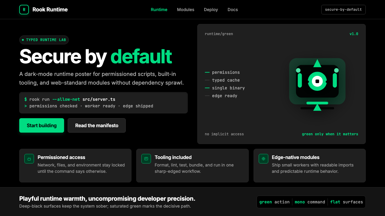 Deno Runtime-GreenWarm precision on black. Saturated green, Inter, and mono code turn security…黑底上的温暖精度:饱和绿、Inter 与等宽代码让安全成为主角。
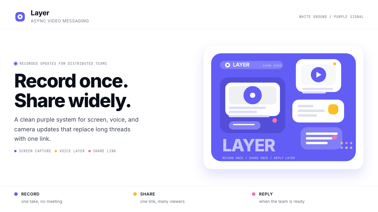 Loom Async-Video PurpleAsync, not meetings. Pure white ground, electric purple, record-button geomet…异步,不开会:纯白底、电紫与录制按钮几何。
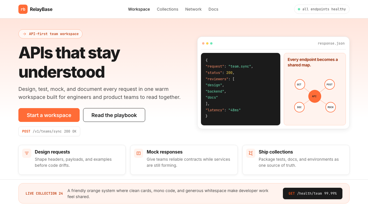 Postman 2024Warm APIs feel approachable. Orange gradients, Inter headlines, and dark mono…温暖的 API 专业感:橙色渐变、Inter 标题与深色等宽代码块。
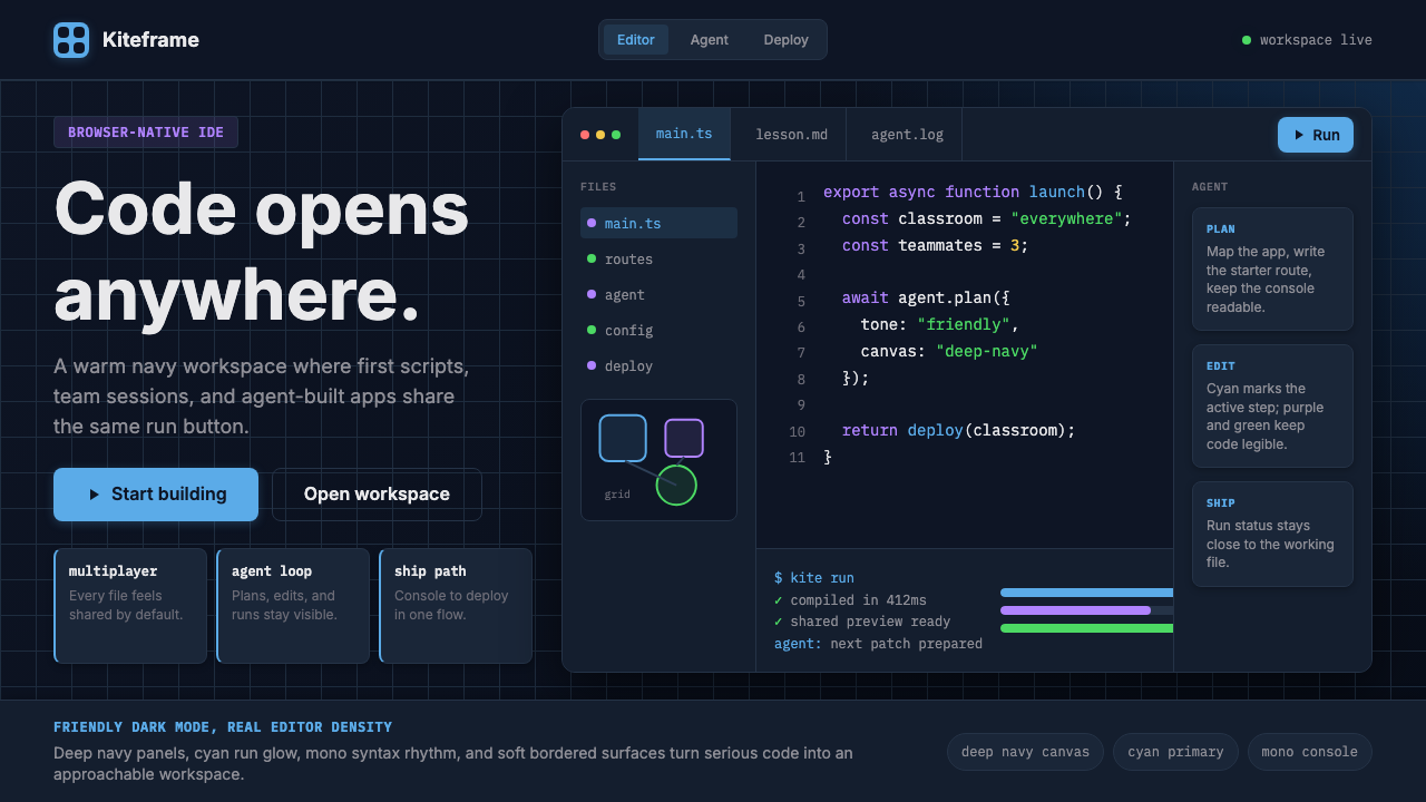 Replit Browser IDE BlueFriendly code gravity. Cyan run lights and mono panels warm the deep navy IDE…亲切的代码引力。青蓝运行光与等宽面板温暖深海军蓝网格。
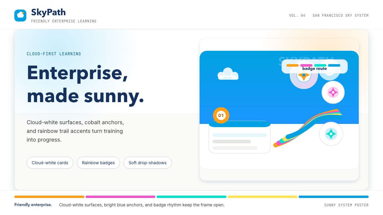 Salesforce TrailheadFriendly enterprise glows. Cloud-white, cobalt, and rainbow badges keep it wa…友好企业感发光。云白、钴蓝和彩虹徽章把它变暖。
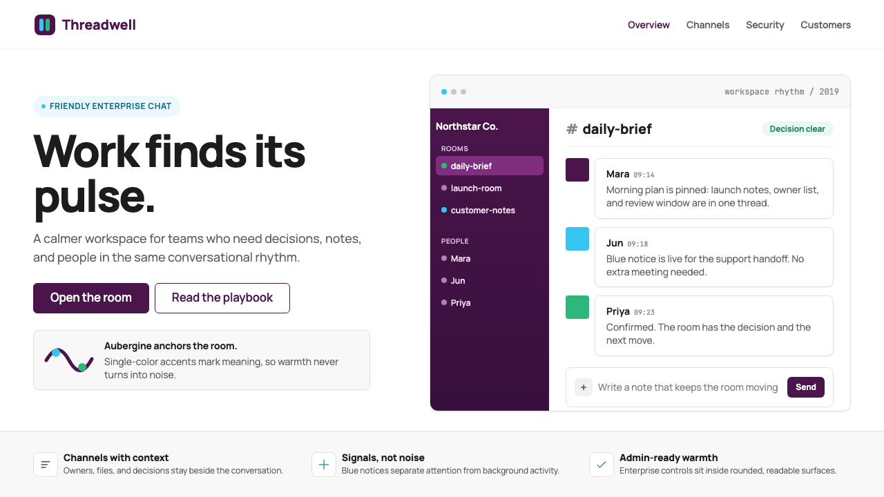 Slack 2019Warm enterprise chat. Aubergine rail, Manrope type, and single-accent badges…温暖企业对话:茄紫侧栏、Manrope 与单色徽章让它有人味。