What is Loom Async-Video Purple?什么是 Loom Async-Video Purple?
Loom made async video a category — and its electric purple-on-white identity made the record button feel as natural as sending an email.Loom 把异步视频变成了一个品类,而那抹电紫配纯白的视觉语言,让「点击录制」这件事变得像发一封邮件一样自然。
Loom Async-Video Purple in briefLoom Async-Video Purple 速览
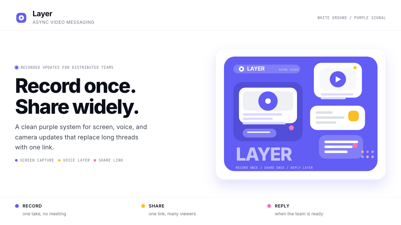
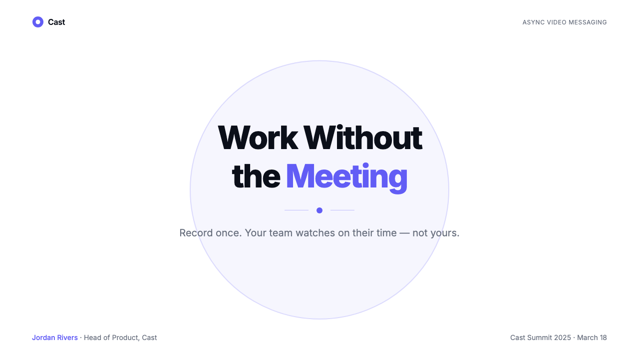
Loom Async-Video Purple is the visual language developed by Loom between its founding in 2015 and a series of refinements through the early 2020s. It centers on a single, saturated electric purple — a hue that sits between indigo and violet, charged and unmistakable — set against a pure white ground. Supporting it are a modernist sans-serif typeface, generous rounded corners on every interactive element, and a compact iconographic vocabulary built around record buttons, video thumbnails, and playback controls.Loom 异步视频紫是 Loom 自 2015 年创立、经 2020 年代初数轮迭代后形成的视觉语言。它以单一、饱和的电紫为核心——一种介于靛蓝与紫罗兰之间、充满张力且辨识度极高的色相——铺陈在纯白底面之上。配合它的是现代感强烈的无衬线字体、所有交互元素上慷慨的圆角,以及围绕录制按钮、视频缩略图与播放控件构建的精简图标体系。
The aesthetic belongs squarely to the friendly modernist SaaS wave that crested during the pandemic era, when distributed teams needed tools that felt approachable rather than corporate, casual rather than formal. Loom's identity resolved a tension that many productivity tools still struggle with: it needed to look professional enough for enterprise sales while feeling light enough that a startup founder would happily record a two-minute update instead of writing a long email. The electric purple solved this by being confident without being severe — energetic without being playful.这套美学完全属于疫情时代涌现的「友好现代 SaaS」浪潮。彼时分布式团队需要那些感觉亲切而非企业化、轻松而非正式的工具。Loom 的视觉识别化解了许多效率工具至今仍在挣扎的矛盾:它需要足够专业以赢得企业客户,同时又要足够轻盈,让创业者愿意录两分钟视频代替写一封长邮件。电紫恰好解决了这道题——它有自信而不严峻,有活力而不幼稚。
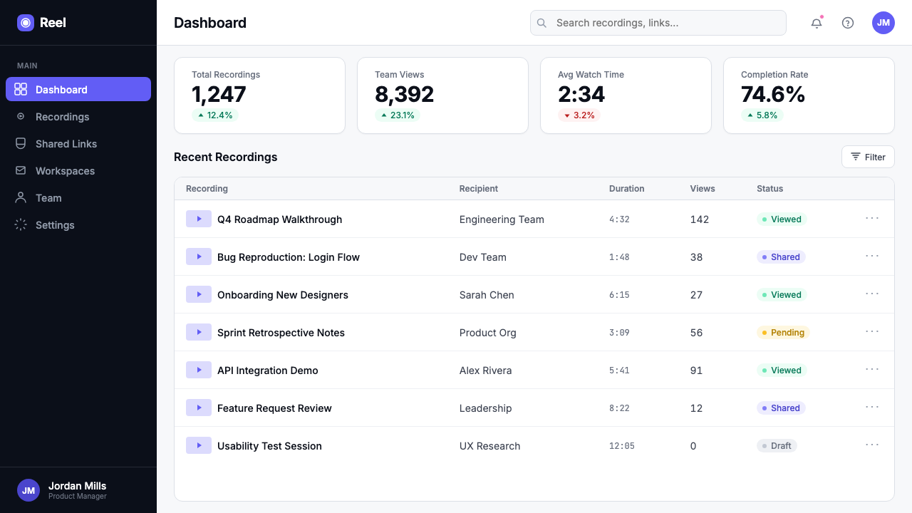
What distinguishes the style from generic SaaS purple is its discipline. The palette is genuinely minimal: primary purple for emphasis and brand moments, pure white for backgrounds and cards, near-black for body text and structural elements, with a controlled range of soft grays for secondary surfaces and dividers. There are no gradients for decoration, no drop shadows for texture — only subtle elevation cues that reinforce interactive affordances. Every visual decision points back to one product truth: this is software that records, shares, and plays back video, and nothing in the interface should distract from that clarity.将这套风格与泛泛的「SaaS 紫」区别开来的,是它的克制。调色板真正做到了极简:品牌紫用于强调与品牌时刻,纯白用于背景与卡片,近黑用于正文与结构性元素,有限几个柔灰用于次级界面与分隔线。装饰性渐变不存在,质感性投影不存在——只有强化交互可见性的微妙高度提示。每个视觉决定都指向同一个产品真相:这是一款录制、分享、回放视频的软件,界面里没有任何东西应当分散这份清晰。
See the Loom Async-Video Purple design system查看 Loom Async-Video Purple 完整设计系统
Where does Loom Async-Video Purple come from?Loom Async-Video Purple 从何而来?
Loom was founded in San Francisco in 2015 by Joe Thomas, Shahed Khan, and Vinay Hiremath. The founding insight was deceptively simple: most of what people use meetings and emails for could be handled better by a short, asynchronous screen recording. The early product was raw and the early brand was provisional, but the company grew steadily on the strength of the idea alone — a Chrome extension that let you record your screen and face simultaneously and share a link in seconds.Loom 由 Joe Thomas、Shahed Khan 与 Vinay Hiremath 于 2015 年在美国旧金山创立。创业洞察朴实得出人意料:人们开会发邮件处理的大部分事情,用一段简短的异步录屏其实能做得更好。早期产品粗糙,早期品牌暂定,但公司凭借这个想法本身稳步成长——一个 Chrome 插件,让你同时录下屏幕与摄像头画面,几秒内生成一条可分享的链接。
The brand found its definitive visual form roughly between 2019 and 2022, during a period of rapid user growth accelerated by the shift to remote work. The electric purple emerged as the signature color during this phase, anchoring a comprehensive redesign that replaced the startup's earlier, less distinctive palette. The choice of purple was not arbitrary: in the broader SaaS color landscape dominated by blues and greens, a confident purple stood out clearly on a crowded app dock and in a cluttered email inbox. It communicated something different from productivity-tool blue — more creative, more personal, less infrastructural.品牌的视觉形态大约在 2019 至 2022 年间趋于定型。那段时期因远程办公浪潮加速,用户增长迅猛。电紫在这一阶段确立为标志性色彩,锚定了一次全面的品牌重塑——取代了公司更早期那套辨识度不足的调色板。紫色的选择并非随意:在被蓝色与绿色主导的 SaaS 色彩版图中,一抹自信的紫在拥挤的应用坞和杂乱的收件箱里都格外醒目。它传递的信号也与效率工具蓝不同——更有创造力,更具个人温度,少一份基础设施感。
Loom's visual identity was shaped in part by the constraints and expectations of the video medium it was built around. Unlike a project management tool or a cloud storage service, Loom's core interface is always adjacent to a camera and a screen — its product UI needed to feel comfortable alongside a user's face. This pushed the design toward warmth and approachability rather than the colder rationalism of enterprise dashboards. Rounded corners, generous whitespace, friendly iconography, and that electric purple all work together to signal that recording yourself is a perfectly normal, low-stakes activity.Loom 的视觉识别,在一定程度上被它所围绕的视频媒介的限制与期待所塑造。与项目管理工具或云存储服务不同,Loom 的核心界面始终与摄像头和屏幕相邻——产品 UI 需要在用户的脸旁边感觉舒适。这将设计推向了温暖与亲近,而非企业仪表板那种更冷冽的理性主义。圆角、充足的留白、友好的图标,加上那抹电紫,共同向用户传递一个信号:对着摄像头录制自己,是一件完全正常、毫无压力的事情。
The Atlassian acquisition in October 2023, at nine hundred seventy-five million dollars, marked the end of Loom's independent brand chapter and the beginning of its integration into the Atlassian ecosystem alongside Jira, Confluence, and Trello. The visual language has evolved under Atlassian's stewardship, but the electric purple and the core iconographic vocabulary — the record button, the play triangle, the video thumbnail grid — remain recognizable anchors, a testament to how effectively the original identity encoded the product's purpose into visual form.2023 年 10 月,Atlassian 以 9.75 亿美元完成对 Loom 的收购,标志着 Loom 独立品牌章节的终结,以及它融入 Atlassian 生态系统——与 Jira、Confluence、Trello 并肩——的开始。视觉语言在 Atlassian 的主导下持续演进,但电紫与核心图标词汇——录制按钮、播放三角、视频缩略图网格——依然是可辨认的锚点,印证着原始视觉识别将产品使命编码进视觉形式的有效程度。
What defines the Loom Async-Video Purple look?Loom Async-Video Purple 的视觉特征是什么?
Signature Purple标志性紫色
The electric purple at the heart of the system is a high-saturation, blue-leaning violet that reads as energetic and distinctive without veering into aggression. It is used purposefully and sparingly: primary calls to action, active states, brand moments, and key iconography. Against pure white, it achieves maximum contrast and presence; against light gray surfaces, it anchors hierarchy without overwhelming secondary content. The color's personality — confident, creative, slightly warm — defines the emotional register of the entire visual system.系统核心的电紫是一种高饱和、偏蓝的紫罗兰,读来充满活力且辨识度高,却不走向攻击性。它被有目的、有节制地使用:主要行动号召、激活状态、品牌时刻与关键图标。在纯白底面上,它实现最大对比度与存在感;在浅灰表面上,它锚定层级而不压倒次级内容。这种颜色的个性——自信、有创造力、略带温暖——定义了整套视觉系统的情感基调。
Pure White Ground纯白底面
The background palette commits to pure white rather than off-white or cream. This is a product-driven decision: video content — with its natural photographic color variation — needs a neutral, predictable container. Pure white ensures that thumbnails, avatars, and screen recordings sit cleanly without color contamination. Secondary surfaces use a very light, nearly imperceptible gray to create gentle separation between panels and cards, maintaining the overall sense of openness and air.底色调板选择纯白,而非米白或奶油色。这是产品驱动的决定:视频内容——带有自然的摄影色彩变化——需要中性、可预期的容器。纯白确保缩略图、头像与屏幕录制能干净地呈现,不受色彩污染。次级界面使用非常浅、几乎难以察觉的灰色,在面板与卡片之间制造温和的分隔,维系整体的开阔与通透感。
Rounded Corners圆角
Every container in the system — cards, buttons, input fields, modal dialogs, video thumbnail frames — carries a consistently generous rounded corner radius. The effect is immediately legible as friendly and approachable rather than formal or authoritarian. Rounded corners also serve a functional purpose in a video-forward interface: they mimic the natural aspect of a camera viewfinder or a television screen, softly signaling that this is a space where recorded moments live. The consistency of the radius across all interactive elements creates visual cohesion without requiring additional unifying devices.系统中每一个容器——卡片、按钮、输入框、模态对话框、视频缩略图边框——都带有一致且慷慨的圆角半径。效果立即被读解为友好与亲切,而非正式或权威。圆角在以视频为中心的界面中也承担功能作用:它们模仿摄像机取景框或电视屏幕的自然形态,轻柔地暗示这是一个录制时刻的栖居空间。所有交互元素上半径的一致性,在不借助额外统一装置的情况下创造了视觉凝聚力。
Record-Button Iconography录制按钮图标语言
The visual vocabulary is organized around a small set of highly legible icons: the filled circle that means record, the triangle that means play, the square that means stop, the camera outline, the screen-share frame. These are not decorative — they are functional symbols drawn with enough weight and simplicity to be immediately parsed at any size. The record button, in particular, becomes a brand device: a filled circle inside a ring, rendered in electric purple, is Loom's most reduced and most recognizable mark.视觉词汇围绕一组高度易读的图标组织:代表录制的实心圆、代表播放的三角形、代表停止的方块、摄像头轮廓、屏幕分享边框。这些不是装饰——它们是功能性符号,以足够的分量和简洁绘制,在任何尺寸下都能被立即解读。录制按钮尤其成为品牌装置:一个圆圈内的实心圆,以电紫呈现,是 Loom 最简化也最具辨识度的标志。
Modernist Sans-Serif Typography现代主义无衬线字体排印
The typeface system uses a neutral, geometric sans-serif that prioritizes readability and screen legibility over expression. Type is set with clear hierarchical contrast: large, moderately heavy headings communicate section structure at a glance, while body text is sized for comfortable reading without crowding. The overall typographic tone is clean and functional, avoiding the expressive extremes of display typefaces on one end and the invisible blandness of system defaults on the other. Letter-spacing is close to optical rather than mathematical, giving text blocks a natural, editorial feel.字体系统使用中性、几何感的无衬线字体,优先考虑可读性与屏幕易读性,而非表达性。字体以清晰的层级对比排版:大号、适中字重的标题一目了然地传递章节结构,正文字号适合舒适阅读而不造成拥挤。整体排印基调干净实用,避免展示字体的表达极端,也避免系统默认字体的无形乏味。字间距接近视觉校准而非数学机械,赋予文字块自然的编辑感。
Subtle Elevation and Shadow微妙的高度感与投影
Unlike the flat, zero-shadow commitment of strict minimalist systems, the Loom aesthetic uses a very restrained soft shadow to distinguish interactive elements — cards, dropdowns, modals — from the background plane. The shadows are diffuse rather than hard-edged, small rather than dramatic, and used only to encode interaction affordance rather than to create decorative depth. The effect is a clean sense of layering — foreground from background, active from passive — without the heaviness of skeuomorphic depth effects.与严格极简系统的完全无阴影承诺不同,Loom 美学使用极其克制的柔和投影来区分交互元素——卡片、下拉菜单、模态框——与背景平面。阴影是漫射而非硬边的,细小而非夸张的,仅用于编码交互可见性,而非制造装饰性深度。效果是一种干净的层次感——前景与背景、激活与被动——而没有拟物化深度效果的沉重。
Video-Native Layout Logic以视频为原生的布局逻辑
Layouts in the Loom style are organized around the video thumbnail as a primary content unit. Grids of thumbnails — typically displayed in two-up or three-up arrangements on desktop — drive the spatial logic of the interface, with text labels, duration badges, and avatar chips arranged in close proximity to each video card. This thumbnail-grid logic differs fundamentally from text-list or icon-grid interfaces: proportions are dictated by the widescreen aspect ratio of video rather than by typographic line heights or icon sizes, giving Loom-style layouts their distinctive, gallery-like horizontal rhythm.Loom 风格的布局以视频缩略图作为主要内容单元来组织。缩略图网格——在桌面端通常以两列或三列方式呈现——驱动界面的空间逻辑,文字标签、时长徽章与头像小片紧密环绕每张视频卡片排列。这种缩略图网格逻辑与文字列表或图标网格界面根本不同:比例由视频的宽屏纵横比决定,而非由字体行高或图标尺寸决定,赋予 Loom 风格布局独特的、画廊般的横向节奏。
See the Loom Async-Video Purple design system查看 Loom Async-Video Purple 完整设计系统
Who shaped Loom Async-Video Purple?谁塑造了 Loom Async-Video Purple?
Co-founder and CEO of Loom through its independent years. Thomas was the primary public voice of the company's mission — the conviction that video is a better communication medium than text for a large class of workplace interactions — and his leadership shaped both the product direction and the brand ethos. The friendly, unhurried quality of the Loom visual identity reflects the same argument: recording a message should feel no more formal than sending one.Loom 联合创始人,在公司独立运营期间担任 CEO。Thomas 是公司使命的主要公开声音——坚信对于大量职场互动,视频是比文字更好的沟通媒介——他的领导既塑造了产品方向,也塑造了品牌精神。Loom 视觉识别那种友好、不急迫的气质,与这个论点如出一辙:录制一条消息,感觉不应该比发送一条消息更正式。
Co-founder of Loom, responsible in the early years for growth and go-to-market thinking. Khan's perspective on viral product loops — the idea that every Loom video sent is itself a product demonstration to the recipient — influenced the identity's emphasis on the shareable link and the playback experience as brand surfaces as important as the recording interface itself.Loom 联合创始人,早期负责增长与市场进入策略。Khan 对病毒式产品循环的洞察——每一条发出的 Loom 视频本身就是对收件人的产品演示——影响了品牌识别对可分享链接与回放体验的重视,将其视为与录制界面同等重要的品牌表面。
Co-founder and CTO of Loom. Hiremath's engineering leadership addressed the deep technical challenge of making low-latency video recording and instant link sharing feel effortless — a challenge that made the product's friendly, casual brand promise technically non-trivial to keep. The visual language's emphasis on speed cues (instant thumbnails, real-time record indicators) reflects the technical architecture beneath it.Loom 联合创始人,担任 CTO。Hiremath 的工程领导力应对了让低延迟视频录制与即时链接分享感觉毫不费力这一深层技术挑战——正是这个挑战,使产品友好、随性的品牌承诺在技术上并非易事。视觉语言对速度线索的强调(即时缩略图、实时录制指示器)反映了其下方的技术架构。
Following the 2023 acquisition, Loom's visual language began a process of alignment with Atlassian's broader design system — itself a mature, blue-dominant enterprise palette built around Jira and Confluence. The ongoing negotiation between Loom's electric purple identity and Atlassian's more utilitarian blue vocabulary is a live case study in what happens to an acquired brand's design language when it must integrate into a larger system while preserving recognizability.2023 年收购完成后,Loom 的视觉语言开始与 Atlassian 更广泛的设计系统对齐——后者是围绕 Jira 和 Confluence 构建的成熟、蓝色主导的企业调色板。Loom 电紫身份与 Atlassian 更功能性蓝色语汇之间持续进行的协商,是一个鲜活的案例研究:当一个被收购品牌的设计语言必须融入更大系统同时保持辨识度时,会发生什么。
How do you use Loom Async-Video Purple today?今天怎么用 Loom Async-Video Purple?
Loom Async-Video Purple is highly legible as a design reference for any product in the async communication, screen-recording, or knowledge-sharing space. More broadly, it represents a mature formulation of the friendly modernist SaaS aesthetic — making it directly applicable to any tool that needs to feel both professional and approachable: onboarding flows, collaboration dashboards, tutorial platforms, and lightweight productivity apps.Loom 异步视频紫作为设计参考,在任何涉及异步沟通、屏幕录制或知识分享的产品中都有极高的可读性。更广泛地说,它代表了「友好现代 SaaS」美学的成熟表述——使其直接适用于任何需要同时传递专业感与亲近感的工具:新用户引导流程、协作仪表板、教程平台以及轻量级效率应用。
For presentation slides, the style works best when the electric purple is used as a focused accent rather than a dominant field. Cover slides benefit from a strong typographic statement on white, with the purple applied to a single headline word, a geometric shape accent, or an icon. Content slides should organize information in thumbnail-friendly proportions — think wide cards rather than tall lists — reflecting the video-native spatial logic of the source aesthetic. Data slides work well in this system when charts are kept to clean outlines and filled only in purple for the primary data series, with grays for supporting series. Avoid filling backgrounds with purple; its power comes from contrast against white, not from saturation.在演示文稿中,这套风格最有效的做法是将电紫用作聚焦性强调,而非主导色域。封面页适合在白底上做强劲的排印陈述,将紫色施加于单个标题词、几何形状强调或图标。内容页应以缩略图友好的比例组织信息——想象宽卡片而非高列表——反映来源美学的视频原生空间逻辑。数据页在这套系统中效果良好,条件是图表保持简洁轮廓,仅对主要数据系列以紫色填充,支撑系列用灰色。避免以紫色填充背景;它的力量来自于与白色的对比,而非饱和度本身。
For web UI, dashboards and settings pages are the most natural fit. Define a layout grid with generous column gutters and use pure white as the page background. Reserve the electric purple exclusively for primary action buttons, active navigation states, and key badges or indicators — do not distribute it across decorative elements. Card components should use a very light shadow for lift rather than heavy borders. For pricing pages, the purple naturally signals the recommended tier when applied to a highlighted card, following the convention Loom itself uses to distinguish its paid plans.对于网页界面,仪表板与设置页面是最自然的适配场景。定义具有宽裕列间距的布局网格,以纯白作为页面背景。电紫专门保留给主要操作按钮、激活导航状态以及关键徽章或指示器——不要将其分散到装饰性元素上。卡片组件应用很浅的投影制造浮起感,而非沉重的边框。对于定价页面,将紫色应用于高亮卡片时,它自然地标示推荐套餐,沿用 Loom 自身区分付费计划的惯例。
For editorial and marketing applications, the style supports confident, video-forward compositions. Feature announcement pages work well with alternating white and very light gray section backgrounds, broken by full-bleed video preview moments in a widescreen frame outlined in purple. Social cards and email headers benefit from a white background with a single purple element — a record-button icon, a headline word, an underline accent — that reads at thumbnail scale. Avoid using photographic backgrounds behind the purple; it is calibrated for white and loses its charge on complex textures.对于编辑与营销应用,这套风格支持自信的、以视频为前景的构图。功能公告页面适合用交替的白色与极浅灰色区块背景,被宽屏框架内的全出血视频预览时刻——以紫色描边——所打破。社交卡片与邮件头图受益于白色背景加单个紫色元素——录制按钮图标、一个标题词、一条下划线强调——在缩略图尺寸下清晰可读。避免在紫色后方使用摄影背景;它是针对白色校准的,在复杂质感上会失去张力。
The most common mistake when applying this style is treating the electric purple as a background color. Loom uses it almost exclusively as a foreground element — on white, it is unmistakable; as a full background, it becomes heavy and loses the fresh, spacious quality that defines the system. A related error is reaching for additional accent colors to compensate for a perceived lack of variety — the system's restraint is deliberate. If a layout feels monotonous, the solution is better typographic contrast and more considered spacing, not the introduction of a secondary palette.应用这套风格时最常见的错误,是将电紫当作背景色使用。Loom 几乎只将它用作前景元素——在白色上,它无可置疑;作为整片背景,它变得沉重,失去了定义这套系统的清新、宽阔质感。一个相关错误是为弥补所谓单调感而引入额外强调色——这套系统的克制是刻意为之的。如果版面感觉单调,解决方案是更好的排印对比与更经过考量的间距,而非引入次级调色板。
See the Loom Async-Video Purple design system查看 Loom Async-Video Purple 完整设计系统
Loom Async-Video Purple — FAQLoom Async-Video Purple · 常见问题
How is Loom Async-Video Purple different from other SaaS purples?Loom 异步视频紫与其他 SaaS 紫有何不同?
Most SaaS purples lean either cooler and more blue (toward a corporate indigo) or warmer and more pink (toward a consumer violet). Loom's purple sits at a distinctive midpoint — saturated enough to be unmistakable, blue-leaning enough to stay professional, and deployed with enough restraint that it never overwhelms the white ground it lives on. The key differentiator is disciplined scarcity: in genuine Loom-derived work, the purple appears on perhaps ten to fifteen percent of the surface area, concentrated in high-value moments. Imitators tend to increase saturation and surface coverage simultaneously, which is exactly what dilutes the color's authority.大多数 SaaS 紫要么偏冷更蓝(趋向企业靛蓝),要么偏暖更粉(趋向消费品紫罗兰)。Loom 的紫色处于一个独特的中间点——饱和度足以令人印象深刻,偏蓝足以保持专业感,部署得足够克制以至于永远不会压倒它所依托的白色底面。关键差异在于有纪律的稀缺性:在真正源自 Loom 的作品中,紫色可能只出现在百分之十至十五的表面积上,集中在高价值时刻。仿效者往往同时提高饱和度和覆盖面积,而这恰恰是稀释色彩权威性的做法。
Does this style work for a dark-mode version of a product?这套风格适合产品的深色模式吗?
A dark variant is feasible but requires significant rethinking rather than simple color inversion. On a dark background, the electric purple needs to be lightened slightly — its full-saturation version against pure black can read as harsh — and the white text elements need careful hierarchy calibration. The video thumbnail problem is also different in dark mode: thumbnails that looked clean on white can appear muddy against dark surfaces, requiring more deliberate framing. Loom itself offers a dark mode, but the electric purple shifts perceptibly in that context — if you are building a dark variant, treat it as a separate design problem rather than an automatic inversion.深色变体在技术上可行,但需要大量重新思考,而非简单的颜色反转。在深色背景上,电紫需要略微提亮——其全饱和版本在纯黑上可能显得刺眼——而白色文字元素需要仔细的层级校准。视频缩略图问题在深色模式下也有所不同:在白色上看起来干净的缩略图,在深色表面上可能显得浑浊,需要更刻意的框架处理。Loom 本身提供深色模式,但电紫在该语境中会有可感知的转变——如果你在构建深色变体,请将其视为独立的设计问题,而非自动反转。
Can this aesthetic work for a product that has nothing to do with video?这套美学能用于与视频完全无关的产品吗?
The foundational principles — electric purple on white, modernist sans-serif, rounded corners, restrained shadow, clean iconography — transfer well to any async or remote-work tool, and broadly to any SaaS product that wants to feel approachable and contemporary. What does not transfer cleanly is the video-native spatial logic: thumbnail grids and widescreen proportions are meaningful in a video context and can look arbitrary in, say, a text-heavy analytics tool. Use the color system and typographic approach freely; adapt the layout proportions to your actual content unit rather than importing the thumbnail-grid rhythm wholesale.基础原则——白底上的电紫、现代主义无衬线字体、圆角、克制的投影、简洁图标——很好地迁移到任何异步或远程办公工具,以及广泛地迁移到任何想要显得亲切和当代感的 SaaS 产品。无法干净迁移的是视频原生的空间逻辑:缩略图网格与宽屏比例在视频语境中有意义,在比如文字密集的分析工具中可能显得武断。请自由使用颜色系统与排印方法;根据你的实际内容单元调整布局比例,而不是原封不动地引入缩略图网格节奏。
How should motion and animation be handled in this style?这套风格中应如何处理动效与动画?
Motion in the Loom aesthetic is purposeful and quick. Transitions are brief — just long enough to confirm state change — and use ease-out curves that feel snappy rather than elastic or springy. The record button's pulsing ring when active is the canonical motion reference: it communicates a live state through a simple, repeating radial animation rather than complex morphing. Avoid long entrance animations for content, decorative particle effects, or any motion that draws attention away from the video content itself. If in doubt, halve the duration and simplify the easing — the aesthetic values clarity over spectacle.Loom 美学中的动效是有目的且简短的。过渡时间短暂——刚好足够确认状态变化——使用 ease-out 曲线,感觉利落而非弹性或回弹式。录制按钮激活时的脉冲圆环是标准动效参考:它通过简单的重复径向动画传递实时状态,而非复杂的形变。避免内容的长入场动画、装饰性粒子效果,或任何将注意力从视频内容本身引开的动效。若有疑问,将时长减半并简化缓动——这套美学重视清晰胜过奇观。
Is the style appropriate for enterprise or regulated-industry contexts?这套风格适合企业或监管行业的使用场景吗?
The Loom aesthetic sits at the approachable end of the professional-to-enterprise spectrum — it signals modernity and usability before it signals authority or seriousness. For enterprise contexts, the style can be tightened: reduce corner radii slightly, increase typographic weight for headings, use the electric purple more sparingly, and ensure all data displays prioritize density and precision over visual comfort. For strictly regulated industries — healthcare, legal, financial compliance — where the aesthetic convention leans toward established neutrality, the electric purple may signal too much personality for the context, and a more restrained blue or gray-dominant system may be preferable.Loom 美学处于专业到企业级谱系中亲切感较强的一端——它传递的首先是现代感与可用性,而非权威感或严肃感。对于企业场景,风格可以收紧:略微减小圆角半径、增大标题字重、更节制地使用电紫,并确保所有数据展示将密度与精确性置于视觉舒适度之上。对于严格监管行业——医疗、法律、金融合规——其美学惯例倾向于既定中性,电紫可能在该语境中传递过多个性,更克制的蓝色或灰色主导系统或许更为合适。
Related design styles相关设计风格
 Deno Runtime-GreenWarm precision on black. Saturated green, Inter, and mono code turn security…黑底上的温暖精度:饱和绿、Inter 与等宽代码让安全成为主角。
 Postman 2024Warm APIs feel approachable. Orange gradients, Inter headlines, and dark mono…温暖的 API 专业感:橙色渐变、Inter 标题与深色等宽代码块。
 Replit Browser IDE BlueFriendly code gravity. Cyan run lights and mono panels warm the deep navy IDE…亲切的代码引力。青蓝运行光与等宽面板温暖深海军蓝网格。
 Salesforce TrailheadFriendly enterprise glows. Cloud-white, cobalt, and rainbow badges keep it wa…友好企业感发光。云白、钴蓝和彩虹徽章把它变暖。
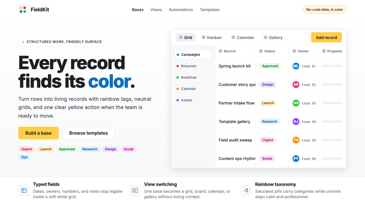 Airtable Spreadsheet-RainbowWork becomes celebratory. Inter grids stay white while rainbow pills and yell…工作变得欢快:白色 Inter 网格中,彩虹标签与黄色按钮点亮节奏。
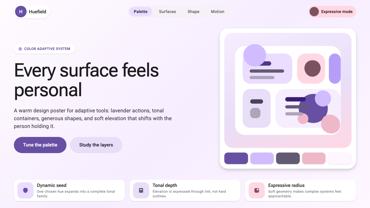 Google Material 3 ExpressiveA living system, themed by your wallpaper. Larger radii, tonal surfaces, emot…能从用户壁纸生成配色的活系统:更大的圆角、表面层级以色调递进取代硬边界——既几…