What is Postman 2024?什么是 Postman 2024?
Postman turned the API request into a first-class design artifact — warm orange confidence, elevated code blocks, and a mascot that makes enterprise tooling feel genuinely human.Postman 将 API 请求提升为正式的设计对象——温暖的橙色自信感、被抬升为主视觉的代码块,以及一只让企业级工具真正显得平易近人的吉祥物。
Postman 2024 in briefPostman 2024 速览
Postman 2024 is the visual and interaction design language developed by Postman, Inc. across the years 2022 through 2024, representing the maturation of a brand that grew from a simple Chrome extension into the world's most widely used API development platform. The system is characterized by a warm signature orange deployed against clean white or near-white surfaces, elevated code-block aesthetics that treat developer output as hero imagery, and a friendly anthropomorphic mascot, Postdog, whose presence softens an otherwise technical product category.Postman 2024 是 Postman 公司在 2022 至 2024 年间建立并成熟的视觉与交互设计语言,标志着一个从简单 Chrome 插件成长为全球最广泛使用的 API 开发平台的品牌走向成熟。这套设计体系以标志性温暖橙色铺陈在干净的白色或近白底面上为特征,以被抬升为首屏主视觉的代码块为核心,以拟人化吉祥物 Postdog 为情感锚点——正是这只友善的狗狗柔化了原本高度技术化的产品类别。
At its core, the system solves a design problem specific to developer tooling: how to signal professional credibility to engineers while remaining approachable enough for product managers, technical writers, and business stakeholders who share the same workspace. It achieves this balance through a deliberate pairing of typefaces — a humanist sans-serif for headlines and marketing copy, a geometric monospaced face for all code surfaces — and through a palette that leads with warm hues rather than the cool greys and deep blues that dominate most enterprise software.从本质上看,这套体系解决的是开发者工具特有的设计难题:如何同时向工程师传递专业可信的信号,又对产品经理、技术文档工程师和共用同一工作空间的业务干系人保持足够的亲和力。它通过一对精心挑选的字体组合实现这种平衡——人文主义无衬线体用于标题和营销文案,几何等宽体覆盖全部代码界面——以及以暖调为主导的色板,而非大多数企业软件惯用的冷灰和深蓝。
The design language is not derived from a historical art movement but from a specific commercial and technological moment: the emergence of the API economy in the mid-2010s and the simultaneous shift in developer tooling from purely command-line experiences toward collaborative, visually designed platforms. Postman 2024 is the visual record of that shift — a brand identity built for an era in which the API itself became a product.这套设计语言并非源自某一历史艺术运动,而是来自一个特定的商业与技术时刻:2010 年代中期 API 经济的兴起,以及开发者工具同期从纯命令行体验向协作式可视化平台的整体转型。Postman 2024 是那次转型的视觉记录——一套为 API 本身成为产品的时代而建立的品牌语言。
Where does Postman 2024 come from?Postman 2024 从何而来?
Postman began in 2012 as a personal side project by Abhinav Asthana, then a computer science student in Bangalore, India. Frustrated by the clumsiness of testing HTTP requests directly in a browser, he built a Chrome extension that simplified the process of sending and inspecting API calls. The extension's orange interface — chosen partly for its visibility against Chrome's grey chrome and partly for its warmth — became the earliest visual seed of what would become a global brand. By the time Abhinav co-founded Postman, Inc. in 2014 with Ankit Sobti and Abhijit Kane, the extension had accumulated hundreds of thousands of users without any dedicated marketing.Postman 起源于 2012 年,最初是班加罗尔计算机科学学生 Abhinav Asthana 的一个个人副业项目。出于对直接在浏览器中测试 HTTP 请求的笨拙方式的不满,他构建了一个简化 API 调用发送与检查流程的 Chrome 插件。这个插件的橙色界面——一半因为它在 Chrome 灰色界面上的辨识度,一半因为它的温暖感——成为日后一个全球品牌最早的视觉种子。到 2014 年 Abhinav 与 Ankit Sobti、Abhijit Kane 共同创立 Postman, Inc. 时,这个插件在没有任何专项营销的情况下已积累了数十万用户。
The company's early visual identity was functional rather than considered — orange was the brand color because it had always been the color, and the interface was organized around utility rather than aesthetic intent. The first major design inflection point came as Postman expanded beyond its Chrome extension origins into a native desktop application, a paid team collaboration layer, and eventually a full platform with environments, mocking, monitoring, and documentation capabilities. Each expansion forced a reckoning with what the brand actually communicated and to whom.公司早期的视觉形象是功能性的,而非经过深思熟虑的——橙色是品牌色,仅仅因为它一直以来都是品牌色;界面的组织逻辑围绕实用性而非审美意图展开。第一个重要的设计转折点出现在 Postman 从 Chrome 插件扩展为原生桌面应用程序、付费团队协作层,以及最终拥有环境管理、Mock 服务、监控与文档能力的完整平台之时。每一次扩张都迫使品牌正视自己究竟在传递什么信号、传递给谁。
The 2022–2024 visual identity represented a deliberate rebranding effort by Postman's in-house brand team, conducted against the backdrop of the company's rapid enterprise growth — Postman had crossed 20 million registered users and was increasingly selling to large engineering organizations. The design challenge was to elevate the brand from a developer utility into a platform brand that could credibly sit alongside enterprise software vendors, while preserving the grassroots developer affection that had made Postman's growth possible in the first place. The solution was to double down on warmth: richer orange gradients with peachy undertones, a mascot with expressive personality, and a typographic system anchored in faces with visible human construction.2022 至 2024 年的视觉形象代表了 Postman 内部品牌团队的一次有意为之的品牌重塑,背景是公司快速的企业级增长——Postman 注册用户已突破两千万,并日益向大型工程组织销售企业服务。设计挑战在于:如何将品牌从一个开发者工具提升为能与企业软件供应商并肩而立的平台品牌,同时保留正是这种草根开发者情感才催生了 Postman 增长奇迹的初心。解决方案是加倍押注温暖感:更浓郁的带蜜桃底调的橙色渐变、具有表现力人格的吉祥物,以及以具有明显人文构造感的字体为锚点的排版体系。
The cultural context of Postman 2024 is the broader API-first movement. By the early 2020s, the software industry had largely adopted the position that APIs were not implementation details but products in their own right — designed, documented, versioned, and marketed. Postman's brand evolved in lockstep with this shift. The elevation of code blocks to hero imagery was not incidental: it reflected an industry-wide normalization of showing raw technical content in marketing materials, as pioneered by developer-tool companies including Stripe, Twilio, and Vercel. Postman 2024 sits firmly in that lineage while adding a warmth and approachability that distinguishes it from the cooler, more austere aesthetics of its nearest peers.Postman 2024 的文化语境是更宏观的 API 优先运动。到 2020 年代初,软件行业已广泛接受这样一种立场:API 不是实现细节,而是产品本身——需要被设计、记录、版本化和营销。Postman 的品牌随这一转变同步演化。将代码块提升为首屏主视觉并非偶然:它反映了行业范围内在营销材料中展示原始技术内容的正常化趋势,这一趋势由 Stripe、Twilio、Vercel 等开发者工具公司率先确立。Postman 2024 稳固地站在这一传承之中,同时以一种将它与最接近的同类产品区别开来的温暖感和亲和力加以标识——相比那些更冷峻、更简朴的同行美学,Postman 的气质是独特的。
What defines the Postman 2024 look?Postman 2024 的视觉特征是什么?
Warm Orange Identity温暖橙色识别系统
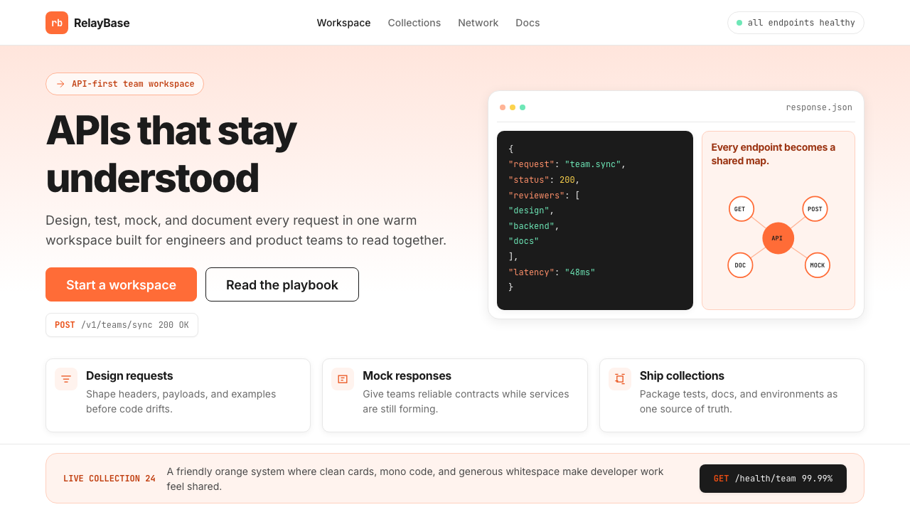
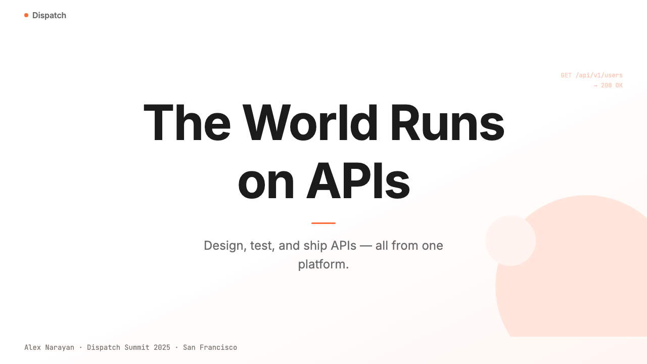
The dominant hue is a warm, saturated orange — not the aggressive neon-orange of alert systems nor the muted terracotta of lifestyle brands, but a confident midpoint with strong visibility on white. This orange appears in gradients that shift toward softer peach at lighter values, maintaining warmth across both marketing surfaces and product UI. It functions as the brand's primary trust signal, carrying associations of energy, approachability, and forward motion without the aggression of pure red or the coolness of blue-shifted alternatives.主色调是一种温暖而饱和的橙色——既不是警报系统那种咄咄逼人的霓虹橙,也不是生活方式品牌的柔和陶土色,而是一种在白色底面上具有强烈辨识度的自信中间地带。这种橙色出现在渐变中,在浅色值时向更柔和的蜜桃色偏移,在市场推广界面和产品 UI 中均保持温暖感。它作为品牌的主要信任信号发挥作用,承载着活力、亲和力和向前运动的联想,却没有纯红的攻击性,也没有偏蓝替代色的冷峻。
Elevated Code as Hero Imagery代码即主视觉
Code blocks occupy a position in Postman's visual system normally reserved for product photography or illustration. They appear prominently on marketing pages, presentations, and social content — rendered in a dark-background monospace format with syntax highlighting that uses warm ambers and muted greens against near-black. The effect communicates that the technical artifact itself is beautiful and worthy of display, rather than something to be hidden behind abstracted UI. This treatment is one of the most distinctive elements of the 2024 language and directly addresses developer audiences who recognize and trust visible technical authenticity.代码块在 Postman 视觉体系中占据的位置,通常是留给产品摄影或插图的。它们醒目地出现在营销页面、演示文稿和社交内容上——以深色背景等宽格式呈现,语法高亮使用温暖的琥珀色和沉稳的绿色叠加在近黑底面上。这种处理传递的信号是:技术产物本身是美丽的、值得展示的,而不是需要被抽象化 UI 遮蔽的东西。这一处理方式是 2024 设计语言最具辨识度的元素之一,直接触达那些认可并信任可见技术真实性的开发者受众。
Humanist-Meets-Monospace Typography人文无衬线与等宽字体的双轨排版
The typographic system is built on a deliberate contrast between two typeface categories. Headlines and marketing text use a humanist sans-serif with open letterforms and visible calligraphic origins, which conveys warmth and approachability at large display sizes. All code-related surfaces — inline code, code blocks, API endpoints, request bodies — use a geometric monospaced typeface with high legibility and clear character differentiation. The contrast between these two voices — one warm and expressive, one precise and technical — mirrors the product's dual audience of marketers and engineers and prevents the design from collapsing into either pure utility or pure warmth.排版体系建立在两类字体之间刻意营造的对比上。标题和营销文案使用具有开放字形和可见书写渊源的人文主义无衬线体,在大字号展示时传递温暖感和亲和力。所有与代码相关的界面——行内代码、代码块、API 端点、请求体——则使用具有高可读性和清晰字符区分度的几何等宽字体。这两种声音之间的对比——一种温暖而有表现力,另一种精确而技术性——映照了产品面向市场人员与工程师的双重受众,并防止设计滑向纯粹的功能性或纯粹的温暖感。
Mascot-Driven Approachability吉祥物驱动的亲和力
Postdog, the brand's canine mascot, is not merely decorative — it functions as an emotional counterweight to the technical density of the product. The mascot appears in illustrations that range from onboarding flows to error states to marketing campaigns, consistently rendered in a warm, simplified style with the brand's orange palette. This character-based warmth is a deliberate strategy for reducing the perceived barrier to entry of API tooling, which historically carried a high-expertise signal. Postdog's presence implicitly communicates that non-experts are welcome, softening a product category that might otherwise feel intimidating.Postdog 这只品牌吉祥物犬绝非单纯的装饰——它作为产品技术密度的情感配重发挥作用。吉祥物出现在从新手引导流程到错误状态再到营销活动的各类插图中,始终以品牌橙色调为基础、以温暖简约的风格呈现。这种角色化温暖感是一种刻意策略,旨在降低 API 工具的门槛感——API 工具历史上一直携带着高专业门槛的信号。Postdog 的存在隐性地传达着欢迎非专家用户的姿态,软化了一个否则可能令人望而生畏的产品类别。
Gradient Warmth with Structural Restraint渐变温暖感与结构克制的平衡
While many developer-tool brands in the same era moved toward flat, nearly-colorless interfaces, Postman 2024 embraces gradients as a signature element — but applies them with deliberate restraint. Gradients appear primarily in hero sections, feature block backgrounds, and marketing illustrations, always flowing between the warm orange family and its lighter, peachy adjacent values rather than introducing unrelated hues. The body of the product UI remains crisp and largely achromatic, so the gradients read as branded moments rather than noise. This creates a rhythm of warmth at key attention points and clarity everywhere else.当同时代许多开发者工具品牌走向扁平化、近乎无色的界面时,Postman 2024 将渐变作为标志性元素拥抱——但以刻意的克制加以运用。渐变主要出现在首屏区域、功能区块背景和营销插图中,始终在温暖橙色系与其较浅的蜜桃邻近色值之间流动,而非引入无关色相。产品 UI 的主体部分保持清爽、基本上是消色调的,因此渐变被读作品牌化的时刻,而非噪声。这在关键注意力节点创造了温暖的节奏,在其他所有地方保持清晰。
Collaborative Space Architecture协作空间架构
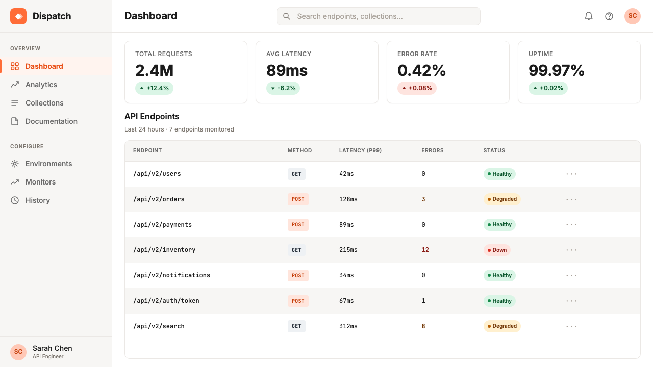
The product UI reflects an architectural decision to organize work around shared spaces rather than individual files. Collections, workspaces, and environments occupy a sidebar hierarchy that prioritizes team context over single-user linear flows. Visually, this manifests as a persistent left-panel navigation in muted tones that never competes with the active editing canvas, combined with a breadcrumb and tab system that makes multi-context work legible. The layout language is closer to a collaborative knowledge tool than a traditional developer console, reflecting the product's positioning at the intersection of engineering and organizational workflow.产品 UI 体现了一个将工作组织在共享空间而非单个文件周围的架构决策。集合、工作空间和环境占据一个优先呈现团队上下文而非单用户线性流程的侧边栏层级。在视觉上,这表现为一个以沉稳色调呈现、从不与活跃编辑画布竞争注意力的持久左侧面板导航,结合使多上下文工作变得清晰可读的面包屑与标签页系统。这套布局语言更接近协作知识工具而非传统开发者控制台,反映了产品在工程与组织工作流交汇处的定位。
Documentation as Design Surface文档即设计界面
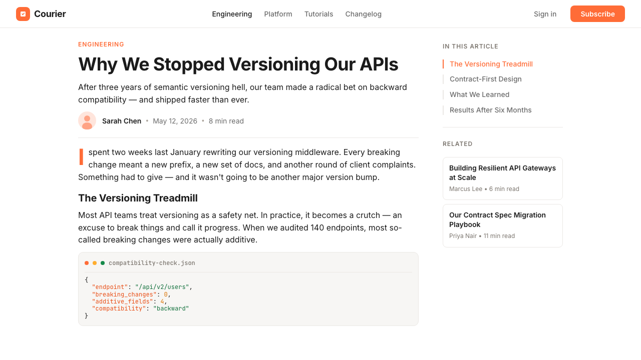
One of the most significant extensions of the Postman 2024 language is its treatment of API documentation as a first-class visual product. Auto-generated documentation pages carry the brand's typographic system and warm palette, transforming what was historically a raw technical artifact into a designed publication. Endpoint listings, parameter tables, and example responses are laid out with clear visual hierarchy, making the documentation readable by non-engineering stakeholders. This positions Postman not just as a testing tool but as a communication platform between API producers and their consumers.Postman 2024 设计语言最重要的延伸之一,是将 API 文档视为一流视觉产品的处理方式。自动生成的文档页面承载了品牌的排版体系和温暖色板,将历史上的原始技术产物转化为经过设计的出版物。端点列表、参数表格和响应示例以清晰的视觉层级排布,使文档对非工程干系人也具有可读性。这将 Postman 定位为不仅是测试工具,更是 API 生产者与消费者之间的沟通平台。
Who shaped Postman 2024?谁塑造了 Postman 2024?
Co-founder and CEO of Postman, Abhinav Asthana created the original Chrome extension in 2012 that seeded the brand's visual identity. His instinct to choose orange — warm, visible, and friendly — over the cool blues and greys dominant in developer tooling at the time set the aesthetic direction that persists in Postman 2024. As CEO through the company's growth from a free tool to a platform valued in the billions, he shaped the strategic decisions that drove the 2022–2024 brand evolution, including the push to make API development genuinely collaborative and the elevation of technical content to marketing-grade visual material.Postman 联合创始人兼 CEO,Abhinav Asthana 于 2012 年创建了奠定品牌视觉身份的原始 Chrome 插件。他选择橙色——温暖、醒目而友善——而非当时开发者工具主流的冷蓝和冷灰,这一直觉性选择设定了在 Postman 2024 中依然延续的美学方向。在公司从免费工具成长为估值数十亿美元平台的全程担任 CEO,他塑造了推动 2022 至 2024 年品牌演化的战略决策,包括让 API 开发真正走向协作的推力,以及将技术内容提升至营销级视觉素材的决定。
Co-founder and CTO, Ankit Sobti shaped the technical architecture of the Postman platform from its earliest days. His engineering decisions — including the choice to build a desktop client rather than remain browser-bound, and the early investment in a team collaboration layer — directly determined the design problems the brand team had to solve. The collaborative workspace model that defines Postman's product layout language emerged from Sobti's conviction that API development was fundamentally a team sport, not an individual activity. The visual system that followed had to make that team context legible at a glance.联合创始人兼 CTO,Ankit Sobti 从最早期开始就塑造了 Postman 平台的技术架构。他的工程决策——包括选择构建桌面客户端而非继续依附浏览器,以及早期投入团队协作层——直接决定了品牌团队必须解决的设计问题。定义 Postman 产品布局语言的协作工作空间模型,正是源于 Sobti 的信念:API 开发从根本上是团队运动,而非个人活动。随之而来的视觉体系必须让这种团队上下文一眼即可读取。
The in-house brand and design team responsible for the 2022–2024 visual identity is the collective force behind Postman's most significant aesthetic transformation. Working against the constraints of a product with 20 million users and deeply embedded visual habits, the team navigated the challenge of elevating brand sophistication without alienating the developer audience that had made organic growth possible. Their key contributions include the refined gradient system, the elevation of code blocks to hero imagery, the integration of Postdog across product and marketing touchpoints, and the typographic pairing that makes technical and marketing content feel like parts of a coherent whole.负责 2022 至 2024 年视觉形象的内部品牌与设计团队,是 Postman 最重要的美学转型背后的集体力量。在拥有两千万用户、视觉习惯已根深蒂固的产品约束下工作,团队应对了在不疏离正是使有机增长成为可能的开发者受众的前提下提升品牌成熟度这一挑战。他们的关键贡献包括:精炼后的渐变体系、将代码块提升为首屏主视觉、跨产品与营销触点整合 Postdog,以及使技术内容与营销内容感觉是一个连贯整体的排版组合。
While not part of Postman's organization, Stripe's design team warrants mention as a defining peer influence on the Postman 2024 language. Stripe's practice of featuring code snippets prominently in marketing materials — treating the developer experience as a design surface rather than a technical afterthought — established a template that Postman extended and personalized. Where Stripe's aesthetic runs cool and precise, Postman's 2024 answer to the same challenge runs warm and mascot-friendly. Understanding this dialogue helps explain why both brands share a structural logic (code as hero, strong typographic hierarchy, minimal decoration) while reading as distinctly different in tone.虽然不属于 Postman 的组织,Stripe 设计团队值得作为 Postman 2024 设计语言的决定性同行影响力而被提及。Stripe 在营销材料中醒目展示代码片段的实践——将开发者体验视为设计界面而非技术附属品——建立了一套 Postman 加以延伸和个性化的模板。Stripe 的美学是冷峻而精确的,Postman 2024 对同一挑战的回应则是温暖而吉祥物友好的。理解这种对话有助于解释:为何两个品牌共享一套结构逻辑(代码即主视觉、强劲的排版层级、极少装饰),却在气质上读来截然不同。
How do you use Postman 2024 today?今天怎么用 Postman 2024?
Postman 2024 is a practical reference for any presentation, UI, or marketing asset that needs to communicate technical credibility without sacrificing warmth. The core principle to internalize before applying it is the system's emotional contract: warm where the brand speaks, crisp where the product works. Confusing these two registers — making the product UI feel like a marketing brochure, or making a marketing deck feel like a developer console — produces incoherent results even when individual elements are correctly executed.Postman 2024 是任何需要在不牺牲温暖感的前提下传递技术可信度的演示文稿、UI 或营销素材的实用参考。在应用之前需要内化的核心原则是这套体系的情感契约:品牌开口说话的地方用温暖,产品发挥功能的地方用清爽。混淆这两种音域——让产品 UI 感觉像营销手册,或让营销幻灯片感觉像开发者控制台——即便单个元素执行正确,也会产生不连贯的结果。
For presentation slides, the system works best when it separates cover and section-opener pages from content pages. Cover slides benefit from the full gradient treatment: the signature warm orange moving toward peach anchors a hero area, large display type in the humanist face carries the primary message, and code or a Postdog illustration provides a visual counterpoint. Content slides should pull back to a clean white or near-white ground with black body text, reserving orange only for data callouts, highlighted terms, or CTAs. Data visualization slides — API usage charts, uptime graphs, team activity metrics — are ideal candidates for the dark code-block aesthetic: a near-black card on a light slide background, with warm amber and muted green used to differentiate data series.对于演示文稿,这套体系在将封面和章节开篇页与内容页区分处理时效果最佳。封面幻灯片适合完整的渐变处理:标志性温暖橙向蜜桃色流动,锚定主视觉区域,人文无衬线体大字号展示文字承载主要信息,代码或 Postdog 插图提供视觉对位。内容幻灯片应退回到干净的白色或近白底面配黑色正文,将橙色仅保留给数据标注、高亮术语或行动号召。数据可视化幻灯片——API 使用量图表、正常运行时间图、团队活动指标——是深色代码块美学的理想场合:浅色幻灯片背景上的近黑卡片,以温暖琥珀色和沉稳绿色区分数据系列。
For web UI design, the system offers clear guidance for dashboards, API documentation pages, and pricing tiers. Dashboards should maintain a light, airy ground with high-contrast black type and restrained orange accents for interactive states and status indicators. Navigation follows a sidebar-first pattern in desaturated tones, ensuring it never competes with the active content canvas. API documentation pages work well with a two-column layout — left for navigation hierarchy, right for content — with the monospaced typeface handling all technical content and the humanist face reserved for prose explanations. Pricing pages are natural fits: tier headers in bold display type, orange as the differentiator for the recommended plan, and a warm gradient strip at the top to ground the page in brand identity without overwhelming the decision content.对于 Web UI 设计,这套体系为仪表板、API 文档页面和定价层级提供了清晰指引。仪表板应保持明亮通透的底面,高对比度黑色文字,橙色仅用于交互状态和状态指示器的克制强调。导航遵循侧边栏优先模式,以去饱和色调呈现,确保不与活跃内容画布争夺注意力。API 文档页面适合双栏布局——左侧为导航层级,右侧为内容——等宽字体处理所有技术内容,人文无衬线体保留给散文式说明。定价页面是天然的适配场景:粗体展示字用于套餐标题,橙色作为推荐套餐的差异化标识,顶部温暖渐变条将页面根植于品牌形象,同时不压制决策内容。
For editorial and marketing contexts — blog headers, social cards, email banners, conference materials — the system's most expressive elements come forward. Full-bleed gradient backgrounds in the orange-to-peach range support bold, single-message headlines in the humanist display face. Code blocks embedded in editorial content should maintain the dark-background monospaced treatment even when the surrounding layout is light, preserving their function as visual anchors. Postdog illustrations can carry significant communicative weight in onboarding emails or error pages, where the human tone of voice needs visual reinforcement. Marketing one-pagers and landing pages benefit from alternating content rhythm: a warm gradient hero, a white feature section with code hero imagery, a dark code-block section, and a warm gradient close.对于编辑和营销场景——博客标题图、社交卡片、邮件横幅、会议材料——这套体系最具表现力的元素走到前台。橙到蜜桃的满版渐变背景支撑人文展示字体的大胆单一信息标题。嵌入编辑内容中的代码块应保持深色背景等宽处理,即便周围版面是浅色,也要保留其作为视觉锚点的功能。Postdog 插图在新手引导邮件或错误页面中可以承载重要的传播重量,这些地方的人文语气需要视觉强化。营销单页和落地页受益于交替的内容节奏:温暖渐变首屏、带代码主视觉的白色功能区、深色代码块区段、温暖渐变结尾。
A common mistake when applying Postman 2024 is treating the orange as interchangeable with any warm color. The system's warmth is precise — it lives in a specific balance between orange and peach, and tipping toward red makes the brand feel aggressive, while tipping toward yellow makes it feel playful in ways that undercut enterprise credibility. A second common error is applying the dark code-block aesthetic to non-code content: dark sections that do not contain actual code or technical data feel like decorative mimicry rather than authentic technical context, and developers notice. Use the dark treatment only where technical content genuinely justifies it.应用 Postman 2024 时最常见的错误,是将橙色视为可与任何暖色互换的颜色。这套体系的温暖感是精确的——它存在于橙与蜜桃之间特定的平衡中:偏向红会让品牌显得咄咄逼人,偏向黄则会产生一种削弱企业级可信度的俏皮感。第二个常见错误是将深色代码块美学应用于非代码内容:不包含实际代码或技术数据的深色区块,感觉像是装饰性的模仿而非真实的技术语境,而开发者是能察觉到这一点的。只在技术内容真正足以支撑的地方使用深色处理。
Postman 2024 — FAQPostman 2024 · 常见问题
Is Postman 2024 only suitable for developer-tool products?Postman 2024 风格只适合开发者工具类产品吗?
Not exclusively. The underlying design logic — warm orange identity, humanist typography for communication, monospaced typography for technical content, elevated code as imagery — is transferable to any context where technical credibility and human approachability need to coexist. SaaS dashboards, API documentation sites, developer-facing marketing, technical conference materials, and data engineering team presentations are all natural fits. The system becomes less appropriate in purely consumer contexts — food, fashion, wellness — where the technical-warmth balance reads as tonally mismatched rather than differentiating.并非如此。其底层设计逻辑——温暖橙色识别、用于传播的人文排版、用于技术内容的等宽排版、被提升为图像的代码——可以迁移到任何需要技术可信度与人文亲和力共存的场景。SaaS 仪表板、API 文档网站、面向开发者的营销材料、技术会议材料和数据工程团队演示都是自然的适配场景。这套体系在纯粹的消费者场景中变得不太合适——食品、时尚、健康——在这些地方,技术与温暖的平衡会被读作音调上的不协调,而非差异化特质。
How does Postman 2024 differ from other developer-tool visual identities like Stripe or Vercel?Postman 2024 与 Stripe 或 Vercel 等其他开发者工具视觉形象有何不同?
All three share a common structure: code as hero imagery, strong typographic hierarchy, restrained decoration, and a conviction that showing real technical content in marketing materials builds trust. The key differences are tonal. Stripe runs cool — its palette is restrained greys and deep indigo, its typography is precise, and its illustrations are abstract and geometric. Vercel runs darker and more dramatic — near-black grounds, high-contrast whites, and a cinematic quality. Postman 2024 runs warmest of the three: orange gradients, a mascot, and a visual system designed to welcome non-engineers into the same workspace as engineers. These are not interchangeable aesthetics; choosing between them should be driven by the emotional tone the product needs to set with its specific audience.三者共享一套通用结构:代码即主视觉、强劲的排版层级、克制的装饰,以及在营销材料中展示真实技术内容能建立信任的信念。关键差异在于气质。Stripe 偏冷——色板是克制的灰色和深靛蓝,排版精确,插图抽象而几何。Vercel 更深沉戏剧化——近黑底面、高对比度白色和电影感质感。Postman 2024 是三者中最温暖的:橙色渐变、吉祥物,以及一套被设计为欢迎非工程师进入与工程师共享工作空间的视觉体系。这些并非可以互换的美学;在它们之间做选择,应由产品需要向特定受众设定的情感基调来驱动。
Can the dark code-block aesthetic be used as a full-page background treatment?深色代码块美学可以用作整页背景处理吗?
It can, but with significant caution. The dark code-block treatment is designed to be a moment of contrast within a predominantly light layout — its power comes from the context shift it creates. Using it as a full-page or full-section background for non-code content strips it of that purpose and can make the design feel heavy or theatrical rather than technically grounded. If a dark treatment is desired for a full section, ensure it contains substantial technical content — actual endpoints, request examples, or response payloads — that justifies the register. Otherwise, a dark near-black background with the humanist typeface and no code elements reads as a generic dark mode, not as a Postman-coded design decision.可以,但需要相当谨慎。深色代码块处理被设计为在以浅色为主的版面中制造对比时刻——它的力量来自它所创造的语境切换。将其作为非代码内容的整页或整节背景使用,会剥夺其设计目的,并可能使设计感觉沉重或戏剧化,而非有技术根基。如果整节确实需要深色处理,确保其中包含足够的技术内容——真实的端点、请求示例或响应载荷——以支撑这种音域。否则,深色近黑背景配人文字体、不含代码元素,读来是通用暗色模式,而非 Postman 编码的设计决策。
How should Postdog be used without it feeling forced or infantilizing?如何使用 Postdog 而不让人感觉刻意或幼稚化?
Postdog works best at emotional inflection points — onboarding moments, empty states, error pages, and success confirmations — where the user's task is paused and a human tone of voice has room to land. It works poorly when inserted into dense functional UI, data-heavy dashboards, or high-stakes decision contexts like billing or security settings, where the character's warmth conflicts with the user's focused attention. In presentation and marketing materials, Postdog is most effective as a single visual anchor per composition rather than as a recurring motif throughout. One well-placed Postdog in an email or slide header carries warmth; multiple Postdog appearances in the same composition reads as a mascot dump rather than a brand decision.Postdog 在情感节点处效果最好——新手引导时刻、空状态、错误页面和成功确认——这些地方用户的任务暂停,人文语气有空间落地。它在被插入密集功能性 UI、数据密集型仪表板或高风险决策场景(如账单或安全设置)时效果欠佳,在那些地方,角色的温暖感与用户的专注注意力相冲突。在演示和营销材料中,Postdog 作为每个构图中的单一视觉锚点比作为贯穿始终的反复母题更有效。邮件或幻灯片标题中一个位置恰当的 Postdog 承载温暖感;同一构图中多次出现 Postdog,读来像是吉祥物堆砌而非品牌决策。
Does Postman 2024 work well in print or physical materials?Postman 2024 在印刷或实体材料中表现如何?
Yes, with one important consideration: the warm orange-to-peach gradients that are central to the digital identity require careful color management in print to maintain their warmth without muddying. The gradient's lightness range is wide, and cheap printing processes may flatten it into a single orange block or shift it toward an unpleasant yellow-brown. For high-quality print — conference signage, premium event materials, brochures — the system translates well. For budget print runs, a flat orange treatment with selective code-block excerpts and Postdog spot illustrations is a more reliable choice than attempting gradient fidelity. The typographic system and mascot-driven warmth port to physical media essentially unchanged.可以,但有一个重要考量:作为数字形象核心的橙到蜜桃渐变,在印刷中需要仔细的色彩管理才能保持温暖感,而不是变得浑浊。渐变的亮度范围较宽,低质量印刷工艺可能将其压平为单一橙色块,或将其偏移为令人不快的黄褐色。对于高质量印刷——会议标牌、高端活动材料、宣传册——这套体系转化良好。对于预算有限的印刷,平涂橙色处理配选取的代码块摘录和 Postdog 点缀插图,是比尝试渐变还原更可靠的选择。排版体系和吉祥物驱动的温暖感几乎不需要改变即可移植到实体媒介。
Related design styles相关设计风格
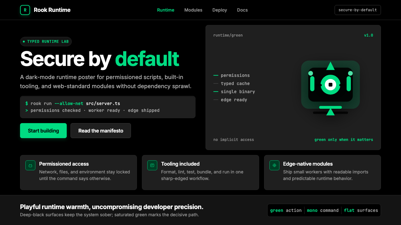 Deno Runtime-GreenWarm precision on black. Saturated green, Inter, and mono code turn security…黑底上的温暖精度:饱和绿、Inter 与等宽代码让安全成为主角。
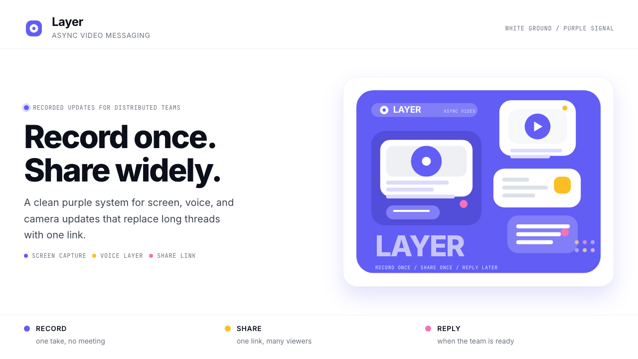 Loom Async-Video PurpleAsync, not meetings. Pure white ground, electric purple, record-button geomet…异步,不开会:纯白底、电紫与录制按钮几何。
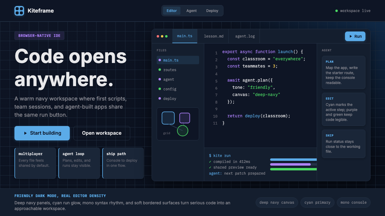 Replit Browser IDE BlueFriendly code gravity. Cyan run lights and mono panels warm the deep navy IDE…亲切的代码引力。青蓝运行光与等宽面板温暖深海军蓝网格。
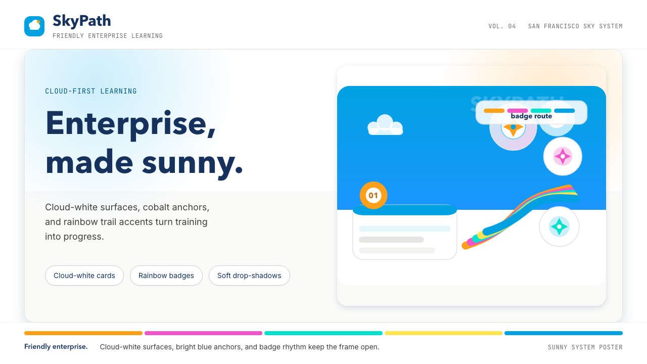 Salesforce TrailheadFriendly enterprise glows. Cloud-white, cobalt, and rainbow badges keep it wa…友好企业感发光。云白、钴蓝和彩虹徽章把它变暖。
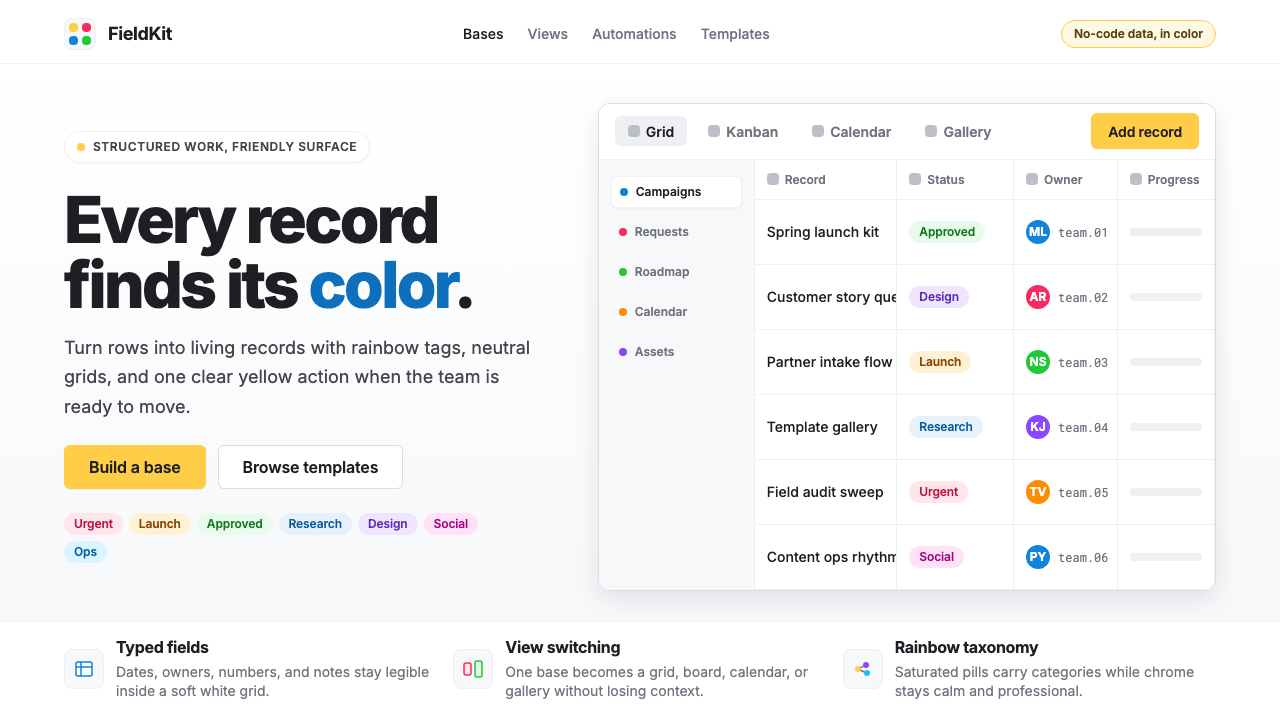 Airtable Spreadsheet-RainbowWork becomes celebratory. Inter grids stay white while rainbow pills and yell…工作变得欢快:白色 Inter 网格中,彩虹标签与黄色按钮点亮节奏。
 Adobe Creative CloudUnified, not uniform. Red anchor, white space, and saturated app tiles organi…统一而不单一:红色锚点、留白与高饱和应用方块组织整套工具。