What is Deno Runtime-Green?什么是 Deno Runtime-Green?
Deno Runtime-Green pairs a single saturated anchor color against pure black to make security and precision feel as warm as a mascot dinosaur.Deno Runtime-Green 以一种高饱和度的锚定色与纯黑并置,让安全与精度拥有了吉祥物小恐龙般的温暖气质。
Deno Runtime-Green in briefDeno Runtime-Green 速览
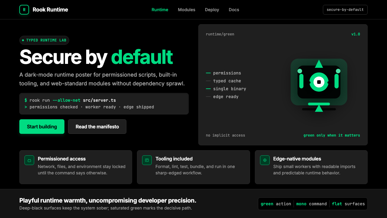
Deno Runtime-Green is the visual identity forged by the Deno company for its JavaScript and TypeScript runtime — a dark-mode-native developer aesthetic that uses a single vivid green as the sole accent color against deep black and slate surfaces. The result is a toolkit that feels simultaneously rigorous and approachable: terminal-precise in its spacing and typographic discipline, yet warmed by a cartoon dinosaur mascot and a green that glows rather than merely sits.Deno Runtime-Green 是 Deno 公司为其 JavaScript 与 TypeScript 运行时打造的视觉身份——一套天生暗色的开发者美学,以单一鲜明的绿色作为纯黑与深灰底面上的唯一强调色。最终效果是一套兼具严谨与亲切的工具语言:在间距与排印纪律上堪比终端,却因一只卡通小恐龙吉祥物与那抹发光而非平铺的绿而充满温度。
The system operates through extreme restraint. One accent color handles every interactive element, every syntax highlight, every call-to-action button. Everything else — backgrounds, body text, borders, secondary labels — lives in a tightly controlled family of blacks, near-blacks, and cool neutral tones. This single-hue discipline means the green carries enormous communicative weight: wherever it appears, it signals action, security, or the Deno brand itself.这套系统依靠极度的克制运作。单一强调色承担所有交互元素、语法高亮与行动按钮的全部职责。其他一切——背景、正文、边框、次级标签——生活在一组严格管控的黑、近黑与冷中性色调家族里。这种单色纪律意味着绿色承载着极大的传达重量:它出现在哪里,那里就意味着行动、安全或 Deno 品牌本身。
Unlike developer-tool aesthetics that accumulate multiple semantic colors as a product matures, Deno Runtime-Green holds the line. Its visual vocabulary is monochromatic in palette and modular in structure — geometric, grid-governed, and built around humanist sans-serif prose paired with monospaced code. The cartoon mascot is not decorative noise; it is the system's deliberate warmth valve, balancing the technical precision with enough personality that the product feels made by and for human beings.与随产品成熟而堆积多种语义色的开发者工具美学不同,Deno Runtime-Green 始终坚守底线。其视觉词汇在色板上是单色的、在结构上是模块化的——几何、网格驱动,由人文主义无衬线正文与等宽代码字体并肩搭建而成。卡通吉祥物不是装饰性噪音;它是系统刻意安装的温度阀门,以足够的个性平衡技术精度,让产品感觉是由人类为人类制造的。
See the Deno Runtime-Green design system查看 Deno Runtime-Green 完整设计系统
Where does Deno Runtime-Green come from?Deno Runtime-Green 从何而来?
Deno's story begins with a confession. In May 2018 at JSConf EU, Ryan Dahl — the creator of Node.js — gave a talk titled 'Ten Things I Regret About Node.js.' He described structural mistakes baked into Node from its earliest days: a security model that gave scripts unconstrained access to the file system and network by default, a module resolution algorithm that produced the infamous node_modules directory, and the abandonment of browser-standard Promises in favor of callbacks. The talk ended with an announcement: he had been building a new runtime, called Deno, that would correct these regrets from first principles.Deno 的故事始于一次公开的忏悔。2018 年 5 月,在 JSConf EU 上,Node.js 的创造者 Ryan Dahl 发表了题为《我对 Node.js 后悔的十件事》的演讲。他描述了 Node 从最初就铸入的结构性失误:一个默认给予脚本对文件系统和网络的无限制访问权的安全模型、催生了臭名昭著的 node_modules 目录的模块解析算法,以及用回调函数取代浏览器标准 Promise 的决定。演讲以一项宣告结尾:他一直在构建一个新的运行时,名为 Deno,将从第一性原理纠正这些遗憾。
Deno 1.0 shipped in May 2020, joined by Bert Belder, Bartek Iwańczuk, and later Andy Jiang. The runtime was written in Rust rather than C++, embedded the V8 engine, and adopted TypeScript as a first-class language without a build step. Security was permissions-based by default: a Deno script could not read a file, make a network request, or access environment variables unless the operator explicitly granted that capability via a flag. This security model was not merely a feature — it was the product's central argument, and the brand's visual language was built to embody it.Deno 1.0 于 2020 年 5 月发布,核心团队包括 Bert Belder、Bartek Iwańczuk,以及后来加入的 Andy Jiang。这个运行时用 Rust 而非 C++ 编写,内嵌 V8 引擎,并将 TypeScript 作为无需构建步骤的一等公民语言。安全性默认基于权限:一个 Deno 脚本无法读取文件、发起网络请求或访问环境变量,除非操作者通过标志位明确授予该能力。这个安全模型不只是一个功能——它是产品的核心论点,而品牌的视觉语言正是为了体现这一论点而生。
The visual identity that emerged through 2022 to 2024 was designed to communicate that security argument at a glance. The choice of a single saturated green as the sole accent color was not arbitrary — green carries a long-established association with terminals, command-line interfaces, and the act of a process completing successfully. On a black surface, a green cursor or green output text signals that something ran without error. Deno appropriated that cultural memory and elevated it: a vivid, warm green that reads as affirmative rather than merely technical.在 2022 至 2024 年间逐渐成形的视觉身份,被设计为让人一眼就能感知到那个安全论点。选择单一饱和绿作为唯一强调色并非随意之举——绿色与终端、命令行界面以及进程成功完成的行为之间,存在着长期积淀的文化关联。在黑色底面上,绿色光标或绿色输出文字意味着某事无误运行完成。Deno 挪用了这份文化记忆并将其升华:一种鲜活、温暖的绿,读来是肯定性的,而非仅仅是技术性的。
The cartoon dinosaur mascot — the Deno-saur — was present from the beginning and is inseparable from the brand's tonal strategy. Developer tools have historically presented themselves with aggressive minimalism or corporate neutrality; the Deno-saur introduced irreverence and warmth into a category that had largely forgotten those qualities. The mascot gives the brand permission to be playful in documentation, friendly in error messages, and humanizing in marketing without sacrificing the underlying precision that serious engineers require. This pairing of rigor and warmth is the brand's most unusual and intentional quality.卡通恐龙吉祥物 Deno-saur 从一开始就存在,与品牌的格调策略不可分割。开发者工具在历史上惯于以激进的极简主义或企业中性面貌示人;Deno-saur 将不羁与温暖带入了一个已基本遗忘这两种品质的品类。这只吉祥物给了品牌一种许可——在文档中俏皮,在错误提示中友善,在市场营销中人性化——同时不牺牲严肃工程师所需的底层精度。这种严谨与温度的配对,是该品牌最不寻常也最刻意的品质。
The broader context is the TypeScript-first developer tooling wave of the early 2020s, which saw runtime environments, package managers, and build tools converge on dark interfaces, monospace code presentation, and minimal color palettes as signals of technical credibility. Deno Runtime-Green participates in this wave but distinguishes itself by committing more deeply than most: where competitors used two or three accent colors, Deno used one; where others hedged with light-mode support, Deno made dark-mode canonical. The visual restraint was a claim about the runtime's philosophy — that constraints, applied thoughtfully, produce better outcomes than unconstrained choice.更宏观的背景是 2020 年代初的 TypeScript 优先开发者工具浪潮:运行时环境、包管理器与构建工具纷纷汇聚于暗色界面、等宽代码呈现与极简色板,以此作为技术可信度的信号。Deno Runtime-Green 参与了这场浪潮,但以比多数同类更深的承诺将自己区别开来:竞争对手用两到三种强调色,Deno 只用一种;其他人用浅色模式支持做对冲,Deno 让暗色模式成为标准形态。视觉上的克制是一种关于运行时哲学的宣告——经过深思熟虑的约束,比无约束的选择产生更好的结果。
What defines the Deno Runtime-Green look?Deno Runtime-Green 的视觉特征是什么?
Single-Accent Color System单强调色系统
The entire palette is organized around one vivid, saturated green that sits at the warm end of the green spectrum — neither cool nor lime, but a green with enough yellow warmth to feel energetic rather than clinical. This single accent color handles every interactive affordance, every syntax highlight, every CTA, every brand mark. All other colors in the system — the blacks, the slates, the neutrals — exist to give this green maximum contrast and clarity. The deliberate mono-accent approach means every instance of green carries brand significance; diluting it with secondary accent colors would collapse the system's communicative logic.整套色板围绕一种鲜活、高饱和的绿色组织,这种绿处于绿色光谱的暖端——既非冷调也非荧光黄绿,而是一种带有足够黄色温度的绿,读来是充满能量的而非临床式的。这一单一强调色承担所有交互动效、语法高亮、行动按钮与品牌标志的职责。系统中所有其他颜色——黑色、深灰、中性色——的存在,是为了给这种绿最大的对比度与清晰度。刻意采用单强调色意味着每次出现的绿都承载品牌意义;用次级强调色稀释它,会让整个系统的传达逻辑崩塌。
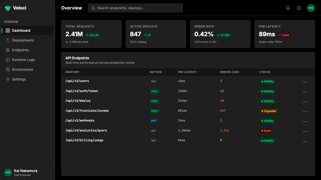
Dark-Ground Canonical暗色底面作为标准形态
Deno Runtime-Green treats dark backgrounds as the native state, not as an optional theme. Deep black is the base surface; slightly lighter slate tones define cards, panels, and elevated layers. This is not dark mode as an afterthought applied to a light design — the entire visual hierarchy, the contrast ratios, and the green's warmth are calibrated for dark grounds. On a light background the system works technically, but it loses the terminal-native quality that makes the green feel earned rather than decorative.Deno Runtime-Green 将暗色背景视为原生状态,而非可选主题。深黑是基础底面;略亮的深灰色调定义卡片、面板与抬升层级。这不是将浅色设计事后套上暗色模式——整个视觉层级、对比度比率与绿色的温度都是为暗色底面校准的。在浅色背景上,系统在技术上可运行,但会失去那种让绿色感觉是被赢得而非被装饰的终端原生气质。
Humanist Sans with Monospaced Code人文主义无衬线正文与等宽代码
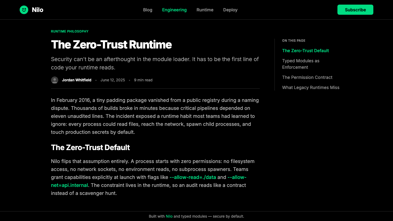
Typography is split across two typeface roles that never blur together. Prose — headings, body copy, labels, navigation — uses a humanist sans-serif with open apertures and generous letter spacing that reads comfortably at long form lengths. Code, terminal output, file paths, and technical identifiers use a distinctly monospaced companion that makes character-by-character precision visible. The contrast between the two is purposeful: the sans-serif communicates, the monospace signals precision. Switching between them marks the boundary between human explanation and machine instruction.排版分为两种字体角色,彼此之间从不模糊边界。散文体——标题、正文、标签、导航——使用一种开口宽阔、字间距慷慨的人文主义无衬线字体,长篇阅读也舒适自如。代码、终端输出、文件路径与技术标识符则使用一种明显的等宽配套字体,让逐字符的精度可见可感。两者之间的对比是有意为之的:无衬线字体负责传达,等宽字体信号精度。在两者之间切换,标示出人类解释与机器指令之间的边界。
Geometric Modular Layout几何模块化版式
Layouts are built on strict invisible grids with consistent column gutters and a clear vertical rhythm tied to the base type size. Sections break cleanly — no gradual fades, no overlapping bleed zones, no organic shapes interrupting the grid. Cards and panels use rounded corners held at the smaller end of the visible range, just enough to soften the hardware feel without approaching the roundness associated with consumer apps. Spacing is generous to the point of airy: breathing room is treated as a quality signal, not wasted real estate.版式建立在严格的不可见网格上,具有一致的列间距与与基础字号挂钩的清晰垂直韵律。各节清晰分断——无渐进淡出、无出血重叠区域、无有机形态打断网格。卡片与面板使用控制在可见范围较小端的圆角,恰好能软化硬件感而不接近消费类应用所关联的圆润度。间距慷慨至通透:呼吸空间被视为品质信号,而非浪费的面积。
Mascot as Tonal Device吉祥物作为格调装置
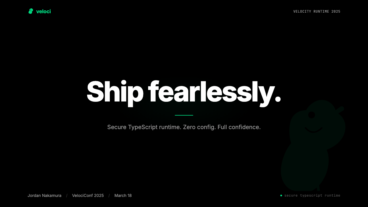
The Deno-saur is not a logo add-on — it is a deliberate systemic element that gives the brand permission to be warm in contexts where pure engineering aesthetics would feel sterile. The dinosaur appears in documentation, error states, empty states, and marketing without undermining the precision of the surrounding technical content. Its cartoon register serves as a contrast foil: the more precise and demanding the surrounding content, the more the mascot's presence signals that the humans behind the tool understand their users are people, not machines. The mascot's green matches the accent color, tying personality to the brand's primary signal.Deno-saur 不是标志的附属物——它是一个刻意设置的系统性元素,赋予品牌在纯工程美学会显得冷漠的场合表现温度的许可。这只恐龙出现在文档、错误状态、空状态与营销内容中,而不削弱周围技术内容的精度。它的卡通语态充当对比衬托:周围内容越精确、要求越高,吉祥物的存在就越能传达出——工具背后的人类理解他们的用户是人,而非机器。吉祥物的绿与强调色一致,将个性与品牌的主信号捆绑在一起。
Permission-Signal Hierarchy权限信号层级
Because Deno's core product argument is security-by-default, the visual system reinforces the concept of explicit permission throughout its UI language. Green is used only for affordances that are safe, successful, or intentionally granted — not as a general-purpose highlight color. Warning and error states use colors that stand distinctly apart from the green accent, preserving the green's meaning as affirmative. This semantic discipline means the color system is not purely decorative; it is making a real-time argument about what is safe, what requires attention, and what requires user intent.由于 Deno 的核心产品论点是默认安全,视觉系统在整个 UI 语言中强化着明确许可的概念。绿色只用于安全的、成功的或被明确授予的操作动效——而不作为通用高亮色。警告与错误状态使用与绿色强调色明确区分的颜色,保护绿色作为肯定性信号的含义。这种语义纪律意味着色彩系统并非纯粹装饰性的;它在实时论证什么是安全的、什么需要注意、什么需要用户的主动意图。
Flat Depth with Hard Borders平面深度与硬边框
Elevation in the system is communicated through slight surface lightness differences between layers rather than soft drop shadows or blurs. Where borders exist, they are crisp and solid — a single-pixel line rather than a diffuse glow. This approach avoids the soft-shadow aesthetic associated with consumer interfaces and preserves the visual precision associated with code editors and terminal environments. The overall effect is a UI that reads as purposefully constructed — every boundary is a decision, not a style default.系统中的层级通过各层之间轻微的表面亮度差异来传达,而非通过柔和的投影或模糊效果。边框存在时,是清晰而实体的——单像素线而非漫射光晕。这种方式回避了与消费类界面关联的软阴影美学,保留了与代码编辑器和终端环境关联的视觉精度。整体效果是一套读来像是被刻意建造的 UI——每条边界都是一个决定,而非风格默认值。
See the Deno Runtime-Green design system查看 Deno Runtime-Green 完整设计系统
Who shaped Deno Runtime-Green?谁塑造了 Deno Runtime-Green?
Dahl created Node.js in 2009 and returned to runtime design with Deno, announced in 2018 and released as version 1.0 in May 2020. His JSConf EU talk, 'Ten Things I Regret About Node.js,' became the founding document of Deno's design philosophy and, by extension, the conceptual frame for its visual identity. The brand's emphasis on security, permissions, and principled constraint all derive from the arguments Dahl made in that talk. His influence on the visual system is indirect but fundamental: the aesthetic is a direct translation of the product's engineering values into color, type, and layout decisions.Dahl 于 2009 年创造了 Node.js,并以 Deno 回归运行时设计领域——2018 年宣布,2020 年 5 月以 1.0 版本发布。他在 JSConf EU 的演讲《我对 Node.js 后悔的十件事》成为 Deno 设计哲学的奠基文献,进而也成为其视觉身份的概念框架。品牌对安全、权限与有原则约束的强调,全部源自 Dahl 在那次演讲中提出的论点。他对视觉系统的影响是间接的但根本性的:这套美学是产品工程价值观向色彩、字体与版式决策的直接转译。
A co-founder of the Deno company, Belder contributed to the technical and organizational foundations that allowed the Deno runtime to evolve from a solo project into a commercially viable platform. The professionalization of the Deno company — the move from open-source experiment to funded product with a coherent brand — is partly the result of this organizational work. The visual identity's polish and consistency, particularly from 2022 onward, reflects the stage of development that Belder helped enable.Deno 公司的联合创始人之一,Belder 为 Deno 运行时从个人项目演变为具有商业可行性的平台奠定了技术与组织基础。Deno 公司的专业化——从开源实验到有融资支持、拥有连贯品牌的产品——部分归功于这些组织工作。视觉身份的精打磨与一致性,尤其是 2022 年以后,正是 Belder 所助力实现的发展阶段的体现。
A core contributor who shaped Deno's technical architecture, particularly around its TypeScript compilation pipeline and runtime internals. The TypeScript-first decision — treating TypeScript as a first-class language without a separate build step — was not merely a technical convenience; it was a brand statement about the kind of developer Deno wanted to attract. That positioning informed the visual system's precision and the documentation's assumption of a technically sophisticated audience.塑造了 Deno 技术架构的核心贡献者,尤其在 TypeScript 编译管线与运行时内核方面。TypeScript 优先的决定——将 TypeScript 视为无需独立构建步骤的一等公民语言——不只是一种技术便利;它是一种关于 Deno 想要吸引什么样开发者的品牌声明。这一定位影响了视觉系统的精度与文档对技术成熟受众的预设。
Jiang joined the Deno team and contributed to the product and community development phases that coincided with the visual identity's most mature period. Developer relations and documentation quality — areas of focus that involve translating technical precision into accessible communication — are directly reflected in the visual system's balance between rigorous structure and human warmth. The Deno-saur's presence in documentation is inseparable from the community-facing work of making a technically demanding runtime feel genuinely welcoming.Jiang 加入 Deno 团队,为恰好与视觉身份最成熟时期重叠的产品与社区发展阶段做出贡献。开发者关系与文档质量——涉及将技术精度转化为可及传达的工作领域——直接体现在视觉系统严谨结构与人文温度之间的平衡中。Deno-saur 在文档中的存在,与让技术要求极高的运行时真正令人感到受欢迎的社区工作密不可分。
How do you use Deno Runtime-Green today?今天怎么用 Deno Runtime-Green?
Deno Runtime-Green is one of the most transferable dark-mode developer aesthetics available as a reference system, because its principles are few and its discipline is high. Applying it correctly requires treating the single green accent as a semantic signal, not a decorative hue — everywhere the green appears, it should mean something specific: action, success, permission granted, or brand. If the green is being used simply to add color to a layout, the system has been misapplied.Deno Runtime-Green 是可作为参考系统使用的最具可移植性的暗色开发者美学之一,因为它的原则少而纪律高。正确应用它,需要将单一绿色强调色视为语义信号而非装饰色调——绿色出现在哪里,都应有具体含义:行动、成功、权限已授予,或品牌本身。如果绿色只是被用来给版面添加色彩,系统就被误用了。
For presentation slides, the system works best when the cover page commits fully to the dark ground with a single green accent element — a glow behind the title, a thin underline on the product name, or the mascot positioned off-axis in a corner. Content slides should use the dark background consistently, keep body text in a light neutral rather than pure white, and reserve green for the single most important piece of information per slide: a metric, a status indicator, or a key term in a code snippet. Data slides take on a terminal-like quality — use monospaced type for numbers, green for the positive or affirming values, and neutral tones for comparative or contextual data.对于演示文稿,这套系统在封面页完全拥抱暗色底面并搭配单一绿色强调元素时效果最佳——标题后的光晕、产品名称下的细线,或吉祥物偏轴置于角落。内容页应始终保持暗色背景,正文用浅中性色而非纯白,将绿色保留给每张幻灯片中最重要的单一信息:一个指标、一个状态指示符,或代码片段中的关键词。数据页呈现出类似终端的气质——数字用等宽字体,正向或肯定性的值用绿色,比较性或语境性数据用中性色调。
For web UI including dashboards and pricing pages, the system is well-suited to any interface where trust and precision are the primary values. Apply a dark base to all primary surfaces, use the lighter slate tones for secondary panels and cards, and bring in the green only for interactive elements: active states, selected items, progress indicators, and primary CTAs. Pricing pages work particularly well — tier differentiation through green accents on the featured plan, with neutral card treatments for other tiers, communicates hierarchy without visual clutter. Navigation should be typographically driven, with the green reserved for the active or current page indicator.对于包括仪表板与定价页面在内的网页 UI,这套系统非常适合信任与精度是首要价值的任何界面。将暗色底面应用于所有主要表面,用较亮的深灰色调处理次级面板与卡片,只在交互元素上引入绿色:激活状态、选中项、进度指示符与主要行动按钮。定价页面尤其适用——通过在特色方案卡片上使用绿色强调进行等级区分,其他等级用中性卡片处理,既传达层级又不造成视觉杂乱。导航应由字体驱动,绿色保留给激活或当前页面指示符。
For editorial and marketing work, Deno Runtime-Green supports a distinctive visual voice that reads as credible and technically serious without feeling inaccessible. Article layouts work best with the dark ground, a generous measure for body text set in the humanist sans-serif, and code examples treated as visual objects in their own right — full-width blocks on a slightly different surface tone, with the syntax highlights in green pulling the reader's eye to the semantically important tokens. Marketing pages can introduce the mascot more liberally: the Deno-saur at larger scale in hero sections provides the warmth that prevents the dark precision from reading as cold or intimidating. Feature grids should stay typographic and grid-governed, with green used only for affirming statements or capability indicators.对于编辑与营销内容,Deno Runtime-Green 支持一种读来可信、技术严肃而不显冷漠的独特视觉声音。文章版式在暗色底面上效果最佳,为人文主义无衬线正文设置慷慨的行宽,代码示例作为视觉对象独立呈现——在略有差异的表面色调上占据全宽区块,语法高亮用绿色将读者目光引向语义重要的词元。营销页面可以更自由地使用吉祥物:在英雄区以较大比例出现的 Deno-saur 提供了防止暗色精度读来冷漠或令人生畏的温度。功能网格应保持字体性与网格约束,绿色只用于肯定性陈述或能力指示符。
A common mistake when applying this system is reaching for additional accent colors to solve information-hierarchy problems. When a design using Deno Runtime-Green feels visually flat or lacks hierarchy, the instinct is often to add a secondary color — amber for warnings, blue for information states, purple for a premium tier. Resist this instinct: the correct solution is almost always typographic contrast (larger scale, heavier weight, lighter or darker neutral tone) rather than chromatic contrast. Introducing additional saturated colors beside the green immediately undermines the single-accent logic that gives the system its identity. If semantic color coding is genuinely required — as in a log viewer with multiple severity levels — keep those colors muted and cool so they read as data rather than brand.应用这套系统时最常见的错误是用添加额外强调色来解决信息层级问题。当使用 Deno Runtime-Green 的设计感觉视觉平淡或缺乏层级时,本能反应往往是添加第二种颜色——警告用琥珀色、信息状态用蓝色、高级层级用紫色。请抵制这种本能:正确的解决方案几乎总是字体对比(更大的尺度、更重的字重、更浅或更深的中性色调),而非色度对比。在绿色旁边引入额外的饱和色,会立即破坏赋予系统身份的单强调色逻辑。如果确实需要语义色彩编码——例如在具有多个严重级别的日志查看器中——保持这些颜色低饱和且偏冷,使其读来像数据而非品牌。
See the Deno Runtime-Green design system查看 Deno Runtime-Green 完整设计系统
Deno Runtime-Green — FAQDeno Runtime-Green · 常见问题
Is Deno Runtime-Green suitable for products that are not developer tools?Deno Runtime-Green 适合非开发者工具类的产品吗?
It can work in any context where technical credibility, precision, and a sense of principled constraint are desirable brand values — infrastructure dashboards, security platforms, data monitoring tools, and B2B SaaS products targeting technically sophisticated buyers. It struggles in contexts that need warmth, sensory richness, or approachability for non-technical audiences: consumer apps, food and beverage brands, wellness products, or anything where the primary emotional register is comfort rather than capability. The mascot can extend the system's range somewhat — the Deno-saur's charm can humanize what would otherwise be a cold precision aesthetic — but the fundamental dark-ground, single-accent-color system is calibrated for audiences who already find technical precision appealing.它可以在任何技术可信度、精度与有原则约束感是期望品牌价值的场景中奏效——基础设施仪表板、安全平台、数据监控工具,以及针对技术成熟买家的 B2B SaaS 产品。它在需要温度、感官丰富性或对非技术受众亲和性的场景中力不从心:消费类应用、食品饮料品牌、健康产品,或任何主要情感基调是舒适而非能力的场景。吉祥物能在一定程度上扩展系统的适用范围——Deno-saur 的魅力能使原本冷硬的精度美学人性化——但基本的暗色底面、单强调色系统是为已经觉得技术精度具有吸引力的受众校准的。
How does this system differ from other dark-mode developer aesthetics like Vercel or Linear?这套系统与 Vercel 或 Linear 等其他暗色开发者美学有何不同?
The primary distinction is the single vivid accent color against an otherwise achromatic palette. Vercel's aesthetic uses near-black grounds with white as the dominant active color and introduces chromatic accents sparingly and only contextually — it is closer to a refined monochrome. Linear's aesthetic uses a dark background with a wider range of purple and violet accents, creating a richer chromatic presence that implies product richness and craft. Deno Runtime-Green is more assertive in its single-color commitment: the green is warm and vivid rather than neutral or cool, and it appears frequently enough to feel like a brand signature rather than a contextual highlight. The mascot is also unusual in this category — neither Vercel nor Linear uses a character, and its presence in the Deno system explicitly introduces humor and warmth that the others eschew.主要区别在于在其他方面近乎无色的色板上那一种鲜活的强调色。Vercel 的美学使用近黑色底面,以白色作为主要激活色,仅在语境中偶尔引入色度强调——更接近提炼过的单色系。Linear 的美学使用暗色背景,搭配更宽泛的紫色与紫罗兰强调色,营造出暗示产品丰富性与工艺感的更丰富色度存在。Deno Runtime-Green 在单色承诺上更为果断:绿色是温暖而鲜活的而非中性或冷调的,出现频率足以感觉像品牌签名而非语境高亮。吉祥物在这个品类中也是罕见的——Vercel 与 Linear 都不使用角色形象,而它在 Deno 系统中的存在明确引入了其他两者所回避的幽默与温度。
Can the system work effectively in a light-background version?这套系统能在浅色背景版本中有效运作吗?
A light-background adaptation is technically possible but requires significant recalibration. The green's warmth and saturation level is optimized for dark grounds — on a white or light background, the same green can appear fluorescent or harsh rather than warm and affirming. A light adaptation typically requires pulling the green toward a slightly deeper, less saturated register to maintain readability and tonal comfort. The monospaced code elements work well in both modes. The mascot translates readily. What is genuinely lost in the light adaptation is the terminal-native quality — the implicit cultural memory of green on black that is part of the dark system's meaning. A light version can be clean and credible, but it will read as a generic developer-tool aesthetic rather than something distinctly Deno.浅色背景改编在技术上是可行的,但需要大量重新校准。绿色的温度与饱和度水平是为暗色底面优化的——在白色或浅色背景上,同样的绿可能显得荧光或刺眼,而非温暖且肯定性的。浅色改编通常需要将绿色拉向略深、饱和度略低的区间,以维持可读性与格调舒适度。等宽代码元素在两种模式下均表现良好。吉祥物也能顺畅转换。浅色改编中真正失去的是终端原生气质——黑底绿字那份隐性的文化记忆,是暗色系统含义的一部分。浅色版本可以干净而可信,但读来会像一种通用开发者工具美学,而非distinctly 属于 Deno 的东西。
How should the mascot be used without undermining the system's technical credibility?如何使用吉祥物而不损害系统的技术可信度?
The mascot earns its credibility by appearing in contexts where it provides genuine emotional function rather than decoration. Error states and empty states are ideal: a technical audience that encounters an error already feels friction, and a mascot that acknowledges the situation with light humor reduces that friction without trivializing the error. Documentation sidebars and onboarding flows benefit similarly. Where the mascot becomes a liability is when it appears in contexts that require pure authority: security advisories, critical error dialogs, compliance documentation. In those contexts, restraint is the correct call. A useful rule: the mascot should appear where a human customer service representative would be appropriate, and disappear where a formal legal or technical notice would be required.吉祥物通过出现在提供真实情感功能而非装饰功能的场景中赢得可信度。错误状态与空状态是理想场合:遭遇错误的技术受众已经感受到摩擦,一只以轻松幽默回应该情况的吉祥物能减少这种摩擦而不至于轻视错误本身。文档侧边栏与引导流程同样受益。吉祥物成为负担的地方,是它出现在需要纯粹权威性的场景中时:安全公告、关键错误对话框、合规文档。在这些场合,克制是正确的选择。一条有用的规则:吉祥物应出现在人类客服代表会合适出现的地方,而在需要正式法律或技术通知的地方消失。
What is the most common way this style is misapplied in practice?这种风格在实践中最常见的误用方式是什么?
The most common failure is treating the vivid green as a general-purpose highlight color and spreading it across too many elements simultaneously. When every interactive element, every hover state, every selected item, and every icon accent uses the same saturated green, the color stops carrying meaning and starts functioning as a theme color — wallpaper rather than signal. The second most common failure is inconsistent dark-ground application: using the dark background for some screens and a light background for others creates a split personality that undermines the system's coherence. The terminal-native quality of the dark ground is not a stylistic preference — it is the context in which the green's cultural meaning is activated. Breaking the dark ground breaks the metaphor.最常见的失败是将鲜活的绿色视为通用高亮色,并将其同时扩散至过多元素。当每个交互元素、每个悬停状态、每个选中项与每个图标强调都使用同样的高饱和绿时,这种颜色就停止承载意义,开始作为主题色运作——变成壁纸而非信号。第二常见的失败是不一致的暗色底面应用:部分屏幕用暗色背景、部分用浅色背景,制造出一种破坏系统连贯性的分裂人格。暗色底面的终端原生气质不是风格偏好——它是绿色文化含义被激活的语境。打破暗色底面,就是打破这个隐喻。
Related design styles相关设计风格
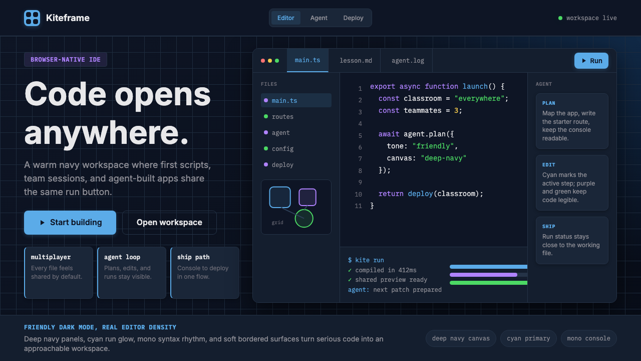 Replit Browser IDE BlueFriendly code gravity. Cyan run lights and mono panels warm the deep navy IDE…亲切的代码引力。青蓝运行光与等宽面板温暖深海军蓝网格。
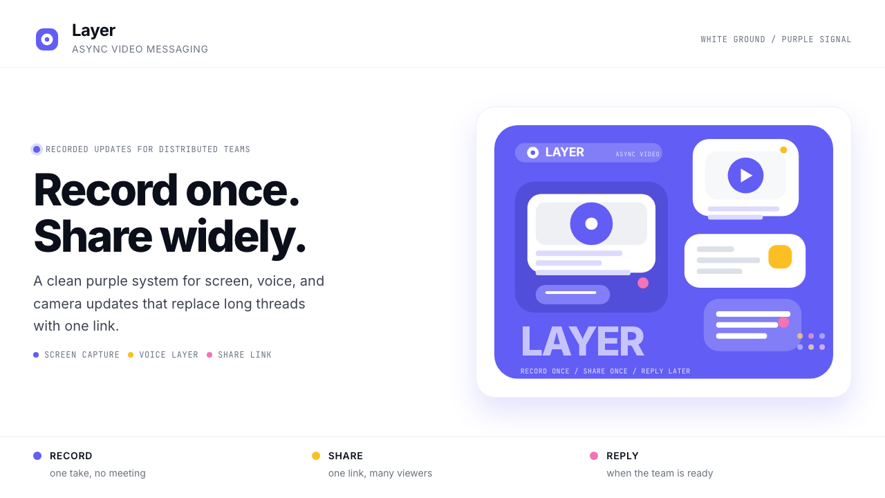 Loom Async-Video PurpleAsync, not meetings. Pure white ground, electric purple, record-button geomet…异步,不开会:纯白底、电紫与录制按钮几何。
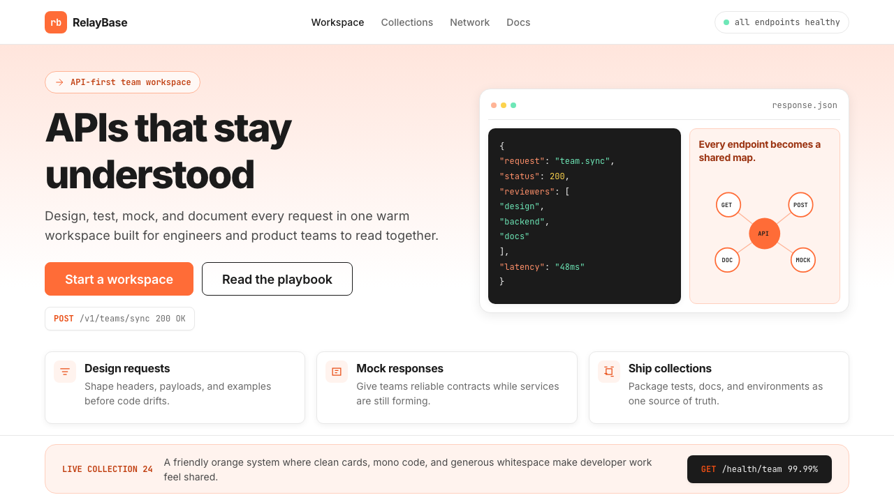 Postman 2024Warm APIs feel approachable. Orange gradients, Inter headlines, and dark mono…温暖的 API 专业感:橙色渐变、Inter 标题与深色等宽代码块。
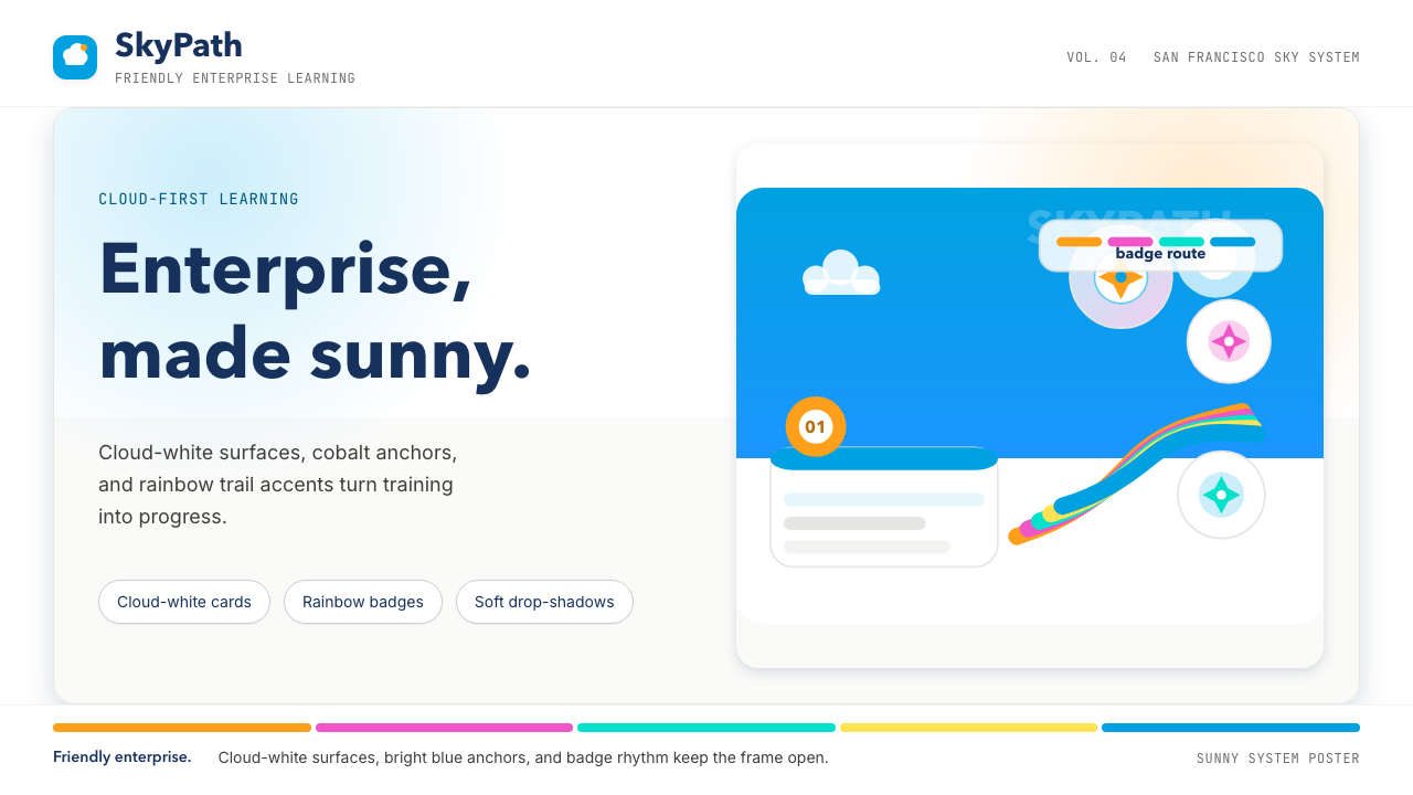 Salesforce TrailheadFriendly enterprise glows. Cloud-white, cobalt, and rainbow badges keep it wa…友好企业感发光。云白、钴蓝和彩虹徽章把它变暖。
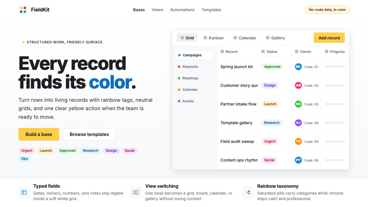 Airtable Spreadsheet-RainbowWork becomes celebratory. Inter grids stay white while rainbow pills and yell…工作变得欢快:白色 Inter 网格中,彩虹标签与黄色按钮点亮节奏。
 Android Bugdroid GreenFriendly tech, reduced to geometry. Vivid green pops from Grey 900 and rounde…友好科技化为几何:明绿从 Grey 900 与圆润字形中跃出。