What is Replit Browser IDE Blue?
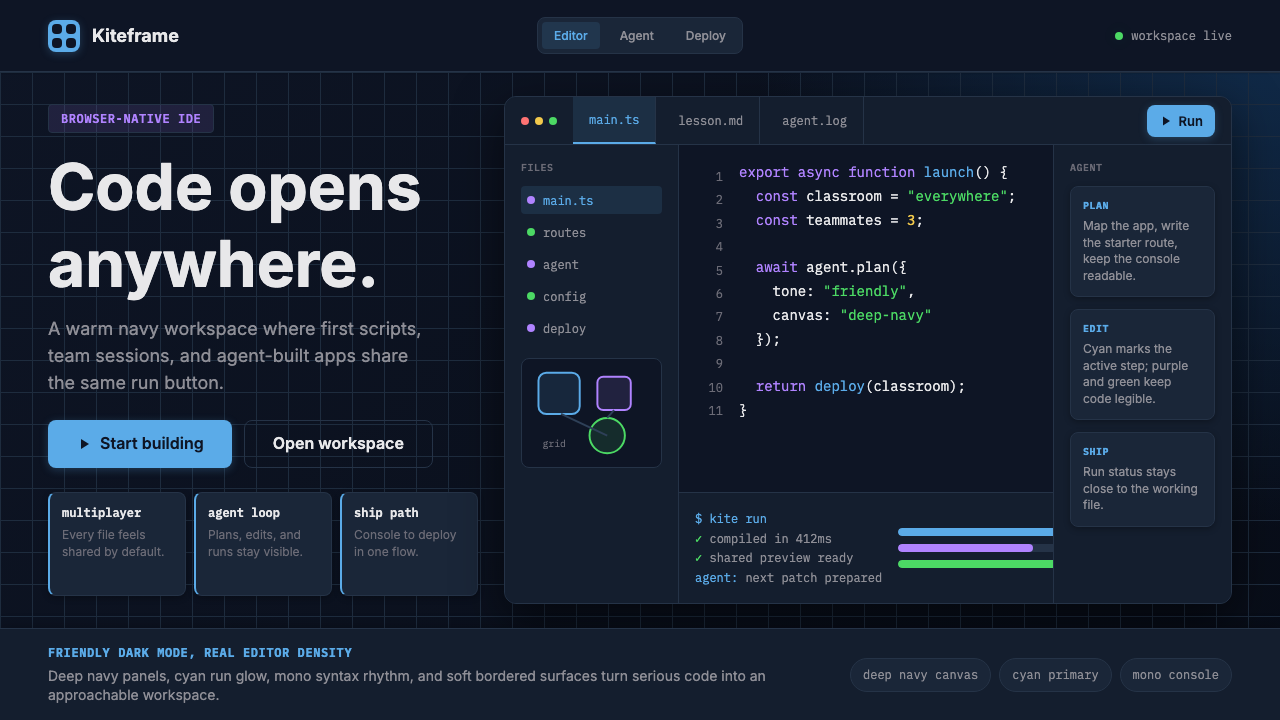
Replit turned the browser into a real code editor by wrapping deep-navy darkness and electric cyan warmth around every run button and multiplayer cursor.
Replit Browser IDE Blue in brief
Replit Browser IDE Blue is the visual identity of the Replit cloud development platform — a design language built to make a professional-grade code editor feel welcoming to first-time programmers while remaining credible to seasoned developers. It centres on a deep, almost ink-like navy canvas, a signature cyan-blue used for every primary action and run button, and a monospaced type system that signals seriousness without severity. The result is an aesthetic that sits at the intersection of hacker culture and friendly consumer software.
What distinguishes this style from generic dark-mode developer tooling is its deliberate warmth. Most dark IDEs pursue a neutral, near-black ground with cool grey accents; Replit leans into the blue family across its entire palette, creating a tonal coherence that feels more like a designed environment than a default terminal. The cyan accent carries real energy — it is the color of the run button, the active tab indicator, and the multiplayer cursor — so that the most important interactive elements are always lit from within.
The style also carries a strong illustration personality. Replit's marketing surfaces — landing pages, blog headers, social graphics — use rounded, friendly character illustrations alongside the dark IDE aesthetic, signalling that this is a place for learners as much as professionals. This tension between the precision of the code editor and the approachability of the illustration layer is what gives the brand its distinctive character.
Where does Replit Browser IDE Blue come from?
Replit was founded in 2016 by Amjad Masad, Faris Masad, and Haya Odeh. The initial idea was straightforward: a browser-based REPL (Read-Eval-Print Loop) that required zero local setup, aimed at students and beginners who found installing a development environment prohibitive. An early focus on Pakistani schoolchildren shaped a core value that has persisted throughout the company's evolution — programming access should have no friction barrier.
As the platform grew through the late 2010s, Replit expanded beyond single-language REPLs into a full IDE experience supporting dozens of programming languages. The visual identity matured alongside this expansion. The deep navy palette emerged as a deliberate choice to distinguish Replit from the lighter, flat aesthetics of educational coding tools like Scratch or Khan Academy, while the cyan accent created a visual bridge between the playfulness of those tools and the seriousness of professional editors like VS Code or JetBrains.
The pivotal creative moment in the brand's history came with its embrace of multiplayer coding — real-time collaborative code editing in the browser, analogous to Google Docs for code. This feature required new visual vocabulary: cursors, presence indicators, and collaborative overlays all had to exist within the dark IDE canvas without visual chaos. The solution — assigning each collaborator a distinct color from a curated palette while keeping the primary cyan for structural actions — established a design logic that continues to define the style.
In 2024, Replit made an aggressive pivot toward AI-agent development with the launch of Replit Agent, a system that could write, debug, and deploy software autonomously based on natural-language instructions. The visual identity absorbed this shift without rupture, because the underlying design language — trust-signalling dark mode, action-oriented cyan, friendly character illustration — was already well-suited to positioning AI capability as approachable rather than threatening. By 2024 and 2025, the current visual identity had crystallized: the deep navy ground, the signature blue-cyan accent, and the illustration layer are all present in their mature forms. Michele Catasta joined as president during this period, contributing to the platform's scaling strategy as it surpassed twenty million users.
What defines the Replit Browser IDE Blue look?
Deep Navy Ground
The foundational canvas is a very dark blue-navy that reads as darker than midnight but warmer than pure black. This ground creates the sense of depth that distinguishes Replit from neutral charcoal dark modes — it anchors all content within a distinctly blue tonal world rather than a chromeless void. The warmth is subtle but consistent: it makes the editor feel like a space, not just a surface.
Cyan-Blue Action Accent
The signature accent is a bright, saturated cyan-blue that sits closer to the sky than to teal. It is reserved almost entirely for primary interactive elements: the run button, active tabs, selected states, link text, and multiplayer cursors. This restraint gives the accent genuine signal value — wherever cyan appears, something important is happening or available. The accent does not bleed into decorative use; it is always doing work.
Monospaced Type System
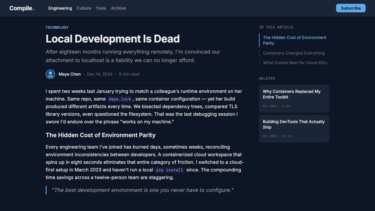
Code and code-adjacent content is set in a monospaced typeface that emphasizes the platform's identity as a real programming environment. Even in marketing contexts, Replit frequently uses monospaced type for functional labels, terminal output previews, and language tags. This typographic choice signals authenticity — this is not a learning toy, it is a working editor — while the generous line-spacing and readable character sizing ensure the type remains approachable rather than cryptic.
Layered Panel Architecture
The UI is organized into discrete panels — file tree, editor, output console, sidebar — each rendered at a slightly different luminosity on the dark navy ground. This subtle differentiation uses value contrast rather than hard borders to establish spatial hierarchy. Panels feel like separate rooms within the same building rather than boxes inside a box. The approach is common in mature IDE design but Replit's tonal coherence makes the layering feel seamless rather than crowded.
Friendly Illustration Layer
Alongside the technical IDE aesthetic, Replit maintains a distinct illustration voice: rounded forms, expressive characters, and a palette that extends the core navy-and-cyan into warmer supporting tones. These illustrations appear on landing pages, error states, onboarding flows, and social content. They communicate that the platform is for humans, not just machines. The contrast between the precision of the code editor and the warmth of the illustrations is not a contradiction — it is the brand's central argument that serious tools can also be welcoming ones.
Multiplayer Presence Vocabulary
Replit pioneered collaborative coding in the browser, and the visual system had to accommodate multiple users working simultaneously. The solution is a presence layer — colored cursors, avatar indicators, and inline attribution — built above the editor without disrupting the primary dark canvas. Each collaborator receives a distinct color from a curated secondary palette, while the structural cyan remains reserved for system actions. This maintains hierarchy even in a crowded session.
Reduced-Noise Interface Philosophy
Despite the density of a full IDE, the Replit interface suppresses visual noise by limiting decorative elements to near-zero. There are no gradient fills in structural chrome, no drop shadows beyond what is necessary to separate panels, and no animation that does not communicate state change or progress. This discipline makes the interface feel faster and calmer than its feature density would suggest — a quality especially valuable for learners who might otherwise be overwhelmed by the complexity of a professional development environment.
Who shaped Replit Browser IDE Blue?
Amjad Masad is the co-founder and CEO of Replit, and the primary architect of its product vision. Originally from Jordan, he worked at Facebook and then at the Y Combinator startup studio before launching Replit with his brother Faris and Haya Odeh. Masad's conviction that computing access should be universal — rooted in his own experience learning to program through limited resources — shaped both the platform's pedagogical mission and its visual identity. His public persona, characterized by directness and technical idealism, has influenced the brand's tone: confident but not corporate, technical but not exclusionary.
Haya Odeh is a co-founder of Replit and contributed to its early technical direction. Her background in software engineering informed the platform's commitment to real-language, real-environment execution from the beginning — ensuring that Replit was never merely a sandboxed simulation of coding but an actual programming environment that ran genuine code. This foundational commitment to authenticity is embedded in the visual language: the dark IDE aesthetic is not a theme applied over a toy, but the natural expression of a platform that takes code seriously.
Faris Masad co-founded Replit alongside his brother Amjad and Haya Odeh, bringing engineering depth to the platform's core infrastructure. The collaborative nature of Replit's product — its multiplayer coding feature, its shared repls, its real-time presence system — reflects a founding team dynamic that understood collaboration as a first-class concern from day one. This value is expressed directly in the visual system through the multiplayer presence vocabulary, which treats the simultaneous presence of multiple users as a feature to celebrate rather than a complexity to hide.
Michele Catasta joined Replit as president during its expansion into AI-agent development, bringing experience from research roles at Google and EPFL. His period coincided with the visual identity reaching its current mature form — the point at which the deep-navy-and-cyan system had to work not just for a collaborative IDE but for an AI-driven development environment. The style's robustness in absorbing this shift without requiring a visual rebrand is partly a testament to how well the foundational design language had been constructed: a dark, trust-signalling palette with a bright action accent is equally suited to running Python as to running an autonomous software agent.
How do you use Replit Browser IDE Blue today?
The Replit Browser IDE Blue aesthetic translates well beyond its native software context into presentations, interfaces, and editorial work — provided the application understands what the style is actually communicating. This is a dark-mode system built on trust, competence, and warmth. It signals that something real and technically capable is happening, while the cyan accent and illustration personality keep that seriousness from tipping into coldness. Applications that want to convey credible technical capability alongside accessibility will find this palette genuinely useful.
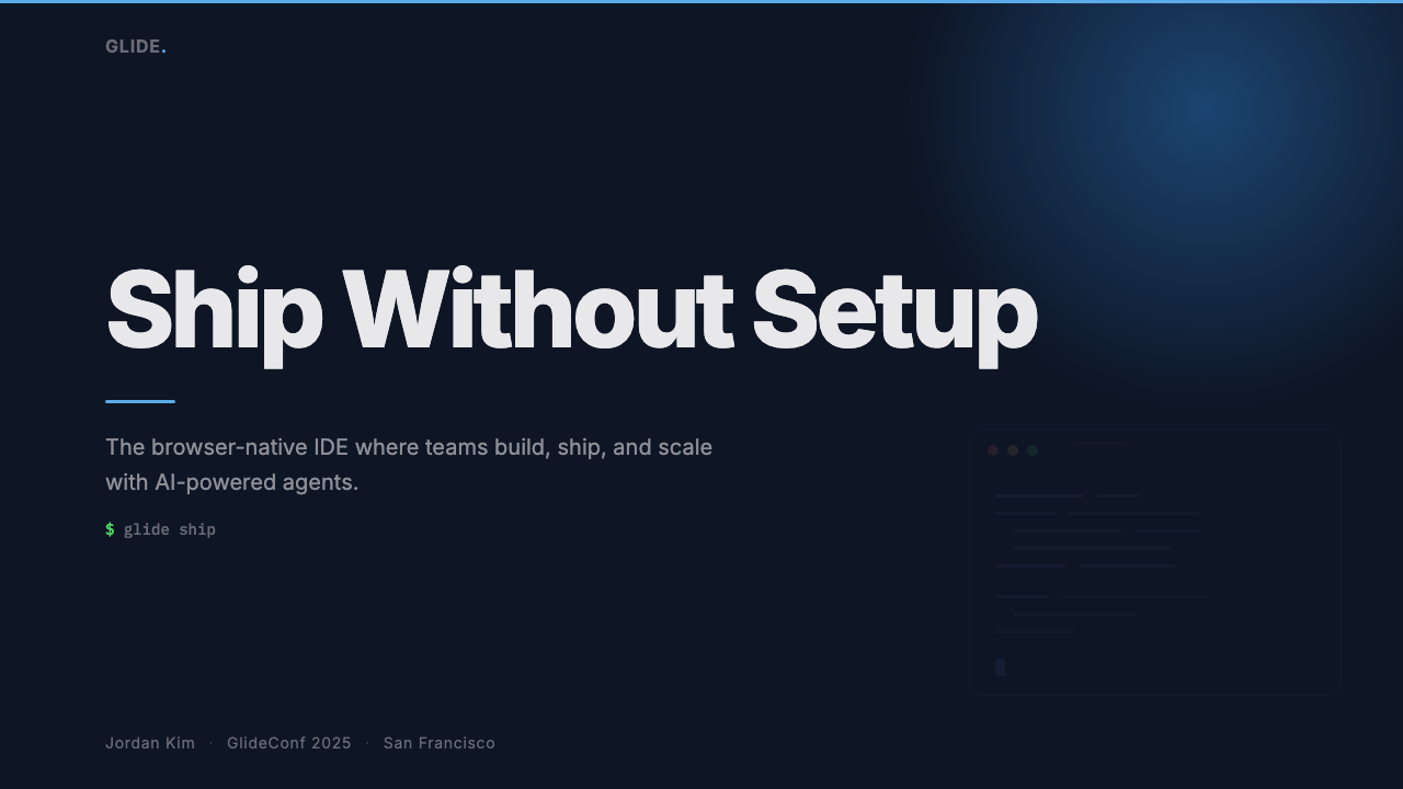
For presentation slides, the style works best when the dark navy ground is used consistently as the primary canvas rather than alternated with light slides. A cover slide benefits from a full-bleed navy field with the title in high-contrast near-white or light type, and a single cyan accent on a key word or structural element. Content slides should maintain the dark ground: white or very light type for body content, cyan reserved for active states, key statistics, or call-outs. Data visualizations — charts, graphs, code output previews — become especially effective on the dark ground, since the high contrast between the ground and the data series produces the kind of immediate legibility that dark-mode data tools are known for. Avoid introducing warm tones or gradient fills; they break the tonal coherence that gives the style its authority.
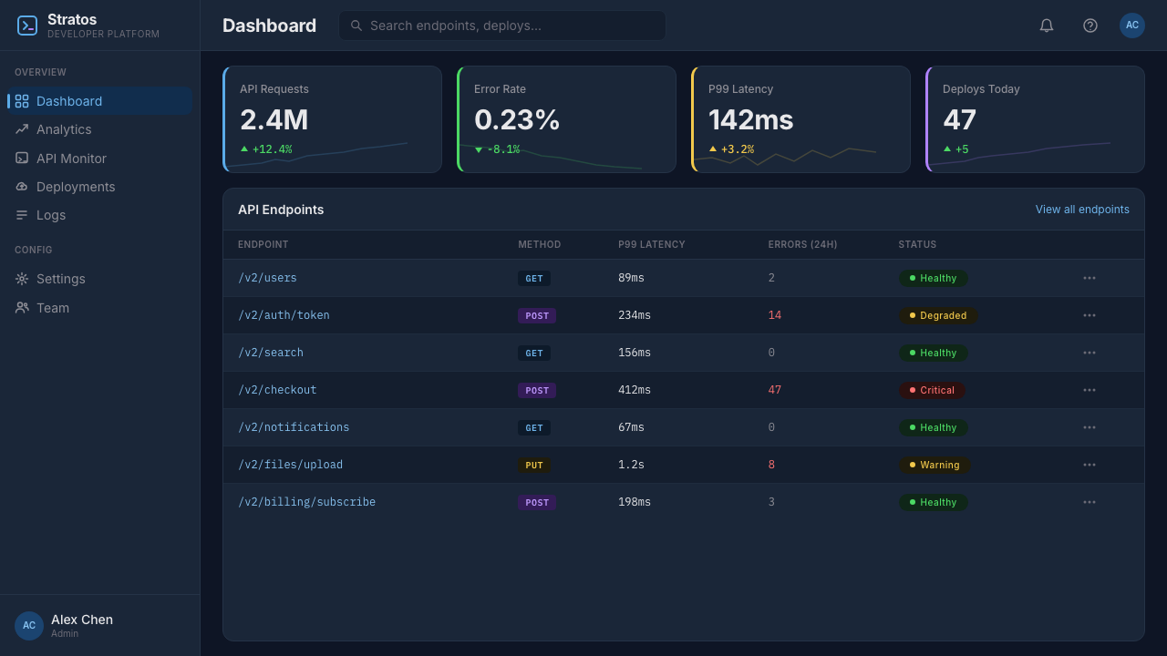
For web UI, dashboards, and developer-facing product pages, this palette is close to native territory. A dashboard built in this aesthetic should define its navigation and sidebar at the deepest navy value, stepping progressively lighter through card backgrounds and then content areas. The cyan accent does critical work in directing attention: status indicators, action buttons, and active navigation items should all be cyan, while secondary actions use a lighter grey. Pricing pages benefit from the style's clarity: tier distinction should be handled through the primary accent rather than through decorative badge systems. The monospaced type vocabulary works especially well for displaying code snippets, API references, or technical specifications.
For editorial and marketing applications, the style supports strong, poster-like treatments. Feature blocks can alternate between deep-navy-ground sections and near-white sections, with cyan as the consistent thread across both. The illustration layer — when available or commissionable — adds warmth to hero sections that might otherwise feel technically austere. Marketing headlines set in a clean, geometric sans-serif at large scale against the dark ground carry the brand's characteristic blend of ambition and approachability. This approach is particularly effective for developer-facing content: technical audiences respond well to visual environments that signal the seriousness of the tools being offered.
A common mistake when applying this style is using the cyan accent too broadly, treating it as a general highlight color rather than a signal reserved for primary actions and interactive states. When cyan appears in decorative borders, background tints, or typographic accents that carry no functional meaning, it loses its signal value and the entire system becomes harder to parse. A second common error is abandoning the monospaced type entirely in favor of a conventional sans-serif for all text; losing the monospaced register makes the output look like a generic dark-themed brand rather than something with genuine IDE heritage. The style is most coherent when the monospaced voice is preserved for technical and functional content, even if a humanist sans-serif is used for longer narrative passages.
Replit Browser IDE Blue — FAQ
How does Replit Browser IDE Blue differ from other dark developer tool aesthetics?
Most dark IDE aesthetics aim for neutrality — a near-black or charcoal ground with cool grey accents that recede so far into the background that color only appears when you look for it. Replit's palette is deliberately chromatic: the deep navy is unmistakably blue, and the cyan accent is bright enough to carry genuine warmth. The result is a dark mode that feels inhabited rather than sterile. The additional illustration layer is also unusual for a developer tool — most professional IDEs have no illustration personality whatsoever, whereas Replit uses rounded character art as an explicit signal of inclusion and approachability.
Can this style work for products that are not developer tools?
Yes, with appropriate adaptation. The deep-navy-and-cyan palette works well for any product that wants to position itself as technically capable, modern, and trustworthy — fintech dashboards, data analytics tools, creative software, AI interfaces, or productivity applications. The key is to keep the signal logic intact: cyan for primary actions only, monospaced type for technical content, and illustration only if it serves a genuine communication purpose. Applying the palette without understanding the underlying logic tends to produce work that looks like a Replit pastiche without the coherence that makes the original compelling.
How should I handle typography when applying this style outside a coding context?
The monospaced type is the most contextually loaded element in the Replit visual system — it directly signals code and technical environment. In non-coding applications, you have two options. The first is to retain monospaced type for any content that is data-like, functional, or quantitative (labels, statistics, system messages, pricing figures) while using a clean geometric or humanist sans-serif for narrative content. The second is to lean into the monospaced voice throughout as a deliberate aesthetic statement — this works best when the product genuinely belongs in the technical space and wants to own that identity fully. What does not work is abandoning monospaced type entirely: without it, the palette reads as generic dark mode rather than IDE-descended.
Is this style suitable for light-mode contexts, or does it only work in dark mode?
The style is fundamentally dark-ground. A light-mode inversion is technically possible but loses most of what makes the aesthetic distinctive. The deep navy is the primary contributor to the sense of depth, focus, and technical credibility; on a white or light ground, the same cyan accent reads as a generic blue rather than as a signal color emerging from depth. If a light-mode application is required, the more viable approach is to treat the navy as an accent or structural color — used for headers, active states, or feature blocks — while keeping the light ground primary. This produces something adjacent to the Replit aesthetic rather than a direct transposition, but it preserves more of the brand logic than a full inversion would.
How does the Replit style handle the transition from educational tool to professional platform?
The genius of the Replit visual system is that it does not make this transition by removing the welcoming elements — it holds both registers simultaneously. The dark navy ground and the monospaced type establish professional-grade credibility from the first moment. The cyan accent and the illustration layer maintain warmth and approachability. The two sets of signals coexist because they operate in different parts of the visual field: technical credibility is established by the structural elements (ground, type, panel architecture), while warmth is expressed through the accent color and the illustration personality. This means the style can read as a beginner-friendly environment to a first-time user and as a serious professional tool to an experienced developer, without contradicting itself in either direction.
Related design styles
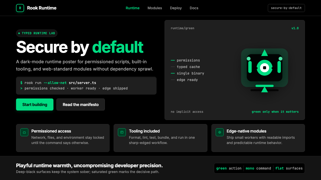 Deno Runtime-GreenWarm precision on black. Saturated green, Inter, and mono code turn security…
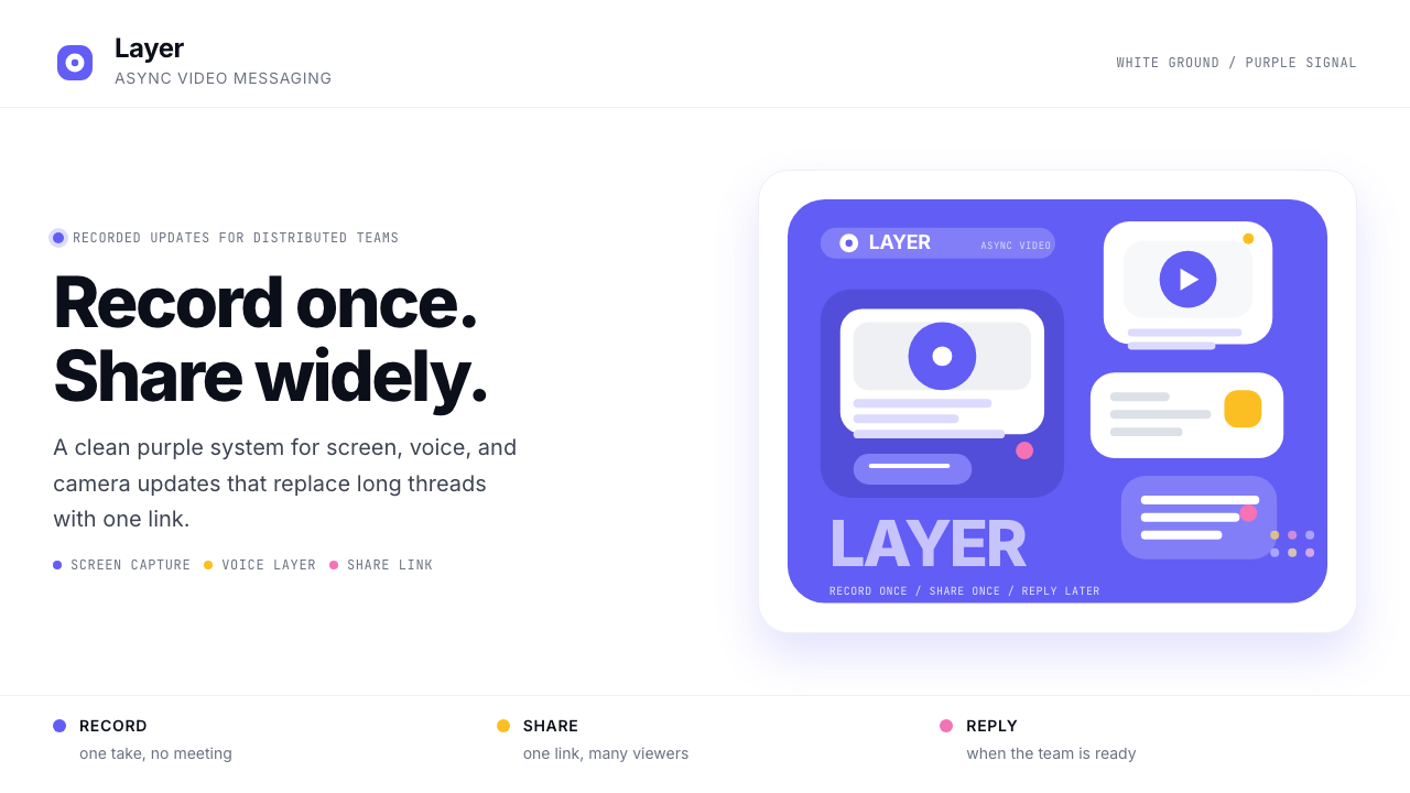 Loom Async-Video PurpleAsync, not meetings. Pure white ground, electric purple, record-button geomet…
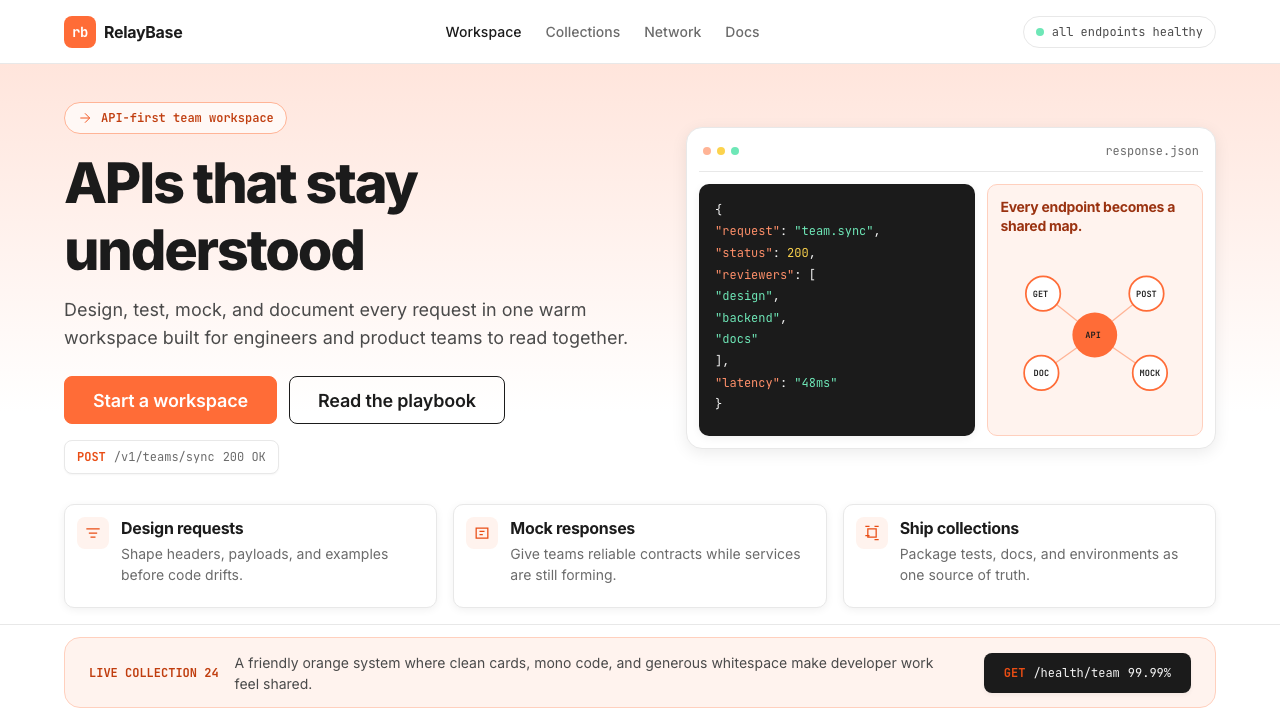 Postman 2024Warm APIs feel approachable. Orange gradients, Inter headlines, and dark mono…
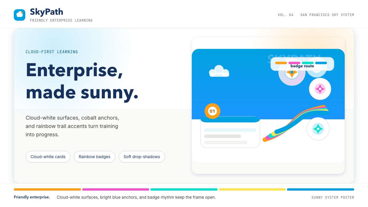 Salesforce TrailheadFriendly enterprise glows. Cloud-white, cobalt, and rainbow badges keep it wa…
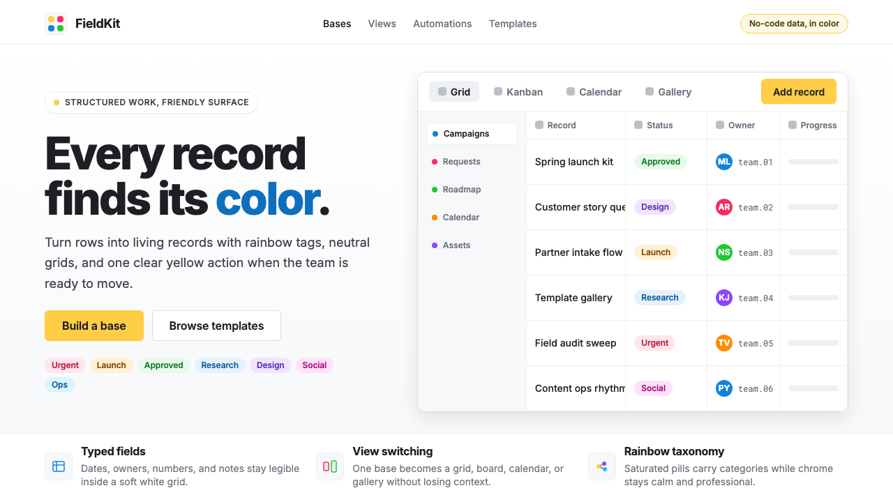 Airtable Spreadsheet-RainbowWork becomes celebratory. Inter grids stay white while rainbow pills and yell…
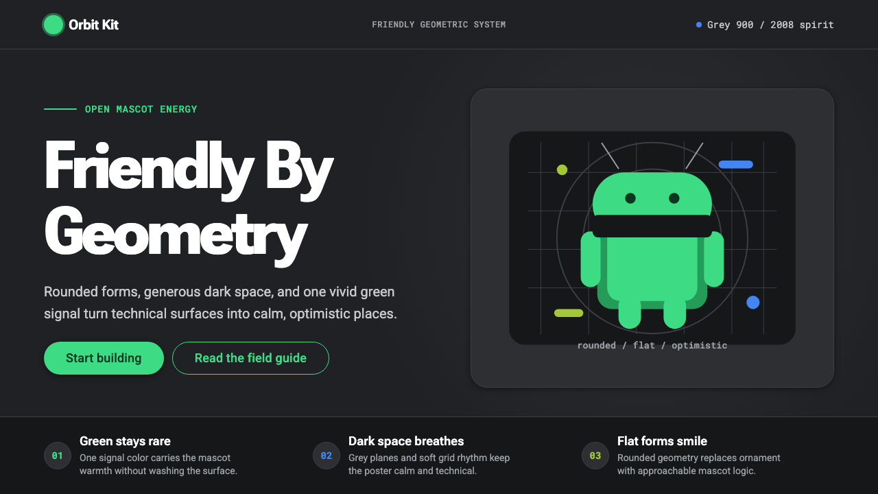 Android Bugdroid GreenFriendly tech, reduced to geometry. Vivid green pops from Grey 900 and rounde…