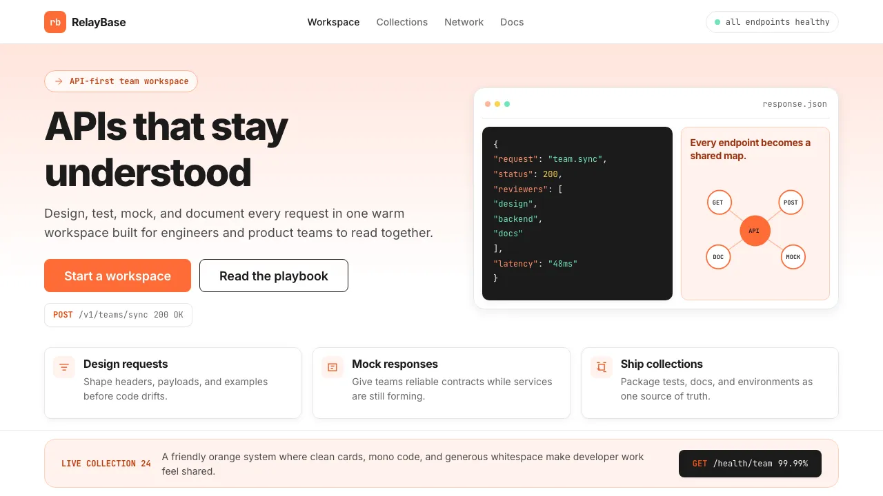
About Postman 2024
Postman turned API development from a command-line afterthought into a first-class design discipline. Its visual identity radiates warm confidence — signature orange on pristine white, code blocks elevated to hero imagery, and a friendly mascot that makes enterprise tooling feel approachable.
The 2022–2024 design language balances developer credibility with marketing polish: Inter headlines at bold weights, JetBrains Mono for every code surface, and soft peach gradients that keep the brand warm without sacrificing readability.
- Origin
- San Francisco / Bangalore
- Era
- 2014 founded; current visual ~2022–2024
- Key figures
- Abhinav Asthana · Ankit Sobti · Postman Brand team
- Movements
- API-first platforms · API economy · collaborative developer tools
Postman 2024 design spec
Colors
Typography
The other 11 sections — buttons, cards, spacing, motion, techniques and more — open once you unlock. Download the DESIGN.md or send it to your AI in one click. Unlock once, yours forever.
Sign up nowStyles similar to Postman 2024
Also inspired by brands & products, with a close feel.
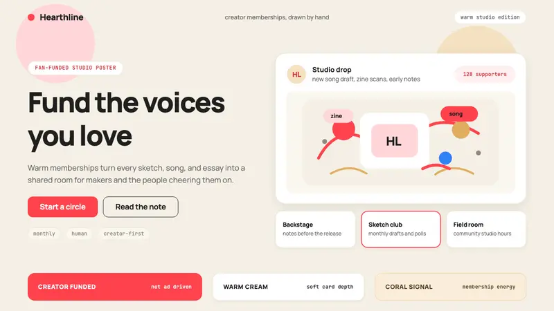 Patreon 2017Creator funding feels human. Coral CTAs on warm cream, rounded cards, hand-drawn accents.
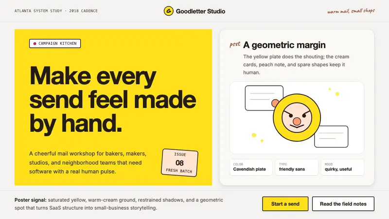 Mailchimp Freddie-YellowFriendly software, handmade. Cavendish yellow blocks and warm geometric mascot shapes.
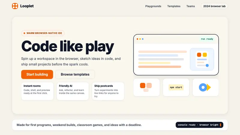 Replit 2024Coding feels warm. Coral buttons, cream panels, rounded code tiles make building playful.
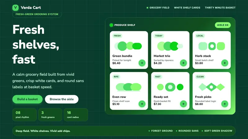 Cornershop AppProduce-fresh and calm. Forest green field, white shelf cards, vivid green accents.