What is Google Material 3 Expressive?什么是 Google Material 3 Expressive?
Material 3 Expressive is Google's boldest move yet — a design system that reads your wallpaper, generates your palette, and turns every interface into something that feels unmistakably yours.Material 3 Expressive 是 Google 迄今最大胆的一步——一套能读取你的壁纸、生成你的配色、让每个界面都显得独一无二属于你的设计系统。
Google Material 3 Expressive in briefGoogle Material 3 Expressive 速览
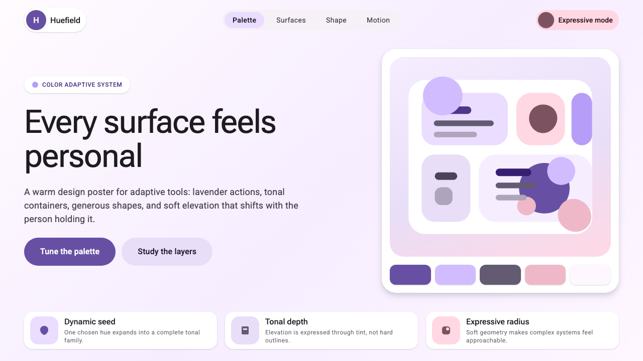
Material 3 Expressive is the latest evolution of Google's Material Design system, launched with Android 12 as Material You and pushed further in 2024 with an Expressive update that amplifies personality, motion, and tonal depth. Where earlier Material versions leaned toward neutral, utility-first surfaces, Expressive embraces warmth and playfulness — larger corner radii that make components feel soft and approachable, emotive shape variation that lets components carry personality without sacrificing the underlying grid logic, and tonal color surfaces that create depth through warmth and saturation rather than harsh boundaries.Material 3 Expressive 是 Google Material Design 系统的最新演进,随 Android 12 以 Material You 之名发布,并在 2024 年经由 Expressive 更新进一步扩展了个性、动效与色调深度。早期版本的 Material 倾向于中性、实用优先的界面表面,而 Expressive 则拥抱温暖与趣味——更大的圆角使组件显得柔和亲切,富有表现力的形状变化让组件在不牺牲底层网格逻辑的前提下承载个性,以色调递进取代硬边界的表面层级通过温度与饱和度变化创造深度。
The defining feature of the system is dynamic color theming. Rather than asking users or designers to select from a fixed brand palette, the system extracts a seed color from the user's current wallpaper and algorithmically generates a complete, harmonious palette — primary, secondary, tertiary, and neutral tones, all calibrated together for legibility and visual coherence. The result is that the same app shell can feel warm terracotta on one device and cool periwinkle on another, each version feeling intentional rather than accidental.该系统的核心特征是动态色彩主题。它不要求用户或设计师从固定品牌色板中选色,而是从用户当前壁纸中提取一个种子色,通过算法生成完整、和谐的配色方案——主色、辅色、强调色与中性色,所有色调统一校准以确保可读性与视觉连贯性。结果是同一个应用外壳在某台设备上可能呈现温暖的赤陶感,在另一台设备上则呈现清冷的紫蓝调,而每一种版本都显得是有意为之,而非偶然。
Visually, Material 3 Expressive is characterized by generous roundness, layered tonal surfaces, and a restrained but emotive use of color. Containers sit on top of containers, each shifted slightly warmer or cooler in tone, creating a sense of atmospheric depth without hard shadows. Shape is used as a communication tool — a floating action button might be rounded, while a card carrying urgent information might carry a more angular cut — so that form and content are in dialogue. The system is geometric and systematic at its core, but it wears that geometry lightly, always bending toward the human.在视觉上,Material 3 Expressive 以圆润饱满、分层的色调表面以及克制而富情感的色彩运用为特征。容器叠落于容器之上,每一层在色调上略微偏暖或偏冷,制造出大气深度感而无须依赖硬阴影。形状被用作沟通工具——悬浮操作按钮可能是圆润的,而承载紧急信息的卡片则可能带有更具棱角的切割——使形态与内容产生对话。该系统在本质上是几何性与系统性的,但它轻盈地穿戴着这种几何感,始终向人性化方向倾斜。
Material 3 Expressive sits at the intersection of two traditions: the systematic, component-driven thinking that Google has championed since the original Material Design in 2014, and a newer emphasis on emotional resonance and individual ownership that reflects how people actually relate to their personal devices. It is a living system — one that acknowledges that a design language deployed across billions of devices must be adaptable enough to feel personal to each one.Material 3 Expressive 站在两种传统的交汇处:自 2014 年原始 Material Design 以来 Google 一贯倡导的系统化、组件驱动思维,以及一种反映人们与个人设备真实关系的、更新的情感共鸣与个性拥有感的强调。它是一套活的系统——承认一套在数十亿台设备上部署的设计语言必须具备足够的适应性,让每一台设备的用户都感受到属于自己的专属感。
See the Google Material 3 Expressive design system查看 Google Material 3 Expressive 完整设计系统
Where does Google Material 3 Expressive come from?Google Material 3 Expressive 从何而来?
Material Design was introduced by Google at Google I/O in 2014, conceived by Matias Duarte and the Google design team as a unified visual language for Android, Chrome OS, and the broader web. The system drew on the metaphor of paper and ink: surfaces were treated as physical layers of paper that could be raised, cast shadows, and slide over one another, while ink — color, type, icons — sat flat on those surfaces. The language was principled and teachable, organizing the sprawling diversity of Google products under a coherent set of rules about elevation, motion, and color.Material Design 由 Google 在 2014 年 Google I/O 大会上发布,由 Matias Duarte 与 Google 设计团队共同构想,作为 Android、Chrome OS 与整个 Web 端的统一视觉语言。该系统借用纸墨隐喻:界面表面被视为可以被抬起、投射阴影、相互滑动的物理纸张层,而墨水——色彩、文字、图标——则平铺于这些表面之上。这套语言有原则可循,便于传授,将 Google 旗下繁杂多样的产品纳入一套关于层级、动效与色彩的连贯规则体系之下。
The first and second generations of Material Design (Material 1 and Material 2, roughly 2014 to 2021) established Google's visual identity across its product ecosystem. Material 2, refined around 2018, softened some of the first version's more rigid surface metaphors and introduced a more flexible color system, but the palettes remained essentially brand-prescribed — developers and designers selected from a curated set of Material color swatches rather than generating palettes from their own content.Material Design 的第一代与第二代(大致涵盖 2014 至 2021 年)确立了 Google 在其产品生态系统中的视觉身份。约于 2018 年精炼成型的 Material 2 软化了第一版本某些较为刚硬的表面隐喻,并引入了更灵活的色彩系统,但配色方案在本质上仍以品牌预设为主——开发者与设计师从一组经过筛选的 Material 色板中选色,而非从自己的内容中生成配色。
The pivotal shift came with Android 12 in 2021, when Google introduced Material You — renamed as Material 3 in the open design system documentation. The innovation was algorithmic personalization: the system would analyze the dominant colors in a user's wallpaper and generate a complete tonal palette derived from that seed color, applied consistently across system UI and all apps that adopted the framework. This was not merely a cosmetic change. It represented a philosophical reorientation: the system was no longer a fixed brand language but an adaptive platform whose visual output was co-authored by the user's own aesthetic choices.关键转变发生在 2021 年的 Android 12 发布之际。Google 推出了 Material You——在开放设计系统文档中更名为 Material 3。其核心创新是算法化个性:系统分析用户壁纸中的主导色,以此为种子色生成完整的色调配色方案,并一致地应用于系统界面与所有采用该框架的应用之中。这不仅仅是视觉层面的改变,更代表了一次哲学层面的重新定向:该系统不再是一套固定的品牌语言,而是一个自适应平台,其视觉输出由用户自身的审美选择共同塑造。
The 2024 Expressive update built on that personalization foundation by expanding the expressive range of the design vocabulary itself. Shape variation became more pronounced and intentional — the system acknowledged that rounded forms communicate differently than angular ones and gave designers a richer toolkit for leveraging that communicative dimension. Motion became more physically playful, with spring and bounce curves that convey energy and responsiveness. Tonal surfaces gained more nuance, allowing designers to build layered, atmospheric interfaces without resorting to the heavy drop shadows of earlier material eras. The Expressive update marked Google's most explicit embrace of emotional design: the goal was not just clarity and function, but delight and genuine personal resonance.2024 年的 Expressive 更新在此个性化基础之上,进一步扩展了设计语汇本身的表现幅度。形状变化变得更加显著而有意为之——系统明确承认圆润形态与棱角形态的沟通方式不同,并为设计师提供了更丰富的工具箱来利用这一表达维度。动效变得更具物理趣味性,弹簧与弹跳曲线传递出活力与响应感。色调表面获得了更丰富的细腻度,使设计师能够构建分层、大气的界面,而无需依赖早期 Material 时代的厚重投影。Expressive 更新标志着 Google 对情感设计最为明确的拥抱:目标不只是清晰与功能,而是愉悦感与真正属于个人的情感共鸣。
What defines the Google Material 3 Expressive look?Google Material 3 Expressive 的视觉特征是什么?
Dynamic Color动态色彩
The palette is not prescribed — it is generated. The system extracts a seed color from the user's wallpaper and algorithmically derives a set of coordinated tonal roles: primary, secondary, tertiary, and neutral, each expressed across a range of light and dark variants. Color in Material 3 Expressive is therefore always harmonious by construction, because all tones originate from the same perceptual root. The result is a system where color feels deeply personal rather than brand-imposed.配色方案不是预先规定的,而是动态生成的。系统从用户壁纸中提取种子色,通过算法推导出一组协调的色调角色:主色、辅色、强调色与中性色,每种色调都涵盖从浅到深的一系列变体。Material 3 Expressive 中的色彩因此在结构上始终是和谐的,因为所有色调均源自同一感知根源。其结果是一套让色彩感觉深度属人、而非品牌强加的系统。
Tonal Surface Layering色调表面层级
Depth and hierarchy are communicated through tonal shifts rather than hard borders or heavy drop shadows. Containers placed upon containers shift subtly in warmth and saturation — a background might carry the coolest neutral tone while a card above it picks up a slightly warmer variant of the same hue family. This creates a sense of atmospheric layering that feels soft and habitable rather than mechanical. The result is depth that reads as light rather than mass.深度与层级通过色调偏移而非硬边界或厚重投影来传达。叠落于其他容器上方的容器,在温度与饱和度上会有细微变化——背景可能承载最冷的中性色调,而其上的卡片则选取同一色相家族中略微偏暖的变体。这种处理创造出一种柔和而宜居的大气分层感,而非机械感。最终效果是一种轻盈而非厚重的深度。
Expressive Shape表现性形状
Shape variation is used deliberately to carry meaning. Components are not uniformly rounded or uniformly angular; instead, different shape vocabularies signal different communicative intentions. A primary action might take a highly rounded, pill-like form to convey approachability and invitation, while a container holding structured data might carry more restrained, subtly rounded corners that signal stability and organization. The system treats shape as a language alongside color and type — a dimension of expression, not mere decoration.形状变化被有意用来承载意义。各组件并非一律圆润或一律棱角分明;不同的形状语汇传达不同的沟通意图。主要操作按钮可能采用高度圆润的胶囊形态,以传达亲切感与邀请感;而承载结构化数据的容器则可能采用更克制、微微圆润的角,暗示稳定性与组织性。该系统将形状视为与色彩和文字并列的语言——一个表达的维度,而非单纯的装饰。
Motion and Physicality动效与物理感
Transitions and micro-interactions in Material 3 Expressive are designed to feel physically plausible — spring and bounce curves give interface elements a sense of weight and momentum that makes them feel tangible rather than purely graphical. Elements overshoot slightly and settle, or compress and release in ways that mirror natural elasticity. This physicality is calibrated to feel playful and responsive rather than heavy or slow, reinforcing the sense that the interface is alive and reacting to the user.Material 3 Expressive 中的过渡与微交互被设计成具有物理合理性——弹簧与弹跳曲线赋予界面元素重量感与动量感,使其感觉真实可触而非纯粹图形化。元素会略微超出目标位置后再回稳,或以类似自然弹性的方式压缩与释放。这种物理感被校准为活泼而响应灵敏,而非沉重或迟缓,强化了界面是有生命的、正在对用户做出反应的感觉。
Typography as Tone字体排印即语调
Type in Material 3 Expressive plays a central role in setting emotional tone. The typographic scale ranges from compact, dense body copy to expressive, large-scale display text that can fill significant portions of a screen. The display sizes in particular are designed to carry personality — not just information hierarchy — and are often rendered in tonal colors derived from the dynamic palette rather than defaulting to pure black. This means that headline text can feel warm and welcoming or crisp and authoritative depending on how the palette is configured.Material 3 Expressive 中的字体排印在设定情感基调方面扮演着核心角色。字体规格从紧凑密集的正文文字跨越至富有表现力的大尺寸展示文字,后者可以占据屏幕的大面积区域。展示尺寸的文字尤其被设计为承载个性——而不仅仅是信息层级——通常以动态配色方案派生的色调色彩渲染,而非默认纯黑。这意味着标题文字可以根据配色方案的配置,呈现出温暖热情或简洁权威的感觉。
Component Ecosystem组件生态系统
Material 3 Expressive ships as a comprehensive component library with detailed specifications for buttons, cards, dialogs, navigation bars, chips, sliders, and dozens of other interface primitives, all of which are pre-wired to the dynamic color system. Each component is designed to work across the full range of palette variations without special-casing, because color roles — not fixed values — govern their appearance. This means that the same component set serves a user with a warm amber palette and a user with a cool cyan palette equally well.Material 3 Expressive 配备了全面的组件库,涵盖按钮、卡片、对话框、导航栏、标签芯片、滑块等数十种界面基元的详细规格,所有组件均已预先与动态色彩系统联通。每个组件被设计为无需针对特殊情况单独处理,即可在全部配色方案变体范围内正常工作——因为色彩角色而非固定值控制其外观。这意味着同一套组件集,能够同等良好地服务于拥有暖琥珀色调配色的用户和拥有冷青色调配色的用户。
Accessibility Through Contrast通过对比度实现无障碍
Legibility is built into the generative process. When the system derives a palette from a wallpaper seed, it does not simply pick attractive tones — it ensures that each on-color value maintains sufficient contrast against its corresponding container color for readable text and recognizable icons across the full generated range. This means that the personalization is not achieved at the expense of usability. The warmest amber palette and the coolest blue-grey palette both meet the same legibility threshold, preserving accessibility regardless of what aesthetic the user's wallpaper drives.可读性内嵌于生成过程之中。当系统从壁纸种子色推导配色方案时,它不只是选择视觉上吸引人的色调——它确保每个在色块上叠加的颜色值与其对应的容器色之间保持足够的对比度,以实现可读的文字与可辨识的图标。这意味着个性化并不以牺牲可用性为代价。最温暖的琥珀色配色方案和最清冷的蓝灰色配色方案均满足相同的可读性门槛,无论用户的壁纸驱动哪种美学倾向,无障碍性都得以保障。
See the Google Material 3 Expressive design system查看 Google Material 3 Expressive 完整设计系统
Who shaped Google Material 3 Expressive?谁塑造了 Google Material 3 Expressive?
Matias Duarte was Vice President of Design at Google and the principal architect of Material Design from its original 2014 launch through the Material You era. He articulated the foundational paper-and-ink metaphor that gave the first generation of Material its coherence, and championed the shift toward emotional and personal design that would eventually manifest as Material 3 Expressive. His vision that design systems should be both systematic and deeply human shaped the philosophical trajectory of the entire Material lineage.Matias Duarte 曾任 Google 设计副总裁,是 Material Design 从 2014 年首次发布至 Material You 时代的主要架构师。他阐明了赋予第一代 Material 内在连贯性的纸墨隐喻基础,并积极倡导向情感化、个性化设计的转变——这一转变最终在 Material 3 Expressive 中得以呈现。他关于设计系统应当既系统化又深度人性化的愿景,塑造了整个 Material 谱系的哲学走向。
The broader Material Design team at Google — spanning UX researchers, visual designers, motion designers, and engineers — developed the algorithmic color system that makes dynamic theming possible. The engineering and design collaboration required to build a palette-generation algorithm that reliably produces harmonious, accessible color schemes from arbitrary seed colors represents one of the more technically sophisticated achievements in recent design systems work. Their research into how users respond to personalized interfaces informed the Expressive direction.Google 更广泛的 Material Design 团队——涵盖用户体验研究员、视觉设计师、动效设计师与工程师——共同开发了使动态主题成为可能的算法色彩系统。构建一个能够从任意种子色可靠生成和谐、无障碍配色方案的配色生成算法,所需的工程与设计协作,代表了近年设计系统工作中技术上最为精密的成就之一。他们对用户如何回应个性化界面的研究,为 Expressive 方向提供了信息依据。
Android itself — as a platform deployed across billions of devices made by hundreds of manufacturers — is a key figure in the Material 3 story. The requirement that Material 3 function coherently across low-end devices and flagship phones, across manufacturer-skinned Android variants and stock Android, across a vast range of screen sizes and densities, shaped every design decision in the system. Material 3 Expressive is as much a platform engineering achievement as a design achievement: its adaptability is a consequence of the constraints imposed by the platform's extraordinary diversity.Android 本身——作为部署在数百家制造商生产的数十亿台设备上的平台——是 Material 3 故事中的关键角色。Material 3 需要在低端设备与旗舰手机、制造商定制 Android 变体与原生 Android、各种屏幕尺寸与像素密度之间保持连贯运作,这一要求塑造了系统中的每一项设计决策。Material 3 Expressive 与其说是设计成就,不如说同等程度上也是平台工程成就:其适应性是平台非凡多样性所施加的约束条件的产物。
The expressive typographic dimension of Material 3 Expressive owes much to the Google Fonts project and the type designers whose work populates it. The availability of a vast, freely licensed library of typefaces — spanning styles from minimalist grotesques to humanist serials, from variable fonts with expressive axes to distinctive display faces — means that the typographic personality of a Material 3 Expressive interface can be tuned independently of its color personality. Type choice becomes a design decision with the same weight as palette choice.Material 3 Expressive 的表现性字体排印维度,很大程度上得益于 Google Fonts 项目及其收录的字体设计师们的工作。一个庞大的、免费授权字体库的存在——涵盖从极简主义怪诞体到人文主义衬线体、从拥有表现力轴的可变字体到鲜明的展示字体的多种风格——意味着 Material 3 Expressive 界面的字体排印个性可以独立于其色彩个性进行调整。字体选择成为一项与配色选择同等分量的设计决策。
Material 3 is an open specification, and the community of developers and designers who build, extend, and critique it is an essential part of how the system evolves. Community-built implementations across frameworks beyond Google's own — including community ports for React, Vue, and other ecosystems — have extended Material 3 Expressive's reach far beyond Android and the Google product family. Community feedback on accessibility edge cases, rendering quirks, and palette generation outliers has shaped successive revisions of the specification.Material 3 是一个开放规范,构建、扩展并批评它的开发者与设计师社区,是推动系统演进的重要力量。社区在 Google 自有框架之外构建的跨框架实现——包括 React、Vue 等生态系统的社区移植版本——使 Material 3 Expressive 的影响力远远超出 Android 与 Google 产品家族。社区对无障碍边缘情况、渲染异常以及配色方案生成离群值的反馈,塑造了规范的历次修订。
How do you use Google Material 3 Expressive today?今天怎么用 Google Material 3 Expressive?
Material 3 Expressive is a style system built for warmth, responsiveness, and personal resonance, and applying it well means leaning into those qualities rather than flattening them toward the neutral. Its dynamic color logic gives designers a framework where aesthetic coherence is guaranteed even as specific tones vary — which makes it especially well suited to contexts where the interface needs to feel approachable and trustworthy simultaneously.Material 3 Expressive 是一套以温暖感、响应性与个性共鸣为目标构建的风格系统,正确应用它意味着拥抱这些品质,而非将其压平为中性化表达。其动态色彩逻辑为设计师提供了一个框架,即便具体色调因设备而异,美学连贯性也能得到保证——这使其特别适合界面需要同时兼具亲近感与可信感的场景。
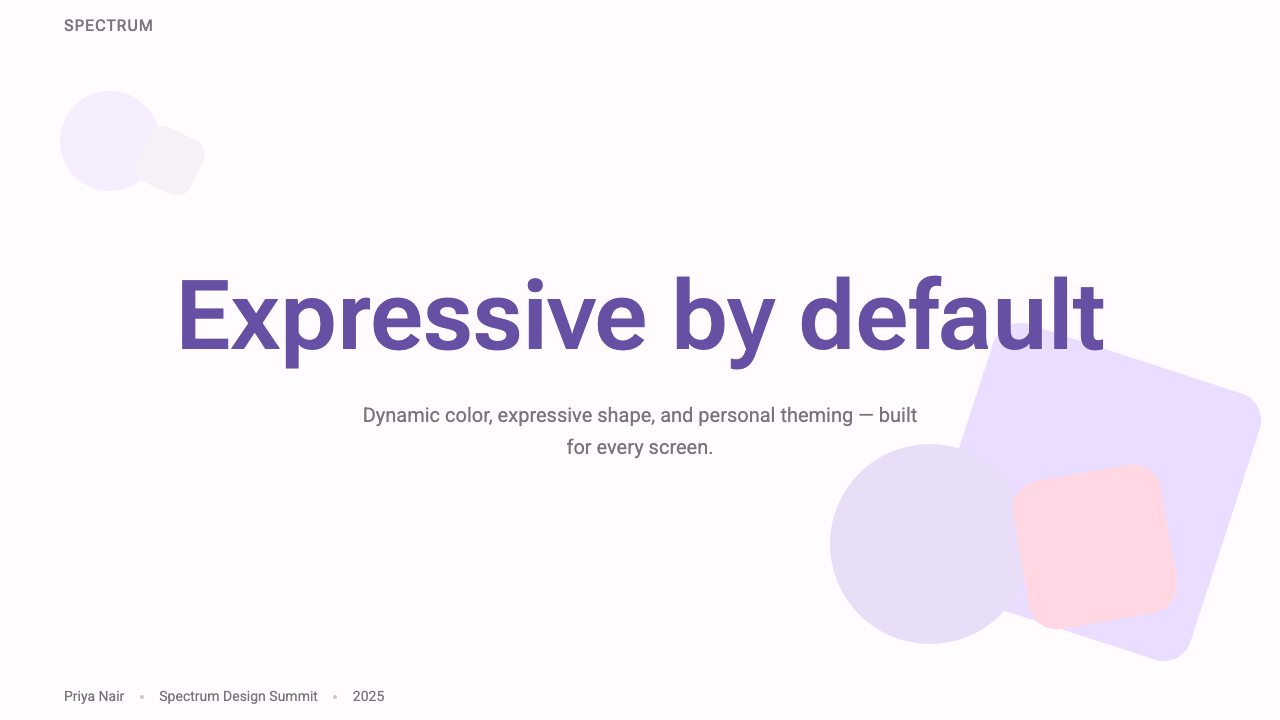
For presentation slides, Material 3 Expressive brings a cover-page boldness that differs sharply from the neutral white decks that dominate most presentation contexts. A cover page built in this idiom typically anchors a large, rounded shape in the primary tonal color to one corner or edge, allows generous white space or surface-color fills to breathe, and uses display-scale type in a tonal color — not necessarily black — so that the headline carries warmth rather than authority alone. Content slides work best when they maintain the tonal surface logic: slide backgrounds should shift slightly in warmth from the cover rather than defaulting to stark white, and data visualizations — bar charts, progress indicators, status systems — should use the primary-secondary-tertiary roles to encode meaning rather than arbitrary color choices.在演示文稿中,Material 3 Expressive 带来了一种封面页的大胆感,与大多数演示场景中主导的中性白色幻灯片形成鲜明对比。以此风格构建的封面页,通常将一个大型圆润形状以主色调色锚定于某一角或边缘,保留充裕的白色空间或表面色填充以供呼吸,并以色调色彩(不必然是纯黑)渲染展示级别的标题文字——让标题承载温暖感,而非仅仅是权威性。内容页在保持色调表面逻辑时效果最佳:幻灯片背景应当在温度上与封面有所偏移,而非默认回归刺眼的白色;数据可视化——柱状图、进度指示器、状态系统——应使用主色、辅色、强调色角色来编码意义,而非任意的色彩选择。
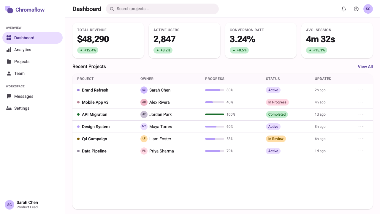
For web user interfaces, Material 3 Expressive's strengths align closely with dashboard and productivity application needs. The component library's pre-built navigation rails, card systems, chips, and action buttons translate directly to information-dense interfaces without requiring extensive visual customization. The tonal surface layering works especially well for dashboards where multiple panels of information need to feel organized and distinct without relying on heavy borders or drop shadows. Pricing pages benefit from the shape vocabulary — primary tier cards might carry more rounded treatment to signal friendliness, while enterprise or advanced tiers might adopt a slightly more structured corner profile to signal capability and formality.对于网页用户界面,Material 3 Expressive 的优势与仪表板及生产力应用的需求高度契合。组件库中预构建的导航栏、卡片系统、标签芯片与操作按钮,可直接移植至信息密集型界面,无需大量视觉定制。色调表面层级在多个信息面板需要感觉有序且相互区分、同时又不依赖厚重边框或投影的仪表板中表现尤为出色。定价页面受益于形状语汇——主力套餐卡片可以采用更圆润的处理来传达友善感,而企业级或高级套餐则可以采用略微更具结构感的角型,以传达能力与正式感。
For editorial and marketing applications, Material 3 Expressive provides a palette logic that rewards consistency. A marketing landing page built in this language should commit to one palette — ideally derived from a brand seed color fed into the Material color algorithm — and apply it uniformly across hero sections, feature blocks, call-to-action components, and testimonial cards. The expressive shape vocabulary supports a landing page structure where hero sections use large, rounded feature cards that feel soft and inviting, while data-heavy comparison sections shift to more angular containers that signal precision and reliability. Motion is an underutilized asset in editorial contexts: the spring transitions that Material 3 Expressive codifies can make scroll-triggered reveals feel physically satisfying rather than merely animated.在编辑与营销应用中,Material 3 Expressive 提供了一套奖励一致性的配色逻辑。以此语言构建的营销落地页应当承诺使用一套配色——理想情况下来自输入 Material 色彩算法的品牌种子色——并将其统一应用于英雄区块、功能特性区块、行动号召组件与推荐语卡片。表现性形状语汇支持这样一种落地页结构:英雄区块使用大型圆润特性卡片,传递柔和的邀请感;而数据密集的对比区块则转向更具棱角的容器,传达精确性与可靠感。动效是编辑场景中一项被低估的资产:Material 3 Expressive 所规范的弹簧过渡,能让滚动触发的内容展示带来物理上的满足感,而不只是动画效果。
A common mistake when applying Material 3 Expressive is treating the dynamic palette as a license for color maximalism — deploying primary, secondary, and tertiary accents simultaneously at full intensity across every component. Authentic Material 3 Expressive work uses the tonal hierarchy with restraint: the primary color appears on the most important interactive elements and nowhere else at full saturation; secondary and tertiary tones appear on supporting surfaces and as accent layers. Similarly, the expressive shape vocabulary should not result in every component carrying the maximum corner radius — contrast between rounder and more restrained shapes is what makes the system communicative rather than merely decorative. The goal is a system where every design choice feels intentional and where the overall impression is warm but never chaotic.应用 Material 3 Expressive 时最常见的错误,是将动态配色方案理解为色彩最大化的许可——在每个组件上同时以全强度展示主色、辅色与强调色。真实的 Material 3 Expressive 作品以克制的方式使用色调层级:主色仅出现在最重要的交互元素上,在其他任何地方都不以全饱和度出现;辅色与强调色出现在辅助性表面及强调层上。同样,表现性形状语汇不应导致每个组件都承载最大圆角半径——更圆润与更克制的形状之间的对比,才是让系统具有沟通性而非仅仅装饰性的关键。目标是一套每个设计选择都显得有意为之、整体印象温暖而绝不混乱的系统。
See the Google Material 3 Expressive design system查看 Google Material 3 Expressive 完整设计系统
Google Material 3 Expressive — FAQGoogle Material 3 Expressive · 常见问题
How is Material 3 Expressive different from earlier versions of Material Design?Material 3 Expressive 与早期版本的 Material Design 有何不同?
The most fundamental difference is in how color is determined. Material 1 and Material 2 provided curated color palettes that designers selected from; Material 3 generates palettes algorithmically from a user's wallpaper. This shifts color from a brand-level decision to a user-level one. The Expressive update compounds this with expanded shape variation and more physically playful motion — qualities that earlier Material versions deliberately restrained in the interest of platform-wide consistency. Where Material 2 leaned toward the controlled and neutral, Material 3 Expressive leans toward the personal and emotive.最根本的区别在于色彩的确定方式。Material 1 与 Material 2 提供经过筛选的色板供设计师选用;Material 3 则从用户壁纸出发通过算法生成配色方案。这将色彩从品牌层面的决策转变为用户层面的决策。Expressive 更新在此基础上叠加了扩展的形状变化与更具物理趣味的动效——而这些品质在早期版本中为了平台整体一致性被刻意抑制。如果说 Material 2 倾向于可控与中性,Material 3 Expressive 则倾向于个性与情感。
Can Material 3 Expressive work for a brand with strict color guidelines?Material 3 Expressive 适合有严格色彩规范的品牌吗?
Yes, with deliberate configuration. While the dynamic wallpaper-based theming is the system's signature feature on Android, the underlying color architecture — primary, secondary, tertiary, and neutral tonal roles — can be seeded with a fixed brand color rather than a user-generated one. The algorithm then generates a complete harmonious palette derived from that brand seed. This means the tonal relationships and surface layering remain coherent while the overall palette stays anchored to the brand's signature hue. Many web and cross-platform implementations of Material 3 take this approach, using the system's structural logic without the device-level personalization.可以,但需要有意识地进行配置。虽然基于壁纸的动态主题是该系统在 Android 上的标志性功能,但底层的色彩架构——主色、辅色、强调色与中性色调角色——可以用固定的品牌色而非用户生成的色彩作为种子色。算法随后生成一套以品牌种子色为基础推导出的完整和谐配色方案。这意味着色调关系与表面层级保持连贯,而整体配色方案依然锚定于品牌的标志性色相。许多 Material 3 的网页端与跨平台实现正是采用这种方式——使用系统的结构性逻辑,同时不引入设备级别的个性化。
Does Material 3 Expressive work in dark mode?Material 3 Expressive 在深色模式下效果如何?
Dark mode is a first-class consideration in Material 3 Expressive, not an afterthought. The dynamic palette generation produces both light and dark variants of every tonal role, and the surface layering logic inverts elegantly — in dark mode, surfaces that appear lighter in light mode use darker, slightly elevated tonal values to maintain the same sense of hierarchy and depth. The dynamic color system ensures that the dark palette derives from the same seed as the light palette, so the two modes feel visually related and intentional rather than like separate design exercises. In practice, dark mode Material 3 Expressive interfaces often feel more dramatic and atmospheric than their light counterparts.深色模式在 Material 3 Expressive 中是一等公民的考量,而非事后补丁。动态配色生成过程会为每个色调角色同时产出浅色与深色变体,表面层级逻辑也能优雅地反转——在深色模式下,浅色模式中显得较亮的表面使用略深但层级上略高的色调值,以维持同样的层级感与深度感。动态色彩系统确保深色配色方案与浅色配色方案来自同一种子色,因此两种模式感觉视觉上相互关联且有意为之,而非两套独立的设计练习。在实践中,深色模式的 Material 3 Expressive 界面往往比浅色版本更具戏剧性与大气感。
Is Material 3 Expressive only relevant for Android apps?Material 3 Expressive 只适用于 Android 应用吗?
No. While Material 3 originated as an Android design language and its dynamic wallpaper theming is most deeply integrated at the Android OS level, the design system's visual principles — tonal surface layering, expressive shape vocabulary, emotive motion — are fully applicable to web interfaces, cross-platform mobile apps, and marketing materials. Google has published open specifications and component libraries for web and Flutter implementations, and the design community has built additional ports for other ecosystems. The system's aesthetic — warm, rounded, layered, human — is just as readable in a web dashboard or a marketing landing page as in a native Android application.不。虽然 Material 3 起源于 Android 设计语言,其动态壁纸主题功能也在 Android 操作系统层面集成最深,但该设计系统的视觉原则——色调表面层级、表现性形状语汇、情感化动效——完全适用于网页界面、跨平台移动应用以及营销素材。Google 已发布针对 Web 与 Flutter 实现的开放规范与组件库,设计社区也为其他生态系统构建了额外的移植版本。该系统的美学——温暖、圆润、分层、人性化——在网页仪表板或营销落地页上与在原生 Android 应用中同样清晰可读。
What kinds of products are a poor fit for Material 3 Expressive?哪类产品不适合使用 Material 3 Expressive?
Material 3 Expressive is optimized for personal, consumer-facing digital products where warmth and approachability are desired. It struggles in contexts requiring extreme visual authority or austerity — high-end luxury goods, formal financial instruments, or products that signal status through restraint and exclusivity. The system's rounded, friendly character can undermine the gravitas that those contexts require. It also fits less naturally in design contexts with strong cultural visual vocabularies of their own — traditional editorial design, historical or heritage brand identities, or specialized professional tools that have developed their own visual conventions over decades. In those cases, the expressive warmth of Material 3 can feel like an intrusion rather than an enhancement.Material 3 Expressive 针对温暖感与亲近感是期望品质的个人化、面向消费者的数字产品进行了优化。它在需要极致视觉权威性或严肃性的场景中会遭遇困难——高端奢侈品、正式金融产品,或通过克制与排他性传达地位感的产品。系统的圆润、友善特质可能削弱这些场景所需的庄重感。它也较难自然融入拥有强烈自身文化视觉语汇的设计场景——传统编辑设计、历史性或传承性品牌标识,或数十年来已形成自身视觉惯例的专业工具。在这些场景中,Material 3 的表现性温暖感可能显得格格不入而非锦上添花。
Related design styles相关设计风格
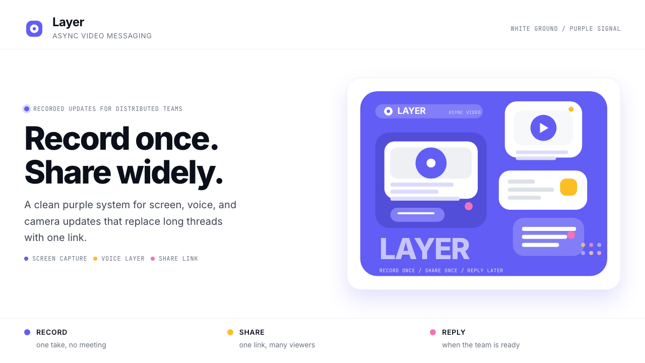 Loom Async-Video PurpleAsync, not meetings. Pure white ground, electric purple, record-button geomet…异步,不开会:纯白底、电紫与录制按钮几何。
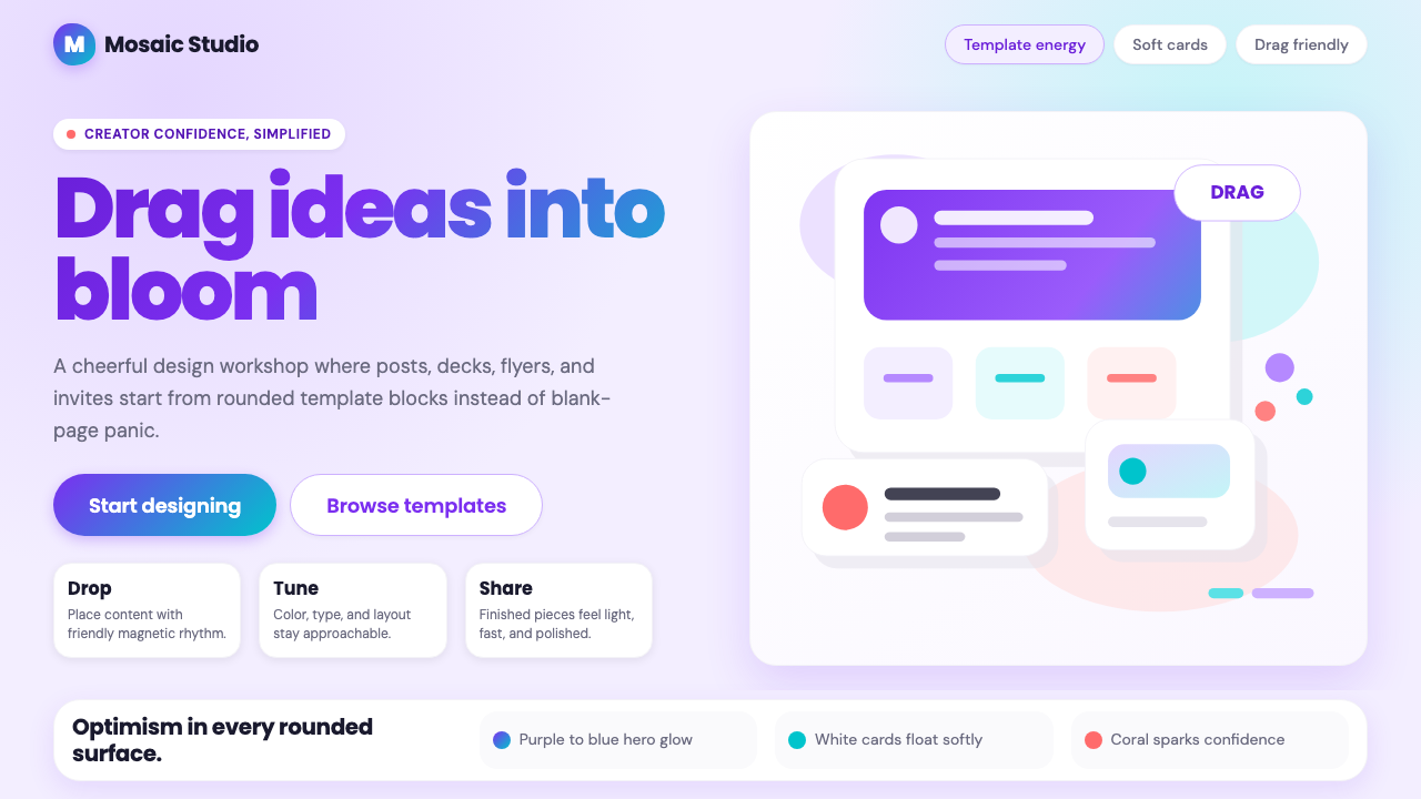 Canva 2024Confidence feels draggable. Purple-blue gradients and floating white template…信心可拖拽:紫蓝渐变与漂浮白卡,让创作变柔和。
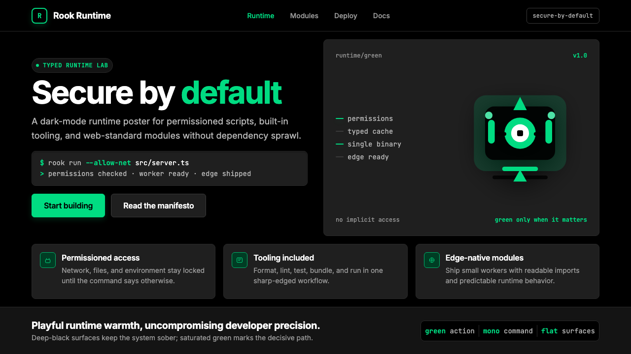 Deno Runtime-GreenWarm precision on black. Saturated green, Inter, and mono code turn security…黑底上的温暖精度:饱和绿、Inter 与等宽代码让安全成为主角。
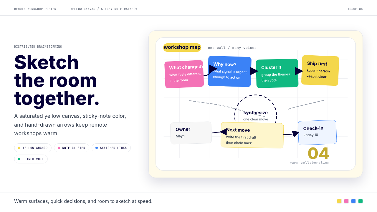 Miro Collab YellowWarm brainstorming in motion. Yellow canvas, sticky-note rainbow, hand-drawn…暖黄白板上的协作灵感。便利贴彩虹和手绘箭头带出流动感。
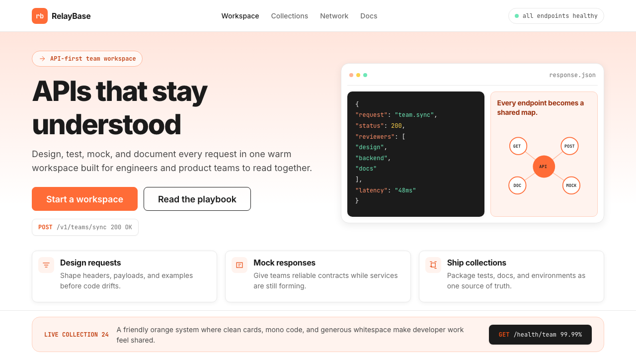 Postman 2024Warm APIs feel approachable. Orange gradients, Inter headlines, and dark mono…温暖的 API 专业感:橙色渐变、Inter 标题与深色等宽代码块。
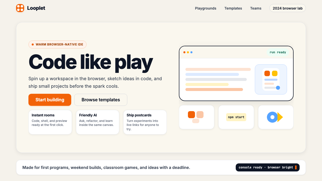 Replit 2024Coding feels warm. Coral buttons, cream panels, rounded code tiles make build…编程变得温暖:珊瑚按钮、奶油面板与圆角代码块让构建更好玩。