What is Canva 2024?什么是 Canva 2024?
Canva turned a billion non-designers into confident creators by making the act of design feel as natural as dragging a card across a table.Canva 让十亿非设计师变成了自信的创作者,它把设计这件事变得像在桌上拖动一张卡片一样自然。
Canva 2024 in briefCanva 2024 速览
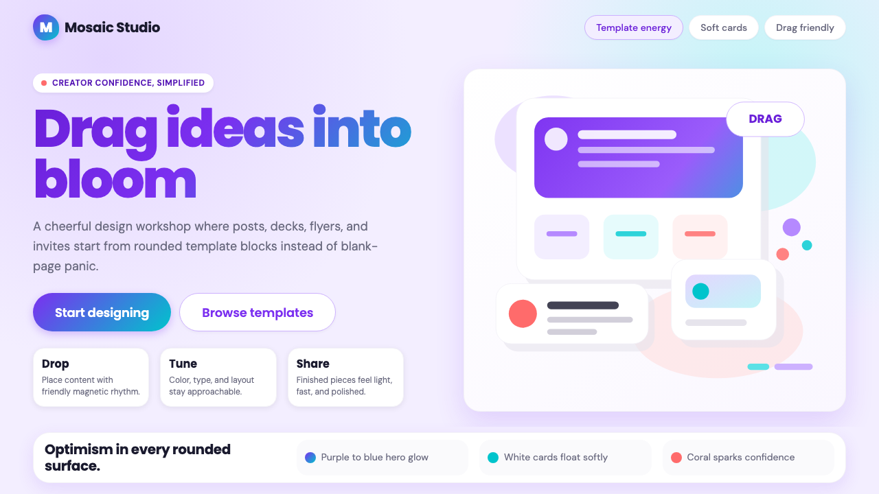
Canva 2024 is the visual identity and interface language of Canva at the height of its global reach — a design system built not for professional studios but for the enormous population of people who need to communicate visually without formal training. Its aesthetic is defined by a signature purple-to-blue gradient that functions as the brand's emotional keynote, paired with generous white work surfaces, softly shadowed template cards, and rounded shapes that signal approachability at every scale. The palette exudes warmth and optimism: deep violet meets sky blue in the hero gradient, soft lavender grounds secondary surfaces, and a warm coral accent punctuates interactive moments.Canva 2024 是 Canva 在全球影响力顶峰时期的视觉识别与界面语言——一套设计系统,并非为专业工作室打造,而是为那些庞大的、需要视觉表达但没有受过正式训练的人群而生。它的美学由一条标志性的紫蓝渐变定义,这条渐变是品牌的情绪主轴;与之搭配的是宽阔的白色创作画布、带有柔和阴影的模板卡片,以及在每一个尺度上都传递亲切感的圆角形状。整体色彩洋溢着温暖与乐观:深紫与天蓝在主视觉区交融,淡薰衣草色托起次要界面,暖珊瑚色在交互时刻点睛。
The typography follows the same philosophy of friendliness. Headlines feel rounded and confident rather than formal or authoritative; body text is clean and open, prioritizing comfortable reading over typographic drama. Rounded corners appear on buttons, cards, tags, and input fields with remarkable consistency — the interface has no sharp angles, no stern geometric rigidity, and no element that might intimidate a first-time user. Shadows are soft and diffuse, suggesting cards floating just above a surface, reinforcing the tactile metaphor of a design tool built around picking up and placing things.字体排印遵循同样的友好哲学。标题字感觉圆润而自信,而非正式或权威;正文干净开阔,以舒适可读为先,而非追求字体戏剧性。圆角以惊人的一致性出现在按钮、卡片、标签与输入框上——界面没有锐角,没有严肃的几何刚硬感,没有任何可能让初次用户望而生畏的元素。阴影柔和弥散,像是卡片漂浮在表面略微上方,强化了一个关于拾起与放置的触觉隐喻——这正是一款拖拽式设计工具的核心体验。
What makes Canva 2024 distinctive as a design system is that it is itself the argument. Every visual decision — the approachable gradient, the gentle shadows, the forgiving rounded forms — encodes the product's central promise: that creativity is accessible, that design does not require expertise, and that anyone can make something that looks good. The aesthetic is not neutral; it is persuasive optimism rendered in purple and blue.Canva 2024 作为设计系统的独特之处在于:它本身就是论证。每一个视觉决策——亲切的渐变、轻柔的阴影、宽容的圆角——都在编码这款产品的核心承诺:创造力是触手可及的,设计不需要专业知识,任何人都能做出好看的东西。这套美学并非中性的;它是以紫蓝两色呈现的说服性乐观主义。
Where does Canva 2024 come from?Canva 2024 从何而来?
Canva was founded in Sydney, Australia in 2013 by Melanie Perkins, Cliff Obrecht, and Cameron Adams. Perkins had identified the problem years earlier while teaching design software at the University of Western Australia: students spent most of their time learning the tool, not using it creatively. Her initial concept — a simplified yearbook design tool called Fusion Books — proved the market demand. Canva launched as a web application with a drag-and-drop editor, template library, and asset marketplace, and within two years had millions of active users across more than 150 countries.Canva 由梅拉妮·帕金斯、克利夫·奥布雷希特与卡梅伦·亚当斯于2013年在澳大利亚悉尼创立。帕金斯多年前在西澳大学教授设计软件时便发现了这个问题:学生把大多数时间花在学习工具本身,而非用它进行创作。她最初的设想——一款名为 Fusion Books 的简化版年鉴设计工具——证明了市场需求的真实存在。Canva 以网页应用形式上线,提供拖拽式编辑器、模板库与素材市场,两年内便在150多个国家拥有了数百万活跃用户。
The visual identity that would become recognizable as 'Canva' coalesced gradually between roughly 2018 and 2021, then matured into the fully cohesive system seen throughout 2022 to 2024. The early Canva aesthetic was lighter and less confident — a generically friendly SaaS look that borrowed liberally from the conventions of consumer web design at the time. As the company grew and began positioning itself not merely as a design tool but as a creative platform and eventual enterprise suite, its visual identity evolved to reflect greater ambition. The purple-blue gradient emerged as the dominant brand signature, asserting personality and warmth in a product category often dominated by sterile utility tools.如今广为人知的「Canva 风格」视觉识别大约在2018年至2021年间逐渐成形,并在2022至2024年间演进为完全连贯的设计系统。早期的 Canva 美学更为轻盈、也不那么自信——一种借鉴彼时消费级网页设计惯例的通用友好型 SaaS 外观。随着公司规模扩张,并开始将自身定位从单纯的设计工具转向创意平台乃至企业套件,视觉识别也随之演进以体现更大的抱负。紫蓝渐变作为主导性品牌标志脱颖而出,在一个常被无趣实用工具主导的产品品类中,彰显出鲜明的个性与温度。
Cameron Adams, who had been a designer at Google before joining Canva as co-founder and Chief Product Officer, brought a sensitivity to interaction design and product aesthetics that shaped the platform's feel. The principle that guided the visual system was not minimalism in the modernist sense but something closer to what might be called expressive accessibility — design choices that actively lower psychological barriers, that signal welcome rather than expertise, and that frame the product experience as inherently encouraging. This is visible in every rounded corner, every soft gradient, every floating card shadow.卡梅伦·亚当斯在加入 Canva 担任联合创始人兼首席产品官之前曾任职谷歌设计师,他对交互设计与产品美学的敏感度深刻塑造了平台的气质。引导这套视觉系统的原则并非现代主义意义上的极简主义,而是更接近「表达性可及性」(expressive accessibility)的某种理念——设计选择主动降低心理门槛,发出欢迎而非专业壁垒的信号,将产品体验框定为一种本质上令人鼓舞的过程。这在每一个圆角、每一道柔和渐变、每一个漂浮卡片阴影中都清晰可见。
The 2024 iteration of the identity also reflects Canva's ambitions beyond casual social content. By this period, Canva had launched Canva for Enterprise, Canva Docs, and extensive presentation and whiteboard tools — products aimed at workplace users creating professional materials. The design system had to scale from a teenager making an Instagram post to a marketing team producing a quarterly report. The solution was not two different aesthetics but a single system flexible enough to feel at home in both contexts: the same gradient and rounded language, calibrated to be simultaneously approachable for newcomers and polished enough for professional outputs.2024年版本的视觉识别也反映了 Canva 超越休闲社交内容的更大抱负。这一时期,Canva 已推出 Canva for Enterprise、Canva Docs 以及完善的演示文稿与白板工具——面向职场用户制作专业材料的产品线。设计系统必须从一个制作 Instagram 帖子的年轻人,一直延伸覆盖到制作季度报告的市场营销团队。解决方案并非两套不同的美学,而是一套足够灵活的统一系统:相同的渐变与圆角语言,经过精心校准,对初学者而言亲切可及,对专业输出而言又足够精良。
What defines the Canva 2024 look?Canva 2024 的视觉特征是什么?
Gradient as Brand Signature渐变作为品牌标志
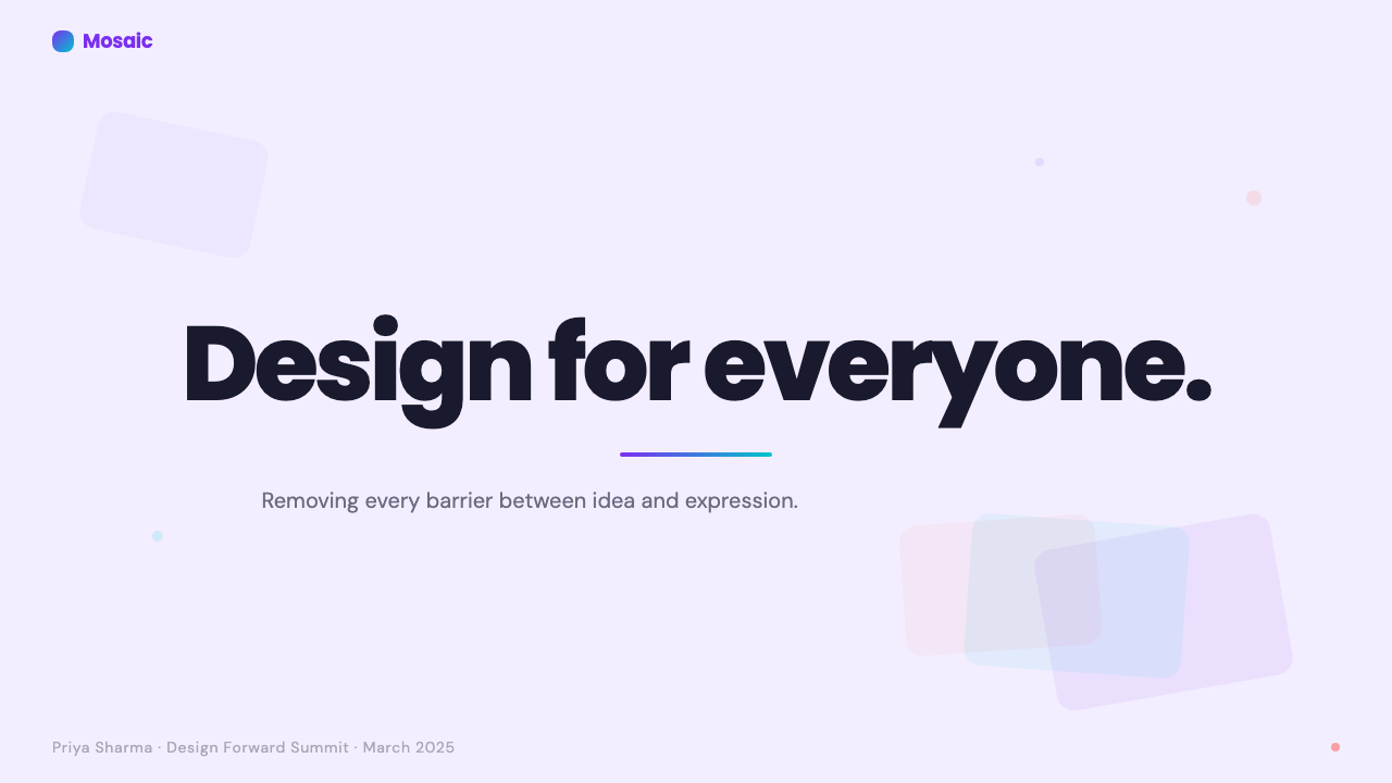
The defining visual element of Canva 2024 is a purple-to-blue gradient that moves from deep violet through mid-tones into sky blue. This gradient appears consistently across hero sections, primary buttons, and illustrated brand moments — it functions not merely as decoration but as an identity marker as recognizable as a logo. Unlike gradients used for depth or realism, Canva's gradient is expressive and optimistic: it reads as energy, possibility, and movement rather than as a lighting simulation. The transition is smooth and warm, never harsh or neon.Canva 2024 最具定义性的视觉元素是一道从深紫经中间色调延伸至天蓝的渐变。这道渐变一致性地出现在主视觉区、主按钮与品牌插图时刻——它不仅仅是装饰,而是像 Logo 一样可辨识的身份标志。不同于用于制造深度或写实感的渐变,Canva 的渐变是表达性的、充满乐观的:它传递的是能量、可能性与运动感,而非光照模拟。过渡平滑而温暖,绝无刺眼或霓虹感。
Rounded Everything无处不在的圆角
Corner rounding in Canva 2024 is not a subtle softening but a defining commitment. Buttons, cards, input fields, tags, modal dialogs, and image thumbnails all carry substantial rounding that gives the interface a consistently soft, pillowy quality. This is not arbitrary — the rounded forms are a visual encoding of the brand's accessibility promise. Sharp corners belong to tools that demand precision and expertise; rounded corners belong to tools that welcome everyone. The consistency of this rounding across every component reinforces the message at every interaction point.Canva 2024 的圆角处理并非轻微的柔化,而是一种定义性的承诺。按钮、卡片、输入框、标签、模态框与图片缩略图,全部带有显著的圆角,赋予界面始终如一的柔和、蓬松质感。这并非随意之举——圆角形式是品牌可及性承诺的视觉编码。锐角属于需要精准与专业技能的工具;圆角属于欢迎所有人的工具。这种圆角贯穿每一个组件的一致性,在每一个交互节点都强化着这一信息。
Soft Floating Shadows柔和漂浮阴影
Cards and panels in Canva 2024 cast soft, diffuse shadows that suggest elevation without drama. The effect is of elements floating just slightly above the surface beneath them — not the hard, offset shadows of a retro or flat-design approach, and not the invisible zero-elevation of pure flat design, but a gentle middle ground that maintains spatial clarity while feeling tactile and inviting. Template preview cards in particular use this shadow treatment to reinforce the metaphor of physical objects you might pick up and rearrange.Canva 2024 的卡片与面板投下柔和、弥散的阴影,暗示高度但不夸张。效果是元素轻轻漂浮在其下方表面略微上方——既非复古或扁平设计的硬边偏移阴影,也非纯扁平设计的零高度隐形,而是一种温柔的中间地带:在保持空间清晰度的同时,呈现出触觉感与邀请感。尤其是模板预览卡片,这种阴影处理强化了「可以拾起并重新摆放的实物」的隐喻。
Accessible Color with Warm Accents具可及性的色彩与暖色点缀
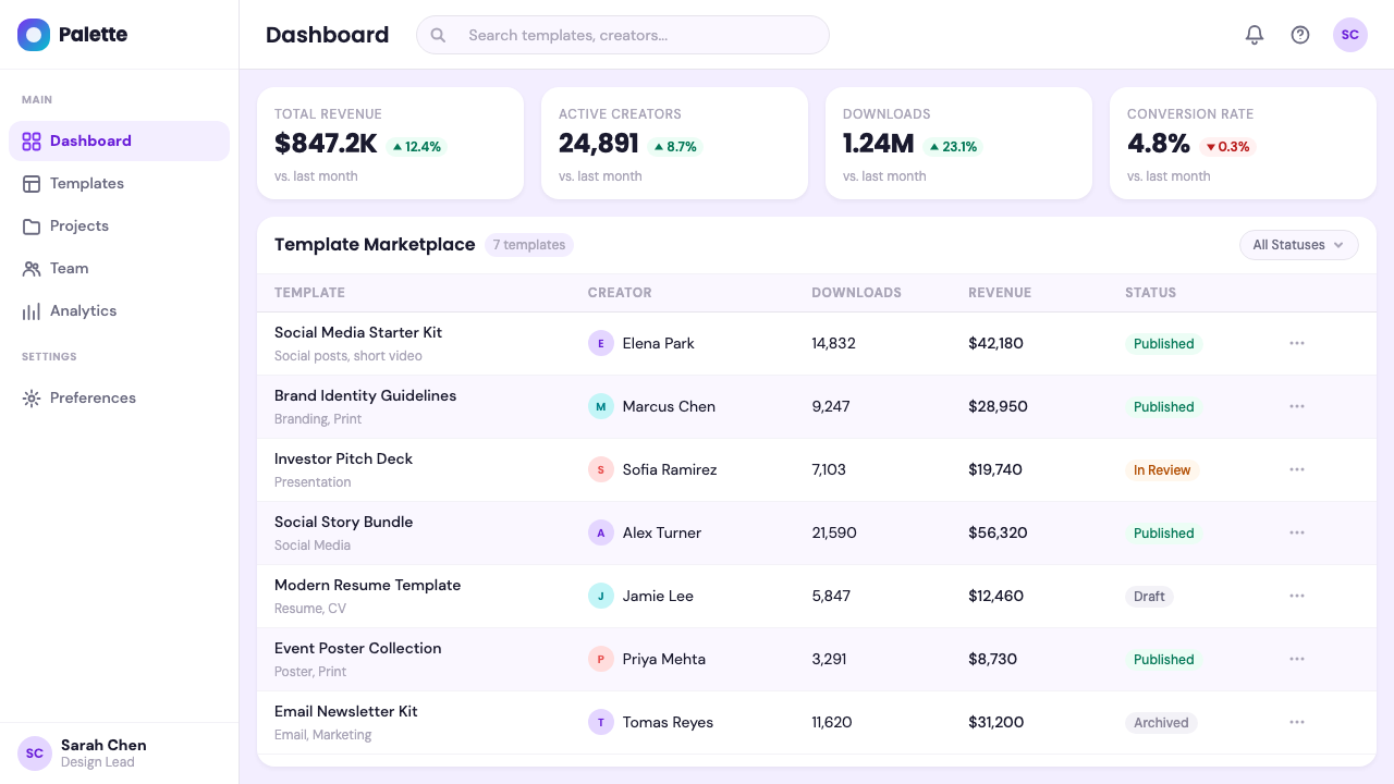
Beyond the signature gradient, Canva 2024 relies on a layered palette of surfaces: primary white for active work areas, a soft lavender for backgrounds and secondary panels, and a warm coral or peachy tone for interactive highlights and calls to action. This palette is carefully calibrated for legibility and emotional warmth simultaneously. Nothing is cold or clinical; nothing is aggressively saturated. The colors work together to suggest a creative environment that is both professional and personally inviting — a workspace that belongs to you.除了标志性渐变之外,Canva 2024 依赖一套分层的底面色板:主白用于活跃创作区域,柔和薰衣草用于背景与次要面板,温暖珊瑚或桃粉色用于交互高光与行动号召。这套色板在可读性与情感温度之间经过精心校准。没有任何冷漠或临床感,没有任何过度饱和的攻击性。这些颜色共同营造出一种既专业又私人温馨的创意环境——一个属于你的工作台。
Template-Card Visual Grammar模板卡片视觉语法
One of Canva's most distinctive visual contributions is the template card: a rounded rectangle that previews a finished design at reduced scale, casting a soft shadow, and arranged in grids that communicate abundance and choice. This card grid pattern has become so associated with Canva that it now reads as a design genre unto itself. The visual grammar of a browseable template library — dense, colorful, thumbnail-previewed, softly shadowed — is legible as 'Canva-like' even when encountered on entirely different platforms that have adopted the same pattern.Canva 最具辨识度的视觉贡献之一是模板卡片:一个圆角矩形,以缩小比例预览一个完成的设计,投下柔和阴影,并以网格排列传递丰富性与选择感。这种卡片网格排版已与 Canva 如此紧密相连,以至于它本身已成为一种设计类型。可浏览式模板库的视觉语法——密集、多彩、缩略图预览、柔和阴影——即便出现在采用了同样模式的完全不同的平台上,也能被立刻识别为「Canva 风格」。
Illustrated Brand Warmth插图式品牌温度
Canva 2024 uses a distinctive style of brand illustration: rounded, slightly three-dimensional figures with the same purple-blue gradient palette, often depicting people in moments of creation, collaboration, or celebration. These illustrations serve to humanize the brand and represent its global, diverse user community. They are never photorealistic; they are stylized to sit comfortably within the same rounded, warm aesthetic as the interface. The figures are consistently joyful, the scenarios collaborative, and the color palette continuous with the broader brand system.Canva 2024 使用一种独特的品牌插图风格:圆润、略带立体感的人物形象,延续同样的紫蓝渐变色板,常常描绘人们在创作、协作或庆祝时刻中的状态。这些插图用于人性化品牌,代表其全球多元的用户社群。它们从不追求照片写实;而是被风格化处理,与界面的圆润温暖美学舒适地融为一体。人物始终洋溢喜悦,场景充满协作,色板与更广泛的品牌系统一脉相承。
Friendly Typography Hierarchy亲切的字体排印层级
The typographic system in Canva 2024 prioritizes approachability over sophistication. Headline type is large, rounded in character, and confident without being aggressive — it invites reading rather than demanding attention. Body text is set with generous line spacing for comfortable scanning. The hierarchy is clear but achieved through scale and weight variation rather than rigid geometric contrast. There is warmth in the letter shapes themselves: the overall typographic tone is that of a knowledgeable friend, not an institutional authority.Canva 2024 的排印系统将亲切感置于精致感之上。标题字大而圆润,自信但不咄咄逼人——它邀请阅读,而非强迫注意。正文设有宽松的行间距以便舒适浏览。层级清晰,但通过尺寸与字重变化而非严格几何对比来实现。字形本身带有温度:整体排印基调是一位见多识广的朋友,而非机构权威。
Who shaped Canva 2024?谁塑造了 Canva 2024?
Perkins co-founded Canva and serves as its CEO. Her original insight — that design software was unnecessarily complex and that there was a vast underserved market of people who needed to create visual content without professional training — defined both the product and the brand identity. Her approach to building the company, emphasizing radical accessibility and a belief that everyone has creative potential, is directly encoded in the visual language Canva developed: inclusive, optimistic, and deliberately non-intimidating.帕金斯是 Canva 的联合创始人兼首席执行官。她的原初洞见——设计软件不必要地复杂,存在一个庞大的未被服务市场,由需要创作视觉内容但没有专业训练的人群构成——既定义了这款产品,也定义了品牌识别。她建设公司的方式,强调彻底的可及性与「每个人都有创意潜力」的信念,被直接编码进 Canva 发展出的视觉语言:包容、乐观、刻意消除门槛感。
Adams co-founded Canva and serves as its Chief Product Officer. Before Canva, he was a designer and developer at Google, where he worked on products that reached massive audiences. His background in both design and engineering shaped Canva's product sensibility: the interface needed to be genuinely delightful, not just functional, and the visual system had to remain coherent as the product scaled from a simple poster tool to a comprehensive creative suite. Adams has been a key steward of the design system's evolution.亚当斯是 Canva 的联合创始人兼首席产品官。加入 Canva 之前,他曾在谷歌担任设计师与开发者,参与触达海量用户的产品工作。他兼具设计与工程背景,塑造了 Canva 的产品感性:界面需要真正令人愉悦,而不仅仅是功能正常;当产品从一个简单的海报工具扩展为综合创意套件时,视觉系统必须保持连贯。亚当斯是这套设计系统演进历程中的核心守护者。
Obrecht co-founded Canva and served as its COO through the company's critical growth phases. His operational focus ensured that the product's visual promise was backed by the infrastructure and business model needed to scale it globally. The philanthropic commitment that Obrecht and Perkins made — pledging the majority of their equity to charitable causes — is part of the brand's story of purpose-driven design, and it has shaped the tone of Canva's communications: genuinely values-led rather than purely commercial.奥布雷希特是 Canva 的联合创始人,在公司关键增长阶段担任首席运营官。他的运营专注确保了产品的视觉承诺背后有支撑其全球扩张所需的基础设施与商业模式。奥布雷希特与帕金斯作出的慈善承诺——将大部分股权捐献给慈善事业——是 Canva 使命驱动设计故事的一部分,并塑造了 Canva 传播的基调:真诚的价值观导向,而非纯粹商业驱动。
Unlike design systems associated with a single iconic designer, Canva's visual identity emerged from a large in-house design team working iteratively across product, brand, and marketing touchpoints from approximately 2018 onward. This distributed authorship is itself meaningful: the identity was not imposed top-down by a single creative director but evolved organically in response to user research, product expansion, and the practical demands of designing for hundreds of millions of users across dozens of languages and cultures. The result is a system that feels lived-in rather than prescribed.与某个标志性设计师相关联的设计系统不同,Canva 的视觉识别是由一支大型内部设计团队从大约2018年起,在产品、品牌与营销触点上迭代工作中涌现出来的。这种分布式作者身份本身是有意义的:这套识别并非由单一创意总监自上而下强加,而是在用户研究、产品扩展以及为数亿跨越数十种语言与文化的用户进行设计的实际需求回应中,有机演进而成。结果是一套感觉经过实际打磨而非凭空规定的系统。
How do you use Canva 2024 today?今天怎么用 Canva 2024?
Canva 2024 is a highly legible and transferable design language for contexts where the goal is to welcome, enable, and retain users who may feel uncertain about their creative abilities. Before applying it, it helps to understand what makes it work: the visual system is built around lowering psychological barriers. Every element — the gradient, the rounded corners, the soft shadows — is a signal that says 'this is easy, you can do this.' That signal only works if the visual execution is consistent and deliberate. Scattering rounded buttons across an otherwise angular, high-contrast interface will not produce the Canva effect.Canva 2024 是一套在以欢迎、赋能与留住对自身创意能力不够自信的用户为目标的场景中,极具可读性与可移植性的设计语言。在应用它之前,理解它的运作逻辑很有帮助:这套视觉系统围绕降低心理门槛而构建。每一个元素——渐变、圆角、柔和阴影——都在发出一个信号:「这很容易,你可以做到。」这个信号只有在视觉执行一致且刻意的情况下才有效。在一个整体上棱角分明、高对比度的界面上零散地加入圆角按钮,并不会产生 Canva 的效果。
For presentation slides, the style translates beautifully to both cover and content pages. A cover slide gains impact from the purple-to-blue gradient applied as a full-bleed background or as a bold curved band, with white headline text set at a generous scale. The gradient anchors energy and optimism immediately. Content slides should lean into the card metaphor: information grouped into softly shadowed rounded-corner panels, with a light lavender or near-white background keeping the overall tone airy. Data slides work especially well when charts are given soft container cards and color-coded using the brand's warm accent tones rather than the aggressive primaries of more technical design systems.在演示文稿中,这种风格在封面页与内容页上都有出色表现。封面页以紫蓝渐变作为全出血背景或大胆弧形色带时最具冲击力,配以大字号白色标题文字。渐变立即锚定了能量与乐观感。内容页应充分利用卡片隐喻:信息归组于带有柔和阴影和圆角的面板中,浅薰衣草或近白色背景保持整体基调通透。数据页在图表被赋予柔和容器卡片、并以品牌暖色调(而非更具技术性设计系统中强硬的原色)进行颜色编码时,效果尤为出色。
For web UI, the Canva visual language suits SaaS dashboards, onboarding flows, pricing pages, and template galleries. The key decisions are surface layering — primary white for active work, soft lavender for sidebar and secondary areas — and consistent component rounding across every interactive element. A pricing page in this style benefits from gradient-topped tier cards, with the recommended tier receiving a more saturated gradient treatment while alternatives use lighter tints. Dashboards should use the soft shadow card system to create visual groupings rather than hard borders. Navigation can use the gradient brand color for active states without overwhelming the layout.在网页界面中,Canva 视觉语言适合 SaaS 仪表板、引导流程、定价页面与模板图库。关键决策在于界面分层——主白用于活跃工作区,柔和薰衣草用于侧边栏与次要区域——以及每一个交互元素上一致的组件圆角。这种风格的定价页面受益于顶部带渐变的套餐卡片,推荐套餐获得更饱和的渐变处理,而其他方案使用更浅的色调。仪表板应使用柔和阴影卡片系统创建视觉分组,而非依赖硬边框线。导航可以将渐变品牌色用于激活状态,而不致淹没整体布局。
For editorial and marketing materials, the style supports a kind of optimistic confidence that works well for product launches, recruitment materials, educational content, and community communications. Feature sections alternate between light lavender backgrounds and white, using the gradient as an accent for pullquotes or section headers rather than as an all-over color. Marketing email layouts benefit from the template-card grid — a visible grid of rounded, softly shadowed content cards immediately reads as 'Canva-native' and reinforces brand recognition. Social media graphics in this style should use the gradient generously, with white or light-colored type for readability.在编辑与营销材料方面,这种风格支持一种乐观自信感,适合产品发布、招募材料、教育内容与社群传播。功能展示区在浅薰衣草背景与白色之间交替,将渐变用作引语或章节标题的强调,而非整体铺底色。营销邮件排版受益于模板卡片网格——一个圆角、柔和阴影的内容卡片网格,立刻传递出「Canva 原生」的感觉,并强化品牌识别度。这种风格的社交媒体图文应大方使用渐变,配以白色或浅色文字保证可读性。
A common mistake when applying Canva 2024 is overdoing the gradient — applying it to every section, every button, every panel simultaneously. In Canva's own design, the gradient is deployed selectively as a hero accent or primary action indicator; most of the interface is white and lavender, letting the gradient carry its full expressive weight precisely because it is not everywhere. A second common error is mixing the soft rounded Canva aesthetic with sharp-cornered components: inconsistency in corner treatment collapses the coherent spatial metaphor the system depends on. Commit to the rounded language throughout, or the system reads as unfinished.应用 Canva 2024 时最常见的错误是过度使用渐变——同时将它应用于每一个区块、每一个按钮、每一个面板。在 Canva 自身的设计中,渐变被选择性地用作英雄区强调或主要动作指示;界面的大部分是白色与薰衣草色,正是因为渐变并非无处不在,它才能充分发挥其表达力。第二个常见错误是将柔和圆角的 Canva 美学与锐角组件混搭:圆角处理的不一致会瓦解整套系统所依赖的连贯空间隐喻。彻底坚守圆角语言,否则整套系统会显得未完成。
Canva 2024 — FAQCanva 2024 · 常见问题
Is Canva 2024 style appropriate for serious or enterprise-facing design work?Canva 2024 风格适合严肃或面向企业的设计工作吗?
Yes, with calibration. The risk with the Canva visual language in enterprise contexts is that the inherent friendliness can read as lightweight or insufficiently authoritative if not handled carefully. The solution is to dial up the professional signals within the system rather than abandoning it: use the deeper end of the purple gradient for hero sections, reduce the density of decorative elements, favor clean white surfaces over layered lavender backgrounds, and ensure that typography is set with precision and clarity. Canva itself has demonstrated this with Canva for Enterprise — the same gradient and rounded language, but with more restraint and compositional discipline applied. The style is not inherently casual; it is inherently approachable, and those are not the same thing.可以,但需要校准。Canva 视觉语言在企业场景中的风险在于:如果处理不当,其固有的友好感可能被解读为轻量感或权威性不足。解决方案是在系统内增强专业信号,而非放弃整套系统:在主视觉区使用渐变较深的紫色端,减少装饰性元素的密度,优先选用干净的白色界面而非多层薰衣草背景,并确保排版精准清晰。Canva 自身已通过 Canva for Enterprise 证明了这一点——相同的渐变与圆角语言,但施加了更多克制与构图纪律。这种风格本质上并非休闲;它本质上是亲切——两者并非同一回事。
How does Canva 2024 differ from other friendly SaaS design systems?Canva 2024 与其他友好型 SaaS 设计系统有何不同?
The key differentiator is the gradient's role. Most contemporary SaaS design systems use gradients sparingly or not at all, preferring flat color fields for clarity and performance. Canva's gradient is not merely decorative — it is identity-defining and emotionally expressive in a way that flat brand colors cannot be. The other differentiator is the template-card visual grammar: the browseable grid of previews is so specifically Canva-associated that it now functions as a cultural reference as much as a design pattern. Mailchimp has warmth; Notion has calm; Figma has precision. Canva has democratic creative energy, and the gradient is its most direct visual expression of that.关键差异在于渐变的角色。大多数当代 SaaS 设计系统对渐变使用克制,甚至完全不用,倾向于以扁平色块追求清晰度与性能。Canva 的渐变并非单纯装饰——它以一种扁平品牌色无法实现的方式,具有身份定义性与情感表达性。另一个差异在于模板卡片视觉语法:可浏览式预览网格与 Canva 的关联已如此紧密,它如今既是设计模式,也是文化参照。Mailchimp 有温暖,Notion 有沉静,Figma 有精准。Canva 有民主性的创意能量,而渐变是这种能量最直接的视觉表达。
Can Canva 2024 work in a dark-mode context?Canva 2024 能在深色模式下运作吗?
The Canva visual language is fundamentally a light-mode system — white work surfaces, lavender backgrounds, and the gradient as an accent all assume a light ground. A dark-mode inversion is possible but requires significant adaptation. On dark grounds, the purple-to-blue gradient can appear richer and more dramatic, which can work well for marketing hero sections or event graphics where impact is the priority. However, the soft floating-card aesthetic — which depends on shadows to create separation from a light background — becomes harder to achieve on dark grounds, typically requiring subtle light-edge glows instead. The rounded, friendly character of the type and components survives the dark inversion reasonably well.Canva 视觉语言从根本上是一套浅色模式系统——白色工作界面、薰衣草背景,以及作为强调的渐变,都以浅色底面为前提。深色模式反转是可行的,但需要相当大的适配。在深色底面上,紫蓝渐变可以呈现出更丰富、更戏剧性的效果,在以冲击力为优先的营销主视觉或活动图形中效果出色。然而,柔和漂浮卡片的美学——依赖阴影在浅色背景上制造分离感——在深色底面上更难实现,通常需要以微妙的浅色边缘辉光来替代。圆润亲切的字体与组件特性在深色反转中保留得相当完好。
How should the gradient be used sparingly vs. generously?渐变应该如何在克制与慷慨使用之间把握分寸?
The practical rule is: the gradient earns its expressive power from contrast with the quieter parts of the system. Use it generously where you want maximum energy — hero sections, primary call-to-action buttons, feature highlights, and brand-defining moments in a presentation or marketing page. Use it sparingly or not at all in utility contexts — body text containers, data tables, form fields, secondary navigation, and content-dense information sections. When in doubt, default to white or soft lavender and let the gradient appear as a deliberate punctuation mark rather than a continuous background hum. The ratio in Canva's own interface is roughly eighty percent quiet surfaces to twenty percent gradient moments.实用原则是:渐变从与系统更安静的部分对比中获得其表达力。在你需要最大能量的地方慷慨使用它——主视觉区、主行动号召按钮、特性高亮,以及演示文稿或营销页面中定义品牌的关键时刻。在实用性场景中克制使用或完全不用——正文容器、数据表格、表单字段、次级导航,以及信息密集的内容区段。如有疑虑,默认使用白色或柔和薰衣草,让渐变作为刻意的标点符号出现,而非持续的背景底色。Canva 自身界面中的比例大约是八成安静底面、两成渐变时刻。
Where does Canva 2024 not work well?Canva 2024 在哪些场景表现欠佳?
The style struggles in contexts that call for high informational density, technical authority, or deliberate visual restraint. Financial services interfaces, medical platforms, legal document tools, and highly data-intensive analytical dashboards often need to project seriousness and precision in ways that the rounded, gradient-accented Canva language can undermine. The friendly optimism that is the style's greatest strength in an onboarding flow becomes a liability in a context where the user needs to trust the system's authority. Similarly, the style does not adapt well to purely typographic or text-heavy editorial formats — its visual interest relies on cards, gradients, and spatial layering, not on the kind of refined typographic hierarchy that makes dense reading comfortable.这种风格在需要高信息密度、技术权威性或刻意视觉克制的场景中表现欠佳。金融服务界面、医疗平台、法律文档工具以及高度数据密集型分析仪表板,往往需要以 Canva 圆润渐变语言可能削弱的方式来传递严肃感与精准性。在引导流程中是最大优势的友好乐观感,在用户需要信任系统权威性的场景中反而成为负担。同样,这种风格也不适合纯字体排印或文字密集型编辑格式——它的视觉趣味依赖卡片、渐变与空间层次,而非那种让密集阅读变得舒适的精良排印层级体系。
Related design styles相关设计风格
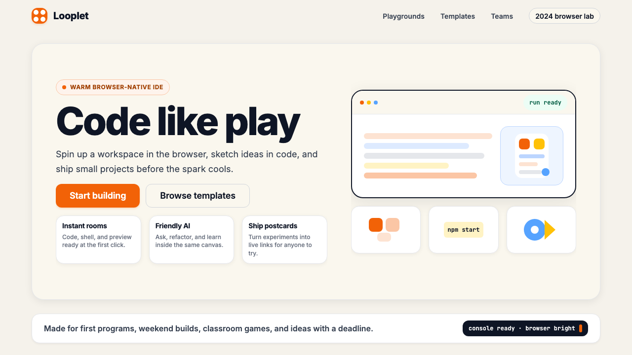 Replit 2024Coding feels warm. Coral buttons, cream panels, rounded code tiles make build…编程变得温暖:珊瑚按钮、奶油面板与圆角代码块让构建更好玩。
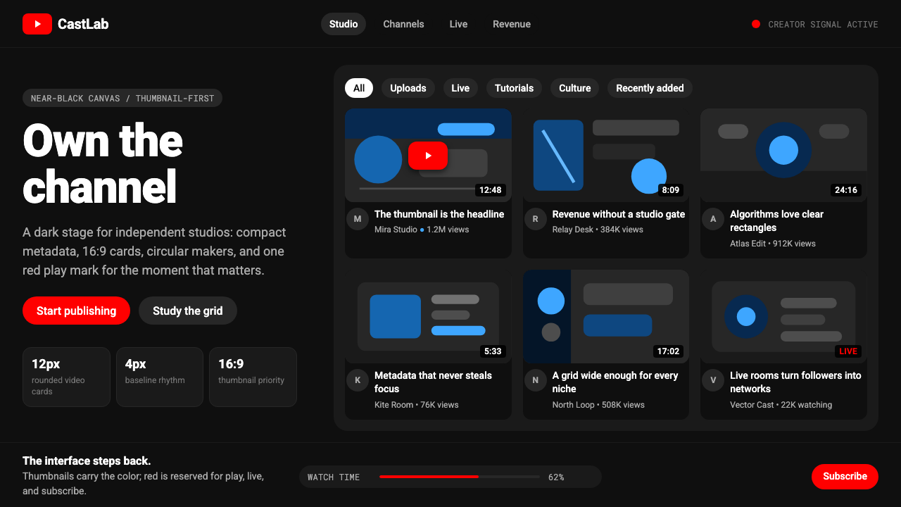 YouTube Creator EconomyThe UI disappears. Near-black Roboto grids let thumbnails shout; red only mea…界面退后:近黑Roboto网格让缩略图发声,红色只为播放。
 Google Material 3 ExpressiveA living system, themed by your wallpaper. Larger radii, tonal surfaces, emot…能从用户壁纸生成配色的活系统:更大的圆角、表面层级以色调递进取代硬边界——既几…
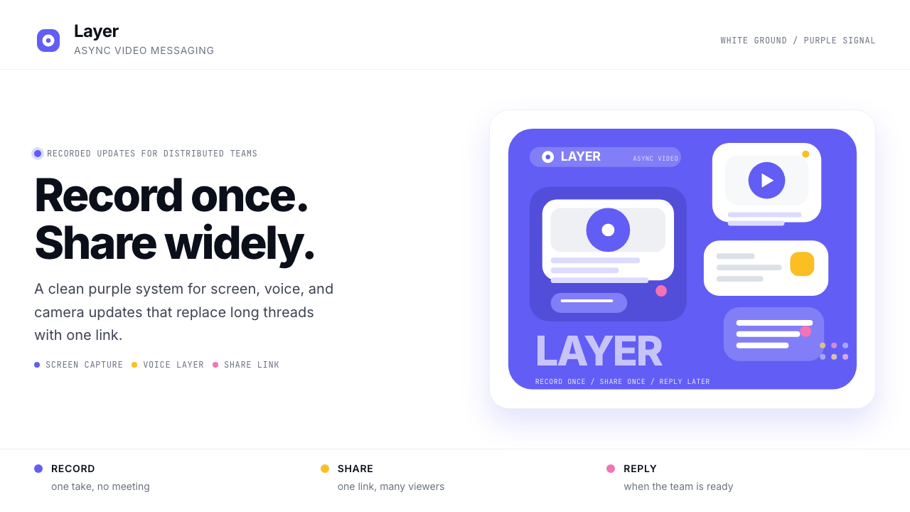 Loom Async-Video PurpleAsync, not meetings. Pure white ground, electric purple, record-button geomet…异步,不开会:纯白底、电紫与录制按钮几何。
 Sentry 2023Debugging gets weird on purpose. Purple-pink gradients, Inter heft, and doodl…故障被玩笑化:紫粉渐变、粗 Inter 与手绘虫子。
 Adobe Creative CloudUnified, not uniform. Red anchor, white space, and saturated app tiles organi…统一而不单一:红色锚点、留白与高饱和应用方块组织整套工具。