What is Sentry 2023?什么是 Sentry 2023?
Sentry's 2023 brand dares to celebrate the bug — vibrant purple-pink gradients, hand-drawn chaos, and the irreverent confidence of engineers who know software always breaks.Sentry 2023 品牌大胆地歌颂「崩溃」本身——紫粉渐变、手绘混乱,以及深知软件必然出错的工程师那股不羁的自信。
Sentry 2023 in briefSentry 2023 速览
Sentry 2023 is the brand identity visual system adopted by the application monitoring and error-tracking company Sentry during its major rebrand in the early-to-mid 2020s. Where most developer-tool companies reach for sterile blues and muted grays to project corporate reliability, Sentry chose the opposite direction: a vibrant palette anchored by deep purple and electric hot pink, layered with hand-drawn bug illustrations, loose doodles of tangled server cables, and expressive gradient washes that feel more like a band poster than an enterprise dashboard.Sentry 2023 是应用监控与错误追踪公司 Sentry 在2020年代初中期完成重大品牌重塑时所采用的视觉系统。大多数开发者工具公司选择冷静的蓝色和中性灰来投射企业可靠感,而 Sentry 却走向了完全相反的方向:以深紫色和炽热粉红为锚点的鲜明色板,叠加手绘虫子插图、缠绕服务器线缆的随意涂鸦,以及充满表现力的渐变光晕——感觉更像一张乐队海报,而非企业仪表板。
The result is a design language that carries genuine personality. It acknowledges the emotional reality of software development — the late-night panic of an outage, the dark humor that spreads through an engineering team when everything is on fire — and transforms that reality into a visual identity that engineers actually enjoy seeing. Rather than asking users to forget that failure happens, Sentry makes failure the protagonist of its visual story.由此产生的设计语言带有真实的个性。它坦率地承认软件开发的情感现实——宕机时深夜的恐慌,一切燃烧时在工程团队中蔓延的黑色幽默——并将这种现实转化为工程师真正乐于看到的视觉身份。Sentry 并不要求用户遗忘故障的存在,而是让故障成为其视觉故事的主角。
As a design style to study and apply, Sentry 2023 belongs to a growing category of developer-first brands that prioritize authenticity and subculture alignment over polish and neutrality. It combines the warmth of illustration-heavy editorial design with the structural clarity required by a data-dense SaaS product, demonstrating that these two tendencies are not in opposition.作为一种可研究和应用的设计风格,Sentry 2023 属于一个日益壮大的开发者优先品牌类别——这类品牌将真实性和亚文化认同置于精致与中立之上。它将插图丰富的编辑设计所具有的温暖感,与数据密集型 SaaS 产品所需的结构清晰度融合在一起,证明这两种倾向并非对立。
Where does Sentry 2023 come from?Sentry 2023 从何而来?
Sentry was founded in 2008 by David Cramer as an open-source error-tracking tool, initially a side project that grew out of the practical frustrations of software maintenance. For much of its early life, Sentry's visual presence was functional and unremarkable — the standard fare of a developer tool that assumed its users cared only about the product, not its packaging. This phase reflected a common assumption in the developer-tools market: that engineers are immune to branding and therefore branding is not worth investing in.Sentry 由 David Cramer 于2008年创立,最初是一个开源错误追踪工具,起源于软件维护实践中积累的切身挫败感。在早期的大部分时间里,Sentry 的视觉面貌功能性十足但平淡无奇——那是一种默认用户只关心产品本身、不在意包装的开发者工具常见面貌。这一阶段折射出开发者工具市场的一个普遍假设:工程师对品牌免疫,因此品牌不值得投资。
The shift began as Sentry scaled from a community-maintained open-source project into a venture-backed SaaS company competing for enterprise and startup engineering budgets. The brand team, led by figures including Chris Jennings, recognized that the market was becoming crowded and that visual differentiation could serve as a meaningful competitive advantage. Rather than competing on the same terms as established monitoring platforms — projecting seriousness, reliability, and enterprise readiness through conservative visual language — Sentry chose to lean into the subculture of its core users.转变始于 Sentry 从社区维护的开源项目扩张为有风险投资支持的 SaaS 公司,开始与企业和初创公司的工程预算展开竞争之时。以 Chris Jennings 为代表的品牌团队意识到,市场正在变得拥挤,视觉差异化可以成为真正有意义的竞争优势。与其在与成熟监控平台相同的维度上竞争——通过保守的视觉语言投射严肃性、可靠性和企业就绪感——Sentry 选择顺着核心用户所在的亚文化方向走。
The developers and site reliability engineers who are Sentry's primary audience have a shared cultural vocabulary: they use dark humor to cope with production incidents, they take pride in their craft while accepting that nothing works perfectly, and they are instinctively skeptical of corporate polish. The Sentry 2023 brand speaks that language directly. Hand-drawn bug characters became mascots rather than symbols of shame; gradient panels that look slightly unhinged reflect the feeling of debugging a production system at three in the morning.使用 Sentry 的开发者和站点可靠性工程师拥有共同的文化词汇:他们用黑色幽默应对生产事故,他们在接受任何事物都不可能完美运行的同时对自己的工艺感到自豪,他们对企业精致感本能地抱有怀疑。Sentry 2023 品牌直接说着这种语言。手绘虫子角色成为吉祥物而非羞耻符号;看起来略显疯狂的渐变面板,折射出凌晨三点调试生产系统的真实感受。
The visual style draws on a broader moment in technology branding where illustration-heavy, personality-forward design systems became popular among developer tools, productivity applications, and direct-to-consumer software brands. Companies across the industry were rediscovering that engineering audiences respond to authenticity in the same way any audience does — and that a brand willing to joke about its own domain earns trust faster than one that projects false confidence. Sentry's execution stands out because the irreverence is consistent and substantive, not a superficial coat of personality over a conventional structure.这种视觉风格依托于科技品牌领域的一个更宏观的时刻——插图丰富、个性鲜明的设计系统在开发者工具、生产力应用和直面消费者的软件品牌中日趋流行。整个行业的公司都在重新发现:工程师受众对真实性的回应方式与任何受众无异——而一个愿意拿自身领域开玩笑的品牌,比一个投射虚假信心的品牌更快赢得信任。Sentry 的执行之所以突出,在于这种不羁是一贯而实质性的,而非覆盖在传统结构之上的表面个性涂层。
What defines the Sentry 2023 look?Sentry 2023 的视觉特征是什么?
Purple-Pink Gradient Identity紫粉渐变身份
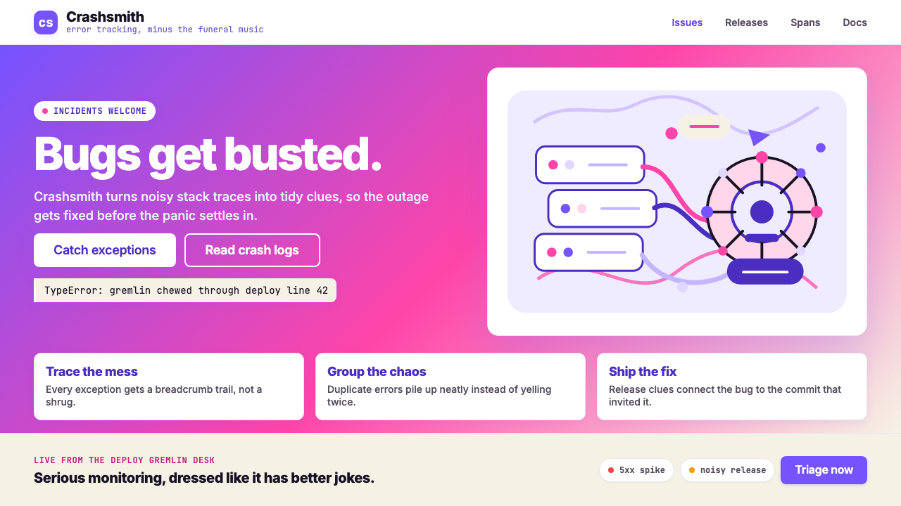
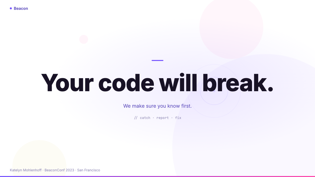
The defining color signature is a bold sweep from deep violet-purple through electric hot pink, used as a background wash, hero panel, or accent field rather than as a subtle highlight. This gradient is unapologetically vivid — it saturates without apology — and gives Sentry's materials an immediate recognizability in a landscape dominated by blues and grays. The gradient functions as a mood carrier as well as a brand marker, evoking both the urgency of a real-time alert and the slightly unhinged energy of a developer staring at a cascading stack trace.最具决定性的色彩标志是从深紫罗兰色扫过炽热粉红的大胆渐变,被用作背景光晕、主视觉面板或强调色区域,而非微妙的点缀。这种渐变毫无歉意地饱和——在蓝色和灰色主导的设计风景中赋予 Sentry 材料以即时可辨认性。渐变既是情绪载体也是品牌标志,同时唤起实时警报的紧迫感和开发者盯着层叠堆栈跟踪时那股略显失控的能量。
Hand-Drawn Illustration Language手绘插图语言
Sentry's visual system incorporates a distinctive illustration vocabulary built around hand-drawn characters, doodle-style annotations, and loosely sketched technical objects — bugs with personalities, servers trailing tangled wires, error codes rendered as cartoonish artifacts. These illustrations are executed with deliberate imperfection: visible line wobble, inconsistent fill, and a sketchbook quality that signals human authorship. The effect is warmth and humor inserted into a context that is often stressful, directly opposing the sterile infographic style that dominates developer tool marketing.Sentry 的视觉系统包含一套独特的插图词汇,围绕手绘角色、涂鸦式注释和随意素描的技术对象构建——有个性的虫子、拖着缠绕电线的服务器、被渲染为卡通文物的错误代码。这些插图以刻意的不完美执行:可见的线条抖动、不均匀的填充,以及一种传达人类作者身份的速写本质感。效果是将温暖与幽默注入一个通常充满压力的语境,直接对抗主导开发者工具营销的无菌信息图风格。
Heavy-Weight Type with Personality有个性的大字重排版
Typography in the Sentry 2023 system leans toward heavy weights — thick strokes, assertive presence, the visual mass of a headline that knows it is important. Sentry's brand adopted Inter as a core workhorse typeface, deployed in its boldest registers for display text, allowing letterforms to claim significant visual territory. The typographic tone matches the brand personality: direct, confident, and slightly irreverent. Headline text is often set large enough to feel bold even in a layout that includes complex data or dense interface elements.Sentry 2023 系统中的排版倾向于大字重——粗笔画、强势存在感、一行知道自己重要的标题所具有的视觉分量。Sentry 品牌采用 Inter 作为核心工作字体,在展示文本中使用最粗的字重,让字形占据显著的视觉领地。排版基调与品牌个性相配:直接、自信,略带不羁。标题文字通常设置得足够大,即使在包含复杂数据或密集界面元素的版面中也能感受到大胆。
Dark Ground with Luminous Accents深色底面搭配发光强调
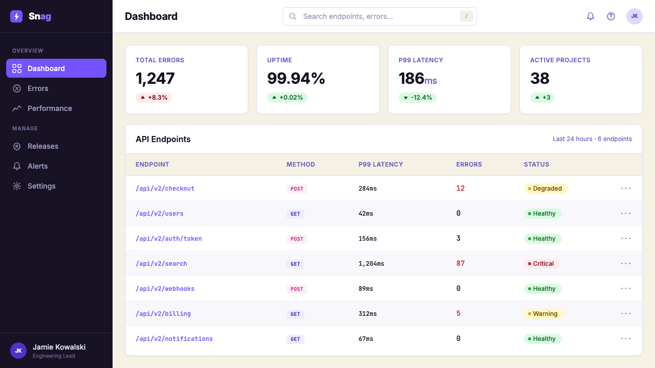
While Sentry's marketing materials do use lighter backgrounds in some contexts, a characteristic mode is dark — near-black panels that make the purple-pink gradients glow with particular intensity, like neon on pavement. This dark base gives the brand an association with after-hours technical work and the glow of screens in dim environments. Light text on dark ground, combined with gradient bursts and brightly colored illustration details, creates a composition that feels energized rather than somber.虽然 Sentry 的营销材料在某些场景下也使用较浅的背景,但一种特征性的模式是暗色——近乎黑色的面板让紫粉渐变以特别的强度发光,像沥青路面上的霓虹灯。这种深色底面赋予品牌一种与深夜技术工作及昏暗环境中屏幕光晕的关联。深色底面上的浅色文字,结合渐变爆发和色彩鲜明的插图细节,创造出一种充满活力而非沉郁的构图。
Confident Spatial Generosity自信的空间慷慨
Despite the visual richness of its palette and illustration work, Sentry 2023 does not feel cluttered. Hero sections give key messages room to breathe; gradient panels are used as large fields rather than squeezed accents; the overall layout structure maintains clear hierarchy even when illustration and typography compete for attention. This spatial generosity reflects a brand with the confidence to leave things out — to trust that the strength of the core visual identity can carry a page without filling every corner.尽管调色板和插图工作在视觉上丰富多彩,Sentry 2023 并不显得杂乱。主视觉区域给关键信息留有呼吸空间;渐变面板被用作大面积区域而非压缩的点缀;即使插图和排版相互竞争注意力,整体版面结构也维持清晰的层级。这种空间慷慨折射出一个品牌所具有的自信——相信核心视觉身份的力量足以承载页面,无需填满每个角落。
Technical Honesty as Visual Theme技术诚实作为视觉主题
Sentry makes the subject matter of its business — errors, crashes, stack traces, broken builds — the actual content of its visual identity rather than hiding it behind aspirational abstractions. Error messages appear in marketing imagery, bug characters are depicted with humor rather than shame, and the color palette itself suggests a system under some degree of stress. This thematic honesty is a design decision as much as a brand strategy: it creates immediate visual resonance with the audience because it represents their daily experience without sanitizing it.Sentry 将其业务的主题——错误、崩溃、堆栈跟踪、构建失败——作为视觉身份的实际内容,而非将其隐藏在鼓励性的抽象概念之后。错误信息出现在营销图像中,虫子角色以幽默而非羞耻的姿态被描绘,调色板本身暗示着一个处于某种程度压力下的系统。这种主题诚实既是设计决策也是品牌策略:它与受众产生即时的视觉共鸣,因为它如实呈现了他们的日常体验,没有加以净化。
Gradient as Structural Element渐变作为结构元素
Rather than using gradients as atmospheric backgrounds, Sentry 2023 treats them as deliberate layout zones — a gradient panel defines a section, creates a visual anchor, or marks a transition between types of content. The gradients are directional and purposeful: they flow from corner to center or across horizontal bands in ways that guide reading order. This structural use of gradient is distinct from decorative gradient application and gives Sentry's pages a dynamic sense of movement that static flat color cannot achieve.Sentry 2023 没有将渐变用作大气背景,而是将其视为刻意的版面区域——渐变面板定义一个版块、创造视觉锚点、或标记不同内容类型之间的过渡。渐变是有方向性和目的性的:它们从角落流向中心,或横跨水平色带,以引导阅读顺序。这种渐变的结构性使用有别于装饰性渐变应用,赋予 Sentry 页面一种静态平面色彩无法实现的动态运动感。
Who shaped Sentry 2023?谁塑造了 Sentry 2023?
David Cramer co-founded Sentry in 2008 as an open-source error-tracking tool, originally building it to solve his own frustrations with production debugging. His engineering-first orientation shaped the company's early culture and its commitment to developer experience as the primary product value. While the visual evolution of the Sentry brand came later and through a dedicated brand team, Cramer's founding ethos — that developers deserve honest, practical tools that acknowledge the real difficulty of software maintenance — provides the philosophical foundation that the 2023 visual identity expresses.David Cramer 于2008年联合创立了 Sentry,最初以开源错误追踪工具的形式,为解决自身在生产调试中的挫败感而构建。他以工程为先的取向塑造了公司早期文化,以及将开发者体验作为首要产品价值的承诺。虽然 Sentry 品牌的视觉演变来得更晚,由专门的品牌团队完成,但 Cramer 的创始精神——开发者应得到诚实、实用的工具,承认软件维护的真实难度——为2023年视觉身份所表达的哲学奠定了基础。
Chris Jennings played a key role in shaping the Sentry brand identity during its evolution toward the 2023 visual system. As part of the brand leadership, Jennings helped articulate the strategic decision to embrace developer subculture as a brand positioning — to move away from generic enterprise aesthetics toward the irreverent, illustration-driven identity that Sentry is now known for. This work required arguing for a brand direction that many conventional advisors would have considered risky for an enterprise-aspiring SaaS product.Chris Jennings 在 Sentry 品牌向2023年视觉系统演进的过程中扮演了关键角色。作为品牌领导层的一员,Jennings 帮助阐明了将开发者亚文化作为品牌定位这一战略决策——从通用的企业美学转向 Sentry 如今为人所知的不羁的、以插图驱动的身份。这项工作要求为一个许多传统顾问会认为对有企业抱负的 SaaS 产品而言风险较高的品牌方向进行论证。
The Sentry Brand Team — the collective of designers, illustrators, and brand strategists who built and maintain the 2023 visual system — deserves credit as a creative unit. The coherence and depth of the Sentry identity, from the illustration vocabulary to the gradient system to the typographic voice, reflects sustained collaborative effort rather than a single authorial vision. The team's willingness to develop a distinctive illustration language, rather than licensing stock imagery or adopting a generic icon set, was the single most consequential creative decision in defining what Sentry 2023 looks like.构建并维护2023年视觉系统的设计师、插图师和品牌策略师的集合体——Sentry 品牌团队——作为一个创意单元值得认可。Sentry 身份的连贯性与深度,从插图词汇到渐变系统再到排版声音,折射出持续的协作努力而非单一的作者愿景。团队愿意开发独特的插图语言——而非授权使用图库图像或采用通用图标集——是定义 Sentry 2023 外观的最具决定性的创意决策。
While not a Sentry employee, the designer of the Inter typeface — Rasmus Andersson — contributed an essential component of the Sentry 2023 visual identity. Inter was designed specifically for screen interfaces, optimized for legibility at both large display and small UI sizes, and became the default choice for a generation of digital products seeking a neutral yet characterful sans-serif. Sentry's adoption of Inter and deployment of it in heavy weights for display use gave the brand its typographic backbone — the voice of the brand's written tone depends significantly on how Inter reads at scale.虽然不是 Sentry 员工,但 Inter 字体的设计师——Rasmus Andersson——为 Sentry 2023 视觉身份贡献了一个核心组件。Inter 专为屏幕界面设计,在大型展示和小型 UI 尺寸下均针对可读性进行了优化,成为寻求中性而有特色无衬线字体的一代数字产品的默认选择。Sentry 采用 Inter 并在展示用途中以大字重部署,赋予品牌排版骨干——品牌书面语气的声音在很大程度上取决于 Inter 在大尺寸下的阅读效果。
Sentry 2023 did not emerge in isolation — it belongs to a broader movement of developer-first companies that began rethinking the assumption that technical audiences are indifferent to design. Companies like Vercel, Linear, Raycast, and Tailwind Labs demonstrated in roughly the same period that well-considered visual identity could function as a developer recruiting tool, a community signal, and a competitive differentiator simultaneously. Sentry's contribution to this movement was to push further into humor and illustration than most, betting that authentic irreverence would resonate more deeply than polished minimalism.Sentry 2023 并非在真空中出现——它属于一个更广泛的开发者优先公司运动,这些公司开始重新审视技术受众对设计漠不关心这一假设。Vercel、Linear、Raycast 和 Tailwind Labs 等公司在大致相同的时期展示了,经过深思熟虑的视觉身份可以同时作为开发者招募工具、社区信号和竞争差异化因素。Sentry 对这一运动的贡献是比大多数公司更深入地推进幽默和插图,押注真实的不羁会比精致的极简主义产生更深刻的共鸣。
How do you use Sentry 2023 today?今天怎么用 Sentry 2023?
Sentry 2023 works best when the product or communication being designed shares its core tension: something serious delivered with personality, technical content that benefits from approachability, a brand that wants to be remembered as different rather than merely competent. The style is a strong fit for developer tools, engineering blogs, error-monitoring dashboards, incident retrospectives, and any product whose audience is comfortable with technical humor.Sentry 2023 在被设计的产品或传播内容与其核心张力相符时效果最佳:以个性传递严肃内容,技术内容从亲切感中受益,品牌希望以与众不同而非仅仅称职被记住。这种风格非常适合开发者工具、工程博客、错误监控仪表板、事故复盘,以及任何受众对技术幽默感到自在的产品。
For presentation slides, Sentry 2023 creates striking covers with minimal elements: a large gradient panel sweeping from deep purple to hot pink behind bold display type, perhaps a single hand-drawn bug or doodle motif in a corner, and a brand mark that floats freely in the composition. The goal is a cover that feels like a concert poster for a band that also writes production code. Content slides should reserve gradient backgrounds for section openers or data highlights; body slides work better with a near-black or very dark ground with light type, using the gradient sparingly as a horizontal accent band or card background. Data slides should treat charts as compositional objects — bar charts in gradient-filled bars, alert counts in vivid pink numerals — making the data itself feel as dynamic as the brand.在演示文稿中,Sentry 2023 以最少的元素创造出引人注目的封面:一块从深紫色扫至热粉红的大渐变面板衬托粗大的展示字体,也许在角落有一个手绘虫子或涂鸦元素,品牌标志自由漂浮在构图中。目标是一个感觉像是为同样编写生产代码的乐队所设计的演唱会海报封面。内容幻灯片应将渐变背景保留给章节起始页或数据高亮;正文幻灯片在近黑色或深色底面配浅色文字的基础上效果更好,将渐变作为水平强调色带或卡片背景少量使用。数据幻灯片应将图表视为构图对象——渐变填充条的柱状图、以鲜明粉红色数字呈现的警报计数——使数据本身与品牌一样充满动感。
For web UI, dashboards, and pricing pages, Sentry 2023 translates into a dark-ground interface where gradient cards mark important states, bold typography creates instant hierarchy, and illustration details (small bug characters, doodle annotations) humanize what would otherwise be a purely data-driven experience. Pricing tables benefit from the style's boldness: a highlighted plan tier with a gradient background and heavy type at large scale immediately signals the recommended choice without requiring subtle visual cues. Navigation should remain typographic and spacious — the illustration work lives in hero areas and feature callouts, not in navigation elements where it would create visual noise.对于网页 UI、仪表板和定价页面,Sentry 2023 转化为以深色为底的界面:渐变卡片标记重要状态,粗体排版创造即时层级,插图细节(小虫子角色、涂鸦注释)使本来纯粹以数据驱动的体验人性化。定价表从这种风格的大胆感中受益:带渐变背景和大尺寸粗体的高亮计划层级,无需细微的视觉提示即可立即发出推荐选择的信号。导航应保持字体性和宽松感——插图工作存在于主视觉区域和功能标注中,而非在导航元素中(在那里会产生视觉噪音)。
For editorial, marketing pages, and conference materials, Sentry 2023 has direct poster-like applicability. Full-width gradient hero sections with large-scale type anchor the page. Illustration elements — hand-drawn bugs, tangled cable motifs, error messages rendered as visual art — appear as section decorations and serve to break the monotony of text-heavy content. Marketing emails in this style should use a single large gradient block at the header, black background through the body, and a brightly colored call-to-action button that references the brand's hot pink. Conference booth and swag applications benefit from the style's bold contrast and illustration vocabulary, translating naturally to large-format print.对于编辑、营销页面和会议材料,Sentry 2023 具有直接的海报式适用性。全宽渐变主视觉区域配大尺寸文字锚定页面。插图元素——手绘虫子、缠绕电缆母题、被渲染为视觉艺术的错误信息——作为版块装饰出现,打破文字密集内容的单调。这种风格的营销邮件应在标题使用一个大渐变色块,正文部分使用黑色背景,并使用参照品牌热粉红的鲜明颜色行动按钮。会议展位和周边产品应用从这种风格的强烈对比和插图词汇中受益,自然地转化为大幅面印刷。
A common mistake when applying Sentry 2023 is treating the gradient as the entire design — simply applying purple-to-pink behind text and calling the work done. What makes the style coherent is the interplay between the gradient system, the typographic weight, and the illustration language; removing any one of these produces a derivative result that lacks the brand's depth. A second frequent error is using the illustration vocabulary without understanding its tone: hand-drawn elements must feel spontaneous and characterful, not clip-art generic. If the illustrations feel like they came from a stock library, the authenticity the style depends on evaporates. When in doubt, apply less illustration with higher quality over more illustration with lower character.应用 Sentry 2023 时最常见的错误是将渐变视为整个设计——仅仅在文字后面应用紫色到粉色渐变就宣告工作完成。使这种风格连贯的是渐变系统、字重和插图语言之间的相互作用;去掉其中任何一个都会产生缺乏品牌深度的衍生结果。第二个常见错误是在没有理解其语气的情况下使用插图词汇:手绘元素必须感觉是自发的、有个性的,而非通用的剪贴画。如果插图感觉来自图库,这种风格所依赖的真实性就会消散。如有疑问,以更少但质量更高的插图取代更多但特色不足的插图。
Sentry 2023 — FAQSentry 2023 · 常见问题
Is Sentry 2023 appropriate for a product that is not a developer tool?Sentry 2023 适合用于非开发者工具类产品吗?
The visual language can be borrowed, but the context matters significantly. The reason the Sentry identity works is that its humor, palette, and illustration content are authentically aligned with its audience's culture. Transplanting the gradient-plus-doodle formula to a product whose users do not share that cultural context risks feeling like costume rather than character — the aesthetic without the substance. That said, the structural elements of the style (dark grounds with luminous gradient accents, heavy display type, generous spatial hierarchy) can transfer to other technical or creative products that want to project confident personality. The illustration vocabulary is the element most tightly bound to the developer context.视觉语言可以借鉴,但语境很重要。Sentry 身份之所以有效,是因为其幽默、色板和插图内容与受众文化真实契合。将渐变加涂鸦的公式移植到用户不共享该文化语境的产品上,有变成服装而非性格的风险——有美学而无实质。话虽如此,这种风格的结构性元素(带发光渐变强调的深色底面、大字重展示排版、慷慨的空间层级)可以转移到其他想要投射自信个性的技术或创意产品。插图词汇是与开发者语境联系最紧密的元素。
How do you maintain readability when using such a vivid, high-saturation palette?在使用如此鲜艳、高饱和度的调色板时,如何维持可读性?
The key is contrast management. Sentry 2023 achieves readability not by reducing the saturation of its accent colors but by using them as backgrounds for large-scale display text rather than body text, and by maintaining near-black or near-white grounds for text-dense sections. The gradient panels are not used behind paragraphs of information — they are used behind single headlines, statistics, or calls to action where a few words must communicate instantly. Body text lives on dark-but-not-gradient grounds, maintaining strong contrast without competing with the accent colors. When in doubt, test: legibility always wins over aesthetic fidelity.关键是对比度管理。Sentry 2023 通过将饱和的强调色用作大尺寸展示文字而非正文的背景,并在文字密集的版块维持近黑或近白的底面来实现可读性——而非降低强调色的饱和度。渐变面板不用于信息段落之后,而用于单行标题、统计数字或行动号召——在那里少数文字必须即时传达。正文生活在深色但非渐变的底面上,维持强烈对比度而不与强调色竞争。有疑问时,请进行测试:可读性永远优先于美学忠实度。
Can this style work for light-mode interfaces?这种风格能用于浅色模式界面吗?
Yes, with adaptation. While Sentry's own brand is primarily associated with dark grounds, the style adapts to light mode by inverting the hierarchy: a near-white or very light gray base, with the purple-pink gradient appearing as card backgrounds, section accents, or interactive state indicators rather than as full-page washes. The illustration vocabulary transfers directly — hand-drawn elements read just as well on light grounds. Typography should remain bold and assertive. The overall effect in light mode is slightly less dramatic but still recognizable as the same design language. Light mode versions work particularly well for long-form content where sustained reading comfort is important.可以,但需要适配。虽然 Sentry 自身的品牌主要与深色底面关联,但通过反转层级,这种风格可以适配浅色模式:近白或非常浅的灰色底面,紫粉渐变作为卡片背景、版块强调或交互状态指示器出现,而非全页面铺设。插图词汇可以直接转移——手绘元素在浅色底面上同样清晰可读。排版应保持粗体和自信。浅色模式下的整体效果稍欠戏剧性,但仍可辨认为相同的设计语言。浅色模式版本特别适合长篇内容,在那里持续阅读的舒适度很重要。
How much illustration is too much?插图用多少算太多?
A useful principle: illustrations should appear at moments of transition or emphasis — section breaks, empty states, hero moments — not as continuous decoration throughout a layout. When every panel has an illustration, none of them create the punctuation effect that makes the style work. Sentry's own materials demonstrate restraint: large gradient panels are often clear of illustration; a single well-placed bug character in a hero area is more effective than five scattered through a page. The goal is for each illustration to feel discovered rather than applied — something that rewards attention rather than competes for it.一个有用的原则:插图应出现在过渡或强调时刻——版块间隔、空状态、主视觉时刻——而非作为贯穿版面的连续装饰。当每个面板都有插图时,没有一个能产生使这种风格奏效的标点效果。Sentry 自身的材料展示了克制:大型渐变面板通常不带插图;主视觉区域一个放置得当的虫子角色比五个散落在页面上的更有效。目标是让每个插图感觉像是被发现而非被应用——奖励注意力的东西,而不是与之竞争的东西。
How does Sentry 2023 relate to other developer-tool visual identities like Vercel or Linear?Sentry 2023 与 Vercel 或 Linear 等其他开发者工具视觉身份有何关联?
Vercel, Linear, and Sentry represent three distinct positions within developer-first branding. Vercel's identity is precision minimalism — near-monochromatic, typographic, extremely disciplined — projecting the confidence of an infrastructure company that needs no visual decoration to be taken seriously. Linear occupies a similar minimal pole but with softer gradients and a more editorial feel. Sentry occupies the opposite extreme: it is the loudest, most personality-forward, and most illustration-rich of the cohort. All three are explicitly departing from generic enterprise SaaS aesthetics, but they do so in different directions. Understanding these positions helps practitioners choose which model fits a given product: minimal authority, editorial precision, or expressive personality.Vercel、Linear 和 Sentry 代表了开发者优先品牌中的三个不同立场。Vercel 的身份是精准极简——接近单色、以排版为主、极度克制——投射出一家不需要视觉装饰就能被认真对待的基础设施公司的信心。Linear 占据类似的极简极点,但带有更柔和的渐变和更具编辑感的氛围。Sentry 占据相反的极端:是该群体中最响亮、个性最鲜明、插图最丰富的。三者都明确地脱离了通用企业 SaaS 美学,但方向各异。理解这些立场有助于从业者选择哪种模式适合特定产品:极简权威、编辑精准,还是表现个性。
Related design styles相关设计风格
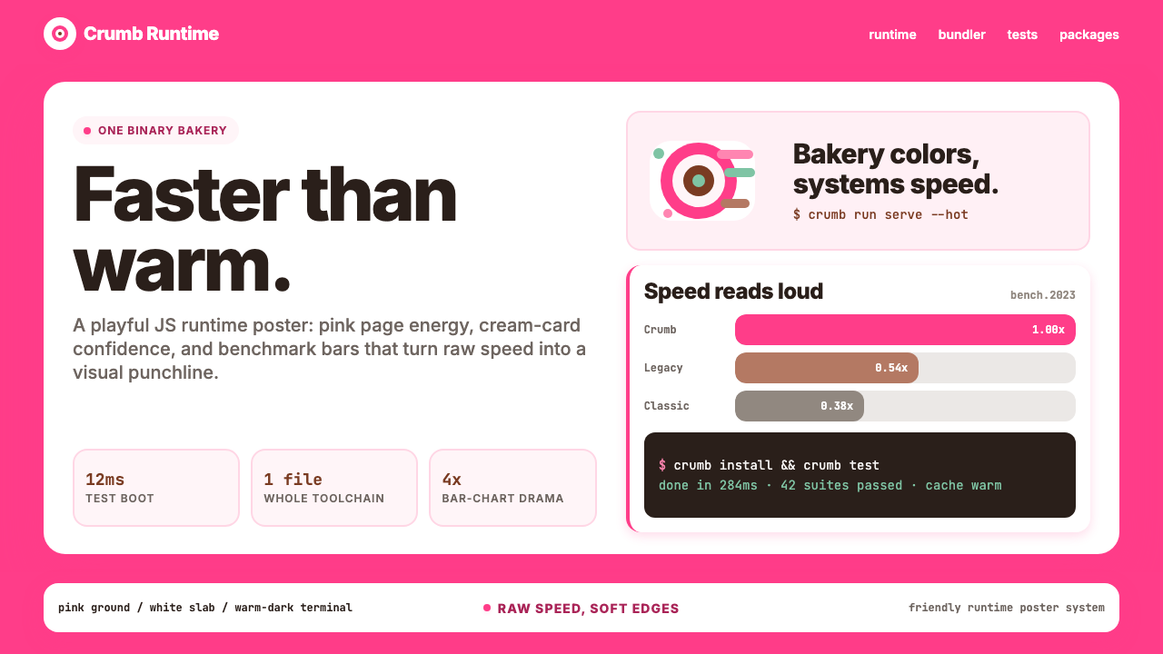 Bun JS Runtime Pink 2023Dev speed gets bakery-bright. Hot pink grounds white slabs, mono bars, and wa…开发速度像烘焙店一样明亮:热粉底、白卡片、等宽基准条与暖黑终端。
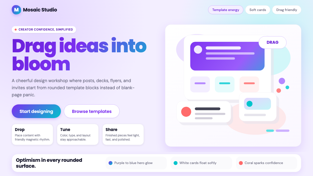 Canva 2024Confidence feels draggable. Purple-blue gradients and floating white template…信心可拖拽:紫蓝渐变与漂浮白卡,让创作变柔和。
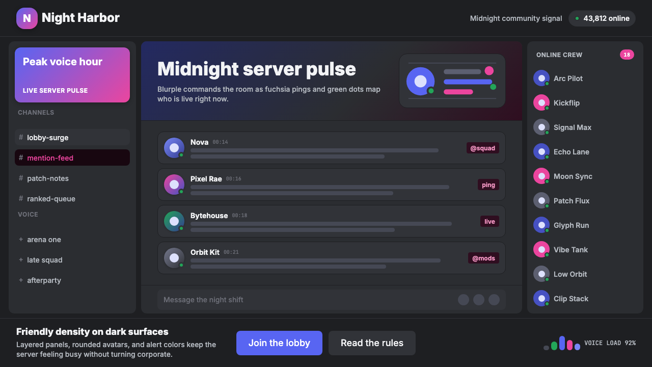 Discord Blurple Server (2020)Midnight server energy. Blurple panels, fuchsia pings, and green status dots…午夜服务器能量:蓝紫面板、品红提醒、在线绿点保持密集。
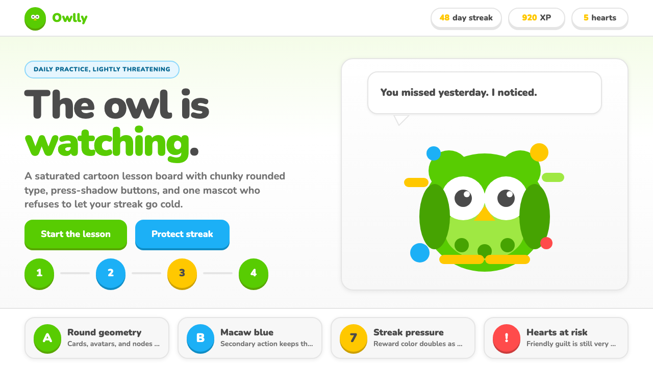 Duolingo Green Owl MascotFriendly guilt goes loud. Saturated green, Nunito heft, and press-shadow butt…友好内疚很响亮:高饱和绿、厚重 Nunito 与按压阴影盯住连胜。
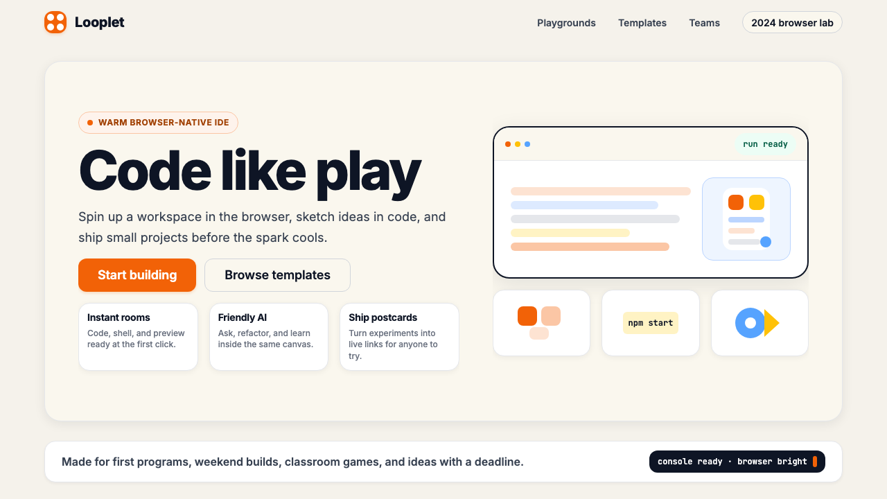 Replit 2024Coding feels warm. Coral buttons, cream panels, rounded code tiles make build…编程变得温暖:珊瑚按钮、奶油面板与圆角代码块让构建更好玩。
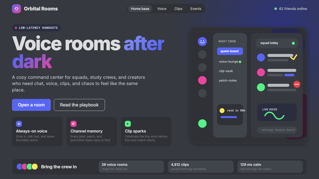 Discord 2024Blurple cozy. Charcoal grounds, illustrated characters — every surface says '…刻意去企业化的语音聊天:blurple 蓝紫、深炭灰底、俏皮插画角色——每个界…