What is Discord 2024?什么是 Discord 2024?
Discord turned a gamer voice-chat tool into a universal community platform by committing to one bold, proprietary blue-purple — and building a deliberately anti-corporate visual language around it.Discord 凭借一种大胆的专属蓝紫色,将游戏语音工具演变为全球社区平台,并围绕它构建了一套刻意去企业化的视觉语言。
Discord 2024 in briefDiscord 2024 速览
Discord 2024 is the visual identity system that emerged from the platform's 2021 rebrand and matured through subsequent years of product expansion. Its defining characteristic is a signature blue-purple — known within the brand as 'blurple' — deployed against deep charcoal dark-mode backgrounds that evoke the atmosphere of a late-night gaming session. The result is an interface that feels warm and inhabited rather than clinical or transactional.Discord 2024 是该平台于 2021 年品牌重塑后逐渐成熟、并随产品不断扩张而演进的视觉识别系统。其最鲜明的特征是一种品牌内部称为「blurple」的标志性蓝紫色,与深炭灰暗色背景相互映衬,营造出深夜联机游戏时那种温暖而沉浸的氛围,让整个界面充满了「有人在」的生活气息,而非冷冰冰的工具感。
The design language is built on deliberate contrasts: dark, cozy backgrounds offset by bright, punchy accent colors; rounded, friendly corners on every surface; illustrated characters that are loose and expressive rather than corporate-polished. Typography stays tight and clean, using scaled sans-serif headings to organize information without imposing formality. Color accents — fuchsia, yellow, green, and red — appear selectively as semantic signals rather than decoration.这套设计语言建立在刻意营造的对比之上:深邃温暖的背景与明亮活泼的强调色相互呼应;每个界面元素都采用圆润友好的边角;插画角色随性而有表现力,远离企业精修感。字体排版保持紧凑干净,以多层级无衬线大字标题来组织信息,却不引入任何刻板感。品红、黄、绿、红等强调色有选择地出现,作为语义信号而非纯粹装饰。
What makes Discord's visual system distinctive is its explicit rejection of enterprise aesthetics. Where productivity software trends toward neutral greys and restrained palettes, Discord leans into saturation, personality, and the visual grammar of digital leisure. Every design decision reinforces the platform's core proposition: this is a place to hang out, not a place to file reports.Discord 视觉系统的独特之处在于它对企业美学的主动拒绝。当生产力软件普遍走向中性灰调和克制色板时,Discord 选择拥抱饱和度、个性与数字休闲的视觉语法。每一个设计决策都在强化平台的核心主张:这是一个「来玩」的地方,不是一个「来上班」的地方。
Where does Discord 2024 come from?Discord 2024 从何而来?
Discord was founded in 2015 by Jason Citron and Stanislav Vishnevskiy, initially as a purpose-built voice and text communication tool for video game players. The earliest versions of the product were functional above all else — the design served the need to get voice chat working with low latency, not to make aesthetic statements. Adoption was rapid among gaming communities, particularly those organizing raids, matches, and guild coordination where real-time voice was essential.Discord 由 Jason Citron 和 Stanislav Vishnevskiy 于 2015 年创立,最初是专为视频游戏玩家打造的语音与文字通信工具。早期版本首要追求功能性——设计服务于以低延迟实现语音通话的需求,而非任何美学表达。产品在游戏社区中迅速普及,尤其受到需要协调副本、对战和公会事务的玩家青睐,实时语音对他们至关重要。
By the late 2010s, Discord had outgrown its original audience. Study groups, fan communities, open-source developer teams, and professional networks had discovered that the server-and-channel architecture worked just as well for their needs. This expansion created a branding challenge: the platform needed a visual identity that could serve a vastly broader and more diverse user base without abandoning the authenticity that had earned its original community's loyalty.2010 年代末,Discord 已远远超出了最初的受众边界。学习小组、粉丝社区、开源开发者团队和专业人士圈子纷纷发现,服务器加频道的架构同样契合他们的需求。这一扩张带来了品牌挑战:平台需要一套视觉识别体系,既能服务于更广泛、更多元的用户群,又不能失去令最初社区忠心耿耿的那份真实感。
The pivotal moment came with the 2021 rebrand, led by Buck, a New York-based illustration and animation studio. Buck's brief was to create a visual system that felt playful, inclusive, and genuinely different from both the gaming-adjacent aesthetic Discord had inherited and the clean corporate look of workplace tools like Slack. The solution centered on the illustrated character Wumpus — a rounded, expressive mascot — and the introduction of blurple as a fully owned brand color. The rebrand also introduced the wider cast of illustrated characters that gave Discord's marketing materials a distinctive personality: loose, warm, and slightly chaotic in a way that felt authentic to internet culture.转折点发生在 2021 年的品牌重塑,主导方是纽约插画与动画工作室 Buck。Buck 的任务是创建一套视觉系统,既要俏皮、包容,又要真正有别于 Discord 早期沾染的游戏亚文化审美,以及 Slack 等职场工具的整洁企业风。解决方案以圆润而富有表情的吉祥物 Wumpus 为核心,同时将 blurple 确立为完全属于 Discord 的品牌色。重塑还引入了更多插画角色阵容,赋予 Discord 营销素材鲜明的个性:随性、温暖,带着一丝契合互联网文化的轻度混乱感。
The Discord brand team continued developing and refining the system from 2021 through 2024, expanding the character library, codifying the dark-mode UI principles that govern the product interface, and working out how the illustrative warmth of the marketing layer could coexist with the functional requirements of a complex real-time communication platform. The result is a system with two registers: a more expressive, character-driven marketing face and a disciplined, hierarchy-focused product face, unified by the blurple anchor and the consistent language of rounded forms and punchy accents.Discord 品牌团队在 2021 年至 2024 年间持续发展和打磨这套体系:扩充角色库,将深色模式 UI 的规范原则系统化,并探索如何让营销层面的插画温度与一个复杂实时通信平台的功能需求和谐共存。最终形成的是一个具有双重调性的系统:面向市场的表达层更具角色感和感染力,面向产品的功能层则注重层级与克制,两者通过 blurple 这一锚点以及一致的圆润形态语言和活泼强调色统一在一起。
What defines the Discord 2024 look?Discord 2024 的视觉特征是什么?
Blurple as Brand Anchorblurple 作为品牌锚点
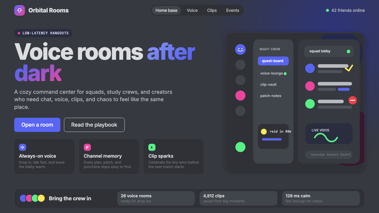
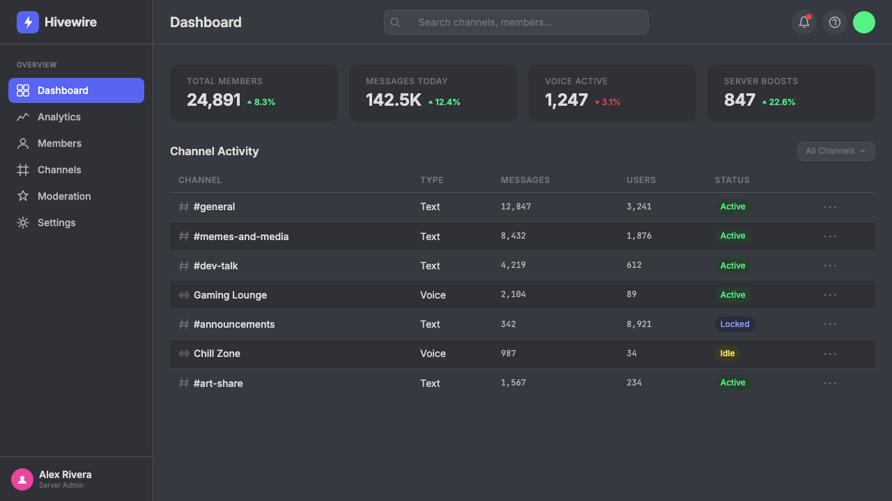
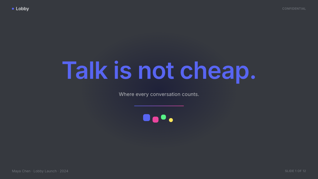
The signature blue-purple sits at the center of Discord's entire visual identity. It is saturated enough to be immediately recognizable in any context, but cool enough in tone to read as trustworthy rather than aggressive. All other colors in the palette — the dark backgrounds, the punchy accents, the near-white text — are tuned to work with blurple rather than compete with it. Using blurple sparingly and consistently is what prevents the palette from feeling chaotic despite its breadth.标志性蓝紫色处于 Discord 整个视觉识别体系的核心。它饱和度足够高,在任何场景中都一眼可辨,同时色调偏冷,读来可信而非咄咄逼人。色板中的其他所有色彩——深色背景、活泼强调色、近白文字——都经过调校,以与 blurple 协作而非竞争。正是对 blurple 的克制而一致的运用,让整个色板在宽幅之下仍不显混乱。
Dark Charcoal Grounds深炭灰底面
Discord's product interface defaults to deep charcoal backgrounds across multiple tonal steps, from the darkest sidebar to the slightly lighter main content area to the elevated surfaces of modals and cards. These dark grounds create a sense of depth through tonal layering rather than cast shadows or gradients. The atmosphere is deliberately nocturnal and immersive — the digital equivalent of a dimly lit room where a group of friends has gathered.Discord 产品界面默认采用多层次深炭灰背景,从最深的侧边栏,到稍浅的主内容区,再到弹窗与卡片的浮起表面,通过色调分层制造纵深感,而非依赖投影或渐变。整体氛围刻意营造出夜间沉浸的感觉——仿佛一间灯光昏暗的房间里,一群朋友聚在一起。
Punchy Semantic Accents活泼的语义强调色
Beyond blurple, the palette includes vivid fuchsia, yellow-green, warm yellow, and red, each carrying a specific semantic role. Green signals online status and positive states; red indicates danger, deletion, or offline; yellow flags warnings; fuchsia appears in marketing and expressive moments. These accents are bright enough to pop on dark backgrounds without requiring large surface areas — they work at the scale of a status dot or a button label.除 blurple 之外,色板还包含鲜艳的品红、黄绿、暖黄与红色,各自承载特定的语义角色。绿色代表在线状态和正向状态;红色指示危险、删除或离线;黄色标记警告;品红出现在营销素材和富有表现力的场合。这些强调色在深色背景上足够亮眼,无需大面积铺陈——在状态点或按钮标签的尺度上同样奏效。
Rounded, Friendly Surfaces圆润友好的界面形态
Every container in the Discord design system — cards, buttons, input fields, avatar frames, modal dialogs — uses generously rounded corners. The effect is a visual softness that distinguishes the product from harder-edged enterprise software. Rounded corners are not merely aesthetic here; they reinforce the brand's social and recreational register, signaling that interactions in this space are lower-stakes and more forgiving than in a productivity tool.Discord 设计系统中的每一个容器——卡片、按钮、输入框、头像框、模态对话框——都采用大弧度圆角。这带来一种视觉上的柔和感,令产品区别于棱角分明的企业软件。圆角在此不仅是美学选择,更强化了品牌的社交休闲调性,传递出这个空间里的互动比生产力工具更轻松、更包容的信号。
Illustrated Characters插画角色
The illustrated character system, developed by Buck, is the most distinctive element of Discord's marketing and onboarding surfaces. Characters are round-headed, expressive, and rendered in a style that reads as hand-drawn without being rough. They populate empty states, error pages, welcome screens, and feature announcements, replacing the cold iconography of enterprise software with something that feels genuinely inhabited. The characters' emotional expressiveness — curiosity, joy, surprise — mirrors the emotional register Discord wants users to associate with the platform.由 Buck 工作室开发的插画角色体系,是 Discord 营销与引导界面上最具辨识度的元素。角色们圆头大眼、表情丰富,以一种看似手绘却不粗糙的风格呈现。他们出没于空白状态页、报错页面、欢迎界面和功能公告中,用真实的存在感取代了企业软件的冷硬图标语言。角色的情感表达力——好奇、喜悦、惊喜——折射出 Discord 希望用户与平台相联结的情感基调。
Two-Register Typography双调性字体排印
Discord's type system operates in two distinct modes. Marketing and display typography is large, bold, and set with tight leading — headlines are commanding and take up space confidently. Product and UI typography is compact and precise, optimized for dense information in chat contexts where messages, timestamps, usernames, and status indicators must coexist legibly at small sizes. Both registers use clean, geometric sans-serif letterforms; the shift between them is one of scale and weight rather than style.Discord 的字体体系在两种截然不同的模式下运作。营销与展示性排版尺寸大、字重重、行距紧——标题气势十足,自信地占据空间。产品与 UI 排版则紧凑精准,专为密集信息场景优化,在聊天界面中让消息、时间戳、用户名和状态标记以小尺寸共存而不失可读性。两种调性均使用干净的几何无衬线字体,差异在于尺度与字重,而非风格本身。
Anti-Corporate Personality去企业化的品牌个性
Perhaps the most deliberate and consistent characteristic of Discord 2024 is what it avoids. There are no stock photographs of people smiling in offices, no neutral grey color ramps signaling 'serious software', no rigid information hierarchies that would feel at home in a business intelligence tool. The visual choices consistently signal leisure, community, and self-expression. This anti-corporate stance is not naïve — it is a carefully constructed brand position designed to differentiate Discord from both consumer social media and enterprise communication tools simultaneously.Discord 2024 最刻意也最一贯的特征,或许正是它刻意回避的东西。没有职场微笑的图库照片,没有暗示「严肃软件」的中性灰色阶,没有适合商业智能工具的刻板信息层级。所有视觉选择都在传递休闲、社区和自我表达的信号。这种去企业化的立场并非天真——它是一个精心构建的品牌定位,旨在同时将 Discord 与消费者社交媒体和企业通信工具区别开来。
Who shaped Discord 2024?谁塑造了 Discord 2024?
Citron co-founded Discord in 2015 after selling his previous gaming company, OpenFeint. His background in gaming-adjacent social software shaped Discord's early focus on voice-first, low-latency communication for players. Under his leadership the platform evolved from a niche gaming utility into a general-purpose community platform, and the 2021 rebrand reflected his ambition to make Discord's identity broad enough to serve that expanded audience without losing the authentic, non-corporate character that gamers had responded to.Citron 在出售其前一家游戏公司 OpenFeint 后,于 2015 年联合创立了 Discord。他在游戏周边社交软件领域的背景,塑造了 Discord 早期对面向玩家的语音优先、低延迟通信的专注。在他的领导下,平台从一个小众游戏工具演变为通用社区平台,2021 年的品牌重塑正是他雄心的体现——让 Discord 的形象足够宽广,能够服务于更广泛的受众,同时保留令玩家认可的真实感与去企业化特质。
Vishnevskiy, Discord's CTO and co-founder, was responsible for the technical architecture that made Discord's low-latency voice infrastructure possible at scale. The reliability and performance of the underlying system created the conditions under which the design language could afford to prioritize experience and personality — a platform that drops audio calls cannot compensate with charming mascots. His engineering decisions shaped the product context within which the visual identity operates.Discord 的联合创始人兼 CTO Vishnevskiy 负责构建使 Discord 低延迟语音基础设施得以规模化的技术架构。正是底层系统的可靠性与性能,为设计语言优先追求体验感和个性提供了前提——一个频繁掉线的平台,再可爱的吉祥物也无从弥补。他的工程决策塑造了视觉识别体系所运作的产品背景。
Buck, a New York-based design, animation, and experience studio, led the 2021 Discord rebrand that established the visual foundations still in use through 2024. Buck's contribution was not limited to the blurple color and Wumpus mascot — the studio developed the broader illustrated character language, the expressive illustration style guide, and the principles for how illustration and product UI should relate to each other. The rebrand is widely cited in design industry discussions as an example of how to evolve a brand without alienating its existing community.总部位于纽约的设计、动画与体验工作室 Buck 主导了 2021 年 Discord 品牌重塑,奠定了沿用至 2024 年的视觉基础。Buck 的贡献不止于 blurple 色彩和 Wumpus 吉祥物——工作室还开发了更广泛的插画角色语言体系、富有表现力的插画风格指南,以及插画与产品 UI 如何相互关联的设计原则。这次重塑在设计行业讨论中被广泛引用,成为品牌演进时如何不失去现有社区认同感的典型案例。
The in-house Discord brand team has been responsible for expanding and codifying the system that Buck established, adapting it across Discord's growing product surface and increasingly complex marketing needs. Between 2021 and 2024, the team grew the character roster, developed the dark-mode UI design language in detail, and navigated the challenge of making a playful marketing aesthetic coexist with the demands of a real-time communication product used by millions. Their ongoing work represents the maturation of the original rebrand into a full-scale design system.Discord 内部品牌团队负责扩展和规范 Buck 所建立的体系,使其适配 Discord 不断扩大的产品界面与日益复杂的营销需求。2021 年至 2024 年间,团队扩充了角色阵容,详细制定了深色模式 UI 的设计语言规范,并应对了一个核心挑战:让俏皮的营销美学与一个拥有数百万用户的实时通信产品的功能需求和谐共存。他们的持续工作,代表着最初品牌重塑走向完整设计系统的成熟过程。
How do you use Discord 2024 today?今天怎么用 Discord 2024?
Discord 2024's visual language is most effective in contexts that call for a social, community-forward, or entertainment-adjacent atmosphere. The style performs well in any setting where the goal is to reduce friction, signal approachability, and distinguish the product from enterprise or productivity software. Understanding what the system is actually built around — the interplay of a dark, cozy background with a single ownable accent color, softened by rounded forms and warmed by character illustration — is essential before applying it to new contexts.Discord 2024 的视觉语言在需要社交感、社区导向或娱乐氛围的场景中最为有效。这套风格在降低用户抵触感、传递亲切感,以及将产品与企业软件或生产力工具区别开来的情境中表现出色。在将其应用到新场景之前,理解这套系统真正构建于什么之上至关重要——深邃温暖的背景与单一专属强调色的相互作用,经由圆润形态软化,再以插画角色注入温度。
For presentation slides, the style works strongly on cover pages and section dividers where personality is at a premium. A dark charcoal cover with blurple as the dominant accent, a bold and tight sans-serif headline, and a single illustrated character or abstract rounded form creates an immediately recognizable, high-energy opener. Content slides should lighten the touch: use a near-white or very light background to ensure readability for dense text and data, carrying the personality through rounded card components, blurple highlight accents, and small character illustrations used as visual anchors rather than decoration. Data slides benefit from the semantic color system — using the green-yellow-red palette for status-style data and blurple for primary data series gives charts an immediate visual logic.在演示文稿中,这种风格在个性表达需求最高的封面页和章节分隔页上效果最强。深炭灰封面以 blurple 为主导强调色,搭配粗重紧凑的无衬线大标题,以及单一插画角色或抽象圆润形态,能营造出极具辨识度的高能量开场。内容页应适度减轻风格浓度:改用近白或极浅背景以确保密集文字与数据的可读性,通过圆角卡片组件、blurple 高亮强调色,以及用作视觉锚点而非装饰的小型角色插画来延续品牌个性。数据页则受益于语义色彩系统——将绿-黄-红色板用于状态类数据,将 blurple 用于主要数据系列,能让图表获得直观的视觉逻辑。
For web interfaces, the Discord style is well-suited to community platforms, developer tools with a social layer, gaming-adjacent products, and any consumer-facing dashboard where warmth and engagement matter more than austerity. Apply the dark background system with careful tonal layering — sidebar, content area, and elevated surfaces should each read as a distinct depth level without requiring hard borders between them. Reserve blurple for primary interactive elements and calls to action; use the accent colors semantically for status, feedback, and alert states. Rounded components throughout, with generously sized touch targets, reinforce the approachable character.在网页界面中,Discord 风格非常适合社区平台、具有社交层的开发者工具、游戏周边产品,以及任何温度感和参与感比素雅克制更重要的面向消费者的仪表板。采用深色背景系统时需注意色调分层的精确性——侧边栏、主内容区和浮起表面应各自呈现出清晰的纵深层次,而无需在它们之间使用硬边分割线。将 blurple 保留给主要交互元素和行动号召;将强调色语义性地用于状态、反馈和警告状态。整体采用圆角组件,搭配宽裕的点击区域,持续强化亲切易用的品牌性格。
For editorial and marketing applications, the style's illustrated character library and expressive color system give it unusual versatility. Feature announcement pages work well with large illustrated compositions — characters in playful scenarios, set against dark grounds with blurple and accent highlights. Pricing and feature comparison pages can use the dark-mode palette with card-based layouts, using blurple to highlight the recommended tier and the semantic accent colors to differentiate feature availability. Email campaigns are strongest when they lead with a character illustration and headline, keeping the body copy on a light background for readability while reserving the dark, blurple-heavy treatment for the hero block.在编辑与营销应用中,这套风格的插画角色库与表现力色彩系统赋予了它不寻常的适用广度。功能公告页采用大型插画构图效果最佳——角色置于俏皮场景中,深色底面辅以 blurple 和强调色高光。定价与功能对比页可采用深色模式色板搭配卡片式布局,以 blurple 突出推荐套餐,用语义强调色区分功能可用性。电子邮件营销活动在以角色插画和标题领衔时效果最强,将正文保持在浅色背景上以确保可读性,同时将深色、blurple 主导的处理方式保留给英雄区块。
A common mistake when applying Discord's aesthetic is using the full accent palette simultaneously at high saturation — fuchsia, yellow, green, red, and blurple all competing for attention in a single layout. Authentic Discord design typically leads with blurple as the primary accent and introduces one or two other colors only in their designated semantic roles. Similarly, the illustrated character style is easy to misuse: placing characters on every surface dilutes their impact. Characters work best as intentional moments — in empty states, celebratory screens, and hero marketing blocks — rather than as wallpaper. The dark background system also requires discipline: using too many shades of charcoal without a clear depth hierarchy produces muddy, undifferentiated layouts rather than the layered depth the system is designed to create.应用 Discord 美学时最常见的错误,是同时使用全套强调色且均以高饱和度呈现——品红、黄、绿、红和 blurple 在单一版面中相互争夺注意力。真实的 Discord 设计通常以 blurple 作为主要强调色,其他色彩仅在其各自指定的语义角色中出现一两种。同样,插画角色风格也容易被误用:将角色放置于每个界面会稀释其冲击力。角色最有效的方式是作为刻意为之的亮点时刻——出现在空白状态页、庆祝反馈界面和营销英雄区块中——而非作为铺陈式的视觉底纹。深色背景系统同样需要严格的自律:若过多使用炭灰色调却没有清晰的纵深层级,得到的是浑浊、缺乏区分的版面,而非这套系统所旨在创造的层次纵深感。
Discord 2024 — FAQDiscord 2024 · 常见问题
Is Discord 2024 only suitable for dark-mode layouts?Discord 2024 风格只适合深色模式版面吗?
Dark mode is the canonical register of Discord's product interface, and the visual system is most fully realized against deep charcoal grounds. That said, the style can be adapted to light backgrounds — particularly for marketing and editorial contexts where extended reading is required. A light-mode Discord variant works best when it retains blurple as the primary accent, uses rounded components and the same semantic color system, and carries personality through character illustration rather than background darkness. The key is to compensate for the loss of atmospheric depth with stronger type hierarchy and more deliberate use of the accent palette.深色模式是 Discord 产品界面的标准调性,这套视觉系统在深炭灰底面上最为完整地呈现。但这种风格也可以适配浅色背景——尤其在需要长篇阅读的营销和编辑场景中。浅色模式的 Discord 变体在保留 blurple 为主要强调色、使用圆角组件和同一套语义色彩系统,并以插画角色而非背景深度来传递个性时效果最佳。关键在于:用更强的字体层级和更刻意的强调色运用,来弥补失去的氛围纵深感。
How does Discord's design differ from other 'dark mode first' products?Discord 的设计与其他「深色优先」产品有何不同?
Many dark-mode products — code editors, video editing software, music production tools — use dark backgrounds primarily for focus and eye comfort during extended professional use. Discord's dark aesthetic is social and expressive rather than professional and recessive. The difference shows up in the accent colors (vivid and semantic rather than muted), the rounded forms (warm and friendly rather than precise and technical), and the presence of illustrated characters (expressive personality rather than information density). Discord is dark because it feels like a cozy late-night hangout, not because it needs to reduce eye strain during an eight-hour work session.许多深色模式产品——代码编辑器、视频剪辑软件、音乐制作工具——采用深色背景主要是为了在长时间专业使用中聚焦和护眼。Discord 的深色美学是社交性和表现性的,而非专业性和内敛性的。差异体现在强调色上(鲜艳且具语义性,而非柔和克制)、形态上(温暖友好,而非精确技术感)以及插画角色的存在(富于表情的个性,而非信息密度)。Discord 选择深色,是因为它要营造深夜温馨聚会的感觉,而不是为了减少八小时工作时的视觉疲劳。
Can the Discord style work for a professional or enterprise product?Discord 风格能用于专业或企业级产品吗?
With significant modification, elements of the Discord style can be adapted for professional tools — but this requires a clear-eyed understanding of which elements carry the recreational signal and which are more neutral. The dark background system, rounded components, and blurple accent can transfer to professional contexts if the character illustrations are removed, the semantic accent colors are used more sparingly, and the type hierarchy is tightened. What remains is a dark, rounded, accent-forward UI that reads as modern and approachable without being explicitly playful. Attempting to use the full system — characters, vivid multi-color accents, loose illustration — in an enterprise context risks undermining the credibility the product needs to establish.经过较大幅度的调整,Discord 风格的部分元素可以适配专业工具——但这需要清醒地认识哪些元素承载了休闲信号,哪些相对中性。深色背景系统、圆角组件和 blurple 强调色在专业场景中是可以迁移的,前提是移除插画角色,更克制地使用语义强调色,并收紧字体层级。剩下的是一套深色、圆润、强调色突出的 UI,读来现代而易于亲近,而不显得刻意俏皮。若在企业场景中尝试使用完整系统——角色、鲜艳的多色强调、随性插画——则有损害产品所需建立的可信度的风险。
What distinguishes blurple from a generic purple or blue?blurple 与普通紫色或蓝色有何不同?
Blurple occupies a precise position between blue and purple — cool enough to carry the associations of trustworthiness and digital modernity that blue brings, warm enough to avoid the coldness of a purely cyan-leaning blue, and distinctive enough in its hue to be immediately associated with Discord rather than any category of product. The name itself — a portmanteau of blue and purple — encodes the intentionality of the mix. In practice, blurple reads differently depending on what surrounds it: against dark charcoal grounds it appears vivid and energetic; against white backgrounds it reads as deep and grounded. This contextual flexibility is part of what makes it a strong brand anchor across Discord's two-register visual system.blurple 精确地占据了蓝色与紫色之间的位置——足够冷调,承载蓝色带来的可信赖感和数字现代感;又足够温暖,避免了纯青蓝的冰冷;其色相的独特性又足以令人立刻联想到 Discord 而非某一通用产品品类。这个名字本身——blue 和 purple 的混成词——就编码了这一混合的刻意性。在实践中,blurple 的视觉呈现因周围环境而异:在深炭灰底面上显得鲜活有力;在白色背景上则显得深沉稳重。这种随语境变化的灵活性,是它能在 Discord 双调性视觉系统中成为强力品牌锚点的原因之一。
How should illustrated characters be used without making a design feel derivative?如何使用插画角色而不让设计看起来像在模仿 Discord?
The issue is not the use of illustrated characters per se — brand mascots and expressive illustration have a long history — but rather the specific combination of round-headed, loosely rendered characters set against dark backgrounds with blurple accents. If you are designing outside Discord's context, the lesson to take is structural rather than stylistic: use illustration to give personality to moments that would otherwise be emotionally flat (empty states, errors, onboarding), choose a character style that is genuinely distinctive to your product rather than generic, and make sure the illustration style is consistent with the rest of the visual system rather than imported from a different aesthetic register. Discord's character style works because it was purpose-built for Discord; copying it produces pastiche.问题不在于使用插画角色本身——品牌吉祥物和富于表现力的插画有着悠久的历史——而在于特定的组合:圆头、随性笔触的角色,置于深色背景与 blurple 强调色之上。如果你在 Discord 语境之外进行设计,可以从中汲取的教训是结构性的而非风格性的:用插画为那些本会情感平淡的时刻赋予个性(空白状态、报错、引导流程);选择一种对你的产品而言真正独特而非通用的角色风格;确保插画风格与整体视觉系统一致,而非从截然不同的美学语境中移植。Discord 的角色风格之所以有效,是因为它是专门为 Discord 而生的;照搬只会产生仿品。
Related design styles相关设计风格
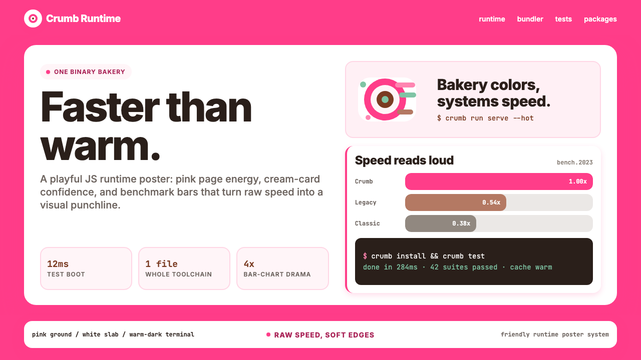 Bun JS Runtime Pink 2023Dev speed gets bakery-bright. Hot pink grounds white slabs, mono bars, and wa…开发速度像烘焙店一样明亮:热粉底、白卡片、等宽基准条与暖黑终端。
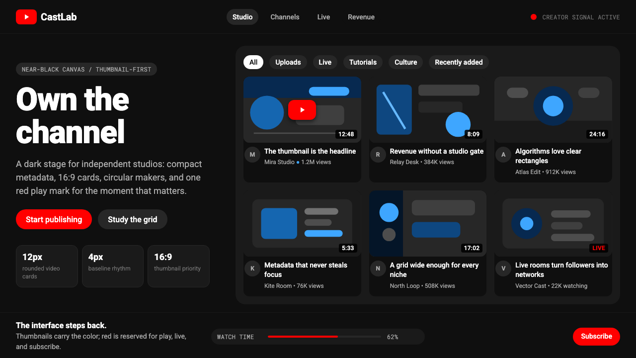 YouTube Creator EconomyThe UI disappears. Near-black Roboto grids let thumbnails shout; red only mea…界面退后:近黑Roboto网格让缩略图发声,红色只为播放。
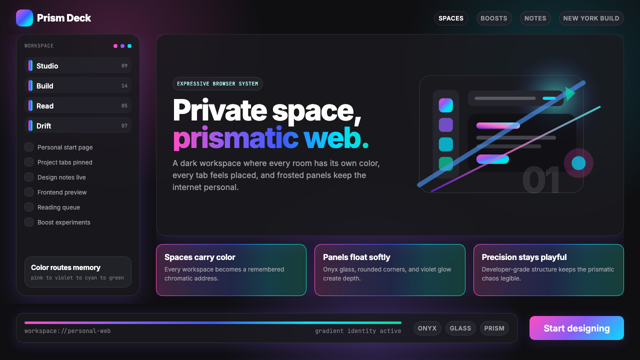 Arc Browser Prismatic (2023)Color is architecture. Pink-violet-cyan ribbons glow over onyx glass and roun…颜色即架构:粉紫青光带浮在黑曜石玻璃面板上。
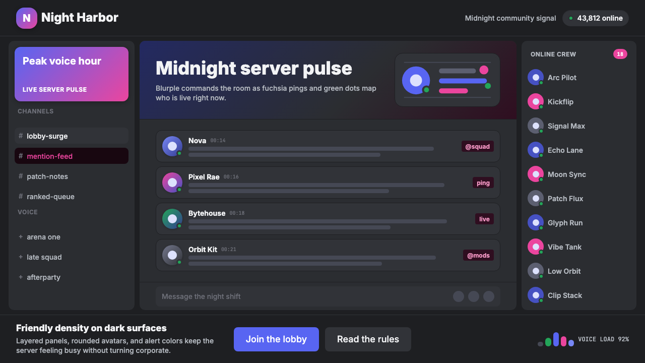 Discord Blurple Server (2020)Midnight server energy. Blurple panels, fuchsia pings, and green status dots…午夜服务器能量:蓝紫面板、品红提醒、在线绿点保持密集。
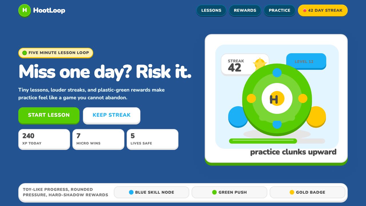 Duolingo 2024Adorable pressure wins. Feather Green, Nunito heft, rounded push-shadows gami…可爱压力取胜:羽毛绿、Nunito粗字与圆角硬阴影,把愧疚游戏化。
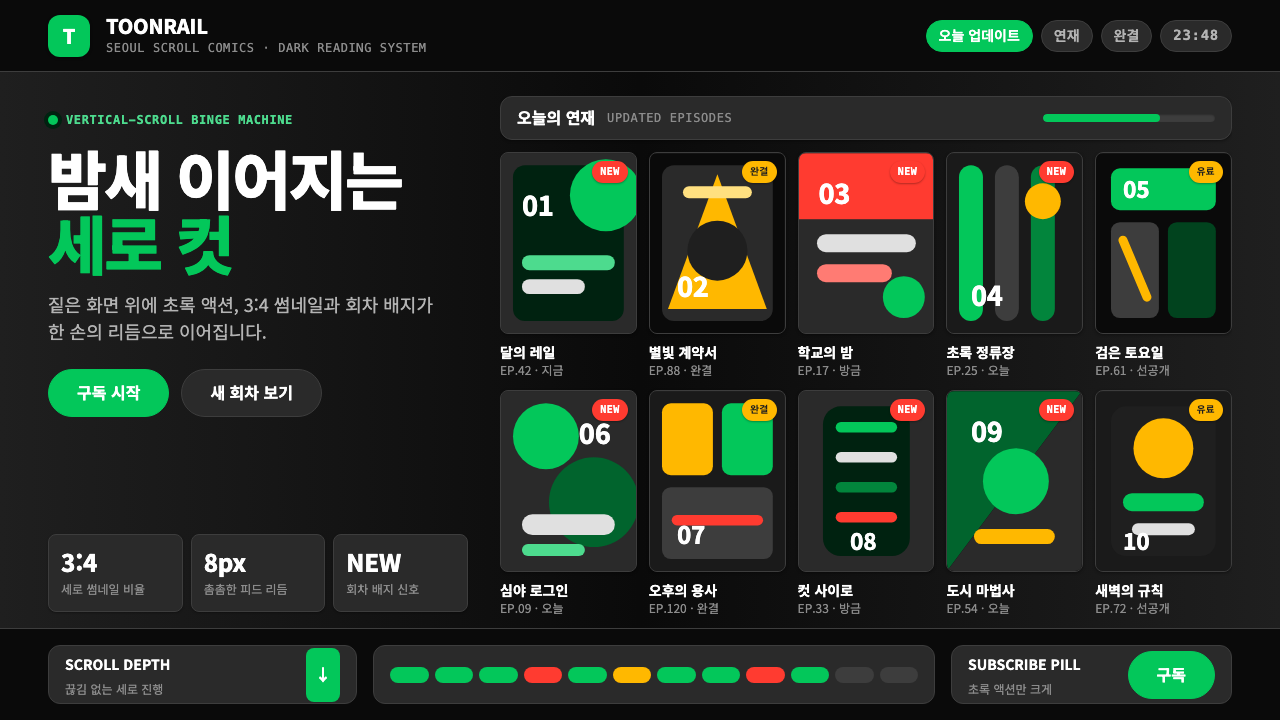 Naver Webtoon (2024)Built for late-night scroll. Charcoal grids, Noto Sans KR, and green episode…为深夜滚动而生:炭灰网格、思源黑体与绿色话数信号。