What is Duolingo 2024?什么是 Duolingo 2024?
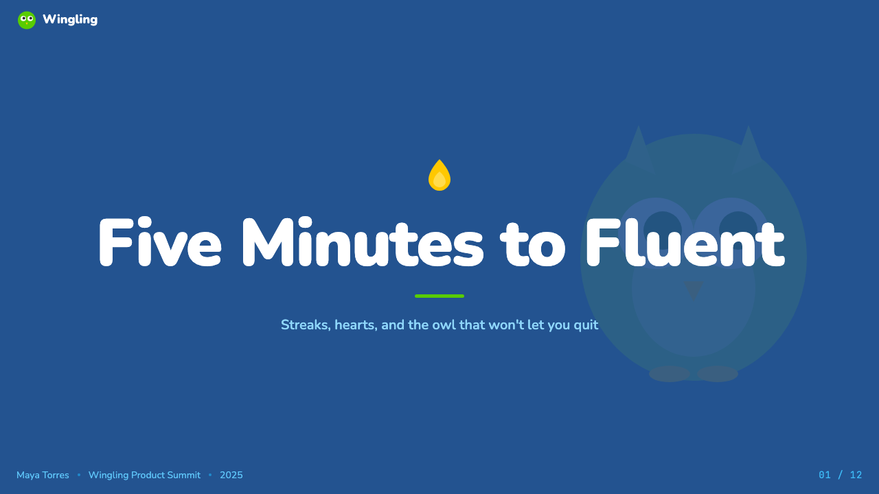
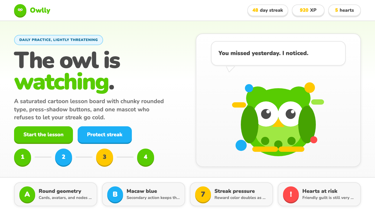
Duolingo turned language learning into a guilt-powered toy — rounded corners, thick push-shadows, and a green owl who knows exactly how long you have ignored your streak.Duolingo 把语言学习变成了一款靠愧疚驱动的玩具——圆角、厚实的按压阴影,还有一只绿色猫头鹰,它清楚地知道你已经多久没打卡了。
Duolingo 2024 in briefDuolingo 2024 速览
Duolingo 2024 is the visual language of the world's most-downloaded education app — a system built entirely around the logic of mobile gaming rather than the conventions of academic software. Every surface is rounded, every interactive element begs to be tapped, and the mascot Duo the Owl functions less as a logo and more as a character who follows you across every screen with the persistence of a well-meaning but slightly menacing friend.Duolingo 2024 是全球下载量最高的教育应用的视觉语言体系——它完全建立在手机游戏的逻辑之上,而非学术软件的惯例之中。每一个界面都是圆角的,每一个交互元素都在召唤点击,吉祥物猫头鹰 Duo 与其说是一个商标,不如说是一个角色,它带着善意而略显强迫的执着,跟随你出现在每一个屏幕上。
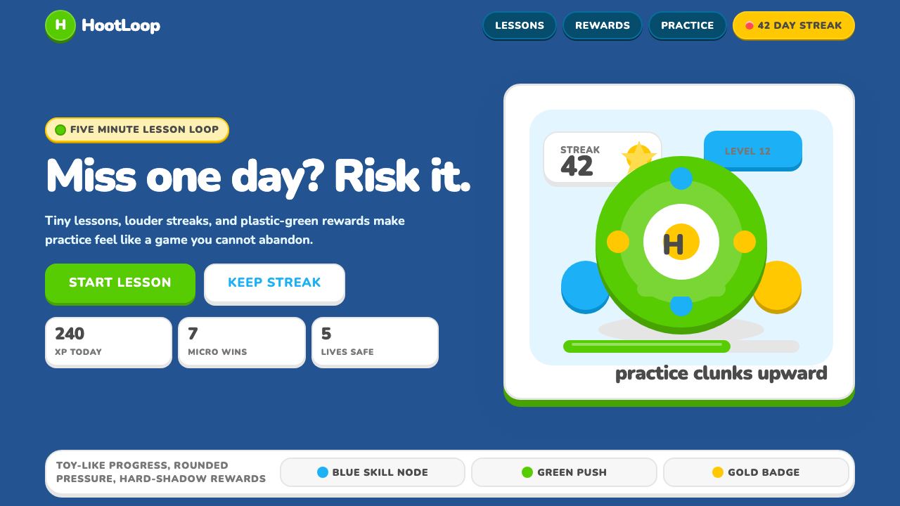
The aesthetic rests on three interlocking ideas: gamification made tactile, reward made visible, and anxiety made charming. Buttons sit on exaggerated bottom-shadows that give the illusion of physical depth — pressing one feels like squeezing a toy. Hearts represent lives, fire icons represent streaks, and progress bars fill with the same satisfying weight as a mobile RPG's experience meter. The visual vocabulary borrows directly from casual games and applies it to vocabulary drills and grammar exercises.这套美学建立在三个相互咬合的理念上:触觉化的游戏设计、可见化的奖励机制,以及被驯化为可爱形态的焦虑感。按钮踩在夸张的下边阴影上,制造出实体深度的错觉——按下去就像捏一个玩具。爱心代表生命值,火焰图标代表连续打卡,进度条以手机 RPG 经验槽一样令人满足的重量不断填充。这套视觉词汇直接从休闲游戏借来,应用于词汇练习和语法题目。
What makes the system coherent rather than chaotic is its tonal consistency. Every element — from the chunky geometric letterforms of the wordmark to the springy animation curves that govern every interaction — communicates the same register: this is serious learning disguised as play, and the disguise is the point. The 2023 rebrand pushed this further, making Duo himself more expressive and meme-ready, and saturating the signature green to a more aggressive, attention-commanding pitch.让这套体系保持连贯而非混乱的,是它在语调上的高度一致性。从 wordmark 粗圆几何字形,到控制每一次交互的弹性动画曲线,每一个元素传递的都是同一种信号:这是伪装成玩耍的严肃学习,而这层伪装本身就是目的。2023 年的品牌焕新将这一逻辑推向更远:Duo 本身变得更具表情张力,更容易成为网络迷因,标志性绿色也被推向更饱和、更具进攻性的视觉强度。
Where does Duolingo 2024 come from?Duolingo 2024 从何而来?
Duolingo was founded in 2011 by Luis von Ahn and Severin Hacker in Pittsburgh, Pennsylvania. Von Ahn, who had previously invented CAPTCHA and sold reCAPTCHA to Google, approached language learning as a computational problem: how do you deliver instruction at scale, keep dropout rates low, and do it for free? The answer was behavioral design — specifically, the application of game mechanics to learning sequences. The earliest version of the app was functional but visually generic; the distinctive character of the current system evolved through successive rebrands as the product scaled.Duolingo 由 Luis von Ahn 和 Severin Hacker 于 2011 年在宾夕法尼亚州匹兹堡创立。Von Ahn 此前曾发明 CAPTCHA 并将 reCAPTCHA 出售给谷歌,他把语言学习作为一个计算问题来处理:如何规模化地提供教学、压低辍学率,并且免费做到这一点?答案是行为设计——具体而言,是将游戏机制应用于学习序列。最早版本的应用功能完整但视觉平庸;当前系统的独特面貌,是随着产品规模扩大经过数次品牌迭代演化而来的。
The key visual inflection point came with the 2023 rebrand, which the Duolingo design team described as a deliberate escalation. The green — long associated with the brand — was pushed to a more saturated, almost electric register. Duo's face gained more expressive range, enabling the viral meme formats that became a major component of the brand's social media presence. The geometry of UI components became rounder and chunkier. The push-shadow on interactive buttons, previously a subtle affordance cue, was thickened into a defining visual signature.关键的视觉转折点出现在 2023 年的品牌焕新,Duolingo 设计团队将其描述为一次蓄意的升级。那抹长期与品牌关联的绿色,被推向更饱和、几近电光感的色彩区间。Duo 的表情获得了更丰富的张力,使其能够支撑病毒式传播的迷因格式——这已成为品牌社交媒体存在的重要组成部分。界面组件的几何形态变得更圆更厚实。交互按钮上的按压阴影,原本只是一个细微的可操作性线索,此时被加厚成一种标志性的视觉签名。
The design draws on a lineage of mobile-game visual language that crystallized in the early 2010s with titles like Angry Birds and Candy Crush — games that demonstrated how tactile, toy-like interfaces could sustain engagement far longer than conventionally polished software. Duolingo applied this grammar to an educational context and refined it over more than a decade of A/B testing, retention analysis, and user behavior data from hundreds of millions of learners.这套设计汲取了手机游戏视觉语言的传承——那套语言在 2010 年代初随着《愤怒的小鸟》和《糖果传奇》等游戏而结晶成形。这些游戏证明,触感十足、玩具质感的界面,能比传统精致软件维持更长久的用户黏性。Duolingo 将这套语法移植到教育场景,并经过十余年的 A/B 测试、留存率分析和来自数亿学习者的用户行为数据,不断打磨精炼。
The mascot-driven approach has roots in a long tradition of educational characters — from McGruff the Crime Dog to Clippy — but Duo's contemporary incarnation is notably different in register. Where earlier educational mascots were reassuring and didactic, Duo operates in an ironic, internet-native mode: the owl's expressions range from cheerful encouragement to barely concealed menace, and Duolingo's social media team has leaned into the threatening-owl meme with a self-awareness that has made the brand unusually legible to younger audiences who are fluent in meme literacy.以吉祥物为核心的品牌路径,有着漫长的教育角色传统作为渊源——从麦格拉夫犯罪预防犬到 Clippy 回形针——但 Duo 当代版本的语调与它们截然不同。早期教育吉祥物往往带有安慰性和教导性,而 Duo 则在一种反讽的、互联网原生的模式下运作:这只猫头鹰的表情从欢快的鼓励到隐约的威胁不等,Duolingo 的社交媒体团队以高度自觉的方式拥抱了「威胁猫头鹰」迷因,使这个品牌对熟悉网络迷因语言的年轻受众有着异常清晰的辨识度。
What defines the Duolingo 2024 look?Duolingo 2024 的视觉特征是什么?
Feather Green and the Core Palette羽毛绿与核心色板
The brand's signature green — internally called Feather Green — is the visual anchor of the entire system. It sits at a high saturation level, positioned to be immediately readable on white backgrounds and to stand out in notification icons on phone home screens. The broader palette introduces a warm red for hearts and error states, a vivid yellow-gold for streaks and achievement highlights, a soft blue for secondary actions, and an off-white that gives the interface its characteristic airy warmth. Every color carries a specific semantic meaning tied to game mechanics: green for success and brand identity, red for lost lives, yellow for ongoing streaks, blue for supplementary actions.品牌标志性的绿色——内部称为「羽毛绿」——是整套系统的视觉锚点。它处于高饱和度区间,在白色背景上具有极强的辨识度,并在手机主屏幕的通知图标中格外显眼。更广泛的色板还引入了暖红色(用于生命值和错误状态)、鲜艳的黄金色(用于连续打卡和成就高光)、柔和的蓝色(用于次要操作)以及一种带有温度的近白色,赋予界面特有的轻盈暖意。每种颜色都承载着与游戏机制紧密绑定的特定语义:绿色代表成功与品牌认同,红色代表失去生命,黄色代表持续连击,蓝色代表辅助操作。
Push-Shadow Buttons按压阴影按钮
The most immediately recognizable element of the Duolingo visual system is the push-shadow on interactive buttons. Rather than a soft diffuse shadow that suggests elevation, each button sits on a thick, hard-edged shadow rendered in a darker tone of the button's own color. When the button is pressed, the shadow collapses and the button drops to meet the surface — a physical metaphor for a toy being pushed down. This mechanism gives every interactive element a tactile, toy-like quality that reinforces the gamified framing of the product. The shadow thickness is deliberately exaggerated far beyond what a utility-first design system would use, making it a stylistic statement as much as a functional affordance.Duolingo 视觉系统中最直观可辨认的元素,是交互按钮上的按压阴影。这不是建议悬浮感的柔和漫射阴影,而是每个按钮底部一块厚实、硬边的阴影,以按钮自身颜色更深的色调渲染。按下按钮时,阴影收缩,按钮下沉贴近表面——一个玩具被按下的物理隐喻。这套机制赋予每一个交互元素触感十足的玩具质感,不断强化产品的游戏化叙事框架。阴影的厚度被刻意夸大到远超功能性设计系统会采用的程度,使其成为一种风格宣言,而不仅仅是可操作性线索。
Rounded Geometry and Chunky Type圆润几何与厚实字体
Every geometric element in the Duolingo system — button corners, card containers, icon backgrounds, avatar frames — is rounded to a degree that approaches the circular. There are no sharp corners in the primary interface components; angularity is reserved for data visualizations and decorative streak motifs. The typeface used throughout the interface is selected for its rounded terminals and generous letter spacing, giving body text a friendly, approachable weight without sacrificing legibility. Headlines are set in a heavier weight that reads as bold but not aggressive, maintaining the playful register. The overall effect is one of deliberate softness: a system that has been rounded at every possible point to remove anything that might feel cold or clinical.Duolingo 系统中的每一个几何元素——按钮圆角、卡片容器、图标背景、头像框架——都被圆化到接近圆形的程度。主要界面组件中没有任何尖角;棱角感被保留给数据可视化和装饰性的连击图标。界面全局使用的字体因其圆润的终端笔画和宽松的字间距而被选用,使正文在保持可读性的同时呈现出友好、亲切的重量感。标题采用更厚重的字重,读起来大胆而不咄咄逼人,维持了整体的活泼基调。整体效果是一种蓄意的柔软感:一套在每一个可能的节点都被圆化处理、彻底消除任何冷冽或临床感的系统。
Game-Layer Visual Metaphors游戏层视觉隐喻
The interface borrows its primary structural metaphors from mobile games rather than productivity software. Hearts function as a life system, visually displayed as a counter that depletes with mistakes and refills over time or through in-app purchases. A flame icon tracks daily streaks, growing more elaborate and animated as the streak lengthens. Experience points accumulate in bars that fill toward a league placement, with users ranked against peers in weekly competitions. Badges, trophies, and achievement icons are rendered in a bold illustrative style that evokes the reward screens of casual games. These elements are not metaphors grafted onto an educational shell — they are the primary interface, with the learning content threaded through them.界面从手机游戏而非生产力软件中借用其主要的结构性隐喻。爱心作为生命系统运作,以一个因犯错而减少、随时间恢复(或通过应用内购补充)的计数器直观呈现。火焰图标追踪每日打卡,随着连续天数增加变得愈发精细和动态。经验值在进度条中积累,指向联赛排名,用户在每周竞赛中与同伴排名对比。徽章、奖杯和成就图标以大胆的插画风格渲染,让人联想到休闲游戏的奖励画面。这些元素并非嫁接在教育外壳上的隐喻——它们就是主界面,学习内容穿插在其中。
Mascot as Interface Element吉祥物作为界面元素
Duo the Owl is not simply a brand logo that appears at launch — he is an active participant in the interface, appearing to celebrate correct answers, express disappointment at mistakes, and deliver push notifications with an increasingly meme-aware tone. His design uses a simplified, highly readable silhouette: large round eyes, a compact beak, and a body shape that scales cleanly from notification icon to full-screen celebration animation. The 2023 redesign gave Duo a wider expressive range, with poses that range from triumphant to vaguely menacing — the latter being the basis for the viral social media content that made Duo recognizable far beyond the app's user base. Mascot expressiveness is treated as a design material, not a marketing decoration.Duo 并非只是在启动时出现的品牌标志——他是界面中的主动参与者,在答对时出现庆祝,在出错时流露失望,并以越来越具备迷因意识的语调推送通知。他的设计采用了简洁、高辨识度的剪影:大而圆的眼睛、紧凑的喙部和干净缩放的身体形态——从通知图标到全屏庆祝动画都能完美呈现。2023 年的重新设计赋予了 Duo 更宽广的表情范围,姿态从胜利欢呼到隐约威胁不等——后者正是那些使 Duo 在应用用户群体之外广泛传播的病毒式社交内容的基础。吉祥物的表情丰富性被视为一种设计材料,而非营销装饰。
Bouncy Motion and Micro-Animation弹性动效与微动画
Motion is treated as a first-class design element in the Duolingo system, not an afterthought. Every correct answer triggers a small celebration animation; every wrong answer produces a brief but legible shake. Buttons compress slightly on press before rebounding. Progress bars fill with a spring-like elasticity rather than a linear slide. Characters scale up with a slight overshoot that gives their appearance a sense of physical arrival. These micro-animations are calibrated to feel satisfying and toylike — they borrow the vocabulary of physical objects being compressed, released, and settling. The total effect is an interface that feels alive and responsive in a way that most utility software deliberately avoids.在 Duolingo 系统中,动效被视为一流的设计元素,而非事后添加的点缀。每一次答对都会触发小小的庆祝动画;每一次答错都会产生简短而清晰的抖动反馈。按钮在按压时略微压缩,随即弹回。进度条以弹簧般的弹性而非线性滑动填充。角色放大时带有轻微的过冲感,使其出现有一种实体落地的质感。这些微动画被精心调校,以产生令人满足的玩具感——它们借用了物理对象被压缩、释放和归位的视觉词汇。整体效果是一个感觉充满生机和即时响应的界面,这是大多数功能性软件刻意回避的体验。
Thick Outlines and Bold Illustration粗描边与粗体插画
Icons, character illustrations, and decorative elements throughout the Duolingo interface use thick, consistent outlines that give the visual system a cartoon-like coherence. This outline approach originated in print illustration traditions designed for small reproductions — thick borders ensure legibility at low resolutions — but in Duolingo's case it also serves to unify wildly different content (vocabulary images, character expressions, reward icons) under a single visual grammar. The illustration style for learning content images is bold and slightly exaggerated, avoiding photorealism in favor of a simplified, universally readable cartoon register. Colors within illustrated areas are flat and saturated, with the outline doing the structural work that shading would otherwise perform.Duolingo 界面中的图标、角色插画和装饰元素,使用统一的粗描边,赋予整套视觉系统卡通般的一致性。这种描边方式源自为小尺寸印刷设计的插画传统——粗边框确保在低分辨率下的可读性——但在 Duolingo 的场景中,它还起到了将截然不同的内容(词汇图片、角色表情、奖励图标)统一在单一视觉语法下的作用。学习内容图片的插画风格大胆而略带夸张,刻意回避写实主义,转而采用简化的、具有普适可读性的卡通语调。插画区域内的颜色是平涂的、高饱和度的,描边承担着本应由阴影处理的结构性工作。
Who shaped Duolingo 2024?谁塑造了 Duolingo 2024?
Von Ahn co-founded Duolingo after selling reCAPTCHA to Google and is credited with establishing the core thesis that language education could be delivered at global scale for free by applying game mechanics to learning sequences. His background in human computation and crowd-sourced problem-solving directly shaped Duolingo's early approach to curriculum design, where users' translation work simultaneously trained language models and produced learning content. As CEO, he has consistently championed the visual direction that prioritizes engagement and accessibility over the conventions of academic software.Von Ahn 在将 reCAPTCHA 出售给谷歌后联合创立了 Duolingo,他被认为确立了这样一个核心论题:通过将游戏机制应用于学习序列,语言教育可以在全球范围内免费提供。他在人类计算和众包问题解决方面的背景,直接塑造了 Duolingo 早期的课程设计方式——用户的翻译工作同时训练语言模型并产出学习内容。作为 CEO,他始终力主将参与度和可及性置于学术软件惯例之上的视觉方向。
Hacker co-founded Duolingo as CTO, overseeing the technical architecture that enables the app's behavioral loop — the push notification systems, streak mechanics, A/B testing infrastructure, and learning algorithms that underpin the gamified experience. The tight feedback cycles between engineering and product that Hacker established created conditions for the rigorous optimization of engagement metrics that shaped not just the product logic but the visual design decisions that emerged from behavioral data.Hacker 作为 CTO 联合创立了 Duolingo,负责支撑应用行为循环的技术架构——推送通知系统、连续打卡机制、A/B 测试基础设施和支撑游戏化体验的学习算法。Hacker 建立的工程与产品之间的紧密反馈循环,为严格优化参与度指标创造了条件,这不仅塑造了产品逻辑,也影响了从行为数据中衍生出的视觉设计决策。
The 2023 rebrand was executed by Duolingo's in-house design team, working in close collaboration with brand and motion designers. Rather than engaging a single external agency, the team treated the rebrand as an internally driven evolution, preserving institutional knowledge about what had worked across years of user testing while pushing the visual language further in the direction of expressiveness, toy-like physicality, and social-media legibility. The team's decision to exaggerate the push-shadow, deepen the green's saturation, and expand Duo's expressive range simultaneously are cited as the three most impactful changes of the rebrand.2023 年的品牌焕新由 Duolingo 的内部设计团队执行,与品牌和动效设计师密切协作。团队没有委托单一外部机构,而是将品牌焕新视为内部驱动的演进,在保留多年用户测试积累的知识的同时,将视觉语言进一步推向表现力、玩具质感的实体感和社交媒体辨识度的方向。团队同时决定夸大按压阴影、加深绿色饱和度并扩展 Duo 表情范围,这三项改变被认为是此次品牌焕新影响最深远的决策。
Duo is not a human designer but merits a figure entry because the owl mascot functions as a design system element with its own design history and evolution. The original Duo was a simpler, more symmetrically friendly illustration. Through successive iterations — particularly the 2023 redesign — Duo gained asymmetric poses, a wider vocabulary of expressions, and a character range that extended from wholesome encouragement to what the internet has collectively described as low-grade menace. This deliberate expansion of Duo's character range gave the brand social media material that performed on platforms where educational content rarely reaches, making the mascot an active design decision with measurable cultural impact.Duo 并非真人设计师,但值得作为一个条目单独列出,因为这只猫头鹰吉祥物本身就是一个拥有独立设计史和演化脉络的设计系统元素。最初的 Duo 是更简单、更具对称友好感的插画形象。经过历次迭代——尤其是 2023 年的重新设计——Duo 获得了不对称的姿势、更丰富的表情词汇,以及从温馨鼓励延伸至互联网集体描述为「低烈度威胁感」的角色范围。这一对 Duo 角色幅度的刻意扩张,为品牌提供了在社交媒体上表现优异的素材——而教育类内容在这些平台上通常难以触达——使吉祥物成为一个具有可衡量文化影响力的主动设计决策。
As one of the lead motion designers on the Duolingo team, Quintero has been publicly credited with shaping the bouncy, spring-curve animation language that defines how the interface feels in motion. The decision to treat micro-animations as primary design deliverables — rather than post-production polish — is central to why Duolingo's interface feels physically alive. The animation principles codified by the motion team, including the slight overshoot on character entrances and the elastic compression of button presses, are among the most widely studied examples of gamified motion design in contemporary mobile product design.作为 Duolingo 团队的主要动效设计师之一,Quintero 被公开认可为塑造了弹性弹簧曲线动画语言的关键人物,正是这套语言定义了界面在运动中的质感。将微动画视为主要设计交付物而非后期制作的润色这一决策,是 Duolingo 界面让人感受到实体生命感的核心原因。动效团队编纂的动画原则——包括角色入场时的轻微过冲感和按钮按压的弹性压缩——是当代移动产品设计中被研究最广泛的游戏化动效设计案例之一。
How do you use Duolingo 2024 today?今天怎么用 Duolingo 2024?
Duolingo 2024 is a highly specific visual system tied to gamification, mascot-driven branding, and mobile-first interaction. Applying it to other contexts works best when the product genuinely shares those qualities — or when the design goal is to deliberately import the register of educational play into a different domain, such as a language-learning side project, a certification platform, or a productivity tool that wants to reward habit formation.Duolingo 2024 是一套与游戏化、吉祥物驱动品牌和移动优先交互高度绑定的视觉系统。将其应用于其他场景,最适合产品本身真正共享这些特质的情境——或者当设计目标是刻意将教育游玩的语调引入另一个领域时,例如语言学习类副项目、认证平台,或一款希望通过奖励习惯养成来留住用户的效率工具。
For presentation slides, the style translates most directly to consumer-facing decks, pitch materials for edtech products, or internal team culture presentations. A cover slide works well with a full-bleed saturated green background, white headline type in a rounded weight, and a bold illustrative element in the lower corner. Content slides should use card-based layouts with generous rounded corners and distinct color blocks per section, mimicking the visual chunking of a lesson interface. Data slides benefit from the thick outline convention applied to chart elements — bars and segments with bold borders read more playfully than conventionally rendered charts, consistent with the energetic register of the system.在演示文稿中,这套风格最直接适用于面向消费者的幻灯片、教育科技产品的融资路演材料,或内部团队文化展示。封面幻灯片采用满版饱和绿色背景、白色圆润字重标题、以及角落处的大胆插画元素,效果极佳。内容幻灯片应使用带有宽圆角的卡片布局,并按区块使用不同颜色,模拟课程界面的视觉分块感。数据幻灯片受益于将粗描边惯例应用于图表元素——带粗边框的柱状图和扇形区块,比传统渲染的图表读来更具活力,符合这套系统的高能量基调。
For web interfaces, the style fits best on landing pages for education tools, children's platforms, wellness apps, and any product where habit formation and daily engagement are central to the value proposition. Navigation bars should carry a light background with the signature green as the primary action color. Call-to-action buttons must use the push-shadow treatment — flat buttons without the thick bottom shadow will read as visually incomplete within this system. Pricing pages work well with color-coded tier cards, each rendered in the palette's distinct semantic colors, with the recommended plan receiving the signature green shadow treatment.在网页界面中,这套风格最适合教育工具、儿童平台、健康应用的落地页,以及任何以习惯养成和每日参与为核心价值主张的产品。导航栏应采用浅色背景,以标志性绿色作为主要操作色。行动号召按钮必须使用按压阴影处理——在这套系统内,没有厚实底部阴影的平面按钮会显得视觉上不完整。定价页面适合使用按色彩区分等级的卡片,每张卡片以色板中特定语义色渲染,推荐方案使用标志性绿色阴影处理。
For editorial and marketing materials, the Duolingo visual language supports high-energy announcements, social media assets, and short-form educational content. Social cards work particularly well: a bold headline in rounded type, a mascot-style illustration or expressive character element, and a single-color saturated background create thumb-stopping compositions. Print applications are rarer but possible — the style's reliance on bold outlines and flat fills means it reproduces cleanly in limited color printing, which is useful for educational posters and classroom materials where print budgets may constrain color options.在编辑和营销材料中,Duolingo 视觉语言支持高能量公告、社交媒体素材和短篇教育内容。社交卡片尤为适用:圆润字体的粗体标题、吉祥物风格的插画或表情丰富的角色元素,以及单一饱和色背景,共同构成抓人眼球的视觉构图。印刷应用相对少见,但也是可行的——这套风格对粗描边和平涂填充的依赖意味着它在有限色彩印刷中清晰再现,对于可能受到预算限制的教育海报和课堂材料而言,这一点尤为实用。
The most common mistake when applying this style is importing only the color palette while leaving the tactile, toy-like structural elements behind. A flat button in Feather Green on a white background without the push-shadow reads as generic app design, not Duolingo. The shadow, the roundness, and the bouncy motion language are inseparable from the palette — they are collectively what produces the gamified feeling. A second common mistake is using the brand green pervasively across all elements, which collapses the semantic system: the green must retain its specific meaning as a success and brand signal, with secondary colors handling other states. Overusing the mascot energy without the underlying grid structure also produces chaos — the Duolingo system is playful but rigorously consistent in spacing and alignment, which is what separates it from visual noise.应用这套风格时最常见的错误,是只引入色板,却抛弃触感十足的玩具式结构元素。一个白底上的羽毛绿平面按钮,若没有按压阴影,读来只像普通的应用设计,而非 Duolingo。阴影、圆润感和弹性动画语言与色板是不可分割的——它们共同产生了游戏化的感受。第二个常见错误是将品牌绿大面积铺满所有元素,这会使语义系统崩溃:绿色必须保留其作为成功信号和品牌识别的特定含义,其他状态应由辅助色处理。在缺乏底层网格结构的情况下过度使用吉祥物能量,也会产生视觉噪音——Duolingo 系统是活泼的,但在间距和对齐上极为严格一致,正是这一点将它与视觉混乱区分开来。
Duolingo 2024 — FAQDuolingo 2024 · 常见问题
Is the Duolingo style appropriate for adult or professional contexts, or does it skew too young?Duolingo 风格适合成人或专业场景,还是它的语调过于年轻化?
The style skews toward a broad consumer audience rather than a specifically young one — Duolingo itself has tens of millions of adult users. However, the visual register is unmistakably playful and anti-institutional, which makes it unsuitable for contexts where authority, credibility, or formal professionalism are primary values: legal platforms, financial services, enterprise B2B software, or medical applications. The style performs well where the product's value proposition is about motivation, habit, and accessible learning. It struggles where users need to feel that the product is serious in a conventional sense.这套风格偏向广泛的消费者受众,而非专门的年轻群体——Duolingo 本身拥有数千万成年用户。然而,其视觉基调明显是活泼的、反建制的,这使它不适合权威性、可信度或正式专业感是核心价值的场景:法律平台、金融服务、企业 B2B 软件或医疗应用。在产品价值主张围绕动力激励、习惯养成和易于上手的学习时,这套风格表现出色。在用户需要感受到产品以传统方式表达严肃感的场合,则力不从心。
How does Duolingo 2024 differ from other gamified design systems like those used in fitness or productivity apps?Duolingo 2024 与健身或效率类应用所使用的其他游戏化设计系统有何不同?
The most significant difference is the role of the mascot and the expressive illustration language. Fitness apps that gamify workouts — like those using ring systems or streak mechanics — typically maintain a sleek, athletic visual register that suggests performance and precision. Productivity apps that borrow game mechanics lean toward clean grids and subdued palettes. Duolingo is distinctive in making the cartoon, the character, and the toy-like physicality central rather than peripheral. The push-shadow button, the chunky rounded type, and Duo himself collectively signal that the product is comfortable operating in a register that other apps avoid — one where silliness and earnestness coexist.最显著的差异在于吉祥物的角色和富有表现力的插画语言。将锻炼游戏化的健身应用——比如使用闭环或连击机制的那些——通常保持一种流线型、运动感的视觉基调,暗示表现和精确性。借用游戏机制的效率应用则倾向于干净的网格和低调的色板。Duolingo 的独特之处在于将卡通感、角色感和玩具质感的实体感置于核心而非边缘。按压阴影按钮、厚实圆润的字体和 Duo 本身,共同传递出产品乐于在其他应用刻意回避的语调中运作——一种滑稽与真诚共存的语调。
Can the push-shadow button style be used sparingly, or does it require full system commitment?按压阴影按钮风格可以单独少量使用,还是必须全面系统性地引入?
It can be used selectively, but with caution. The push-shadow works well as a highlight mechanism — applying it only to the single most important call-to-action on a page, while other buttons use conventional treatment, can create a useful focal point without requiring a full system adoption. However, using the shadow inconsistently across multiple interactive elements within the same product will read as unresolved rather than intentional. The safest selective application is as a campaign accent: a landing page built otherwise in a more neutral style that uses the push-shadow button on the primary conversion element to add energy and specificity.它可以选择性使用,但需谨慎。按压阴影作为高光机制效果良好——仅将其应用于页面上最重要的单一行动号召,而其他按钮采用常规处理,可以在不要求全面引入系统的情况下创造有效的视觉焦点。然而,在同一产品中对多个交互元素不一致地使用阴影,会显得未经解决而非出于刻意。最安全的选择性应用是作为活动强调:一个整体以更中性风格构建的落地页,在主要转化元素上使用按压阴影按钮,以增加活力和特殊性。
How does the Duolingo visual system handle dark mode?Duolingo 视觉系统如何处理深色模式?
The Duolingo system is fundamentally light-mode-native — the signature green, the off-white warmth, and the color-coded semantic system all originate in and are optimized for bright backgrounds. A dark mode variant exists in the app, but it requires significant adjustments: the green must be slightly de-saturated to avoid eye strain against dark backgrounds, the push-shadows shift to slightly lighter tones rather than darker ones, and the overall warmth of the palette is reduced. The illustrated characters and mascot elements translate more easily to dark backgrounds than the typographic and structural components. Any dark-mode application of this visual language should be treated as a separate palette calibration rather than a simple color inversion.Duolingo 系统从根本上是浅色模式原生的——标志性绿色、带温度的近白色以及色彩编码的语义系统,都源于并优化于明亮背景。应用中存在深色模式变体,但需要大量调整:绿色必须略微降低饱和度以避免在深色背景上产生视觉疲劳,按压阴影转向略微偏浅而非更深的色调,整体色板的暖意也有所减弱。插画角色和吉祥物元素比字体和结构组件更容易适应深色背景。这套视觉语言的任何深色模式应用,都应当被视为独立的色板重新校准,而非简单的颜色反转。
What is the relationship between the Duolingo visual style and the underlying behavioral science it expresses?Duolingo 视觉风格与其所表达的行为科学之间是什么关系?
The visual language is not separate from the behavioral design — it is the behavioral design made visible. Every aesthetic choice maps to a psychological mechanism: the push-shadow buttons trigger haptic anticipation; the streak flame exploits loss aversion (missing a day feels like losing something tangible); the heart counter creates scarcity; the league table activates social comparison. The rounded, toy-like geometry lowers perceived effort by signaling that the environment is low-stakes and forgiving. The mascot's expressiveness creates a social presence that users respond to emotionally in ways they do not with abstract interfaces. Understanding this mapping is essential for anyone using the style — stripped of its behavioral context, the visual elements become decoration rather than function.视觉语言与行为设计并非相互独立——它是行为设计的可见化呈现。每一个美学选择都对应一种心理机制:按压阴影按钮触发触觉期待感;连续打卡火焰利用损失厌恶(错过一天感觉像失去了某个实在的东西);爱心计数器制造稀缺性;联赛排名激活社会比较。圆润的玩具式几何形通过传递低风险、宽容环境的信号来降低感知努力成本。吉祥物的表情丰富性创造了一种社交存在感,使用户产生情感回应,而这是抽象界面无法做到的。理解这种映射关系,对于任何使用这套风格的人都至关重要——脱离了行为科学的语境,这些视觉元素就变成了装饰而非功能。
Related design styles相关设计风格
 Duolingo Green Owl MascotFriendly guilt goes loud. Saturated green, Nunito heft, and press-shadow butt…友好内疚很响亮:高饱和绿、厚重 Nunito 与按压阴影盯住连胜。
 Discord 2024Blurple cozy. Charcoal grounds, illustrated characters — every surface says '…刻意去企业化的语音聊天:blurple 蓝紫、深炭灰底、俏皮插画角色——每个界…
 YouTube Creator EconomyThe UI disappears. Near-black Roboto grids let thumbnails shout; red only mea…界面退后:近黑Roboto网格让缩略图发声,红色只为播放。
 Bun JS Runtime Pink 2023Dev speed gets bakery-bright. Hot pink grounds white slabs, mono bars, and wa…开发速度像烘焙店一样明亮:热粉底、白卡片、等宽基准条与暖黑终端。
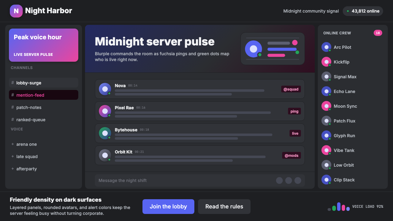 Discord Blurple Server (2020)Midnight server energy. Blurple panels, fuchsia pings, and green status dots…午夜服务器能量:蓝紫面板、品红提醒、在线绿点保持密集。
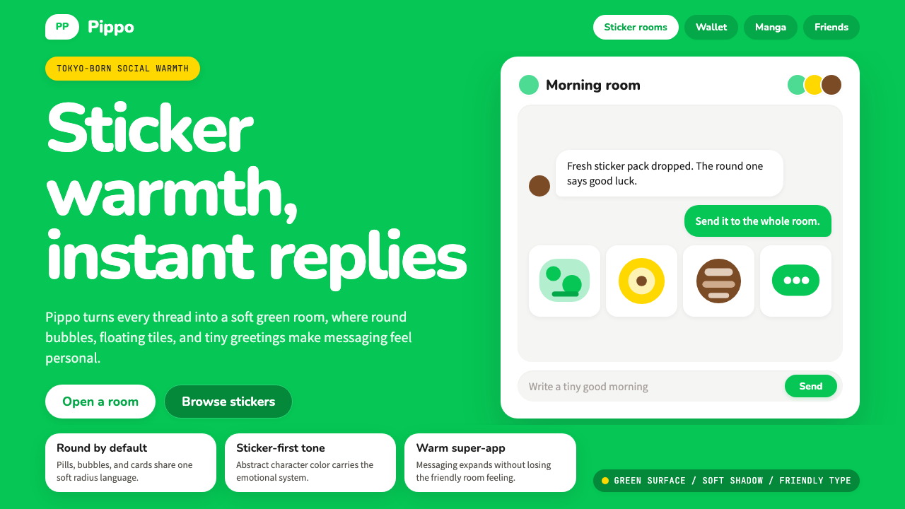 LINE Messenger GreenChat feels like a sticker. Bright green, pill bubbles, and rounded Nunito kee…聊天像贴图般亲近:亮绿、药丸气泡与圆润 Nunito 保持温度。