What is LINE Messenger Green?什么是 LINE Messenger Green?
Born from a disaster and built on bear stickers, LINE's signature green became the warmest color in East Asian digital life.从一场灾难中诞生,由熊猫贴图构建——LINE的标志性绿色成为东亚数字生活中最有温度的颜色。
LINE Messenger Green in briefLINE Messenger Green 速览
LINE Messenger Green is the visual design system originating from LINE Corporation's flagship chat application — a system defined by a vivid, friendly green as its anchor color, compulsively rounded surfaces on every interactive element, and a warmth that stems directly from the app's character-driven identity. Where most messaging platforms reach for cool neutrals or bold primaries, LINE reaches for approachability: a green that reads as energetic yet safe, paired with pill-shaped buttons, softly shadowed cards, and type choices that feel hand-selected for legibility at every size.LINE Messenger Green是LINE公司旗舰聊天应用所衍生的视觉设计体系——以一种充满活力又亲切的绿色为锚点色,每一个交互元素都采用圆润造型,整体传递出一种源自其角色驱动身份的温暖感。大多数即时通讯平台倾向于冷静的中性色或鲜明的原色,LINE则选择了亲近感:这种绿色充满活力却令人安心,与药丸形按钮、柔阴影卡片和精心选配的文字风格共同构成一套在任何尺寸下都清晰易读的界面语言。
The system is unified not just by its signature color but by a philosophy of what a chat interface should feel like. LINE was designed from the beginning to communicate affection — its sticker economy, featuring characters like Brown the bear and Cony the rabbit, demanded a visual environment that did not compete with the characters but complemented and elevated them. The result is a UI language where every rounded corner, every gentle shadow, every carefully balanced white space reads as an invitation rather than an instruction.这套体系的统一性不仅来自标志色,更来自于一种关于聊天界面应该给人何种感受的哲学。LINE从一开始就是为传递情感而设计的——以布朗熊、可妮兔为代表的贴图经济,要求一个不与角色竞争而是衬托并升华角色的视觉环境。其结果是一套UI语言:每一个圆角、每一道柔和的阴影、每一处精心平衡的留白,传递的都是邀请而非指令。
Today, LINE Messenger Green has become a recognized aesthetic in East and Southeast Asian digital design — a shorthand for warmth, accessibility, and character-forward personality. Designers reference it the way they reference Duolingo's green or Spotify's black: as a tonal commitment that goes beyond color into gesture, shape, and emotional register.如今,LINE Messenger Green已成为东亚与东南亚数字设计领域一个被广泛认知的美学坐标——温暖、易用、角色先行的代名词。设计师们援引它的方式,就像援引Duolingo的绿色或Spotify的黑色一样:那是一种在颜色之外延伸至姿态、形态与情感基调的整体承诺。
See the LINE Messenger Green design system查看 LINE Messenger Green 完整设计系统
Where does LINE Messenger Green come from?LINE Messenger Green 从何而来?
LINE was not designed in a design studio on a slow Tuesday afternoon. It was built in a crisis. On March 11, 2011, the Tōhoku earthquake and tsunami struck northeastern Japan, killing nearly twenty thousand people and collapsing telecommunications infrastructure across the region. Engineers at NHN Japan, working in Shinjuku, Tokyo, found that conventional phone calls were impossible but data packets were still moving. Within weeks, they had built a network-agnostic messaging app that could route communication over any available data connection. LINE launched publicly in June 2011 — and the urgency of its origin gave it a design imperative that most apps never face: it had to work, immediately, for everyone, without instruction.LINE并非在某个悠闲的星期二下午于设计工作室中诞生,它是在危机中被打造出来的。2011年3月11日,东日本大地震与海啸袭击了日本东北部,造成近两万人罹难,整个地区的电信基础设施随之瘫痪。东京新宿的NHN Japan工程师们发现,传统电话无法接通,但数据包仍在传输。几周之内,他们搭建了一款网络无关的即时通讯应用,能够通过任何可用的数据连接路由通信。LINE于2011年6月正式公开发布——其诞生的紧迫感赋予了它大多数应用从未面临过的设计命题:必须立刻、对所有人、无需说明书地正常工作。
That founding context shaped the aesthetic in ways that persist to this day. Approachability was not a design trend LINE chose — it was a survival requirement. Rounded forms, high-contrast color, large tap targets, and immediately legible interface elements were not refinements added later; they were baked in from the beginning by teams who understood that the first users might be disaster survivors operating unfamiliar devices under extreme stress. The warm, friendly visual register that defines the brand is therefore not superficial: it is structural, inherited from an engineering culture that treated ease of use as a humanitarian value.这一创始背景以至今仍可察觉的方式塑造了其美学。亲近感并非LINE选择的设计趋势,而是生存的必要条件。圆润的造型、高对比度的配色、宽大的点击区域、一眼可辨的界面元素,都不是事后添加的精修,而是从一开始就被嵌入系统——那些工程师深知,最初的用户可能是正在极端压力下操作陌生设备的灾难幸存者。因此,定义这一品牌的那种温暖友好的视觉基调并非表面文章:它是结构性的,继承自一种将易用性视为人道主义价值的工程文化。
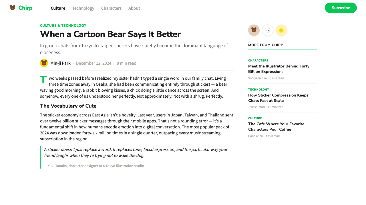
The sticker economy, which launched shortly after the app itself, transformed LINE from a utility into a cultural phenomenon. Designer Kang Byung Mok and the Line Friends creative team developed the original character lineup — Brown the bear, Cony the rabbit, Sally the chick, and their companions — as a system of expressive shorthand for emotions that typed language struggles to convey. These characters became enormously popular across East and Southeast Asia, spawning physical retail stores, cafes, collaborations with global brands, and a manga platform. The visual system had to scale to contain an IP empire while remaining a functional messaging interface — a tension that the rounded, character-first design language resolved by making warmth the organizing principle at every level.不久后随应用一同推出的贴图经济,将LINE从一个工具转变为一种文化现象。设计师姜炳默与Line Friends创意团队打造了最初的角色阵容——布朗熊、可妮兔、莎莉鸡及其伙伴们——作为一套表达口语难以传递之情感的速记符号系统。这些角色在东亚与东南亚获得了巨大的人气,催生了实体零售店、主题咖啡馆、与全球品牌的联名合作,以及一个漫画平台。视觉体系必须承载一个IP帝国的规模,同时保持作为功能性即时通讯界面的本职——这种张力被圆润的、角色优先的设计语言化解了,方式是将温暖感确立为贯穿一切层面的组织原则。
The 2019 brand refresh and the subsequent visual evolution through the early 2020s refined the system without abandoning its foundations. The signature green deepened slightly and became more precisely defined across digital contexts. Type choices became more deliberate, leaning toward rounded humanist letterforms that echoed the curves of the interface elements rather than imposing geometric rigidity. The current visual system, representing the design language at maturity, reflects a decade of refinement in which every design decision was tested against the question: does this feel like LINE? That question has a clear answer — it should feel warm, rounded, and alive with personality.2019年的品牌焕新以及2020年代初期的视觉持续演进,在不放弃根基的前提下对这套体系进行了打磨。标志性绿色在数字语境中变得略深,定义也更加精准。文字的选择变得更为考究,倾向于圆润的人文主义字形——与界面元素的曲线呼应,而非施加几何的刚硬。现代视觉体系代表了这套设计语言的成熟形态,折射出十年打磨的成果,其中每一个设计决策都经过这样一道检验:这感觉像LINE吗?这个问题有一个清晰的答案——它应该感觉温暖、圆润,并充满个性的活力。
What defines the LINE Messenger Green look?LINE Messenger Green 的视觉特征是什么?
Signature Green标志绿
The anchor of the entire system is a vivid, mid-tone green that sits between the natural world and the digital — more saturated than a leaf, more organic than a neon, warm enough to feel inviting rather than clinical. It appears on primary action buttons, navigation bars, confirmation states, and key brand touchpoints. The green is not neutral; it carries an emotional charge that the system leans into deliberately, using it as the primary signal that something is active, friendly, and ready.整套体系的锚点是一种鲜明的中调绿色,介于自然界与数字世界之间——比叶片更饱和,比霓虹更有机,足够温暖以令人感到受邀而非置身诊室。它出现在主要操作按钮、导航栏、确认状态和核心品牌触点上。这种绿色并非中性;它携带着一种情感电荷,系统有意借助它传递一个信号:某件事是活跃的、友好的、随时准备好的。
Rounded Everything无处不在的圆角
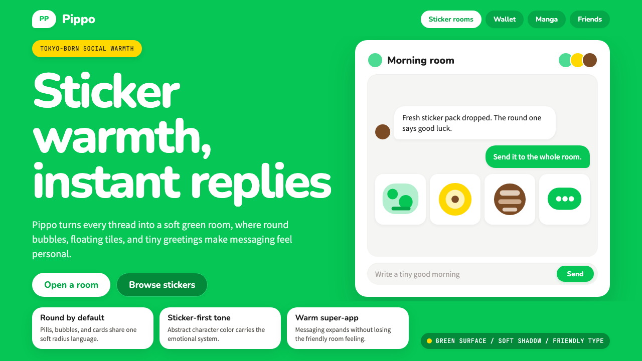
Where many design systems reserve rounded corners for a few select components, LINE rounds everything — buttons, input fields, message bubbles, avatars, cards, modal windows, and even notification badges. The radius is generous rather than token: elements are pill-shaped or bubble-shaped at their most characteristic. This pervasive roundness communicates the same message at every scale: no sharp edges, no hard stops, no severity. The interface is a soft space.许多设计体系只为少数特定组件保留圆角,LINE则将圆角施加于一切——按钮、输入框、消息气泡、头像、卡片、模态窗口,乃至通知角标。圆角弧度慷慨而非象征性:最具特色的形态是药丸形或气泡形。这种无处不在的圆润在每一个尺度上传递着同一条信息:没有锋利的边角,没有生硬的终止,没有严苛。界面是一个柔软的空间。
Message Bubble Language消息气泡语言
The chat bubble is the fundamental unit of the LINE interface, and its design carries the system's warmth at the most granular level. Outgoing messages appear in the signature green; incoming messages appear in white or a very light neutral — the color contrast immediately communicates direction without requiring the user to read sender labels. The bubble's tail is soft and rounded, never angular. System messages and timestamps are rendered in muted, secondary tones to recede behind the conversational content.聊天气泡是LINE界面的基本单位,其设计在最细粒度的层面上承载了这套体系的温度。发出的消息以标志绿色呈现,收到的消息则以白色或极浅的中性色呈现——颜色对比直接传达了方向,无需用户阅读发送者标签。气泡的尾巴柔和而圆润,从不呈锐角。系统消息和时间戳以低调的次要色调呈现,退居在对话内容之后。
Sticker-Scale Expressiveness贴图级别的表达力
The LINE visual system is built to coexist with an enormous library of illustrated stickers, animated characters, and expressive imagery. This requires a UI language that does not compete with rich content — backgrounds stay clean, layouts stay open, and color is used with enough restraint that a large illustrated sticker can enter the composition without clashing. The design system treats empty space as a stage, not as waste, because character content needs room to perform.LINE视觉体系的设计是为了与海量的插图贴图、动态角色和表情图像共存。这需要一套不与丰富内容竞争的UI语言——背景保持干净,布局保持开阔,色彩使用足够克制,使一张大型插图贴图能够进入画面而不产生冲突。设计体系将留白视为舞台而非浪费,因为角色内容需要空间来表演。
Soft Shadow Depth柔阴影深度
Unlike design systems that use hard-edged shadows derived from Bauhaus or flat design principles, LINE employs soft, diffuse shadows that give cards and panels a gentle elevation above the background. These shadows are not dramatic — they do not simulate strong directional lighting or theatrical depth. They are ambient and slight, just enough to separate layers and establish hierarchy without creating visual weight. The overall effect is comfortable and approachable rather than sharp and assertive.不同于源自包豪斯或扁平设计原则的硬边阴影体系,LINE采用柔和、漫散的阴影,赋予卡片和面板一种轻微的层叠感。这些阴影并不戏剧化——它们不模拟强烈的定向光照或剧场式深度,而是环境性的、轻微的,仅足以分离图层并建立层级,不产生视觉重量。整体效果舒适而亲切,而非锋利和强势。
Warm White Ground暖白底面
The backgrounds in LINE's interface trend toward a warm white rather than a pure or cool white. This slight warmth keeps the interface from feeling clinical or sterile, and it creates a harmonious relationship with the signature green — which is itself a warm-leaning tone. Chat list screens, settings panels, and content areas all sit on this warm white ground, ensuring that even densely packed information screens feel inviting rather than demanding.LINE界面的背景倾向于暖白色而非纯白或冷白。这一丝细微的暖意让界面不至于显得临床或无菌,同时与标志性绿色形成和谐关系——后者本身也是一个偏暖的色调。聊天列表、设置面板和内容区域都置于这一暖白底面之上,确保即使是信息密集的屏幕,感受上也是邀请而非压迫。
Humanist Typographic Register人文主义排印基调
The typefaces chosen to represent LINE across its interfaces share a common quality: humanist warmth. Rather than geometric sans-serifs with their cool precision, LINE's type leans toward letterforms with slightly organic curves, generous letter-spacing, and an overall feeling of friendliness. Headlines are confident but never aggressive. Body text is legible at small sizes without sacrificing personality. The typographic register consistently says: this is a communication tool made for humans, by humans who thought carefully about how words should feel.LINE界面所选用的字体共享一种品质:人文主义的温暖。不同于几何无衬线字体冷静的精准,LINE的文字倾向于带有微微有机曲线、慷慨字间距、整体传递亲切感的字形。标题自信而不咄咄逼人,正文在小尺寸下依然清晰易读,同时不失个性。这种排印基调始终在说:这是一个为人类而造、由认真思考过文字感受的人所打造的沟通工具。
See the LINE Messenger Green design system查看 LINE Messenger Green 完整设计系统
Who shaped LINE Messenger Green?谁塑造了 LINE Messenger Green?
Lee Hae-jin co-founded NHN Corporation (which later became Naver and the parent organization of LINE) and served as a driving force behind LINE's development and international expansion. His vision of a networked communication platform that could withstand infrastructure failure — informed directly by the 2011 disaster — gave LINE its founding design philosophy: build for accessibility and universality above all else. Lee's strategic decisions to expand LINE aggressively into East and Southeast Asia rather than competing head-on with WhatsApp in Western markets shaped the cultural contexts in which LINE's warm, character-forward aesthetic would take root.李海珍共同创立了NHN(后来演变为Naver及LINE的母公司),是LINE开发与国际扩张背后的核心推动力。他对一个能够抵御基础设施故障的网络通信平台的构想——直接受到2011年灾难的启示——赋予了LINE最初的设计哲学:将无障碍性与普遍性置于一切之上。李海珍将LINE积极扩张至东亚与东南亚、而非在西方市场与WhatsApp正面竞争的战略决策,塑造了LINE那种温暖、角色优先美学得以生根的文化语境。
As CEO of Line Corporation, Akira Morikawa oversaw the period in which LINE transformed from a disaster-response messaging tool into one of Asia's most recognized consumer technology brands. Under his leadership, the app expanded its feature set — from messaging to payments, news, gaming, and e-commerce — while maintaining the visual and tonal consistency that defined the LINE experience. His stewardship of the brand through the 2019 refresh and the subsequent merger discussions with Naver and SoftBank's Yahoo Japan shaped the current state of the visual identity.作为Line Corporation的CEO,森川亮主导了LINE从灾难应急通讯工具转变为亚洲最具知名度的消费科技品牌之一的时期。在他的领导下,应用扩展了功能版图——从即时通讯到支付、新闻、游戏和电子商务——同时保持了定义LINE体验的视觉与基调一致性。他在2019年品牌焕新期间及后续与Naver、软银Yahoo Japan的合并谈判中对品牌的掌舵,塑造了当前视觉识别的面貌。
The designer credited with creating the original Line Friends character system — Brown, Cony, Sally, Moon, Choco, and the extended cast — Kang Byung Mok produced the visual personalities that became the emotional backbone of the entire LINE brand. His character designs were not merely illustrative add-ons; they defined the emotional register that the UI system had to honor and support. The visual warmth, rounded forms, and expressive palette of the LINE interface can be understood as the UI designer's response to the design imperative that Kang's characters established: every element must feel like it belongs in the same world as these characters.姜炳默是创作最初Line Friends角色体系的设计师——布朗、可妮、莎莉、月亮、巧克力及其他角色——他塑造的视觉个性成为整个LINE品牌情感脉络的骨架。他的角色设计并非单纯的插图附件,而是定义了UI体系必须尊重和支撑的情感基调。LINE界面的视觉温暖感、圆润形态与富有表现力的配色,可以被理解为UI设计师对姜炳默角色所确立的设计命题的回应:每一个元素都必须感觉与这些角色身处同一个世界。
Idezawa succeeded Morikawa as Line Corporation's CEO and presided over the company's progression toward a super-app model — a vision in which LINE's friendly interface would become the gateway to a comprehensive suite of services spanning financial products, healthcare, government services, and daily commerce. This super-app ambition placed new demands on the visual system, requiring it to maintain warmth and approachability while accommodating the complexity and trust signals needed for financial and civic applications. The design language's ability to stretch across these contexts without losing its identity is testament to its underlying strength.出泽刚接替森川亮出任Line Corporation CEO,主导了公司向超级应用模式演进的进程——在这一愿景中,LINE亲切的界面将成为一套涵盖金融产品、医疗健康、政府服务与日常商业的综合服务入口。这一超级应用的雄心对视觉体系提出了新要求:在容纳金融与政务应用所需的复杂度与信任信号的同时,保持温暖与亲近感。这套设计语言能够在如此宽广的场景中延伸而不失去自身特性,印证了其底层结构的强度。
Beyond Kang Byung Mok's founding character designs, the ongoing Line Friends creative team has continued to expand the character universe — introducing new characters, seasonal variants, collaborations with external IP owners, and creator-made sticker sets that number in the hundreds of thousands. This collective creative output has maintained the visual diversity that keeps LINE's ecosystem feeling alive and personal, while the core design team's work on the app itself has ensured that the interface remains a stable, legible frame around that abundance of expressive content. The ongoing tension between UI restraint and character abundance is one of the defining creative challenges the team navigates.在姜炳默的创始角色设计之外,Line Friends持续运营的创意团队不断扩展角色宇宙——推出新角色、季节性变体、与外部IP的联名合作,以及数量多达数十万套的创作者贴图。这一持续的集体创作产出维持了LINE生态系统充满活力与个性的视觉多样性,而应用本身的核心设计团队确保界面始终是这片丰盛表达内容周围一个稳定、清晰的框架。UI克制与角色丰富性之间持续的张力,是团队所导航的最具定义性的创意挑战之一。
How do you use LINE Messenger Green today?今天怎么用 LINE Messenger Green?
LINE Messenger Green is one of the most instructive styles for designers who need to communicate warmth, friendliness, and approachability through a digital interface — particularly in Asian markets where the LINE brand has deep cultural resonance. Applying it correctly means understanding that the warmth is not produced by the green alone, but by the combination of color, form, shadow quality, and type register working together. A green button on a cold, angular layout with hard shadows does not feel like LINE; it feels like a contradiction.LINE Messenger Green是需要通过数字界面传递温暖、友好与亲近感的设计师最具启发性的风格之一——尤其在LINE品牌拥有深厚文化共鸣的亚洲市场。正确运用这套风格意味着理解:这种温暖并非单独由绿色产生,而是由颜色、形态、阴影质地与字体基调协同工作共同营造的。一个绿色按钮出现在冷峻的棱角布局与硬边阴影之中,感觉不像LINE,而像是一种矛盾。
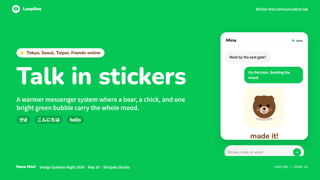
For presentation slides, LINE Messenger Green works exceptionally well on covers and opening sequences where emotional tone needs to be established quickly. A cover built in this style might pair the signature green with a warm white ground, a rounded display typeface set at generous scale, and a character illustration or icon with soft, diffuse shadows. Content slides benefit from the system's clarity: consistent use of the green for key terms, data points, or CTAs against clean white fields, with information organized in card-like containers that use rounded corners and subtle elevation. Data visualizations should use the green as the primary data color, with supporting neutrals and the occasional warm accent for secondary series — the result feels readable and friendly rather than clinical.在演示文稿中,LINE Messenger Green在需要迅速建立情感基调的封面与开场序列上表现尤为出色。以这种风格打造的封面可以将标志性绿色与暖白底面结合,搭配大尺度圆润展示字体,以及带有柔和漫散阴影的角色插图或图标。内容页受益于这套体系的清晰性:在干净的白色底面上,绿色一致用于关键词、数据点或行动号召,信息组织于使用圆角和微妙层叠感的卡片式容器中。数据可视化应以绿色作为主数据色,辅以中性色,偶尔以暖调强调色标注次要序列——效果清晰易读而充满亲切感,而非临床冷漠。
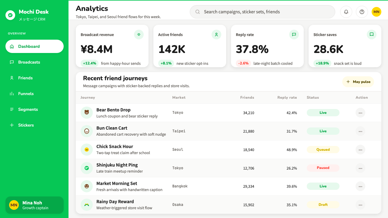
For web UI including dashboards and pricing pages, LINE Messenger Green adapts well to contexts where complex information needs to feel manageable. A dashboard built in this aesthetic uses soft-shadow cards as the primary container unit, with the signature green appearing on active states, primary action buttons, and positive metric indicators. Pricing pages benefit from the system's built-in approachability: tier cards with generous rounded corners, the signature green on the recommended tier, and typographic hierarchy that uses scale and weight rather than aggressive color contrast. Navigation should feel open and unhurried — generous spacing, rounded toggle elements, and a warm white background that prevents the information density from feeling overwhelming.对于包括仪表板和定价页面的网页UI,LINE Messenger Green能良好适应需要让复杂信息感觉可掌控的场景。以这一美学构建的仪表板以柔阴影卡片为主要容器单位,标志性绿色出现在激活状态、主要操作按钮和正向指标上。定价页面受益于这套体系内置的亲近感:圆角慷慨的定价层级卡片,推荐档位使用标志性绿色,排版层级依靠尺度与字重而非强烈的色彩对比来建立。导航应感觉开阔而从容——宽松的间距、圆润的切换元素,以及防止信息密度显得压迫的暖白背景。
For editorial and marketing contexts, the style supports a warmth-forward approach to content presentation. An editorial layout in this register keeps the signature green for pull quotes, key facts, or section introductions — using it sparingly enough that each appearance carries emphasis. Marketing pages built in this style benefit from full-width sections that alternate between the signature green background and warm white, with character or product imagery given generous space. Email marketing in this style uses the green header confidently but keeps the body area clean and well-padded, with a single green call-to-action button per section. The emotional register should always feel like receiving a message from a friend, not receiving a notification from a system.对于编辑与营销场景,这种风格支持以温暖为先的内容呈现方式。以这一基调构建的编辑版面将标志性绿色保留给引文、关键事实或章节引语——用量足够克制,使每次出现都携带强调力。以这种风格构建的营销页面受益于在标志性绿色背景与暖白色之间交替的全宽版块,角色或产品图像获得充足的呼吸空间。这种风格下的电子邮件营销自信地使用绿色顶部横幅,但保持正文区域干净而留有余白,每个版块只设置一个绿色行动号召按钮。情感基调始终应该是:收到来自朋友消息的感受,而非收到系统通知的感受。
The most common mistake when applying LINE Messenger Green is using the green in ways that remove its warmth — particularly by pairing it with cool-toned neutrals, sharp corners, or hard-edged shadows. The green is warm and organic; set it against cool greys or pure blue-whites and it becomes jarring rather than inviting. A second common error is over-saturating the composition with the green, turning a warm accent into an overwhelming field. In authentic LINE-inspired work, the green appears where action or emphasis is genuinely needed, and the majority of the visual field stays in the warm whites and light neutrals that give the green room to breathe and signal.运用LINE Messenger Green时最常见的错误,是以削弱其温暖感的方式使用绿色——尤其是将其与冷调中性色、锐利直角或硬边阴影配对。这种绿色是温暖而有机的;将其置于冷灰或纯蓝白之上,它便从令人愉悦变成刺眼突兀。第二种常见错误是用绿色过度饱和画面,将一个温暖的强调色变成一片压倒性的色块。在真正受LINE启发的作品中,绿色只出现在真正需要行动或强调的地方,视觉画面的大部分保持在暖白和浅中性色中,给绿色留下呼吸和信号传递的空间。
See the LINE Messenger Green design system查看 LINE Messenger Green 完整设计系统
LINE Messenger Green — FAQLINE Messenger Green · 常见问题
How does LINE Messenger Green differ from other friendly app design systems like Duolingo or Headspace?LINE Messenger Green与Duolingo或Headspace等其他友好型应用设计体系有何不同?
All three use green or warm tones to signal approachability, but they serve very different emotional registers. Duolingo's green is energetic and slightly gamified — it pairs with aggressive streak mechanics and high-contrast alerts, making it motivating rather than soothing. Headspace uses warmth through color temperature and organic illustration, aiming for calm rather than energy. LINE Messenger Green is specifically social: it is warm in the way a received sticker is warm — personal, expressive, and relational. Its visual language is built around the presence of other people and character personalities, which gives it a distinctly different feeling from apps oriented toward individual habit formation or personal wellness.三者都以绿色或暖色传递亲近感,但服务于截然不同的情感基调。Duolingo的绿色充满活力,带有轻微游戏化色彩——它与强烈的连续打卡机制和高对比度提醒配对,营造的是激励感而非抚慰感。Headspace通过色温和有机插图传递温暖,目标是平静而非能量。LINE Messenger Green则是特定意义上的社交温暖:它像收到一张贴图时的温暖——私人、富有表现力、关系性的。它的视觉语言围绕他人的存在和角色个性构建,这使其与面向个人习惯养成或个人健康的应用有着截然不同的感受。
Can LINE Messenger Green work for professional or enterprise contexts, or is it too playful?LINE Messenger Green适用于专业或企业场景吗?还是说它太过活泼?
LINE itself has expanded successfully into financial services, government integrations, and healthcare through LINE Pay and LINE Health — which suggests that the visual system has more range than its sticker-economy origins might imply. The key is calibration: for professional contexts, reduce the character imagery and the most exuberant green usage to accents and CTAs only, increase the typographic weight and hierarchy, and lean into the system's clean, open white space rather than its warmest, roundest elements. The resulting aesthetic reads as approachable and trustworthy rather than playful. Contexts that are genuinely incompatible with this style tend to be those requiring visible authority signals — legal, governmental, or high-stakes financial services where severity is itself a trust signal.LINE本身已经通过LINE Pay和LINE Health成功扩展至金融服务、政府整合和医疗健康领域——这说明这套视觉体系比其贴图经济的起源所暗示的有更宽广的适用范围。关键在于校准:在专业场景中,将角色图像和最活跃的绿色用量减少至仅用作强调和行动号召,增强排版的字重与层级感,着重利用体系中干净开阔的留白,而非其最温暖、最圆润的元素。由此产生的美学传递的是亲切与可信赖,而非活泼。真正与这种风格不相容的场景,往往是那些需要显性权威信号的语境——法律、政务,或严肃性本身就是信任信号的高风险金融服务。
Is LINE Messenger Green suitable for dark mode?LINE Messenger Green适合深色模式吗?
LINE does support a dark mode, and the visual system adapts with care. In dark mode, the backgrounds shift to deep charcoal and dark neutral tones rather than pure black — maintaining the warmth of the original system by avoiding a cold, pitch-black ground. The signature green remains largely consistent, though it may appear slightly more vivid against dark backgrounds. Message bubbles in dark mode use dark neutrals for incoming messages and the signature green for outgoing, preserving the directional color logic. The soft shadows become more subtle or are replaced with slight border treatments to maintain layer separation without losing the gentle quality of the lighting system.LINE确实支持深色模式,视觉体系的适配也经过精心考量。在深色模式下,背景转变为深炭灰和深中性色调,而非纯黑——通过避免冰冷的纯黑底面来保持原始体系的温暖。标志性绿色基本保持一致,尽管在深色背景下可能显得略微更鲜明。深色模式下的消息气泡对收到的消息使用深中性色,对发出的消息使用标志性绿色,保留了方向性的色彩逻辑。柔和阴影变得更为微妙,或被轻微的边框处理所替代,以在不失去光照系统柔和品质的前提下维持图层分离。
Why does LINE use green as its primary color rather than blue, which dominates most communication apps?为什么LINE选择绿色作为主色,而非主导大多数通讯应用的蓝色?
The choice is both practical and cultural. At the time of LINE's launch, the major messaging platforms — iMessage, early WhatsApp, Facebook Messenger — were using blues and greens derived from the convention of telecommunications (blue for technology, trust, and distance). LINE's green is warmer and more organic than the blues of these competitors, positioning it as friendlier and more personal. In East Asian cultural contexts, green carries associations of freshness, growth, and positive energy without the formal distance that blue can suggest. It also photographs well against the light backgrounds of the Asian mobile interfaces of the early 2010s, where LINE was building its earliest and most passionate user base.这一选择兼具实用性与文化考量。在LINE发布之时,主流即时通讯平台——iMessage、早期WhatsApp、Facebook Messenger——使用的是源自电信行业惯例的蓝色与绿色(蓝色代表科技、信任与距离感)。LINE的绿色比这些竞争对手的蓝色更温暖、更有机,使其呈现出更友好、更私人的定位。在东亚文化语境中,绿色承载着清新、生长与正向能量的联想,不带蓝色可能暗示的正式距离感。它在2010年代初期亚洲移动界面的浅色背景上也拍摄效果良好,彼时LINE正在建立其最早也最具热情的用户群体。
How should a designer handle the sticker and character imagery if they are not working with official LINE assets?如果设计师没有官方LINE素材,应如何处理贴图和角色图像?
The character imagery is a significant part of what makes LINE feel like LINE — but the visual system's warmth is not exclusively dependent on it. Designers working without official character assets can draw on the system's other elements: the signature green, the pervasive rounded forms, the soft shadow system, the warm white backgrounds, and the humanist typographic register. Custom illustrations in a rounded, expressive style — not necessarily animal characters, but any illustration language that shares the same warmth and exuberance — can occupy the role that the official characters play. Alternatively, emoji used generously and at scale, or user-generated avatar imagery, can fill the expressive function. The essential principle is that the interface should feel populated with personality, even if that personality comes from sources other than the original Line Friends cast.角色图像是LINE感觉像LINE的重要组成部分——但这套视觉体系的温暖感并非完全依赖于角色。没有官方角色素材的设计师可以借助体系的其他元素:标志性绿色、无处不在的圆润形态、柔阴影体系、暖白背景,以及人文主义排印基调。以圆润、富有表现力风格绘制的自定义插图——不必是动物角色,但任何在温暖感与生命力上与之共鸣的插图语言——都可以占据官方角色所扮演的角色。或者,大量且大尺寸使用的表情符号,或用户生成的头像图像,也能实现表达功能。核心原则是:界面应该感觉充满个性,即使这种个性来自官方Line Friends阵容以外的来源。
Related design styles相关设计风格
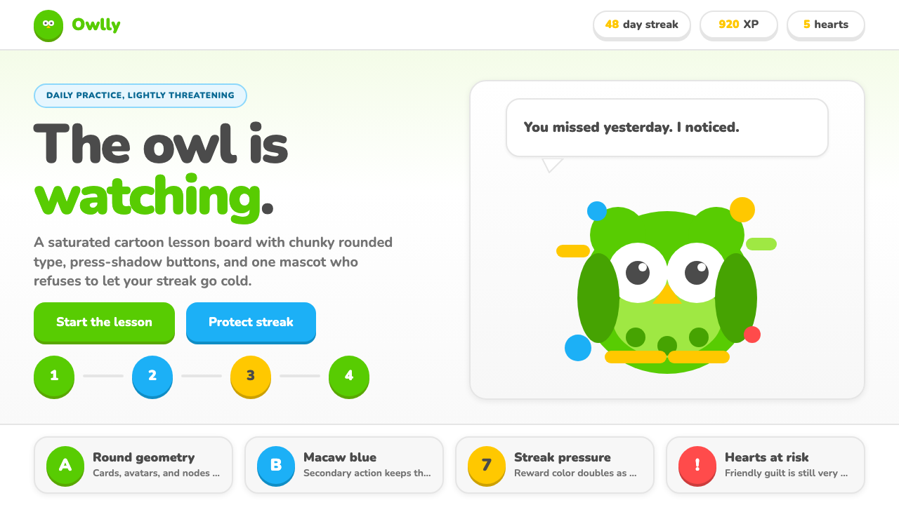 Duolingo Green Owl MascotFriendly guilt goes loud. Saturated green, Nunito heft, and press-shadow butt…友好内疚很响亮:高饱和绿、厚重 Nunito 与按压阴影盯住连胜。
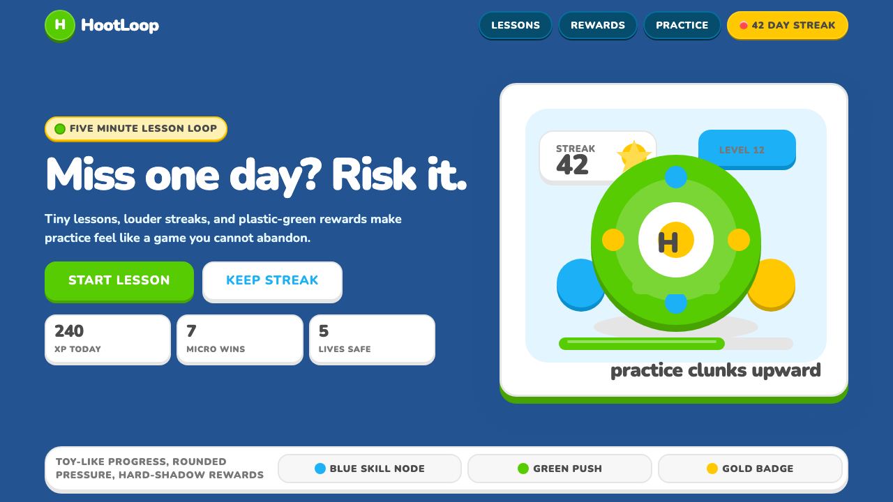 Duolingo 2024Adorable pressure wins. Feather Green, Nunito heft, rounded push-shadows gami…可爱压力取胜:羽毛绿、Nunito粗字与圆角硬阴影,把愧疚游戏化。
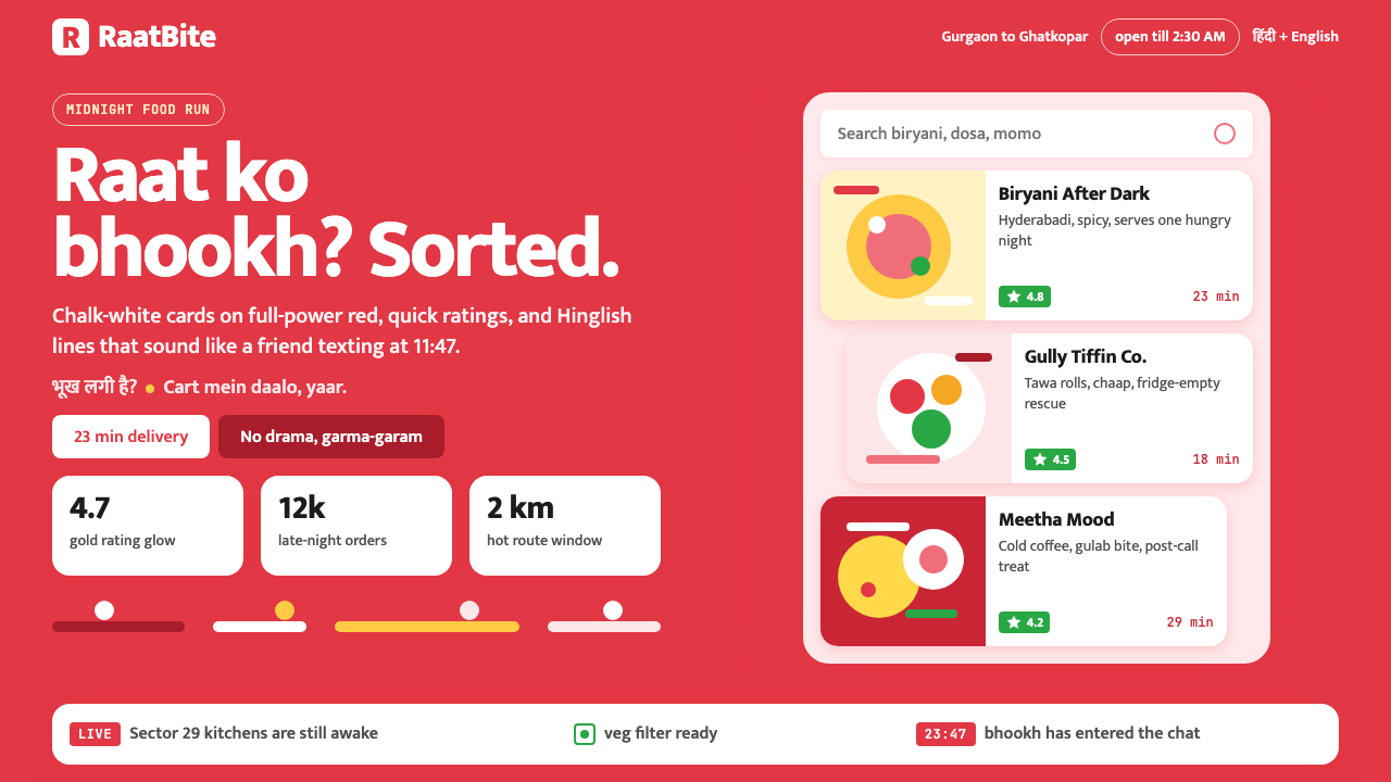 Zomato India DeliveryOwns the midnight scroll. Saturated red, Mukta Hinglish, white cards and gold…午夜外卖很会说话:饱和红、Mukta双语字和白卡金星撑起深夜滚动。
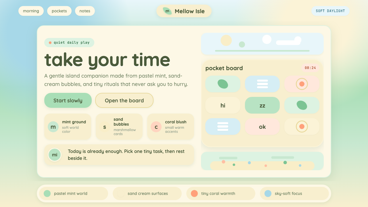 Animal Crossing — New HorizonsNo pressure, only daylight. Mint fields and sand bubbles soften every edge.没有压力,只有日光。薄荷地与沙奶油气泡软化所有边角。
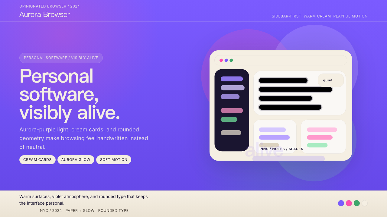 Arc BrowserPersonal software, visibly alive. Aurora purple glows over cream cards and ro…有生命感的个人软件。极光紫铺底,奶油卡片和圆润字形发光。
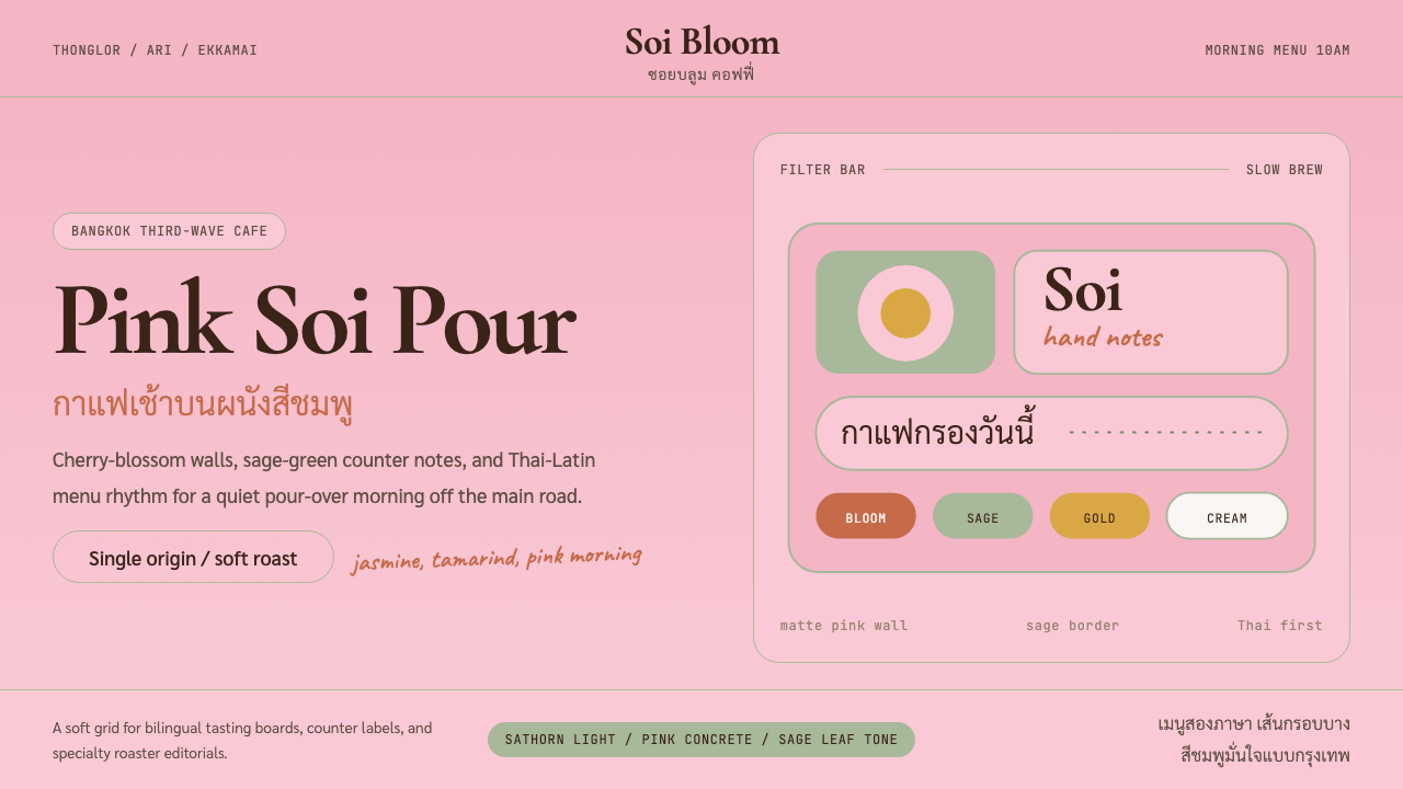 Bangkok Third-Wave CafeBangkok feels soft but sure. Cherry pink, sage borders, and Thai-Latin menu r…曼谷柔和却自信:樱花粉、鼠尾草边框与泰英菜单节奏。