What is Animal Crossing — New Horizons?什么是 Animal Crossing — New Horizons?
Animal Crossing: New Horizons turned the panic of 2020 into a design lesson: that softness, roundness, and perpetual gentle daylight can carry an entire visual language.《集合啦!动物森友会》将2020年的焦虑化作一堂设计课:柔软、圆润与永恒的温柔光线,足以撑起一套完整的视觉语言。
Animal Crossing — New Horizons in briefAnimal Crossing — New Horizons 速览
Animal Crossing: New Horizons is a life-simulation video game released by Nintendo in March 2020, whose visual identity has since become one of the most recognizable comfort aesthetics in contemporary digital culture. Its design language centers on a palette of pastel mint greens, sand-cream neutrals, and soft sky tones — colors that never push into loud saturation and never recede into harshness. Every surface in the interface seems lit by the same overcast island morning: gentle, directionless, and permanently forgiving.《集合啦!动物森友会》是任天堂于2020年3月发布的生活模拟游戏,其视觉识别体系已成为当代数字文化中最易辨认的治愈美学之一。这套设计语言以粉彩薄荷绿、沙滩奶油色与柔和天空色调为核心——这些色彩从不推向刺眼的高饱和度,也从不跌入生硬的黯淡。界面上的每一个表面似乎都被同一种阴天岛屿清晨的光线照亮:温柔、无方向感,且永远包容。
The system draws heavily from the kawaii tradition that has defined Japanese consumer culture since the 1970s — a philosophy in which cuteness is not merely decorative but functional, communicating safety, approachability, and emotional ease. In the game's interface, this translates to marshmallow-rounded button shapes, speech-balloon dialogue boxes with soft outlines and character portrait insets, and leaf-shaped or pebble-shaped icons that feel hand-hewn rather than machine-generated. Nothing has a sharp corner. Nothing asserts itself aggressively. The entire visual register operates just below the threshold of excitement.这套系统深深扎根于自1970年代以来定义日本消费文化的可爱(kawaii)传统——一种将可爱不仅视为装饰、更视为功能性语言的哲学,传达安全感、亲近感与情感上的轻松。在游戏界面中,这体现为棉花糖般圆润的按钮形状、带柔和轮廓与角色头像内嵌的对话气泡框,以及树叶形或鹅卵石形图标——它们看起来像手工制作,而非机器生成。没有任何元素有锐利的边角,没有任何元素咄咄逼人。整个视觉音域运作在兴奋阈值之下。
What distinguishes the New Horizons aesthetic from generic kawaii is the precision with which Nintendo's EPD team maintained these constraints across every touchpoint — UI chrome, seasonal color shifts, furniture item thumbnails, invitation cards, in-game signage. The coherence is total. The style has since escaped its original game context and entered broader design vocabulary: applied to slide decks, brand identities, social media templates, and web interfaces that seek the same quality of ambient warmth and low visual pressure.将新视野美学与泛泛的可爱风格区分开来的,是任天堂EPD团队在每一个接触点——UI框架、季节性色彩变化、家具物品缩略图、邀请函、游戏内告示牌——保持这些约束的精确程度。整体连贯性是彻底的。如今这套风格已经溢出原始游戏语境,进入更广泛的设计词汇:被应用于幻灯片、品牌形象、社交媒体模板,以及所有追求同等环境温暖感与低视觉压力品质的网页界面。
See the Animal Crossing — New Horizons design system查看 Animal Crossing — New Horizons 完整设计系统
Where does Animal Crossing — New Horizons come from?Animal Crossing — New Horizons 从何而来?
The Animal Crossing series was born in Kyoto, Japan, inside Nintendo's internal development organization. The original Animal Crossing launched in 2001 for the Nintendo 64 in Japan and arrived in North America in 2002 on the GameCube. Series producer Katsuya Eguchi had conceived a game about moving to a new town, making acquaintances gradually, and inhabiting a domestic space that changed with the real-world passage of time — days, seasons, annual holidays. The premise required a visual tone that was unhurried and unhierarchical: no enemies to defeat, no urgent visual signals, no color coding for danger. From the earliest game in the series, softness was a structural requirement rather than a stylistic afterthought.动物森友会系列诞生于日本京都,在任天堂内部开发组织中孕育成形。初代《动物森友会》于2001年在日本登陆Nintendo 64,2002年以GameCube版本进入北美市场。系列制作人江口胜也构想了一款关于搬到新城镇、逐渐结识朋友、在随现实时间流逝而变化的居所中生活的游戏——日夜交替、四季更迭、每年的节假日循环往复。这一前提要求一种从容而无层级感的视觉基调:没有需要击败的敌人,没有紧迫的视觉信号,没有用于标记危险的色彩编码。从系列最早的作品起,柔软就是结构性的要求,而非风格上的事后添加。
New Horizons, the fourth mainline entry, entered development under director Aya Kyogoku and producer Hisashi Nogami. The shift in setting from a village to a deserted island introduced a specific palette rationale: island environments naturally produce soft ambient light, bleached sand, shallow turquoise water, and tropical foliage in muted greens. The design team built its visual vocabulary around these environmental references, arriving at a palette that felt geographically motivated rather than arbitrarily sweetened. The mint-green and cream combination has photographic precedent in the over-exposed look of film photography shot in bright, sandy outdoor environments.第四部正统作品《新视野》在总监京极彩与制作人野上恒的主导下进入开发。场景从村庄转变为无人岛,带来了特定的色彩逻辑:岛屿环境天然产生柔和的漫射光、漂白的沙地、浅绿松石色的浅水,以及静穆灰绿色调的热带植被。设计团队围绕这些环境参照构建视觉词汇,最终形成了一套感觉上有地理依据而非随意甜化的色板。薄荷绿与奶油色的组合,在明亮沙地户外环境中拍摄的过曝胶片摄影里有其摄影学前例。
The timing of New Horizons' March 2020 release coincided with the beginning of global pandemic lockdowns, and the game became a cultural phenomenon precisely because its design values matched a collective psychological need. The soft palette, the absence of visual urgency, the looping ambient music, and the game's core loop of gentle daily tasks — picking fruit, talking to neighbors, decorating interiors — offered a controlled environment radically unlike the visual overload of news and social media. Cultural critics and design writers noted that New Horizons had effectively prototyped what therapeutic digital design might look like at scale.《新视野》2020年3月的发布时间与全球疫情封锁的开始恰好重合,这款游戏成为文化现象,正是因为其设计价值观契合了一种集体心理需求。柔和的色板、视觉紧迫感的缺失、循环播放的环境音乐,以及游戏由摘水果、与邻居交谈、装饰室内组成的温柔日常任务核心循环——提供了一个受控环境,与新闻和社交媒体的视觉超载截然相反。文化批评者和设计写作者注意到,《新视野》实际上在大规模地原型化了治愈性数字设计的可能面貌。
The game's aesthetic inheritance is traceable to several parallel traditions in Japanese visual culture. Sanrio's character design vocabulary — Hello Kitty, My Melody, the extended cast of soft-edged, emotionally neutral characters — established the template for facial simplicity and color restraint in Japanese consumer goods from the 1970s onward. Nintendo's own design lineage, running from the original Game Boy's compact screen to the DS's dual-display intimacy, had always favored legibility and emotional approachability over graphical spectacle. New Horizons synthesized these traditions into a system precise enough to be reproducible — which is why it has proven so influential outside gaming contexts.这款游戏的美学传承可追溯至日本视觉文化中的若干平行传统。三丽鸥的角色设计词汇——Hello Kitty、美乐蒂,以及那一大家族软边、情感中性的角色——从1970年代起就在日本消费品中确立了面部简洁化与色彩克制的模板。任天堂自身的设计脉络,从初代Game Boy的紧凑屏幕到DS的双屏亲密感,始终将易读性与情感亲近性置于图形奇观之上。《新视野》将这些传统综合为一套足够精确、可供复制的系统——这正是它在游戏语境之外被证明如此有影响力的原因。
What defines the Animal Crossing — New Horizons look?Animal Crossing — New Horizons 的视觉特征是什么?
Palette色板
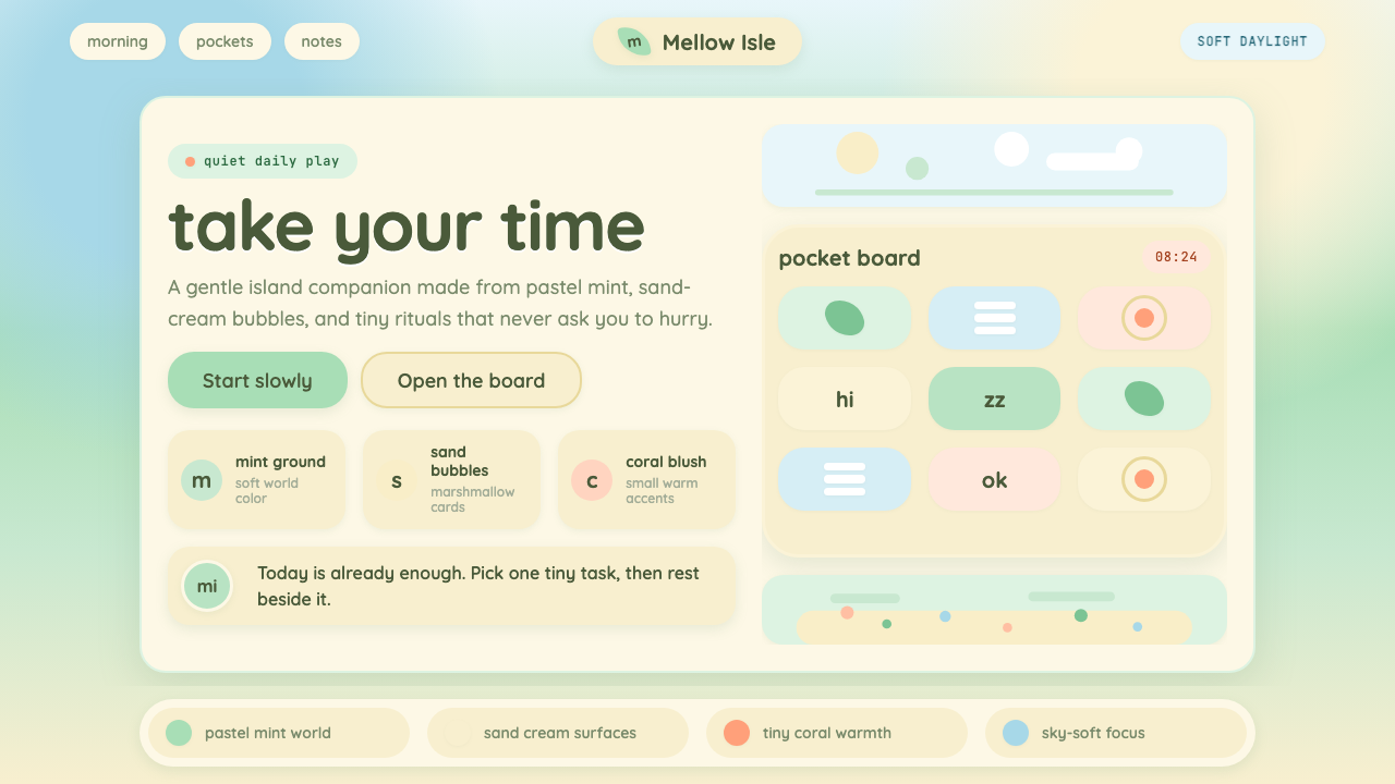
The signature color system is built from desaturated, light-valued tones: mint green as the primary accent, sand cream as the dominant neutral ground, and soft sky blue as a secondary field color. Supporting tones include pale peach, warm ivory, and muted sage. No color in the system raises its saturation above a gentle mid-level whisper — the effect is of a world that has been left in soft afternoon light rather than lit for commercial photography. Dark values are used sparingly and only for type legibility or subtle boundary marking, never as mood-setting fields.标志性的色彩系统由低饱和度、高明度的色调构成:薄荷绿作为主要强调色,沙滩奶油色作为主导中性底色,柔和天空蓝作为次要场域色。辅助色调包括淡桃色、暖象牙色和静穆鼠尾草绿。系统中没有任何颜色的饱和度超过温柔的中等低语——整体效果如同一个被柔和午后光线沐浴、而非为商业摄影精心打光的世界。深色调使用极为克制,仅用于文字的易读性或微妙的边界标记,从不用作营造氛围的大面积底色。
Roundness圆润度
Rounded corners are not a detail in this system — they are a structural value. Buttons, dialog boxes, item thumbnails, map tiles, and notification badges all share an extreme corner radius that approaches the oval or lozenge. The effect removes every sharp visual threat from the interface. In borrowed applications, maintaining this degree of roundness is more important than matching any specific color, because the rounded geometry is what communicates psychological safety and approachability at a perceptual level before color is even consciously registered.在这套系统中,圆角不是细节——它是结构性价值。按钮、对话框、物品缩略图、地图方块与通知徽章全部共享一个极度圆润、接近椭圆或药丸形的角半径。这一处理从界面中移除了所有锐利的视觉威胁。在借鉴性应用中,保持这种圆润程度比匹配任何具体颜色都更重要——因为圆润的几何形态在色彩被意识层面识别之前,就已经在感知层面传递了心理安全感与亲近感。
Typography字体排印
Type in the Animal Crossing visual system is consistently round-stroked, friendly, and at a comfortable medium weight — never condensed, never heavy to the point of aggression, never styled with sharp ink-trap details that would create visual tension. Letterforms are spaced generously, and text hierarchies are created through gentle size steps rather than dramatic weight contrasts. Headlines and body text exist in the same friendly register; even instructional text is presented as if handwritten on a signboard rather than output by a system.动物森友会视觉系统中的字体始终是笔画圆润、亲切友好、字重适中的——从不压缩,从不因字重过重而产生攻击感,从不带有会制造视觉张力的锐利墨腔细节。字母间距宽松,文字层级通过温和的尺寸递进而非戏剧性的字重对比来建立。标题与正文存在于同一友好的音域中;即便是说明性文字,也被呈现得如同手写在告示牌上,而非由系统输出。
Illustrated Texture插画质感
Rather than photographic imagery or clean vector flatness, the system uses a lightly illustrated quality — objects have subtle hand-drawn outlines, gentle watercolor-adjacent fills, and a slight softness to their edges that suggests pencil or brush rather than mouse or bezier curve. This illustrated quality is consistent across all object categories: furniture, clothing items, plants, tools, and food all share the same rendering style, creating a world that feels entirely hand-made. Applied to design work beyond games, this quality can be approximated through loose icon styles, slightly imperfect fill shapes, and hand-lettered accents.这套系统使用的不是摄影图像,也不是干净的矢量平面,而是带有轻微插画质感的风格——物体有微妙的手绘轮廓、接近水彩的轻柔填色,以及略带柔软的边缘,暗示铅笔或画笔而非鼠标或贝塞尔曲线。这种插画质感在所有物体类别中保持一致:家具、服装、植物、工具与食物共享同一种渲染风格,构建出一个感觉完全手工制作的世界。在游戏以外的设计工作中应用这种质感,可以通过松散的图标风格、略带不完美的填充形状和手写体强调元素来近似实现。
Ambient Warmth环境温暖感
Unlike design systems that use warmth as an accent layered over a neutral base, Animal Crossing saturates the entire visual field with ambient warmth. There is no cool, neutral backdrop waiting in reserve — even the sky tones and water hues carry a hint of warmth. Shadows, where they appear, are tinted rather than gray or black; highlights are cream rather than pure white. The effect is of an environment that has already been pre-warmed — as if the sun set the tone before any design decisions were made. This pervasive warmth is what gives the style its characteristic feeling of arriving home.与那些将温暖感作为叠加在中性底色上的强调色来使用的设计系统不同,动物森友会将环境温暖感渗透到整个视觉场域。没有冷静、中性的背景在等待备用——即便是天空色调和水色调也带有一丝暖意。阴影(若出现)是带色调而非灰色或黑色的;高光是奶油色而非纯白。整体效果如同一个已被预先暖化的环境——仿佛阳光在任何设计决定做出之前就已定下基调。这种弥漫的温暖感正是赋予这种风格其特有的归家感的来源。
Low Hierarchy Pressure低层级压力
Most design systems use strong visual hierarchy to direct user attention — urgent red for alerts, high-contrast black for primary actions, recessive gray for secondary content. Animal Crossing deliberately flattens this hierarchy. Everything occupies approximately the same calm register, and the user is trusted to look at what interests them rather than being pushed through a prescribed attention path. Applied to non-game contexts, this principle suggests restraint in the use of bold emphasis, aggressive calls to action, and notification-style visual urgency that ruptures the ambient tone.大多数设计系统使用强烈的视觉层级来引导用户注意力——红色用于紧急警示,高对比度黑色用于主要操作,退场灰色用于次要内容。动物森友会则刻意平抑这种层级感。所有元素占据大致相同的平静音域,用户被信任可以自主注视感兴趣的内容,而非被推着走过预设的注意力路径。将这一原则应用于非游戏语境,意味着克制使用粗体强调、攻击性的行动号召,以及会破坏环境基调的通知式视觉紧迫感。
Seasonal Responsiveness季节响应性
One of the system's most distinctive qualities is its explicit acknowledgment of time and season as design variables. The game's palette shifts across the year: cherry blossom pinks in spring, deep greens and bright blues in summer, amber and terracotta in autumn, and muted silver-whites in winter. This seasonal responsiveness is unusual in UI design, which typically strives for timeless consistency. Applied to design systems outside the game, it suggests a model where core palette tokens remain stable but a seasonal or contextual accent layer shifts appropriately — giving a brand a sense of aliveness without instability.这套系统最与众不同的特质之一,是它将时间与季节明确纳入设计变量。游戏色板随年份推移而变化:春天的樱花粉,夏天的深绿与明蓝,秋天的琥珀与赤土色,冬天的静穆银白。这种季节响应性在UI设计中异乎寻常——UI设计通常追求超越时间的一致性。应用于游戏之外的设计系统,它提示了一种模型:核心色板令牌保持稳定,但季节性或情境性的强调色层适时变换——赋予品牌一种鲜活感而不失稳定性。
See the Animal Crossing — New Horizons design system查看 Animal Crossing — New Horizons 完整设计系统
Who shaped Animal Crossing — New Horizons?谁塑造了 Animal Crossing — New Horizons?
Kyogoku served as director of Animal Crossing: New Horizons, becoming the first woman to direct a mainline Animal Crossing title. Under her direction, the game's core experience shifted toward player creative agency — the island construction tools, the terraforming system, the expanded furniture placement flexibility — while rigorously preserving the visual softness and low-pressure aesthetic established by the series. Her approach demonstrated that a design language can accommodate deep functionality without sacrificing its tonal warmth.京极彩担任《集合啦!动物森友会》总监,成为首位执导动物森友会正统系列作品的女性。在她的主导下,游戏核心体验向玩家创作主动性倾斜——岛屿建设工具、地形改造系统、扩展的家具摆放自由度——同时严格保持了系列确立的视觉柔软性与低压美学。她的方法证明了一套设计语言在不牺牲基调温暖感的前提下,完全可以承载深度功能性。
Nogami has produced the Animal Crossing series since its Nintendo 64 origins, making him the single most continuous creative steward of its visual and experiential identity. His long tenure gives him a rare vantage on what the series' aesthetic core actually is — as distinct from any individual game's implementation. Nogami has spoken publicly about designing for players who are not motivated by competition or mastery, a philosophical position that directly explains the series' restrained, non-urgent color and layout language.野上恒自Nintendo 64起就担任动物森友会系列制作人,是这套视觉与体验身份最持续的创意守护者。漫长的任期赋予他一种罕见的视角——真正理解系列美学核心是什么,而非局限于任何单一作品的具体实现。野上曾公开谈及为不受竞争或精通驱动的玩家而设计,这一哲学立场直接解释了系列克制、无紧迫感的色彩与版面语言。
Eguchi originated the Animal Crossing concept and directed the earliest entries, establishing the foundational premise that would define the series visual tone for two decades. His key insight — that a game about unhurried daily life requires a visual system with no urgency signals — translated directly into the palette and interface decisions that New Horizons later refined. Eguchi's work is a case study in how an experiential philosophy, when committed to with sufficient precision, generates a coherent aesthetic system as a natural consequence.江口胜也构想了动物森友会系列并执导了最早的作品,确立了此后二十年间定义系列视觉基调的基础前提。他的核心洞见——关于从容日常生活的游戏需要一套没有紧迫感信号的视觉系统——直接转化为《新视野》后来精炼的色板与界面决定。江口的工作是一个典型案例:当一种体验哲学以足够的精确度被坚守时,一套连贯的美学系统会作为自然结果而生成。
Nintendo Entertainment Planning and Development, the internal studio responsible for New Horizons, operates with an unusually tight integration of design, engineering, and product management. The cross-functional nature of EPD's structure is evident in the New Horizons aesthetic: seasonal palette shifts, real-time weather systems, and time-of-day lighting are not mere graphical effects but designed behaviors that required deliberate coordination across teams. The consistency of the visual system across all of these dynamic variables — which could easily have produced incoherence — reflects a design culture with shared values rather than a single designer's vision.任天堂企划开发部(EPD)是负责《新视野》的内部工作室,以设计、工程与产品管理异常紧密的整合方式运作。EPD跨职能结构的性质在《新视野》的美学中清晰可见:季节性色板变化、实时天气系统与昼夜光线,不仅仅是图形效果,而是需要跨团队刻意协调的设计行为。视觉系统在所有这些动态变量中——本可轻易产生不连贯——所保持的一致性,折射出的是拥有共同价值观的设计文化,而非单一设计师的个人愿景。
How do you use Animal Crossing — New Horizons today?今天怎么用 Animal Crossing — New Horizons?
Animal Crossing: New Horizons has escaped its game-context origins and become a transferable design reference precisely because its principles are emotional and tonal rather than narrowly iconographic. Applying it does not mean drawing leaf icons or Tom Nook avatars — it means committing to a consistent register of softness, roundness, and ambient warmth across every element of a composition. The most important discipline is restraint: allowing nothing to escalate into visual urgency, never letting a color reach full saturation, and defaulting always to more rounded corners rather than fewer.《集合啦!动物森友会》之所以能够逸出游戏语境成为可移植的设计参照,恰恰是因为它的原则是情感性与基调性的,而非狭义的图像化的。应用它并不意味着画树叶图标或狸克头像——而是意味着在构图的每一个元素中,坚守柔软、圆润与环境温暖感的一致音域。最重要的自律是克制:不让任何元素升级为视觉紧迫感,永远不让颜色抵达完全饱和,并始终默认更圆润的角而非更锐利的角。
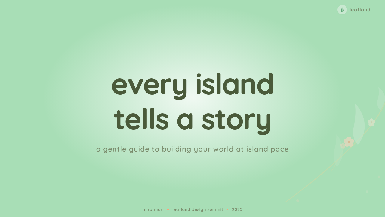
For presentation slides, the style works particularly well for cover slides, section dividers, and any content page where the goal is receptive attention rather than alert urgency. A cover built in this aesthetic places a soft mint or sand-cream background beneath a round-cornered card or illustrated element, with the title in a friendly medium-weight typeface that does not demand attention so much as invite it. Content slides should resist the temptation to use high-contrast accent colors for bullet points or data labels — instead, hierarchy is communicated through gentle size differences and generous white space. Data slides benefit from the style's softness if charts are rendered in tinted, slightly desaturated bar or area forms rather than full-saturation primaries.对于演示文稿,这种风格在封面页、章节分隔页,以及任何目标是让观众以接受性注意而非警觉性注意参与的内容页上表现尤佳。以这种美学构建的封面,将柔和薄荷色或沙滩奶油色背景置于圆角卡片或插画元素之下,标题使用亲切的适中字重字体——不是强迫注意力,而是邀请注意力。内容页应抵制为项目符号或数据标签使用高对比度强调色的诱惑——层级通过温和的尺寸差异与充裕的留白来传递。数据页若将图表渲染为带色调、略微降低饱和度的柱状或面积形式,而非使用全饱和度的主色,则能充分受益于这种风格的柔软感。
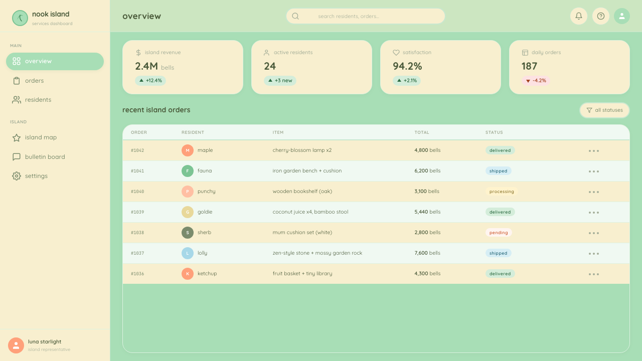
For web user interfaces, the aesthetic suits wellness applications, community platforms, onboarding flows, and any product where the user's emotional state at arrival is anxious or uncertain and the design's job is to de-escalate. Dashboard layouts in this style use a cream or very light mint background, card containers with significant corner radii and a faint warm drop shadow (soft and blurred rather than hard-offset), and action buttons in a muted mint or warm sand that suggest possibility without demanding a click. Pricing pages translate well because the tier distinctions can be communicated through soft background color differences — one tier on cream, another on pale mint — without requiring the aggressive contrast that many SaaS pricing pages use.对于网页用户界面,这种美学适合健康应用、社区平台、引导流程,以及任何用户到达时情绪焦虑或不确定、而设计任务是使其平静下来的产品。这种风格的仪表板布局使用奶油色或极浅薄荷色背景、带有显著圆角和微弱暖色投影(柔和模糊而非硬边偏移)的卡片容器,以及以静穆薄荷色或暖沙色呈现的操作按钮——暗示可能性,而非强迫点击。定价页面的转化同样顺畅,因为套餐区别可以通过柔和的背景色差异来传达——一个套餐用奶油色底,另一个用浅薄荷色底——无需许多SaaS定价页面惯用的那种攻击性对比。
For editorial and marketing contexts, the style supports a narrative of care, accessibility, and human warmth. Magazine layouts can adopt the ambient palette for section openers and pull-quote backgrounds, using the cream-and-mint combination to signal a tonal shift from harder editorial content. Marketing landing pages work best when the overall page background is a warm off-white and distinct sections are differentiated by one step of softness — a slightly more saturated mint for a feature panel, for instance — rather than by dramatic contrast reversals. Social media graphics in this style tend to center an illustrated or softly photographed subject against a generous expanse of one ambient tone, with minimal text and no hard-edged graphic violence.对于编辑与营销语境,这种风格支持关怀、亲近与人文温暖的叙事。杂志版面可以将环境色板用于章节开篇和引文背景,以奶油与薄荷的组合标记与较为强硬的编辑内容的基调转换。营销落地页的最佳做法是:整体页面背景为温暖的近白色,不同区块通过柔和度的一个梯级来区分——例如特性面板使用略微饱和度稍高的薄荷色——而非通过戏剧性的对比反转。这种风格的社交媒体图形,倾向于将插画或柔和摄影主体置于一种环境色调的大面积留白之上,文字极简,无任何硬边的图形冲击感。
A common mistake when applying this aesthetic is softening the palette while retaining sharp layout decisions: using the mint-and-cream colors on a layout that still features tight margins, aggressive typographic hierarchy, and hard-edged card containers. The result is a color palette working against a structure that contradicts it. The opposite error is pushing roundness and softness so far that the layout loses all legibility hierarchy — every element at the same gentle scale with no organizing structure. Both errors come from treating the style's visual qualities as independent variables rather than an integrated system where palette, corner radius, spacing, and type weight all serve the same emotional purpose.应用这种美学时最常见的错误,是在保留锐利版面决策的同时柔化色板:在仍有紧窄边距、攻击性排版层级与硬边卡片容器的版面上使用薄荷与奶油配色。结果是色板与和它相矛盾的结构相互对抗。相反的错误是将圆润与柔软推得太远,以至版面失去所有易读性层级——每个元素都以同样温和的尺度存在,没有任何组织结构。两种错误都源于将这种风格的视觉品质视为独立变量,而非将色板、圆角半径、间距与字重都服务于同一情感目的的整合系统。
See the Animal Crossing — New Horizons design system查看 Animal Crossing — New Horizons 完整设计系统
Animal Crossing — New Horizons — FAQAnimal Crossing — New Horizons · 常见问题
Is this style too playful for professional or business contexts?这种风格对于专业或商业场景是否过于俏皮?
The style's playfulness is a matter of implementation depth rather than inherent incompatibility. At full intensity — leaf icons, character illustrations, bouncing animations — it is indeed calibrated for a consumer and entertainment audience. Pulled back to its structural principles — soft palette, rounded containers, generous spacing, low visual urgency — it becomes a credible vocabulary for wellness brands, educational platforms, financial products targeting anxiety reduction, and any B2C context where the user's emotional safety is a design goal. The key is to adopt the tonal principles while substituting professional illustration standards and type choices for the game's more exuberant iconography.这种风格的俏皮感是实现深度的问题,而非内在的不兼容性。在全强度状态下——树叶图标、角色插画、弹跳动画——它确实是为消费者和娱乐受众校准的。将其拉回到结构原则层面——柔和色板、圆角容器、充裕间距、低视觉紧迫感——它便成为健康品牌、教育平台、以减少焦虑为目标的金融产品,以及任何以用户情感安全感为设计目标的B2C场景的可信词汇。关键在于采纳基调原则,同时以专业的插画标准和字体选择替换游戏中更为奔放的图像符号。
How does this differ from generic pastel or millennial pink aesthetics?这与泛泛的粉彩或千禧粉美学有何区别?
Generic pastel aesthetics typically reduce to a color palette choice applied over conventional layout structures — round images, cursive type, and pink backgrounds. The Animal Crossing system is more architecturally coherent: roundness is applied to geometry, not just to color choices; warmth is ambient rather than accent; type choices reinforce rather than contrast the softness; and the system includes a rationale for hierarchy, spacing, and seasonal variation that generic pastel aesthetics lack. The difference is between a visual mood and a design system. One is applied, the other is built.泛泛的粉彩美学通常简化为叠加在常规版面结构上的色板选择——圆形图片、花体字、粉色背景。动物森友会系统在建筑上更为连贯:圆润感被应用于几何形态,而不仅仅是颜色选择;温暖感是环境性的而非强调性的;字体选择强化而非对比柔软感;这套系统包含了对层级、间距与季节变化的理性,而这些是泛泛的粉彩美学所缺乏的。区别在于视觉情绪与设计系统之间的差距。一种是叠加上去的,另一种是构建起来的。
Can this style work in dark mode?这种风格能在深色模式下使用吗?
With significant care. The Animal Crossing palette is fundamentally light-ground — its warmth and softness depend on light values doing structural work. A direct inversion produces a color system that reads as murky rather than warm: dark mint and dark cream on black are not the dark-mode equivalents of their light versions. A more successful dark-mode adaptation treats deep navy or very dark warm gray as the ground, uses the original mint and cream tones as foreground accents in their light forms, and reduces overall element density to maintain the generous-space quality the style requires. The ambient warmth that defines the style on a light ground must be approximated through other means — warm-tinted shadows, slightly amber-shifted neutrals — in a dark context.需要极为谨慎。动物森友会色板在根本上是浅色底面导向的——其温暖感与柔软感依赖浅色值承担结构性工作。直接反转产生的色彩系统读起来是浑浊的而非温暖的:黑色底上的深薄荷色和深奶油色,并不是它们浅色版本的深色模式等价物。更成功的深色模式适配方案,是以深海军蓝或非常深的暖灰色作为底色,以原始的薄荷色和奶油色调以其浅色形态作为前景强调,并降低整体元素密度以维持这种风格所需要的充裕空间感。在浅色底面上定义这种风格的环境温暖感,在深色语境中必须通过其他手段来近似——带暖色调的阴影、略微偏琥珀的中性色。
What makes this style feel therapeutic, and can that quality be reproduced intentionally?是什么让这种风格感觉具有治愈性?这种品质可以被刻意复现吗?
Researchers in environmental psychology have identified several visual properties associated with reduced cognitive load and emotional de-escalation: low contrast, soft boundaries, warm ambient light, a low density of visual events per unit area, and an absence of urgency signals. The Animal Crossing interface exhibits all of these properties simultaneously and consistently. The therapeutic quality is not accidental — it is the direct consequence of a design system built around a premise of no pressure. To reproduce it intentionally, the designer must commit to every one of these properties at once: reducing contrast means also reducing type weight and also softening shadows and also lowering color saturation. Partial application — soft colors on a high-contrast layout — produces the opposite of the intended effect, creating tension between palette and structure.环境心理学研究者已经识别出若干与降低认知负荷和情绪平复相关的视觉属性:低对比度、柔和边界、温暖的漫射光、每单位面积视觉事件的低密度,以及紧迫感信号的缺席。动物森友会界面同时且一致地呈现了所有这些属性。治愈性的品质并非偶然——它是一套以「不施压」为前提构建的设计系统的直接结果。要刻意复现它,设计师必须同时兼顾每一种属性:降低对比度意味着同时降低字重、软化阴影、降低色彩饱和度。局部应用——在高对比度版面上使用柔和颜色——会产生与预期效果相反的结果,在色板与结构之间制造张力。
Where does this style struggle or become inappropriate?这种风格在哪些场景下表现欠佳或不适用?
The style's structural weakness is in contexts that require urgency, authority, or high information density. Emergency interfaces, financial trading platforms, security dashboards, and any product where the user must process large amounts of data rapidly are poorly served by a visual system that is architecturally committed to lowering visual urgency. The softness that creates warmth in a low-stakes context creates ambiguity in a high-stakes one — if every element reads at the same calm register, critical alerts and secondary labels become equally soft and equally ignorable. Additionally, the style can feel culturally misaligned in contexts that call for formality, seriousness, or institutional authority — legal documents, medical record interfaces, enterprise procurement tools — where the ambient kawaii associations undermine rather than support the product's credibility.这种风格的结构性弱点在于需要紧迫感、权威感或高信息密度的语境。紧急界面、金融交易平台、安全仪表板,以及任何用户必须快速处理大量数据的产品,都无法从一套在架构上承诺降低视觉紧迫感的视觉系统中受益。在低风险语境中创造温暖感的柔软性,在高风险语境中创造的是模糊性——如果每个元素都以同样平静的音域呈现,关键警示与次要标签会同样柔和、同样容易被忽视。此外,在需要正式感、严肃性或机构权威的语境中——法律文件、医疗记录界面、企业采购工具——这种风格可能显得文化上格格不入,其弥漫的可爱联想会削弱而非支撑产品的可信度。
Related design styles相关设计风格
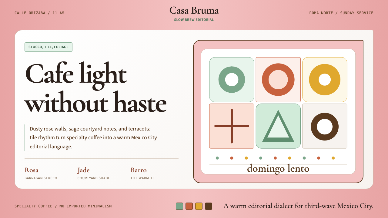 CDMX Roma Norte CafeMexico City coffee, unhurried. Dusty rose, sage jade, and serif rhythm carry…从容的墨城咖啡感:灰玫瑰、鼠尾草绿与衬线节奏传递温度。
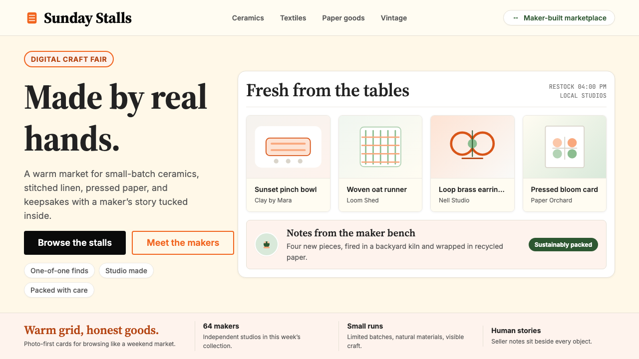 Etsy HandmadeA digital craft fair, in orange. Hand-drawn accents, cream backgrounds, delib…数字时代的手工艺集市:标志性 Etsy 橙、奶油底色、手绘插画点缀——每件物品…
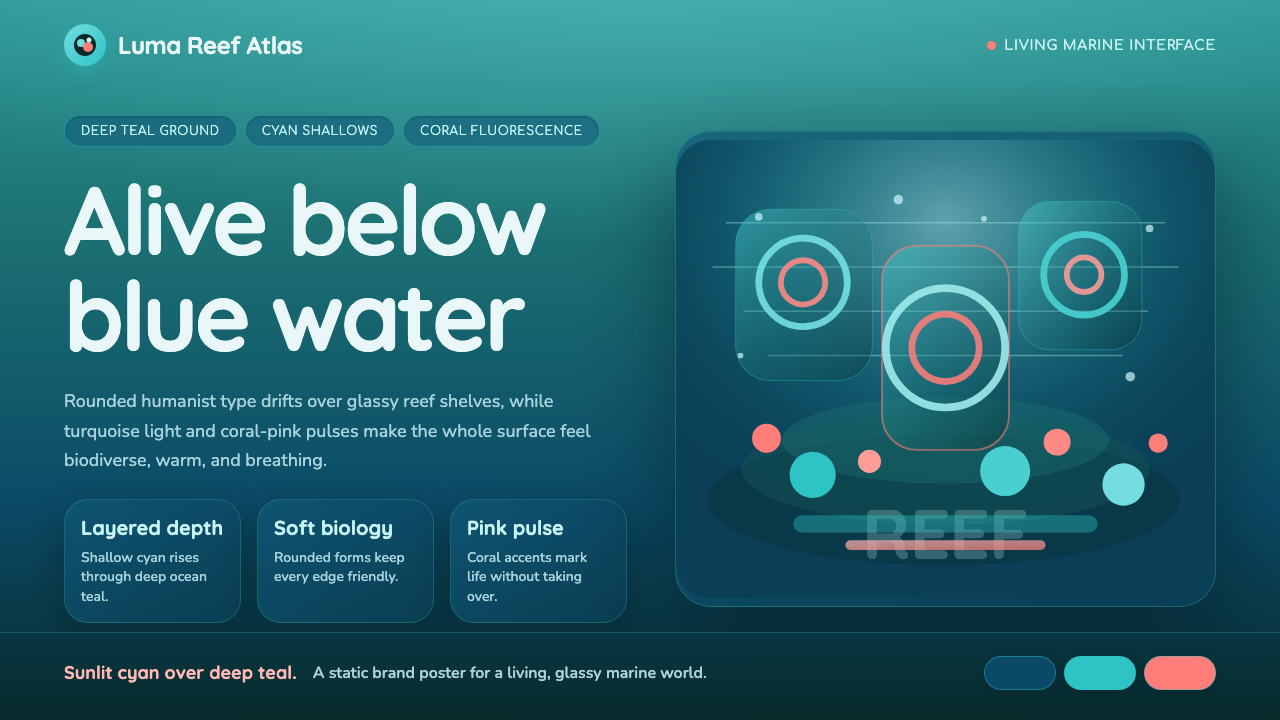 Great Barrier ReefAlive under deep teal. Quicksand curves, cyan glow, and coral-pink pulses bui…深海蓝绿中有生命:圆润字形、青蓝光晕与珊瑚粉脉冲层叠成礁。
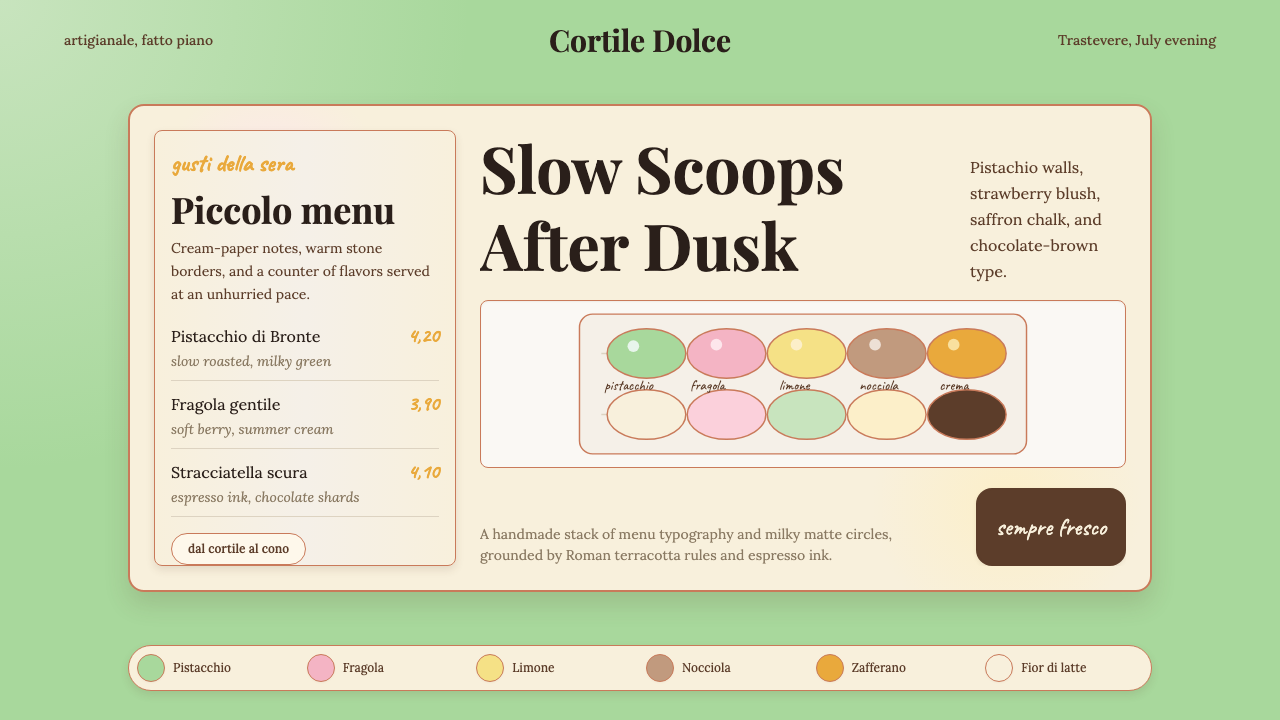 Italian Gelato ShopWarmth is hand-scooped. Pistachio green, cream panels, high-contrast serif, c…手工温暖被舀起。开心果绿、奶油纸卡、高反差衬线和粉笔字。
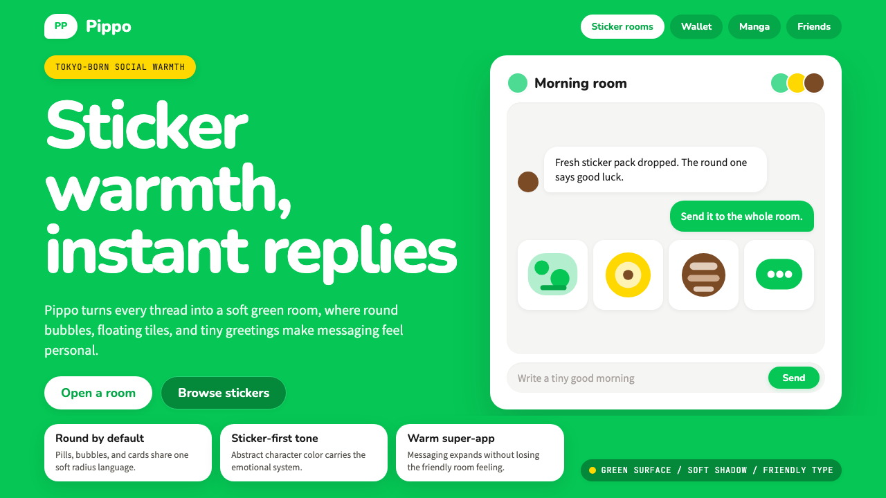 LINE Messenger GreenChat feels like a sticker. Bright green, pill bubbles, and rounded Nunito kee…聊天像贴图般亲近:亮绿、药丸气泡与圆润 Nunito 保持温度。
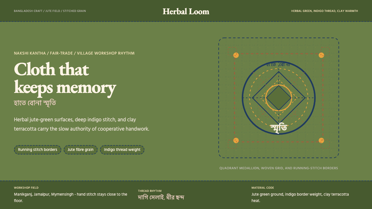 Bangladeshi Jute CraftMemory stays stitched. Jute green, indigo borders, terracotta warmth.记忆被缝进画面。黄麻绿、靛蓝虚线、陶土暖调。