What is Great Barrier Reef?
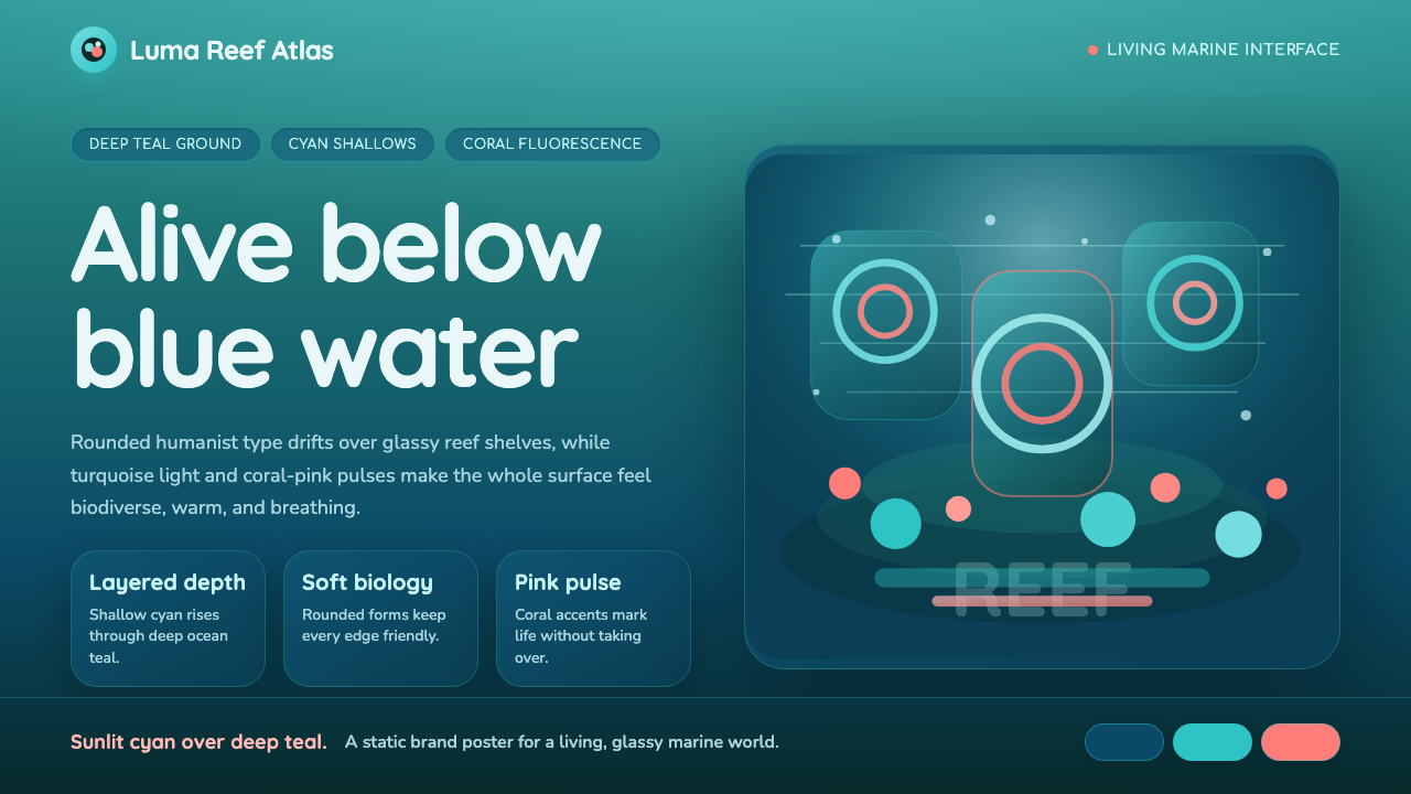
Great Barrier Reef translates the world's largest living ecosystem into a design language — deep ocean teal as structural ground, turquoise glows rising toward the surface, and coral-pink pulses that behave less like accent colors and more like bioluminescent life signs.
Great Barrier Reef in brief
Great Barrier Reef is a contemporary marine-ecology visual language rooted in the actual chromatic and spatial experience of Queensland's reef system: the way deep tropical water filters out red wavelengths and amplifies teal and cyan, the way coral polyp colonies create layered, organic depth, and the way fluorescent proteins in living coral glow warm pink and orange against a cold blue-green field. Applied to interfaces, this produces a dark-background system with a very specific emotional register — immersive, alive, and quietly awe-inspiring rather than clinical or futuristic.
The palette is narrow but ecologically precise. Every color in the system corresponds to something real happening at the reef: the near-black of abyssal water, the shifting blue-green of shallow tropical shallows, the cyan bloom of sunlit sand flats, and the warm coral-pink of colonial organisms under blue water. Rounded, humanist typefaces carry the friendliness of marine biology illustration — approachable even when the subject matter is scientifically complex. Nothing in the system is hard-edged or angular; the reef metaphor demands flow, curve, and organic softness.
Visually, the style sits at the intersection of conservation visual identity and contemporary dark-mode interface design. It is recognizable less by a single signature element and more by the coherent depth illusion created by layering multiple dark-teal values — the sense that you are looking not at a flat surface but into something deep, inhabited, and gently luminous.
Where does Great Barrier Reef come from?
The Great Barrier Reef stretches more than two thousand kilometers along the northeastern coast of Queensland, Australia, and comprises more than two thousand nine hundred individual reefs. It is the only biological structure visible from space with the naked eye. The reef's visual character — its extraordinary range of blues, greens, and warm-colony colors — has been photographed, filmed, and illustrated since the nineteenth century, but the specific design vocabulary drawing on reef chromatics emerged in earnest from the 2010s onward, as digital dark-mode interfaces matured and conservation science began demanding its own visual identity distinct from the generic 'ocean blue' of environmental branding.
The scientific context is essential to understanding what makes this palette feel authoritative rather than decorative. Marine biologist Anya Salih's research into coral fluorescence — she documented how coral proteins emit green, cyan, and orange-red light when exposed to blue wavelengths — gave designers a scientific basis for the warm pink accent pulsing against cold teal. Coral biologist Charlie Veron, who has catalogued more coral species than any other researcher, and climate scientist Ove Hoegh-Guldberg, whose work on coral bleaching gave the reef urgent cultural prominence, both contributed to a decade of heightened visual attention to the reef's color ecology as something that might be lost. The palette is thus inflected with a particular emotional weight: it celebrates a beauty that is under threat.
The movements feeding this visual language include ocean conservation visual identity, where organizations like the Great Barrier Reef Marine Park Authority developed palettes grounded in photographic realism rather than simplified map-color blues; nature-photography palettes popularized by underwater documentary work, which educated a global audience in the actual chromatic complexity of reef environments; and coral-fluorescence research, which produced startling scientific images of glowing coral polyps that entered popular visual culture and gave designers a license to use warm pinks and oranges against cold teal that would otherwise seem counterintuitive.
As a contemporary digital aesthetic, Great Barrier Reef sits firmly in the post-2020 wave of organic, nature-derived dark interfaces — a corrective to the sterile navy-and-neon palettes that dominated dark-mode design in the 2010s. Where those palettes borrowed loosely from science-fiction visual conventions, reef-derived palettes insist on ecological specificity: each color has a biological referent, and the depth layering mirrors the actual physics of light in water.
What defines the Great Barrier Reef look?
Color
The palette is built on a narrow, ecologically anchored range of blue-greens anchored by a very deep teal ground, rising through several middle turquoise values to a pale cyan highlight at the top of the depth stack. Against this cold field, coral-pink appears as the sole warm accent — used sparingly, the way fluorescent coral proteins appear in nature: vivid but isolated, never overwhelming the surrounding coolness. The palette has no neutrals in the conventional sense; black and near-black serve as structural grounds rather than neutral fillers.
Typography
Rounded humanist sans-serif letterforms are the typographic signature of this system. The choice is not arbitrary — rounded terminals and open apertures recall marine illustration conventions, where legibility in scientific diagrams requires approachable rather than imposing letterforms. Type sits in generous line-height to allow the dark background to breathe around it, creating the impression of text suspended in water rather than pressed against a surface. Size hierarchy is handled with moderate contrast: the system avoids the extreme weight jumps of more aggressive styles, preferring a layered, depth-sensitive reading order.
Depth and Layering
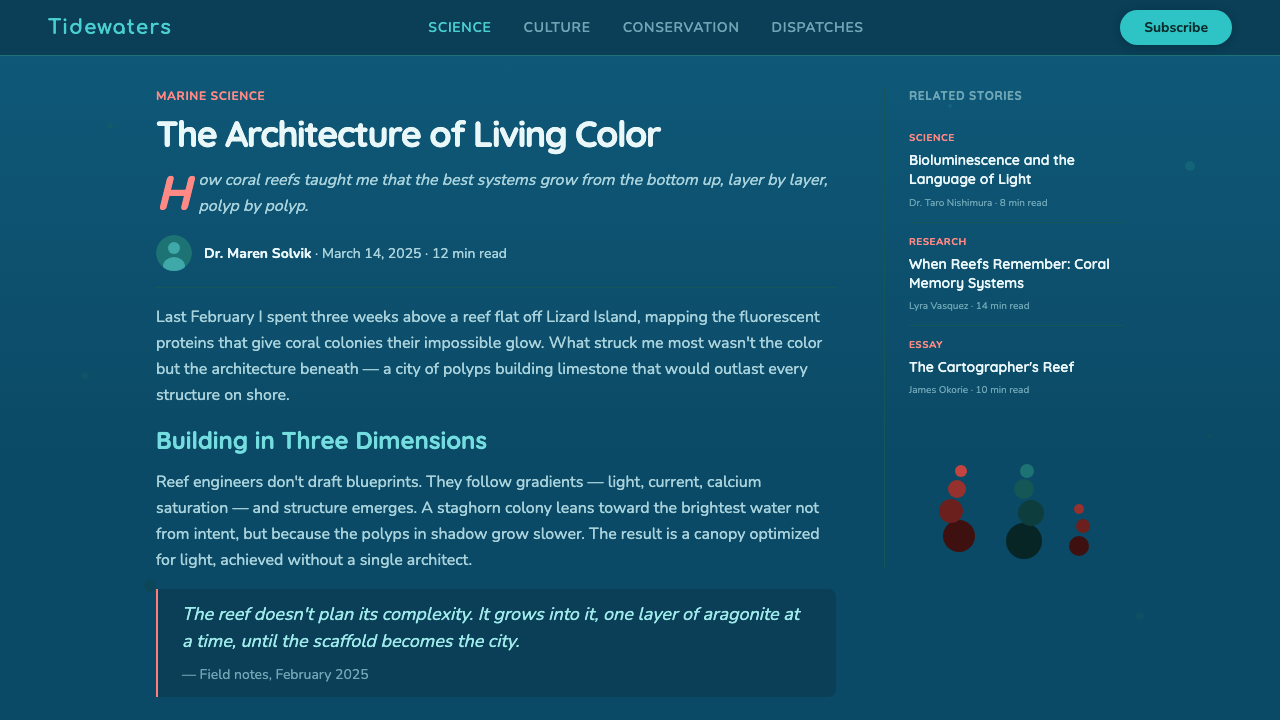
The central compositional logic of this style is depth — the illusion that the interface has vertical dimension, like looking down through water columns. This is achieved through stacked teal values rather than hard drop shadows: the darkest background sits furthest back, mid-tone panels float above it, and accent elements appear to glow at or near the surface. Gradients play an essential structural role — unlike design systems that avoid them, reef-derived palettes use flowing, organic gradients as the primary depth mechanism, because flat color would collapse the sense of being submerged.
Organic Form
Hard geometric shapes — squares, triangles, sharp rectangles — are absent from authentic reef-style compositions. Containers use generous corner radii, borders follow flowing curves, and decorative elements suggest coral branching patterns or soft wave forms. Even data visualizations lean toward rounded, organic chart types — donut charts over hard pie slices, smooth-line graphs over angular polylines. The underlying message is biological: this is a system shaped by growth and adaptation rather than mechanical precision.
Glow and Luminosity
The fluorescent quality of reef organisms — their capacity to absorb short-wavelength light and re-emit longer wavelengths as warm, visible glow — is the stylistic DNA of the warm accent in this system. Interactive states, notifications, and calls to action use coral-pink or warm cyan not as flat color fills but as softly glowing elements, often with a subtle bloom effect spreading into the surrounding dark field. This luminosity effect must be handled with restraint: overuse turns a living reef into a nightclub, and the quiet authority of the aesthetic depends on most surfaces remaining dark and calm.
Motion
Motion in reef-derived interfaces tends toward the slow, fluid, and continuous — the rhythm of ocean current rather than mechanical click-response. Transitions dissolve rather than slide; elements entering the viewport might drift slightly, as if carried by a gentle current. Loading states often use pulsing or rippling animations that evoke bioluminescent signaling. Fast, sharp animations break the immersion — the style's tempo is set by the reef's own biological rhythms, which are measured in seconds and minutes rather than milliseconds.
Warmth Against Cold
The defining tension in this system — and what separates it from generic dark-teal interfaces — is the deliberate contrast between the cold, deep-ocean foundation and the warm coral-pink accent. This is not a complementary color scheme in the decorative sense; it replicates a specific natural phenomenon. Cold water absorbs warm wavelengths. The warm colors that survive and flourish at the reef are biologically generated rather than environmentally reflected. Translating this into interface design means the warm accent must always feel self-generated — glowing from within — rather than illuminated by an external source.
Who shaped Great Barrier Reef?
Salih is a marine biologist whose research into coral fluorescent proteins — published in the journal Nature in 2000 — was the first systematic scientific account of why living corals glow. She demonstrated that coral polyps contain proteins capable of absorbing short-wavelength blue-violet light and re-emitting it at longer wavelengths, producing the vivid greens, cyans, and warm pinks visible under UV illumination. Her work gave designers and photographers a scientific framework for what had previously been treated purely as a visual spectacle, and the imagery generated by fluorescence photography became a direct source for the warm-pink-on-cold-teal design logic at the heart of this style.
Known as 'the father of coral taxonomy,' Veron has described and named more coral species than any other researcher — over eight hundred at last count. His multivolume reference work Corals of the World functions as an encyclopedic visual atlas of reef life, and the chromatic richness documented in its pages has been a direct influence on anyone working with reef-derived palettes. His later public advocacy for reef conservation, framed around the specific visual character of what bleaching destroys — the color, the organism density, the layered depth — gave the palette its elegiac undertone: these are the colors of something that might not survive.
Hoegh-Guldberg is the climate scientist whose 1999 prediction that the Great Barrier Reef would experience mass bleaching within decades — and whose subsequent documentation that this was indeed occurring — made the reef's color ecology a matter of urgent global concern. His work transformed reef imagery from a subject of natural wonder into a visual record of ecological crisis. For designers, this context matters: the reef palette carries a double valence that most decorative color systems lack — it is simultaneously beautiful and endangered, celebratory and elegiac. Understanding this duality is what separates authentic use of the palette from superficial borrowing.
The GBRMPA, established by Australian legislation in 1975, developed the institutional visual identity that first translated the reef's ecological complexity into a designed, publicly legible language. Its communications materials, scientific publications, and public education campaigns throughout the 1980s and 1990s popularized a palette grounded in documentary photography rather than simplified map-color blues — establishing conventions that later digital designers inherited. The Authority's consistent visual association of deep ocean teal with scientific authority and conservation urgency helped anchor these colors as more than decorative choices.
While not a person, the production design and color grading of the BBC and BBC Studios documentary series Blue Planet II — particularly the reef sequences shot in Australian waters — had a measurable influence on the contemporary visual conventions for depicting underwater environments. Its cinematography, graded to bring out the contrast between deep cold-water teal and warm fluorescent coral colors, became a reference point for a generation of designers working with ocean-derived palettes. The series' global viewership also educated a mass audience in the actual chromatic complexity of reef environments, creating cultural familiarity with a palette that had previously been confined to scientific illustration and nature photography.
How do you use Great Barrier Reef today?
Great Barrier Reef is one of the most atmospherically specific design styles available — which means it can deliver extraordinary immersive impact when deployed correctly, and feel incongruous when forced onto contexts that require different emotional registers. The starting question before applying this palette is always: does this product's core experience benefit from a feeling of depth, organic life, and quiet immersion? Applications where users are meant to explore, discover, or contemplate are natural fits. Applications where users need to process information rapidly under stress — emergency dashboards, high-frequency trading interfaces — are not.
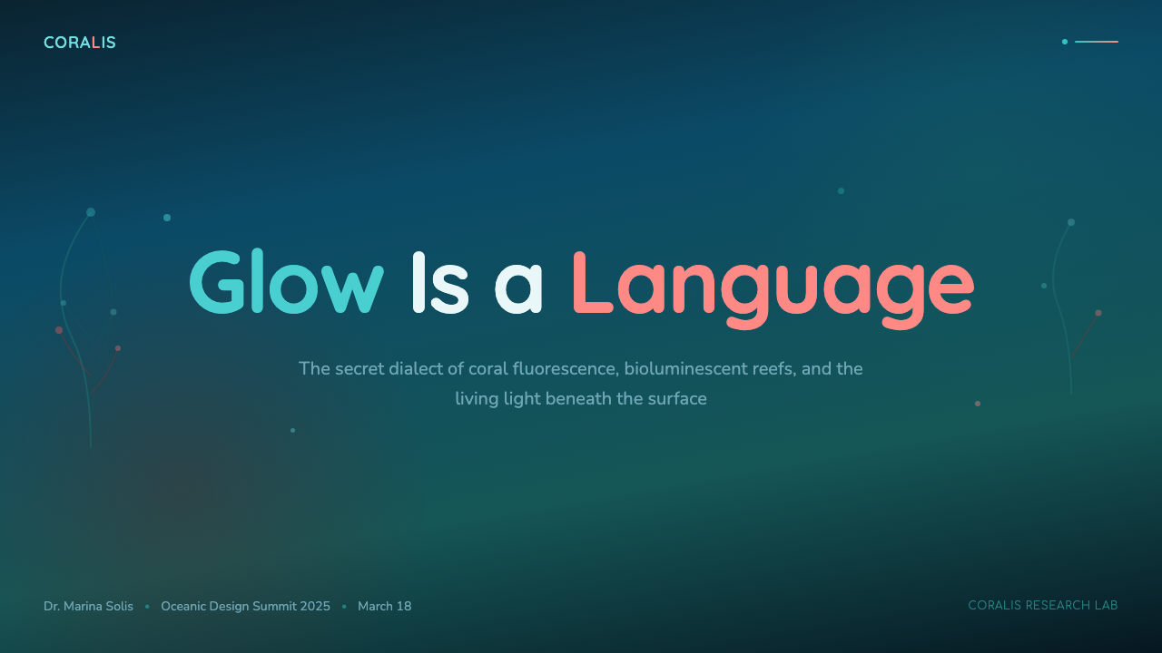
For presentation slides, the style works best on cover and transition pages where immersion is the goal, and should be handled with restraint on data-heavy content slides. A cover page benefits from a full-depth background in the darkest teal, a single large element in warm coral-pink as the focal point, and title type in a light turquoise or near-white. Data slides should simplify the palette significantly: a single mid-teal background with white type and coral-pink chart accents will be far more legible than a full multi-layer depth treatment. The most common error on slides is applying the full atmospheric palette to every slide, which fatigues the eye and makes the content hierarchy invisible.
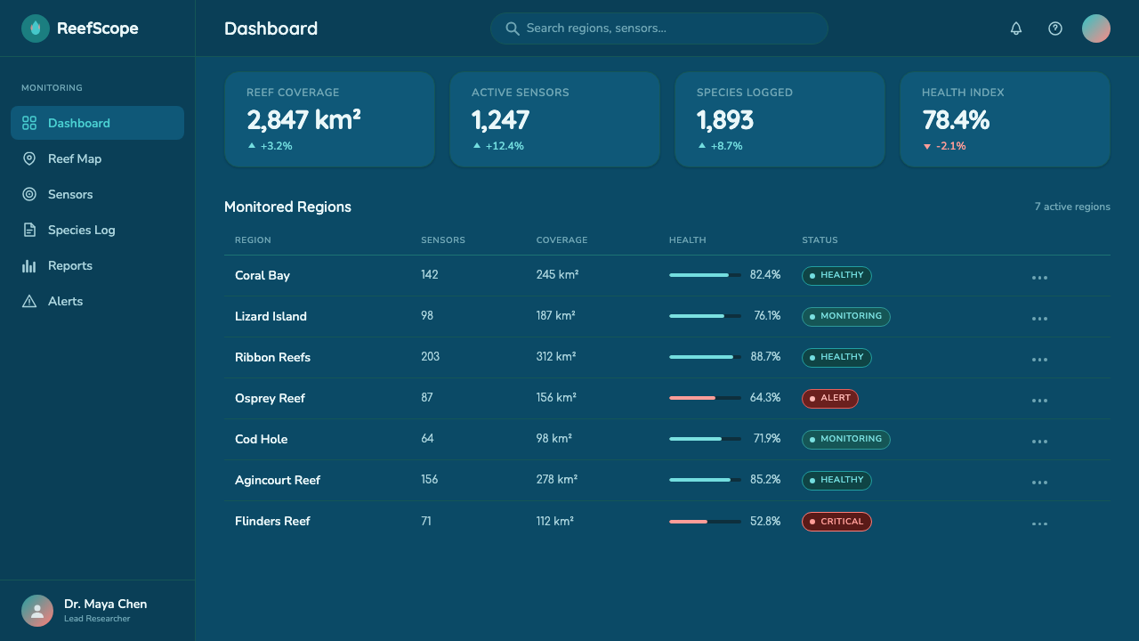
For web interfaces and dashboards, the style is well-suited to analytics platforms, portfolio sites, and any product positioned around discovery or exploration. The depth-layering logic translates directly to card-based layouts: set the page background in the deepest teal, card surfaces in a lighter mid-teal, and active or elevated states in a lighter teal still, with coral-pink reserved for primary interactive elements and critical alerts. Navigation and structural chrome should be near-invisible — dark and recessive — so that content appears to float above the structural layer. Because the palette is dark and richly chromatic, accessible contrast for body text requires careful attention: white or very light teal for primary text, medium teal for secondary, and nothing in the mid-palette range where legibility collapses.
For editorial and marketing work, the reef palette creates a strong sense of editorial identity that works well for conservation communication, science journalism, wellness and ocean-adjacent lifestyle brands, and products that want to signal both natural beauty and technological sophistication. Feature sections can use the full depth treatment — dark background, layered panels, glowing accents. Call-to-action sections should simplify and sharpen: coral-pink button on deep teal background, minimal text, maximum contrast.
A common mistake when applying this style is treating coral-pink as a general accent color to be used generously throughout the interface. In the reef ecosystem, warm colors are biologically precious and biologically rare — they appear at specific moments in response to specific stimuli. An interface that saturates its surface with coral-pink simply looks tropical rather than reef-specific, and loses the tension between cool depth and warm light that makes the palette distinctive. Use coral-pink for one or two elements per screen maximum, and allow the deep teal to dominate. A second common mistake is substituting a generic dark navy or deep blue for the specific teal ground: navy reads as corporate or nautical, not as ocean depth. The teal must carry green as well as blue to evoke water rather than sky or uniform.
Great Barrier Reef — FAQ
Is this style only appropriate for ocean or environmental brands?
No, but the ecological origin of the palette always carries some emotional weight, and designers should be intentional about whether that weight serves their context. The style works well for any product where the desired user experience involves depth, exploration, or a sense of inhabiting a complex living system — analytics platforms, data exploration tools, creative portfolio sites, wellness applications with a scientific grounding, and gaming interfaces with underwater or biological themes. It works less well for fast-food ordering, financial transaction flows that need to feel neutral and trustworthy rather than immersive, or any context where warm domestic comfort is the emotional target.
How does Great Barrier Reef relate to other dark-mode design systems?
Most dark-mode design systems use near-black or very dark gray as their base layer, with blue or cool-gray mid-tones and saturated primary or neon colors as accents. Great Barrier Reef differs in three specific ways: the base color is teal rather than neutral, carrying both blue and green; the accent is biologically warm — coral-pink — rather than neon or electric; and the depth layering is achieved through multiple chromatic values rather than lightness increments alone. The result reads as organic rather than digital, and immersive rather than high-contrast. It is more closely related to biophilic dark interfaces than to the cold, neon-on-black aesthetics of gaming or cryptocurrency visual cultures.
How does this style handle accessible contrast on a dark background?
The specific teal ground values used in this style create real accessibility challenges because teal occupies a chromatic middle ground where neither white nor black provides automatic high contrast at all saturation levels. The safe approach is to use white or very pale near-white type for all primary reading text, reserve mid-teal values for decorative elements only, and use coral-pink exclusively for interactive affordances where color alone is never the only signal (always pairing it with an underline, icon, or size distinction). Never use mid-teal type on a deep-teal background for readable text — what looks sufficient on a calibrated design screen will fail under a wide range of real viewing conditions.
Can this palette work in a light-mode or mixed-light context?
A light-mode inversion of Great Barrier Reef is possible but loses the core depth metaphor almost entirely. On a white or light-teal ground, the dark-to-light depth layering that constitutes the style's main compositional logic cannot function, and the palette reduces to a pleasant blue-green and coral color scheme without the specific atmospheric character that makes it distinctive. Light-mode reef-inspired palettes exist and can be attractive, but they should be understood as loosely related rather than as the same style. A mixed approach — light-mode primary interface with deep-teal accent components — can work well for products that need light-mode legibility while retaining some of the oceanic atmosphere.
How does Great Barrier Reef differ from general 'ocean blue' or 'aqua' palettes?
Generic ocean-blue palettes tend to be lighter, cooler, and more uniformly chromatic — a single mid-blue or sky-blue repeated across surfaces with white as the primary neutral. Great Barrier Reef is specifically darker, specifically teal (green-inflected rather than sky-blue), and depends on the coral-pink warm accent for its ecological specificity. Without the coral-pink, a reef palette becomes indistinguishable from the ocean palettes used by airline and cruise brands for decades. The key differentiator is the biological warmth of the accent and the depth-through-layering compositional logic — both of which derive from specific knowledge of what the reef actually looks like under water, not from a generalized association with the sea.
Related design styles
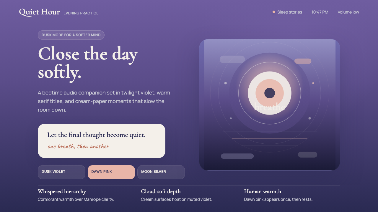 Calm App Purple MeditationWhispers at bedtime. Dusk-purple gradients, cream serif type, and dawn-pink w…
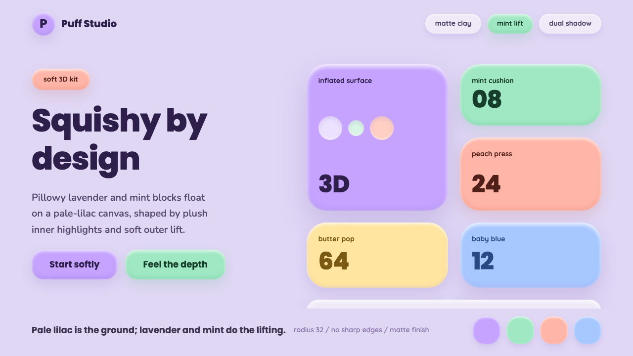 ClaymorphismSquishy, not flat. Lilac clay surfaces puff up with mint and lavender dual sh…
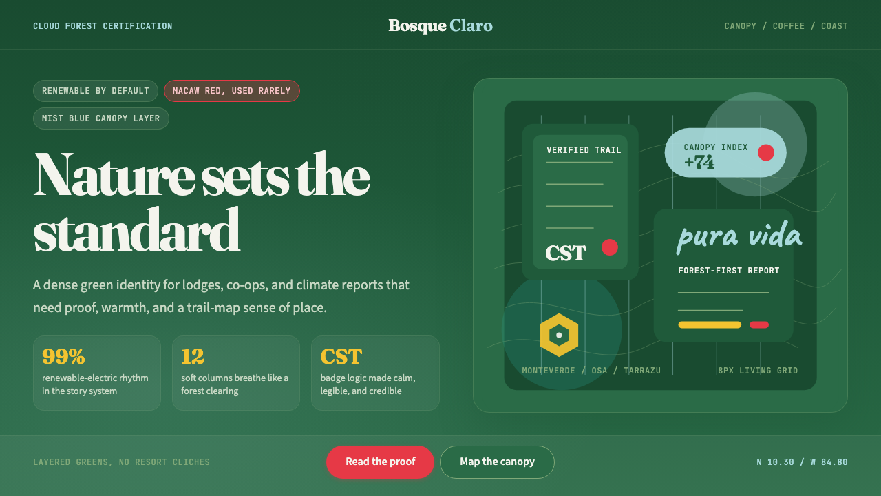 Costa Rica Pura Vida EcoAlive without greenwash. Cloud-forest green, Fraunces serif, and scarlet acce…
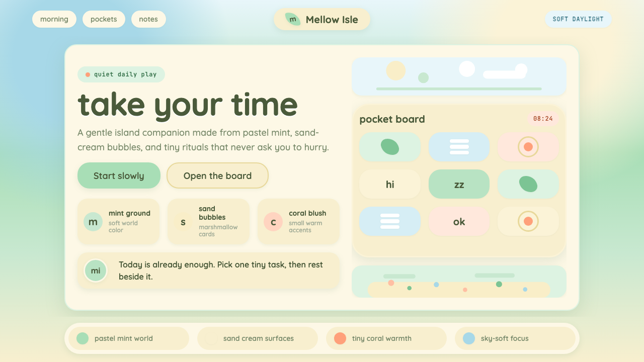 Animal Crossing — New HorizonsNo pressure, only daylight. Mint fields and sand bubbles soften every edge.
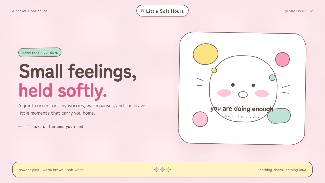 Chiikawa (2022)Tenderness made visible. Powder pink, warm-brown wobbles, and pill-soft forms…
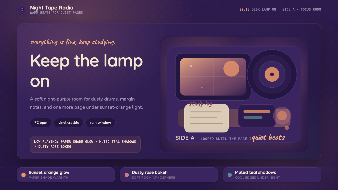 Lo-fi Hip Hop / ChillhopCozy focus at 2am. Night purple, Quicksand type, and sunset-orange lamp glow.