What is Xiaohongshu (RedNote) 2024?什么是 Xiaohongshu (RedNote) 2024?
Xiaohongshu 2024 turns a lifestyle app into a visual friend — warm cream-pink waterfall cards and a signature red accent that feels like a recommendation from someone you trust.小红书 2024 把一款生活方式应用变成了视觉上的朋友——暖奶油粉的瀑布流卡片,加上一抹标志性的红,像是来自你信任的人的真心推荐。
Xiaohongshu (RedNote) 2024 in briefXiaohongshu (RedNote) 2024 速览
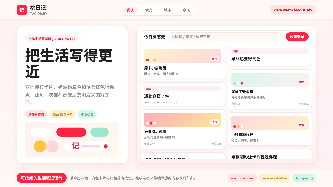
Xiaohongshu 2024 is the visual design language of China's most influential lifestyle content platform — a system built around warmth, intimacy, and the feeling of a curated personal diary shared among friends. Its hallmark is the two-column waterfall photo card layout, where softly rounded image tiles cascade on a cream-pink ground, each card just editorial enough to feel elevated without feeling cold or corporate.小红书 2024 是中国最具影响力的生活方式内容平台的视觉设计语言——一套围绕温暖、亲密与「被精心策划的私人日记」感而构建的系统。其核心标志是双列瀑布流照片卡片布局:圆角柔和的图片磁贴在奶油粉底色上错落排布,每张卡片都带有足够的编辑感,却不显冷漠或商业化。
The aesthetic bridges two worlds: the discovery-grid logic of a visual search engine and the personal warmth of a handwritten shopping notebook. Every interface decision — the gentle rounding of card corners, the tinted warmth of drop shadows, the pill-shaped call-to-action buttons in signature Xiaohongshu red — reinforces a single emotional premise: this is content from a trusted friend, not an ad from a brand.这套美学跨越两个世界:视觉搜索引擎的发现式网格逻辑,以及手写购物笔记的私人温度。每一个界面决策——卡片圆角的弧度、投影的暖色调、标志性小红书红的药丸形按钮——都在强化同一个情感前提:这是来自朋友的真诚分享,而不是品牌投放的广告。
What distinguishes the 2024 iteration from earlier versions of the platform is a more refined bilingual typographic hierarchy that gracefully layers Chinese and English text, and a more deliberate use of negative space to let photography breathe. The result is a design system that feels simultaneously intimate and editorial — warm enough to invite browsing, polished enough to confer credibility on every note it displays.2024 年的版本与早期相比,最显著的进化在于更加精炼的双语排版层级——中英文文字的叠加处理更加优雅,以及更有意识地运用留白让摄影内容呼吸。最终呈现的是一套既亲密又具编辑感的设计体系:足够温暖以吸引漫游浏览,足够精致以赋予每一篇笔记以可信度。
See the Xiaohongshu (RedNote) 2024 design system查看 Xiaohongshu (RedNote) 2024 完整设计系统
Where does Xiaohongshu (RedNote) 2024 come from?Xiaohongshu (RedNote) 2024 从何而来?
Xiaohongshu — literally 'Little Red Book,' also marketed internationally as RedNote — was founded in Shanghai in 2013 by Charlwin Mao (毛文超) and Miranda Qu (瞿芳). The platform began as a cross-border shopping guide, helping Chinese consumers discover and review foreign products at a time when outbound travel was booming and overseas goods carried enormous aspirational weight. Its earliest visual identity was functional and utilitarian, organized around user-generated photos and text reviews rather than any coherent design philosophy.小红书由毛文超和瞿芳于2013年在上海创立。平台最初以跨境购物攻略起家,帮助中国消费者发现并评测海外产品——彼时出境旅游热潮兴起,海外商品承载着巨大的消费憧憬。早期的视觉风格偏向功能性与实用性,以用户生成的图文晒单为核心,尚无系统性的设计哲学可言。
The transformation from directory to design system happened gradually between 2018 and 2022 as the platform's audience shifted from overseas shoppers to a much broader urban Chinese demographic seeking lifestyle inspiration across beauty, food, travel, fashion, and home decor. During this period the in-house design team, working from Xiaohongshu's Shanghai headquarters, began formalizing the visual conventions that users had already adopted organically: warm-toned photography, handwritten annotations, softly decorated layouts that felt personal rather than promotional. The signature red — a vibrant, slightly warm-leaning hue — became the primary brand accent, appearing consistently in interactive elements and identity marks.从信息目录到设计体系的转变,发生在2018年至2022年之间。随着平台用户群体从海淘消费者扩展至追求美妆、美食、旅行、时尚与家居灵感的广泛城市人群,总部位于上海的小红书内部设计团队开始系统整理用户已在自发使用的视觉惯例:暖色调摄影、手写式标注、带有私人感而非促销感的柔和版面装饰。标志性的红色——一种明艳而微微偏暖的色相——确立为核心品牌强调色,稳定地出现在交互元素与品牌标识中。
The 2024 visual vocabulary represents the mature expression of a design system that had been iterating in production at scale for nearly a decade. By this point the platform had over 300 million registered users and a monthly active base exceeding 100 million, with content ranging from three-second short videos to long-form illustrated essays. The design system had to accommodate this range while maintaining a consistent emotional register. The solution was a flexible card-based grid where image proportions, caption lengths, and overlay treatments could vary widely while the palette, corner radii, shadow treatment, and typographic hierarchy remained constant.2024年的视觉语言,代表了一个已在大规模生产环境中迭代近十年的设计系统的成熟表达。此时平台注册用户超过三亿,月活用户逾一亿,内容形态从数秒短视频到长篇图文笔记应有尽有。设计系统必须兼容这种多样性,同时维持一致的情感基调。解决方案是灵活的卡片式网格:图片比例、字幕长度、叠加处理方式可以大幅变化,而色板、圆角弧度、阴影处理与排版层级始终保持不变。
Contextually, the Xiaohongshu 2024 aesthetic sits within a broader tradition of what critics and designers have termed 'Asian warm UI' — a design sensibility that emerged across Japanese, Korean, and Chinese consumer applications in the early 2020s, characterized by cream and blush grounds, soft shadows, rounded forms, and typography that prioritizes readability and warmth over graphic assertiveness. Within this tradition, Xiaohongshu occupies a distinctive position: more editorial than domestic Japanese apps, more personal than Korean beauty platforms, and more photographic than Chinese e-commerce competitors. Its design reflects the specific character of its content — notes (笔记, biji), a form that sits between a review, a diary entry, and a how-to guide.从更宏观的视角看,小红书 2024 的美学隶属于批评者与设计师所称的「亚洲暖色 UI」传统——这一设计感性于2020年代初在日本、韩国与中国消费类应用中同步兴起,以奶油与腮红色底面、柔和阴影、圆润形态,以及重视易读性与温度感而非图形强硬感的排版为特征。在这一传统中,小红书占据着独特的位置:比日本本土应用更具编辑感,比韩国美妆平台更具个人感,比中国电商竞品更以摄影为核心。它的设计折射出其内容的独特性质——「笔记」,一种横跨评测、日记与教程之间的特殊内容体裁。
What defines the Xiaohongshu (RedNote) 2024 look?Xiaohongshu (RedNote) 2024 的视觉特征是什么?
Palette色彩
The Xiaohongshu 2024 palette is built on a warm cream-pink ground — not pure white, not beige, but a softly tinted neutral that reads as inviting rather than clinical. Against this ground, the signature Xiaohongshu red operates as the single dominant accent: it appears in primary buttons, notification badges, the logo mark, and interactive highlights, never diffused across large surface areas but concentrated into small, precise moments of emphasis. Secondary tones are drawn from muted blush, warm sand, and soft sage — neutrals that appear in tag backgrounds, secondary card surfaces, and state indicators. The overall effect is warm without being sweet, and cohesive without being monotonous.小红书 2024 的色板以暖奶油粉底色为基础——不是纯白,不是米色,而是一种带有微微暖调的中性色,读来是邀请感而非临床感。在这一底色上,标志性的小红书红作为唯一的主强调色运作:出现在主要按钮、通知徽章、品牌标识与交互高亮处,从不漫延至大面积区域,而是集中于小而精准的强调时刻。次要色调来自低饱和腮红、暖沙色与柔软的雾绿——以中性姿态出现在标签背景、次级卡片面与状态指示器中。整体效果温暖而不甜腻,统一而不单调。
Waterfall Card Grid瀑布流卡片网格
The defining structural motif of the interface is the two-column waterfall grid, where cards of varying height cascade downward in alternating columns. Each card is a self-contained unit: a photograph or video thumbnail at the top, followed by a short title in Chinese, a user avatar and handle, and an engagement count. The grid is never rigid — card heights are governed by image proportions and content length — which creates a pleasantly irregular rhythm that encourages extended browsing. The card corner rounding is consistent and generous, giving each tile a soft, approachable silhouette.界面的核心结构母题是双列瀑布流网格:高度各异的卡片在左右两列间交替向下流动。每张卡片是一个自洽的单元:顶部是照片或视频缩略图,其下依次是中文短标题、用户头像与昵称、互动数据。网格从不僵硬——卡片高度由图片比例与内容长度决定——制造出一种令人愉悦的不规则节奏,鼓励持续浏览。卡片圆角弧度一致且圆润,赋予每个磁贴柔和、亲切的轮廓。
Typography字体排印
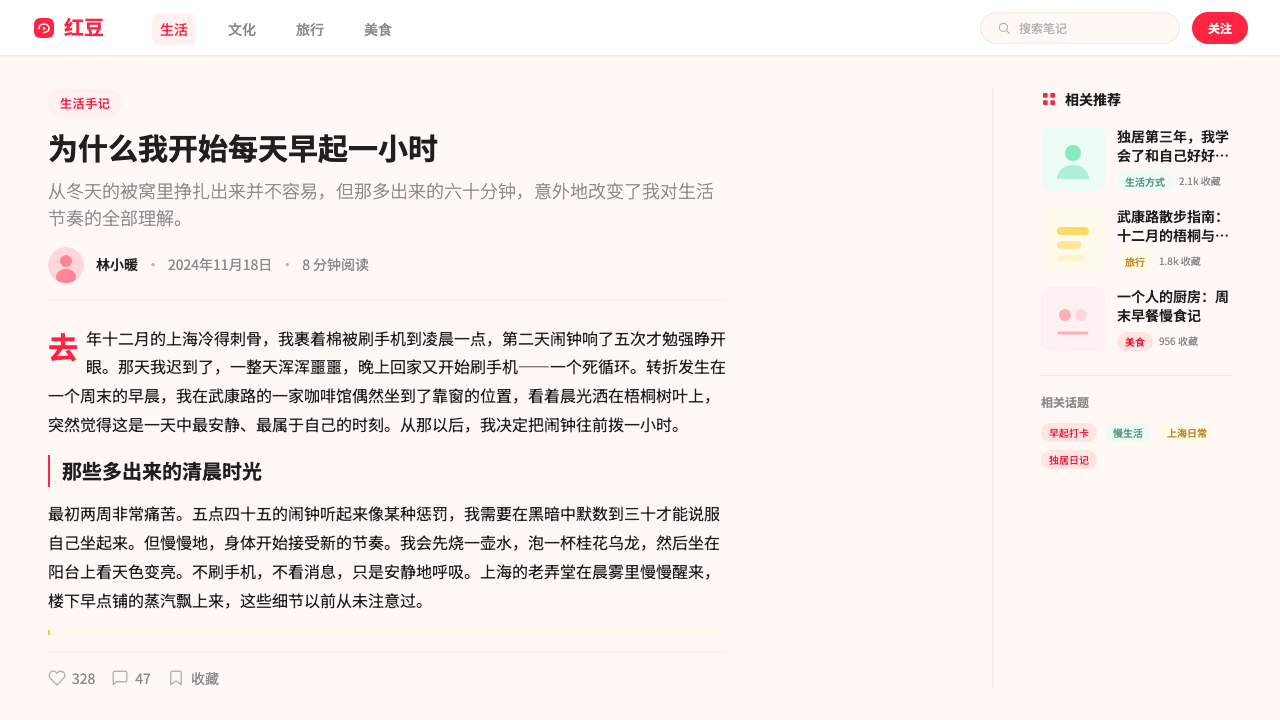
The typographic system is built for Chinese-first bilingual display. The primary typeface family is humanist and highly legible at small sizes, chosen for its friendly rather than authoritative quality. Hierarchy is established through size, weight, and color temperature rather than through decorative ornament: primary titles appear in medium-to-bold weight at a comfortable reading size, secondary information drops to a lighter weight and smaller size, and metadata — likes, saves, user handles — recedes further into a warm mid-tone. Where English text appears alongside Chinese, it is sized to be complementary rather than competing, giving the layout a quietly cosmopolitan feel without breaking the warmth of the overall register.排版系统为中文优先的双语显示而建立。主字体家族具有人文主义特征,在小字号下保持高可读性,以亲切感而非权威感为选择依据。层级通过字号、字重与色温建立,而非依赖装饰:主标题以中等偏粗字重呈现于舒适的阅读尺寸,次要信息降至更轻字重与更小字号,元数据——点赞、收藏、用户昵称——进一步退隐为暖色调的中间层次。当英文文字与中文并置时,字号被调整为互补而非竞争的关系,为版面带来一种安静的国际感,同时不破坏整体基调的温度。
Shadows and Elevation阴影与层次感
Xiaohongshu 2024 uses soft, warm-tinted drop shadows rather than the crisp, neutral shadows of earlier flat-design conventions. The shadows are subtle — just enough to lift a card off the cream ground and suggest a gentle z-axis depth — and their warmth is calibrated to feel natural against the overall palette rather than as a graphic device. Elevated surfaces, such as bottom sheets and modal overlays, use slightly cooler and more diffuse shadow treatments to differentiate them from card-level content. The result is an interface that feels layered and tangible without resorting to the heavy skeuomorphic effects of an earlier era.小红书 2024 采用柔和的暖色调投影,而非早期扁平设计惯例中锐利、中性的阴影。投影十分克制——刚好足够将卡片从奶油底色上轻轻托起,暗示一个温柔的纵深感——其暖调被精心调校,以在整体色板中显得自然,而非作为图形装置突兀存在。底部弹层、模态遮罩等高层级界面,使用略冷、更漫射的阴影处理,以区别于卡片层级内容。最终呈现的是一个有层次感、有质感的界面,同时不借助早期拟物设计的厚重效果。
Interactive Elements交互元素
Buttons, tags, and action indicators in the 2024 system share a consistent rounded language: pill-shaped primary CTAs in the signature red invite action without aggression; rounded rectangular secondary buttons sit comfortably at lower visual weight; filter tags and category chips use the same corner language at a smaller scale, often on a soft blush or warm sand background. Icon usage is restrained and line-based, favoring simplicity over expressiveness. The overall interaction design communicates availability and affordance through shape and color temperature rather than through bold visual noise.2024 年系统中的按钮、标签与操作指示器共享一套一致的圆润语言:标志红色的药丸形主要行动按钮以温和而不强硬的姿态引导操作;次级按钮采用圆角矩形,以较低的视觉分量舒适地存在;筛选标签与分类标签在更小尺度下沿用相同的圆角逻辑,常以低饱和腮红或暖沙色为底。图标使用克制,以线描为主,偏向简洁而非表现力。整体交互设计通过形状与色温传达可用性与操作预示,而非依赖强烈的视觉噪音。
Photography and Content Framing摄影与内容呈现
Photography is the dominant content medium on Xiaohongshu, and the 2024 design system treats it with care. Images are never forced into a single fixed crop ratio within the waterfall grid; instead, the grid accommodates portrait, square, and landscape proportions, letting the content itself determine the visual rhythm. High editorial standards have evolved within the user community — bright, airy backgrounds, flat-lay compositions, and warm-filtered tones are so pervasive that they have become a recognizable subcultural aesthetic in their own right. The interface design supports rather than competes with this photographic content, using neutral card backgrounds and restrained overlay typography to keep image quality at the fore.摄影是小红书的主导内容媒介,2024年的设计系统以审慎的态度对待它。图片在瀑布流网格内从不被强制裁切为单一固定比例;网格兼容竖向、正方形与横向比例,让内容本身决定视觉节奏。高编辑标准已在用户社区中自然进化——明亮通透的背景、平铺构图、暖调滤镜如此普遍,已自成一种可辨认的亚文化美学。界面设计扶持而非竞争于这种摄影内容,以中性卡片底色与克制的叠加排版,将图片品质保持在最前端。
Brand Red as Anchor品牌红作为锚点
Across the entire interface, the Xiaohongshu red functions as a precise semantic anchor: it appears where the platform wants the user to act, react, or identify. It is never used decoratively, never used for text beyond the most critical labels, and never allowed to bleed into the photographic content layer. This disciplined restraint is what gives the color its power — because it appears sparingly and consistently, users immediately understand its meaning without reading any text. It is an accent that behaves like a signal.在整个界面中,小红书红作为精准的语义锚点运作:它出现在平台希望用户行动、回应或认同的地方。它从不用于装饰,从不用于最关键标签以外的文字,也从不被允许渗入摄影内容层。正是这种有纪律的克制赋予了这个颜色力量——因为它以稀少而一致的方式出现,用户无需阅读任何文字就能立即理解其含义。它是一个行为像信号灯的强调色。
See the Xiaohongshu (RedNote) 2024 design system查看 Xiaohongshu (RedNote) 2024 完整设计系统
Who shaped Xiaohongshu (RedNote) 2024?谁塑造了 Xiaohongshu (RedNote) 2024?
Co-founder and CEO of Xiaohongshu, Charlwin Mao built the platform from a cross-border shopping guide into China's foremost lifestyle content community. His vision of Xiaohongshu as a space for authentic peer-to-peer recommendation — distinct from both pure social networks and transactional e-commerce — directly shaped the editorial warmth and trust-first emotional register that defines the platform's design language. Under his leadership the company resisted the aggressive commercial visual conventions of Chinese super-apps and maintained the intimate, note-like aesthetic that became Xiaohongshu's signature.小红书联合创始人兼 CEO 毛文超,将平台从跨境购物攻略发展为中国最重要的生活方式内容社区。他将小红书定位为真实的点对点推荐空间——有别于纯粹的社交网络和交易型电商——这一愿景直接塑造了平台设计语言中以编辑温度与信任优先为特征的情感基调。在他的领导下,公司抵制了中国超级应用中常见的强烈商业视觉惯例,维持了成为小红书标志的亲密笔记式美学。
Co-founder and former COO Miranda Qu was instrumental in shaping the early community guidelines and content norms that became the invisible foundation of Xiaohongshu's visual culture. Her focus on genuine user experience and quality content moderation created the conditions under which the platform's characteristic photographic aesthetic — warm, airy, editorial — could emerge organically from user behavior rather than being imposed top-down. The design system that matured by 2024 is in many ways a formal expression of the content culture she helped cultivate.联合创始人、前 COO 瞿芳在塑造小红书早期社区准则与内容规范方面发挥了关键作用,这些准则成为平台视觉文化的隐形基础。她对真实用户体验与优质内容审核的专注,创造了平台标志性摄影美学——温暖、通透、编辑感——从用户行为中自然生长的条件,而非自上而下的强制输出。到2024年成熟的设计系统,在许多意义上是她所帮助培育的内容文化的形式化表达。
The platform's Shanghai-based design organization — operating without a single named public figurehead — has been responsible for systematizing the visual conventions that users first developed organically. Over the years between 2018 and 2024, this team formalized the card radius standards, shadow warmth calibration, color hierarchy rules, and bilingual typographic system that constitute the 2024 design language. Their work is notable for its fidelity to user behavior: rather than imposing a design vision from above, the team repeatedly observed which visual patterns earned user trust and refined the system to amplify those patterns.这支驻上海的设计团队——没有单一的公开署名负责人——负责将用户自发形成的视觉惯例系统化。在2018年至2024年间,他们将卡片圆角标准、阴影暖调校准、色彩层级规则与双语排版系统正式化,构成2024年的设计语言。他们的工作因其对用户行为的忠诚而值得关注:团队并非自上而下地强加设计愿景,而是反复观察哪些视觉模式赢得用户信任,并不断优化系统以放大这些模式。
Uniquely among major platform design languages, Xiaohongshu's visual identity was co-authored by its user base. The warm-filtered photography, flat-lay composition conventions, handwritten annotation overlays, and pastel accessory styling that became the platform's aesthetic were developed not by designers but by hundreds of thousands of lifestyle content creators responding to what earned engagement on the feed. By 2024, these user-originated conventions had become so consistent and recognizable that the platform's design team essentially formalized what the community had already built.在主要平台设计语言中独一无二的是,小红书的视觉身份由其用户群体共同创作。那些暖调滤镜摄影、平铺构图惯例、手写标注叠加、马卡龙配色道具——这些构成平台美学的元素,并非由设计师创造,而是由数十万生活方式内容创作者在回应「什么在信息流中获得互动」的过程中自然生成的。到2024年,这些用户原创的惯例已如此稳定而可辨认,以至于平台设计团队本质上是在将社区已经构建的东西正式化。
How do you use Xiaohongshu (RedNote) 2024 today?今天怎么用 Xiaohongshu (RedNote) 2024?
The Xiaohongshu 2024 aesthetic is among the most immediately recognizable and emotionally accessible contemporary design styles, and it translates well beyond its native app context — but only when the emotional premise is preserved. The system works because it makes content feel like a trusted personal recommendation. Wherever that premise is appropriate, the visual language can follow.小红书 2024 美学是当代辨识度最高、情感接触门槛最低的设计风格之一,完全可以在其原生应用语境之外良好移植——但前提是保留其情感前提。这套系统之所以有效,是因为它让内容感觉像是来自可信朋友的真诚推荐。只要这一前提成立,其视觉语言就可以随之而来。
For presentation slides, the style works best when applied to lifestyle, consumer, or community-oriented decks. A cover slide benefits from a softly tinted warm ground with a strong centered or left-aligned photograph and a clean Chinese-first bilingual title treatment. The Xiaohongshu red should appear only in the brand mark or a single accent element — a button label, a category badge — not as a field color. Content slides should use the card motif: each key point presented as an individual card unit with a thumbnail, a heading, and two to three lines of supporting text. Data slides take on an editorial quality when treated like infographic notes rather than chart dumps — use warm-toned illustration or soft photography as the context layer beneath the data.在演示文稿中,这种风格最适合生活方式、消费品或社区导向的幻灯片。封面幻灯片适合使用微暖色调底面搭配一张强烈的居中或左对齐照片,以及简洁的中文优先双语标题处理。小红书红只应出现在品牌标识或单一强调元素中——如按钮标签、分类徽章——而不应作为底色大面积铺设。内容页面应采用卡片母题:每个关键论点以独立卡片单元呈现,包含缩略图、标题与两三行支撑文字。数据页面在被当作信息图笔记而非图表堆砌处理时,会呈现出编辑感——在数据下方使用暖调插图或柔和摄影作为情境层。
For web interfaces and product dashboards, the aesthetic suits discovery-oriented surfaces, user profile pages, and any interface where content quality and personal curation are the primary value propositions. Apply it with a cream-tinted background across the entire viewport, the two-column card grid as the primary content container, and the signature red reserved strictly for primary calls to action and notification states. Navigation should be typographic and restrained, with category labels rather than icon-heavy toolbars. Avoid large empty white areas — the warmth of the aesthetic depends on the cream ground being consistently maintained.在 Web 界面与产品仪表板中,这种美学适合发现式导向的界面、用户主页,以及任何以内容质量与个人策展为核心价值主张的界面。以奶油色调底色覆盖整个视口,双列卡片网格作为主要内容容器,标志性红色严格保留给主要行动按钮与通知状态。导航应当是字体性的、克制的,以分类标签取代图标密集的工具栏。避免大面积空白区域——这种美学的温度依赖奶油底色的持续维持。
For editorial layouts and marketing materials, the style supports aspirational lifestyle content across beauty, food, travel, and home categories. A marketing page built in this language might open with a full-bleed warm-toned hero photograph, followed by a tightly spaced two-column grid of card-style feature blocks. Section breaks should be handled typographically — a larger weight heading at a warmer color temperature — rather than with decorative dividers or ruled lines. Email campaigns in this style benefit from centered single-column layouts with generous padding around card-style content blocks, maintaining the intimate feel of a personal note rather than a broadcast message.在编辑版面与营销素材中,这种风格支持美妆、美食、旅行与家居品类的生活方式内容。以这种语言构建的营销页面,可能以全幅暖调英雄图开场,随后进入间距紧凑的双列卡片式特性区块网格。段落分隔应通过排版处理——以更大字重、更暖色温的标题——而非装饰性分割线或横线。这种风格的邮件营销受益于居中的单列布局,在卡片式内容块周围留有充足内边距,维持私人笔记而非广播消息的亲密感。
A common mistake when applying this style outside its native context is importing the warmth without the restraint. The Xiaohongshu palette reads as warm and inviting because the signature red appears rarely and precisely — it is the rarity that creates the warmth of its welcome. Applying the red to headlines, decorative borders, background fields, or secondary buttons simultaneously destroys the signal value and makes the design read as a generic consumer brand rather than a curated lifestyle voice. Similarly, softening every element into rounded corners and blush tones without any anchoring typographic clarity produces sweetness without hierarchy — a mood board rather than a design system.在原生语境之外应用这种风格时,最常见的错误是引入温暖感却丢失了克制感。小红书色板之所以显得温暖且令人愉悦,正是因为标志红出现得稀少而精准——正是这种稀少感创造了它出现时的欢迎感。将红色同时用于标题、装饰边框、底色区域或次级按钮,会同时摧毁其信号价值,使设计读来像一个普通消费品牌而非有策展感的生活方式声音。同样,在没有任何排版清晰度锚定的情况下将每个元素都圆角化、腮红化,会产生甜腻感却无层次感——一个情绪板,而非一套设计系统。
See the Xiaohongshu (RedNote) 2024 design system查看 Xiaohongshu (RedNote) 2024 完整设计系统
Xiaohongshu (RedNote) 2024 — FAQXiaohongshu (RedNote) 2024 · 常见问题
Is Xiaohongshu 2024 the same as general 'Chinese soft aesthetic' or 'quiet luxury' design?小红书 2024 和泛化的「中国柔美风格」或「静奢风」设计是同一回事吗?
Related but meaningfully distinct. The broader Chinese soft aesthetic and quiet luxury trends share the warm palette and restrained decoration, but they lean toward minimalism and premium restraint. Xiaohongshu 2024 is more editorial, more photographic, and more socially oriented — it is built around discovery and community validation rather than the solitary consumption of premium goods. The card grid, the bilingual typography, the user-attribution elements, and the specific warmth of the signature red are all native to the platform's social-content function and do not appear in quiet luxury or general soft aesthetic work.相关但有实质区别。更广泛的中国柔美风格与静奢风趋势共享暖色板与克制装饰,但它们倾向于极简主义与高端克制。小红书 2024 则更具编辑感、更以摄影为核心、更具社交导向——它围绕发现与社区认可构建,而非围绕高端商品的独自消费。卡片网格、双语排版、用户归因元素,以及标志红的特定温度,都是平台社交内容功能的原生产物,不会出现在静奢风或泛柔美风格的作品中。
Can this style work for B2B or enterprise products?这种风格适用于 B2B 或企业级产品吗?
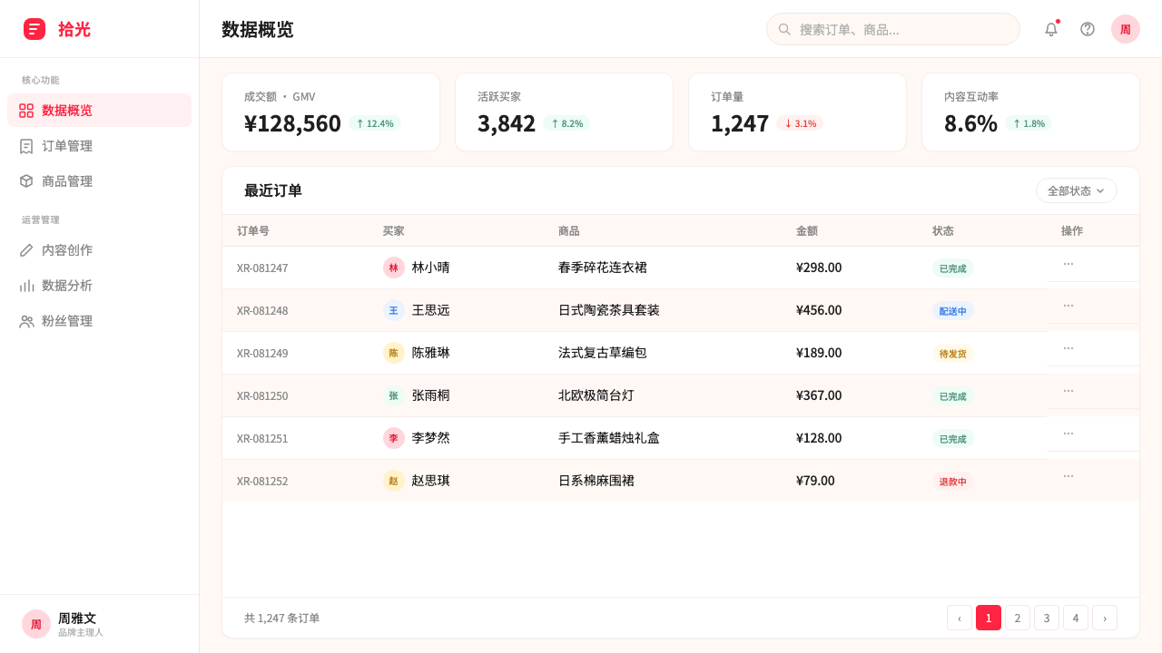
With significant adaptation, yes — but the more enterprise the audience, the more the system needs to be shifted toward its restrained end. The card grid and bilingual typographic hierarchy transfer well to data-rich B2B dashboards. The cream ground, when kept subtle, reads as warmth in B2C contexts and as approachability in B2B ones. What should not transfer is the soft shadow treatment at full intensity, the pill-button forms, and the community-annotation visual language — these read as consumer-grade in enterprise contexts. Think of it as borrowing the palette and grid logic while replacing the social-content-specific elements with more authoritative typographic treatments.经过较大幅度的适配,可以——但受众越偏向企业级,系统就越需要向其克制端移动。卡片网格与双语排版层级可以很好地迁移至数据丰富的 B2B 仪表板。奶油底色在足够克制时,在 B2C 语境中读为温暖,在 B2B 语境中则读为亲和。不应迁移的是全强度的柔和阴影处理、药丸形按钮形态,以及社区标注式视觉语言——这些在企业场景中会被读为消费级。可以理解为:借用色板与网格逻辑,同时以更具权威感的排版处理替换社交内容专属元素。
How should the signature red be used when designing in this style outside the Xiaohongshu brand?在小红书品牌之外以这种风格设计时,应如何运用标志红?
The red should be treated as a semantic signal, not a decorative choice. Replace it with whatever primary brand accent color the product uses, but maintain the same discipline of restriction: the accent appears only in primary interactive elements, notification states, and brand identification marks — never in decorative borders, background fields, or secondary interface elements. The warmth of the overall palette will carry the aesthetic even with a completely different accent color, as long as the cream-pink ground, the soft shadows, and the rounded card forms are preserved. The critical principle is not the specific hue but the ratio of restraint to emphasis.应将红色视为语义信号,而非装饰选择。将其替换为产品自身的主要品牌强调色,但维持同等的克制纪律:强调色只出现在主要交互元素、通知状态与品牌识别标识中——从不出现在装饰边框、底色区域或次级界面元素中。整体色板的温度感,即使在完全不同的强调色下也能承载这套美学,只要奶油粉底色、柔和阴影与圆润卡片形态得以保留。关键原则不是特定的色相,而是克制与强调的比例。
Why does the Xiaohongshu aesthetic feel so different from other major Chinese platform designs?为什么小红书的美学与其他主要中国平台的设计感觉如此不同?
Most major Chinese super-apps — including shopping, payments, and short video platforms — are designed around density, speed, and conversion. Their visual language maximizes the number of stimuli per screen area: bright saturated colors, dense information grids, countdown timers, discount badges, and high-contrast promotional banners all compete for attention simultaneously. Xiaohongshu's design philosophy inverts this: it optimizes for lingering, trust-building, and peer-to-peer discovery rather than transaction velocity. The warm grounds, restrained palette, and editorial card format are all expressions of a different conversion theory — that users will spend more time and ultimately more money on a platform that feels like a friend's recommendation than on one that feels like a marketplace.大多数主要的中国超级应用——包括购物、支付与短视频平台——都围绕密度、速度与转化率而设计。它们的视觉语言最大化每屏幕区域的刺激数量:高饱和亮色、密集信息网格、倒计时器、折扣徽章与高对比度促销横幅同时争夺注意力。小红书的设计哲学与此相反:它优化的是停留、信任建立与点对点发现,而非交易速度。暖色底面、克制色板与编辑式卡片格式,都是一种不同转化理论的表达——用户在一个感觉像朋友推荐的平台上,会比在一个感觉像集市的平台上花更多时间,最终也会花更多钱。
Is this style suitable for dark mode applications?这种风格适合深色模式应用吗?
The Xiaohongshu 2024 aesthetic is fundamentally a light-mode design language — the cream-pink ground, warm shadows, and soft tonal ranges all depend on the brightness of a light environment to read correctly. A dark inversion is technically possible but requires a complete rethinking of the palette: dark mode equivalents should use deep warm charcoal or dark brown tones as grounds rather than pure black, replace the cream accents with warm off-white highlights, and keep the signature accent color at reduced saturation to prevent it from becoming garish against a dark field. The photographic card content, which anchors the aesthetic, translates reasonably well to dark mode because photography is media-agnostic. The most challenging element to translate is the warm shadow — on a dark ground, shadows are invisible, so elevation must instead be handled through subtle border highlights or very slightly lighter surface tones.小红书 2024 美学从根本上是一套浅色模式的设计语言——奶油粉底色、暖色阴影与柔和的色调范围,都依赖浅色环境的亮度才能正确呈现。深色反转在技术上可行,但需要对色板进行全面重构:深色模式等效版本应以深暖炭灰或深棕色为底面,而非纯黑;以暖白色高光替代奶油色强调;将标志强调色的饱和度适当降低,以防在深色底面上显得刺目。作为美学锚点的摄影卡片内容,可以较好地迁移至深色模式,因为摄影本身是媒介无关的。最难迁移的元素是暖色阴影——在深色底面上,阴影不可见,因此层次感必须转而通过微妙的边框高光或略亮的表面色调来处理。
Related design styles相关设计风格
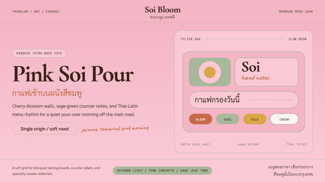 Bangkok Third-Wave CafeBangkok feels soft but sure. Cherry pink, sage borders, and Thai-Latin menu r…曼谷柔和却自信:樱花粉、鼠尾草边框与泰英菜单节奏。
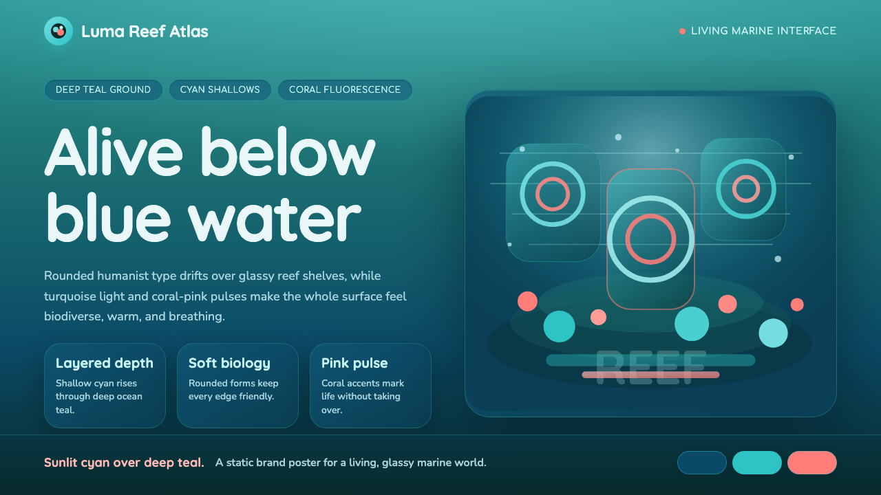 Great Barrier ReefAlive under deep teal. Quicksand curves, cyan glow, and coral-pink pulses bui…深海蓝绿中有生命:圆润字形、青蓝光晕与珊瑚粉脉冲层叠成礁。
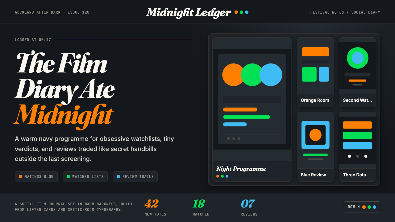 Letterboxd Cinephile Orange-GreenMidnight cinephilia glows. Fraunces italics and orange-green-blue dots cut th…午夜影迷感发光:深蓝网格里,斜体 Fraunces 与橙绿蓝圆点定调。
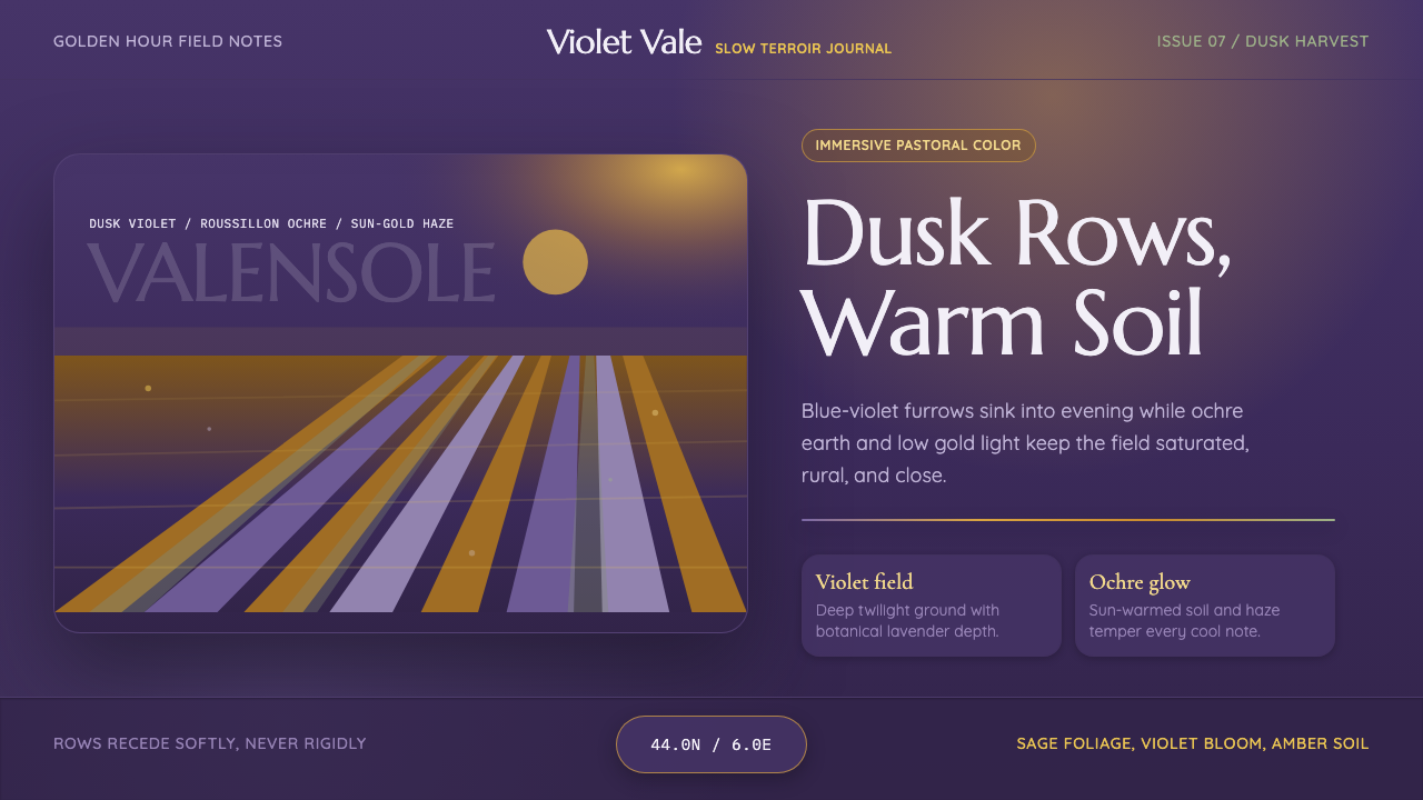 Provence LavenderSaturated pastoral dusk. Violet rows, ochre soil, and sun-gold haze build the…饱和的田园黄昏:紫色花垄、赭土与金色暮霭定调。
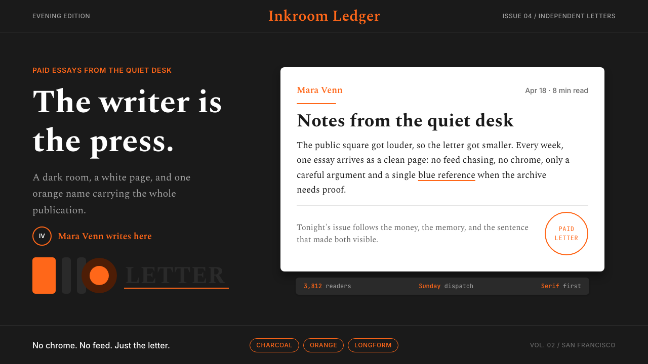 Substack Orange NewsletterLit page, dark room. Orange serif bylines ignite white cards on charcoal.暗室里的亮页。橙色衬线署名点燃炭黑上的白卡。
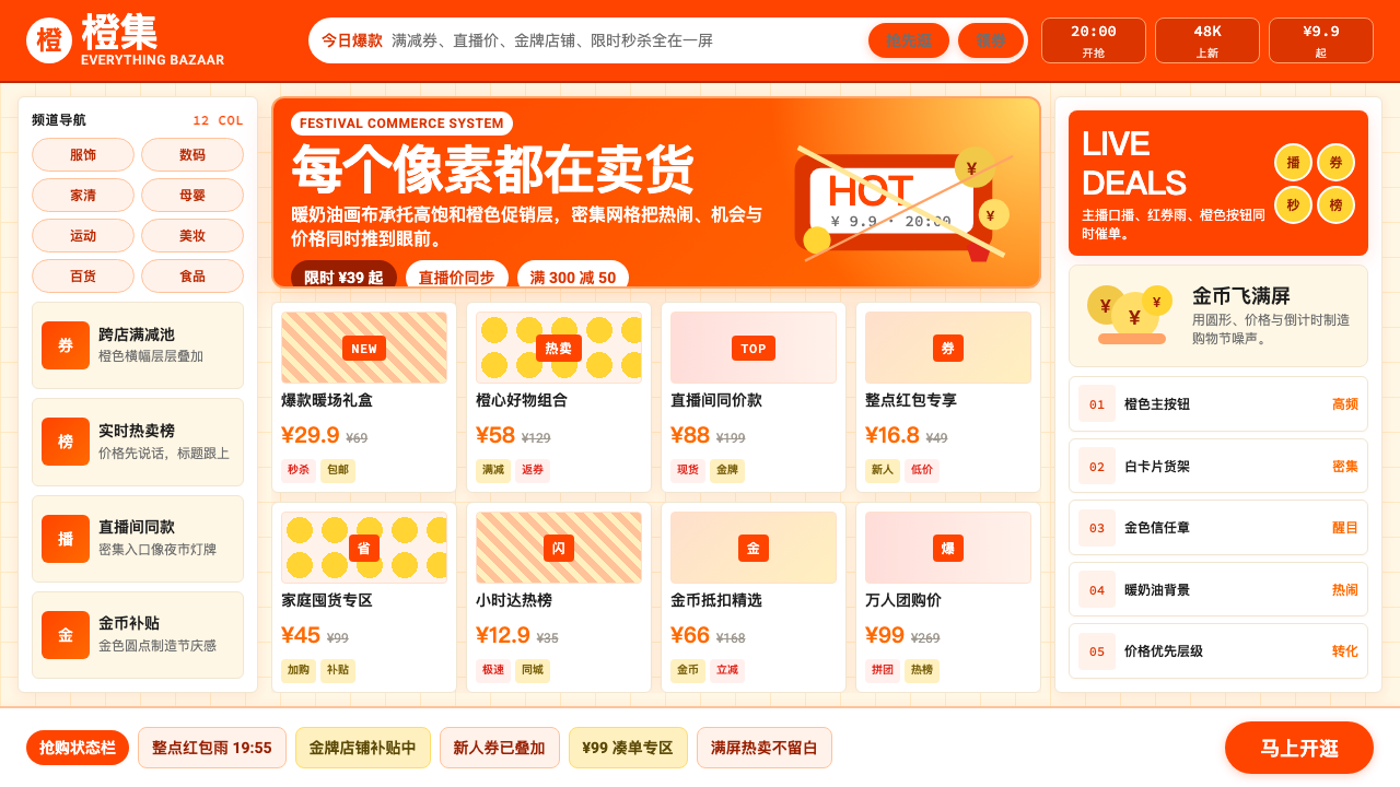 Taobao (淘宝)Every pixel sells. Orange on cream, dense price grids and gold coins shout ab…每个像素都在卖货。橙色压在奶油底上,密集价格网格与金币喊出丰盛。