What is Taobao (淘宝)?什么是 Taobao (淘宝)?
Taobao turned the Chinese street bazaar into pixels — saturated orange on warm cream, dense grids of goods, and a visual language where abundance is the message.淘宝把中国集市变成了像素——饱和橙色压在暖奶油底上,密集的商品网格,以及一套以丰盛本身为信息的视觉语言。
Taobao (淘宝) in briefTaobao (淘宝) 速览
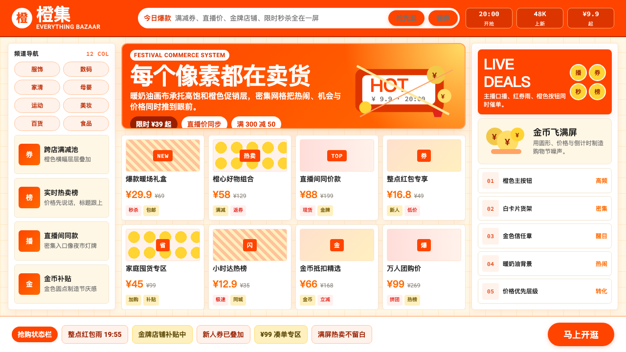
Taobao is the visual dialect of Chinese consumer e-commerce — a design system built not to calm or reassure but to excite, tempt, and convert. Its signature is layered abundance: warm orange banners stacked over cream backgrounds, product grids packed to the edge of the canvas, countdown timers ticking above price badges, and animated gold coins drifting across the screen during promotional festivals. Nothing about this system is accidental. Every element is engineered for the attention economy of a platform where millions of merchants compete for the same scroll.淘宝是中国消费电商的视觉方言——这套设计系统的目的不是平静或安抚,而是激发、诱惑与转化。其标志性风格是层叠的丰盛:暖橙色横幅堆叠在奶油底色之上,商品网格铺满画布边缘,倒计时器在价格标签上方滴答作响,节日促销期间金币动效从屏幕漂落。这套系统的每个元素都不是偶然的。在数百万商家竞争同一条滚动浏览流的平台注意力经济中,每个细节都经过工程化设计。
The aesthetic grew directly from the physical markets it replaced. Chinese street bazaars and wholesale districts have always communicated through density and volume — the more goods displayed, the more trustworthy and prosperous the stall appears. Taobao translated this logic into digital form: information density is not a bug but a signal of legitimacy and opportunity. Where Western e-commerce platforms trend toward editorial whitespace and restrained product photography, Taobao fills every available zone with promotional text, social proof indicators, seller certifications, and live video previews.这种美学直接脱胎于它所取代的实体市场。中国的街头集市和批发市场历来通过密度和体量进行沟通——展示的商品越多,摊位看起来越可信、越繁荣。淘宝将这种逻辑转化为数字形式:信息密度不是缺陷,而是合法性与机会的信号。西方电商平台趋向编辑式留白与克制的商品摄影,淘宝则用促销文字、社交证明指标、卖家认证和直播预览填满每一个可用区域。
The style reached its mature form across the 2010s and consolidated through the Singles Day shopping festival, which Taobao and its Alibaba sibling Tmall turned into the world's largest retail event. The festival's visual language — explosive oranges and reds, cascading countdown timers, fireworks and coin motifs — became inseparable from the Taobao brand identity itself. Today the style encompasses the entire ecosystem of Chinese consumer commerce: the static banner, the livestreaming overlay, the mobile cart, and the animated storefront — all speaking the same loud, generous, irresistible visual language.这种风格在2010年代趋于成熟,并通过双十一购物节得以巩固——淘宝与其阿里巴巴兄弟平台天猫将双十一打造成全球最大的零售事件。节日的视觉语言——爆炸性的橙色与红色、层叠的倒计时器、烟火与金币母题——与淘宝品牌身份本身变得密不可分。今天,这种风格涵盖了中国消费电商的整个生态系统:静态横幅、直播叠加层、移动购物车与动态店铺首页——所有这些都在诉说同一种响亮、慷慨、不可抵挡的视觉语言。
Where does Taobao (淘宝) come from?Taobao (淘宝) 从何而来?
Taobao was founded in Hangzhou in May 2003 by Jack Ma and a small team at Alibaba with an explicit mission: defeat eBay China. At the time, eBay had acquired EachNet and controlled roughly eighty percent of the Chinese consumer-to-consumer market. Taobao's early design choices were partly strategic and partly improvised — the platform needed to look trustworthy enough to attract sellers while signaling abundance to buyers. The warm orange that would become its defining color was chosen for its cultural resonance: in Chinese tradition, orange and gold connote prosperity, good fortune, and harvest. The color did not arrive from a brand consultancy; it emerged from the practical logic of competing in a market steeped in these associations.淘宝由马云及阿里巴巴的一支小团队于2003年5月在杭州创立,带着一个明确的使命:击败eBay中国。彼时,eBay已收购易趣,控制着中国C2C市场大约八成份额。淘宝早期的设计选择一半是战略性的,一半是随机应变的——平台需要看起来足够可信以吸引卖家,同时向买家传递丰盛感。将成为其标志性色彩的暖橙色,是因其文化共鸣而被选定的:在中国传统中,橙色与金色象征繁荣、好运与丰收。这个颜色不是品牌顾问的成果,而是从竞争于一个深浸这些文化联想的市场的实践逻辑中自然生长出来的。
eBay's Chinese interface at the time was adapted from its American parent — relatively sparse, transactional, and neutral in palette. Taobao went the opposite direction. Dense product listings, prominent seller ratings, real-time chat through Wangwang (the platform's built-in messaging tool), and heavy promotional graphics created an experience closer to a market day than a catalog. By 2006, eBay China had shut down its domestic platform. The design language that defeated it was not refined by any aesthetic doctrine — it was validated by conversion rates and seller adoption.彼时eBay的中国界面是从美国母公司改编而来的——相对稀疏、偏重交易、色调中性。淘宝走向了完全相反的方向。密集的商品列表、突出的卖家评分、通过旺旺(平台内置即时通讯工具)进行的实时聊天,以及大量的促销图形,创造了一种更接近集市赶大集而非商品目录的体验。到2006年,eBay中国已关闭其国内平台。击败它的设计语言不是经过任何美学学说打磨出来的——它是被转化率和卖家采纳率验证出来的。
The Singles Day shopping festival, launched in 2009 under Daniel Zhang, transformed the platform's visual identity permanently. Originally a quirky celebration of single life on November 11 (the date 11/11 comprising four ones), it was repurposed as a twenty-four-hour sales event whose visual branding required something immediately recognizable as festive, urgent, and abundant. The design team developed the explosive red-and-orange countdown aesthetic that today millions of designers associate with the style. Livestreaming commerce, which accelerated dramatically after 2016, added another layer: the style now had to function as a broadcast overlay — text badges, real-time viewer counts, and promotional banners sitting on top of live video — demanding even greater contrast and visual punch.由张勇在2009年发起的双十一购物节,从此永久性地改变了这个平台的视觉身份。这个节日最初是对11月11日(日期11/11由四个1组成)单身生活的另类庆祝,后来被重新定位为24小时限时促销活动,其视觉品牌需要某种能立即被识别为喜庆、紧迫且丰盛的东西。设计团队开发了爆炸性的红橙倒计时美学,如今数百万设计师都将这种风格与之联系在一起。在2016年后急剧加速的直播电商,又叠加了新的一层:这种风格现在必须作为广播叠加层运作——文字标签、实时观看人数和促销横幅覆盖在直播视频之上——对更高的对比度和视觉冲击力提出了更苛刻的要求。
The current consolidated visual identity — overseen during the tenures of Jiang Fan and later Eddie Wu as Alibaba restructured its commerce business — reflects over two decades of optimization for the mobile screen. The shift from desktop to mobile between 2012 and 2016 compressed the canvas and intensified the density. On a smartphone, the margin between a tap converting and a user scrolling past is a fraction of a second, and every refinement to the visual system since has been calibrated for that moment. Taobao Orange is not a color selected for beauty; it is a color selected because it performs — in low-light conditions, on screens of varying quality, at thumbnail scale, and under the competitive pressure of a feed where a thousand other products are one swipe away.当前经过整合的视觉身份——在蒋凡及后来吴泳铭主导阿里巴巴电商业务重组期间逐步成型——反映了超过二十年针对移动屏幕的持续优化。2012年至2016年间从桌面端向移动端的转变压缩了画布,强化了密度。在智能手机上,一次点击转化与用户划走之间的差距只有几分之一秒,此后对视觉系统的每一次优化都是为那个瞬间而校准的。淘宝橙不是为美而选择的颜色;它是因为「有效」而被选择的颜色——在弱光条件下、在品质参差不齐的屏幕上、在缩略图尺寸下、在信息流中面对其他数千个商品的竞争压力下,它依然有效。
What defines the Taobao (淘宝) look?Taobao (淘宝) 的视觉特征是什么?
Signature Orange and Warm Palette标志性橙色与暖色调色板
Taobao Orange is a deeply saturated, warm reddish-orange — vivid enough to anchor banners and call-to-action buttons at a glance, culturally loaded enough to carry associations of prosperity and festivity. It sits on warm cream or off-white backgrounds rather than cold white, maintaining a sense of warmth even at maximum saturation. Promotional periods introduce intense reds alongside the orange, and gold appears as a secondary accent, reinforcing the celebration-and-abundance register. Cool neutrals are rare; the palette stays in the warm half of the spectrum almost without exception.淘宝橙是一种深度饱和的暖红橙色——鲜艳到足以一眼锚定横幅和行动召唤按钮,在文化上又承载着足够浓厚的繁荣与节庆联想。它落在暖奶油色或米白色背景上,而非冷白色,即便在最高饱和度下也维持着暖意。促销期间,浓烈的红色与橙色并肩出现,金色作为次级强调色强化节庆与丰盛的基调。冷色调的中性色极为罕见;整个色板几乎毫无例外地停留在色谱的暖色半区。
Maximal Information Density极致信息密度
Where most design systems treat empty space as a breathing room to protect, Taobao treats it as inventory awaiting goods. Product grids run edge to edge with minimal gutters. Price badges, discount percentages, seller ratings, shipping promises, and social proof figures coexist in the same compact card. Far from feeling chaotic to the intended audience, this density communicates competence and abundance — a seller who fills their space confidently is, by Chinese retail convention, a seller with something to offer.大多数设计系统将留白视为需要保护的呼吸空间,而淘宝将其视为等待上货的库存。商品网格以极小的间距铺满边缘。价格标签、折扣百分比、卖家评分、物流承诺与社交证明数据在同一张紧凑卡片里共存。这种密度对于目标受众而言并不感到混乱——恰恰相反,它传达出能力与丰盛:一个自信填满自己空间的卖家,在中国零售惯例中,正是一个有货可卖的卖家。
Countdown and Urgency Mechanics倒计时与紧迫感机制
Time-limited offers are not a minor feature but a structural pillar of the visual system. Countdown timers — hours, minutes, and seconds displayed in high-contrast numeral blocks — appear across banner placements, product cards, and checkout flows. Flash-sale indicators, stock-level warnings, and buyer-count displays create a persistent sense that inaction has a cost. The typography used for countdowns is characteristically large, monospaced in rhythm, and rendered in contrasting color against the orange or red ground, giving each timer the visual weight of a headline.限时优惠不是一个次要功能,而是视觉系统的结构性支柱。倒计时器——以高对比度数字块展示的小时、分钟和秒数——出现在横幅位置、商品卡片和结账流程中。闪购指示器、库存预警和购买人数显示,持续营造出一种「不行动就会付出代价」的紧迫感。倒计时使用的字体特征鲜明:字号大,节奏上呈等宽感,在橙色或红色底面上以对比色渲染,赋予每个计时器标题级的视觉重量。
Celebratory Motion and Festival Graphics庆典动效与节日图形
Static design is supplemented by motion in ways that have no direct equivalent in Western e-commerce aesthetics. Animated gold coins tumble across promotional pages during major shopping events. Fireworks and confetti sequences punctuate successful purchases. Livestreaming interfaces carry constant motion: scrolling comments, floating heart animations triggered by viewer interactions, and real-time gift animations overlay the video content. Even in static banner work, the compositional language borrows from festival graphics — radial bursts, diagonal energy lines, and layered badge elements that imply motion even at rest.静态设计被动效以西方电商美学中没有直接对应物的方式所补充。在重大购物节活动期间,动态金币翻滚穿越促销页面。烟火与彩纸序列点缀着成功购买的瞬间。直播界面保持持续的动态:滚动的评论、由观众互动触发的漂浮爱心动画,以及实时礼物动画叠加在视频内容上。即便在静态横幅作品中,构图语言也借鉴自节日图形——放射状爆发、对角线能量线,以及层叠的徽章元素,即便静止也暗示着运动。
Typographic Aggression and Hierarchy by Scale字体的攻击性与尺度层级
Taobao typography is blunt and functional, organized almost entirely by size contrast rather than typographic refinement. Key price figures and promotional headlines appear at dramatic scale — sometimes occupying a third or more of a banner's height — to be readable as a thumbnail in a crowded feed. Supporting copy is compressed into small but legible text, often stacked vertically or wrapped tightly around product imagery. Weight and scale create hierarchy in the absence of generous spacing. The overall impression is of text that shouts where it needs to shout and whispers where it merely informs.淘宝的字体排版直接而功能性,层级几乎完全依赖尺度对比而非字体美学的精细处理来组织。关键价格数字和促销标题以戏剧性的尺度出现——有时占据横幅高度的三分之一甚至更多——以便在拥挤的信息流中作为缩略图时依然清晰可读。配套的说明文字被压缩成小而可辨的文本,常常垂直堆叠或紧紧环绕商品图像。在没有充裕间距的情况下,字重与尺度构建出层级关系。整体印象是:需要呐喊的文字在呐喊,仅作告知的文字在低语。
Layered Badges and Trust Signals层叠徽章与信任信号
Because buyers and sellers are strangers transacting across a decentralized marketplace, the visual system dedicates significant real estate to trust infrastructure. Seller level badges, official brand certifications, logistics guarantee icons, buyer protection emblems, and platform-verified labels stack onto product cards alongside pricing. These elements use a distinct sub-language: rounded rectangles, shield shapes, and star clusters rendered in the warm palette of the broader system but with their own internal hierarchy. The density of trust signals on a single card can seem excessive by Western standards but reads as reassurance in context.由于买卖双方是在去中心化集市中交易的陌生人,视觉系统将相当大的版面空间专用于信任基础设施。卖家等级徽章、官方品牌认证、物流保障图标、买家保护标志和平台认证标签与价格信息一起层叠在商品卡片上。这些元素使用一套独特的子语言:圆角矩形、盾牌形状和星形组合,以更宏观系统的暖色调渲染,但拥有自身内部的层级关系。单张卡片上信任信号的密度在西方标准看来可能显得过量,但在语境中读作一种安心。
Mobile-First Compression移动优先的压缩感
The Taobao visual system was substantially redesigned around the mobile canvas between 2012 and 2016, and the compression this demanded became a defining characteristic rather than a constraint. Horizontal navigation collapsed into icon-driven bottom bars. Product cards narrowed to fit two across a phone screen while retaining all their commercial information. Banner formats adapted to vertical scrolling rather than horizontal browsing. The result is a design language that looks dense but not broken on small screens — every element has been ruthlessly right-sized for a thumb-navigated context where a few pixels of extra margin can push a critical price point below the fold.淘宝视觉系统在2012年至2016年间围绕移动画布进行了实质性的重新设计,这一过程所要求的压缩感成为了一种定义性特征,而非一种约束。横向导航折叠进图标驱动的底部导航栏。商品卡片收窄以在手机屏幕上两列并排显示,同时保留所有商业信息。横幅格式适应了垂直滚动而非水平浏览的方式。结果是一套在小屏幕上看来密集却不破碎的设计语言——每一个元素都被无情地调整到适合拇指导航语境的尺寸,在那里多出几个像素的边距就可能把一个关键价格点推到折叠线以下。
Who shaped Taobao (淘宝)?谁塑造了 Taobao (淘宝)?
Jack Ma co-founded Alibaba in 1999 and launched Taobao in 2003 with a clear competitive brief: build a platform that could outmaneuver eBay by understanding Chinese consumer psychology rather than importing American e-commerce conventions. His insistence on free listings for sellers — against the paid-listing model eBay used — was both a business strategy and a design statement: abundance is created by lowering barriers, and abundance would define what the platform looked like. Ma's vision of an everything-store rooted in Chinese market culture established the cultural foundation on which the visual language was built.马云于1999年联合创立阿里巴巴,并于2003年创立淘宝,带着一个明确的竞争任务:通过理解中国消费者心理而非照搬美国电商惯例,打造一个能击败eBay的平台。他坚持为卖家提供免费发布商品的政策——对抗eBay采用的付费刊登模式——既是商业策略,也是一种设计宣言:通过降低门槛创造丰盛,而丰盛将定义这个平台的外观。马云对一个植根于中国市场文化的万能商店的愿景,奠定了视觉语言赖以建立的文化基础。
Daniel Zhang joined Alibaba in 2007 and became chief operating officer in 2013, eventually serving as CEO. He is credited with transforming Singles Day from a niche cultural observation into the world's largest retail event, beginning in 2009. The visual identity of that festival — the countdown clock aesthetic, the orange-and-red explosion of promotional graphics, the real-time sales dashboard broadcast to hundreds of millions of viewers — was developed under his operational leadership. Zhang's contribution to the Taobao style is less about individual design decisions than about institutionalizing the festival as a recurring visual event that reset expectations for promotional design annually.张勇于2007年加入阿里巴巴,2013年出任首席运营官,后升任CEO。他被认为从2009年起将双十一从一个小众文化节点转变为全球最大的零售事件。该节日的视觉身份——倒计时时钟美学、橙红色促销图形的爆炸式呈现、向数亿观众直播的实时销售大屏——正是在他的运营领导下形成的。张勇对淘宝风格的贡献与其说是个别设计决策,不如说是将这个节日制度化为一个每年重置促销设计预期的循环视觉事件。
Jiang Fan served as president of Taobao and Tmall during a period of intense mobile and livestreaming expansion in the late 2010s. Under his leadership the platform deepened its integration of short-form video and live commerce, which required substantial evolution of the visual system to handle the layered overlays, animated interaction states, and real-time information displays that livestreaming commerce demands. The current mature form of Taobao's mobile-first visual language — with its densely annotated video surfaces and commerce-native motion vocabulary — took shape during his tenure.蒋凡在2010年代末移动端与直播高速扩张期间担任淘宝和天猫总裁。在他的领导下,平台深化了对短视频与直播电商的整合,这要求视觉系统进行实质性的演进,以处理直播电商所需的层叠叠加层、动态交互状态与实时信息展示。淘宝移动优先视觉语言的当前成熟形态——其密集注释的视频界面与电商原生的动效词汇——正是在他任期内成型的。
Eddie Wu, one of Alibaba's original co-founders, returned to lead the Taobao and Tmall businesses as Alibaba undertook a major structural reorganization beginning in 2023. His tenure coincides with a period of refinement rather than reinvention — sharpening the platform's identity amid intensifying competition from Pinduoduo and Douyin e-commerce, and adapting the visual system for an era of AI-driven personalization and content-commerce integration. Wu's leadership represents the phase in which the Taobao visual language, now approaching its third decade, is being calibrated for sustained relevance rather than initial conquest.吴泳铭是阿里巴巴最初的联合创始人之一,在阿里巴巴从2023年开始进行重大结构重组之际,回归领导淘宝和天猫业务。他的任期与一个精炼而非重塑的时期相吻合——在拼多多与抖音电商竞争日趋激烈的环境中强化平台身份,并使视觉系统适应AI驱动个性化与内容电商融合的时代。吴泳铭的领导标志着一个阶段:淘宝视觉语言在接近其第三个十年之际,被校准以维持持久的相关性,而非完成最初的征服。
How do you use Taobao (淘宝) today?今天怎么用 Taobao (淘宝)?
Applying the Taobao aesthetic requires committing to its fundamental premise: density is a feature, not a failure. Designers accustomed to editorial whitespace may instinctively reduce product counts, increase padding, and mute the orange — but each of those moves dilutes the system's logic. The style works because it is complete: the warm background, the saturated orange, the dense grid, the badge system, and the countdown elements reinforce one another. Pulling any element toward restraint without rebalancing the whole produces something that is neither Taobao nor its restrained alternative — it becomes incoherent.应用淘宝美学要求承诺其根本前提:密度是特性,不是失败。习惯于编辑式留白的设计师可能会本能地减少商品数量、增加内边距、降低橙色饱和度——但每一个这样的动作都在稀释系统的逻辑。这种风格之所以有效,是因为它是完整的:暖色背景、饱和橙色、密集网格、徽章系统和倒计时元素相互强化。在不重新平衡整体的情况下将任何元素拉向克制,会产生一种既非淘宝风格、也非其克制替代品的东西——它会变得不连贯。
For presentation slides, the style translates most effectively onto cover pages and section dividers rather than dense content pages. A Taobao-inspired cover uses a warm cream or pale ground with a bold orange headline at large scale, a product or data visualization rendered as a dense grid inset, and one or two badge-like callout elements to anchor key figures. Data slides adopt the countdown aesthetic: key metrics are given large, high-contrast numeral treatments in orange or warm red, with supporting context in compact supporting text. Avoid applying the festival-explosion graphic language to data — the motion and radial-burst elements belong on promotional surfaces, not analytical ones.对于演示文稿,这种风格最有效地转化到封面页和章节分隔页,而非密集的内容页面。受淘宝启发的封面以暖奶油色或浅色底为基础,以大尺度的粗体橙色标题为主导,将商品或数据可视化以密集网格嵌入,并用一到两个徽章式引用元素锚定关键数字。数据页采用倒计时美学:关键指标以橙色或暖红色获得大尺度、高对比度的数字处理,配套说明以紧凑的辅助文字呈现。避免将节日爆炸式图形语言用于数据——动效和放射状爆发元素属于促销画面,而非分析性画面。
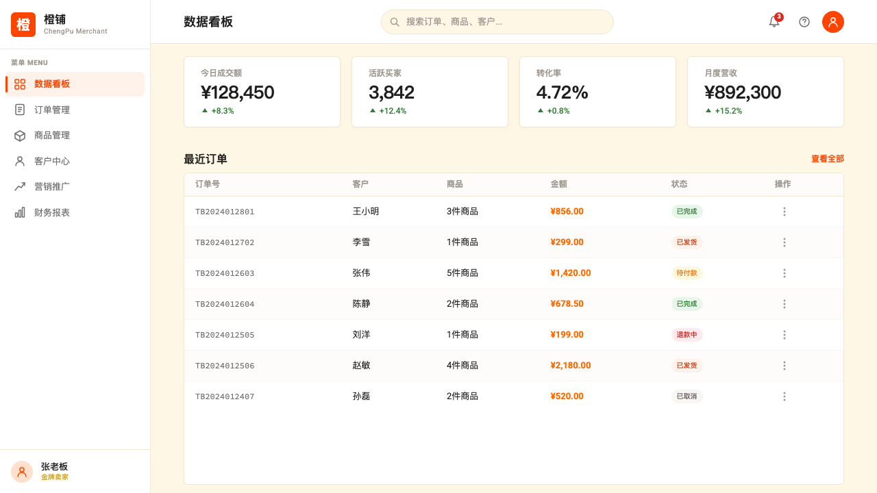
For web UI and dashboards, the style is well-suited to commerce-adjacent contexts: pricing tables, promotional landing pages, product comparison pages, and conversion-focused interfaces. The approach requires maintaining a warm ground color throughout, using the signature orange consistently for primary interactive elements and active states, and building card components with visible borders or warm-toned shadows rather than cool drop shadows. Trust-signal infrastructure — badge elements, guarantee icons, and certification indicators — should be treated as first-class design components rather than afterthoughts, sized and positioned with the same care as pricing information. Navigation should be compact and icon-forward.对于网页界面和仪表板,这种风格特别适合与电商相邻的场景:定价表、促销落地页、商品对比页和以转化为核心的界面。这种方法要求在整个界面中保持暖色底色,将标志性橙色一致地用于主要交互元素和激活状态,并以可见边框或暖色调阴影(而非冷色调投影)构建卡片组件。信任信号基础设施——徽章元素、保障图标和认证指示符——应被视为一等设计组件而非事后补充,以与价格信息同等的重视程度进行尺寸设计和位置布置。导航应当紧凑且以图标为主。
For editorial and marketing work, the style operates best at the scale of a campaign or event — posters, festival graphics, promotional email headers, and social media cards. A Taobao-derived poster composition uses a diagonal energy structure: the dominant orange mass sits at an angle rather than in a symmetric block, promotional headlines strike boldly across the composition, and supporting elements (prices, countdowns, certification badges) layer on top in descending scale. The style is less well suited to long-form editorial where sustained reading requires the kind of visual calm that this palette actively resists.对于编辑和营销内容,这种风格在活动或事件的规模上表现最佳——海报、节日图形、促销邮件标题和社交媒体卡片。源自淘宝的海报构图使用对角线能量结构:主导的橙色色块以对角线而非对称块状布局,促销标题在构图中强劲穿越,辅助元素(价格、倒计时、认证徽章)以递减的尺度层叠其上。这种风格不太适合需要视觉平静以支撑持续阅读的长篇编辑内容——而这种平静正是这套色板所主动抵制的。
A common mistake when borrowing this aesthetic is treating the orange as a pure accent color used sparingly against white — the way a Western brand might use a brand color for calls to action only. In the Taobao system, the warm orange is the ambient temperature of the whole surface: it appears in the background warmth, in the dominant promotional elements, and in the interactive states simultaneously. Used sparingly on a cold white ground, it simply looks like an orange button on a minimal interface. The style only reads correctly when the warm palette saturates the entire composition and the orange has company — warm cream, promotional red, and gold — rather than sitting alone against a neutral field.借鉴这种美学时常见的错误,是将橙色视为一种如西方品牌对待品牌色那样——仅用于行动召唤的纯粹点缀色——节制地使用在白色底面上。在淘宝系统中,暖橙色是整个界面的环境温度:它同时出现在背景的暖意中、主要促销元素中和交互状态中。在冷白色底面上节制地使用,它只是看起来像极简界面上的一个橙色按钮。只有当暖色调色板浸透整个构图,橙色拥有同伴——暖奶油色、促销红和金色——而不是孤独地立于中性底面之上时,这种风格才能正确传达。
Taobao (淘宝) — FAQTaobao (淘宝) · 常见问题
Is Taobao design the same as general Chinese internet aesthetics?淘宝设计等同于一般的中国互联网美学吗?
Not exactly. Taobao is the most prominent representative of Chinese e-commerce visual style, but it is one school within a broader spectrum. Chinese social platforms like WeChat and Weibo, news aggregators like Toutiao, and utility apps like Alipay each have their own visual register, which varies considerably in density and palette. What distinguishes the Taobao style specifically is its commerce-first orientation: every visual decision is in service of transaction. Other Chinese platforms balance commerce with content, community, or utility in ways that produce different visual outcomes. Taobao is best understood as the maximalist commerce end of the Chinese digital design spectrum.不完全是。淘宝是中国电商视觉风格最具代表性的样本,但它只是更广泛谱系中的一个流派。微信、微博等中国社交平台,头条等资讯聚合器,以及支付宝等工具类应用,各自拥有在密度和色调上差异显著的视觉语域。淘宝风格的独特之处在于其以电商为第一优先的取向:每一个视觉决策都服务于交易。其他中国平台在电商与内容、社区或工具之间保持平衡,产生了不同的视觉结果。淘宝最好被理解为中国数字设计谱系中极致主义电商端的代表。
Can this aesthetic work for luxury or premium product contexts?这种美学适合奢侈品或高端商品的场景吗?
With significant modification, but in its full form, no. The Taobao visual system communicates value through abundance and competition — the crowd, the countdown, the layered social proof. Luxury goods derive their perceived value partly from scarcity signals: limited visual noise, generous space, restrained type, and the absence of competitive comparison. A full Taobao treatment applied to a luxury product would undermine the product's positioning. However, elements of the style — particularly the warm palette and the use of gold as an accent — can be drawn into more restrained luxury-adjacent compositions without importing the density and urgency mechanics.经过大幅修改后可以,但以完整形态呈现则不行。淘宝视觉系统通过丰盛与竞争传达价值——拥挤感、倒计时、层叠的社交证明。奢侈品的感知价值部分来自稀缺性信号:有限的视觉噪音、充裕的空间、克制的字体,以及竞争性比较的缺席。将完整的淘宝处理方式应用于奢侈品,会破坏产品的定位。然而,这种风格的部分元素——尤其是暖色调色板和将金色用作强调色——可以被引入更克制的高端相邻构图中,而不必引入密度和紧迫感机制。
How does the style handle dark mode or night themes?这种风格如何处理深色模式或夜间主题?
The Taobao visual system is fundamentally a warm-light-ground system, and dark inversions require careful handling. On a dark background, the warm orange retains its energy but loses the warmth contrast it gets from the cream ground — it can begin to read more aggressively as a pure attention device rather than a celebration signal. Gold accents work well on dark backgrounds, and deep warm neutrals (dark brown or very dark amber) can replace pure black while maintaining palette coherence. The density of the system remains compatible with dark contexts, but the festival warmth — which depends on the cream-and-orange relationship — needs to be rebuilt through deliberate material choices rather than simply inverting the lightness.淘宝视觉系统从根本上是一套暖浅色底面系统,深色反转需要谨慎处理。在深色背景上,暖橙色保留了其能量感,但失去了从奶油底色获得的暖意对比——它可能开始被读作一种纯粹的注意力装置,而非庆典信号。金色强调色在深色背景上效果良好,深暖中性色(深棕或非常深的琥珀色)可以取代纯黑,同时保持色板的连贯性。这套系统的密度与深色场景兼容,但节日的暖意——它依赖于奶油色与橙色之间的关系——需要通过刻意的材质选择来重建,而不仅仅是反转明度。
Does using this style risk looking like a knockoff of Taobao itself?使用这种风格是否有看起来像淘宝山寨版的风险?
The risk is real if the full system is replicated without adaptation. The combination of the specific orange, the dense grid, the gold coins, the countdown typography, and the layered badge system in its complete form will read as Taobao to Chinese audiences in particular. The style is more transferable when specific elements are drawn from it selectively: the warm-palette energy, the density principle, the trust-signal approach, or the festival-bold typography can each be applied in contexts adapted to different product categories, geographic markets, or brand languages without producing a Taobao replica. The goal is to apply the style's underlying logic — density as trust, warmth as invitation, boldness as confidence — rather than its specific surface inventory.如果在没有改编的情况下完整复制这套系统,这种风险是真实存在的。将特定橙色、密集网格、金币、倒计时字体和层叠徽章系统以完整形态组合在一起,对中国受众而言会直接读作淘宝。当从中选择性地抽取特定元素时,这种风格的移植性更强:暖色调能量、密度原则、信任信号方式,或节日式粗犷字体,各自都可以在适应不同商品品类、地理市场或品牌语言的语境中应用,而不会产生淘宝复制品。目标是应用这种风格的底层逻辑——密度即信任、暖意即邀请、大胆即自信——而非其特定的表面元素清单。
How does this style relate to the broader live-commerce and short-video era?这种风格与更广泛的直播电商和短视频时代有何关联?
Taobao's visual style has evolved in direct dialogue with livestreaming and short-form video commerce, and in many ways the platform's design vocabulary expanded to absorb the new medium rather than being replaced by it. The core elements — the orange palette, density, countdown urgency, and trust signals — translated naturally into the livestream overlay format, where they compete for attention against the video content itself. Douyin (TikTok in China) and Kuaishou brought competing visual dialects into the space, generally with more emphasis on the personality of the host and less on the product grid. The Taobao aesthetic remains distinctive for privileging the product and the transaction over the entertainer — it is commerce wearing a costume of celebration rather than entertainment that also sells.淘宝的视觉风格在与直播和短视频电商的直接对话中持续演进,在许多方面,平台的设计词汇是扩展以吸收新媒介,而非被其取代。核心元素——橙色色板、密度、倒计时紧迫感和信任信号——自然地转化进直播叠加层格式,在那里它们与视频内容本身竞争注意力。抖音和快手将竞争性的视觉方言带入了这一空间,总体上更强调主播的个人魅力而非商品网格。淘宝美学仍以将商品和交易置于娱乐者之上而保持其独特性——它是穿着庆典服装的电商,而非顺带卖货的娱乐。
Related design styles相关设计风格
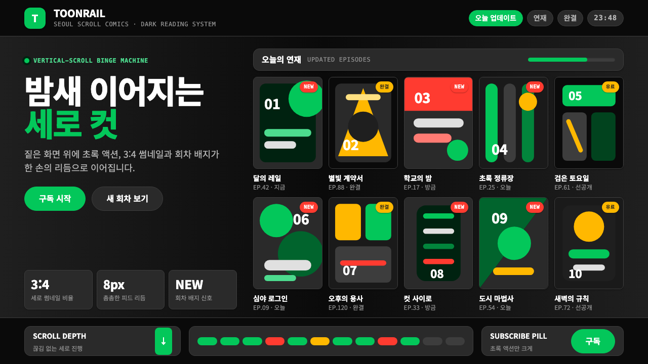 Naver Webtoon (2024)Built for late-night scroll. Charcoal grids, Noto Sans KR, and green episode…为深夜滚动而生:炭灰网格、思源黑体与绿色话数信号。
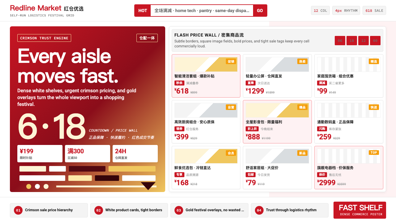 JD.com (京东)Urgency earns trust. Deep red prices pack a white 12-column grid with gold fe…急迫也可信:深红价格挤满白色12栏网格,金色大促点燃节奏。
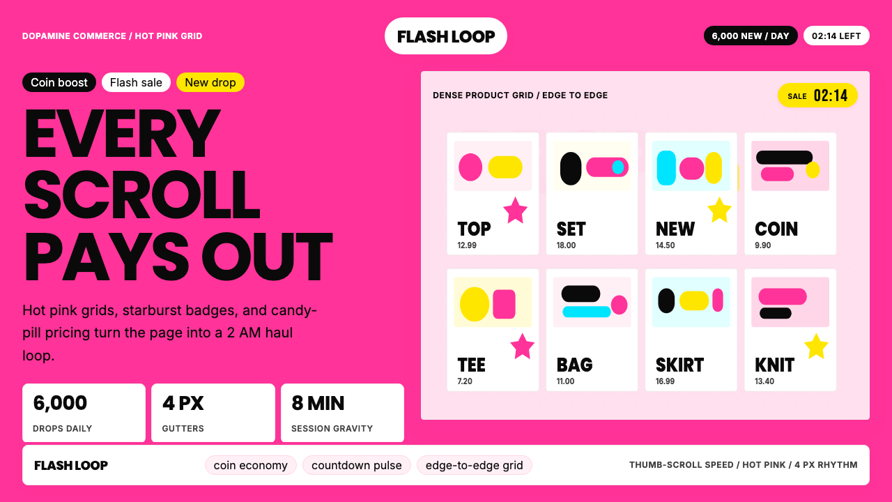 Shein Fast FashionDopamine density wins. Hot pink grids, starbursts, and candy pills pack every…高密度多巴胺取胜。热粉网格、星爆和糖果药丸挤满每个像素。
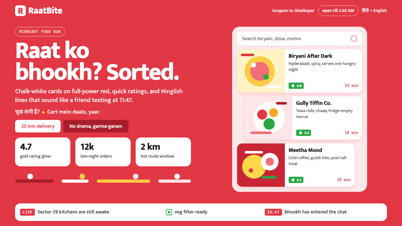 Zomato India DeliveryOwns the midnight scroll. Saturated red, Mukta Hinglish, white cards and gold…午夜外卖很会说话:饱和红、Mukta双语字和白卡金星撑起深夜滚动。
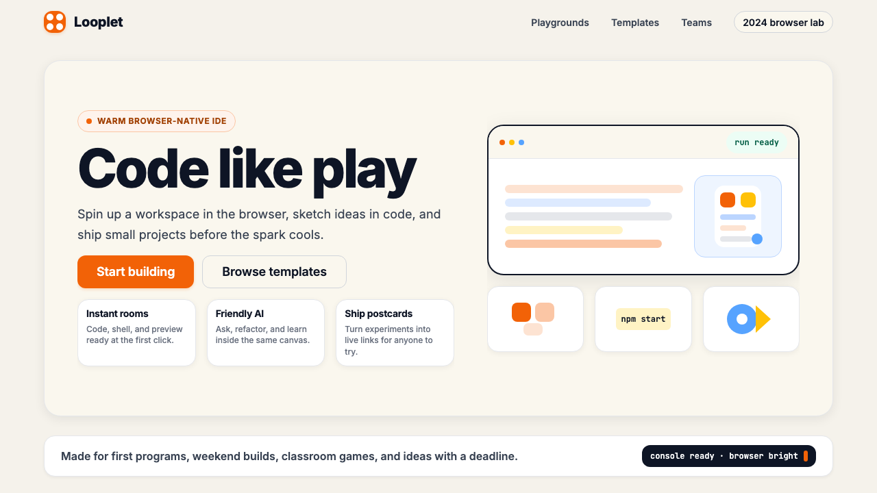 Replit 2024Coding feels warm. Coral buttons, cream panels, rounded code tiles make build…编程变得温暖:珊瑚按钮、奶油面板与圆角代码块让构建更好玩。
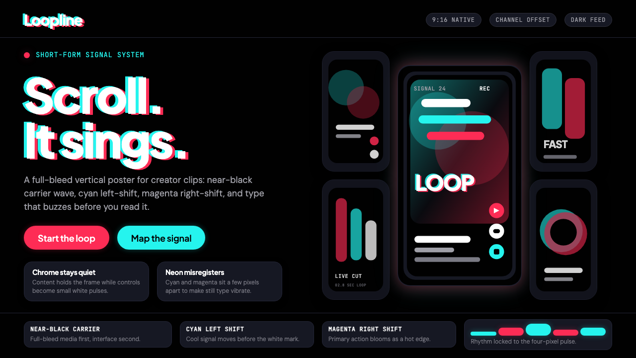 TikTok 2024Attention vibrates. Near-black feed, cyan-magenta offsets, and vertical frame…注意力在震动。近黑底、青粉错位与竖屏框架发出嗡鸣。