What is TikTok 2024?什么是 TikTok 2024?
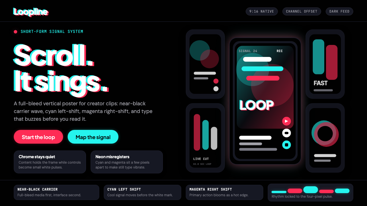
TikTok's visual identity is built on a single, unforgettable trick: two neon channels — one cyan, one magenta — misaligned by just enough to make the entire interface feel like it's vibrating.TikTok 的视觉身份建立在一个令人难忘的技巧之上:青色与洋红两道霓虹色通道,以微小的错位制造出整个界面仿佛在颤动的感觉。
TikTok 2024 in briefTikTok 2024 速览
TikTok 2024 is the mature form of the visual identity ByteDance built for its global short-video platform across the years 2020 to 2024. It is a dark-mode-native system — not dark mode as an afterthought, but dark mode as the foundational condition. Almost every interface decision flows from that commitment: the near-black canvas exists to make video content appear with maximum luminance, and every chrome element is engineered to recede behind it.TikTok 2024 是字节跳动为其全球短视频平台在 2020 至 2024 年间逐步完善的视觉身份的成熟形态。它以深色模式为原生语境——并非事后附加的深色选项,而是作为根本性前提存在。几乎所有界面决策都由此派生:近黑色的画布让视频内容以最大亮度呈现,每一个界面元素都被精心设计成隐退其后的存在。
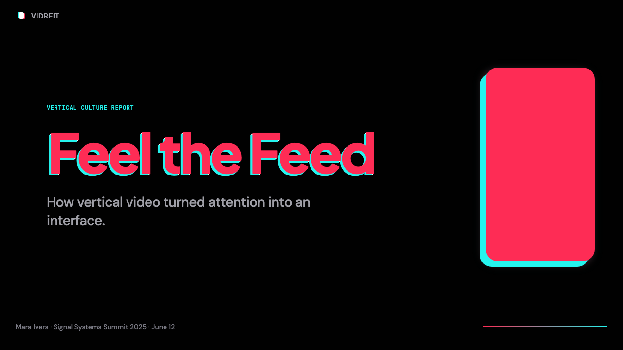
The style's most recognizable signature is the chromatic offset, borrowed from the wordmark, in which a cyan copy and a magenta copy of a graphic element are nudged slightly out of register, creating a glitch-like vibration. This effect — reminiscent of misaligned printing or analog TV signal degradation — gives the identity a kinetic quality without requiring literal motion. Even static applications of the brand appear to buzz with energy.这套风格最具辨识度的标志是色彩错位效果——借鉴自品牌字标——将图形元素的青色副本与洋红色副本微微偏离对齐,制造出类似故障的震动感。这种效果令人联想到印刷套色偏差或模拟电视信号的衰退,赋予品牌视觉动态感,而无需任何真实的动态。即使是品牌的静态应用,看起来也仿佛嗡嗡作响,充满能量。
Beyond the signature effect, TikTok 2024 is a rigorously minimal system. The interface chrome is subordinate to the 9:16 vertical video frame at all times. Typography is rounded and approachable, iconography is reduced to confident outlines, and the overall composition is built for one-handed, thumb-driven scrolling. The aesthetic communicates a single directive: content first, chrome invisible.除了这一标志性效果,TikTok 2024 本质上是一套严苛的极简系统。界面外壳在任何时候都服从于 9:16 的竖屏视频框架。字体圆润亲切,图标被简化为自信的轮廓线,整体构图为单手拇指操作的滑动方式而生。这套美学传递的是唯一一条指令:内容在前,界面隐形。
Where does TikTok 2024 come from?TikTok 2024 从何而来?
The story of TikTok's visual identity begins in Beijing in 2016, when ByteDance launched Douyin — a short-video application aimed at the Chinese market. Douyin's early identity was energetic and youth-oriented, leaning into the neon palettes and kinetic aesthetics that were emerging across Chinese digital culture. The chromatic offset device — the cyan-magenta double exposure on the musical note logo — appeared from the start, signaling disruption and forward motion in a visual vocabulary that Gen Z recognized as authentically digital rather than polished-corporate.TikTok 视觉身份的故事始于 2016 年的北京——字节跳动推出了面向中国市场的短视频应用「抖音」。抖音早期的视觉形象充满活力、朝气蓬勃,延续着当时中国数字文化中涌现的霓虹色调与动态美学。色彩错位装置——音符 logo 上青色与洋红的双重曝光效果——从一开始就已出现,以一种 Z 世代视为真实数字感(而非企业抛光感)的视觉语言,传递着颠覆与前进的信号。
In 2018, ByteDance merged Douyin's international expansion with Musical.ly, a Shanghai-founded lip-sync video platform that had built a substantial following among Western teenagers. The combined product launched globally as TikTok with a visual identity that carried Douyin's energy forward while simplifying and flattening the interface to accommodate a much wider user base. The 2018-era TikTok retained lightness in some interface contexts, but the trajectory toward dark-mode primacy was already underway.2018 年,字节跳动将抖音的国际扩张与 Musical.ly 合并——后者是一家上海创立的口型同步视频平台,在西方青少年中积累了可观的用户基础。合并后的产品以 TikTok 的名义全球上线,视觉身份延续了抖音的能量,同时简化并压平了界面,以容纳更广泛的用户群体。2018 年的 TikTok 在部分界面场景中仍保留了一定的明亮感,但向深色模式主导的演进轨迹已然确立。
The 2020 visual refresh established the system that would define the 2020–2024 era. The near-black background became canonical. The wordmark — the musical note with its characteristic cyan-magenta offset — was refined and made more geometrically confident. The interface chrome was stripped to essentials: a five-icon bottom navigation bar, a floating action button for creation, and an almost invisible status bar. The total effect was immersive in a way that prior mobile interfaces rarely achieved — the video occupied the screen, and the UI was its servant.2020 年的视觉刷新确立了定义 2020 至 2024 年时代的系统。近黑色背景成为规范。字标——音符及其标志性的青洋红色错位——被提炼得更具几何自信。界面外壳被削减至最基本要素:五图标底部导航栏、一个用于创作的浮动操作按钮,以及几乎隐形的状态栏。整体效果以一种先前移动端界面鲜少实现的方式形成沉浸感——视频占据屏幕,UI 是其仆从。
The broader context for TikTok's aesthetic choices was the rise of what media theorists began calling the attention economy's visual mode: interfaces optimized not for comprehension but for affect, not for decision-making but for flow. TikTok 2024 is a precise visual response to that condition. Its darkness removes cognitive distractions; its chromatic signature creates micro-moments of delight; its typographic restraint ensures nothing competes with the video. Whether that constitutes an aesthetic achievement or an interface ethics problem is a debate the design community has not resolved — but as a visual system, it is coherent, distinctive, and widely imitated.TikTok 美学选择的更广泛背景,是媒介理论家开始称之为「注意力经济视觉模式」的兴起:界面被优化的目标不是理解而是感受,不是决策而是流动。TikTok 2024 是对这一状况的精准视觉回应。它的深色去除认知干扰;它的色彩标志在微小时刻制造愉悦;它的字体克制确保没有任何东西与视频竞争。这究竟是一项美学成就还是一个界面伦理问题,是设计界尚未解决的争论——但作为视觉系统,它是连贯的、独特的,且被广泛模仿的。
What defines the TikTok 2024 look?TikTok 2024 的视觉特征是什么?
Near-Black Ground近黑底色
The foundational surface is not pure black but a very deep, slightly warm near-black — dark enough to eliminate distracting context around video content, but with just enough depth to avoid the harsh contrast of a pure void. This ground is the system's single most consequential decision: it positions video as light source rather than artifact, and forces every other interface element to work at the extremes of contrast.基础底面并非纯黑,而是一种极深、略带暖意的近黑色——深到足以消除视频内容周围的干扰背景,同时又有足够的层次感,避免纯黑的刺眼对比。这是整个系统最具决定性意义的单一选择:它将视频定位为光源而非制品,迫使所有其他界面元素在对比度的极端处运作。
Chromatic Offset Signature色彩错位标志
The cyan-magenta double-registration effect is TikTok's most distinctive graphic device. Applied to the wordmark and selectively to graphic elements, it simulates the look of two color layers printed or projected slightly out of alignment. The result reads simultaneously as technical imperfection and deliberate energy — a glitch that is clearly designed, not accidental. The two offset channels, when they overlap, create a near-white highlight; where they separate, they produce chromatic fringing that vibrates against the dark ground.青色与洋红色的双重错位效果是 TikTok 最具辨识度的图形装置。应用于字标及部分图形元素时,它模拟了两层色彩在印刷或投影中轻微未对准的外观。效果同时传达出技术性瑕疵与刻意的能量感——一种显然经过设计而非偶然产生的「故障」。两道错位的色彩通道重叠之处产生近白色的高光;分离之处则产生与深色底面形成震动对比的色彩边缘光晕。
Vertical-First Composition竖屏优先构图
Every compositional decision in the system respects the primacy of the 9:16 video rectangle. Interface overlays — comment layers, creator information, action buttons — are arrayed vertically along the right edge and bottom strip of the frame, leaving the center and upper portions unobstructed. This edge-hugging layout strategy is unique to mobile-first vertical video design and represents a departure from both horizontal broadcast conventions and square-format social media grids.系统中所有构图决策都遵从 9:16 视频矩形的主导地位。界面叠加层——评论层、创作者信息、操作按钮——沿画面右侧边缘与底部条带竖向排列,将中央及上部区域保持畅通。这种紧贴边缘的版面策略专属于移动端优先的竖屏视频设计,标志着与横屏广播惯例和方形社交媒体网格的根本性偏离。
Rounded, Approachable Typography圆润亲切的字体排印
The typefaces used across TikTok's interface share a rounded, optically friendly quality — terminals are soft rather than sheared, letterforms are open and legible at small sizes against video backgrounds. This contrasts with the harder-edged sans-serifs common in earlier social platforms. The roundness communicates accessibility and informality, signaling that the platform belongs to creators and viewers rather than to institutions. Text hierarchy is established through size and weight contrast rather than color variation.TikTok 界面所使用的字体具有共同的圆润、视觉友好的品质——笔画末端柔和而非切削,字形在视频背景上以小尺寸显示时开放且易读。这与早期社交平台常见的硬边无衬线字体形成对比。圆润感传递出亲和力与非正式性,表明这个平台属于创作者与观众,而非机构。文字层级通过尺寸与字重对比建立,而非色彩变化。
Minimal, Outline-Driven Iconography极简轮廓图标体系
The icon set favors clean outlines over filled shapes, with a stroke weight calibrated for legibility against both dark video backgrounds and the near-black UI chrome. Active states shift an icon from outline to filled or add the signature neon accent color — a state change that is immediately readable without requiring labels. The restraint of the iconography is deliberate: overly detailed icons would compete with video content for visual attention.图标集倾向于简洁轮廓而非填充形状,笔触粗细经过校准,确保在深色视频背景与近黑界面外壳上均能清晰辨认。激活状态将图标从轮廓变为填充,或添加标志性的霓虹强调色——这种状态变化无需标签即可即时识别。图标设计的克制是刻意为之:过于细致的图标会与视频内容争夺视觉注意力。
Neon Accent Economy霓虹强调色的节制运用
Beyond the chromatic offset in the wordmark, neon accent colors appear sparingly in the interface — reserved for notification badges, record indicators, selected states, and moments of particular emphasis. This economy of application is what gives the accents their force: on a near-black canvas, a single neon touch is immediately noticed. When neon appears everywhere, it becomes noise; when it appears rarely, it becomes signal.除了字标上的色彩错位效果之外,霓虹强调色在界面中的使用极为节制——仅保留给通知徽章、录制指示灯、选中状态及特别强调的时刻。正是这种节制赋予了强调色力量:在近黑色的画布上,一处霓虹触点会被立即注意到。当霓虹色无处不在时,它变为噪音;当它很少出现时,它成为信号。
Full-Bleed, Frame-Filling Video全出血满框视频
The video frame is not inset, bordered, or contained — it fills the display edge to edge. This full-bleed treatment was a radical departure from the padded, card-based layouts that dominated social media design in the early 2010s, and it became TikTok's most imitated structural innovation. By eliminating the container, the platform removes any visible signal of the interface's authority over the content: the content is the interface.视频画面并不内嵌、无边框、无容器——它从边到边充满整个显示屏。这种全出血处理是对 2010 年代初主导社交媒体设计的留白卡片式版面的根本性背离,也成为 TikTok 被模仿最多的结构性创新。通过消除容器,平台移除了界面对内容行使权威的任何可见信号:内容即界面。
Who shaped TikTok 2024?谁塑造了 TikTok 2024?
Zhang founded ByteDance in Beijing in 2012 and conceived Douyin in 2016 as a product that would use algorithmic recommendation — rather than social graph or subscription — as the primary mechanism for content discovery. This foundational product decision shaped the visual identity directly: if the feed is algorithmically curated rather than socially chosen, then the interface must minimize friction to the absolute minimum, and the visual system must never distract from the content being served. Zhang stepped back from ByteDance's CEO role in 2021, but his product philosophy — that the algorithm is the experience — remains the conceptual infrastructure on which TikTok's visual identity rests.张一鸣于 2012 年在北京创立字节跳动,并于 2016 年构想出抖音——一款以算法推荐而非社交关系或订阅作为内容发现主要机制的产品。这一根本性的产品决策直接塑造了视觉身份:如果信息流由算法策展而非社交选择,那么界面必须将摩擦降至绝对最低,视觉系统绝不能分散用户对所推送内容的注意力。张一鸣于 2021 年卸任字节跳动 CEO,但他的产品哲学——算法即体验——依然是 TikTok 视觉身份所依托的概念基础设施。
Shou became TikTok's CEO in 2021 and has been the platform's most public face through its years of regulatory scrutiny in the United States and Europe. While his role is primarily strategic and political rather than design-specific, his tenure coincided with the consolidation and maturation of the 2020–2024 visual identity — the period in which TikTok's aesthetic moved from a challenger identity to a globally recognized standard. The visual stability maintained through this turbulent period reflects a conscious decision to hold aesthetic ground under institutional pressure.周受资于 2021 年就任 TikTok CEO,在平台经历美国和欧洲监管审查的数年间,成为其最公开的代言人。尽管他的角色主要是战略性与政治性的,而非直接涉及设计,但他的任期与 2020 至 2024 年视觉身份的巩固和成熟时期重合——在这一阶段,TikTok 的美学从挑战者身份演变为全球公认的标准。在这段动荡时期所保持的视觉稳定性,折射出一种在机构压力下坚守美学立场的自觉选择。
The anonymous collective of designers — based primarily in Beijing with significant teams in Singapore, Los Angeles, and Dublin — who built and maintained the TikTok visual system represents one of the largest sustained design operations in consumer technology. The team operates across product design, brand, motion, and content design disciplines simultaneously, managing consistency across a platform used in over 150 countries while allowing regional creative teams substantial latitude for local market expression. Their work on the full-bleed vertical video interface has influenced the design direction of nearly every major social platform launched or relaunched since 2020.这支主要驻扎在北京、同时在新加坡、洛杉矶和都柏林设有规模可观团队的匿名设计师集体,构建并维护着 TikTok 视觉系统,代表着消费科技领域规模最大的持续性设计运营之一。团队同时跨越产品设计、品牌、动效与内容设计多个专业领域,管理着一个在 150 多个国家使用的平台的视觉一致性,同时赋予各地区创意团队相当大的本土市场表达空间。他们在全出血竖屏视频界面上的工作,影响了 2020 年以来几乎所有主要社交平台的设计方向。
The co-founders of Musical.ly — the platform that merged with Douyin to become TikTok — contributed the Western user experience sensibility that shaped the global interface. Musical.ly, founded in Shanghai in 2014, had pioneered the full-screen vertical video feed before TikTok's consolidation and had developed a creator-centric design philosophy that emphasized ease of production over passive consumption. The merger was not merely a business transaction; it was a fusion of two distinct interface philosophies that produced the hybrid visual system TikTok 2024 represents.Musical.ly 的联合创始人朱骏与杨鲁予——这家平台与抖音合并后成为 TikTok——带来了塑造全球界面的西方用户体验感知力。2014 年在上海创立的 Musical.ly,早在 TikTok 整合之前就已开创了全屏竖屏视频信息流,并发展出一套以创作者为中心的设计哲学,强调生产的便捷性而非被动消费。这次合并不仅仅是一次商业交易,它是两种截然不同的界面哲学的融合,催生了 TikTok 2024 所代表的混合视觉系统。
How do you use TikTok 2024 today?今天怎么用 TikTok 2024?
Applying TikTok 2024 aesthetics to designed artifacts — presentations, web interfaces, marketing materials — requires understanding what the style is actually optimizing for: immediate impact at high scroll speed, emotional affect over rational comprehension, and the subordination of chrome to content. Those goals translate differently across different contexts, and the style must be adapted rather than copied wholesale.将 TikTok 2024 的美学应用于设计制品——演示文稿、网页界面、营销材料——需要理解这套风格真正优化的是什么:在高速滑动中形成即时冲击、情感感受优先于理性理解、以及界面外壳对内容的绝对服从。这些目标在不同语境中的转化方式各异,风格必须被适配而非整体照搬。
For presentation slides, the TikTok aesthetic works best when treated as an energy framework rather than a direct interface transcription. Cover slides benefit from the near-black ground with a single neon accent element — a geometric shape in the signature cyan or magenta, or the chromatic offset device applied to a key word in the title. Content slides should keep backgrounds dark but increase text contrast sharply; the style does not support low-contrast body copy the way a minimalist light-mode design might. Data slides gain significant character when charts and graphs are treated as objects on a dark field — bars and segments that glow rather than sit, with neon accent colors used to highlight the single most important data point rather than to color-code all categories.对于演示文稿,TikTok 美学在作为能量框架而非直接界面转录时效果最佳。封面页受益于近黑色底面搭配单一霓虹强调元素——以标志性青色或洋红制作的几何形状,或将色彩错位装置应用于标题中的关键词。内容页应保持深色背景,同时大幅提升文字对比度;这种风格并不像极简浅色模式设计那样支持低对比度正文。数据页在将图表视为深色场中的对象时获得显著个性——柱条与扇区以发光而非静置的方式呈现,以霓虹强调色突出最重要的单一数据点,而非为所有类别编码颜色。
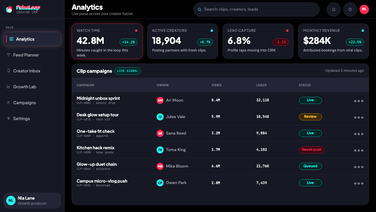
For web interfaces and dashboards, the TikTok palette is most effective in media-heavy contexts where dark mode reduces eye strain and maximizes content luminance. Dashboard implementations work well with a near-black canvas, white or very light type for primary data labels, and neon accents reserved for alerts, active states, and threshold indicators. Avoid distributing neon color across too many UI elements — the power of the accent depends entirely on its scarcity. Pricing pages in this aesthetic can use the dark ground to create a premium, immersive quality, with tier differentiation achieved through accent color rather than card background color.对于网页界面与仪表板,TikTok 色板在深色模式能减少眼疲劳、最大化内容亮度的富媒体语境中最为有效。仪表板实现方案在近黑色画布、白色或极浅色字体用于主要数据标签、霓虹强调色保留给警示、激活状态和阈值指示时效果良好。避免将霓虹色分布于过多界面元素——强调色的力量完全取决于其稀缺性。这种美学的定价页面可以利用深色底面创造高端、沉浸的品质感,层级差异通过强调色而非卡片背景色来实现。
For editorial and marketing work, the style's most transferable elements are the full-bleed compositional logic and the chromatic offset device. An editorial spread in the TikTok aesthetic leads with a full-width, edge-to-edge image or video still on a dark background, with typographic overlays arrayed at the bottom or right edge rather than centered. The chromatic offset can be applied to pull quotes, section headers, or brand marks to inject the characteristic kinetic energy without requiring full interface replication. Marketing pages benefit from alternating full-bleed dark sections with moments of high-contrast white — a visual rhythm that echoes the platform's infinite scroll logic.对于编辑与营销内容,这套风格最具可移植性的元素是全出血构图逻辑与色彩错位装置。TikTok 美学的编辑版面以深色背景上从边到边的全幅图像或视频截帧为主导,字体叠加层排列于底部或右侧边缘而非居中。色彩错位可应用于引用语、章节标题或品牌标识,以注入标志性的动态能量,而无需完整复制界面形态。营销页面受益于全出血深色区块与高对比度白色时刻的交替——一种呼应平台无限滑动逻辑的视觉节奏。
A common mistake when applying TikTok 2024 to non-video contexts is over-relying on the neon accents as the primary design element. In the platform itself, neon works because it appears against a canvas that is almost entirely content — the accents are highlights on a field of video, not elements in a graphic composition. Translated to a static designed artifact, neon-heavy execution reads as garish rather than energetic. The discipline is to use near-black as the primary visual experience, let the content carry the weight, and deploy neon with the same restraint the platform's own interface designers applied: rarely, pointedly, and always in service of a single communicative purpose.将 TikTok 2024 应用于非视频语境时,一个常见错误是过度依赖霓虹强调色作为主要设计元素。在平台本身,霓虹色之所以有效,是因为它出现在一块几乎全部由内容构成的画布上——这些强调色是视频场域上的高光,而非图形构图中的元素。移植到静态设计制品中,霓虹过重的执行效果会显得俗丽而非充满活力。正确的做法是:以近黑色作为主要视觉体验,让内容承载重量,以平台界面设计师所应用的同等克制来部署霓虹色——稀少、有的放矢,且始终服务于单一的传达目的。
TikTok 2024 — FAQTikTok 2024 · 常见问题
Is TikTok 2024 the same as general dark-mode design?TikTok 2024 和一般深色模式设计是一回事吗?
No. General dark-mode design is typically a surface-level inversion of a light-mode interface — light backgrounds become dark, dark text becomes light, and the underlying visual logic remains unchanged. TikTok 2024 was conceived as dark-mode native from the start: the near-black ground is not a preference setting but the foundational design condition, and every other decision — the neon accent economy, the chromatic offset, the full-bleed video treatment — is designed specifically for that dark foundation. Applying the TikTok aesthetic in light mode produces something that looks generically modern but loses the system's essential character.不是。一般的深色模式设计通常是对浅色界面的表面级反转——浅色背景变深色,深色文字变浅色,底层视觉逻辑不变。TikTok 2024 从一开始就以深色模式为原生设计条件:近黑色底面不是偏好设置,而是根本性的设计前提,其他所有决策——霓虹强调色的节制、色彩错位、全出血视频处理——都专门为这一深色基础而设计。在浅色模式下应用 TikTok 美学,产生的效果看起来泛泛地现代,但失去了系统的本质特征。
Can the chromatic offset effect be applied to non-brand elements without looking derivative?色彩错位效果可以应用于非品牌元素,而不显得像在模仿吗?
Yes, with care. The chromatic offset — a cyan layer and a magenta layer nudged out of alignment — is recognizable as TikTok-adjacent, but the underlying technique of color-channel misalignment has a longer history in print, analog photography, and early digital art. Applied to a headline, a graphic motif, or a section divider rather than to a wordmark, it reads as energetic and kinetic rather than as brand impersonation, provided the rest of the visual system does not also mimic TikTok's specific palette and chrome treatment. The mistake is using the offset in isolation on a light background with standard typography — that combination reads as pure appropriation. Used as part of a coherent dark-ground system, it contributes texture and vitality.可以,但需谨慎。色彩错位——将青色图层与洋红色图层错开对齐——与 TikTok 的关联是显而易见的,但色彩通道错位这一底层技术在印刷、模拟摄影和早期数字艺术中有着更久远的历史。将其应用于标题、图形母题或章节分隔符而非字标时,只要其余视觉系统不同时模仿 TikTok 的特定色板和界面外壳处理,读起来会是充满活力与动态感,而非品牌模仿。错误的做法是在浅色背景搭配标准字体的孤立语境中使用错位效果——这种组合读起来像是纯粹的挪用。作为连贯深色底系统的一部分使用时,它提供了质感与生命力。
How does TikTok 2024 differ from vaporwave or cyberpunk aesthetics that use similar colors?TikTok 2024 与同样使用相似色彩的蒸汽波或赛博朋克美学有何不同?
The color overlap is real — all three use neon cyan and magenta on dark grounds — but the design philosophies are very different. Vaporwave is nostalgic, maximalist, and ironic: it layers references, embraces visual excess, and treats neon as one element in a dense collage of retro-digital imagery. Cyberpunk is dystopian and complex: it piles texture, typography, and grid density to evoke a gritty technological overload. TikTok 2024 is none of those things. It is ruthlessly reductive — the neon accents appear in isolation against a nearly empty dark canvas, and the dominant visual experience is the video content itself. The shared palette is coincidental; the design values are opposed.色彩上的重叠是真实存在的——三者都在深色底面上使用霓虹青色与洋红色——但设计哲学截然不同。蒸汽波是怀旧的、极繁主义的、带有反讽意味的:它层叠着各种参照,拥抱视觉过剩,将霓虹色视为密集复古数字影像拼贴中的一个元素。赛博朋克是反乌托邦式的、复杂的:堆叠质感、字体与网格密度,以唤起粗粝的技术过载感。TikTok 2024 不是以上任何一种。它是无情的减法主义——霓虹强调色在几乎空旷的深色画布上孤立出现,主导视觉体验的是视频内容本身。共用的色板是巧合;设计价值观则是对立的。
Does the TikTok visual system work for B2B or professional contexts?TikTok 视觉系统适用于 B2B 或专业场景吗?
With significant adaptation, certain elements can translate to professional contexts — particularly the dark-ground dashboard approach and the restraint of neon accent use. A data-heavy analytics tool or a developer platform can borrow the near-black canvas and white-type hierarchy for genuine functional reasons: reduced eye strain in low-light environments, higher perceived contrast for data labels, and a contemporary premium feel. However, the chromatic offset device and any strong neon treatment are difficult to carry into contexts where institutional authority and sober professionalism are required signals. The core rule is that the more emotionally expressive elements of TikTok 2024 are tools for consumer entertainment contexts; the structural and compositional elements are more broadly applicable.经过适度改造,某些元素可以移植至专业场景——尤其是深色底仪表板处理方式与霓虹强调色的节制运用。数据密集的分析工具或开发者平台可以出于真实功能原因借鉴近黑色画布与白色字体层级:在低光环境中减少眼疲劳、为数据标签提供更高的感知对比度,以及传递当代高端感。然而,色彩错位装置和任何强烈的霓虹处理,在需要机构权威感与严肃专业性的场景中都难以立足。核心原则是:TikTok 2024 中情感表现力更强的元素是消费娱乐场景的工具;结构性与构图性元素则具有更广泛的适用性。
Why has TikTok's visual identity been so widely imitated by other platforms?为什么 TikTok 的视觉身份被众多其他平台广泛模仿?
Because it solved a genuine design problem that no previous platform had fully addressed: how to make a graphical user interface effectively invisible so that user-generated video content could be the sole focus of attention. The full-bleed vertical frame, the edge-arrayed controls, the near-black ground, the subdued chrome — none of these were inevitable choices, but together they constituted a coherent solution to the problem of the interface competing with the content. Instagram Reels, YouTube Shorts, Snapchat Spotlight, and numerous regional video platforms all adopted similar visual logics within years of TikTok's global expansion, because the solution worked regardless of the specific brand executing it. Imitation in this case is not flattery — it is evidence that the design system identified something structurally true about how human attention responds to full-bleed vertical video.因为它解决了一个此前任何平台都未能完全应对的真实设计问题:如何让图形用户界面有效隐形,使用户生成的视频内容成为注意力的唯一焦点。全出血竖屏框架、沿边排列的控件、近黑色底面、被抑制的界面外壳——这些都不是必然的选择,但组合在一起构成了一个连贯的解决方案,解决了界面与内容争夺注意力的问题。Instagram Reels、YouTube Shorts、Snapchat Spotlight 以及众多地区性视频平台,都在 TikTok 全球扩张后数年内采用了相似的视觉逻辑,因为这个解决方案无论由哪个具体品牌执行都奏效。在这种情形下,模仿不是奉承——它是这套设计系统识别出了关于人类注意力如何响应全出血竖屏视频的某种结构性真相的证据。
Related design styles相关设计风格
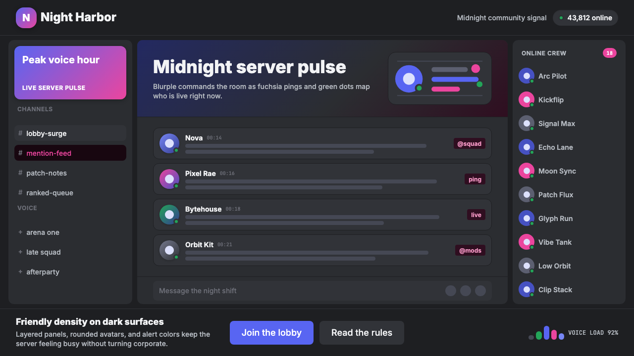 Discord Blurple Server (2020)Midnight server energy. Blurple panels, fuchsia pings, and green status dots…午夜服务器能量:蓝紫面板、品红提醒、在线绿点保持密集。
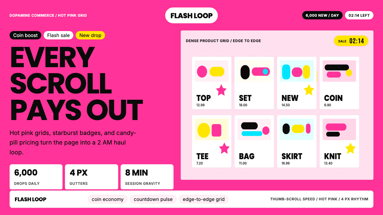 Shein Fast FashionDopamine density wins. Hot pink grids, starbursts, and candy pills pack every…高密度多巴胺取胜。热粉网格、星爆和糖果药丸挤满每个像素。
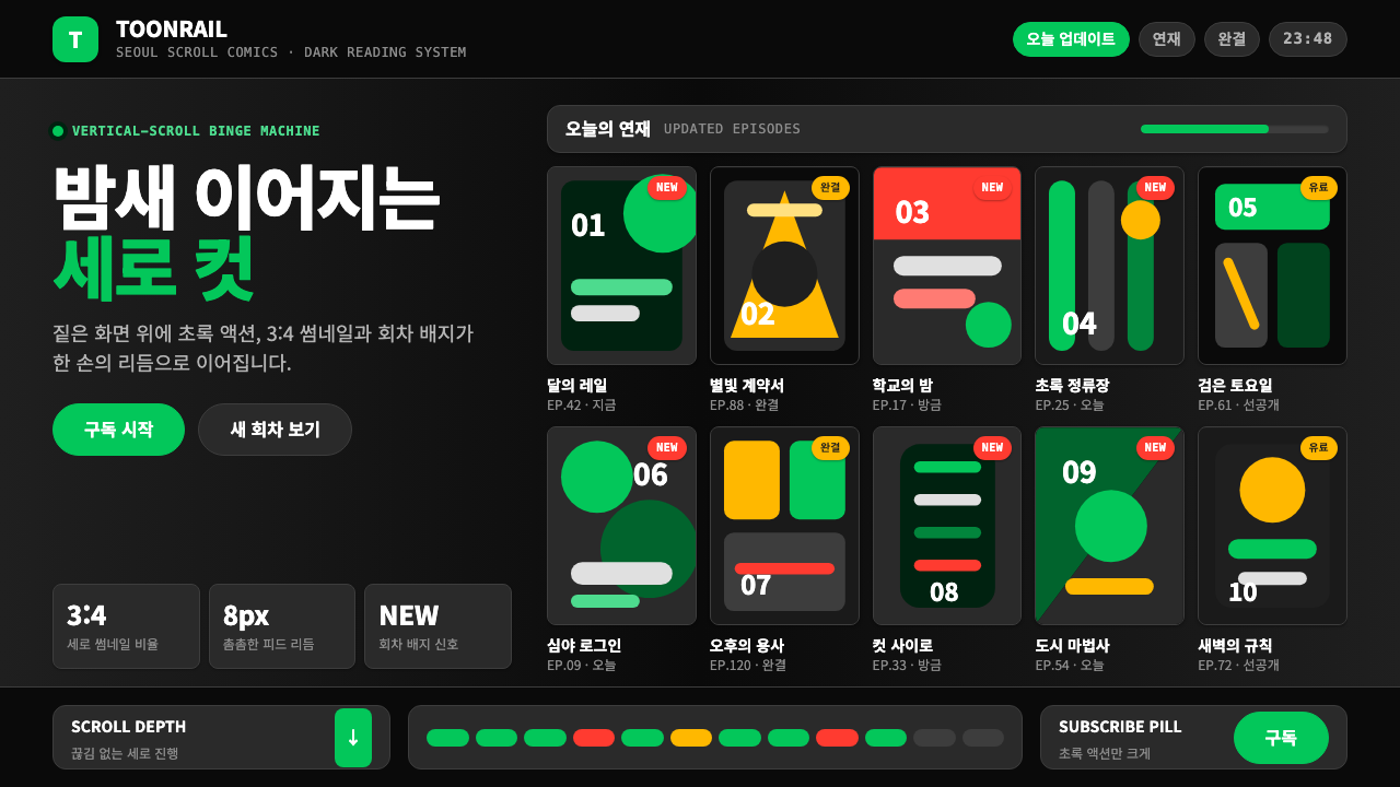 Naver Webtoon (2024)Built for late-night scroll. Charcoal grids, Noto Sans KR, and green episode…为深夜滚动而生:炭灰网格、思源黑体与绿色话数信号。
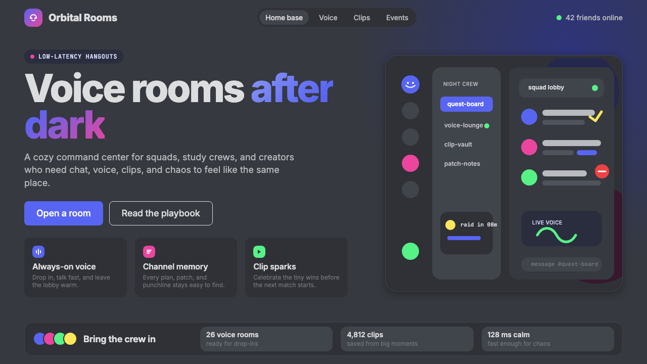 Discord 2024Blurple cozy. Charcoal grounds, illustrated characters — every surface says '…刻意去企业化的语音聊天:blurple 蓝紫、深炭灰底、俏皮插画角色——每个界…
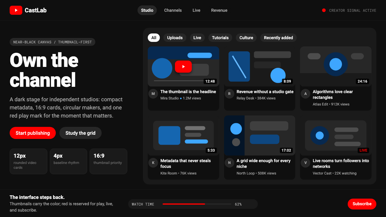 YouTube Creator EconomyThe UI disappears. Near-black Roboto grids let thumbnails shout; red only mea…界面退后:近黑Roboto网格让缩略图发声,红色只为播放。
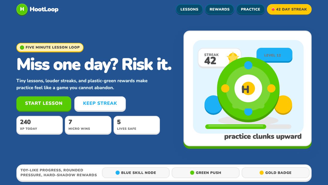 Duolingo 2024Adorable pressure wins. Feather Green, Nunito heft, rounded push-shadows gami…可爱压力取胜:羽毛绿、Nunito粗字与圆角硬阴影,把愧疚游戏化。