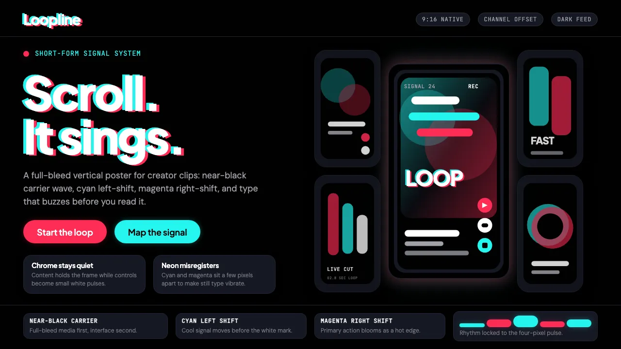
About TikTok 2024
TikTok is the vertical-video attention machine — a neon-cyan and neon-magenta glitch on near-black that became the visual language of Gen Z's internet. The signature "vibration" effect misaligns two color channels by a few pixels, making the wordmark appear to buzz with kinetic energy.
Born from ByteDance's 2016 Douyin and fused with Musical.ly in 2018, the current 2020–2024 identity is dark-mode native. Chrome is minimal, content is full-bleed, and the UI is subordinate to the 9:16 video frame. The message: scroll, don't think, just feel.
- Origin
- Beijing, China (ByteDance) / global
- Era
- 2016 Douyin launch; 2018 TikTok global merger; current visual 2020–2024
- Key figures
- Zhang Yiming · Shou Zi Chew · ByteDance Design Team
- Movements
- Short-form vertical video · Algorithmic content discovery · Creator economy · Gen Z digital culture
TikTok 2024 design spec
Colors
Typography
The other 11 sections — buttons, cards, spacing, motion, techniques and more — open once you unlock. Download the DESIGN.md or send it to your AI in one click. Unlock once, yours forever.
Sign up nowStyles similar to TikTok 2024
Also inspired by brands & products, with a close feel.
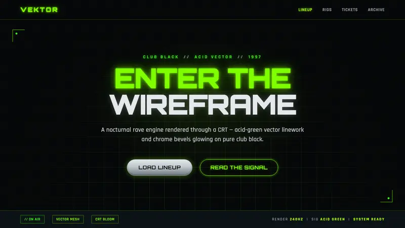 Playstation Rave Green 1997Enter the wireframe. Acid-green vector lines and chrome glow on club black, a rave through a CRT.
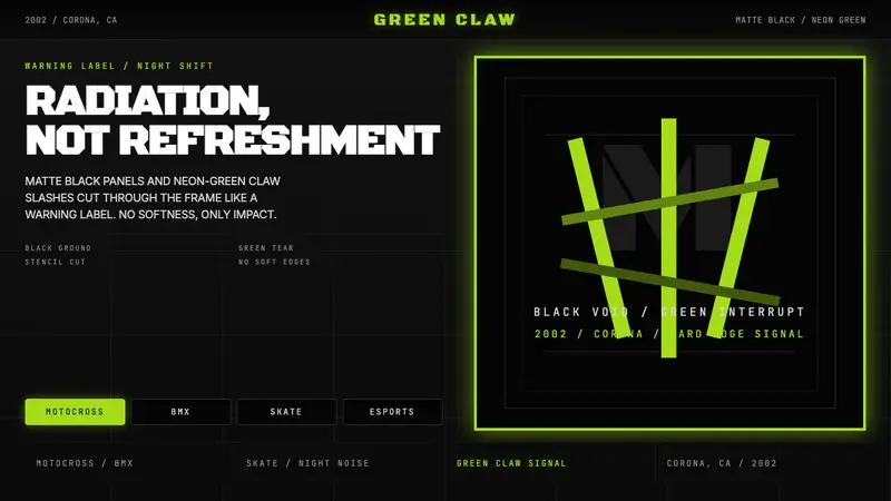 Monster Energy Claw (2002)Aggression, not refreshment. Matte black and neon-green claw slashes cut the frame.
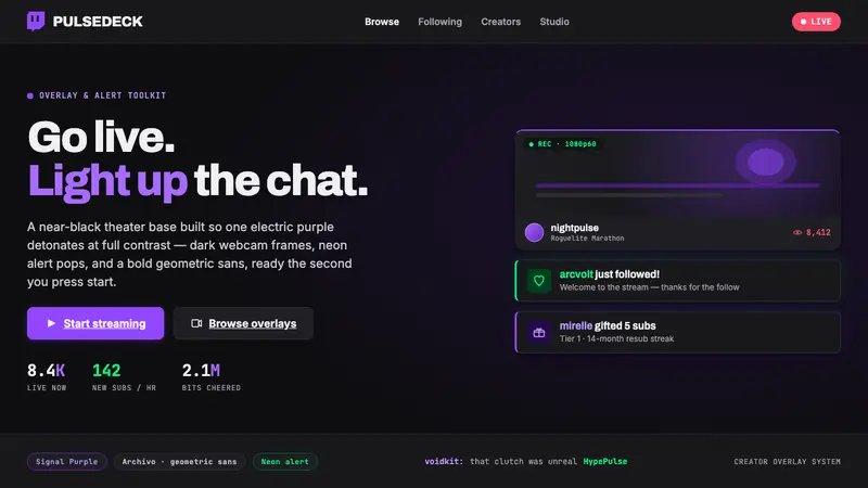 Twitch Streamer OverlayNear-black theater base, one electric purple. Dark webcam frames, neon alert pops, geometric sans.
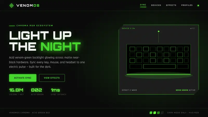 Razer Chroma GreenEsports gear at night. Acid Pantone-802 green burns on matte black via RGB glow halos, dark-only.