About Monster Energy Claw (2002)
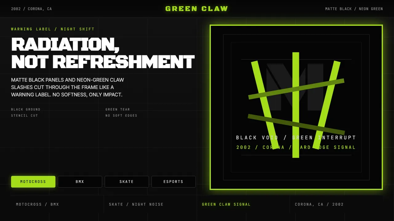
Monster Energy's visual identity is one of the most aggressively consistent brand systems of the 21st century: matte black ground, three neon-green claw scratches forming an angular "M," gothic-stencil type, zero soft edges. Launched in 2002 by Hansen Natural in Corona, California, the can became a subcultural badge across motocross, BMX, skate, NASCAR, and esports.
The design language says radiation, not refreshment. Everything is black; the green is a violent interruption — a claw tearing through the surface. Typography is compressed, uppercase, stencil-cut. There is no friendliness here, only impact.
- Origin
- Corona, California
- Era
- 2002 launch by Hansen Natural; Monster Beverage Corp rebrand 2012; visual identity consistent through 2024
- Key figures
- Rodney Sacks · Hilton Schlosberg · Hansen Natural in-house design team
- Movements
- extreme-sports sponsorship branding · energy-drink saturation marketing · 2000s aggressive-masculine subculture identity
Monster Energy Claw (2002) design spec
Colors
Typography
The other 11 sections — buttons, cards, spacing, motion, techniques and more — open once you unlock. Download the DESIGN.md or send it to your AI in one click. Unlock once, yours forever.
Sign up nowStyles similar to Monster Energy Claw (2002)
Also inspired by brands & products, with a close feel.
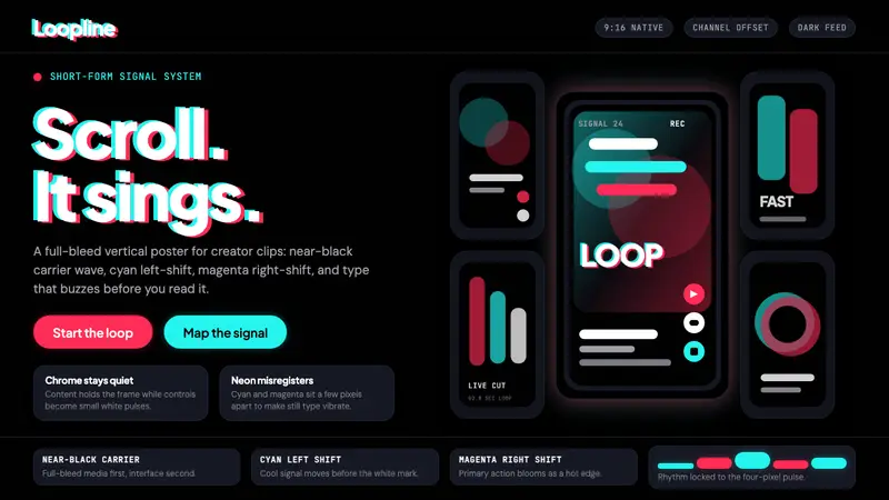 TikTok 2024Attention vibrates. Near-black feed, cyan-magenta offsets, and vertical frames buzz.
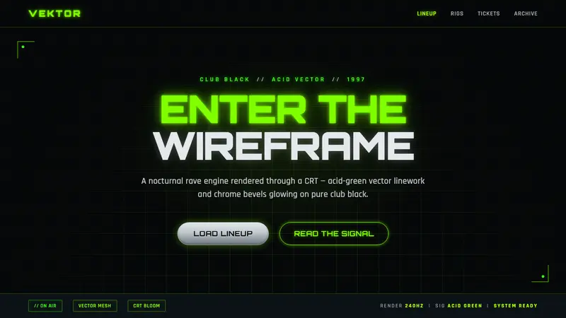 Playstation Rave Green 1997Enter the wireframe. Acid-green vector lines and chrome glow on club black, a rave through a CRT.
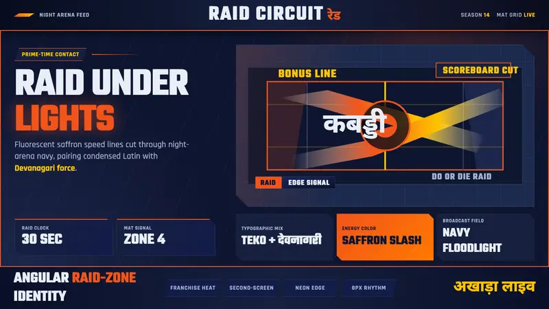 Pro Kabaddi LeagueBroadcast electricity. Saffron slashes, navy court grids, and Devanagari type collide.
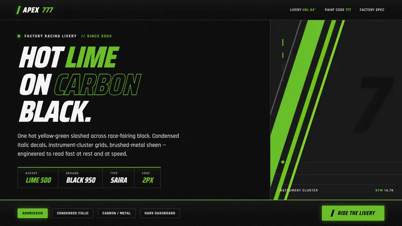 Kawasaki Racing Lime GreenFactory-livery aggression. Hot Kawasaki lime slashed across carbon black in condensed italic decals.