What is Monster Energy Claw (2002)?什么是 Monster Energy Claw (2002)?
Three neon-green claw slashes tear through matte black — Monster Energy's 2002 visual identity turned a can of liquid into the universal badge of extreme-sport subculture.三道霓虹绿爪痕划破哑黑底面——Monster Energy 2002年的视觉系统将一罐饮料变成了极限运动亚文化的通用徽章。
Monster Energy Claw (2002) in briefMonster Energy Claw (2002) 速览
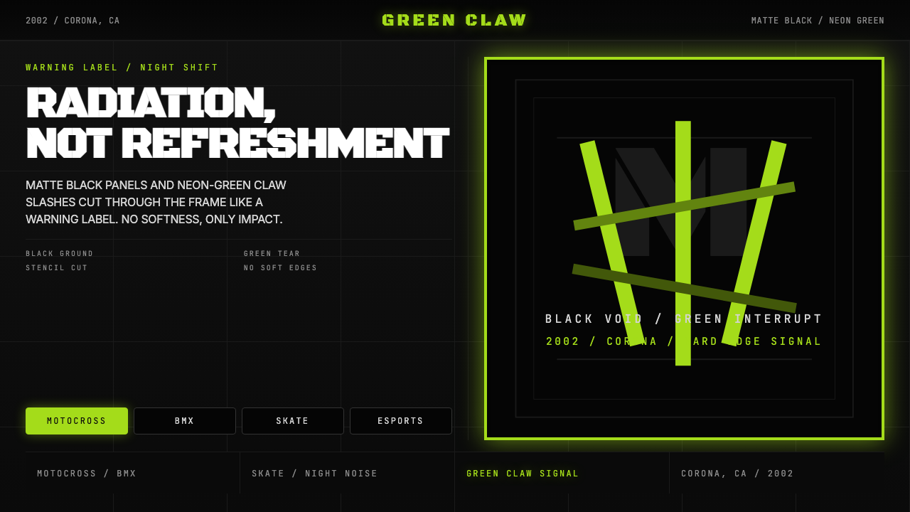
Monster Energy Claw is a brand visual identity system launched in 2002, built on a strict opposition between two visual extremes: an absolute matte black ground and a violent neon-green mark. The mark itself — three diagonal slashes forming a rough, angular "M" — reads simultaneously as a claw wound and as a letterform, blurring the boundary between symbol and logotype in a way few consumer-goods identities have achieved.Monster Energy Claw 是2002年推出的品牌视觉系统,建立在两种视觉极端的严格对立之上:绝对的哑光黑色底面与暴力的霓虹绿标志。这个标志本身——三道斜向爪痕组成粗粝、棱角分明的「M」字形——既像爪痕伤口,又像字母形态,以一种罕见的方式模糊了符号与字体标识的边界。
The design language is built entirely on aggression. There are no soft curves, no warm tones, no gradual transitions. Typography is compressed, fully uppercase, and cut in the manner of a military stencil. Every decision in the system communicates the same message: power, danger, speed. The green is not chosen for its associations with nature or freshness — in this context it functions as a radioactive warning signal, the color of something that should not be touched but cannot be ignored.这套设计语言完全以攻击性为基础构建。没有柔和曲线,没有暖色调,没有渐进过渡。字体压缩、全大写,以军事模板的方式切割。系统中的每一个决定都传达同一个信息:力量、危险、速度。绿色的选择并非源于对自然或清爽的联想——在这个语境中,它发挥的是放射性警告信号的功能,是某种不应被触碰却无法被忽视的东西的颜色。
What makes the system unusually durable is its rigidity. Over more than two decades, the core mark — black ground, three green scratches — has remained essentially unchanged while being applied across aluminum cans, motorsport liveries, esports backdrops, apparel, and digital surfaces. It is a rare example of a consumer brand identity that achieved total subcultural saturation without ever softening its original visual proposition.这套系统异常持久的原因在于它的刚性。超过二十年间,核心标志——黑底加三道绿色划痕——基本保持不变,同时被应用于铝罐、赛车涂装、电竞背景、服装和数字界面。这是一个罕见的案例:一个消费品牌视觉系统在从未柔化其原始视觉主张的情况下,实现了对整个亚文化圈的全面饱和渗透。
See the Monster Energy Claw (2002) design system查看 Monster Energy Claw (2002) 完整设计系统
Where does Monster Energy Claw (2002) come from?Monster Energy Claw (2002) 从何而来?
Monster Energy was created in 2002 by Hansen Natural Corporation, a beverage company based in Corona, California that had previously focused on natural sodas and juice drinks. Co-founders Rodney Sacks and Hilton Schlosberg recognized an opportunity to compete with Red Bull, which had entered the American market in 1997 and was rapidly expanding. Rather than fight Red Bull on its own terms — the slender silver can, the European premium positioning, the calm blue-and-silver palette — they made the opposite choice in every dimension. Where Red Bull was refined, Monster would be raw.Monster Energy 由汉森天然公司(Hansen Natural Corporation)于2002年创立。这家总部位于加利福尼亚州科罗纳的饮料公司此前专注于天然汽水和果汁饮品。联合创始人罗德尼·萨克斯(Rodney Sacks)与希尔顿·施洛斯伯格(Hilton Schlosberg)察觉到了竞争红牛的机会——红牛于1997年进入美国市场,正在迅速扩张。他们没有在红牛的主场上与之正面对抗——那细长的银罐、欧式高端定位、冷静的蓝银色板——而是在每个维度上做出了相反的选择。红牛精致,Monster 就要粗粝。
The visual identity was developed by Hansen Natural's in-house design team with a brief that was essentially a list of subcultures to target: motocross, BMX, skateboarding, NASCAR, and the emerging world of competitive gaming. These communities shared an aesthetic language that corporate brand design had largely ignored — the visual vocabulary of tattooing, metal album art, and extreme-sport gear graphics, all characterized by high contrast, aggressive letterforms, and marks that looked hand-torn rather than computer-drawn. The three-claw mark directly references this tradition. It reads as something that has physically damaged its surface.视觉系统由汉森天然公司内部设计团队开发,任务简报本质上是一份目标亚文化圈清单:极限摩托、BMX、滑板、NASCAR 以及正在兴起的竞技电竞世界。这些社群共享一套企业品牌设计长期忽视的美学语言——纹身、金属专辑封面与极限运动装备图形的视觉词汇,共同特征是高对比度、攻击性字形,以及看起来手工撕裂而非电脑绘制的标记。三爪标志直接引用了这一传统,让人感觉它已经物理损伤了所在的表面。
The choice of black as the dominant ground was deliberate and counterintuitive for a beverage category that had, at the time, been dominated by clear, white, and metallic packaging. Black said premium in certain contexts — luxury goods, audio equipment — but in this case it was chosen not for luxury connotations but for danger ones. Black is the color of asphalt, of night racing, of conditions where visibility is low and the stakes are high. Against that ground, the neon green functions as a warning or a wound rather than a brand color.选择黑色作为主导底面是有意为之,对于一个当时以透明、白色和金属质感包装为主流的饮料品类而言,这是一个反直觉的决定。黑色在某些语境中代表高端——奢侈品、音响设备——但在此处,它的选择并非为了奢华联想,而是为了危险联想。黑色是沥青的颜色、夜间赛车的颜色、能见度低而风险极高的情境的颜色。在这样的底面上,霓虹绿充当的是警告或伤口,而非品牌色彩。
The can itself became the primary communication medium. Unlike brands that treat packaging as one element among many in a broader identity system, Monster Energy concentrated virtually all visual investment in a single surface. The can was designed to be readable across a crowded refrigerator shelf, on a racetrack pit wall, on a streaming thumbnail. Its two-color high-contrast system meant it could be reproduced as a sticker, a decal, a tattoo, or an embroidered patch without losing legibility. This medium-agnostic legibility was not a deliberate design philosophy so much as a consequence of extreme restraint — the fewer the elements, the more durable the mark.铝罐本身成为主要传播媒介。与把包装视为更广泛视觉系统中诸多元素之一的品牌不同,Monster Energy 将几乎所有视觉投入集中于单一表面。罐体被设计为在拥挤的冷柜货架上、赛道维修区墙壁上、直播缩略图中都能被清晰识别。其双色高对比系统意味着它可以以贴纸、车贴、纹身或刺绣徽章的形式复制,而不失去易读性。这种媒介无关的易读性与其说是刻意的设计哲学,不如说是极度克制的结果——元素越少,标志越持久。
What defines the Monster Energy Claw (2002) look?Monster Energy Claw (2002) 的视觉特征是什么?
Color Opposition色彩对立
The entire palette is built on a single opposition: a matte, light-absorbing black ground against a single acid-green accent that reads as electric, almost bioluminescent. There are no mid-tones, no tertiary colors, no gradual transitions between the two. The black is not merely dark — it is chosen specifically for its deadness, its absence of reflectivity. The green is not merely bright — it is chosen for its clinical, high-voltage quality, closer to the glow of a cathode-ray tube or a radiation warning than to any natural reference. This two-color discipline is the system's greatest structural strength: it cannot be misread, reproduced incorrectly, or diluted by context.整套色板建立在单一对立之上:哑光、吸光的黑色底面,对抗单一的酸性绿色强调色——那种绿色电气十足,近乎生物发光。没有中间色调,没有第三色,两者之间没有任何渐进过渡。黑色不只是深——它的选择专为其死寂感、其零反射率而来。绿色不只是亮——它的选择为其临床、高压的质感,更接近阴极射线管的辉光或辐射警告,而非任何自然参照。这种双色纪律是系统最大的结构性优势:它无法被误读、无法被错误复制、也无法被语境稀释。
The Claw Mark爪痕标志
The three diagonal slashes that form the central mark are neither perfectly geometric nor freely hand-drawn — they occupy a deliberate middle ground that suggests both speed and violence. Each slash is slightly irregular, tapering at one end, suggesting motion and physical force. Read together, they form a compressed letterform legible as an "M," but the mark functions even when the letterform reading is not consciously made. It operates on two levels simultaneously: brand identifier and damage record. The mark implies that the surface has been attacked, which is an unusual and effective proposition for something sold in convenience stores.构成核心标志的三道斜向划痕既不是完美的几何形,也不是自由手绘——它们占据着一个刻意设定的中间地带,同时暗示速度与暴力。每道划痕都略有不规则,一端收尖,暗示运动与物理力量。合并阅读时,它们形成一个可被解读为「M」的压缩字母形,但即便观者没有有意识地识别出字母,这个标志依然有效。它在两个层面同时运作:品牌识别符与伤害记录。这个标志暗示表面曾遭受攻击——对于一个在便利店出售的商品而言,这是一种不寻常且有效的主张。
Typography字体排印
The wordmark and supporting type are set in heavily compressed, fully uppercase letterforms with the texture of a stencil or a stamp — as if the letters have been cut from a rigid template and applied with force rather than typeset with care. Character spacing is tight, almost no air between letters. This compression creates visual weight and density that reads as urgency. There is no secondary typeface, no script accent, no humanist softening. The type system is entirely about pressure — it looks like something that has been forced onto a surface.文字标识与辅助字体以高度压缩、全大写的字形排列,带有模板或印章的质感——仿佛字母是从坚硬的模板上裁切后用力压上去的,而非精心排印而成。字距极紧,字母之间几乎没有呼吸空间。这种压缩制造了视觉重量与密度,传递出紧迫感。没有次要字体,没有手写体点缀,没有人文主义的柔化处理。整套字体系统完全关乎压力——它看起来像是被迫印压在表面上的东西。
Zero Softness零柔化
Every edge in the system is hard. There are no rounded corners on the can geometry, no feathered edges on the claw marks, no ambient glow around the green against the black. Shadows, where they appear in branded contexts, are sharp and directional rather than diffuse. This absolute commitment to hard edges is what gives the identity its confrontational quality. Soft edges communicate friendliness, approachability, safety. Hard edges communicate none of those things — they communicate impact, cut, and the kind of energy that does not ask permission.系统中的每一条边都是硬边。罐体几何没有圆角,爪痕没有羽化边缘,绿色与黑色之间没有环境光晕。在品牌语境中出现的阴影(若有)是锐利且有方向的,而非漫射。这种对硬边的绝对坚守赋予了这个视觉系统其对抗性品质。柔和边缘传递友好、易于接近、安全。硬边不传达这些——它传达冲击、切割,以及一种不请求许可的能量。
Subcultural Legibility亚文化可读性
The visual system speaks a language already fluent within its target communities before it was applied to a drink can. The high-contrast mark, the stencil typography, the black-ground presentation, and the claw-wound imagery all have prior references in tattoo flash art, underground music graphics, and action-sport equipment design. This means the identity did not need to explain itself — it arrived already legible as belonging to a specific value system: raw, uncompromising, anti-establishment in affect if not in fact. This native legibility within subculture, combined with total visual consistency, is what enabled subcultural adoption at a scale rarely achieved by corporate brand design.这套视觉系统在被应用于饮料罐之前,就已经使用了其目标社群内部流通的语言。高对比标志、模板字体、黑底呈现与爪伤图像,都在纹身闪图、地下音乐图形和动作运动装备设计中有其前身参照。这意味着这个视觉系统无需自我解释——它一出现就已经被识读为属于特定价值体系:粗粝、不妥协、在姿态上(即便不在事实上)反建制。这种在亚文化内部的原生可读性,结合完全的视觉一致性,造就了企业品牌设计中罕见的亚文化规模化采纳。
Medium Independence媒介无关性
Because the system uses only two colors and relies entirely on hard-edged marks, it reproduces accurately across an exceptional range of surfaces and processes: embossed aluminum, printed vinyl, screen-printed fabric, embroidered patches, digital displays, broadcast overlays, and large-format outdoor printing. The mark loses nothing when scaled from a thumbnail to a racecar hood. This medium independence was not engineered for scalability in the contemporary sense — it emerged as a byproduct of extreme formal restraint — but it has proven one of the system's most commercially valuable properties.由于系统只使用两种颜色,完全依赖硬边标志,它能在异常广泛的表面和工艺上准确复制:压花铝材、印刷乙烯基、丝印织物、刺绣徽章、数字显示屏、广播叠加图形和大幅户外印刷。从缩略图缩放到赛车引擎盖,标志毫无损失。这种媒介无关性并非为了当代意义上的可扩展性而刻意设计——它是极度形式克制的副产品——但事实证明,它是这套系统最具商业价值的特性之一。
Consistency as Identity一致性即身份
For over two decades, the core visual proposition has not changed. While most consumer brands regularly update their visual identity to track cultural trends, Monster Energy has treated its 2002 mark as definitional rather than as a starting point. The consistency itself has become part of the brand's meaning: the mark communicates that it does not change, does not soften, does not negotiate. In a media environment saturated with visual refresh cycles, unchanging marks accrue a kind of institutional gravity. The Monster claw does not look dated — it looks permanent.超过二十年间,核心视觉主张始终未变。当大多数消费品牌定期更新视觉系统以追随文化潮流时,Monster Energy 将其2002年的标志视为定义性的,而非起点。这种一致性本身已成为品牌意义的一部分:标志传达了它不会改变、不会软化、不会妥协。在视觉更新周期饱和的媒体环境中,一成不变的标志积累起一种机构性的引力。Monster 爪痕不显得过时——它显得永久。
See the Monster Energy Claw (2002) design system查看 Monster Energy Claw (2002) 完整设计系统
Who shaped Monster Energy Claw (2002)?谁塑造了 Monster Energy Claw (2002)?
As co-founder and CEO of Hansen Natural (later Monster Beverage Corporation), Sacks made the strategic decision that Monster would not compete with Red Bull on shared ground. The choice to build the brand around extreme-sport sponsorship rather than lifestyle aspiration advertising shaped every downstream visual decision. Sacks maintained the visual system's rigidity through more than two decades of brand extension, licensing, and media evolution — a commitment to non-dilution that is unusual in consumer packaged goods at Monster's scale.作为汉森天然公司(后更名为 Monster Beverage Corporation)的联合创始人与首席执行官,萨克斯做出了Monster不在共同战场上与红牛竞争的战略决定。围绕极限运动赞助而非生活方式憧憬广告构建品牌的选择,塑造了所有后续的视觉决策。萨克斯在超过二十年的品牌延伸、授权与媒介演变中维持了视觉系统的刚性——这种对不稀释的承诺在 Monster 体量级别的消费包装品中实属罕见。
Schlosberg, co-founder and President, was central to the commercial negotiations that made Monster's sponsorship model viable at scale — the partnerships with motorsport teams, BMX athletes, skateboarders, and esports organizations that deployed the visual identity across a vast array of surfaces and media. The breadth of these sponsorships stress-tested the visual system constantly and confirmed that its medium independence was a genuine operational advantage rather than an aesthetic accident.联合创始人兼总裁施洛斯伯格是使 Monster 赞助模式得以大规模运作的商业谈判核心——与赛车队、BMX运动员、滑板手和电竞组织的合作伙伴关系,将这套视觉系统部署于大量表面与媒介之上。这些赞助的广度持续对视觉系统进行压力测试,并证实其媒介无关性是真正的运营优势,而非美学上的偶然。
The uncredited design team that originated the Monster Energy visual identity in 2002 made decisions whose longevity they could not have anticipated. Their choice to reference subcultural visual languages — specifically the tattooing, heavy-metal, and extreme-sport graphic traditions — rather than conventional beverage design conventions produced a mark with genuine insider credibility. The restraint of the two-color system, which may have been as much a production constraint as an aesthetic choice, proved to be the identity's greatest structural advantage.2002年创作 Monster Energy 视觉系统的匿名内部设计团队做出了若干无法预见其持久性的决定。他们选择参照亚文化视觉语言——具体是纹身、重金属和极限运动图形传统——而非惯常的饮料设计规范,由此产生了一个具有真正圈内认可度的标志。双色系统的克制(这或许与其说是美学选择,不如说是生产约束)被证明是视觉系统最大的结构性优势。
Though many athletes carried the Monster mark, Pastrana — motocross and rally driver, action-sports polymath — represents the archetype of talent the brand built its visual identity to serve. His presence across motocross, rally, and Nitro Circus events put the black-and-green mark in front of the exact audiences the identity was designed to speak to, and his crossover appeal demonstrated that the visual system could migrate from niche subculture to mainstream visibility without losing its core credibility.尽管许多运动员都携带着 Monster 标志,越野摩托与拉力赛车手、动作运动全能运动员特拉维斯·帕斯特拉纳代表了这个品牌构建视觉系统所服务的运动员原型。他在越野摩托、拉力赛事和 Nitro Circus 活动中的出现,将黑绿标志带到了视觉系统设计用于对话的准确受众面前,而他跨界的吸引力证明这套视觉系统能够从小众亚文化迁移到主流能见度,而不失去其核心可信度。
Monster Energy's expansion into esports sponsorship beginning in the early 2010s represented the most significant test of the visual identity's transferability. Broadcast overlays, team jerseys, stage backdrops, and digital thumbnails required the mark to function at resolutions and in contexts its 2002 designers could not have anticipated. The fact that the two-color system performed correctly across all of these contexts — and that gaming communities received it with the same subcultural affinity as action-sport communities — confirmed that the visual language had genuine cross-subculture resonance, not merely extreme-sport specificity.Monster Energy 从2010年代初开始进入电竞赞助领域,这是对视觉系统可移植性的最重要考验。广播叠加图形、队服、舞台背景和数字缩略图要求这个标志在其2002年设计者无法预见的分辨率和语境中正常运作。双色系统在所有这些语境中表现正确——游戏社群以与动作运动社群同样的亚文化亲和力接纳了它——这证实了这套视觉语言具有真正的跨亚文化共鸣,而非仅限于极限运动的特殊性。
How do you use Monster Energy Claw (2002) today?今天怎么用 Monster Energy Claw (2002)?
Monster Energy Claw is one of the more demanding historical styles to apply in presentation or digital work because its power comes from discipline and commitment — half-measures produce neither the brand's aggression nor a legible alternative aesthetic. Applying this style correctly requires a genuine willingness to work in near-total darkness: black or very deep charcoal backgrounds, a single neon or acid accent color, and no softening elements whatsoever. If this feels too extreme for the context, the style is probably not the right choice.Monster Energy Claw 是在演示或数字设计中应用难度较高的历史风格之一,因为它的力量来自纪律与承诺——半途而废既无法产生品牌的攻击性,也无法形成清晰的替代美学。正确应用这种风格需要真正愿意在近乎全黑的环境中工作:黑色或极深的炭黑底面,单一霓虹或酸性强调色,以及绝对没有任何柔化元素。如果这对于具体语境而言过于极端,这种风格很可能不是正确的选择。
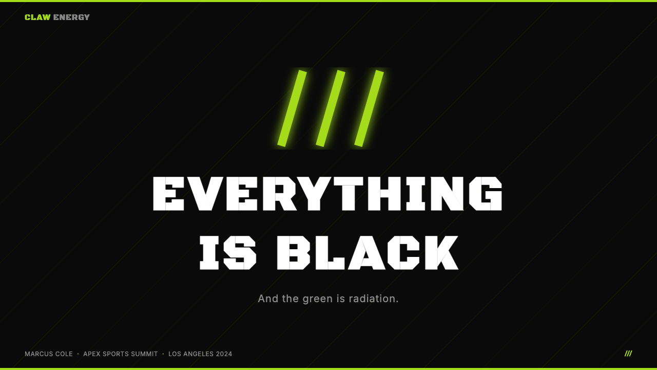
For presentation slides, the Monster Claw approach works best for covers and section dividers where visual impact is the primary goal, rather than for information-dense content slides where legibility and data hierarchy compete with aesthetic intensity. A cover built in this style uses the full black ground, places the most important text in a compressed bold typeface at large scale, and uses the accent color only for a mark, a line, or a single emphasized word — never as a background fill for a content area. Data slides are possible in this system but require care: charts and graphs should be rendered as clean geometric shapes in the accent color against the dark ground, with white or near-white used for labels and values. Decorative complexity of any kind destroys the system's impact.对于演示文稿,Monster Claw 方式最适合封面和章节分隔页——视觉冲击是主要目标的场景——而非信息密集的内容页(在那里,易读性与数据层级会与美学强度竞争)。以这种风格构建的封面使用完整的黑色底面,将最重要的文字以大尺寸压缩粗体字放置,只在标志、线条或单个强调词上使用强调色——绝不将其用于内容区域的背景填充。数据幻灯片在这套系统中是可行的,但需要谨慎处理:图表应在深色底面上以强调色渲染为干净的几何形,白色或近白色用于标签和数值。任何形式的装饰复杂性都会摧毁系统的冲击力。
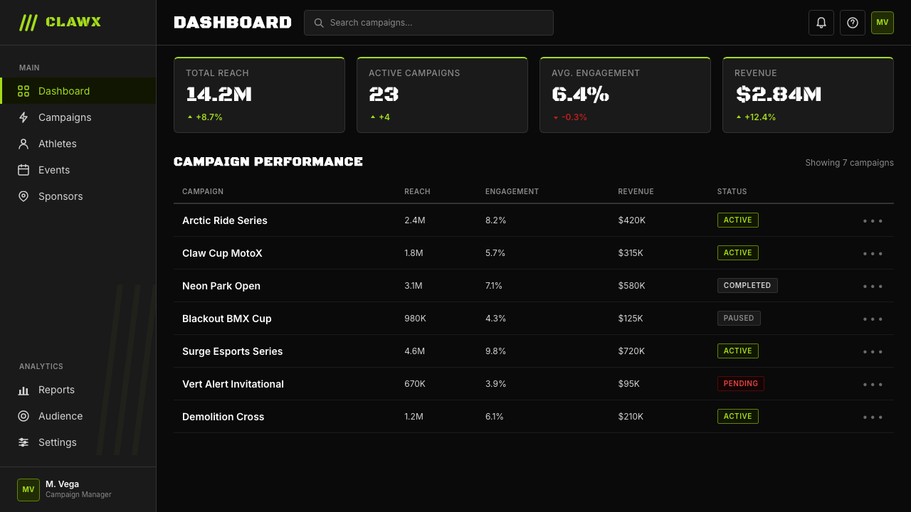
For web interfaces, this aesthetic is well-matched to dark-mode dashboards, gaming platforms, esports product pages, and any digital product where performance, intensity, and technical credibility are the primary brand values. The pattern: a near-black background, a single accent color used exclusively for interactive states and primary actions, and monochrome white or light gray for all secondary text and structural elements. Card components should have hard borders or hard-shadow offsets — no soft glow, no blur, no glass-morphism effects. Navigation and UI chrome should be typographic, using compressed uppercase labels. The system breaks down immediately if gradients, multiple accent colors, or decorative imagery are introduced.对于网页界面,这种美学与深色模式仪表板、游戏平台、电竞产品页面,以及任何以性能、强度和技术可信度为主要品牌价值的数字产品高度匹配。模式如下:近黑色背景,单一强调色专门用于交互状态和主要操作,单色白色或浅灰色用于所有次要文字和结构性元素。卡片组件应有硬边框或硬边偏移阴影——没有柔和光晕,没有模糊,没有玻璃拟态效果。导航和界面框架应是字体式的,使用压缩的全大写标签。一旦引入渐变、多个强调色或装饰性图像,系统立即崩溃。
For editorial and marketing applications, this style produces work with strong poster-like impact in contexts where the audience skews toward gaming, action sports, or youth entertainment. Full-bleed layouts with black grounds, accent-color headline type, and white body text create immediate high contrast. Section breaks should be marked with a horizontal rule or a geometric accent mark rather than whitespace alone. Where photography is used, it should be treated to increase contrast and reduce mid-tones — the goal is to integrate human subjects into the visual system's intensity rather than creating a naturalistic window that contradicts the graphic language.对于编辑和营销应用,在受众偏向游戏、动作运动或青年娱乐的语境中,这种风格产生具有强烈海报感的作品。黑色底面的满版布局、强调色标题字体和白色正文创造出立即的高对比度。段落分隔应以水平线或几何强调标记而非单纯留白来标示。在使用摄影时,应对其进行处理以增加对比度、减少中间调——目标是将人物主体整合到视觉系统的强度中,而非创造与图形语言相矛盾的自然主义窗口。
A common mistake when applying this style is using the accent green (or whichever neon is chosen) at large area. In the Monster system, the accent color is a wound, not a ground — it appears on the mark, on a word, on a border. As soon as the neon becomes a background for a content block or a large decorative element, it loses its violence and becomes merely a color. A second common error is introducing warm mid-tones or gray backgrounds to make the system more readable: this instantly dissolves the confrontational quality that gives the style its character. If content complexity requires more visual breathing room, the correct solution is to increase whitespace or divide content across more screens, not to soften the color system.应用这种风格时一个常见错误是将强调绿色(或所选的任何霓虹色)大面积使用。在 Monster 系统中,强调色是一道伤口,而非底面——它出现在标志上、一个词上、一条边框上。一旦霓虹色成为内容区块的背景或大型装饰元素,它就失去了暴力感,变成了仅仅一种颜色。另一个常见错误是引入暖色中间调或灰色背景以提高可读性:这会立即消解赋予这种风格其特质的对抗性品质。如果内容复杂度需要更多视觉呼吸空间,正确的解决方案是增加留白或将内容分散到更多屏幕中,而非柔化色彩系统。
See the Monster Energy Claw (2002) design system查看 Monster Energy Claw (2002) 完整设计系统
Monster Energy Claw (2002) — FAQMonster Energy Claw (2002) · 常见问题
Is this style only for gaming and extreme sports, or can it be applied more broadly?这种风格只适合游戏和极限运动,还是可以更广泛地应用?
The style is genuinely specialized. Its visual language encodes specific cultural values — aggression, raw physicality, anti-establishment affect — that are well-aligned with gaming, action sports, motorsport, security software, and certain categories of performance tools. Applied outside these contexts, it tends to create a tone mismatch that is difficult to resolve: a financial services dashboard styled this way reads as reckless rather than powerful, a wellness app reads as threatening rather than energizing. The style can be used for contrast or provocation in editorial contexts, but as a primary UI language for consumer-facing products it has a narrow band of appropriate applications.这种风格确实是专门化的。它的视觉语言编码了特定的文化价值观——攻击性、原始的肉体感、反建制姿态——与游戏、动作运动、赛车运动、安全软件以及某些性能工具类别高度契合。应用于这些语境之外,它往往会造成难以解决的基调不匹配:以这种风格设计的金融服务仪表板会被读作鲁莽而非强大,健康应用会被读作威胁性而非充满活力。这种风格可以在编辑语境中用于制造对比或挑衅,但作为面向消费者产品的主要界面语言,它的适用场合是一个狭窄的频段。
The palette is so restrictive — how do you handle a slide deck that needs multiple data series or information types?这套色板限制如此之多——如何处理需要多个数据系列或信息类型的幻灯片演示?
This is the central tension in applying a two-color system to data-rich contexts. The solution is a tonal hierarchy rather than a color expansion: use the full-saturation accent color for the most important data series or call-out, reduce saturation significantly for secondary series (moving the accent toward a more muted, darker version of itself), and use white or light gray for tertiary labels and reference lines. The background's darkness gives you a natural depth dimension — brighter elements read as foreground, darker elements as background. Introducing additional hues to resolve data complexity is technically possible but breaks the identity logic entirely. If the data genuinely requires more than three tonal levels, consider whether this visual system is appropriate for the content.这是将双色系统应用于数据丰富语境时的核心张力。解决方案是色调层级而非颜色扩展:对最重要的数据系列或强调内容使用全饱和度强调色,对次要系列显著降低饱和度(将强调色向更柔和、更深的自身版本移动),对第三级标签和参考线使用白色或浅灰色。背景的深色赋予了你一个自然的深度维度——更亮的元素被读作前景,更暗的元素被读作背景。引入额外色调来解决数据复杂性在技术上是可行的,但会完全打破视觉系统的逻辑。如果数据确实需要超过三个色调层级,请考虑这套视觉系统是否适合该内容。
How is Monster Energy Claw different from a generic "dark mode" or "cyberpunk" aesthetic?Monster Energy Claw 与通用的「深色模式」或「赛博朋克」美学有何不同?
The most important difference is restraint. Generic dark-mode design tends to use multiple accent colors, complex gradients, and glowing effects to generate visual richness. Cyberpunk aesthetics typically add chromatic aberration, scanlines, noise textures, and layered neon hues. Monster Energy Claw uses none of these: it is two colors, hard edges, compressed type, and nothing else. The result is more brutal and less decorative than either reference. When designers apply Monster-style thinking and then add purple glow effects, lens flares, or gradient neon, they are blending the Monster system with cyberpunk conventions and losing the disciplinary clarity that makes the original effective.最重要的区别是克制。通用深色模式设计倾向于使用多种强调色、复杂渐变和发光效果来产生视觉丰富性。赛博朋克美学通常添加色差效果、扫描线、噪点纹理和多层霓虹色调。Monster Energy Claw 以上皆无:两种颜色、硬边、压缩字体,此外什么都没有。结果比上述两个参照都更为粗粝,装饰性更少。当设计师应用 Monster 式思路然后添加紫色光晕效果、镜头光晕或渐变霓虹时,他们是在将 Monster 系统与赛博朋克规范混合,并失去了使原作有效的纪律清晰度。
Can this style work in print, and are there print-specific considerations?这种风格能用于印刷吗?有哪些印刷特有的注意事项?
The style is extremely well-suited to print because it was born in print — the can is a printed surface. High-contrast black grounds with a single fluorescent or neon accent color are a standard technique in screen printing and commercial offset printing. The accent green in the original is formulated as a fluorescent ink in many applications, which cannot be reproduced accurately in standard four-color process printing — a digital equivalent typically needs to be chosen for web contexts. For large-format printing such as event banners and signage, the high-contrast system performs at scale without degradation. The compressed type requires careful attention to minimum size — at very small scales, the tight character spacing and compressed letterforms can begin to close up.这种风格非常适合印刷,因为它诞生于印刷——罐体就是一个印刷表面。深黑底面配单一荧光或霓虹强调色是丝网印刷和商业胶印中的标准技术。原版中的强调绿色在许多应用中被配制为荧光油墨,无法在标准四色印刷中准确复制——数字场景通常需要选择数字等效色。对于活动横幅和标识等大幅面印刷,高对比系统在放大规模时不会降质。压缩字体需要仔细注意最小尺寸——在非常小的比例下,紧密的字间距和压缩字形可能开始闭合。
Is it possible to use this style without making everything feel threatening or aggressive?是否可以使用这种风格而不让一切感觉具有威胁性或攻击性?
Only partially. The style's aggression is not incidental — it is structural. The choices that generate visual impact (black ground, no softening, compressed type, fluorescent accent) are the same choices that generate the threatening quality. You can reduce the aggression at the margins by increasing white or light content on the page, choosing a slightly warmer or more saturated green that reads as less radioactive, or giving the type slightly more tracking. But each of these adjustments moves you away from the source system. The more you soften, the more generic the result becomes, and at some point it stops being a version of Monster Energy Claw and becomes a dark-themed design that borrows some of its surface qualities. If a gentler version of this energy is what the project needs, it is worth asking whether a different style — one whose structural values are closer to the project's requirements — would produce better results.只能部分做到。这种风格的攻击性并非偶然——它是结构性的。产生视觉冲击的选择(黑色底面、无柔化、压缩字体、荧光强调色)与产生威胁感的选择是相同的。你可以在边缘减少攻击性:在页面上增加白色或浅色内容,选择稍暖或饱和度稍高、读起来不那么放射性的绿色,或给字体稍多一点字间距。但每一项调整都使你远离源系统。你越柔化,结果就越通用,在某个节点上它就不再是 Monster Energy Claw 的变体,而变成了一个借用了部分表面品质的深色主题设计。如果项目需要的是这种能量的更温和版本,值得质问:是否有另一种风格——其结构价值观更接近项目需求——会产生更好的结果。
Related design styles相关设计风格
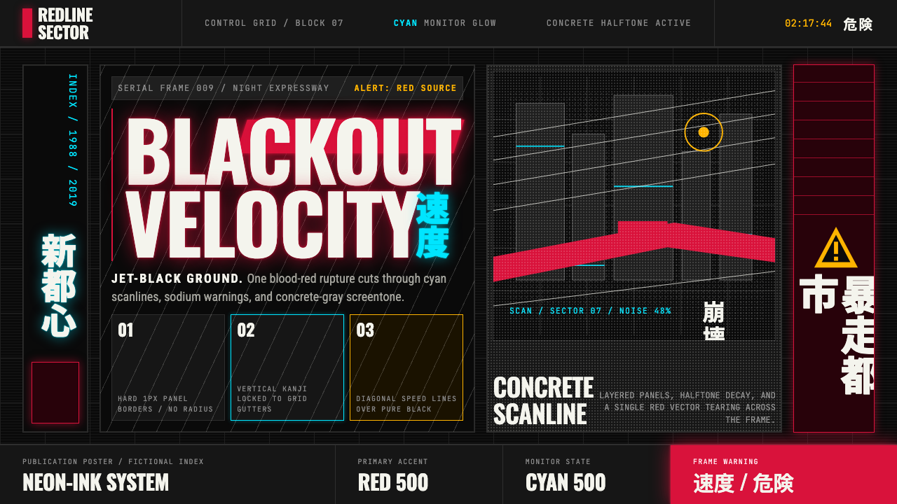 Akira (Otomo)Cyberpunk at impact. Kaneda red, cyan kanji, halftone concrete, and diagonal…冲击式赛博朋克:金田红、青色汉字、混凝土网点与斜向速度线。
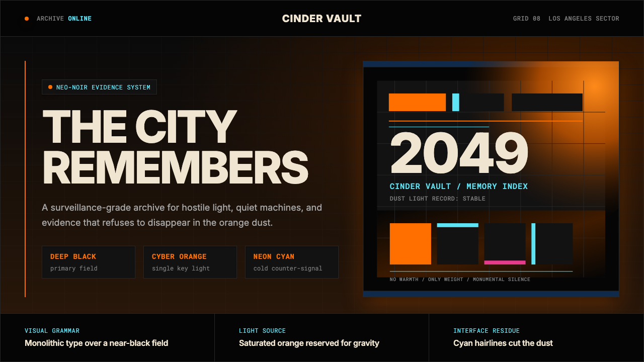 Blade Runner 2049Noir with tectonic weight. Orange dust, cyan hairlines, and monumental Inter…黑色电影有构造重量:橙色尘光、青色发丝线与黑底巨型 Inter。
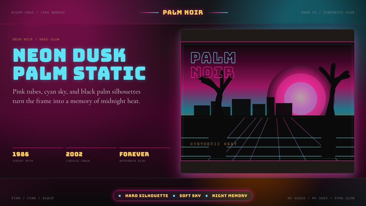 GTA Vice City (2002)Neon-noir nostalgia. Pink-cyan dusk, chunky type, and palm silhouettes.霓虹黑色怀旧。粉青黄昏、粗体字和棕榈剪影。
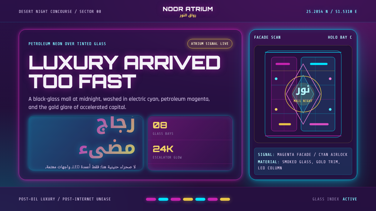 Gulf FuturismLuxury feels accelerated. Magenta-cyan neon cuts glass grids over purple-blac…奢华被加速:品红与电青霓虹切过紫黑玻璃网格。
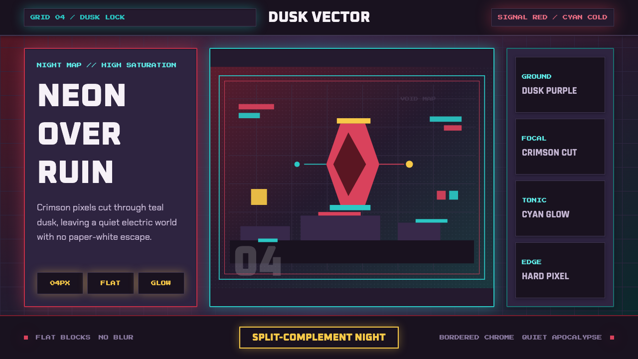 Hyper Light DrifterBeautiful ruin glows. Dusk purple holds crimson pixels and cyan grid light.废土很美:暮紫承托猩红像素与青色网格光。
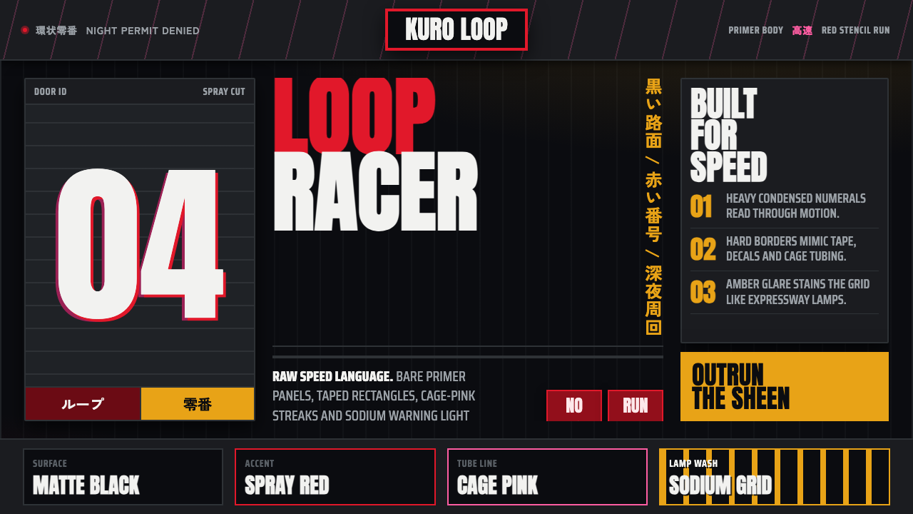 Kanjōzoku Loop RacerSpeed as contraband. Hot red numbers slice black tarmac with amber grid glare.速度像违禁品。黑色沥青上,火红数字与琥珀网格切开夜色。