What is Blade Runner 2049?什么是 Blade Runner 2049?
Blade Runner 2049 turned a dying world into a design language — monumental black fields, glowing orange dust, and hairline-thin cyan signals that feel like civilization's last transmissions.《银翼杀手2049》把一个垂死的世界变成了一套设计语言——巨大的黑色平野、燃烧的橙色尘光,以及如文明最后信号般细若发丝的青色线条。
Blade Runner 2049 in briefBlade Runner 2049 速览
Blade Runner 2049 (2017) is a neo-noir science-fiction film directed by Denis Villeneuve and shot by cinematographer Roger Deakins. Its visual language — deep black grounds, vast saturated orange dust atmospheres, hairline-thin cyan interface lights, and sporadic bursts of hot pink neon — has become one of the most influential design aesthetics of the 2010s, finding its way into product interfaces, presentation decks, editorial design, and brand identity far beyond the film industry.《银翼杀手2049》(2017)是由丹尼斯·维伦纽瓦执导、罗杰·迪金斯掌镜的新黑色科幻电影。它的视觉语言——深邃的黑色底调、大面积饱和橙色尘雾气氛、细若发丝的青色界面光,以及偶发的热粉霓虹爆发——已成为2010年代最具影响力的设计美学之一,深入产品界面、演示文稿、编辑设计与品牌视觉识别等电影行业之外的广泛领域。
The aesthetic is built around extreme tonal contrast and chromatic restraint. Most of any frame is darkness or warm dust; moments of cyan or magenta arrive as precise, isolated signals against that darkness. Scale is monumental: brutalist concrete towers dwarf human figures; typographic elements in UI designs following this style are similarly oversized, treating letterforms as architectural masses rather than readable marks.这套美学建立在极端的明暗对比与克制的色彩运用之上。每一个画面中大多数区域都是黑暗或温暖的尘埃;青色或品红色在那片黑暗中如精确的、孤立的信号般到来。尺度是纪念碑式的:野兽派混凝土塔楼使人的身躯相形见绌;遵循这种风格的界面设计中,字体元素同样是超大号的,将字形视为建筑体量而非可读标记。
What distinguishes Blade Runner 2049 from generic cyberpunk or dark-UI trends is its emotional temperature. The palette is not aggressive or chaotic — it is exhausted, melancholy, and enormously composed. Every glowing element feels rare, earned, and fragile against the surrounding dark. Designers who apply this aesthetic are not chasing excitement; they are building weight.《银翼杀手2049》与一般赛博朋克或深色界面趋势的区别在于它的情感温度。这套色板并不咄咄逼人或混乱无序——它是疲惫的、忧郁的,却又极度沉稳内敛。每一个发光元素在周围黑暗的映衬下都显得珍稀、艰难得来,又脆弱不堪。使用这套美学的设计师们追求的不是刺激感,而是在建造一种重量。
See the Blade Runner 2049 design system查看 Blade Runner 2049 完整设计系统
Where does Blade Runner 2049 come from?Blade Runner 2049 从何而来?
The visual world of Blade Runner 2049 is inseparable from the 1982 original directed by Ridley Scott. Scott's film — based on Philip K. Dick's 1968 novel Do Androids Dream of Electric Sheep? — established the visual grammar of neo-noir science fiction: perpetual acid rain, vertical neon signage, smoke-filled interiors, and a color palette that blended Los Angeles smog with Shanghai night markets. That film introduced the idea that a future city could look simultaneously high-tech and decayed, simultaneously overwhelming and intimate.《银翼杀手2049》的视觉世界与雷德利·斯科特1982年的原作密不可分。斯科特的电影——改编自菲利普·K·迪克1968年的小说《仿生人会梦见电子羊吗?》——确立了新黑色科幻电影的视觉语法:永无止境的酸雨、竖向霓虹招牌、烟雾弥漫的室内空间,以及融合了洛杉矶雾霾与上海夜市的色彩色板。那部电影引入了这样一种概念:未来城市可以同时显得高科技而腐朽,同时令人窒息又充满亲密感。
When Denis Villeneuve took on the sequel three and a half decades later, he and production designer Dennis Gassner made a decisive formal choice: to move the dominant color temperature from the cold blues and greens of the original into deep ochre and orange — the warmth of dust, of vast arid territories, of a world whose biosphere has collapsed. Where Scott's Los Angeles was perpetually wet, Villeneuve's is perpetually dry. This shift was not merely atmospheric; it transformed the aesthetic from frenetic and claustrophobic to monumental and desolate.当丹尼斯·维伦纽瓦三十五年后接手续集时,他与制片设计师丹尼斯·加斯纳做出了一个决定性的形式选择:将主导色温从原作的冷蓝与冷绿移向深赭石色与橙色——尘埃的温度、辽阔干旱地带的温度、一个生物圈已然崩溃的世界的温度。斯科特的洛杉矶永远潮湿,维伦纽瓦的则永远干燥。这一转变不仅仅是氛围上的;它将美学从狂乱而幽闭恐惧式的转变为纪念碑式而荒芜的。
Cinematographer Roger Deakins — who won his long-overdue Academy Award for his work on this film — brought a discipline rooted in classical painting and landscape photography. He studied the way strong directional light from a single source carves form out of darkness, and he applied this understanding to enormous architectural sets and exterior wastelands alike. The result is that every frame of Blade Runner 2049 has the compositional rigor of a Hopper painting or a Caspar David Friedrich landscape: lone figures dwarfed by inhuman scale, light arriving from precisely one direction, and a profound sense of stillness.摄影师罗杰·迪金斯——凭借本片获得了他期待已久的奥斯卡奖——带来了一种植根于古典绘画与风景摄影的纪律。他研究强烈的单一方向光线如何从黑暗中雕凿出形态,并将这种理解应用于巨大的建筑场景与室外荒地。结果是,《银翼杀手2049》的每一帧都具有霍珀画作或卡斯帕·大卫·弗里德里希风景的构图严谨性:孤独的人物被非人的尺度所淹没,光线从精确的单一方向而来,以及一种深沉的静止感。
The film's influence on design practice emerged gradually through the late 2010s, as dark-mode interfaces became standard, as digital products began competing on emotional depth rather than feature lists, and as a generation of designers who had grown up with the original Blade Runner found themselves in positions of visual authority. The 2049 palette — specifically the combination of near-black grounds, saturated warm amber or orange accents, and cold hairline cyan — became a recognizable shorthand for a particular kind of ambitious, cinematic digital product: one that wanted to feel inevitable rather than cheerful.这部电影对设计实践的影响在2010年代后期逐渐显现——随着深色模式界面成为标准,随着数字产品开始在情感深度而非功能列表上展开竞争,随着伴随原版《银翼杀手》成长的一代设计师走到视觉决策的位置。2049的色板——尤其是近乎纯黑的底面、饱和的暖琥珀色或橙色强调,以及冷色调发丝线青色的组合——成为特定类型雄心勃勃的电影化数字产品的可识别符号语言:那种希望给人感觉是必然而非愉快的产品。
What defines the Blade Runner 2049 look?Blade Runner 2049 的视觉特征是什么?
Ground and Atmosphere底色与氛围
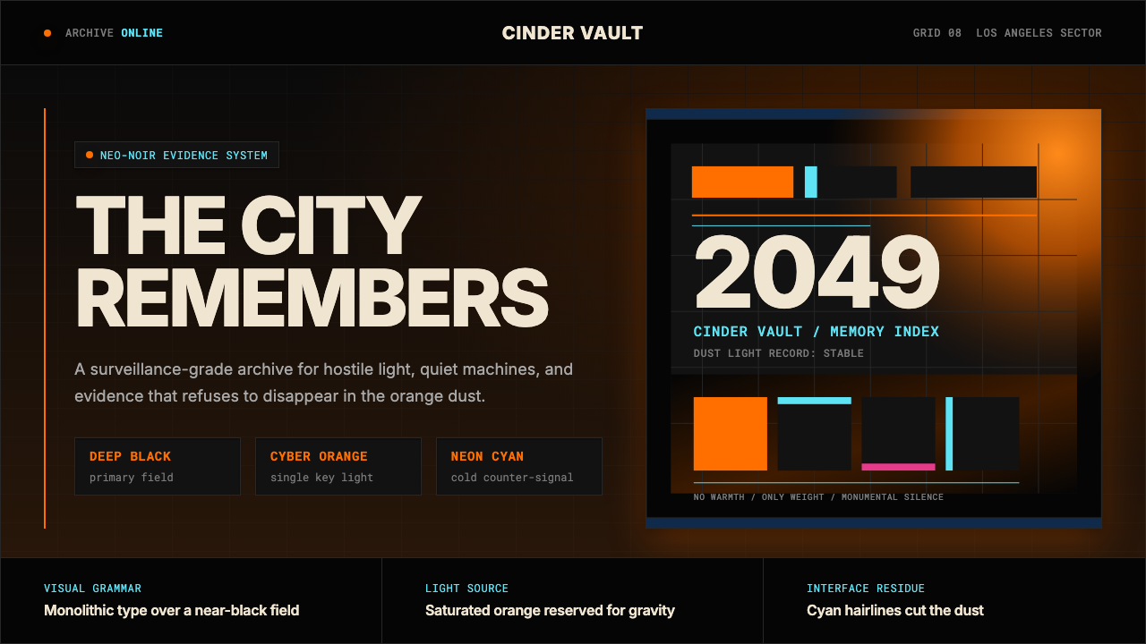
The dominant visual field is near-total darkness — not the grey-tinged dark of a generic dark theme, but a black so dense it feels physical. Into this darkness, atmosphere is introduced as a secondary ground: a warm amber or orange haze that sits between the viewer and distant objects, giving every composition a sense of vast depth. The relationship between the dark foreground and the atmospheric middle distance is the engine of the aesthetic's emotional power.主导视觉场域是近乎完全的黑暗——不是一般深色主题那种带灰调的暗,而是一种浓重到有质感的黑。黑暗之中,氛围被引入作为次级底色:一层温暖的琥珀色或橙色雾霭悬浮在观者与远景物体之间,赋予每个构图以辽阔纵深感。暗色前景与大气感中景之间的关系,是这套美学情感力量的驱动引擎。
Saturated Orange and Amber Accent饱和橙色与琥珀色强调
Orange and deep amber function as the primary warm accent: they appear as dust atmospheres filling entire mid-ground zones, as glowing call-to-action buttons in interface applications, as horizontal bands separating sections. The saturation is high — this orange never fades to a neutral brown — but it is never combined with other warm saturated hues. It stands alone against darkness, which is precisely what makes it legible and striking.橙色与深琥珀色作为主要暖色强调发挥作用:它们以尘雾气氛的形式填满整个中景区域,作为界面应用中发光的行动号召按钮出现,作为分隔区块的水平色带使用。饱和度很高——这种橙色从不褪变为中性棕色——但它绝不与其他饱和暖色调搭配。它独自矗立在黑暗面前,这正是它清晰可辨又引人注目的原因所在。
Hairline Cyan and Cold Precision发丝青色与冷色精准
Against the warm atmospheric ground, cold cyan appears as the color of precision and technology: interface readouts, structural diagram lines, edge-lit architectural forms. These elements are characteristically fine and exact — hairlines rather than thick rules — suggesting technical systems running below the surface warmth. The coolness of cyan creates a temperature dialogue with the orange that is fundamental to the aesthetic's sense of tension and complexity.在温暖的大气感底色衬托下,冷色调青色作为精准与技术的颜色出现:界面读数、结构图示线条、边缘发光的建筑形态。这些元素特征性地纤细而精确——是发丝线条而非粗重规则线——暗示着在表面温度之下运行的技术系统。青色的冷感与橙色之间形成的温度对话,是这套美学紧张感与复杂性的根本来源。
Monumental Typography纪念碑式字体排印
Type in this aesthetic is treated as architecture. Headlines are set in oversized, optically extreme sans-serif forms — ultralight weights that feel almost skeletal, or ultrabold weights that feel like slabs of concrete — with generous spacing between characters that emphasizes each letterform's individual mass. Body text is sparse and exact, often placed with deliberate asymmetry relative to the dominant headline mass. There is no decorative typography; letterforms are either structural anchors or information, never ornamentation.这套美学中的文字排印被当作建筑来对待。标题以超大号、视觉上极端的无衬线字形设置——极细字重给人近乎骨骼的感觉,或超粗字重给人混凝土板块的感觉——字符间以宽阔间距排列,强调每个字形各自的体量感。正文文字稀疏而精确,往往相对于主导标题体量呈刻意的非对称布局。没有装饰性字体排印;字形要么是结构锚点,要么是信息,绝不是装饰。
Brutalist Scale and Emptiness野兽派尺度与空旷感
The sense of scale in Blade Runner 2049 is relentlessly inhuman. Architectural elements and landscape forms are enormous relative to any human reference point. In design applications, this translates to abundant empty space used not as minimalist breathing room but as an expression of vast distance — empty zones that feel like wastelands rather than careful whitespace. The composition is never crowded; it is spacious in the way that ruins are spacious.《银翼杀手2049》中的尺度感是持续不断的非人化。建筑元素与景观形态相对于任何人体参照点都是巨大的。在设计应用中,这转化为大量空白空间——不是极简主义式的呼吸空间,而是对辽阔距离的表达——那些空白区域感觉像废墟而非精心设计的留白。构图从不拥挤;它是宽广的,如同废墟的宽广。
Hot Pink and Neon as Rare Signal热粉与霓虹作为稀有信号
Moments of hot pink or saturated magenta function as the aesthetic's most unexpected element: a flash of advertising holography, a single neon sign, an edge-lit surface in an interior. These colors appear infrequently and in small quantities, which makes them visually electric when they arrive. In interface terms, hot pink or magenta is reserved for the highest-priority alert or the most unexpected interactive element — a disruption, not a system.热粉或饱和品红的时刻作为这套美学中最出人意料的元素发挥作用:一闪全息广告影像、单独的霓虹招牌、室内边缘发光的表面。这些颜色出现频率极低且量少,这使它们出现时在视觉上极具电流感。在界面语言中,热粉或品红被保留用于最高优先级警示或最出人意料的交互元素——是一次中断,而非一个系统。
Surface Without Decoration无装饰的表面
Surfaces in this aesthetic are either pure black or carry the texture of the environment — concrete grain, atmospheric haze, weathered material — but they are never decorated. There are no ornamental borders, no pattern fills, no gradient washes applied for visual interest. The only visual events are the color accents and typographic elements described above. Restraint is total: if an element is not structural or informational, it does not exist.这套美学中的表面要么是纯黑色,要么携带环境质感——混凝土颗粒、大气雾霭、风化材质——但绝不带装饰性处理。没有装饰性边框,没有图案填充,没有为视觉趣味而施加的渐变洗刷。唯一的视觉事件是上述色彩强调与字体元素。克制是彻底的:若一个元素不具结构性或信息性,它便不存在。
See the Blade Runner 2049 design system查看 Blade Runner 2049 完整设计系统
Who shaped Blade Runner 2049?谁塑造了 Blade Runner 2049?
Villeneuve, the Quebec-born director known for Arrival, Dune, and Incendies, brought a meditative, almost geological patience to Blade Runner 2049. Where other science-fiction directors accelerate to urgency, Villeneuve slows down — his frames hold longer than conventional cinema, allowing the weight of architectural space and atmospheric color to accumulate. His directorial instinct to treat silence and duration as formal materials is what gives the aesthetic its quality of stillness, and what makes it so transferable to static design applications where time is replaced by considered space.来自魁北克的导演维伦纽瓦——以《降临》《沙丘》与《烈火焚身》著称——将一种沉思的、近乎地质学式的耐心带入《银翼杀手2049》。当其他科幻导演加速至紧迫感时,维伦纽瓦则减速——他的镜头停留得比传统电影更长,让建筑空间与大气色彩的重量得以积累。他将沉默与时长视为形式材料的导演本能,赋予了这套美学静止的品质,也使它在时间被精心空间所替代的静态设计应用中如此具有可移植性。
Deakins is one of the most technically rigorous cinematographers working in studio filmmaking. His approach to Blade Runner 2049 was to solve every lighting problem with a single, large, motivated light source — meaning the light in each scene appears to come from somewhere logical within the world of the film. This discipline produces the aesthetic's characteristic quality: every element in a frame is either in direct, saturated light or in almost total shadow, with very little middle ground. The high-contrast tonal structure that defines the visual style in design applications is a direct inheritance from Deakins' lighting philosophy.迪金斯是好莱坞制片电影领域技术最为严谨的摄影师之一。他处理《银翼杀手2049》的方法是用单一、大型、有动机的光源解决每一个布光问题——意味着每个场景中的光线看起来都来自电影世界内部某个合乎逻辑的地方。这种自律产生了这套美学的特征性品质:画面中每个元素要么在直接的饱和光线下,要么在几乎完全的阴影中,中间地带极少。在设计应用中定义视觉风格的高对比度色调结构,是对迪金斯布光哲学的直接继承。
Production designer Dennis Gassner built the world of 2049 as a series of distinct environmental zones, each with its own atmospheric color signature: the amber dust of the Los Angeles wasteland, the monochrome grey of the protein farms, the cold white of the Las Vegas ruins, the blue-green of the offshore sea headquarters. This zoning system — where color signals location and emotional register simultaneously — is directly applicable to design systems thinking, where color zones in a product communicate context and state rather than mere decoration.制片设计师丹尼斯·加斯纳将2049的世界构建为一系列不同的环境区域,每个区域都有其独特的大气色彩标志:洛杉矶荒地的琥珀色尘雾、蛋白质农场的单色灰调、拉斯维加斯废墟的冷白,以及海上总部基地的蓝绿色。这一区域划分系统——色彩同时传递位置与情感基调——直接可应用于设计系统思维,在产品中,色彩区域传递的是语境与状态,而非单纯的装饰。
Composer Hans Zimmer and frequent collaborator Benjamin Wallfisch produced a score for Blade Runner 2049 that treated silence as compositional material. Long stretches of ambient drone, metallic resonance, and sub-bass vibration are interrupted by moments of sharp melodic precision — a structural pattern that directly mirrors the visual aesthetic's relationship between vast emptiness and precise signal. Zimmer's approach demonstrates that the 2049 aesthetic is fundamentally a system of contrast management, and that understanding this carries over into how silence and whitespace are used in design work.作曲家汉斯·季默与长期合作者本杰明·瓦菲什为《银翼杀手2049》创作了将沉默视为构成材料的配乐。漫长的环境无人机音效、金属共鸣与次低音振动,被尖锐的旋律精准时刻所中断——这一结构模式直接镜像了视觉美学中辽阔空旷与精准信号之间的关系。季默的方法证明,2049美学从根本上是一套对比管理系统,理解这一点延伸到了设计工作中对沉默与空白的运用方式。
Though Syd Mead passed away in 2019 before completing significant work on 2049, his visual conceptualization work on the original 1982 Blade Runner established the foundational vocabulary that Villeneuve's film both inherited and reacted against. Mead's future was dense, layered, and industrial; Villeneuve's response was to hollow it out, replacing density with desolation. Understanding Mead's original vision is essential for understanding what Blade Runner 2049 is doing when it empties a space that the original would have filled.尽管赛德·米德于2019年去世,未能完成2049的大量工作,但他在1982年原版《银翼杀手》上的视觉概念设计工作奠定了维伦纽瓦电影所继承并反应的基础词汇。米德的未来是稠密的、多层的、工业化的;维伦纽瓦的回应是将其掏空,以荒芜取代密度。理解米德的原始愿景,对于理解《银翼杀手2049》在腾空原版会填满的空间时所做的事情,是不可或缺的。
How do you use Blade Runner 2049 today?今天怎么用 Blade Runner 2049?
Blade Runner 2049's aesthetic is one of the most transferable cinematic design languages available to contemporary practitioners, precisely because its core logic — extreme tonal contrast, atmospheric warm ground, cold precise signal, monumental scale — translates from screen to surface with minimal translation loss. The rules are few, but they must be applied with genuine commitment. Half-measures produce mediocrity rather than tension.《银翼杀手2049》的美学是当代设计师可用的最具可移植性的电影设计语言之一,正因为其核心逻辑——极端明暗对比、大气感暖色底、冷色精准信号、纪念碑式尺度——从银幕转移到平面时几乎没有损耗。规则很少,但必须以真正的承诺来执行。半心半意的应用产生平庸,而非张力。
For presentation slides, this aesthetic excels at cover pages and section transitions. A cover slide works best as a near-full-black composition with a single atmospheric warm element — an abstract dust band, a horizontally-placed wide image with strong amber color grading — and an oversized, optically-extreme headline in cold white or hairline weight. Section transition slides can use a pure color-field approach: deep amber on black, functioning like a scene cut in cinema. Content slides should restrain themselves to the color system's logic: dark ground, white for body text, orange or amber used only for a single call-out or highlighted data point per slide. Stacked warm colors or multi-color data charts in this system immediately read as system violations.对于演示文稿,这套美学在封面页与章节过渡页上表现出色。封面幻灯片最适合做成近乎全黑的构图,配以单一的大气感暖色元素——一条抽象尘带、一张具有强烈琥珀色调的横向宽图——以及在冷白或发丝字重下超大号、视觉上极端的标题。章节过渡页可以使用纯色块方式:深琥珀色压黑底,如同电影中的场景切换。内容页应将自身约束于色彩系统逻辑中:深色底面,正文用白色,橙色或琥珀色每张幻灯片仅用于单一的引用或高亮数据点。在这套系统中,叠加暖色或多色数据图表,立刻读作系统违规。
For web interfaces and dashboards, this palette is exceptionally powerful for tools that need to communicate authority, technical depth, and calm expertise — financial analytics platforms, developer dashboards, systems monitoring tools, and luxury or prestige digital products. The approach: commit to a near-black base throughout, use the warm amber-orange tone for primary interactive elements and key metrics, use hairline-weight dividers and labels in cold cyan or grey-white, and reserve hot pink or magenta as a single high-alert signal color used nowhere else. Pricing pages in this system work well when tier differentiation is signaled through luminance and warmth rather than color switching.对于网页界面与仪表板,这套色板对于需要传达权威感、技术深度与冷静专业能力的工具——金融分析平台、开发者仪表板、系统监控工具以及奢侈或高端数字产品——具有异常强大的效力。方法如下:始终以近乎纯黑的基底贯穿全局,将温暖的琥珀橙调用于主要交互元素与关键指标,用发丝字重的冷青色或灰白色分隔线与标签,并将热粉或品红保留为唯一一处高优先级警示信号色,不用于其他任何地方。在此系统中,定价页面在用亮度与温度而非颜色切换来区分等级时,表现最佳。
For editorial layouts and marketing materials, the style produces strong poster-like compositions that age well. A feature article header in this aesthetic uses a full-bleed dark image with strong warm color grading, an oversized display headline at the top or bottom edge, and almost no additional visual elements — no decorative borders, no gradient overlays, no secondary typographic ornament. Marketing pages work best with a sectional alternation rhythm: full-width black-with-amber zones for feature statements, near-white or concrete-grey zones for supporting copy, and one absolute-black zone with cold precise typographic content for technical specification or pricing.对于编辑版面与营销材料,这种风格产生强烈的海报式构图,经久耐看。这套美学下的专题文章页眉,使用满版出血的深色图像配以强烈暖色调处理,顶边或底边处一个超大展示标题,几乎没有其他视觉元素——无装饰性边框,无渐变叠层,无次级字体装饰。营销页面最适合采用分区交替节奏:黑底琥珀色全宽区块用于特性声明,近白色或混凝土灰区块用于支撑性文案,一个绝对黑底配以冷色精准字体内容的区块用于技术规格或定价。
A common and damaging mistake when applying this aesthetic is lighting up too many elements. The aesthetic's power comes entirely from contrast and scarcity: orange glows because everything around it is dark; cyan hairlines read because everything beside them is either black or warm. As soon as a second orange element, a second cyan accent, or a warming gradient appears behind body text, the system collapses into generic dark-UI. The discipline required is to identify the single most important element in each screen or page — and make only that element warm and bright. Everything else serves as its darkness.应用这套美学时最常见也最具破坏性的错误,是点亮太多元素。这套美学的力量完全来自对比与稀缺:橙色发光是因为周围一切都是黑暗;青色发丝线可读是因为它旁边的一切要么是黑色,要么是暖色。一旦出现第二个橙色元素、第二个青色强调,或在正文背后加上一道暖化渐变,整套系统便坍塌成通用深色界面。所需的自律是:识别每个屏幕或页面中最重要的单一元素——只让那一个元素温暖而明亮。其他一切,都是服务于它的黑暗。
See the Blade Runner 2049 design system查看 Blade Runner 2049 完整设计系统
Blade Runner 2049 — FAQBlade Runner 2049 · 常见问题
How is Blade Runner 2049 different from generic dark-UI or cyberpunk design?《银翼杀手2049》风格与一般深色界面或赛博朋克设计有何不同?
Generic dark UI tends to use multiple bright colors, high overall saturation, and decorative neon elements distributed evenly across a dark ground — the result feels energetic and chaotic. Generic cyberpunk multiplies visual noise: overlapping glitch effects, heavy scan lines, crowded information density. Blade Runner 2049 does the opposite: it uses extreme restraint, almost no color except in deliberate, isolated moments, and vast amounts of empty dark space. The emotional register is melancholy and monumental, not exciting or aggressive. If your dark composition has more than two accent colors active at once, or any decorative effects, it is not 2049 — it is cyberpunk.一般深色界面往往使用多种明亮颜色、全局高饱和度,以及均匀分布于深色底面上的装饰性霓虹元素——结果给人充满活力却混乱的感觉。一般赛博朋克叠加视觉噪音:叠加的故障效果、粗重的扫描线、拥挤的信息密度。《银翼杀手2049》则恰恰相反:它使用极度克制,几乎没有任何颜色,只在刻意的、孤立的时刻例外,以及大量空旷的黑暗空间。情感基调是忧郁与纪念碑式的,而非令人兴奋或具有攻击性。如果你的深色构图同时有超过两种强调色处于激活状态,或有任何装饰效果,那便不是2049——那是赛博朋克。
Can this aesthetic work for a warm or consumer-facing product?这套美学能用于温暖的或面向消费者的产品吗?
The 2049 aesthetic is poorly suited to contexts requiring warmth, accessibility, or emotional invitation. Products for children, food and beverage brands, wellness applications, social platforms, and any product where the first emotional task is to make the user feel welcome will struggle with this aesthetic — its darkness, scale, and melancholy read as exclusion rather than inclusion. The style is most effective when the product wants to signal that it is serious, technically sophisticated, and not for everyone. Trying to make it warm by adding organic textures or softer typography undermines the system's logic entirely.2049美学不适合需要温暖感、可及性或情感邀请的场景。儿童产品、食品饮料品牌、健康应用、社交平台,以及任何第一情感任务是让用户感到受欢迎的产品,都会在这套美学中举步维艰——它的黑暗、尺度与忧郁读来是排斥而非包容。当产品希望传递自身严肃、技术上精密且并非为所有人准备的信号时,这种风格最为有效。试图通过添加有机质感或更柔和的字体来使其温暖,会彻底破坏系统逻辑。
How many accent colors should a 2049-inspired design use at once?受2049启发的设计应同时使用多少种强调色?
The functional maximum is two: one warm (orange or amber) and one cold (cyan or grey-white). In most applications, one is sufficient. The hot pink or magenta third accent, if used at all, should appear in a single location per entire screen or page, never repeated. The entire aesthetic depends on each chromatic event feeling rare and deliberate. A composition where orange appears in a button, a chart highlight, a section background, and a progress indicator simultaneously has diluted the system to the point of incoherence. One anchor, one accent — and then darkness.功能性最大值是两种:一种暖色(橙色或琥珀色)和一种冷色(青色或灰白色)。在大多数应用中,一种就足够了。热粉或品红第三强调色,如果使用,应在整个屏幕或页面中仅出现在单一位置,绝不重复。整套美学依赖于每一个色彩事件感觉罕见而刻意。当橙色同时出现在按钮、图表高亮、区域背景和进度指示器中时,这套系统已被稀释至语无伦次。一个锚点,一个强调——然后是黑暗。
Does this style work in light-mode or white-background contexts?这种风格能用于浅色模式或白色背景场景吗?
The 2049 aesthetic is fundamentally a dark-ground system, and a light inversion substantially changes its character. On a white or near-white ground, the warmth and atmospheric depth of the amber-orange tones shifts from glowing to simply warm, losing their quality of illumination-from-within. The cold cyan accents, against white, read as decorative rather than precise. A partial application — very dark charcoal or warm dark grey as ground rather than pure black — preserves more of the aesthetic's gravitas than a full light inversion. If a light version is required, treating it as an independent system (high-contrast light surface, single warm-amber accent, no atmospheric grounding) is more honest than calling it 2049.2049美学从根本上是一套深色底面系统,浅色反转会实质性地改变其性格。在白色或近白色底面上,琥珀橙调的温暖感与大气深度,从内在发光变为单纯的温暖,失去了由内向外发光的品质。冷色调青色强调,在白色衬托下,读来是装饰性的而非精准的。部分应用——以极深炭灰或温暖深灰作为底面而非纯黑——比完全浅色反转保留了更多这套美学的庄重感。如果确实需要浅色版本,将其视为一套独立系统(高对比度浅色表面、单一暖琥珀色强调、无大气感底色)比称其为2049更为诚实。
What is the single most important rule for maintaining the integrity of this style?维护这种风格完整性最重要的单一规则是什么?
Protect the darkness. Every design decision that adds a second warm element, lightens the ground, introduces a gradient, or populates an empty zone with supplementary decoration is a decision to reduce contrast — and reduced contrast is a reduced aesthetic. The darkness is not the absence of design; it is the material the glowing elements are made of. Blade Runner 2049's power, in film and in design, comes entirely from how much is withheld. A designer applying this aesthetic is not adding things to a dark template; they are deciding, over and over, what does not need to exist.保护黑暗。每一个增加第二个暖色元素、使底面变浅、引入渐变或用补充性装饰填满空旷区域的设计决策,都是减少对比度的决策——而减少对比度就是削弱美学。黑暗不是设计的缺席;它是发光元素赖以成立的材料。《银翼杀手2049》的力量,无论在电影中还是在设计中,完全来自于多少东西被克制不表达。应用这套美学的设计师不是在为深色模板添加东西;他们是在一次又一次地决定,什么东西不需要存在。
Related design styles相关设计风格
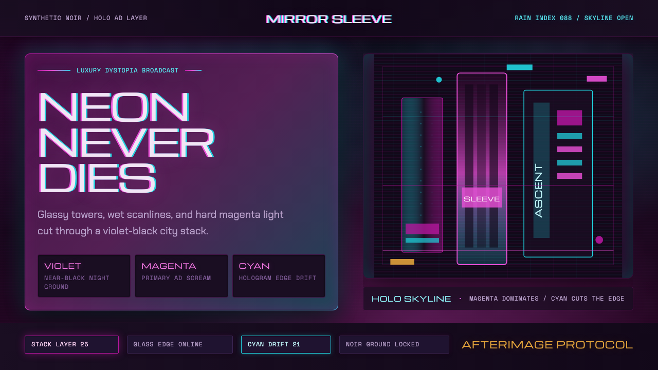 Altered CarbonNeon screams off noir. Magenta glass, cyan scanlines, and stacked vertical si…霓虹刺破黑夜:品红玻璃、青色扫描线与垂直招牌。
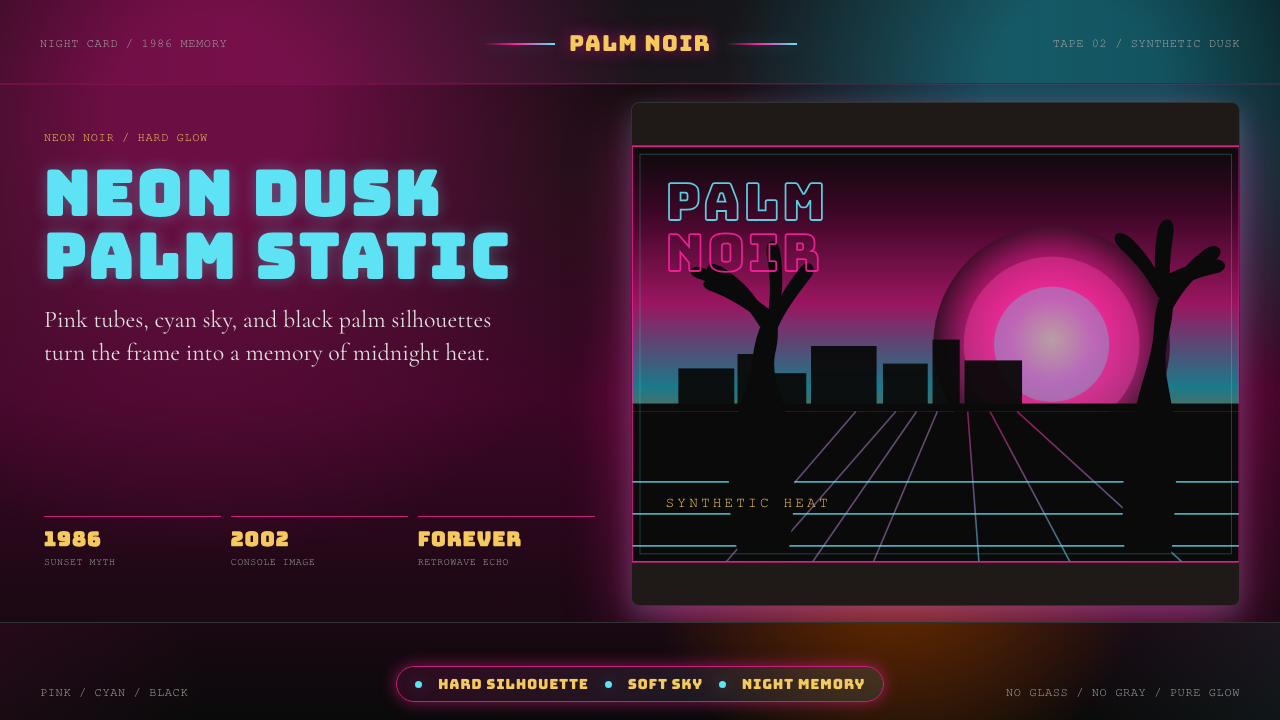 GTA Vice City (2002)Neon-noir nostalgia. Pink-cyan dusk, chunky type, and palm silhouettes.霓虹黑色怀旧。粉青黄昏、粗体字和棕榈剪影。
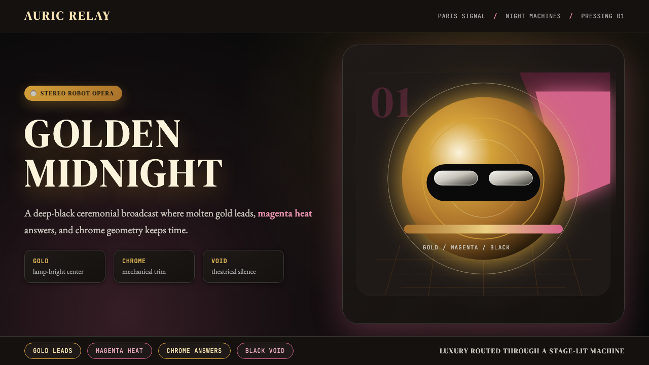 Daft Punk Discovery (Gold-Helmet)Warm sci-fi disco. Gold serif caps orbit a magenta void with chrome-disc geom…温热科幻迪斯科:金色衬线大字环绕品红虚空与铬色圆盘。
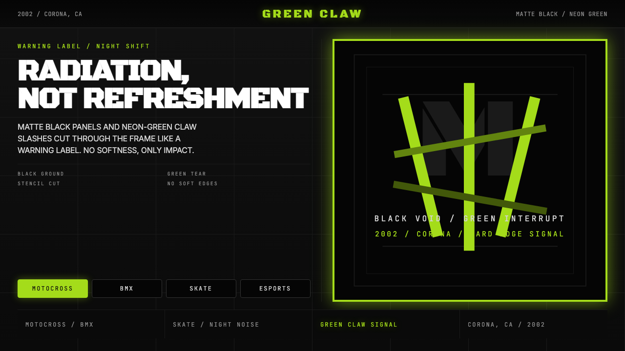 Monster Energy Claw (2002)Aggression, not refreshment. Matte black and neon-green claw slashes cut the…不是清爽,是冲击。哑黑底与霓绿爪痕撕裂画面。
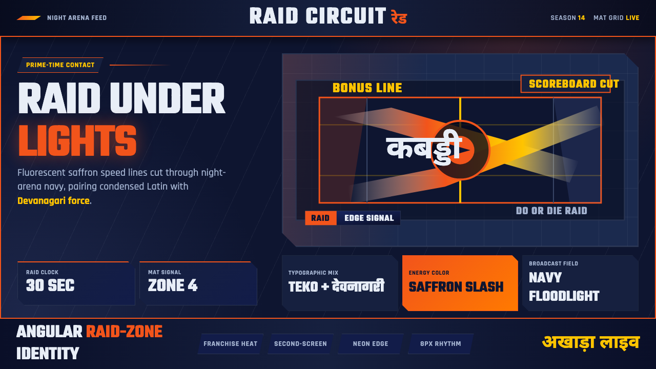 Pro Kabaddi LeagueBroadcast electricity. Saffron slashes, navy court grids, and Devanagari type…转播电流感:藏红斜线、深蓝场地网格与天城体碰撞。
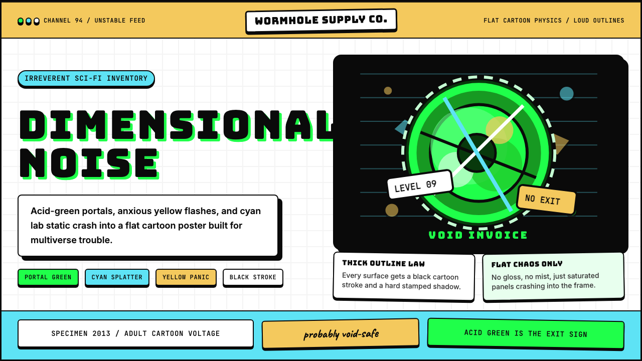 Rick and MortyCartoon chaos goes nuclear. Acid green portals, cyan jolts, yellow panic, thi…卡通混乱核爆:酸绿传送门、青蓝电流、黄色慌张与粗黑描边。