What is Rick and Morty?什么是 Rick and Morty?
Rick and Morty weaponized the Saturday-morning cartoon — acid-green portals, thick black outlines, and a multiverse of screaming color that made irreverence look like philosophy.《瑞克和莫蒂》把周六早晨的卡通片变成了武器——酸绿传送门、粗黑描边,以及让无厘头看起来像哲学的多元宇宙色彩狂潮。
Rick and Morty in briefRick and Morty 速览
Rick and Morty is the visual language of Adult Swim's flagship sci-fi animated series, premiered in 2013 and created by Dan Harmon and Justin Roiland. Its aesthetic is not accidental or incidental to the show's themes — it is an argument. The saturated acid-green portal, the chunky black character outlines, the riot of flat multiverse color all announce a world that is simultaneously childlike and nihilistic, accessible and philosophically abrasive.《瑞克和莫蒂》是成人游泳频道旗舰科幻动画系列的视觉语言,2013年首播,由 Dan Harmon 与 Justin Roiland 共同创作。它的美学并非偶然或对主题可有可无的点缀——它本身就是一种论断。那个高饱和的酸绿传送门、粗笨的黑色人物轮廓线、平涂多元宇宙色彩的狂欢,共同宣告了一个既孩子气又虚无主义、既触手可及又哲学刺眼的世界。
The design language operates on a deliberate contradiction: it uses the visual grammar of children's television — thick outlines, flat fills, bold primary-adjacent colors, expressive character geometries — to carry content that is deliberately adult, chaotic, and self-aware. This tension is structural. The cartoon form is not a wrapper for the ideas; it is inseparable from them. The show's visual identity has become one of the most recognized and referenced aesthetics in contemporary animation and graphic design.这套设计语言建立在一个刻意的矛盾之上:它使用儿童电视的视觉语法——粗轮廓线、平涂色块、大胆的近原色、富有表现力的人物几何形——承载刻意成人化、混乱且自我意识极强的内容。这种张力是结构性的。卡通形式不是包裹思想的外壳,它与思想本身不可分割。这部剧的视觉识别已成为当代动画与平面设计领域被引用最广泛的美学之一。
As a design system applied outside the show itself, the Rick and Morty aesthetic signals irreverence, intelligence, and a refusal to take conventional visual hierarchies seriously. It is the visual equivalent of a joke that is also an argument. Applied correctly, it produces work that feels energetic, opinionated, and memorably bold — a useful counterpoint to the polished minimalism that dominates most contemporary digital design.作为一套应用于剧集之外的设计系统,《瑞克和莫蒂》美学传递的信号是:不羁、智识与对常规视觉层级的拒绝。它是视觉版的既是笑话也是论点。正确运用时,它产出充满活力、观点鲜明、令人难忘的大胆作品——恰好与主导当代数字设计的精致极简主义形成有力对照。
See the Rick and Morty design system查看 Rick and Morty 完整设计系统
Where does Rick and Morty come from?Rick and Morty 从何而来?
The show premiered on Adult Swim — Cartoon Network's late-night block for adult animation — on December 2, 2013. Its visual style was shaped from the outset by the production studio Williams Street and later Starburns Industries, working within the aesthetic conventions of Adult Swim's existing lineup while pushing them into more chaotic, color-saturated territory. The character designs by Justin Roiland deliberately echo the loose, slightly off-model quality of improvisational sketch animation: Rick and Morty are both instantly recognizable and visually unstable, their outlines slightly wobbly, their proportions cartoonishly exaggerated.该剧于2013年12月2日在成人游泳频道首播——这是卡通网络专为成人动画开设的深夜时段。其视觉风格从一开始便由制作公司 Williams Street(后来是 Starburns Industries)主导,在成人游泳频道既有节目的美学惯例中运作,同时将其推向更混乱、更高饱和度的领域。Justin Roiland 的人物设计刻意呼应即兴草图动画那种松散、略微偏离标准的质感:瑞克和莫蒂都是一眼可辨又视觉上不稳定的——轮廓线略显颤抖,比例被夸张到卡通极限。
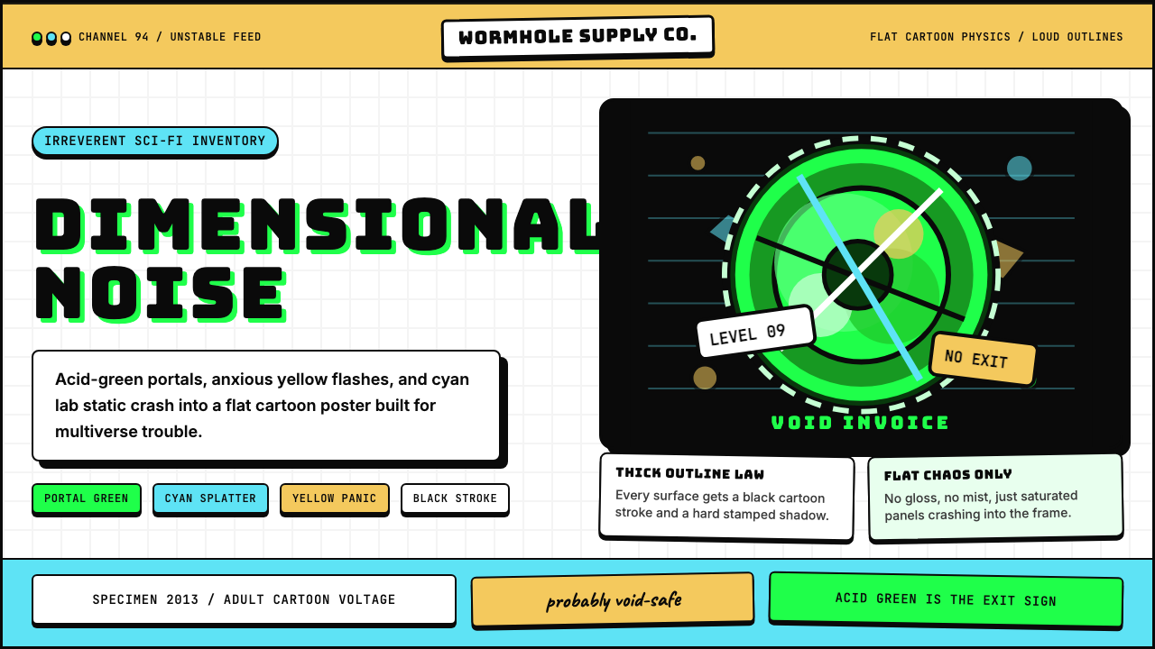
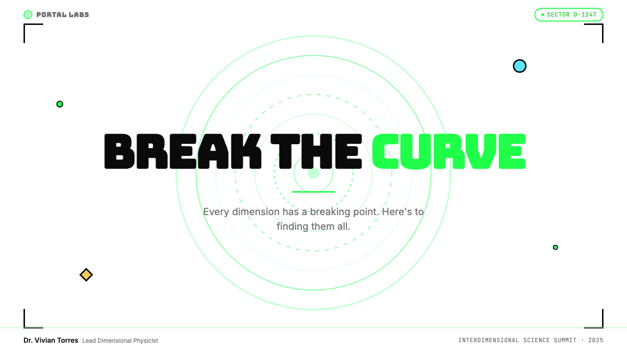
The acid-green portal — arguably the show's single most recognizable visual element — was established in the pilot and became an immediate visual shorthand for interdimensional travel, danger, and possibility simultaneously. Its color sits in a register that does not exist in nature at such intensity: it is a screen color, a fluorescent color, a color that could only exist in a lit medium. This intentionality distinguishes it from the more naturalistic palettes of contemporaries: the green is not illustrative but symbolic, functioning more like a brand mark than a narrative color choice.酸绿传送门——堪称全剧最具辨识度的视觉元素——在试播集中确立,并迅速成为跨维度旅行、危险与可能性同时共存的视觉速记符号。它的颜色处于自然界中不可能以如此强度存在的频段:这是一种屏幕色、荧光色,一种只能在发光媒介中存在的颜色。这种刻意性使它有别于同时代作品更具自然主义感的色调:这个绿色不是说明性的,而是象征性的,其功能更接近品牌标志而非叙事色彩选择。
The broader color system pairs that portal-green with what might be called Morty-yellow — the warm, slightly anxious yellow of Morty's shirt and much of the human-world palette — and Rick-blue, the cool, slightly otherworldly blue of Rick's hair and many alien environments. These three colors form the show's primary visual triangle, with black outlines and white fills providing structure. Secondary and environmental colors are used freely and often violently across alien worlds and interdimensional sequences, but the core trio anchors every scene that takes place in recognizable space.更宏观的色彩体系将传送门绿与「莫蒂黄」配对——莫蒂衬衫和大部分人类世界场景所用的那种温暖、略带焦虑的黄色——以及「瑞克蓝」,即瑞克蓝发和许多外星环境所呈现的那种冷静、略带异世感的蓝色。这三种颜色构成了全剧的主色三角,黑色轮廓线和白色填充提供结构。次级色和环境色在外星世界和跨维度序列中被自由且常常激烈地使用,但核心三色在每一个发生于可辨认空间中的场景里都稳定锚定全局。
Dan Harmon's background in improvisational writing and Justin Roiland's roots in internet animation culture both contributed to a visual ethos that valorizes roughness over refinement, expressive exaggeration over photorealistic detail, and tonal instability over polish. The show's visual style was never designed to be beautiful in a conventional sense — it was designed to be legible, energetic, and capable of supporting extreme emotional range, from cosmic horror to bathroom humor, within a single scene. This range is itself part of the aesthetic: the cartoon form must be robust enough to contain both registers without collapsing into either.Dan Harmon 在即兴写作方面的背景,以及 Justin Roiland 根植于互联网动画文化的来源,共同促成了一种将粗粝置于精炼之上、将表现性夸张置于写实细节之上、将情绪不稳定置于精致抛光之上的视觉伦理。这部剧的视觉风格从未被设计成传统意义上的美——它被设计为清晰可读、充满活力,并能在单一场景内支撑从宇宙恐怖到厕所笑话的极端情绪跨度。这种跨度本身就是美学的一部分:卡通形式必须足够坚韧,能够同时容纳两种极端而不向任何一端坍塌。
What defines the Rick and Morty look?Rick and Morty 的视觉特征是什么?
Portal Green传送门绿
The defining color of the system is an almost fluorescent acid green that occupies a visual register beyond naturalistic illustration — it reads as artificial, electric, and urgent. This color functions as the system's anchor and brand mark simultaneously, used for the show's signature portal device and extended across interface elements, backgrounds, and typographic accents wherever the aesthetic is applied. It is not a green that invites contemplation; it is a green that demands attention.这套系统的核心色是一种近乎荧光的酸绿,处于超越自然主义插图的视觉频段——它读起来是人工的、带电的、紧迫的。这种颜色同时充当系统的锚点与品牌标志,用于剧集标志性的传送门装置,并在应用这套美学时延伸至界面元素、背景和字体强调色。这不是一个邀请你沉思的绿色,而是一个要求你注意的绿色。
Character Yellow and Rick Blue角色黄与瑞克蓝
Complementing the portal green, a warm, slightly anxious yellow drawn from Morty's iconic shirt anchors the human-world palette, while a cool, slightly otherworldly blue — associated with Rick's hair and alien environments — provides tonal contrast. These two colors operate as secondary and tertiary anchors within the system, creating a three-way chromatic tension that is energetic rather than harmonious. The combination reads as deliberately off-balance, which is part of its expressive purpose.与传送门绿相辅相成,来自莫蒂标志性衬衫的温暖、略带焦虑的黄色锚定了人类世界的色调,而与瑞克蓝发及外星环境相关联的冷静、略带异世感的蓝色提供了色调对比。这两种颜色在系统内充当二级和三级锚点,制造出一种充满活力而非和谐的三向色彩张力。这种组合有意制造失衡感,这本身就是其表现目的的一部分。
Thick Black Outlines粗黑轮廓线
Every character and major design element in the system is bounded by a heavy, consistent black stroke that reads as decisive and slightly rough rather than refined. These outlines are not the elegant variable-weight lines of fine illustration; they are uniform, chunky, and assertive — the visual equivalent of a marker on paper. They flatten depth, unify disparate elements, and give the system its legibility at any scale. The outline is the system's most transferable structural element.系统中的每个人物和主要设计元素都被一条粗重、一致的黑色描边所界定,读起来是果断的、略显粗粝的,而非精致的。这些轮廓线不是精细插图那种优雅的粗细变化线条;它们是均匀的、粗笨的、强势的——视觉上相当于马克笔落在纸上。它们压平深度,统一各异元素,赋予系统在任何尺寸下的可读性。轮廓线是这套系统中可移植性最强的结构性元素。
Flat Cartoon Geometry平涂卡通几何
Shapes are filled with flat, unmodulated color — no gradients, no texture, no ambient occlusion. Character bodies, environmental elements, and decorative shapes all share this quality of being solidly, completely themselves: a yellow shirt is entirely yellow, a green portal is entirely green. This flatness makes the system's elements behave like graphic design elements rather than illustrations, which is precisely why the aesthetic transfers so cleanly from animation frames to slides, posters, and digital interfaces.形状以平涂、无调制的色彩填充——无渐变,无纹理,无环境遮蔽。人物身体、环境元素和装饰性形状都共享这种彻底自我完整的品质:黄色衬衫就是完整的黄色,绿色传送门就是完整的绿色。这种平面性使系统的元素表现得像平面设计元素而非插图,这正是这套美学能如此干净地从动画帧迁移到幻灯片、海报和数字界面的原因。
Expressive Typography表现性字体排印
Display type in the Rick and Morty aesthetic tends toward chunky, bold letterforms — often condensed, all-caps, with exaggerated weight contrasts. The typographic approach prioritizes impact and legibility over elegance, using type as a blunt instrument to command attention rather than as a refined compositional element. Letter spacing is typically tight; type blocks are treated almost as shapes, with mass and weight that can compete visually with the saturated color fields around them.在《瑞克和莫蒂》美学中,展示性字体倾向于粗笨、加粗的字形——通常是压缩体、全大写,字重对比夸张。排版方式将冲击力和可读性置于优雅之上,将字体当作钝器来命令注意力,而非作为精炼的构图元素。字距通常紧凑;字体块被当作形状对待,具有能与周围高饱和色域在视觉上竞争的质量与分量。
Multiverse Color Chaos多元宇宙色彩混乱
Beyond the core three-color system, the aesthetic endorses a controlled use of color chaos — particularly in backgrounds, alien environments, and accent elements. Complementary and clashing hues appear side by side without apology, echoing the show's narrative premise that the multiverse contains infinite variation and that visual order is itself a convention rather than a law. This permission to clash is not arbitrary; it is bounded by the structural presence of black outlines and the anchoring role of the portal-green and character palette.在核心三色系统之外,这套美学认可对色彩混乱的受控使用——尤其体现在背景、外星环境和强调性元素上。互补色和冲突色毫无歉意地并排出现,呼应了剧集的叙事前提:多元宇宙包含无限变体,视觉秩序本身不过是约定而非法则。这种允许冲突的授权并非任意的;它受到黑色轮廓线的结构性存在,以及传送门绿和人物色盘的锚定角色所约束。
Controlled Roughness受控的粗粝感
The system deliberately retains an imperfect, hand-drawn quality that reads as spontaneous rather than mechanical. Character outlines are slightly wobbly; shapes are not geometrically perfect; proportions are exaggerated to the point of caricature. This controlled roughness is not laziness — it is an aesthetic position that signals authenticity, creative velocity, and a rejection of the over-refined output of premium design tools. In applied design work, this quality can be introduced through hand-drawn illustration elements, deliberately imperfect shapes, or textures that evoke marker and ink.这套系统刻意保留了一种不完美的手绘质感,读起来是自发的而非机械的。人物轮廓略显颤抖;形状并非几何上完美的;比例被夸张到漫画级别。这种受控的粗粝感不是懒惰——它是一种美学立场,传递的信号是真实性、创作速度,以及对高端设计工具过度精炼输出的拒绝。在应用设计中,这种品质可以通过手绘插图元素、刻意不完美的形状,或唤起马克笔与墨水感的纹理来引入。
See the Rick and Morty design system查看 Rick and Morty 完整设计系统
Who shaped Rick and Morty?谁塑造了 Rick and Morty?
Harmon co-created Rick and Morty with Justin Roiland and serves as its primary narrative architect. His background in improvisational comedy and community television gave him an ethos that valued tonal instability, self-aware structure, and the deliberate violation of genre conventions. The show's visual aesthetic reflects these values: its cartoon form is simultaneously embraced and undermined, used sincerely and ironically within the same frame. Harmon's narrative method — in which every scene follows a strict internal logic even when the surface content is chaotic — maps directly onto the show's visual approach of using structured color and outline systems to contain maximum chromatic disorder.Harmon 与 Justin Roiland 共同创作了《瑞克和莫蒂》,并担任其主要叙事架构师。他在即兴喜剧和社区电视方面的背景赋予了他一种重视情绪不稳定性、自我意识结构以及刻意违反类型惯例的创作伦理。这部剧的视觉美学反映了这些价值观:其卡通形式被同时拥抱和颠覆,在同一画框内既真诚又反讽地使用。Harmon 的叙事方法——即使表层内容混乱,每个场景也遵循严格的内在逻辑——直接映射到该剧的视觉路径上:用结构化的色彩和轮廓系统容纳最大程度的色彩无序。
Roiland co-created the series and voiced both lead characters, Rick Sanchez and Morty Smith, through the first six seasons. His aesthetic roots are in internet animation culture of the early 2010s — lo-fi, deliberately imperfect, comfortable with visual roughness and tonal extremity. The character designs he developed for Rick and Morty carry this sensibility: they are recognizable from a distance, expressive up close, and deliberately resistant to the over-clean output of mainstream animation pipelines. Roiland's visual language can be understood as a counter-argument to prestige animation aesthetics.Roiland 共同创作了这部系列剧,并在前六季中为两位主角——瑞克·桑切斯和莫蒂·史密斯——配音。他的美学根源在于2010年代初期的互联网动画文化——低保真、刻意不完美、对视觉粗粝和情绪极端感到自在。他为《瑞克和莫蒂》开发的人物设计承载了这种感性:从远处可辨识,近看富有表现力,且刻意抗拒主流动画流水线过于精洁的输出。Roiland 的视觉语言可被理解为对精英动画美学的一种反驳。
Goldstein served as a writer on the series and contributed to the development of its narrative and visual identity during key early seasons. The writers' room's collective sensibility — which blended high-concept science fiction with absurdist comedy and philosophical inquiry — directly shaped the visual demands placed on the production: the aesthetic had to be able to hold extreme visual contrast, rapid tonal shifts, and environments ranging from suburban mundanity to cosmic horror. Goldstein represents the writing team's role in defining those visual requirements.Goldstein 曾任该系列编剧,并在早期关键几季中参与了其叙事与视觉识别的开发。编剧团队的集体感性——将高概念科幻与荒诞喜剧和哲学探询融合——直接塑造了对制作的视觉要求:美学必须能够承载极端的视觉对比、快速的情绪转换,以及从郊区平庸到宇宙恐怖的各类环境。Goldstein 代表了编剧团队在界定这些视觉需求方面所扮演的角色。
Siciliano worked in the production design and visual development of the series, helping to establish and maintain the visual system across seasons and across the expanding multiverse of the show's environments. The challenge of maintaining visual coherence across an intentionally chaotic universe — where every alien planet and every timeline can look completely different — required developing a set of underlying design rules that could absorb infinite variation while remaining recognizably itself. This work represents a sophisticated application of flexible systems thinking within an aesthetic defined by deliberate disorder.Siciliano 参与了该系列的场景设计与视觉开发,帮助在各季以及剧集不断扩展的多元宇宙环境中建立并维护视觉系统。在一个刻意混乱的宇宙中——每颗外星球和每条时间线都可以看起来完全不同——维持视觉连贯性的挑战,需要开发一套能够吸收无限变体同时保持自身可辨识性的底层设计规则。这项工作代表了在一种以刻意无序为定义的美学中,对灵活系统思维的精湛运用。
How do you use Rick and Morty today?今天怎么用 Rick and Morty?
Applying the Rick and Morty aesthetic to designed work requires understanding its core contradiction: it uses the grammar of children's illustration to carry adult, chaotic, and philosophically loaded content. The style works best when the same tension is present in the application — when the designed artifact needs to be immediately accessible while also signaling that it is not taking conventional hierarchies at face value. A productivity tool dashboard, a gaming platform, or an event brand for a creative or technical community are natural homes for this aesthetic.将《瑞克和莫蒂》美学应用于设计作品,需要理解其核心矛盾:它用儿童插画的语法承载成人化、混乱且充满哲学意味的内容。当相同的张力在应用中也存在时,这种风格效果最佳——即当设计物需要即时可及,同时又需要传递出它不打算把常规层级当真的信号。生产力工具仪表板、游戏平台,或面向创意或技术社区的活动品牌,都是这套美学的天然栖息地。
For presentation slides, the style excels at cover pages and section breaks. A cover should commit to the portal-green as a dominant field or accent, use all-caps bold type with tight tracking, and include at least one character or geometric element with a visible black outline. Content slides should resist the temptation to use full multiverse chaos — instead, pull back to a two-color system anchored by the portal-green and black outlines, using the third color only for data highlights or call-outs. Data visualizations work well when chart elements are given cartoon weight: bars with visible outlines, fills in the core palette, labels in bold condensed type. Avoid photorealistic illustration or soft-shadow card components — they cancel the aesthetic entirely.在演示文稿中,这种风格在封面页和章节分隔页上表现出色。封面应当以传送门绿作为主导色域或强调色,使用全大写粗体字与紧字距,并包含至少一个带有可见黑色轮廓线的角色或几何元素。内容页应当抵制使用完整多元宇宙混乱的诱惑——转而退回到以传送门绿和黑色轮廓线为锚的双色系统,仅将第三种颜色用于数据高亮或引用标注。数据可视化在图表元素获得卡通分量时效果最好:带有可见轮廓线的柱条、用核心色盘填充、标签采用粗体压缩字体。避免写实插图或柔阴影卡片组件——它们会完全抵消这套美学。
For web interfaces and dashboards, the style requires commitment. A half-applied Rick and Morty aesthetic reads as inconsistent rather than bold — the system needs the black outlines, the flat fills, and the saturated accent color working together. Navigation and header elements should use the portal-green or deep black as background, with white or yellow type. Cards and containers should be outlined rather than shadow-elevated. Interactive states should use color change rather than soft elevation — hover states that shift to portal-green or character-yellow feel native to the system. Pricing pages work particularly well: the boldness and color differentiation between tiers reads clearly, and the style's irreverence can offset the transactional nature of pricing communication.对于网页界面和仪表板,这种风格需要承诺。半途而废地应用《瑞克和莫蒂》美学读起来像不一致而非大胆——系统需要黑色轮廓线、平涂填充和高饱和强调色协同运作。导航和标题元素应使用传送门绿或深黑色作为背景,配以白色或黄色字体。卡片和容器应用轮廓线界定而非投影提升。交互状态应通过颜色变化而非柔性提升来实现——悬停时切换到传送门绿或角色黄的状态与系统天然契合。定价页面尤其适合:各等级之间的粗犷感与色彩区分读起来清晰,这种风格的不羁感也能平衡定价传播的交易性质。
For editorial and marketing work, the aesthetic shines in contexts where energy and distinctiveness are more important than refinement. Event posters, email campaign headers, social cards, and launch announcement graphics all benefit from the system's poster-like boldness. Use the portal-green as a dominant background on a primary visual, pair it with white or black type, and introduce character-yellow as a secondary accent. If using illustration, it should be in the thick-outline, flat-fill style — not photorealistic, not softly rendered. Copy tone should mirror the visual tone: direct, slightly irreverent, confident.对于编辑和营销内容,这套美学在能量和独特性比精致更重要的场景中大放异彩。活动海报、邮件营销头图、社交媒体卡片和发布公告图形都能从系统的海报式粗犷中受益。在主视觉上使用传送门绿作为主导背景,配以白色或黑色字体,引入角色黄作为次级强调色。若使用插图,应采用粗轮廓线、平涂填充的风格——而非写实的、柔和渲染的。文案语气应与视觉语气相映:直接、略带不羁、充满自信。
A common mistake when applying this aesthetic is treating the multiverse color chaos as the primary design move rather than the structural elements that contain it. The system's legibility comes from its outlines and its flat fills — the chaos is only readable because of the structure beneath it. Designers who lead with clashing complementary colors and forget the anchoring role of black outlines, portal-green, and bold type produce work that reads as simply noisy rather than energetically chaotic. The other frequent error is mixing the aesthetic with soft-shadow components, gradient backgrounds, or refined sans-serif type at small weights — each of these signals a different visual system and dilutes the Rick and Morty language into incoherence.应用这套美学时最常见的错误,是将多元宇宙色彩混乱当作主要设计动作,而非当作承载它的结构性元素。这套系统的可读性来自其轮廓线和平涂填充——混乱之所以可读,正是因为其下有结构存在。那些以互补色冲突为主导却忘记黑色轮廓线、传送门绿和粗体字型锚定作用的设计师,产出的作品读起来只是嘈杂,而非充满活力的混乱。另一个常见错误是将这套美学与柔阴影组件、渐变背景或小字重精致无衬线字体混用——每一种都在传递不同的视觉系统信号,将《瑞克和莫蒂》语言稀释为语义不连贯。
See the Rick and Morty design system查看 Rick and Morty 完整设计系统
Rick and Morty — FAQRick and Morty · 常见问题
Is this style limited to entertainment brands, or can it work for serious products?这种风格仅限于娱乐品牌,还是也能用于严肃产品?
The style is not inherently limited to entertainment, but it does carry strong connotations of irreverence and youthful energy that need to be matched by the product's positioning. It works well for developer tools, gaming platforms, creative software, and any product that wants to signal it is not taking the established order too seriously. It is less well-suited to financial services, healthcare, legal platforms, or any context where the user's baseline expectation is conservative authority. The question to ask is not whether the style is serious enough, but whether the product's audience will read its irreverence as a positive value signal or as a mismatch.这种风格本质上并不局限于娱乐,但它确实带有强烈的不羁和年轻活力的内涵,需要与产品定位相匹配。它适合开发者工具、游戏平台、创意软件,以及任何想要传达自己不太把既定秩序当真的产品。它不太适合金融服务、医疗保健、法律平台,或任何用户基线期望是保守权威感的场景。要问的问题不是这种风格是否足够严肃,而是产品的受众是否会将其不羁感读作正面的价值信号,还是一种不匹配。
How should this aesthetic handle data-heavy interfaces without becoming visually overwhelming?这套美学在数据密集型界面中应如何处理,以免造成视觉过载?
The key is understanding which elements carry the aesthetic weight and which should recede. In a data-heavy context, let the structural chrome — headers, navigation, section dividers — carry the portal-green and character-yellow accents, while the data layer itself operates in a more restrained black-and-white or black-and-cream register. Chart elements can have the flat fills and outlined strokes that fit the system without being high-saturation. Reserve the full color intensity for the most important signals: error states, success indicators, primary call-to-action elements. The system's black outline logic is particularly useful here — outlined cards and table rows feel native to the aesthetic without requiring saturated fills.关键在于理解哪些元素承载美学重量,哪些应该退居次位。在数据密集型场景中,让结构性装饰——标题、导航、章节分隔——承载传送门绿和角色黄强调色,而数据层本身在更克制的黑白或黑奶油色调中运作。图表元素可以有符合系统的平涂填充和轮廓线笔触,而无需高饱和度。将完整色彩强度保留给最重要的信号:错误状态、成功指示器、主要行动呼吁元素。系统的黑色轮廓线逻辑在此特别有用——带轮廓线的卡片和表格行感觉天然契合这套美学,而无需高饱和填充。
Can the Rick and Morty aesthetic be applied in a light and a dark mode version?《瑞克和莫蒂》美学可以同时做浅色和深色模式版本吗?
Both modes are viable, but they require different handling. The light mode — cream or white background with portal-green and character-yellow accents — is closer to the show's human-world palette and tends to feel more approachable. The dark mode — deep black background with portal-green as the dominant accent — echoes the show's alien and interdimensional environments and reads as more intense and immersive. The main risk in dark mode is that the portal-green and character-yellow can both feel overwhelming at full saturation against black; consider using the character-yellow more sparingly in dark contexts and leaning on white type and portal-green for the primary visual hierarchy. Black outlines remain essential in both modes — without them, elements lose the cartoon weight that defines the system.两种模式都可行,但需要不同的处理方式。浅色模式——奶油或白色背景配传送门绿和角色黄强调色——更接近剧集的人类世界色盘,读起来更亲切。深色模式——深黑色背景以传送门绿作为主导强调色——呼应了剧集的外星和跨维度环境,读起来更强烈、更沉浸。深色模式的主要风险在于,传送门绿和角色黄在纯黑底面上以全饱和度呈现时都可能感觉过于压倒性;考虑在深色场景中更节制地使用角色黄,转而以白色字体和传送门绿支撑主要视觉层级。黑色轮廓线在两种模式下都是不可或缺的——没有它们,元素就会失去定义这套系统的卡通分量。
How does this style differ from other cartoon-influenced aesthetics like Futurama or Adventure Time?这种风格与《飞出个未来》或《探险活宝》等其他受卡通影响的美学有何不同?
All three are Adult Animation aesthetics, but they occupy different visual registers. Futurama's design language is more streamlined and retrofuturist — it references 1950s science fiction illustration with cleaner lines and a more optimistic color palette. Adventure Time operates in a softer, more organic register with rounded forms and a pastel-influenced range that signals childlike wonder rather than nihilism. Rick and Morty is the most deliberately rough, the most saturated, and the most typographically aggressive of the three. Its portal-green is more chemical than nostalgic, its outlines are thicker and less refined, and its overall palette tends toward high-energy clash rather than thematic harmony. The key distinguishing quality is intentional instability: where the other two aesthetics aim for internal coherence, Rick and Morty valorizes the kind of visual tension that comes from pushing color and form to the edge of readability.三者都是成人动画美学,但处于不同的视觉频段。《飞出个未来》的设计语言更流线型、更复古未来主义——它援引1950年代科幻插画的干净线条和更乐观的色调。《探险活宝》运作在更柔软、更有机的频段,圆润的形态和受粉彩影响的色域传递的是孩童式的惊奇而非虚无主义。《瑞克和莫蒂》是三者中最刻意粗粝的、最高饱和度的、字体处理上最激进的。其传送门绿更接近化学物质而非怀旧感,其轮廓线更粗且更少精炼,整体色盘趋向高能量的冲撞而非主题和谐。关键的区别性品质是刻意的不稳定性:另外两种美学追求内在连贯性,而《瑞克和莫蒂》推崇将色彩和形式推至可读性边缘所产生的那种视觉张力。
What is the single most important rule for using this aesthetic well?运用这套美学的最重要规则是什么?
Commit to the outlines. The entire system's legibility and tonal identity rests on the presence of consistent, heavy black strokes around every major element. Designers often adopt the color palette — the portal-green, the character-yellow, the flat fills — while treating outlines as optional or decorative. This produces work that has the energy of the system without its structure, and the result reads as loud rather than bold. The outline is not decoration; it is the load-bearing element. Once that principle is established, the rest of the system — the flat fills, the saturated accents, the expressive type — falls into place naturally.坚守轮廓线。整套系统的可读性与情调身份完全依赖于每个主要元素周围一致的、粗重的黑色描边的存在。设计师常常采用色盘——传送门绿、角色黄、平涂填充——同时将轮廓线视为可选的或装饰性的。这会产出具有系统能量却缺乏其结构的作品,结果读起来嘈杂而非大胆。轮廓线不是装饰;它是承重结构。一旦这一原则确立,系统的其余部分——平涂填充、高饱和强调色、表现性字体——就会自然而然地各就各位。
Related design styles相关设计风格
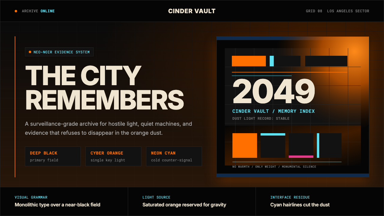 Blade Runner 2049Noir with tectonic weight. Orange dust, cyan hairlines, and monumental Inter…黑色电影有构造重量:橙色尘光、青色发丝线与黑底巨型 Inter。
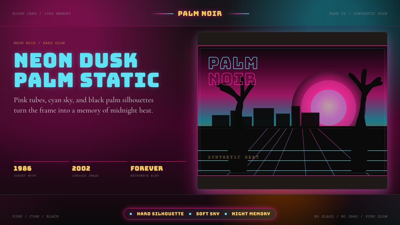 GTA Vice City (2002)Neon-noir nostalgia. Pink-cyan dusk, chunky type, and palm silhouettes.霓虹黑色怀旧。粉青黄昏、粗体字和棕榈剪影。
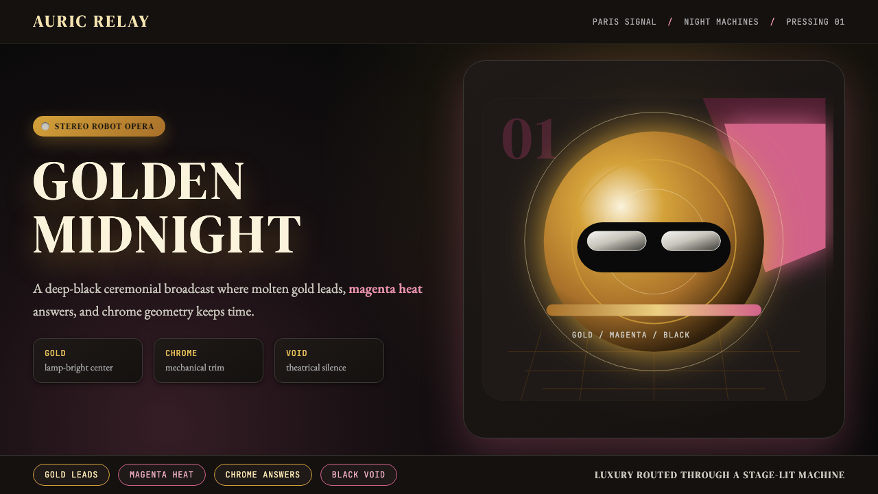 Daft Punk Discovery (Gold-Helmet)Warm sci-fi disco. Gold serif caps orbit a magenta void with chrome-disc geom…温热科幻迪斯科:金色衬线大字环绕品红虚空与铬色圆盘。
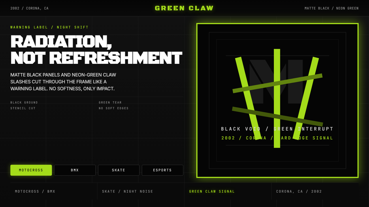 Monster Energy Claw (2002)Aggression, not refreshment. Matte black and neon-green claw slashes cut the…不是清爽,是冲击。哑黑底与霓绿爪痕撕裂画面。
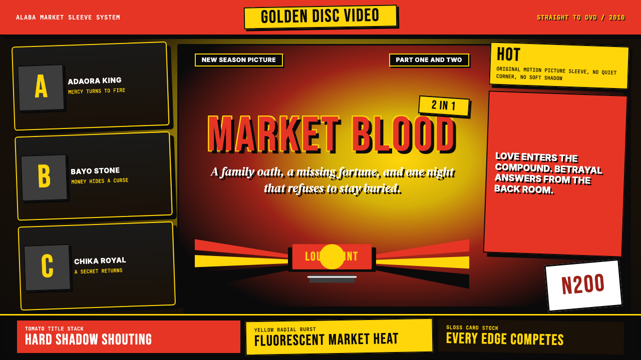 Nigerian Nollywood DVD Poster (2010)Market-stall cinema shouts. Tomato red type and yellow burst collide on jet b…市场摊位式电影在喊:番茄红大字与黄色爆裂撞上黑底。
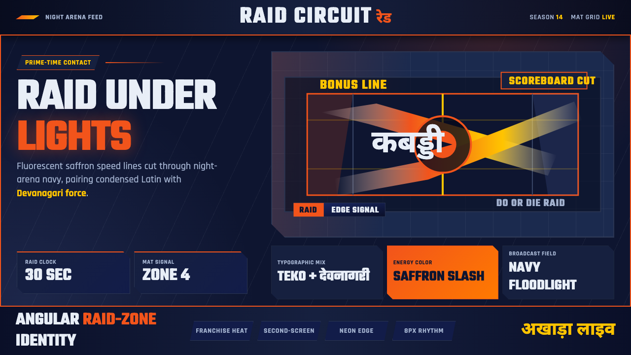 Pro Kabaddi LeagueBroadcast electricity. Saffron slashes, navy court grids, and Devanagari type…转播电流感:藏红斜线、深蓝场地网格与天城体碰撞。