Design style guide设计风格指南
What is Nigerian Nollywood DVD Poster (2010)?什么是 Nigerian Nollywood DVD Poster (2010)?
Nollywood's DVD sleeve was never just packaging — it was a one-card marketing department, built from pure visual noise and absolute commercial urgency.诺莱坞的DVD封套从来不只是包装——它是一张卡片就撑起的营销部门,由纯粹的视觉噪音和绝对的商业紧迫感构成。
Nigerian Nollywood DVD Poster (2010) in briefNigerian Nollywood DVD Poster (2010) 速览
Nigerian Nollywood DVD Poster (2010) is the visual language that powered the world's second-largest film industry through its straight-to-DVD era. Between roughly 2000 and 2015, Nollywood studios bypassed theatrical release entirely, flooding Lagos markets like Idumota and Alaba International with hundreds of new titles every month. The DVD sleeve was the sole marketing instrument — it had to sell the film from a distance of two meters, in a crowded stall, under harsh fluorescent light, at a price of around two hundred naira.尼日利亚诺莱坞DVD海报(2010)是推动全球第二大电影工业度过直销DVD时代的视觉语言。大约在2000年至2015年间,诺莱坞制片厂完全绕开院线发行,每月将数百部新片涌入拉各斯的伊杜莫塔、阿拉巴国际等市场。DVD封套是唯一的营销工具——它必须在两米开外、拥挤的摊位上、刺眼的荧光灯管下,以大约两百奈拉的价格完成对这部电影的全部销售。
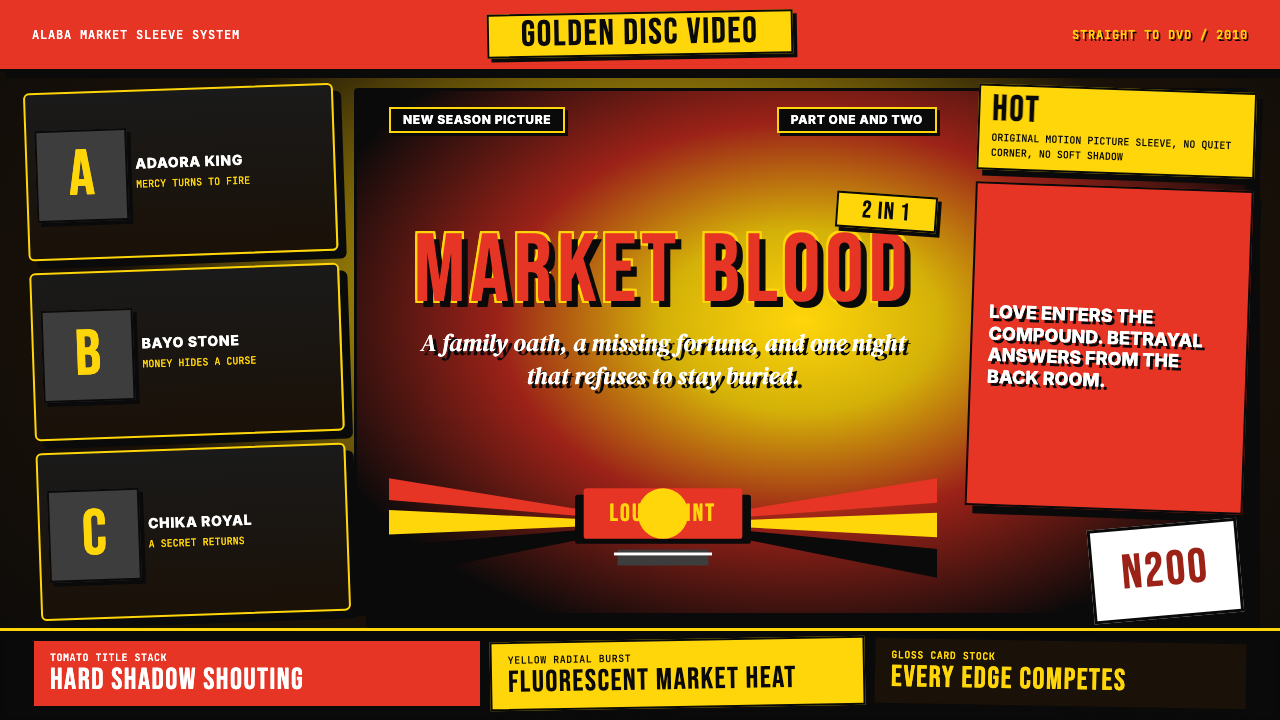
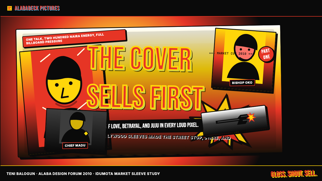
The result was a design system defined by maximum contrast and zero restraint. Tomato-red titles in condensed all-caps letterforms scream across jet-black grounds. Radial yellow burst graphics — starburst explosions of energy — push actor cutouts into aggressive foreground prominence. Drop shadows with exaggerated offsets give every element a dimensional urgency. The composition is dense, hierarchical, and deliberately confrontational: if your eye is not arrested in under a second, the sleeve has already failed its purpose.由此诞生的是一套以最大对比度和零克制为定义的设计系统。超窄体全大写的番茄红标题在纯黑背景上尖叫。径向黄色爆裂图形——星爆式能量炸裂——将演员裁切图像推向强势前景。带有夸张偏移量的投影给每个元素注入立体的紧迫感。构图密集、层级分明、蓄意对抗:如果你的目光在一秒内没有被捕获,这张封套就已经失职。
This aesthetic did not emerge from a design studio or a creative brief — it emerged from the economics of a market stall. Graphic artists in Alaba developed visual shortcuts that reliably communicated genre, star power, and emotional stakes at a glance. Horror titles reached for greens and reds with jagged brush strokes; romantic dramas softened slightly with gradient skies. But the underlying grammar — heavy type, saturated color, hard cutouts, burst graphics — remained constant across the genre spectrum. It is one of the few design traditions of the twenty-first century that was shaped entirely by its distribution medium.这种美学并非诞生于设计工作室或创意简报,而是从市场摊位的经济现实中生长出来的。阿拉巴的平面美工开发出一套视觉捷径,能够在瞬间可靠地传达类型、明星号召力与情感赌注。恐怖题材会用带锯齿笔触的绿与红;言情剧稍微柔化,加入渐变天空。但底层语法——厚重字体、饱和色彩、硬边裁切、爆裂图形——在所有类型中保持一贯。这是二十一世纪少数几个完全由发行媒介塑造的设计传统之一。
Where does Nigerian Nollywood DVD Poster (2010) come from?Nigerian Nollywood DVD Poster (2010) 从何而来?
Nollywood's origin story is inseparable from the cassette economy of early 1990s Lagos. Kenneth Nnebue, a Lagos electronics trader, is widely credited with producing the first commercial Yoruba home-video film in 1992 using blank tapes he was trying to sell. The straightforward commercial logic — make a film, distribute it on the same medium you already sell — created an industry almost by accident. By the mid-1990s, dozens of production companies were releasing films on VHS cassette; by the 2000s, DVD technology made duplication cheaper, storage smaller, and print quality dramatically better, which directly enabled the sleeve's visual ambition.诺莱坞的起源与1990年代初拉各斯的磁带经济密不可分。拉各斯电子产品商人肯尼斯·恩内布,被普遍认为于1992年利用积压的空白磁带制作了第一部商业约鲁巴语家庭录像电影。这种直接的商业逻辑——拍一部电影,用你本来就在卖的媒介发行——几乎是意外地创造出了一个产业。到1990年代中期,已有数十家制片公司在VHS录像带上发行电影;到2000年代,DVD技术使复制成本更低、存储体积更小、印刷质量大幅提升,这直接催生了封套视觉的雄心。
The Alaba International Market in Lagos became the nerve center of Nollywood distribution. Wholesale dealers there could move tens of thousands of copies of a single title in a weekend. For the sleeve to work in this environment, it needed to communicate across multiple simultaneous pressures: it had to stand out in a pile of competing titles, survive being handled hundreds of times, and convey genre, mood, and star in under a second. These constraints — not aesthetic ideology — produced the visual language. Red and yellow were chosen because they are the highest-contrast pairing against black available in standard CMYK printing; condensed caps were chosen because they pack the most readable letterforms per centimeter of sleeve width.拉各斯的阿拉巴国际市场成为诺莱坞发行的神经中枢。那里的批发商可以在一个周末卖出单个片名的数万张拷贝。在这种环境中,封套要发挥作用,需要在多重同时存在的压力下传达信息:在一堆竞争片名中脱颖而出,经受住数百次翻拿而不损,在一秒内传递类型、情绪与主演。是这些约束条件——而非美学意识形态——产生了这套视觉语言。红与黄被选中,是因为它们是标准CMYK印刷中与黑色对比度最高的色彩组合;超窄大写被选中,是因为它们在每厘米封套宽度内能压入最多可读字母。
The key figures associated with the Nollywood DVD era were primarily directors and producers rather than graphic designers, because sleeve design was almost never credited. Genevieve Nnaji, who became Nollywood's biggest female star through the mid-2000s, appeared on sleeves with a frequency that shaped the visual template of the romantic drama subgenre: her face, heavily retouched, cropped against a sunset or a burst graphic, became so common it functioned as genre signage. Tunde Kelani and Kunle Afolayan brought higher production values to their sleeves from the late 2000s onward, experimenting with more refined type and composed photography rather than hard photo cutouts, foreshadowing the post-DVD era.与诺莱坞DVD时代相关的关键人物主要是导演和制片人,而非平面设计师,因为封套设计几乎从不署名。珍妮薇芙·纳雅吉在2000年代中期成为诺莱坞最大的女明星,她出现在封套上的频率之高,塑造了言情剧子类型的视觉模板:她的面孔,经过大量修图,在日落或爆裂图形前裁切呈现,如此常见以至于成为了类型识别符号。图德·凯拉尼与昆勒·阿福拉扬从2000年代末开始为封套带入更高的制作品质,在字体与摄影构图上进行更精炼的探索,而非简单的照片硬裁切,预示了DVD后时代的到来。
By 2012, the Nollywood DVD model was already under pressure from cinema multiplex expansion — Silverbird and Genesis Cinema chains began growing rapidly across Lagos and Abuja — and from the earliest piracy pressures of internet-distributed content. The sleeve aesthetic began to bifurcate: prestige productions adopted poster conventions borrowed from American cinema, while the lower-budget direct-to-market tier doubled down on the maximalist formula. The 2010 vintage captured here represents the peak and the beginning of the end simultaneously — maximum visual intensity just before the medium that required it began to fade.到2012年,诺莱坞DVD模式已经承受来自院线扩张的压力——西尔弗博德和创世纪院线开始在拉各斯和阿布贾快速扩张——以及来自网络内容最早期盗版浪潮的压力。封套美学开始分叉:精品制作借鉴了好莱坞海报惯例,而低预算直销市场那一端则加倍强化极繁公式。本文所呈现的2010年前后风格,同时代表了巅峰与终结的开始——最大视觉强度,就在需要它的媒介开始消退之前。
What defines the Nigerian Nollywood DVD Poster (2010) look?Nigerian Nollywood DVD Poster (2010) 的视觉特征是什么?
Color色彩
The palette is built around extreme contrast rather than harmony: jet black grounds anchor compositions, with tomato red and golden yellow deployed as the two primary signal colors. Red carries urgency and genre seriousness — it appears almost universally on titles and most prominently in action and horror sleeves. Yellow, particularly in its burst-graphic form, signals energy, surprise, and commercial excitement. Both colors are applied at full saturation with no tinting or tonal modulation; subtlety was not a production value in this context. Secondary colors appear in photography — actor clothing, setting — but the graphic overlay elements stay within the red-yellow-black triad.色板建立在极端对比而非和谐之上:纯黑底面锚定构图,番茄红与金黄色作为两种主要信号色部署其上。红色传递紧迫感与类型严肃性——几乎在所有标题上都有出现,在动作与恐怖类封套中最为突出。黄色,尤其是爆裂图形中的黄,传递能量、惊喜与商业感召力。两种颜色均以满饱和度施用,不经过色调或明度调节;含蓄在这一语境下从不构成制作价值。次要色彩出现在摄影图像中——演员服装、场景背景——但图形叠加元素保持在红-黄-黑三色组合之内。
Typography字体排印
Type is the loudest element on the sleeve. Film titles are set in heavily condensed uppercase letterforms — squeezed to pack maximum letters across a narrow width while maintaining legibility at any viewing distance. The condensed proportion creates a vertical tension that reads as urgency. Supporting credits, cast names, and taglines appear in secondary sizes that still maintain a dramatic size hierarchy; there is rarely a gentle gradation between levels. All type is rendered with hard drop shadows offset diagonally, giving letterforms a cut-out three-dimensional quality without any softness. Italic and oblique settings appear frequently as additional emphasis devices.字体是封套上声音最大的元素。电影标题以高度紧缩的大写字母形式排列——横向压缩以在窄幅内容纳更多字母,同时在任何观看距离保持可读性。超窄比例制造出一种垂直张力,被解读为紧迫感。配角演职员表、主演姓名与宣传语以次级尺寸出现,仍保持戏剧性的尺寸层级差异;各级之间鲜有平缓过渡。所有字体均以对角偏移的硬边投影渲染,使字母形态呈现出一种剪切式立体感,毫无柔和成分。斜体和倾斜排版作为额外强调手段频繁出现。
Burst Graphics爆裂图形
The radial burst — a starburst or sunray pattern radiating from a central point — is the single most recognizable motif of this visual tradition. Bursts function as backgrounds for actor portraits, as attention-directing devices behind title text, and as raw expressions of energetic excess. They are almost always rendered in bright yellow or a yellow-to-orange gradient against the black ground. Their origin is partly practical — a burst creates a natural vignette that separates a photo cutout from the background — and partly semiotic: the burst graphic has roots in comic book visual language for impacts and revelations, imported wholesale into popular African commercial art.径向爆裂——从中心点向外辐射的星芒或光线图案——是这一视觉传统最具辨识度的单一母题。爆裂图形作为演员肖像的背景、标题文字后方的注意力引导装置,以及能量过剩的直白表达而发挥作用。它们几乎总以亮黄色或黄橙渐变呈现,对比黑色底面。其起源一半出于实用——爆裂图形能形成自然晕影,将照片裁切图像从背景中分离——一半出于符号学:爆裂图形在漫画视觉语言中有着表达冲击与揭示的根源,被整体移植进非洲流行商业艺术。
Actor Cutouts演员裁切图像
Photography in Nollywood sleeves is almost never composed for the sleeve — it is cut out, scaled, and repositioned from existing production stills or promotional portraits. The hard-edge cutout (a silhouette with a sharp, clean boundary, no feathering) is both a production method and a visual signature. Multiple actors are frequently stacked in a diagonal arrangement, each scaled to indicate their billing importance, with the lead character largest and most centrally placed. Retouching is heavy — skin smoothing, brightness boosting, eye enlargement — creating an idealized hyper-real representation quite different from photographic naturalism.诺莱坞封套中的摄影图像几乎从不为封套专门取景——而是从现有剧照或宣传写真中裁切、缩放、重新定位。硬边裁切(具有清晰利落边界、无羽化的剪影)既是制作方法,也是视觉签名。多位演员通常以对角线排列堆叠,各自按片酬等级缩放,主角最大且位置最居中。修图程度极重——磨皮、提亮、放大眼睛——创造出一种理想化的超真实呈现,与摄影自然主义截然不同。
Composition and Density构图与密度
Nollywood sleeves reject negative space almost as a matter of principle. Every area of the composition carries either a visual element or a block of text; white or empty space reads as wasted selling real estate. The hierarchy is typically organized vertically: title at top in the largest type, actor faces spanning the middle, taglines or distributor credits at the bottom, with burst graphics and color fills occupying the spaces between. The density is not chaotic — there is a clear reading order — but it is aggressive in a way that assumes the viewer will invest close attention only after the sleeve has already shouted for it.诺莱坞封套几乎以原则性的方式拒绝留白。构图的每个区域都承载着视觉元素或文字块;空白或留空被解读为浪费掉的销售空间。层级通常垂直组织:顶部是最大字号的标题,中部是演员面孔横跨其中,底部是宣传语或发行公司署名,爆裂图形与色彩填充占据其间的空隙。密度并非混乱——存在清晰的阅读顺序——但其方式是进攻性的:它假设观者只有在封套已经喊出声音之后才会投入近距离注意力。
Shadow and Outline投影与轮廓
Drop shadows in this tradition are hard-edged, heavily offset, and rendered as solid opaque shapes rather than transparent blurs. A title's shadow might be offset by a distance almost equal to the letter height itself, creating the impression of three-dimensional letters lifted off the surface. Outlines — thin stroke borders around letters and graphic elements — appear frequently as an additional separation device, allowing red type to be legible even when placed over a complex photographic region. The layering of outline, shadow, and color on every text element contributes to the visual noise that is, paradoxically, the system's principal organizational technique.这一传统中的投影是硬边、大偏移、以实体不透明形状而非透明模糊渲染的。标题的投影偏移距离有时几乎等于字母高度本身,创造出字母从表面浮起的立体印象。轮廓线——字母和图形元素周围的细描边——作为额外的分离手段频繁出现,使红色文字即使叠放在复杂摄影区域上也能保持可读性。每个文字元素上轮廓、投影与色彩的叠加,共同构成了视觉噪音——矛盾的是,这正是该系统主要的组织技术。
Genre Coding类型编码
Within the broader maximalist framework, specific visual signals encode genre with surprising consistency. Horror and thriller sleeves emphasize green accents alongside the red-black base, often incorporating dripping or cracking texture effects. Romantic drama sleeves allow slightly softer photograph color grading and may introduce pastel accent tones in sky backgrounds. Family and spiritual drama sleeves frequently feature multiple actors arranged around a symbolic motif — a cross, a crown, a family house. These genre signals function as a shared visual vocabulary between producers and the market-stall buyer who needed to categorize a title in seconds.在更宏观的极繁框架之内,特定视觉信号以令人惊讶的一致性对类型进行编码。恐怖与惊悚封套在红-黑底色之上强调绿色点缀,常常加入滴落或开裂的纹理效果。言情剧封套允许摄影图像色调稍微柔和,并可能在天空背景中引入淡彩色调。家庭与灵性题材封套常以围绕象征性母题排列的多位演员为特征——十字架、王冠、家族宅邸。这些类型信号作为制片方与市场摊位买家之间的共享视觉词汇运作,后者需要在数秒内完成对一部作品的分类。
Who shaped Nigerian Nollywood DVD Poster (2010)?谁塑造了 Nigerian Nollywood DVD Poster (2010)?
Nnebue is credited as the father of Nollywood by many historians, having produced the 1992 film that launched the home-video industry almost inadvertently while trying to move surplus blank tapes through his electronics shop. His commercial instinct — packaging a product for direct consumer sale rather than institutional distribution — established the straight-to-market logic that shaped every aspect of the visual tradition that followed, including the sleeve design imperative of selling the product at the point of display.恩内布被许多历史学家誉为诺莱坞之父,他于1992年制作的那部电影几乎是在无意间——为了通过自己的电子产品店处理积压的空白磁带——启动了整个家庭录像工业。他的商业本能——将产品直接打包供消费者购买,而非走机构发行路线——确立了直销市场的逻辑,这一逻辑塑造了此后视觉传统的每个方面,包括封套设计必须在陈列点完成销售的核心命题。
Nnaji became the most recognizable face of Nollywood between the mid-2000s and the mid-2010s, and her ubiquitous presence on DVD sleeves shaped the visual conventions of the romantic drama subgenre more than any single director or designer. Her retouched portrait — luminous skin, expressive eyes, composed against burst graphics or sunset backgrounds — served as a genre signal that buyers could read from a distance. Her later directorial work on Lion Heart (2018) marked the formal end of the sleeve-first era she had come to embody.纳雅吉在2000年代中期至2010年代中期成为诺莱坞最具辨识度的面孔,她在DVD封套上无处不在的存在,比任何单一导演或设计师都更深刻地塑造了言情剧子类型的视觉惯例。她经过修图的肖像——光亮的肤色、富有表情的眼睛、以爆裂图形或日落背景为衬——作为类型信号发挥作用,买家可以从远处读取。她后来执导《狮心》(2018年)的工作,标志着她所代表的封套优先时代正式终结。
Kelani, working through his production company Mainframe Film and Television, consistently pushed Nollywood sleeve design toward more composed and culturally rooted imagery from the early 2000s onward. His films drew on Yoruba literary and oral traditions, and his sleeves often featured more considered photographic framing, Yoruba-script elements, and references to traditional textile patterns rather than the generic maximalism of market-stall production. He represents the documentary and auteur tendency within Nollywood that existed in tension with the commercial mainstream.凯拉尼通过其制片公司Mainframe Film and Television,从2000年代初便持续推动诺莱坞封套设计走向更有构图意识与文化根基的图像呈现。他的电影汲取约鲁巴文学与口述传统,其封套常常呈现更具考量的摄影构图、约鲁巴文字元素,以及对传统纺织图案的引用,而非市场摊位制作中那种通用极繁主义。他代表了诺莱坞内部与商业主流存在张力的纪录片与作者电影倾向。
Afolayan, son of the veteran Nollywood director Adeyemi Afolayan, brought cinematic production values into the home-video market with films like The Figurine (2009) and Phone Swap (2012). His sleeves were among the first to treat the photographic image as a composed element rather than a cutout — using depth of field, intentional lighting, and designed color grading. This approach anticipated the prestige Nollywood era that followed the DVD period, and his visual choices influenced a generation of sleeve designers who aspired to move beyond the Alaba aesthetic.阿福拉扬,诺莱坞资深导演阿德耶米·阿福拉扬之子,以《偶像》(2009年)和《换机》(2012年)等作品将电影级制作品质带入家庭录像市场。他的封套是最早将摄影图像视为构图元素而非裁切物的作品之一——使用景深、有意识的布光和精心设计的色调分级。这种方式预示了DVD时代之后的精品诺莱坞时代,他的视觉选择影响了一代渴望超越阿拉巴美学的封套设计者。
How do you use Nigerian Nollywood DVD Poster (2010) today?今天怎么用 Nigerian Nollywood DVD Poster (2010)?
The Nollywood DVD Poster aesthetic is one of the most legible maximalist traditions available to contemporary designers precisely because its rules are so consistent. The system works through a small set of highly amplified signals — extreme color contrast, condensed bold type, burst graphics, hard shadows — and succeeds or fails based on how fully each of those signals is committed to. Half-measures produce incoherence; full commitment produces an unmistakable visual loudness that cuts through digital noise in exactly the same way it cut through market-stall competition.诺莱坞DVD海报美学是当代设计师可以借鉴的最易解读的极繁传统之一,正因为它的规则极为一贯。这套系统通过一小组高度放大的信号运作——极端色彩对比、紧缩粗体字、爆裂图形、硬边投影——其成败取决于对每一个信号的承诺程度。半途而废会产生不连贯;全力投入则产生一种毋庸置疑的视觉嘈杂,正如它穿透市场摊位竞争一样穿透数字噪音。
For presentation slides, this system is most effective in contexts where disruption, energy, or cultural celebration are the intended tone. Cover slides benefit most: a full-bleed black background, a central actor-style portrait or product image cut out against a yellow burst, and a condensed-caps title in tomato red with a diagonal shadow creates an immediate cinematic drama. Content slides within a Nollywood-inflected deck should retain the color coding — red for titles, yellow for highlights, black grounds — but reduce the density significantly. Data slides work well with the color palette applied to chart elements, keeping backgrounds dark and bars or segments in the primary red-yellow range.对于演示文稿幻灯片,这套系统在颠覆性、能量感或文化庆典为意图基调的语境中最为有效。封面幻灯片收益最大:全出血黑色背景,中央以演员风格的人物肖像或产品图像裁切于黄色爆裂图前,番茄红对角线投影的超窄大写标题,立即制造出电影级戏剧感。在诺莱坞风格幻灯片组的内容页中,应保留色彩编码——红色用于标题,黄色用于重点,黑色为底——但需大幅降低密度。数据页面将这套色板应用于图表元素效果良好,保持深色背景,柱状或扇形元素使用主色系红黄。
For web and digital interfaces, the style adapts most naturally to hero sections, promotional banners, and event-announcement contexts where a single message needs maximum immediacy. A dark-ground hero with a burst graphic behind a product image, condensed type in the primary palette, and a hard-shadow call-to-action button captures the tradition's energy without overwhelming the rest of a UI. Dashboard or pricing contexts benefit from the color system — red for critical states or primary tier, yellow for highlight or featured — while restraining the burst graphics and type density to maintain navigational clarity.对于网页与数字界面,这种风格最自然地适配需要单一信息以最大即时感呈现的主视觉区、推广横幅和活动公告语境。深色背景主视觉区,产品图像后有爆裂图形,主色系超窄字体,带硬边投影的行动召唤按钮,能够捕捉这一传统的能量而不淹没界面其余部分。仪表板或定价页面从色彩系统中获益——红色用于关键状态或主要层级,黄色用于突出显示或推荐项——同时克制爆裂图形和字体密度以维持导航清晰度。
For editorial and marketing work — particularly for brands in entertainment, music, African diaspora culture, or any context celebrating popular energy — this style offers a visual register that no European or American design tradition provides. Event posters, album covers, social media announcement graphics, and promotional emails all work well with Nollywood-derived composition. The key is maintaining the genre coding logic: decide which color means urgency and which means energy, assign them to information types, and stay consistent.对于编辑与营销工作——特别是娱乐、音乐、非洲散居文化品牌,或任何庆祝大众能量的语境——这种风格提供了欧美任何设计传统都无法提供的视觉音域。活动海报、专辑封面、社交媒体公告图文,以及推广邮件都适合诺莱坞衍生的构图方式。关键是维持类型编码逻辑:决定哪种颜色代表紧迫,哪种代表能量,将它们指派给相应的信息类型,并保持一贯。
The most common mistake when applying this aesthetic is confusing maximalism with randomness. Nollywood sleeves are dense, but they have a strict visual hierarchy: one dominant color temperature (warm dark), one signal red, one accent yellow, a clear reading order from top to bottom. Designers who import the saturation and the burst motifs without imposing that hierarchy produce work that reads as noisy rather than bold. A second frequent error is softening the shadows — feathering them, reducing their offset, making them transparent. Soft shadows undermine the cut-out physicality that gives this tradition its kinetic energy. If the shadow is not hard, it is not Nollywood.应用这种美学时最常见的错误是将极繁与随机混淆。诺莱坞封套密集,但有严格的视觉层级:一种主导色温(暖色深底),一种信号红,一种强调黄,从上至下清晰的阅读顺序。那些引入了饱和度和爆裂母题却没有施加层级的设计师,产出的作品读起来是噪杂而非大胆。第二个常见错误是软化投影——给它们羽化边缘、缩小偏移、使其透明。柔和的投影会破坏这一传统赖以获得动能的裁切式物质感。如果投影不是硬的,就不是诺莱坞。
Nigerian Nollywood DVD Poster (2010) — FAQNigerian Nollywood DVD Poster (2010) · 常见问题
Is this style appropriate outside of African or Nigerian cultural contexts?这种风格适合在非洲或尼日利亚文化语境之外使用吗?
Yes, with intentionality. The Nollywood poster aesthetic is a fully formed design system, not simply a cultural artifact, and its visual logic — contrast-driven hierarchy, burst energy graphics, condensed type — transfers to any context where maximum attention-capture is the goal. Entertainment brands, music industry work, festival and event promotion, and any product positioning itself as bold and accessible rather than refined and exclusive are natural fits. The caution is to engage with the tradition knowingly rather than superficially: understand why the visual language is structured as it is, rather than borrowing only surface elements like the burst graphic or the red-black color contrast.可以,但需要有意为之。诺莱坞海报美学是一套完整成型的设计系统,而非单纯的文化产物,其视觉逻辑——对比驱动的层级、爆裂能量图形、超窄字体——可以迁移到任何以最大注意力捕获为目标的语境。娱乐品牌、音乐行业作品、节庆与活动推广,以及任何将自身定位为大胆亲民而非精致高冷的产品,都是自然的契合点。需要注意的是,要在知情而非流于表面的前提下使用这一传统:理解这套视觉语言为何如此构建,而不仅仅是借用爆裂图形或红黑色彩对比等表面元素。
How do I avoid the style looking like unintentional bad design?如何避免这种风格看起来像无意为之的劣质设计?
The distinction between a knowing use of the Nollywood aesthetic and a simply poorly designed piece comes down to intentional control of hierarchy and commitment. Three signals indicate intentionality: first, the color assignments are consistent and purposeful — red always signals one type of information, yellow another; second, the type hierarchy is legible at multiple distances, with dominant elements clearly dominant; third, the burst and shadow graphics are applied at full intensity, not watered down into approximate versions. Diluted execution reads as accident; fully committed execution reads as style. Additionally, adding any element that does not belong to the system — soft gradients, neutral tones, centered symmetrical layouts — immediately breaks the internal logic and signals unintentional pastiche.有意借鉴诺莱坞美学与单纯设计粗糙之间的区别,在于对层级的有意控制和对风格的全力投入。三个信号表明有意为之:第一,色彩指派一贯且有目的性——红色始终标示一类信息,黄色另一类;第二,字体层级在多个观看距离下都可读,主导元素明确主导;第三,爆裂图形与投影以全强度施用,而非稀释成近似版本。稀释的执行被解读为偶然;全力投入的执行被解读为风格。此外,加入任何不属于该系统的元素——柔和渐变、中性色调、居中对称版面——都会立即破坏内在逻辑,并暴露出无意识的拼凑。
Can this style work in digital-first contexts like mobile screens or social media?这种风格能在移动屏幕或社交媒体等以数字为主的语境中发挥作用吗?
The style transfers extremely well to social media and mobile contexts — in some ways better than to print, because the high contrast and bold type are optimized for small-screen legibility at a distance, which is exactly how social media graphics are consumed. The burst graphic reads clearly as a thumbnail at low resolution. The condensed caps title communicates even when a post is scrolled past at speed. The primary palette of red, yellow, and black retains maximum contrast on both OLED dark screens and standard light-mode interfaces. The main adaptation for digital is to reduce the total number of elements per composition — the DVD sleeve could accommodate ten separate text blocks because it was held in the hand; a social post should probably reduce this to three or four.这种风格在社交媒体和移动端语境中适应性极强——在某些方面甚至优于印刷,因为高对比度和粗大字体针对小屏幕的远距可读性进行了优化,而这正是社交媒体图文的消费方式。爆裂图形在低分辨率缩略图中清晰可辨。超窄大写标题即使在帖子被快速划过时也能传达信息。红、黄、黑的主色系在OLED深色屏幕和标准浅色模式界面上都保持最大对比度。针对数字端的主要调整是减少每个构图中的元素总数——DVD封套可以容纳十个独立文字块,因为它被握在手中;社交帖子则大概应将其减少至三至四个。
What is the relationship between Nollywood poster design and other African popular visual traditions?诺莱坞海报设计与其他非洲流行视觉传统之间有什么关系?
Nollywood poster design sits within a broader lineage of West African popular commercial art that includes Ghanaian hand-painted cinema signs (made famous by artists like Kwame Akoto and popularized by the retroactive collection of painters from Kumasi), Nigerian bar and barber-shop signage, and the hand-lettered truck and bus art of the Mammy Wagon tradition. What these share is a commitment to maximum communicative force in the most economical format possible, using locally available tools and materials. The Nollywood sleeve is the digital and offset-print evolution of this tradition — it retained the visual energy and hierarchy logic of hand-painted commercial art while adapting to CMYK printing workflows and photo-manipulation software. The contemporary Ghanaian movie poster tradition is closely related and developed in parallel, sharing the burst graphic, hard-cutout photography, and condensed-caps typography.诺莱坞海报设计处于西非流行商业艺术更广泛脉络之中,这一脉络包括加纳手绘电影招牌(经由夸梅·阿科托等艺术家广为人知,并因追溯性收藏库马西画师作品而走向国际)、尼日利亚酒吧与理发店招牌,以及妈妈车传统的手写车身与巴士艺术。这些传统的共同点是:在尽可能经济的形式中,以本地可用工具和材料实现最大传达力。诺莱坞封套是这一传统在数字与胶版印刷时代的演进——保留了手绘商业艺术的视觉能量与层级逻辑,同时适应了CMYK印刷工作流程和图像处理软件。当代加纳电影海报传统与此密切相关,并行发展,共享爆裂图形、硬边裁切摄影与超窄大写字体排印。
How did Nollywood sleeve design change after the DVD era ended?DVD时代结束后,诺莱坞封套设计发生了怎样的变化?
The transition to streaming — primarily Netflix Africa, Amazon Prime Video, and local platforms like ShowMax — changed the marketing artifact from a physical sleeve to a digital thumbnail and poster image. The thumbnail context rewarded high contrast (still present in the tradition) but penalized information density (the sleeve's key mode). Post-DVD Nollywood marketing graphics generally became more similar to American streaming art: composed photography, less burst graphics, more careful typographic spacing, and a softer overall palette. However, the market-stall sensibility did not disappear entirely — it migrated into social media promotional content for events and music videos associated with Nollywood talent, where the burst-graphic and condensed-caps aesthetic still appears as a genre signal, particularly for content targeting Nigerian diaspora audiences.向流媒体的过渡——主要是Netflix非洲、亚马逊Prime Video以及ShowMax等本地平台——将营销媒介从实体封套变为数字缩略图和海报图像。缩略图语境奖励高对比度(这一传统的保留项),但惩罚信息密度(封套的核心模式)。DVD后时代的诺莱坞营销图像总体上变得与美国流媒体美术更为接近:构图摄影,爆裂图形减少,字体间距更为讲究,整体色调更柔和。然而,市场摊位感性并未完全消失——它迁移进了与诺莱坞艺人相关的活动及音乐视频的社交媒体推广内容,在那里,爆裂图形与超窄大写美学仍作为类型信号出现,尤其针对尼日利亚海外侨民受众的内容。
Related design styles相关设计风格
 Cartoon Network 90s BlocksKids-cable noise, squared. Black-white checkerboards crash into hot-yellow Bu…方块化的儿童有线电视噪音:黑白棋盘撞上热黄 Bungee 字块。
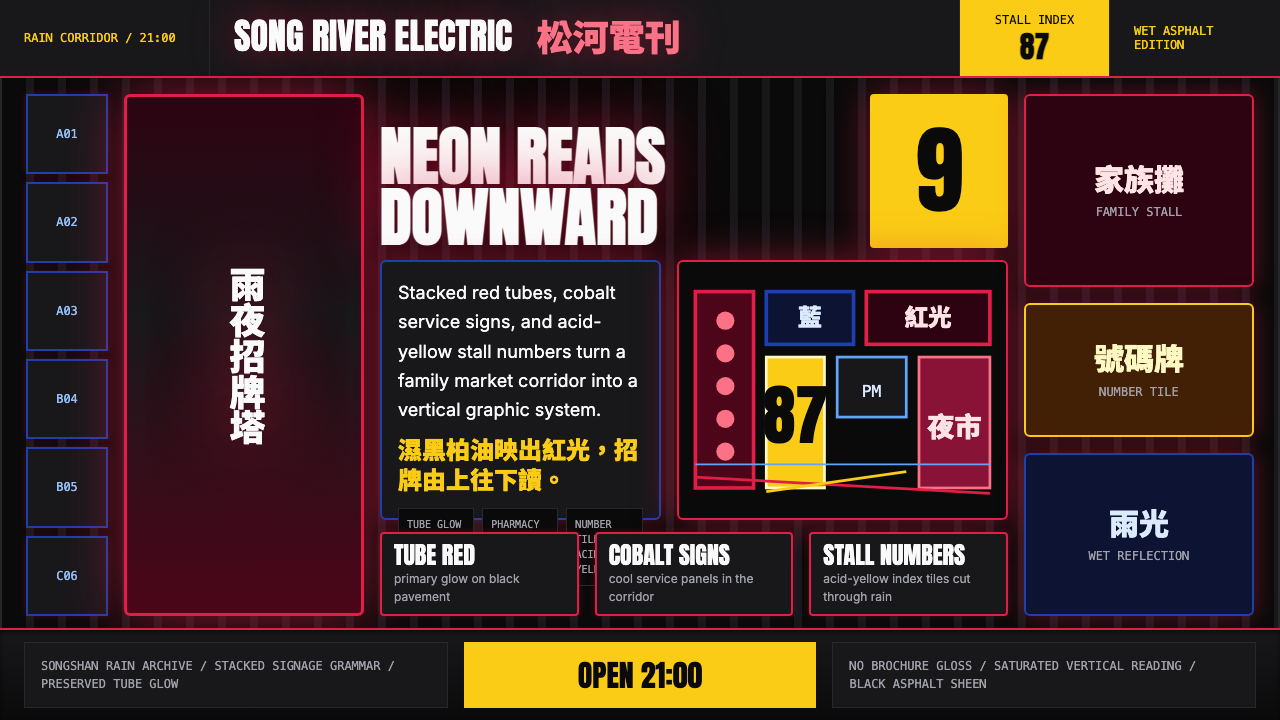 Taiwanese Raohe Night Market NeonTaipei night reads vertically. Neon red, cobalt panels, and acid-yellow numbe…台北夜色垂直閱讀:霓虹紅、鈷藍看板與酸黃號碼疊在濕黑地面。
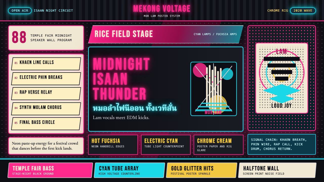 Thai Mor Lam Isaan (2020)Joy at maximum volume. Fuchsia-cyan neon, chrome type, and halftone grids hit…最大音量的欢愉:黑底上洋红青霓虹、铬字与网点格爆发。
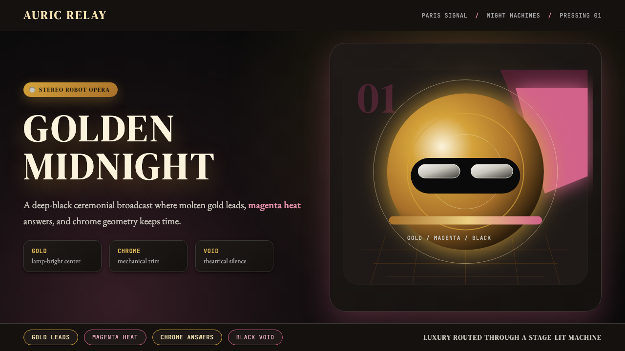 Daft Punk Discovery (Gold-Helmet)Warm sci-fi disco. Gold serif caps orbit a magenta void with chrome-disc geom…温热科幻迪斯科:金色衬线大字环绕品红虚空与铬色圆盘。
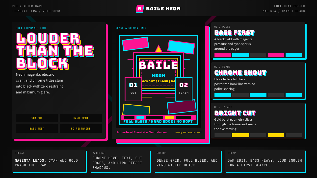 Funk Carioca FavelaMaximalist and unruly. Magenta, cyan, and chrome slam into black at thumbnail…极繁又躁动。洋红、电青与镀铬在黑底上硬碰硬。
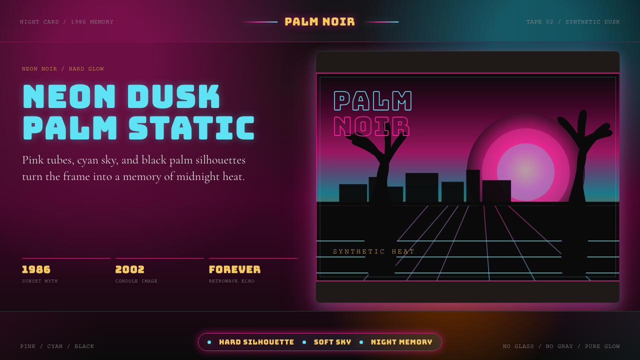 GTA Vice City (2002)Neon-noir nostalgia. Pink-cyan dusk, chunky type, and palm silhouettes.霓虹黑色怀旧。粉青黄昏、粗体字和棕榈剪影。