What is Funk Carioca Favela?什么是 Funk Carioca Favela?
Funk Carioca Favela is the visual roar of Rio's baile funk scene — neon magenta and electric cyan screaming over pitch black, chrome-bevel titles, and maximalist energy that treats restraint as a foreign concept.放克卡里奥卡贫民窟风格是里约巴伊利放克场景的视觉咆哮——霓虹洋红与电光青在纯黑上尖叫,镀铬浮雕标题,极繁主义能量将克制视为不存在的概念。
Funk Carioca Favela in briefFunk Carioca Favela 速览
Funk Carioca Favela is a grassroots visual aesthetic born from the sound-system culture of Rio de Janeiro's favelas. It emerged organically in the mid-2000s and reached its most recognizable peak between 2010 and 2018, driven almost entirely by the explosion of YouTube as a platform for baile funk music. Thousands of independent producers and MCs created their own thumbnails, flyers, and promotional graphics using pirated software at midnight, and the resulting aesthetic — loud, layered, unstoppable — became a global visual signature.放克卡里奥卡贫民窟风格是一种草根视觉美学,诞生于里约热内卢贫民窟的音响系统文化之中。它在2000年代中期自发涌现,并在2010年至2018年间达到最具辨识度的高峰,几乎完全由YouTube作为巴伊利放克音乐平台的爆炸性增长所驱动。数千名独立制作人和MC在深夜用盗版软件制作自己的缩略图、传单和宣传图,由此诞生的美学——响亮、层叠、势不可挡——成为一种全球性视觉标签。
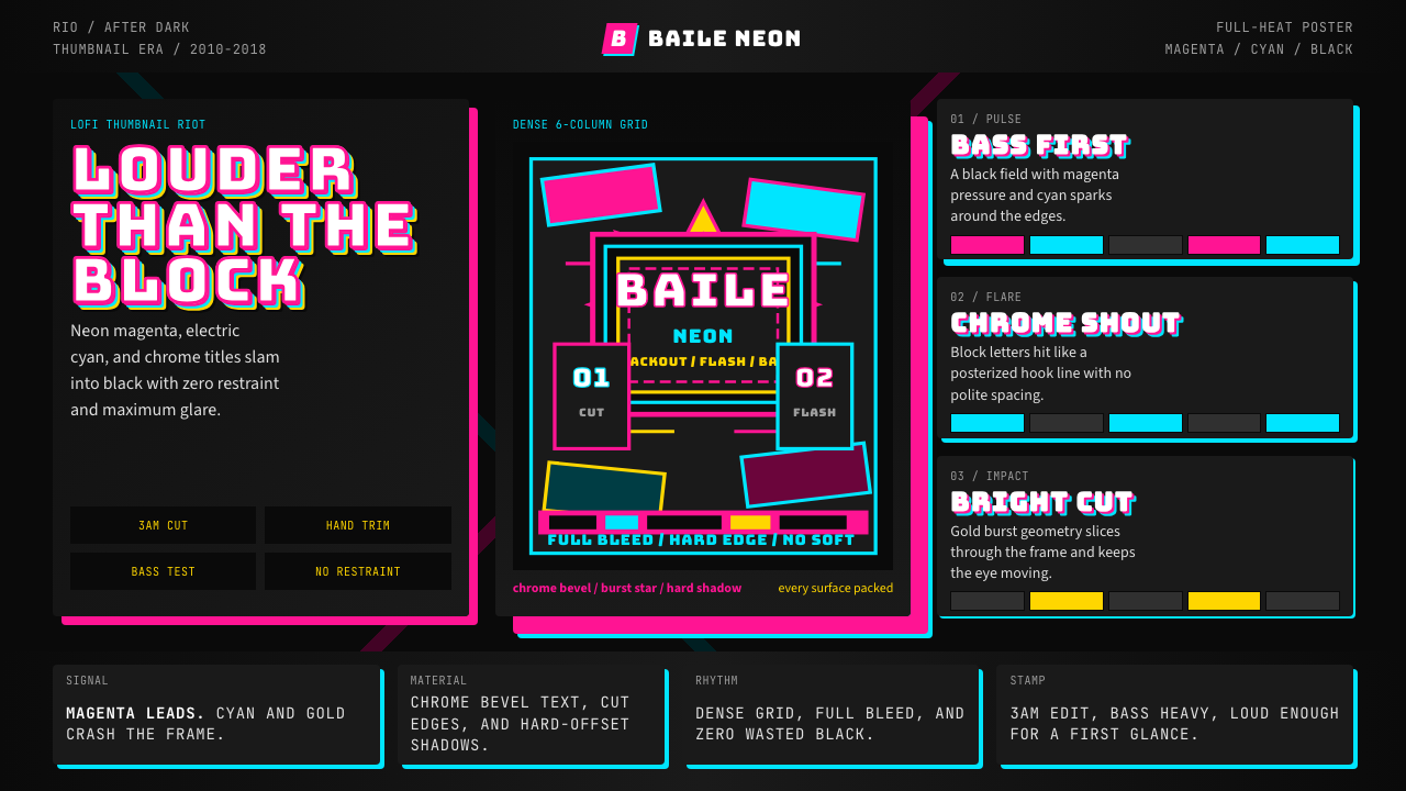
The style is defined by its absolute rejection of minimalism. Every surface is packed. Color does not accent; it overwhelms. Text is not set; it is weaponized — beveled, chrome-plated, outlined in contrasting neon, and scaled to fill every available corner. Background elements compete rather than recede. The visual grammar is one of maximum density and maximum contrast, where the goal is not balance but impact: the thumbnail must stop a thumb mid-scroll even when viewed at the size of a postage stamp.这种风格以其对极简主义的彻底拒绝为核心。每一个表面都被塞满。颜色不是点缀,而是铺天盖地。文字不是被排版,而是被武装——浮雕、镀铬、以对比霓虹描边,并被放大到填满每一个可用角落。背景元素相互竞争而非退让。其视觉语法是最大密度与最大对比度的叠加,目标不是平衡而是冲击:缩略图必须在邮票大小的尺寸下依然能让滑动的手指停下来。
Unlike most design movements that began in studios or academies, Funk Carioca Favela is a product of pure necessity and democratized tools. It is the aesthetic language of communities that had no formal design training but had access to Photoshop, a digital camera, and an audience hungry for their music. That origin story is inseparable from its visual character — the rough cut-out photography, the deliberately imperfect drop shadows, the lens flares that nobody tried to remove — because these were not mistakes. They were the style.与大多数发源于工作室或学院的设计运动不同,放克卡里奥卡贫民窟风格是纯粹出于需要与工具民主化的产物。它是那些没有受过正规设计训练、却能接触到Photoshop、数码相机和渴望他们音乐的受众的社区的视觉语言。这段起源故事与其视觉特征密不可分——粗糙的抠图人像、刻意不完美的投影、没人试图去掉的镜头光晕——因为这些不是失误,而是风格本身。
See the Funk Carioca Favela design system查看 Funk Carioca Favela 完整设计系统
Where does Funk Carioca Favela come from?Funk Carioca Favela 从何而来?
Funk carioca as a music genre has roots stretching back to the late 1970s and early 1980s, when Miami bass and electro funk records began circulating in Rio's working-class neighborhoods through the baile funk — the neighborhood dance party organized around massive portable sound systems. The visual culture that would eventually crystallize into the Funk Carioca Favela aesthetic grew alongside the music, beginning with hand-painted banners and photocopied flyers advertising these events. By the 1990s, the introduction of affordable desktop publishing tools in Brazil's informal economy began shifting production toward digital means, though the grassroots, high-energy visual sensibility remained constant.放克卡里奥卡作为音乐流派的根源可追溯至1970年代末和1980年代初,当时迈阿密贝斯和电子放克唱片开始通过「巴伊利放克」——围绕庞大便携音响系统举办的社区舞会——在里约工人阶级社区中流传。最终凝结为放克卡里奥卡贫民窟美学的视觉文化与音乐并肩成长,起初以手绘横幅和复印传单宣传这些活动为形式。1990年代,巴西非正规经济中价格亲民的桌面出版工具的引入开始将生产转向数字手段,但其草根、高能量的视觉感性始终如一。
The true catalyst for the style's global visibility was the rise of YouTube and social media between 2005 and 2012. MCs and producers from neighborhoods like Rocinha, Complexo do Alemão, and Cidade de Deus suddenly had access to a worldwide distribution channel that required no gatekeepers, no labels, and no professional media infrastructure. The thumbnail became the primary piece of graphic design in this economy: it had to communicate genre, energy, artist identity, and mood in a single compressed image, competing against thousands of other thumbnails in YouTube's recommendation sidebar. This constraint — maximum communication in minimum space — shaped the visual maximalism that defines the style.这种风格在全球范围内真正获得可见度的催化剂,是2005年至2012年间YouTube和社交媒体的崛起。来自罗西尼亚、阿勒芒复合体和德乌斯城等社区的MC和制作人,突然获得了一条不需要守门人、不需要唱片公司、不需要专业媒体基础设施的全球发行渠道。缩略图成为这一经济体中最核心的平面设计作品:它必须在单张压缩图像中传达风格、能量、艺术家身份和情绪,同时与YouTube推荐侧栏中的数千张其他缩略图竞争。这一约束——在最小空间内实现最大传达——塑造了这种风格所定义的视觉极繁主义。
Kondzilla, the music video producer from São Paulo who relocated his practice to serve the funk carioca market, played a pivotal role in professionalizing and amplifying the aesthetic. His production company's videos — shot in favelas, featuring artists like MC Kevinho, Anitta, and Ludmilla — brought cinematic production value to baile funk while retaining its raw visual DNA: the saturated colors, the aggressive typography, the sense of overflowing energy. By the early 2010s, Kondzilla's channel had accumulated hundreds of millions of views, and the aesthetic he helped codify was being studied by brands and designers worldwide.来自圣保罗、将业务迁移以服务放克卡里奥卡市场的音乐视频制作人Kondzilla,在使这一美学走向专业化和放大化方面发挥了关键作用。他的制作公司拍摄的视频——在贫民窟取景,邀请MC凯文霍、阿妮塔和鲁德米拉等艺术家参与——将电影级制作价值带入巴伊利放克,同时保留了其原始视觉基因:高饱和色彩、攻击性排版、溢出的能量感。2010年代初,Kondzilla的频道已积累数亿次播放量,他帮助系统化的这种美学正被全球的品牌和设计师所研究。
MC Carol, Anitta, and Ludmilla each contributed to the style's mainstream crossover in different ways. Anitta in particular engineered a career that moved from pure funk carioca into international pop, and her visual identity during the 2010s served as a bridge between the raw favela aesthetic and the conventions of global commercial music marketing — demonstrating that the style could scale up without losing its essential character. This crossover documented that Funk Carioca Favela was not merely a subcultural curiosity but a fully formed visual language capable of competing on the world stage.MC卡罗尔、阿妮塔和鲁德米拉各自以不同方式推动了这种风格进入主流。尤其是阿妮塔精心打造了一条从纯放克卡里奥卡迈向国际流行音乐的职业路径,她在2010年代的视觉形象充当了原始贫民窟美学与全球商业音乐营销惯例之间的桥梁——证明这种风格可以在不失去其本质特征的情况下实现规模化升级。这一跨界记录表明,放克卡里奥卡贫民窟风格不仅仅是一种亚文化奇观,而是一套能够在世界舞台上竞争的完整视觉语言。
What defines the Funk Carioca Favela look?Funk Carioca Favela 的视觉特征是什么?
Color色彩
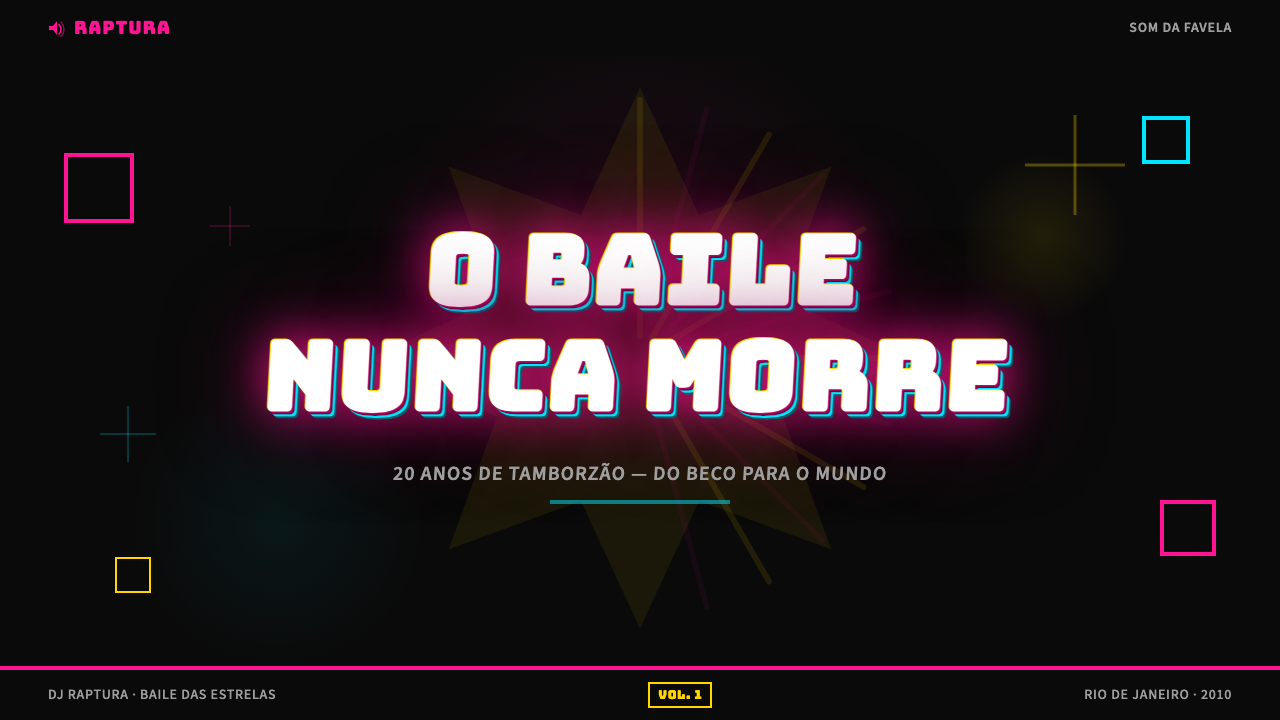
The palette is built on extreme contrast and maximum saturation. Neon magenta and electric cyan are the twin anchors, almost always deployed against a pitch-black ground so that they appear to emit their own light. Acid yellow appears frequently as a third presence, and hot orange, lime green, and electric violet fight for space in more densely layered compositions. Nothing is muted. Nothing is pastel. The guiding principle is not harmony but competition: every color vies for dominance, and the overall effect is one of chromatic overload that reads as energy rather than chaos when executed with confidence.色板建立在极度对比与最大饱和度之上。霓虹洋红与电光青是两大支柱,几乎总是铺设于纯黑底面,使它们看起来在自己发光。酸黄频繁作为第三势力出现,而艳橙、荧光绿和电紫则在更密集的层叠构图中争夺空间。没有任何柔和色调,没有任何粉蜡色。指导原则不是和谐而是竞争:每种颜色都在争夺主导权,整体效果在自信执行时呈现为能量而非混乱的色彩过载。
Typography字体排印
Text in the Funk Carioca Favela style is never understated. Titles are set in heavy, condensed, or ultra-bold letterforms and then treated with chrome beveling, metallic gradients, multiple outline layers, or hard-edged glow effects. The outline-within-outline technique — where a bright inner stroke is ringed by a dark outer stroke — creates a three-dimensional floating quality that makes type appear to hover above the background. All-caps is the default for headlines. Multiple type sizes coexist on a single surface without a formal grid, with scale used as the primary driver of attention rather than position or whitespace.放克卡里奥卡贫民窟风格中的文字从不低调。标题以粗重、窄体或超粗字形排版,再经过镀铬浮雕处理、金属渐变、多层描边或硬边发光效果的修饰。描边套描边的技法——明亮的内描边被深色外描边环绕——制造出三维漂浮感,使文字看起来悬浮在背景之上。全大写是标题的默认形态。多种字号在不依赖正式网格的单一画面上共存,以尺度作为吸引注意力的主要驱动力,而非位置或留白。
Texture and Surface质感与表面
Where the Bauhaus insists on flat surfaces, Funk Carioca Favela insists on maximum surface richness. Every element is treated: chrome effects simulate metallic reflections, lens flare overlays create a sense of live event photography, noise and grain textures evoke the feel of a scanned flyer, and glitter or sparkle brushes add points of light across the composition. The background itself is rarely flat black — it typically hosts a starburst, a radial gradient, a textured overlay, or all three simultaneously. This layering creates visual depth not through spatial composition but through the accumulation of effects.包豪斯坚持平面化表面,而放克卡里奥卡贫民窟风格则坚持最大化的表面丰富性。每个元素都经过处理:镀铬效果模拟金属反射,镜头光晕叠层创造现场活动摄影的即时感,噪点与颗粒质感唤起扫描传单的触感,闪光或星芒笔刷在构图中添加点状光源。背景本身很少是纯黑——它通常承载着星爆图案、径向渐变、质感叠层,或三者同时出现。这种分层通过效果的堆积而非空间构图来创造视觉深度。
Composition构图
The compositional logic, if there is one, is centrifugal: everything pushes outward from the center, and there is no designated empty space for the eye to rest. Cut-out photographs of performers — often taken with heavy flash and shot against informal backgrounds — are dropped into the composition with deliberately rough masking, leaving visible halos and edge artifacts that the style reclaims as authenticity markers. Elements overlap freely and without hierarchy. The result is a total surface where every zone carries information, and the cumulative density communicates the energy of the baile funk itself.构图逻辑如果说有的话,是离心式的:一切都从中心向外推进,没有指定的空白让眼睛休息。表演者的抠图人像——通常以强闪光灯拍摄,背景随意——以刻意粗糙的遮罩方式置入构图,留下可见的光晕和边缘瑕疵,而这种风格将其重新定义为真实性的标记。元素自由叠压,不存在层级秩序。结果是一个每个区域都承载信息的完整表面,其累积密度传达了巴伊利放克本身的能量。
Photography Treatment人像处理
Performer photography is central to the style, and its treatment is distinctive. Figures are isolated from their backgrounds with a selection approach that prioritizes speed over precision — soft, uneven edges are acceptable and common. The isolated figure is then typically enlarged to fill a significant portion of the frame, sometimes cropped at unexpected points. Color grading pushes skin tones toward warmth and amplifies specular highlights to create a glossy, hyper-real look. Drop shadows on the cut-out figure are hard, offset, and rendered in the background's complementary color or in pure black, reinforcing the sense that the figure has been physically placed on top of the composition.表演者人像是这种风格的核心,其处理方式独具特色。人物从背景中分离时,采用的是注重速度而非精度的选取方式——柔软、不均匀的边缘是可以接受的常见情况。分离后的人物通常被放大以占据画面的大部分,有时以出人意料的方式裁切。色彩调级将肤色推向暖调,并放大镜面高光以创造光泽的超写实感。抠图人物上的投影是硬边的、偏移的,以背景的互补色或纯黑色渲染,强化了人物被实物摆放在构图之上的感觉。
Energy and Density能量与密度
The single most defining quality of the style is its refusal to leave anything empty. Negative space is not a design tool but an opportunity missed. This density is not random accumulation — when the style is working at its best, the competition between elements creates a specific reading sequence: the face or figure first, the title second, the contextual information third. But this sequence emerges from visual weight and contrast rather than from compositional order. The energy the style projects is deliberate: it communicates that what is being advertised is loud, alive, and worth attention.这种风格最具决定性的品质是其拒绝留下任何空白。留白不是设计工具,而是被错过的机会。这种密度不是随机堆积——当这种风格发挥最佳时,元素之间的竞争创造了特定的阅读顺序:面孔或人物在先,标题其次,背景信息第三。但这种顺序来自视觉重量和对比,而非构图秩序。这种风格所投射的能量是经过计算的:它传达正在宣传的事物是响亮的、鲜活的、值得关注的。
Glow and Light Effects发光与光效
Light effects serve as the style's primary atmospheric device. Outer glow applied to type and graphic elements gives the entire composition the appearance of a stage lit by colored spotlights. Lens flares — circular bursts, streak flares, and polygonal bokeh overlays — suggest the experience of looking directly at a bright light source at a live event. Starburst shapes radiating from a central point create a sense of explosive revelation. These effects collectively simulate the experience of the baile funk sound system environment: a dark room, high-power speaker stacks, and light shows that seem physically overwhelming.光效是这种风格的主要氛围装置。应用于字体和图形元素的外部发光使整个构图呈现出被彩色聚光灯照亮的舞台外观。镜头光晕——圆形光爆、条状光晕和多边形焦外模糊叠层——暗示在现场活动中直视强光源的体验。从中心点向外辐射的星爆形状创造出爆炸性揭示的感觉。这些效果共同模拟了巴伊利放克音响系统环境的体验:黑暗的房间、高功率音箱堆叠,以及看起来令人身体震撼的灯光秀。
See the Funk Carioca Favela design system查看 Funk Carioca Favela 完整设计系统
Who shaped Funk Carioca Favela?谁塑造了 Funk Carioca Favela?
Kondzilla is the production company and creative persona of music video director Weatherly Konrad Silva, who became the central figure in professionalizing the visual language of baile funk. Operating from São Paulo but working deeply with the Rio favela music scene, Kondzilla's YouTube channel grew to become one of the most-watched music channels in the world, with a cumulative viewership in the billions. His production style — high production value applied to raw funk carioca content, with the aesthetic energy of DIY thumbnails translated into cinematic music videos — effectively canonized what had been an informal and rapidly evolving visual system. The Kondzilla aesthetic, distributed at massive scale across YouTube, served as the primary global reference point for designers, brands, and media researchers studying this visual style.Kondzilla是音乐视频导演韦瑟利·孔拉德·席尔瓦的制作公司和创意人格,他成为推动巴伊利放克视觉语言走向专业化的核心人物。Kondzilla的YouTube频道总部位于圣保罗,但深度参与里约贫民窟音乐场景,发展成为全球观看量最高的音乐频道之一,累计观看量达数十亿次。他的制作风格——将高制作价值应用于原始的放克卡里奥卡内容,同时将DIY缩略图的美学能量转化为电影级音乐视频——有效地将一套原本非正式且快速演进的视觉系统经典化。以巨大规模分发于YouTube的Kondzilla美学,成为设计师、品牌和媒体研究者研究这一视觉风格的主要全球参照。
Anitta, born Larissa de Macedo Machado in the Honório Gurgel neighborhood of Rio de Janeiro, began her career in pure funk carioca and engineered one of Latin music's most deliberate international crossovers. Her visual identity during the 2010s was a sustained negotiation between the raw aesthetic of baile funk and the conventions of international pop marketing, and she consistently managed to retain the essential energy and color grammar of the favela aesthetic even as her production budgets and global reach expanded dramatically. Anitta's career demonstrated that the visual language of Funk Carioca Favela was not a low-budget substitute for something more polished — it was a fully valid expressive system capable of competing at the highest levels of global entertainment.阿妮塔,本名拉里萨·德·马塞多·马沙多,出生于里约热内卢奥诺里奥·古尔格尔社区,职业生涯始于纯粹的放克卡里奥卡,并精心策划了拉丁音乐中最具目的性的国际跨界之一。她在2010年代的视觉形象是巴伊利放克原始美学与国际流行音乐营销惯例之间的持续谈判,即便制作预算和全球影响力大幅扩张,她始终保留了贫民窟美学的本质能量与色彩语法。阿妮塔的职业生涯证明,放克卡里奥卡贫民窟风格的视觉语言不是对更精致事物的低预算替代——它是一套完全成立的表达系统,能够在全球娱乐的最高层面竞争。
Ludmilla, born Ludmilla Oliveira Ferreira in the Duque de Caxias neighborhood near Rio, rose through the baile funk circuit with a visual presentation that leaned heavily into the maximalist graphic style of the scene. Her early career is a particularly clear record of the style in its unmediated form — promotional imagery made with genuine community production tools, operating entirely within the aesthetic logic of the favela YouTube economy. As her career developed and her audience expanded, her visual work shifted toward higher production values while maintaining the color intensity and typographic boldness that had defined her early presence. Ludmilla's trajectory illustrates how the style scales from grassroots self-production to professional studio output without fundamentally changing its character.鲁德米拉,本名鲁德米拉·奥利维拉·费雷拉,出生于里约近郊的杜克·德·卡希亚斯社区,通过巴伊利放克巡回演出崛起,其视觉呈现方式大量依赖这一场景的极繁主义图形风格。她的早期职业生涯是该风格未经中介的最清晰记录之一——用真实的社区制作工具制作的推广图像,完全在贫民窟YouTube经济的美学逻辑内运作。随着职业生涯发展和受众扩大,她的视觉作品转向了更高制作价值,同时保持了定义其早期形象的色彩强度和排版大胆感。鲁德米拉的轨迹说明了这种风格如何从草根自制生产扩展到专业工作室产出,而不从根本上改变其特征。
MC Carol, born Carolina Oliveira in Niterói, is one of the most politically engaged figures to have emerged from the funk carioca scene, and her visual presentation reflects a deliberate use of the style's maximalist grammar in service of confrontational political and social messaging. Her album art and promotional imagery deploy the full toolkit of the Funk Carioca Favela aesthetic — neon colors, chrome type, densely layered imagery — while incorporating content that addresses race, gender, and class in Brazil with directness rarely seen in mainstream Brazilian pop. MC Carol's work demonstrates the style's capacity to carry serious cultural weight without abandoning its visual intensity, and her international recognition helped establish funk carioca's place in global conversations about music, politics, and visual culture.MC卡罗尔,本名卡罗利纳·奥利维拉,出生于尼泰罗伊,是从放克卡里奥卡场景中涌现出的最具政治参与意识的人物之一,她的视觉呈现反映了对这种风格极繁主义语法的刻意运用,以服务于对抗性的政治和社会信息。她的专辑封面和推广图像部署了放克卡里奥卡贫民窟美学的完整工具集——霓虹色彩、镀铬文字、密集层叠的图像——同时纳入直接回应巴西种族、性别和阶级问题的内容,其直白程度在巴西主流流行音乐中极为罕见。MC卡罗尔的工作证明了这种风格在不放弃视觉强度的情况下承载严肃文化重量的能力,而她的国际认可帮助确立了放克卡里奥卡在有关音乐、政治和视觉文化的全球对话中的地位。
How do you use Funk Carioca Favela today?今天怎么用 Funk Carioca Favela?
Applying Funk Carioca Favela to designed work requires understanding what gives the style its energy: not randomness, but controlled overload. Every element is pushed to its maximum expression, but there is a hierarchy underneath the density — performer first, title second, event or release information third. Before adding any effects, establish this reading order. The effects exist to amplify the hierarchy, not to obscure it. An application that piles on chrome, glow, and texture without a clear focal point will read as muddy rather than loud.将放克卡里奥卡贫民窟风格应用于设计作品,需要理解是什么赋予这种风格能量:不是随机性,而是受控的过载。每个元素都被推向其最大表达,但密度之下存在层级——表演者在先,标题其次,活动或发布信息第三。在添加任何效果之前,先建立这种阅读顺序。效果的存在是为了放大层级,而非遮蔽它。在没有清晰焦点的情况下堆叠镀铬、发光和质感的应用会显得混浊而非响亮。
For presentation decks, the style works best for cover slides and bold section dividers where the goal is impact rather than information delivery. A cover in this style should commit fully: pitch black ground, a performer or product image treated with the style's characteristic cut-out and glow treatment, a title set in heavily beveled or outlined type, and a color burst or starburst radiating behind the central subject. Content slides within the same deck should dial back the effects significantly — full-density Funk Carioca Favela on every slide creates visual fatigue. Use the style for entrances and high-impact moments; use a simplified derived palette (the neon colors on black, without the layered effects) for data and body-copy slides.对于演示文稿,这种风格最适合封面幻灯片和大胆的章节分割页,目标是冲击力而非信息传达。这种风格的封面应当全力投入:纯黑底面,一张经过该风格特有的抠图和发光处理的表演者或产品图像,以大量浮雕或描边字体排版的标题,以及从中心主体向后辐射的色彩爆发或星爆图案。同一套演示文稿中的内容幻灯片应当显著降低效果强度——每张幻灯片都使用全密度放克卡里奥卡贫民窟风格会造成视觉疲劳。将这种风格用于入场和高冲击力时刻;在数据和正文幻灯片上使用简化的衍生色板(黑底上的霓虹色彩,不加层叠效果)。
For web interfaces and dashboards, direct application of the full Funk Carioca Favela density is rarely appropriate for data-heavy contexts, but the style's color logic and typographic boldness translate well to entertainment platforms, event pages, music streaming interfaces, and any product targeting audiences familiar with the aesthetic. Use the high-saturation neon palette against dark backgrounds for navigation elements and calls to action. Apply the style's characteristic heavy outlined type for section headers and featured labels. Reserve the full glowing, layered treatment for hero sections, featured artist cards, and promotional banners. Pricing pages and feature tables should use a restrained version — neon accent colors on near-black grounds, with clean typographic hierarchy — to maintain readability while preserving the aesthetic register.对于网页界面和仪表板,在数据密集型场景中直接应用完整的放克卡里奥卡贫民窟密度通常并不适宜,但这种风格的色彩逻辑和排版大胆感在娱乐平台、活动页面、音乐流媒体界面以及任何面向熟悉这一美学的受众的产品上转化良好。将高饱和霓虹色板应用于深色背景的导航元素和行动号召。将该风格特有的粗重描边字体用于章节标题和特色标签。将完整的发光、层叠处理保留给英雄区域、特色艺术家卡片和推广横幅。定价页面和功能表格应使用克制版本——近黑底面上的霓虹强调色,配以清晰的字体层级——以在保持美学气质的同时维持可读性。
For editorial and marketing applications, the style is particularly powerful for event promotion, music-related editorial content, cultural journalism about Latin American urban culture, and any campaign that needs to communicate aliveness and immediacy. Concert and event posters in this style should be treated as pure maximalism: no hierarchy element is too bold, no color is too saturated. For print-format editorial, a more selective application works better — use the style's color palette and typographic treatment for display elements (headlines, pull quotes, section openers) while keeping body text in a clean, high-contrast setting that allows the reader's eye to rest between the high-energy moments.对于编辑和营销应用,这种风格在活动推广、与音乐相关的编辑内容、拉丁美洲城市文化的文化新闻报道,以及任何需要传达生命力和即时性的活动中尤为有力。这种风格的演唱会和活动海报应当被当作纯粹的极繁主义处理:没有任何层级元素太粗犷,没有任何颜色太饱和。对于印刷格式的编辑,更具选择性的应用效果更好——将这种风格的色板和排版处理用于展示元素(标题、引用语、章节开篇),同时将正文保持在干净、高对比度的设置中,让读者的眼睛在高能量时刻之间得以休息。
A common mistake when applying this style outside its native context is treating the roughness as optional or as something to be smoothed away. The visible cut-out edges, the lens flares that nobody removed, the slightly imperfect masking — these are not production errors that better tools would have eliminated. They are authenticity markers that signal genuine origin in a grassroots production context. Sanitizing them too aggressively produces something that has the color palette of Funk Carioca Favela but not its energy. A related mistake is using the style's neon colors in isolation — cyan and magenta against a white or grey ground — without the black background that gives them their appearance of self-illumination. On white, these colors look loud; on black, they look electric. The difference is decisive.在其原生语境之外应用这种风格时,一个常见错误是将粗糙感视为可选项,或将其视为需要被磨平的东西。可见的抠图边缘、没人去掉的镜头光晕、略显不完美的遮罩——这些不是更好的工具本应消除的生产失误,而是真实性的标记,信号着在草根制作语境中的真实起源。过度净化它们会产生一种具有放克卡里奥卡贫民窟风格色板但不具备其能量的东西。另一个相关错误是单独使用这种风格的霓虹色彩——将青色和洋红放在白色或灰色底面上——而不搭配赋予它们自发光外观的黑色背景。在白色底面上,这些颜色看起来响亮;在黑色底面上,它们看起来充满电力。这个差别至关重要。
See the Funk Carioca Favela design system查看 Funk Carioca Favela 完整设计系统
Funk Carioca Favela — FAQFunk Carioca Favela · 常见问题
Is this style appropriate for premium or luxury brands?这种风格适合高端或奢侈品牌吗?
Rarely in its full form, and only when the brand is explicitly engaging with the culture the style represents rather than appropriating its surface. Funk Carioca Favela is, at its core, an aesthetic of abundance produced under material constraint — its maximalism is a form of aspiration and pride, not excess for its own sake. A luxury brand adopting the style without cultural grounding risks misrepresentation. However, individual elements of the aesthetic — the neon-on-black color logic, the typographic boldness, the high-energy density — have been selectively adopted by fashion brands, streetwear labels, and cultural institutions engaging with Latin American urban identity. The distinction between cultural engagement and superficial borrowing lies in whether the application acknowledges the style's specific origin and community.在其完整形式下极少适合,且只有在品牌明确参与而非挪用该风格所代表的文化时才成立。放克卡里奥卡贫民窟风格从本质上说是一种在物质约束下生产的丰盛美学——它的极繁主义是一种抱负和骄傲的形式,而非单纯为了过度。一个在缺乏文化根基的情况下采用这种风格的奢侈品牌面临歪曲呈现的风险。然而,这一美学的个别元素——黑底霓虹的色彩逻辑、排版的大胆感、高能量密度——已被时尚品牌、街头服饰品牌和参与拉丁美洲城市身份的文化机构选择性采纳。文化参与与表面借用之间的区别在于应用是否承认这种风格的特定起源和社区。
How does Funk Carioca Favela differ from Memphis design or 1990s rave aesthetics?放克卡里奥卡贫民窟风格与孟菲斯设计或1990年代锐舞美学有何不同?
All three share a rejection of restrained modernism and a commitment to maximum visual energy, but their origins, rules, and cultural meanings are distinct. Memphis design (Milan, 1980s) was a studio-produced, deliberately theoretical movement that treated maximalism as an intellectual proposition — its geometry and color were systematic responses to functionalist orthodoxy. Nineties rave aesthetics were produced by a subculture organized around a specific pharmacological and sonic experience, and their visual character reflects the particular visual phenomena associated with that experience — fractals, strobe effects, and extreme optical vibration. Funk Carioca Favela is neither theoretical nor pharmacologically coded; it is community commercial production, born from the need to sell music in a competitive thumbnail economy. Its maximalism is marketing, not manifesto.三者都拒绝克制的现代主义并追求最大视觉能量,但其起源、规则和文化含义各不相同。孟菲斯设计(1980年代米兰)是工作室出品的、刻意理论化的运动,将极繁主义视为一种智识命题——其几何形态和色彩是对功能主义正统的系统性回应。1990年代锐舞美学由一个围绕特定药理和声音体验组织的亚文化所产生,其视觉特征反映了与该体验相关的特定视觉现象——分形、频闪效果和极端视觉振荡。放克卡里奥卡贫民窟风格既非理论化的,也非药理学编码的;它是社区商业生产,诞生于在竞争性缩略图经济中销售音乐的需要。它的极繁主义是营销,而非宣言。
Can the style work in a light-background context?这种风格能在浅色背景下使用吗?
Technically possible, but it requires accepting a fundamental shift in the style's character. The black ground is not a neutral choice in Funk Carioca Favela — it is the mechanism that gives the neon colors their apparent luminosity and the composition its sense of a stage lit from within. On a white or cream ground, the same neon magenta and electric cyan read as loud print colors rather than as light sources, and the glow effects that depend on the black-to-neon contrast largely dissolve. What remains is a brightly colored, densely composed graphic style — still energetic, but without the characteristic sense of self-illumination that is the style's most distinctive atmospheric quality. If a light background is required, the recommendation is to use a single strongly colored accent from the palette rather than the full neon range, and to reduce layered effects significantly.技术上可行,但需要接受风格特征的根本性转变。黑色底面在放克卡里奥卡贫民窟风格中不是中性选择——它是赋予霓虹色彩表观发光性和构图从内部被照亮感的机制。在白色或奶油色底面上,同样的霓虹洋红和电光青读起来像是响亮的印刷色彩而非光源,依赖黑色到霓虹色对比的发光效果也基本消融。剩下的是一种色彩明亮、构图密集的图形风格——仍然充满能量,但没有了这种风格最具特色的大气品质:自发光感。如果必须使用浅色背景,建议从色板中选择单一强调色而非完整的霓虹色系,并显著减少层叠效果。
How should this style be approached when used for data visualization?将这种风格用于数据可视化时应如何处理?
The style's core color logic — high-saturation neons against black — translates surprisingly well to data visualization contexts, provided that the decorative layering is stripped away. Data charts in a Funk Carioca Favela-derived palette should use the neon colors functionally: each series or category assigned a single neon color, the background held at near-black, and grid lines either eliminated or reduced to very low-contrast marks. The result reads as a high-tech dark-mode data display rather than as baile funk promotional material, and the color separation between series is excellent. What must not carry over are the chrome effects, the layered textures, and the decorative typography — these are incompatible with readable data. The typographic boldness of the style can be applied to chart titles and axis labels at reduced intensity without compromising readability.这种风格的核心色彩逻辑——高饱和霓虹色彩搭配黑色背景——在数据可视化场景中的转化效果出人意料地好,前提是剥离装饰性分层。源自放克卡里奥卡贫民窟风格色板的数据图表应以功能性方式使用霓虹色彩:每个系列或类别分配单一霓虹颜色,背景保持接近黑色,网格线要么消除要么减至极低对比度的标记。结果呈现为高科技深色模式数据显示,而非巴伊利放克推广材料,系列之间的色彩分离效果出色。不应移植的是镀铬效果、层叠质感和装饰性排版——这些与可读数据不兼容。这种风格的排版大胆感可以以降低强度的方式应用于图表标题和坐标轴标签,而不会影响可读性。
What separates an authentic application of this style from a shallow imitation?对这种风格的真实应用与浅层模仿之间,区别在哪里?
The deepest distinction is whether the application understands what the style is communicating, not just what it looks like. Funk Carioca Favela is the visual language of community pride, musical energy, and commercial necessity under specific material conditions. Authentic application — even when executed at a higher production level — preserves the hierarchy logic (performer or product as undisputed focal point), the sense of overflowing abundance rather than controlled excess, and the quality of self-generation that comes from building everything to its maximum rather than restraining elements for aesthetic balance. Shallow imitation typically does the opposite: it applies neon colors and chrome effects to a layout that is fundamentally organized around negative space and conventional hierarchy, producing something that reads as a corporate interpretation of the style rather than an expression of it. The tell is always the background: if it still has breathing room, the style is not yet present.最深层的区别在于应用是否理解这种风格在传达什么,而不仅仅是它看起来像什么。放克卡里奥卡贫民窟风格是特定物质条件下社区骄傲、音乐能量和商业必要性的视觉语言。真实的应用——即便以更高制作水准执行——保留了层级逻辑(表演者或产品作为无可争议的焦点)、溢出式丰盛感而非受控过度感,以及通过将一切推向最大而非为了美学平衡而克制元素所产生的自生成品质。浅层模仿通常做的是相反的事情:将霓虹色彩和镀铬效果应用于一个从根本上围绕留白和传统层级组织的版面,产出的东西读起来像是对这种风格的企业诠释,而非其表达。判断标准永远是背景:如果背景仍有喘息空间,这种风格就还不在场。
Related design styles相关设计风格
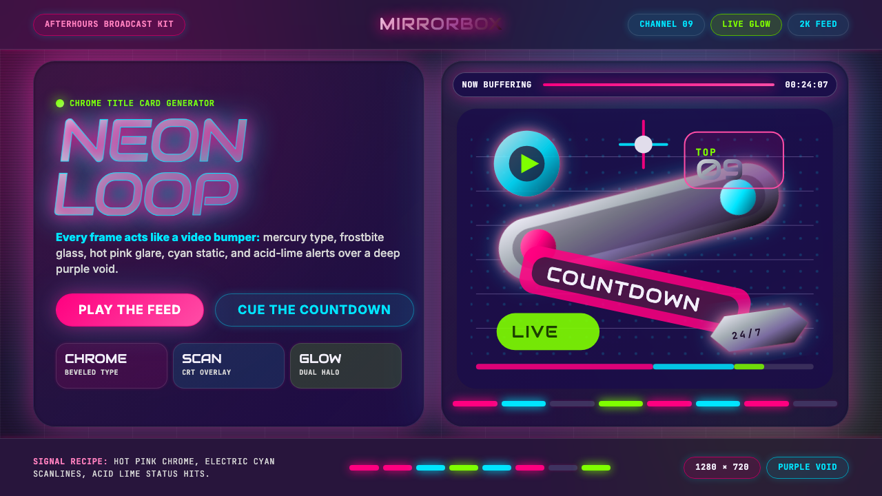 MTV Y2K (2000s)Maximum-volume Y2K. Hot pink chrome, cyan scanlines, and lime hits burn over…高音量千禧感:粉铬、青色扫描线与酸橙光烧过紫色虚空。
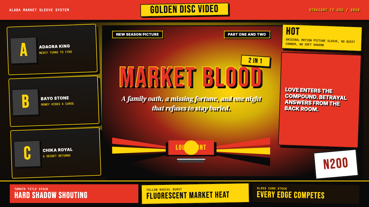 Nigerian Nollywood DVD Poster (2010)Market-stall cinema shouts. Tomato red type and yellow burst collide on jet b…市场摊位式电影在喊:番茄红大字与黄色爆裂撞上黑底。
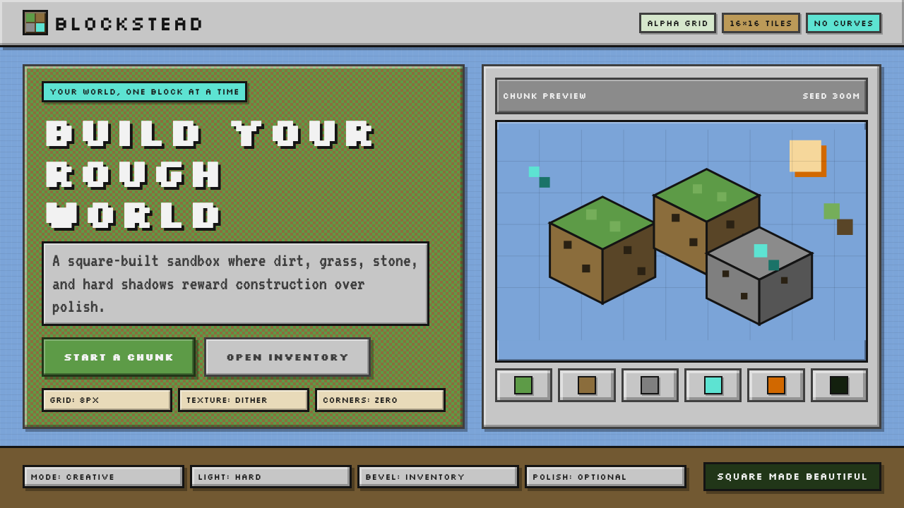 Minecraft VoxelUgly becomes buildable. Grass green, dirt brown, hard bevels, and 16×16 grids…丑也能亲手搭:草绿泥棕、硬边物品栏与16×16栅格。
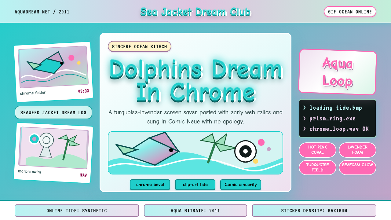 Seapunk 2011Sincere ocean kitsch. Turquoise gradients, Comic Neue chrome, and clip-art do…真诚的海洋俗艳:青绿渐变、Comic Neue 铬字与海豚剪贴画相撞。
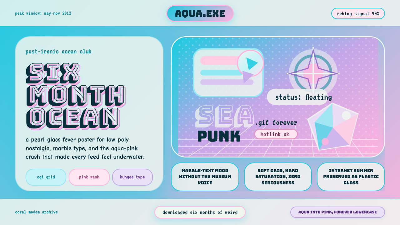 Seapunk Tumblr (2012)Burns bright then crashes. Aqua-pink wash, Bungee type, glassy CGI-grid colla…短暂燃烧后坠落。水蓝粉渐变、Bungee字与玻璃CGI网格拼贴。
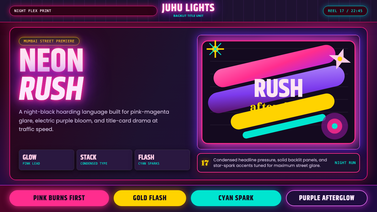 Bollywood Neon MumbaiMumbai pop burns bright. Khand stacks glow over night-black, with pink-purple…孟买流行灼亮:Khand 堆叠夜黑底,粉紫霓虹与星芒爆闪。