What is MTV Y2K (2000s)?什么是 MTV Y2K (2000s)?
MTV's millennium-era identity turned every screen into a music video title card — chrome gradients, neon scanlines, and lens-flare halos burning over deep purple voids at maximum volume.MTV千禧时代的视觉语言把每一块屏幕变成音乐录影带片头——铬渐变、霓虹扫描线与镜头光晕在深紫虚空上以最大音量燃烧。
MTV Y2K (2000s) in briefMTV Y2K (2000s) 速览
MTV Y2K is the broadcast design aesthetic that defined the network's visual identity from the late 1990s through roughly the mid-2000s — a period anchored by shows like Total Request Live, Cribs, and Pimp My Ride. It represents Y2K visual culture at its most amplified: chrome-metallic type treatments, scanline-and-glitch overlays, and hot pink, cyan, and acid lime screaming against deep purple or near-black voids. Every surface gleams, every edge glows, and every transition flickers as if the signal is about to overload.MTV Y2K是该频道从1990年代末到2000年代中期定义其视觉识别的广播设计美学——这一时期以《Total Request Live》《Cribs》《Pimp My Ride》等节目为核心锚点。它代表Y2K视觉文化的极致放大:铬金属字体处理、扫描线与故障叠加,以及热粉、电光青与酸橙色在深紫或近黑虚空上的尖叫。每个表面闪耀,每条边缘发光,每次过渡都如同信号即将过载般闪烁。
The style is best understood as an intentional sensory assault. Unlike design movements that pursued restraint or clarity, MTV Y2K embraced excess as a statement — more chrome, more neon, more lens flare, more motion blur. The underlying message was that the millennium itself was spectacular, and the screen should reflect that spectacle at all times. It fused early glassmorphism (frosted, translucent surfaces suggesting depth), mercury-glass gradients (reflective metallic transitions that seem to contain light), and lens-flare halos (starburst rings of color radiating from bright focal points) into a deliberately overstimulating whole.这种风格最好被理解为一种刻意的感官冲击。与追求克制或清晰的设计运动不同,MTV Y2K将过剩奉为宣言——更多铬光,更多霓虹,更多镜头光晕,更多运动模糊。其底层信息是:千禧年本身就是壮观的,屏幕应该时刻反映这种壮观。它将早期玻璃拟态(暗示深度的磨砂半透明表面)、水银玻璃渐变(似乎内含光线的反射金属过渡)与镜头光晕(从明亮焦点向外辐射的彩色星爆光环)融合成一个刻意过度刺激的整体。
Visually, the style sits at the intersection of broadcast graphics, early CGI experimentation, and music video aesthetics. It borrowed the kinetic energy of hip-hop and pop video production, the technological optimism of early digital consumer culture, and the futurist chrome fantasies that science fiction had been building since the 1980s. The result was a design language that felt simultaneously cutting-edge and celebratory — a visual declaration that digital culture had arrived and that it was loud.在视觉上,这种风格处于广播图形、早期CGI实验与音乐录影带美学的交汇处。它借鉴了嘻哈和流行音乐录影制作的动态能量、早期数字消费文化的技术乐观主义,以及科幻小说自1980年代以来构建的未来主义铬色幻想。结果是一套设计语言,同时让人感受到尖端与庆典——一个视觉宣言,宣告数字文化已经到来,而且它是嘈杂的。
See the MTV Y2K (2000s) design system查看 MTV Y2K (2000s) 完整设计系统
Where does MTV Y2K (2000s) come from?MTV Y2K (2000s) 从何而来?
MTV launched in 1981 with the explicit mission of making music visual — a 24-hour television channel devoted entirely to music videos, VJ personalities, and the theatrical presentation of pop culture. By the mid-1990s, MTV had become the dominant youth media brand in the United States and was expanding globally through regional networks. Its graphic identity in those early and middle years was bold but relatively contained: primary-color logotypes, energetic motion graphics, and the network's famous shape-shifting logo bugs. The transition into Y2K aesthetics was gradual, beginning around 1997 and accelerating sharply as 1999 approached.MTV于1981年创立,其明确使命是将音乐视觉化——一个24小时完全献给音乐录影带、VJ主持人与流行文化戏剧性呈现的电视频道。到1990年代中期,MTV已成为美国主导的青年媒体品牌,并通过区域网络向全球扩张。那些早期与中期年间,其平面识别大胆而相对克制:原色标志字体、富有活力的动态图形,以及网络著名的形态变换台标。向Y2K美学的过渡是渐进的,约从1997年开始,随着1999年的临近而急剧加速。
The historical context is essential. The late 1990s were saturated with millennium anxiety and millennium optimism in nearly equal measure. Consumer technology was changing rapidly — the first generation of truly affordable home computers, the early public web, nascent digital cameras, and DVD players all arrived in the same compressed window. Design software was becoming powerful enough for individual artists and small studios to produce broadcast-quality motion graphics without industrial facilities. This democratization of digital production tools created a moment when chrome gradients, lens flares, and CGI reflections were simultaneously new, impressive, and achievable — and therefore everywhere.历史背景至关重要。1990年代末,千禧焦虑与千禧乐观以几乎相等的比例充斥着整个时代。消费技术正在快速变革——第一代真正平价的家用电脑、早期公共互联网、新兴数码相机与DVD播放器,全部在同一个压缩时间窗口内到来。设计软件变得足够强大,个人艺术家和小型工作室无需工业设施便可制作广播级动态图形。这种数字生产工具的民主化创造了一个时刻:铬渐变、镜头光晕与CGI反射同时是新鲜的、令人印象深刻的、可实现的——因此无处不在。
MTV's design teams, operating from the network's Times Square headquarters in New York City, were well positioned to absorb and amplify these trends. The network had always operated by treating its graphics as a form of programming in their own right — the bumpers, idents, and show open sequences were designed to be as visually arresting as the content they surrounded. Under executives including Tom Freston, who served as CEO during much of the relevant period, MTV maintained a culture of graphic experimentation. The on-air look became progressively more chrome-heavy, more neon-saturated, and more glitch-inflected through the TRL era (Total Request Live debuted in 1998 and ran until 2008), which placed the visual language of Y2K aesthetics at the center of daily American youth media consumption.MTV的设计团队在纽约时代广场总部运营,处于吸收和放大这些趋势的有利位置。该网络历来将其图形视为一种自成一体的节目形式——频道过渡、台标识别与节目开场序列都被设计成与所包围内容同样具有视觉冲击力。在汤姆·弗雷斯顿等高管(他在相关时期的大部分时间担任CEO)的领导下,MTV维持着图形实验的文化。《Total Request Live》时代(TRL于1998年首播,持续至2008年)的播出视觉效果变得越来越多铬光、越来越多霓虹饱和、越来越多故障感,将Y2K美学的视觉语言置于美国青年日常媒体消费的中心。
Key creative figures shaped the era. Carson Daly, as the face of TRL, embodied the style's cultural position — a bridge between celebrity excess and teenage aspiration framed in visual language that referenced luxury, technology, and spectacle simultaneously. Photographer and director David LaChapelle contributed a saturated, hyper-real visual sensibility to the network's editorial and video aesthetic that aligned perfectly with Y2K's rejection of naturalism. Eric Nyari, who worked in MTV's design and branding operations, was among those who translated these cultural energies into consistent on-air graphic systems. The broader context also includes the simultaneous rise of hip-hop as the dominant popular music genre, which brought its own visual vocabulary — iced-out jewelry, chrome rims, palatial interiors — into television design through shows like Cribs.几位关键创意人物塑造了这个时代。卡森·达利作为TRL的形象代言人,体现了这种风格的文化位置——一座桥梁,将名人的过剩与青少年的渴望用同时指涉奢华、科技与奇观的视觉语言框架起来。摄影师兼导演大卫·拉沙贝尔为该网络的编辑与录影带美学贡献了一种饱和、超现实的视觉感性,与Y2K对自然主义的拒绝完美契合。在MTV设计与品牌部门工作的埃里克·尼亚里是将这些文化能量转化为一致播出图形系统的人员之一。更广泛的背景还包括嘻哈音乐作为主导流行音乐类型的同步崛起,它通过《Cribs》等节目将自身视觉词汇——镶钻珠宝、铬轮毂、宫殿式室内——带入了电视设计之中。
What defines the MTV Y2K (2000s) look?MTV Y2K (2000s) 的视觉特征是什么?
Chrome-Metallic Surfaces铬金属表面
The defining material of MTV Y2K is chrome — not as a solid color but as a gradient effect that simulates highly reflective metallic surfaces. Type treatments, logo elements, and decorative shapes all receive this mercury-glass treatment: light appears to exist within the element itself, shifting from brilliant white at the highlight through steel gray to near-black at the shadow edge. The effect communicates luxury, technology, and futurism simultaneously, drawing on associations with car culture chrome and science-fiction spacecraft. Chrome surfaces are rarely flat; they catch implied light sources and reflect implied environments, giving even static elements a sense of movement.MTV Y2K的决定性材质是铬——不是作为纯色,而是作为模拟高反射金属表面的渐变效果。字体处理、标志元素与装饰形状都获得这种水银玻璃处理:光线似乎存在于元素内部,从高光处的灿烂白,经由钢灰,延伸至阴影边缘的近黑。这种效果同时传递奢华、科技与未来主义,借助汽车文化铬光与科幻飞船的联想。铬表面几乎从不平整;它们捕捉暗示的光源并反射暗示的环境,赋予即使是静态元素一种运动感。
Neon Color Palette霓虹色板
The dominant hues are hot pink, electric cyan, and acid lime — all pushed to luminosity levels that suggest they are being generated by light rather than pigment. These colors appear against deep purple, near-black, or void backgrounds that allow them to vibrate at maximum intensity. The palette is explicitly theatrical: these are not colors found in nature but colors found in signs, screens, and the imagined future. Purple backgrounds serve a specific function — they are warm enough to feel dramatic rather than cold, and they allow both the warm neon pinks and the cool neon cyans to read with equal intensity without either dominating.主导色调是热粉、电光青与酸橙——全部被推至暗示它们由光而非颜料生成的亮度水平。这些颜色出现在深紫、近黑或虚空背景上,使它们能以最大强度振动。这种色板明确具有戏剧性:这些不是自然界中存在的颜色,而是在标识、屏幕与想象的未来中存在的颜色。紫色背景具有特定功能——它足够温暖,让人感受到戏剧性而非寒冷,同时允许温暖的霓虹粉和冷调的霓虹青以同等强度呈现,不让任何一方主导。
Scanlines and Glitch Overlays扫描线与故障叠加
Horizontal scanlines — fine parallel lines running across the entire composition — reference the CRT television technology through which MTV's audience originally consumed its content. Rather than hiding this technological mediation, the style celebrates it as texture and identity. Glitch overlays add a second layer of technological self-reference: fragmented blocks, signal interference patterns, and momentary digital artifacts that suggest the broadcast is at the edge of its technical limits. Together, scanlines and glitches function as the style's version of grain in film photography — a texture that simultaneously marks the medium and adds visual richness.水平扫描线——贯穿整个构图的细平行线——参照了MTV受众最初消费其内容的CRT电视技术。这种风格不是隐藏这种技术中介,而是将其作为质感与识别特征来庆祝。故障叠加增加了第二层技术自我指涉:碎片化的色块、信号干扰模式与瞬间数字伪影,暗示广播正处于其技术极限的边缘。扫描线与故障共同发挥着这种风格中胶片摄影颗粒感的作用——一种同时标记媒介并增添视觉丰富性的质感。
Lens-Flare Halos and Light Bleeds镜头光晕与光溢
Lens flares — the starburst rings, streaks, and polygon-shaped artifacts produced when a bright light source enters a camera lens — are used not as photographic accidents but as deliberate compositional elements. A focal point in the composition will frequently be surrounded by concentric rings of color, radiating spokes of light, or a general bloom that bleeds the boundary between object and background. Light bleeds extend this logic: entire sections of the composition glow outward, dissolving edges into luminous halos. The effect reinforces the sense that the visual content is itself a source of energy — that looking at it means being exposed to light.镜头光晕——当明亮光源进入相机镜头时产生的星爆光环、光条与多边形伪影——不是作为摄影意外使用,而是作为刻意的构图元素。构图中的焦点常常被同心彩色光环、向外辐射的光芒或将对象与背景边界溶解的泛光所包围。光溢将这一逻辑延伸:整段构图向外发光,将边缘消融成发光光晕。这种效果强化了一种感觉:视觉内容本身是一个能量来源——凝视它意味着暴露于光线之中。
Frosted and Translucent Layering磨砂与半透明分层
MTV Y2K anticipates what would later be formally named glassmorphism: surfaces that appear frosted or partially transparent, allowing the color and content behind them to bleed through in a diffused, softened form. These translucent panels create depth without relying on hard shadows — instead of a solid card sitting on a background, a frosted card merges with it, suggesting a physical object made of treated glass or polished acrylic. The layering is typically extreme: four, five, or six translucent elements stacked and overlapping create compositions of considerable depth despite the two-dimensional surface.MTV Y2K预示了后来被正式命名为玻璃拟态的风格:看起来磨砂或部分透明的表面,允许其后的色彩与内容以扩散、柔化的形式渗透穿透。这些半透明面板在不依赖硬边阴影的情况下创造深度——磨砂卡片不是作为实心卡片置于背景上,而是与背景融合,暗示一个由处理玻璃或抛光亚克力制成的实体对象。分层通常是极端的:四、五或六个半透明元素叠加重叠,在二维表面上创造出相当深度的构图。
Kinetic and Overloaded Typography动态与过载排版
Type in the MTV Y2K style is never quiet. Letterforms receive the same chrome-gradient treatment as other design elements, frequently with added glow effects that cause them to appear lit from within. Scale is used dramatically: headlines may be enormous and slightly condensed, pushed to the absolute edge of the composition, while secondary text is much smaller and sometimes set in tight monospaced or technical-looking faces that evoke digital readouts. Multiple type weights, angles, and treatments often coexist on the same composition — the typographic chaos is part of the style's energy rather than an oversight.MTV Y2K风格中的字体从不安静。字形获得与其他设计元素相同的铬渐变处理,常常附加使其看起来从内部发光的光效。尺度被戏剧性地运用:标题可能巨大且略微压缩,被推至构图的绝对边缘,而次要文字则小得多,有时以紧密的等宽或技术感字体排列,唤起数字读出器的联想。多种字重、角度与处理方式常常共存于同一构图——排版混乱是风格能量的一部分,而非疏漏。
Deep-Space Void Backgrounds深空虚空背景
Backgrounds are rarely neutral. The typical MTV Y2K background reads as a deep, radiating void — dark purple or near-black at the edges, blooming toward a lighter, slightly blue or magenta center, as if the composition is being viewed through the entrance to a tunnel of light. This vignette effect gives the composition a sense of infinite recession while simultaneously framing all foreground elements as if they are emerging from darkness toward the viewer. The background is not empty space but rather atmospheric space — full of depth, color, and implied dimensionality.背景几乎从不中性。典型的MTV Y2K背景呈现为一个深沉、向外辐射的虚空——边缘处深紫或近黑,向略带蓝色或品红的更亮中心绽放,如同透过一个光之隧道入口观看构图。这种暗角效果在赋予构图无限后退感的同时,将所有前景元素框架为从黑暗中向观者涌现。背景不是空的空间,而是大气性空间——充满深度、色彩与暗示的立体感。
See the MTV Y2K (2000s) design system查看 MTV Y2K (2000s) 完整设计系统
Who shaped MTV Y2K (2000s)?谁塑造了 MTV Y2K (2000s)?
Freston co-founded MTV and served as its chief executive through much of the Y2K era, providing the institutional leadership and creative latitude that allowed the network's design culture to develop its signature excess. Under his stewardship, MTV expanded globally while maintaining a consistent on-air aesthetic identity rooted in spectacle and experimentation. His belief in treating MTV as a creative brand rather than a conventional broadcaster created the conditions under which the Y2K visual language could flourish as a genuine design movement rather than simply a network house style.弗雷斯顿是MTV的联合创始人,在Y2K时代的大部分时间担任首席执行官,提供了允许网络设计文化发展其标志性过剩风格的机构领导力与创意空间。在他的领导下,MTV在全球扩张的同时,维持着根植于奇观与实验的一致播出美学身份。他将MTV视为创意品牌而非传统广播商的理念,创造了Y2K视觉语言作为真正设计运动而非仅仅是网络内部风格得以繁荣的条件。
As the host of Total Request Live from its 1998 debut through 2003, Carson Daly was the human face at the center of the Y2K aesthetic's daily broadcast expression. TRL was the program through which the visual language of MTV Y2K became most visible to its audience — the chrome graphics, neon countdown sequences, and glitch overlays of the show's packaging surrounded Daly on screen five days a week. His persona — friendly, aspirational, simultaneously celebrity-adjacent and audience-approachable — embodied the style's central tension between spectacle and accessibility.作为《Total Request Live》从1998年首播到2003年的主持人,卡森·达利是Y2K美学日常广播表达中心的人类面孔。TRL是MTV Y2K视觉语言对受众最为可见的节目——节目包装中的铬图形、霓虹倒计时序列与故障叠加每周五天将达利包围在屏幕上。他的形象——友好、充满渴望感、同时与名人相邻又对受众平易近人——体现了这种风格在奇观与亲近性之间的核心张力。
LaChapelle is a photographer and music video director whose hyper-saturated, maximalist visual style was among the most influential in shaping the broader Y2K aesthetic. His images — populated by celebrities, extreme color, surreal props, and an almost overwhelming density of visual information — provided the editorial and video template that MTV's design language echoed and systematized. His work for artists including Britney Spears, Christina Aguilera, and Elton John during this period constitutes a primary visual record of Y2K excess, and his sensibility of deliberate over-stimulation is inseparable from the network's graphic identity of the same era.拉沙贝尔是一位摄影师兼音乐录影带导演,其高度饱和、极致主义的视觉风格是塑造更广泛Y2K美学的最具影响力的风格之一。他的图像——充斥着名人、极端色彩、超现实道具与几乎令人窒息的视觉信息密度——为MTV的设计语言所呼应与系统化提供了编辑与录影带模板。他在这一时期为布兰妮·斯皮尔斯、克里斯蒂娜·阿奎莱拉与艾尔顿·约翰等艺人创作的作品,构成了Y2K过剩的主要视觉记录,他刻意过度刺激的感性与同时代网络的图形身份密不可分。
Nyari worked within MTV's design and branding operations during the network's Y2K peak, contributing to the translation of the era's cultural energies into systematic on-air graphic languages. Figures like Nyari represent the often-uncredited design practitioners who took the broader aesthetic currents of Y2K culture — its chrome, its neon, its digital futurism — and built them into repeatable, broadcast-ready design systems that could be applied consistently across the network's programming slate and promotional materials.尼亚里在网络Y2K巅峰时期参与了MTV的设计与品牌运营,为将那个时代的文化能量转化为系统性播出图形语言作出贡献。像尼亚里这样的人物代表了那些常常不被署名的设计从业者——他们将Y2K文化更广泛的美学潮流(其铬光、其霓虹、其数字未来主义)构建为可重复、可播出的设计系统,能够在网络的节目单与宣传材料中得到一致应用。
Hype Williams is a music video director whose work in the late 1990s and early 2000s was foundational to the visual grammar that MTV's graphic designers absorbed and broadcast. His signature techniques — extreme wide-angle lens distortion that stretches the edges of the frame, hypersaturated color grading, and the use of reflective surfaces, luxury objects, and deep cinematic contrast — defined the music video aesthetic that TRL and other MTV programming brought into living rooms daily. His videos for artists including Missy Elliott, Jay-Z, and Busta Rhymes are among the most direct expressions of Y2K visual culture in motion.海普·威廉姆斯是一位音乐录影带导演,他在1990年代末和2000年代初的作品对MTV图形设计师所吸收和广播的视觉语法具有奠基性意义。他的标志性技法——极端广角镜头畸变使画面边缘延伸、高度饱和的色彩分级,以及反光表面、奢华物品与深沉电影对比度的运用——定义了TRL及其他MTV节目每天带入客厅的音乐录影带美学。他为米西·艾略特、Jay-Z和巴斯塔·莱姆斯等艺人执导的录影带,是动态Y2K视觉文化最直接的表达之一。
How do you use MTV Y2K (2000s) today?今天怎么用 MTV Y2K (2000s)?
MTV Y2K is a high-intensity style that succeeds through commitment rather than moderation. Applying it at half-volume — a little chrome here, a mild neon accent there — typically produces results that feel dated or confused rather than stylish. When the style is the right choice, it should be executed at full intensity: deep void backgrounds, chrome-gradient headlines, neon accent colors that feel actively luminous, and scanline or glitch textures that reinforce the broadcast-era reference. The aesthetic rewards designers who treat excess as a discipline rather than an accident.MTV Y2K是一种通过投入而非节制取得成功的高强度风格。以半音量应用它——这里一点铬光,那里一点温和霓虹强调——通常会产生感觉过时或混乱而非时髦的结果。当这种风格是正确选择时,应以全强度执行:深邃虚空背景、铬渐变标题、感觉主动发光的霓虹强调色,以及强化广播时代参照的扫描线或故障纹理。这种美学奖励那些将过剩视为一种纪律而非意外的设计师。
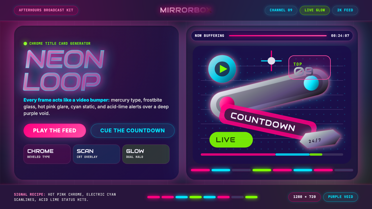
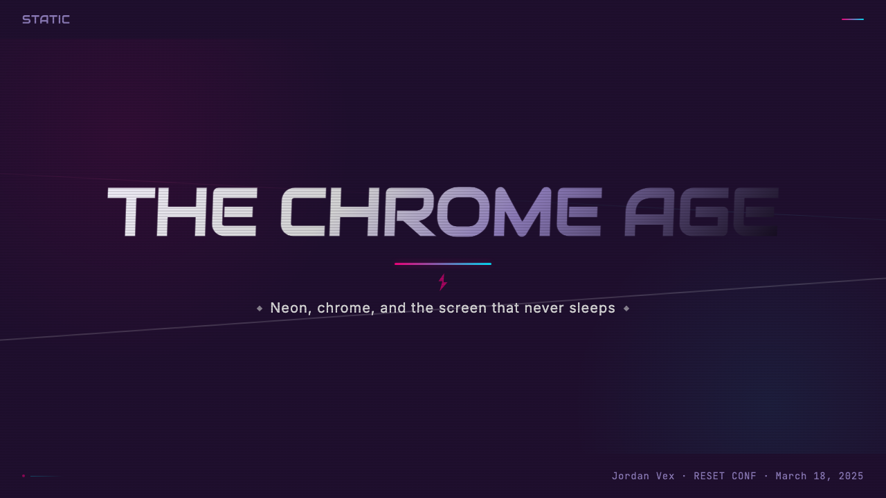
For presentation slides, the style is most effective as a thematic or editorial statement. A cover slide in MTV Y2K style should commit to a full deep-purple-to-void background, a chrome-treated headline in a large condensed display typeface, and one or two neon accent colors used for supporting text or graphic elements. Content slides require more restraint — the background treatment and color palette should remain consistent, but the density of effects should decrease so that data and text remain readable. Data visualizations should use the neon palette actively: bar charts and graphs with neon fill against deep backgrounds read as inherently energetic rather than analytical, which works well for creative, entertainment, or cultural industry presentations.对于演示文稿,这种风格作为主题性或编辑性陈述最为有效。MTV Y2K风格的封面幻灯片应当承诺一个完整的深紫到虚空背景、以大型压缩展示字体呈现的铬处理标题,以及一到两种用于支持文本或图形元素的霓虹强调色。内容幻灯片需要更多克制——背景处理和色板应保持一致,但效果密度应降低,以便数据和文本保持可读。数据可视化应主动使用霓虹色板:在深色背景上以霓虹填充的柱状图和图表本质上读起来充满活力而非分析性,这在创意、娱乐或文化产业演示中效果出色。
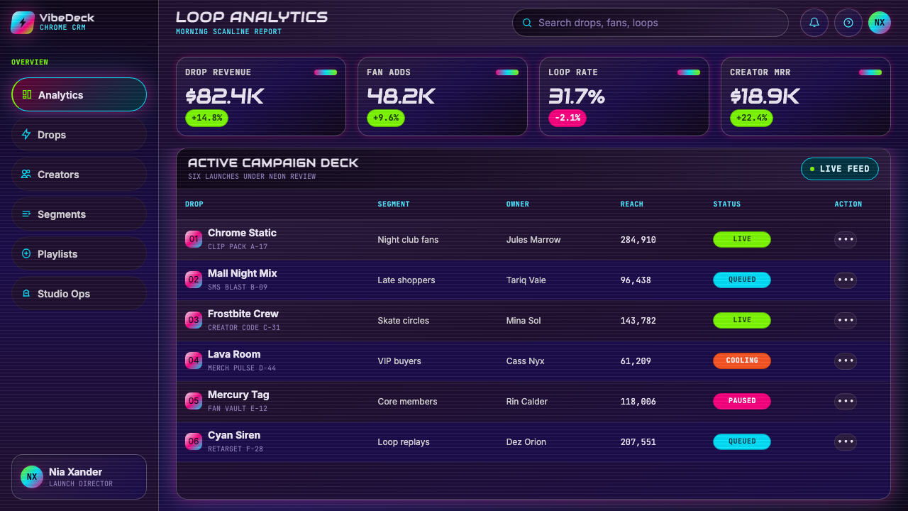
For web user interfaces and dashboards, MTV Y2K works best for products in the music, entertainment, gaming, or digital culture verticals where the aesthetic's associations with energy and spectacle are brand-appropriate. A pricing page or feature showcase built in this style uses a deep dark background with subtle vignette, frosted or translucent card components with chrome-gradient accent borders, and neon color coding for tier differentiation or interactive states. Navigation should be typographic and high-contrast. The style requires careful attention to accessibility: neon text on dark backgrounds can achieve excellent contrast ratios, but glitch overlays and scanline textures should be applied at low enough opacity that they do not impede legibility.对于网页用户界面和仪表板,MTV Y2K最适合音乐、娱乐、游戏或数字文化垂直领域的产品,在这些领域中,这种美学与能量和奇观的关联与品牌定位相符。以这种风格构建的定价页面或功能展示,使用带有微妙暗角的深色暗背景、带有铬渐变强调边框的磨砂或半透明卡片组件,以及用于层级区分或交互状态的霓虹配色。导航应当是字体性的、高对比度的。这种风格需要对无障碍性给予仔细关注:深色背景上的霓虹文字可以实现出色的对比度,但故障叠加和扫描线纹理应以足够低的不透明度应用,以免妨碍可读性。
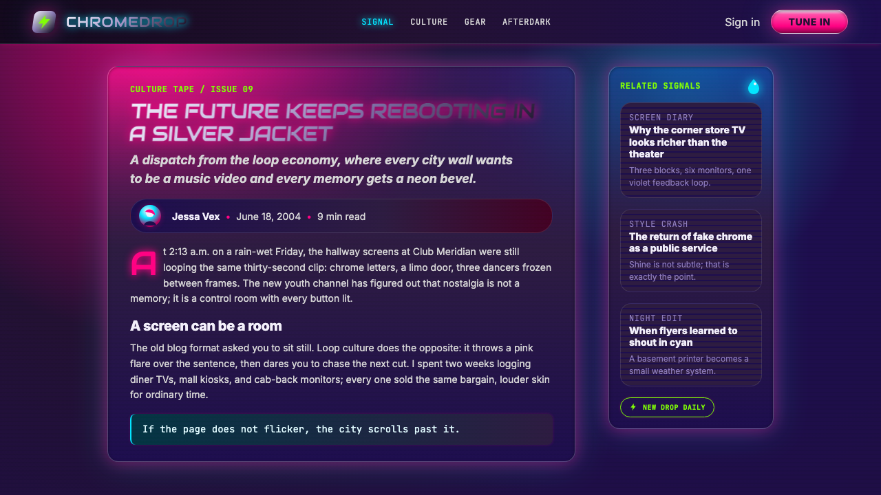
For editorial and marketing applications, the style excels in contexts where the content itself is about spectacle, culture, or digital life — music releases, gaming announcements, entertainment features, fashion editorial. A full-page marketing spread in MTV Y2K style uses the full void background, allows chrome elements to bleed toward the edges of the composition, and places neon typographic callouts at angles that reinforce the kinetic energy of the layout. Social card formats benefit from the style's tendency toward focal-point composition: a single chrome-treated headline or logo in the center of a deep void background, surrounded by lens-flare halos, is immediately legible at thumbnail scale and recognizable as a stylistic statement.对于编辑与营销应用,这种风格在内容本身关于奇观、文化或数字生活的场景中表现出色——音乐发行、游戏公告、娱乐特写、时尚编辑。MTV Y2K风格的全版营销展示使用完整的虚空背景,允许铬元素向构图边缘渗透,并将霓虹字体callout以角度放置,以强化版面的动态能量。社交卡片格式受益于这种风格对焦点构图的倾向:深色虚空背景中央一个铬处理标题或标志,被镜头光晕包围,在缩略图尺寸下立即可识别,并作为风格陈述清晰可辨。
The most common mistake when applying MTV Y2K is using the neon palette against light or white backgrounds. The style's colors are engineered for darkness — they achieve their characteristic luminosity only when the background has sufficient depth to absorb and contrast them. A second common error is applying chrome gradients to body text, which creates illegibility. Chrome treatments work at display sizes, where individual letterforms are large enough to render the gradient transition; at body text sizes, the effect becomes visual noise. Finally, the style is not suited to contexts that require trust-signaling, conservative brand positioning, or emotional warmth — it communicates energy and spectacle, not reliability or care.应用MTV Y2K时最常见的错误是将霓虹色板用于浅色或白色背景。这种风格的颜色是为黑暗而设计的——只有当背景有足够深度来吸收和对比它们时,才能实现其特有的发光感。第二个常见错误是将铬渐变应用于正文文字,这会造成不可读性。铬处理在展示尺寸下有效,在这种尺寸下单个字形足够大,可以渲染渐变过渡;在正文文字尺寸下,效果变成视觉噪音。最后,这种风格不适合需要信任信号、保守品牌定位或情感温暖的场景——它传递的是能量与奇观,而非可靠性或关怀。
See the MTV Y2K (2000s) design system查看 MTV Y2K (2000s) 完整设计系统
MTV Y2K (2000s) — FAQMTV Y2K (2000s) · 常见问题
Is MTV Y2K the same as general Y2K aesthetic, or is it distinct?MTV Y2K和一般Y2K美学是同一回事,还是有所区别?
Y2K aesthetic is a broad category that includes many strands — the soft, iridescent pastels of early-2000s consumer product design, the rounded bubbly typography of tech company logos, the futurist utility wear of early streetwear culture, and much more. MTV Y2K is a specific, high-saturation variant of this broader category, distinguished by its broadcast origins, its extreme darkness-and-neon contrast, and its direct connection to music video and celebrity culture. General Y2K can be relatively gentle and pastel; MTV Y2K is always loud, dark, and chrome-heavy. Think of MTV Y2K as the full-volume, maximum-chrome subset of a much wider aesthetic family.Y2K美学是一个宽泛的类别,包含许多分支——2000年代初消费品设计中柔和、彩虹色的粉彩调,科技公司标志的圆润泡泡字体,早期街头文化的未来主义功能性服装,以及更多。MTV Y2K是这个更广泛类别的一个特定的高饱和变体,以其广播起源、极端的黑暗与霓虹对比,以及与音乐录影带和名人文化的直接联系而区别于其他。一般Y2K可以相对温和和粉彩化;MTV Y2K永远是嘈杂的、暗沉的、铬光充斥的。可以将MTV Y2K理解为一个更广泛美学家族中,全音量、最大铬光的子集。
Can this style work for a serious or professional product, or is it only for entertainment brands?这种风格能用于严肃或专业的产品,还是只适合娱乐品牌?
The style's associations are strongly tied to entertainment, youth culture, and spectacle, which limits its applicability in contexts that require conservative trust-signaling — finance, healthcare, legal services, and enterprise software typically cannot absorb the aesthetic without undermining their credibility positioning. However, the style can work for professional products in sectors where energy and cultural relevance are desirable brand values: gaming platforms, music technology tools, creative software, streaming services, digital-native media brands, and event or festival properties. The key question is whether the product's audience would find the aesthetic energizing or alienating. When the audience overlap with Y2K nostalgia culture is high, the style can function as an effective cultural alignment signal.这种风格的关联性与娱乐、青年文化和奇观紧密相连,这限制了它在需要保守信任信号的场景中的适用性——金融、医疗、法律服务和企业软件通常无法吸收这种美学而不损害其可信度定位。然而,这种风格可以在能量和文化相关性是理想品牌价值的行业中的专业产品上发挥作用:游戏平台、音乐技术工具、创意软件、流媒体服务、数字原生媒体品牌,以及活动或节日属性。关键问题是产品的受众是否会认为这种美学充满活力还是令人疏远。当受众与Y2K怀旧文化的重叠度高时,这种风格可以作为有效的文化对齐信号发挥作用。
How do scanlines and glitch effects work without making content unreadable?扫描线和故障效果如何在不使内容难以阅读的情况下发挥作用?
Scanlines and glitch effects function as atmospheric textures rather than foreground elements — they should be visible but never dominant. The practical rule is that these effects should be applied at an opacity level where the underlying content remains fully legible, and where a viewer could read all the text in the composition even without noticing the texture overlaying it. Glitch effects in particular should be applied to background regions or to non-essential decorative elements rather than to headline text or data. The most controlled approach is to use scanlines as a full-composition overlay at low opacity, and to use glitch effects as localized accents on specific graphic elements — a logo, a decorative band, a transition area — rather than as a uniform treatment across all content.扫描线和故障效果作为大气纹理而非前景元素发挥作用——它们应当可见,但绝不应占主导地位。实际规则是:这些效果应以使底层内容保持完全可读的不透明度级别应用,即使观看者没有注意到覆盖其上的纹理,也能读取构图中的所有文字。故障效果尤其应当应用于背景区域或非必要装饰元素,而非应用于标题文字或数据。最有控制力的方法是:将扫描线作为低不透明度的全构图叠加,将故障效果作为特定图形元素上的局部强调——标志、装饰带、过渡区域——而非作为所有内容的统一处理。
Does the style translate well to print, or is it fundamentally a screen aesthetic?这种风格能很好地转化为印刷品,还是它从根本上是一种屏幕美学?
The style originated in and is optimized for the screen — its defining qualities (luminous neon colors, chrome reflections, scanline textures, and glitch artifacts) all depend on or reference light-emitting display technology. Print translation is possible but requires deliberate adaptation. Neon colors in print will not achieve the luminosity they have on-screen; a UV or fluorescent ink treatment can partially compensate, making this a higher-production-cost application. Chrome gradients translate reasonably well when printed at large scale on coated or metallic stock. Glitch and scanline elements can be reproduced as halftone or rasterized patterns. The overall effect in print will necessarily be less luminous and less kinetic than on screen, which means the composition needs to lean harder on bold typography and strong compositional structure to compensate for what the printing process cannot replicate.这种风格起源于屏幕并针对屏幕进行了优化——其决定性品质(发光霓虹色、铬光反射、扫描线纹理与故障伪影)全部依赖于或参照发光显示技术。印刷转化是可能的,但需要刻意适应。印刷中的霓虹色不会达到屏幕上的发光度;UV或荧光墨水处理可以部分补偿,使其成为更高生产成本的应用。铬渐变在涂层或金属纸张上大尺寸印刷时效果尚可。故障和扫描线元素可以作为半色调或光栅化图案再现。印刷中的整体效果必然比屏幕上更少发光感、更少动感,这意味着构图需要更多依赖大胆的排版和强有力的构图结构,以补偿印刷工艺无法复制的内容。
How does MTV Y2K relate to the current nostalgia revival of early-2000s aesthetics?MTV Y2K与当前2000年代初美学的怀旧复兴有何关联?
The early-2000s aesthetic revival that emerged strongly in the early-to-mid 2020s draws heavily on MTV Y2K as one of its primary visual references. This revival is driven by a generation for whom these aesthetics are childhood memories rather than contemporary design — which gives them the particular emotional charge of nostalgia rather than the directness of trend. Designers applying MTV Y2K today are therefore working in two registers simultaneously: as a historical reference with documented origins, and as an active nostalgia currency with contemporary cultural resonance. This dual function means the style can be applied both to projects aiming for authentic period recreation and to projects using the nostalgic association as a branding signal. The key distinction is intentionality — knowing which mode you are operating in, and executing with enough specificity that the reference reads as deliberate rather than accidental.在2020年代初至中期强劲兴起的2000年代初美学复兴,将MTV Y2K作为其主要视觉参照之一大量借鉴。这场复兴由一代人驱动,对他们来说,这些美学是童年记忆而非当代设计——这赋予它们怀旧的特定情感力量,而非趋势的直接性。因此,今天应用MTV Y2K的设计师同时在两个维度上工作:作为有记录起源的历史参照,以及作为具有当代文化共鸣的主动怀旧货币。这种双重功能意味着,这种风格既可以应用于旨在真实还原时代的项目,也可以应用于将怀旧关联作为品牌信号的项目。关键区别在于意图性——了解你在哪种模式下运作,并以足够的具体性执行,使参照读起来像是刻意为之而非偶然。
Related design styles相关设计风格
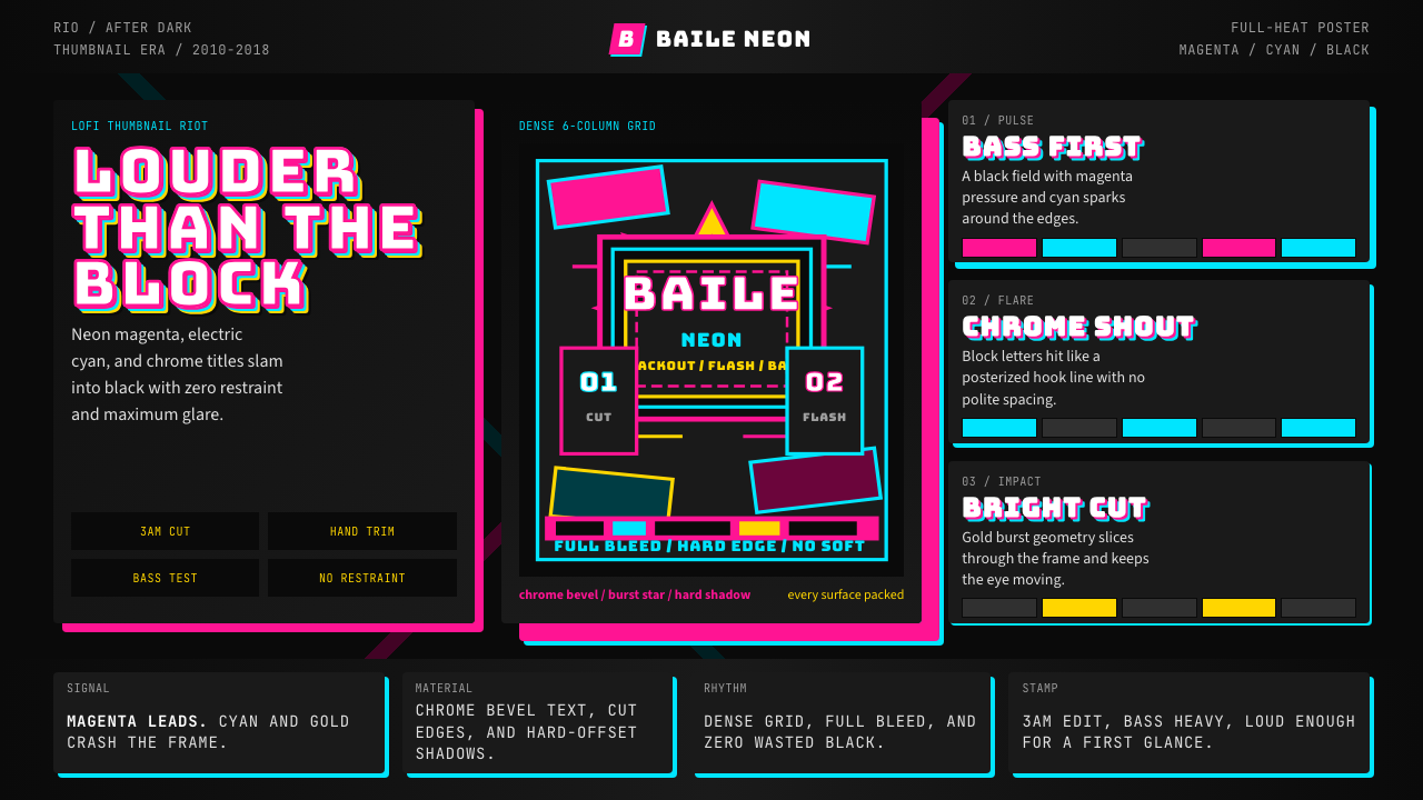 Funk Carioca FavelaMaximalist and unruly. Magenta, cyan, and chrome slam into black at thumbnail…极繁又躁动。洋红、电青与镀铬在黑底上硬碰硬。
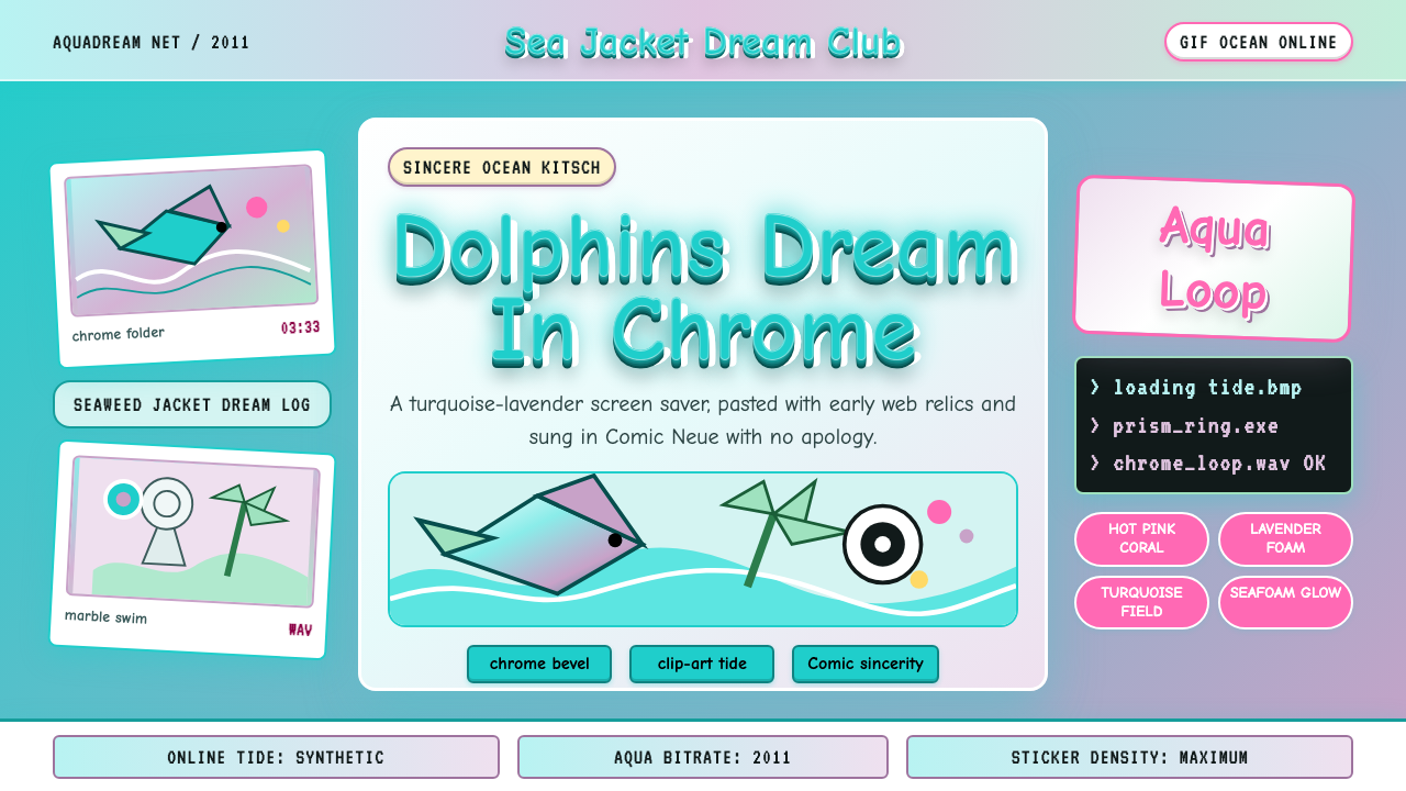 Seapunk 2011Sincere ocean kitsch. Turquoise gradients, Comic Neue chrome, and clip-art do…真诚的海洋俗艳:青绿渐变、Comic Neue 铬字与海豚剪贴画相撞。
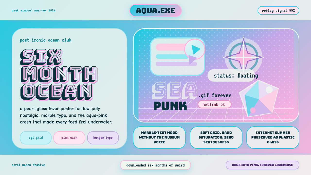 Seapunk Tumblr (2012)Burns bright then crashes. Aqua-pink wash, Bungee type, glassy CGI-grid colla…短暂燃烧后坠落。水蓝粉渐变、Bungee字与玻璃CGI网格拼贴。
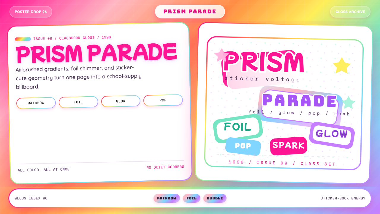 Lisa Frank Rainbow (90s)Pure sticker-saturation. Rainbow gradient, magenta glow, foil shimmer, bubbly…纯粹贴纸饱和。彩虹渐变、品红辉光、全息闪片、胖圆字体。
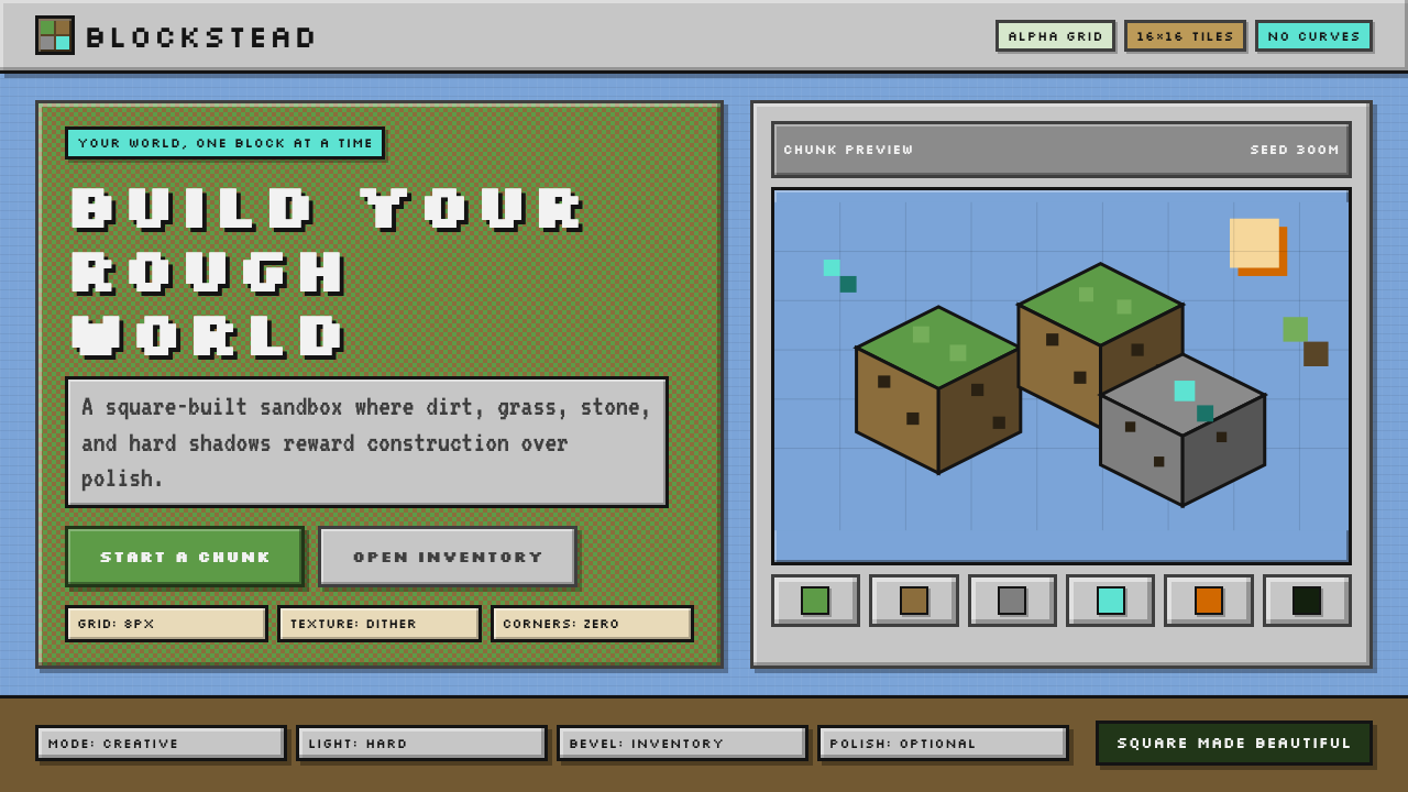 Minecraft VoxelUgly becomes buildable. Grass green, dirt brown, hard bevels, and 16×16 grids…丑也能亲手搭:草绿泥棕、硬边物品栏与16×16栅格。
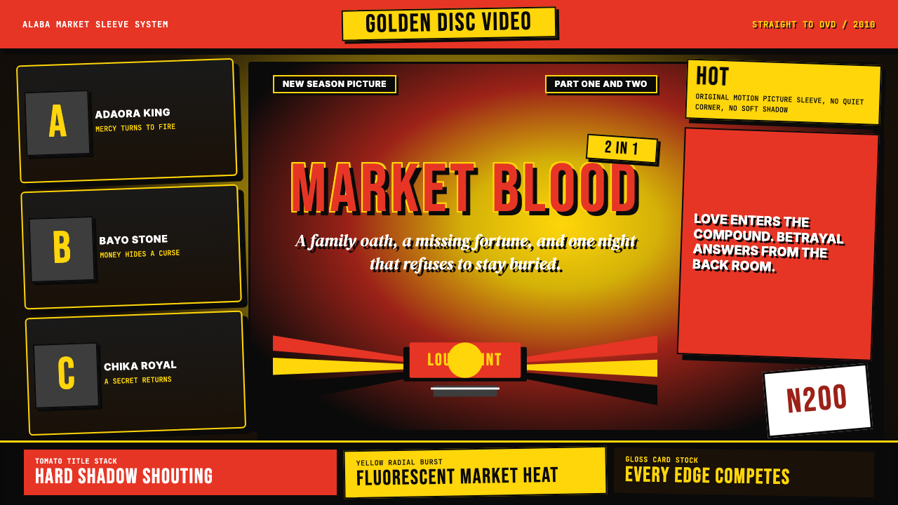 Nigerian Nollywood DVD Poster (2010)Market-stall cinema shouts. Tomato red type and yellow burst collide on jet b…市场摊位式电影在喊:番茄红大字与黄色爆裂撞上黑底。