What is Seapunk Tumblr (2012)?
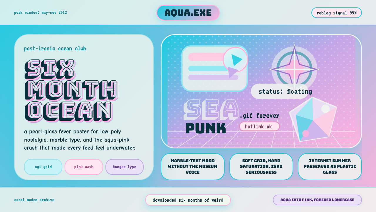
Seapunk burned through 2012 like a neon depth charge — aqua-pink gradients, low-poly dolphins, and ironic CGI nostalgia that peaked on Tumblr and vanished before the new year.
Seapunk Tumblr (2012) in brief
Seapunk is a micro-aesthetic that emerged from Tumblr and the Chicago underground music scene in 2011 and reached its visual peak across the summer of 2012. Its look is instantly distinctive: aqua-into-pink gradient washes, low-polygon 3D animals (dolphins above all), fragments of classical Greek sculpture, Windows 95-era screensaver swirls, bubbly rounded letterforms, and a general air of Y2K nostalgia shot through with post-internet irony. The whole visual language feels simultaneously sincere and self-aware — earnest enough to commit to a marble-textured fill but knowing enough to wink at its own absurdity.
Part of what made Seapunk unusual was that it arrived as a complete package: a music scene, a fashion sensibility, and a design language all at once. The aesthetic was inseparable from the social infrastructure of early-2010s Tumblr, where image reblogging meant a single arresting visual could propagate across thousands of blogs overnight. In that environment, the Seapunk look — oversaturated, layered, referencing multiple eras of digital kitsch simultaneously — was perfectly adapted to the platform's visual logic. It rewarded the reblog.
The movement collapsed almost as fast as it rose. When Rihanna used the Seapunk visual vocabulary as stage dressing on Saturday Night Live in late 2012, the community read it as appropriation without credit, and the aesthetic's underground credibility evaporated. By Christmas 2012, Seapunk was largely treated as a historical artifact — which, paradoxically, has made it more interesting as a design object. Freed from the social stakes of subcultural authenticity, its visual grammar can be studied and applied on its own terms.
Where does Seapunk Tumblr (2012) come from?
The word 'seapunk' is generally attributed to Albert Redwine, a Chicago-based artist and musician who tweeted it in 2011 — originally as a joke hashtag describing a dream about a jacket covered in barnacles. The term was immediately picked up by Tumblr users in the Chicago and Brooklyn music underground, who retroactively applied it to an aesthetic that had already been forming across online spaces. Lil Internet, Ultrademon, and Zombelle were among the earliest figures to develop both the music and the visual language simultaneously, producing a body of work that mixed Chicago footwork influences with aquatic CGI imagery and early-internet nostalgia.
The aesthetic drew from several overlapping source pools. The aqua-and-pink color palette echoed the teal-and-magenta combinations common in early-1990s computer graphics, when limited color palettes pushed designers toward saturated complementary pairings. The low-polygon 3D animals — dolphins, sharks, tropical fish — referenced the CGI demos and screen savers of the Windows 95 era, when three-dimensional geometry was new enough to be celebrated for its own sake. The incorporation of classical Greek marble sculpture fragments (particularly busts) was part of a broader early-2010s internet art tendency that placed ancient and digital imagery in collision, treating both as equally de-contextualized image files.
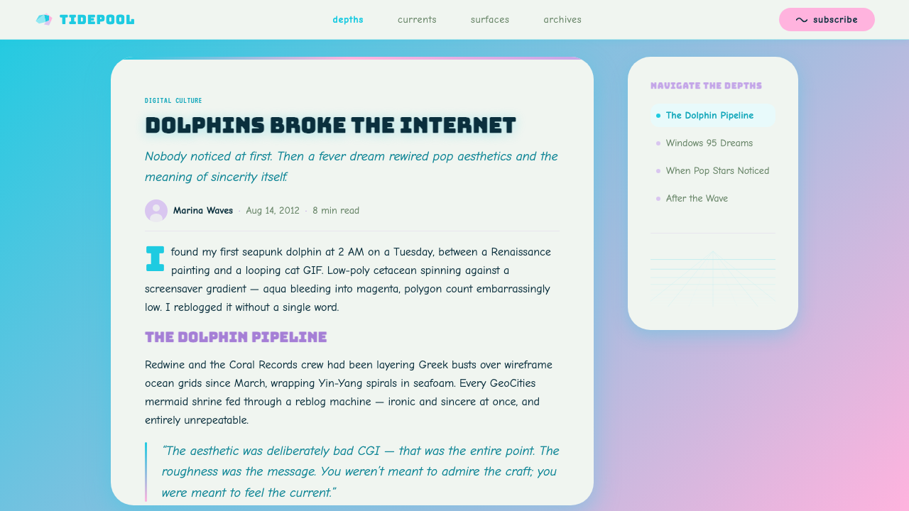
Tumblr was not just the distribution channel for Seapunk but its actual production environment. The platform's gifset culture — short looping animations assembled from film clips or original renders — was perfectly suited to the aquatic, shimmering quality the aesthetic demanded. Seapunk images were frequently animated: scrolling ocean grids, dolphins leaping through starfields, busts slowly rotating on pedestals. This temporal dimension — the way Seapunk images moved — was as much a part of the style as any static element, and it is worth noting when applying the aesthetic in contemporary contexts.
The lifecycle from ironic joke to visual scene to mainstream appropriation to cultural artifact took roughly eighteen months, from the original tweet in 2011 to the post-SNL dispersal in early 2013. The speed of that cycle was itself a product of the social media ecology of the period — the same platform dynamics that allowed an aesthetic to propagate overnight also allowed credibility collapse to happen almost instantaneously. Seapunk became a useful case study in how micro-aesthetics form, peak, and dissolve in networked culture, and its visual language survived long after the social conditions that produced it had vanished.
What defines the Seapunk Tumblr (2012) look?
Aqua-to-Pink Gradient
The defining chromatic signature of Seapunk is a gradient that moves from saturated aqua or teal at one pole to hot pink or magenta at the other, often passing through lavender or mint in between. This combination reads simultaneously as tropical ocean water and early-1990s computer graphics — a double association that gives it its distinctive nostalgic charge. The gradient is typically applied broadly: as a background wash, as a color fill for type, or as an overlay on photographic imagery.
Low-Poly 3D Imagery
Seapunk makes deliberate use of early CGI aesthetics, particularly the low-polygon three-dimensional models that characterized consumer 3D graphics of the Windows 95 era. Dolphins, tropical fish, and sharks appear as primary motifs — their angular facets and flat-shaded surfaces celebrate the technical limitations of early consumer 3D rather than concealing them. This approach treats computational imperfection as aesthetic texture rather than a problem to overcome.
Classical Marble Fragments
A recurring Seapunk motif is the fragment of ancient Greek or Roman marble sculpture — particularly busts — placed in digital contexts where it has no historical business being. The marble's tactile, physically weighty quality creates a deliberate clash with the weightless, frictionless surfaces of CGI and screen-based imagery. This juxtaposition of ancient and digital, of the irreproducibly physical and the infinitely copyable, was one of the style's most knowing moves.
Rounded Bubble Typography
Seapunk type leans heavily into display faces with exaggerated roundness and weight — letterforms that feel inflated, almost pressurized. This typographic sensibility connects to early-internet web graphics, where bubble lettering was a common stylistic choice in hobbyist design. The typefaces are not particularly legible at small sizes and make no apology for it; legibility is secondary to personality and presence.
Screensaver Geometry
Wireframe grids receding to a vanishing point, spinning geometric solids, and looping abstract patterns all reference the Windows-era screensavers that functioned as many users' first exposure to real-time computer graphics. In Seapunk, these patterns serve as backgrounds, texture overlays, and transitional elements. They carry a specific temporal marker: the period when consumer computing was new enough to be mesmerizing in its own right.
Iridescence and Gloss
Surfaces in Seapunk tend toward shiny, reflective, or iridescent qualities — chrome finishes, holographic color shifts, glass-like overlays. This aesthetic of synthetic luxury is another inheritance from early digital graphics culture, where reflective surfaces were a demonstration of technical capability. In contemporary applications, iridescence reads as both retro-futurist and trend-aware, situating the style in a specific moment of digital visual culture.
Layered Collage Density
Seapunk imagery rarely presents a single clean focal element; instead, it stacks — gradients beneath 3D renders beneath marble fragments beneath text, all held together by the shared color palette. This density is not carelessness but a deliberate signal of abundance: the style is maximalist in a very specific way, accumulating references to multiple digital eras and cultural registers simultaneously. Restraint is not a Seapunk value.
Who shaped Seapunk Tumblr (2012)?
Redwine is credited with coining the term 'seapunk' in a 2011 tweet describing a dream about a barnacle-covered jacket — a moment of throwaway internet humor that inadvertently named a movement. As a visual artist and musician based in Chicago, he was already working in the aquatic CGI aesthetic that the word came to describe, and his early output helped establish the visual vocabulary before it had a name. His role is more origin-mythic than directorial; the movement outgrew any single authorial claim almost immediately.
Lil Internet (real name William Garrett) was a music video director and producer whose visual work became some of the most widely circulated early Seapunk material. His productions combined aquatic CGI, neon gradients, and the low-budget digital collage sensibility that defined the style at its peak. As both a collaborator within the scene and a visual practitioner with broader reach, he helped articulate the aesthetic for audiences beyond Tumblr's immediate community.
Ultrademon was a DJ and producer whose music — built from pitched-up samples, aquatic sound design, and the tempo signature associated with Chicago footwork — provided Seapunk with its sonic dimension. The visual and the musical sides of the movement were deeply intertwined, and Ultrademon's work demonstrates how the aquatic, otherworldly aesthetic extended beyond images into sound: slippery, iridescent, temporally unstable.
Zombelle was a New York-based visual artist and musician who brought a darker, more gothic edge to the Seapunk aesthetic — incorporating black and deep violet alongside the canonical aqua-pink palette, and drawing connections between the movement and an older lineage of DIY internet culture. Her work demonstrates that Seapunk was never a single fixed look but a cluster of shared references applied with considerable individual variation.
How do you use Seapunk Tumblr (2012) today?
Seapunk is an intentionally retro aesthetic, and using it well means making peace with its maximalism. Unlike design systems that reward restraint, Seapunk rewards commitment — half-hearted applications that pick up the gradient but drop the low-poly motifs, or adopt the rounded type but neutralize the colors, tend to produce work that reads as vaguely dated rather than specifically referential. The system functions as a whole, and its individual elements derive their meaning from the company they keep.
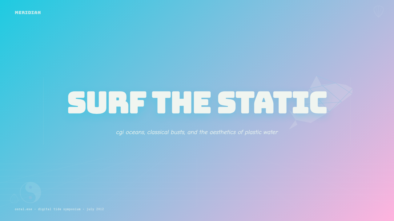
For presentation slides, Seapunk works best on covers and section dividers rather than content pages. A Seapunk cover might place a large aqua-to-pink gradient wash behind a prominently rounded display typeface, with a dolphin or geometric screensaver motif in the background layer. Section dividers can use wireframe grid imagery to signal transitions. Content slides, by contrast, should be pulled back significantly — the gradient reduced to an accent band or border, type in a neutral sans-serif at readable weights — so the cover's boldness has somewhere to land. Data slides in a Seapunk presentation work best when charts are rendered with the aqua-pink palette directly, treating bars and segments as colored geometric objects in the style's register.
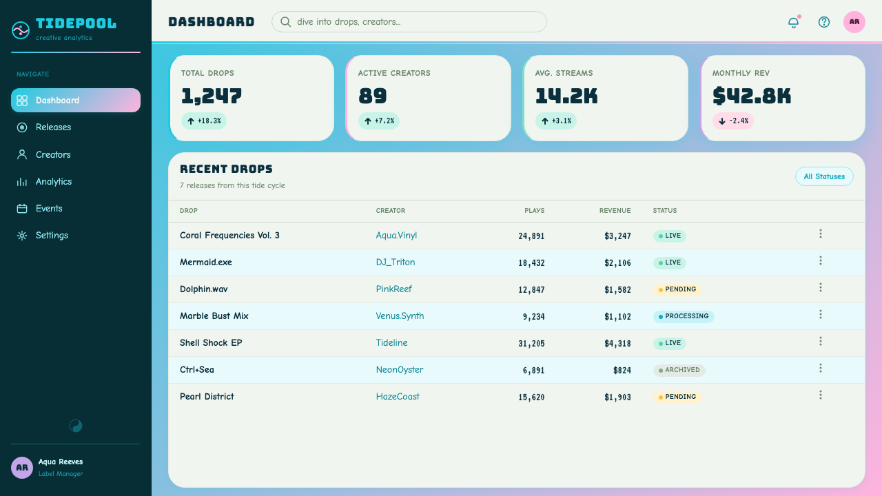
For web interfaces, Seapunk is best suited to contexts that lean into nostalgia explicitly — personal portfolio sites, event pages for music or art events, creative agency homepages, and any interface that wants to signal a specific subcultural alignment. Dashboard and data-heavy interfaces are challenging because Seapunk's density can fight information hierarchy. The practical solution is to confine the aquatic gradient and decorative motifs to header zones, promotional blocks, and empty states, while keeping the primary content areas in high-contrast neutral territory with the palette appearing only in interactive highlights and accent elements.
For editorial and marketing contexts, Seapunk's poster quality makes it effective for event announcements, album artwork, merchandise, and social media graphics where the goal is visual impact at a glance. The style's association with Tumblr-era internet aesthetics also makes it legible shorthand for a kind of early-2010s nostalgia, which can be deployed deliberately in contexts targeting audiences who lived through that period. A marketing page that uses Seapunk is implicitly making a claim about its cultural references — this works when the audience shares those references and falls flat when they do not.
A common mistake when applying Seapunk is treating it as purely decorative — layering the gradient and dolphin imagery onto a layout without committing to the overall visual logic. Seapunk is not a surface coat; it is a coherent set of references that work because they are internally consistent. Another frequent error is desaturating the palette to make it more palatable, which strips the style of the overdriven intensity that gives it its character. If the colors feel too loud, Seapunk is probably the wrong style for the context — rather than taming it, choose a different system.
Seapunk Tumblr (2012) — FAQ
Is Seapunk the same as vaporwave?
They are related but distinct. Both emerged from early-2010s internet music and art culture and draw on similar source materials — 1990s computer graphics, consumer electronics nostalgia, early CGI aesthetics — but their visual and emotional registers differ. Vaporwave tends toward cooler, more desaturated tones, corporate imagery, and a sense of alienation and melancholy. Seapunk is warmer, more saturated, more explicitly aquatic, and carries a different emotional charge — more ironic exuberance than ambient longing. They are sibling micro-aesthetics that share a visual genealogy without being interchangeable.
Why did Seapunk collapse so quickly?
Several factors converged. First, the Rihanna SNL moment in late 2012 was read by the community as mainstream appropriation without credit, which destroyed the subcultural credibility that sustained the scene's participants. Second, the visual language was extraordinarily easy to reproduce — the gradient and the dolphin were both accessible to anyone with basic design tools — which meant that once the aesthetic became widely visible, it flooded rapidly and the signal was lost in the noise. Third, Tumblr micro-aesthetics were structurally short-lived: the platform rewarded novelty, and the same reblog dynamics that allowed Seapunk to propagate overnight also accelerated its saturation and subsequent obsolescence.
Can Seapunk be applied without the aquatic animal motifs?
Yes, though the result becomes harder to read as specifically Seapunk and more likely to be perceived as generic gradient or retro-CGI design. The aqua-pink gradient is the most portable element — it can stand alone in contexts where the full visual system would be too loud. The wireframe ocean grid and screensaver geometry are similarly adaptable as standalone references. The dolphins and marble busts are the most culturally specific elements and the most likely to read as meme-adjacent rather than aesthetic choices if deployed in isolation. A reduced Seapunk that leads with the gradient and geometric screensaver patterns, with the 3D animals as optional accents, covers most of the style's visual ground while remaining more broadly applicable.
Does Seapunk work in dark-mode interfaces?
Seapunk actually performs quite well on dark backgrounds, perhaps better than it does on light ones. The aqua-pink gradient reads more vividly against deep navy or near-black than against white, and the iridescent, glassy surface qualities that characterize the style take on additional depth when placed over a dark field. The low-poly animal motifs and wireframe grid patterns also benefit from dark backgrounds, where their geometric facets and line work are easier to read. A dark-ground Seapunk interface feels slightly more alien and nocturnal than its light equivalent — more appropriate for certain contexts, such as music events or late-night entertainment applications.
How does Seapunk relate to contemporary Y2K nostalgia?
Seapunk predates the current wave of Y2K nostalgia by roughly a decade and is, in some ways, its direct ancestor. The 2012 Seapunk scene was already mining the early-internet and Windows 95 visual archive for aesthetic material — treating those references with a mix of genuine affection and post-ironic distance — at a time when Y2K aesthetics had not yet returned to mainstream visibility. Contemporary Y2K nostalgia draws on many of the same source materials (frosted plastic, early CGI, dot-com graphic design) but tends to be less specifically aquatic and less dense in its layering. Seapunk can be understood as an earlier, more internet-native, and more subculturally specific form of the same retrospective impulse.
Related design styles
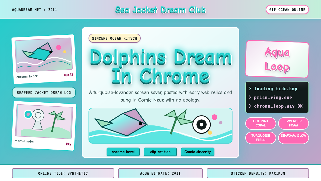 Seapunk 2011Sincere ocean kitsch. Turquoise gradients, Comic Neue chrome, and clip-art do…
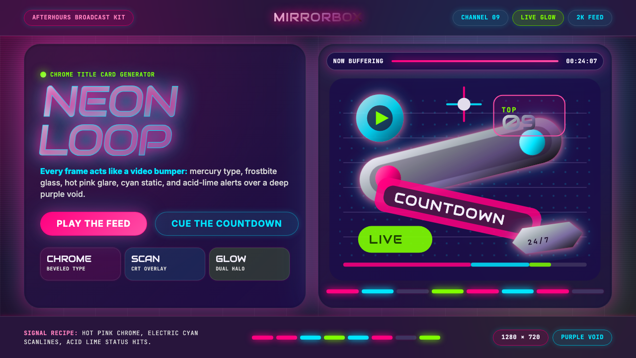 MTV Y2K (2000s)Maximum-volume Y2K. Hot pink chrome, cyan scanlines, and lime hits burn over…
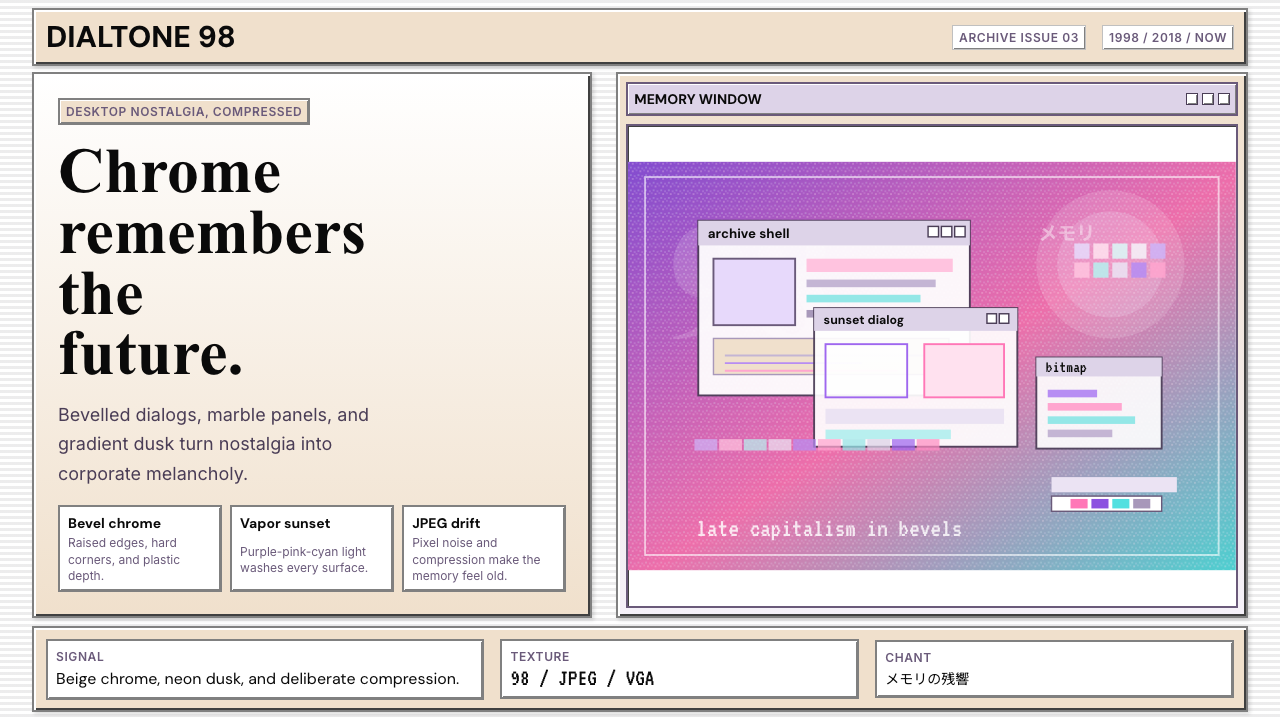 Windows 98 VaporwaveCorporate melancholy glows. Bevelled panels and purple-pink-cyan dusk do the…
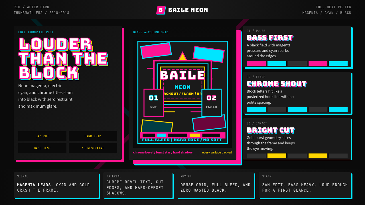 Funk Carioca FavelaMaximalist and unruly. Magenta, cyan, and chrome slam into black at thumbnail…
 Weird Twitter / ShitpostGloriously ugly on purpose. Blown-out HDR reds and white-stroke Impact caps o…
 Ant Farm InflatablesTemporary architecture glows. Vinyl-blue domes swell over dark desert teal.