What is Windows 98 Vaporwave?什么是 Windows 98 Vaporwave?
Windows 98 Vaporwave is where corporate nostalgia melts into a purple-pink-cyan fever dream — every bevelled button and bitmap glyph a monument to digital melancholy.Windows 98 蒸汽波是企业怀旧在紫粉青渐变梦境中的熔化之处——每一个凸起按钮、每一个位图字形,都是数字忧郁的纪念碑。
Windows 98 Vaporwave in briefWindows 98 Vaporwave 速览
Windows 98 Vaporwave is a hybrid visual aesthetic that fuses the literal graphical interface of Microsoft's 1998 operating system with the hallucinatory gradient dreamscapes of vaporwave, the early-2010s internet music and art movement. The result is a style that holds two seemingly opposite sensibilities in deliberate tension: the grey corporate functionalism of late-1990s desktop computing and the lavender-pink-cyan romanticism of an era obsessed with its own digital past.Windows 98 蒸汽波是一种混合视觉美学,将微软1998年操作系统的真实图形界面与蒸汽波的迷幻渐变梦境融为一体。蒸汽波是2010年代初兴起于互联网的音乐与艺术运动。由此形成的风格刻意在两种看似相反的感性之间保持张力:1990年代末桌面计算机的灰色企业功能主义,与一个沉迷于自身数字过去的时代所特有的薰衣草粉青浪漫主义。
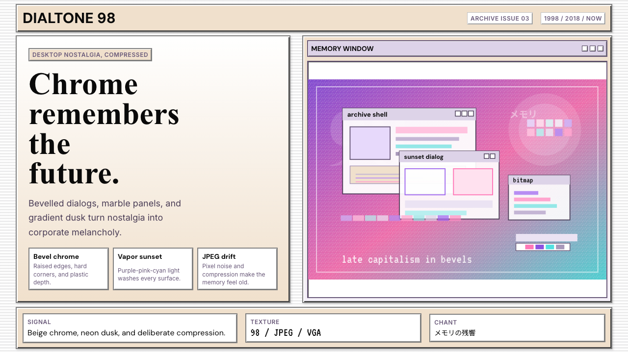
The visual grammar of this style is immediately recognizable. Raised, bevelled panel borders — the hallmark of the Win32 interface toolkit — frame content against marble-cream or charcoal backgrounds. Bitmap typefaces with a distinctly compressed, low-resolution quality sit alongside gradient washes that shift from deep violet through rose pink to electric cyan. Greek marble busts, Roman columns, and classical statues float over degraded JPEG sunsets and CRT scanline textures, referencing the vaporwave canon of ironic classicism. Pixel-art dithering patterns inherited from sixteen-color VGA palettes appear as background textures or decorative fills.这种风格的视觉语法令人过目难忘。凸起的浮雕面板边框——Win32界面工具包的标志性特征——将内容框定于大理石奶油色或炭黑色背景之上。带有明显压缩感与低分辨率质感的位图字体,与从深紫罗兰渐变至玫瑰粉再到电光青的渐变色块并列而置。希腊大理石半身像、罗马立柱、古典雕像漂浮在JPEG压缩伪影的落日与CRT扫描线纹理之上,呼应着蒸汽波对讽刺性古典主义的一贯迷恋。继承自十六色VGA色板的像素艺术抖动图案,则作为背景纹理或装饰性填充出现。
What distinguishes Windows 98 Vaporwave from generic vaporwave is its deliberate grounding in a specific piece of software history. The style does not simply evoke a retro digital mood — it quotes a precise graphical system, complete with its window chrome, its system font, its grey-scale UI controls, and its particular brand of institutional blandness. The vaporwave gradient palette then acts as a chromatic contradiction injected into that system: corporate grey made electric, office beige drenched in neon twilight. The resulting aesthetic is one of ironic mourning — for a technological moment, for a particular shape of digital capitalism, for the innocence of a pre-social-media internet.将Windows 98蒸汽波与泛化蒸汽波区分开来的,是它对一段特定软件历史的刻意扎根。这种风格不仅仅是在唤起一种复古数字氛围——它引用的是一套精确的图形系统,连同它的窗口外壳、系统字体、灰阶UI控件,以及它那独特的机构性平淡无奇。蒸汽波的渐变色板随即作为一种色彩矛盾被注入这个系统:企业灰变得电光四射,办公米色被霓虹暮色浸透。由此诞生的美学是一种讽刺性的哀悼——为一个技术时刻,为一种特定形态的数字资本主义,为前社交媒体互联网的某种纯真。
See the Windows 98 Vaporwave design system查看 Windows 98 Vaporwave 完整设计系统
Where does Windows 98 Vaporwave come from?Windows 98 Vaporwave 从何而来?
The two halves of this aesthetic have separate genealogies that converged online in the mid-2010s. Windows 98 launched in June 1998 as Microsoft's consumer-facing update to Windows 95, standardizing the grey-bordered, bevelled-panel visual language of the Win32 API across millions of household computers. By the time the aesthetic was nostalgized, Windows 98 had become a shared cultural touchstone for an entire generation of internet users who had grown up with it: its Start button, its system tray, its modal dialog boxes, and its particular palette of grey, white, and teal were the visual backdrop of early internet culture.这一美学的两个组成部分有着各自独立的谱系,在2010年代中期于互联网上汇流。Windows 98于1998年6月发布,作为微软对Windows 95的消费级更新,将Win32 API的灰色边框、凸起面板视觉语言标准化于数以百万计的家用计算机之上。当这种美学被怀旧化时,Windows 98已成为整整一代互联网用户共同的文化坐标:它的开始按钮、系统托盘、模态对话框,以及那套灰白青特有的色板,都是早期互联网文化的视觉背景。
Vaporwave as a musical and visual genre emerged around 2010 to 2011, associated with artists including Daniel Lopatin (recording as Oneohtrix Point Never), James Ferraro, and most definitively Ramona Xavier, who performed as Vektroid and released the landmark album Floral Shoppe in 2011 under the alias Macintosh Plus. Vaporwave sampled and slowed down the smooth-jazz corporate music of the 1980s and early 1990s, recontextualizing it as ambient meditation on consumerism, globalization, and late capitalism. Its visual culture — developed simultaneously across Tumblr, SoundCloud, and early internet art communities like Are.na — drew on Greek marble statuary, Miami Vice palette choices, Japanese katakana typography, and the iconography of 1980s and 1990s consumer electronics.蒸汽波作为音乐与视觉流派,约在2010至2011年间出现,与Daniel Lopatin(以Oneohtrix Point Never为艺名录音)、James Ferraro等艺术家相关,尤其与Ramona Xavier密切相连——她以Vektroid为名演出,并于2011年以Macintosh Plus为别名发布了里程碑专辑《Floral Shoppe》。蒸汽波对1980至1990年代初的轻爵士企业音乐进行采样并将其放慢,将其重新语境化为对消费主义、全球化与晚期资本主义的氛围冥想。其视觉文化——同步在Tumblr、SoundCloud以及Are.na等早期互联网艺术社区中形成——援引了希腊大理石雕像、迈阿密风格配色、日文片假名排版,以及1980至1990年代消费电子产品的图像志。
The synthesis into Windows 98 Vaporwave took hold between approximately 2014 and 2018, driven largely by the Tumblr community alongside early Reddit communities dedicated to vaporwave art. The specific OS was chosen for its resonance: Windows 98 sat at the hinge point between the pre-commercial internet and the dotcom bubble, between analogue and digital culture, between corporate blandness and something still genuinely new. Artists like Mary Bell and anonymous online contributors began overlaying the vaporwave gradient palette directly onto screenshotted Windows 98 interfaces, adding classical marble busts behind dialog boxes and inserting pixel-dithered sunset textures into desktop wallpapers.Windows 98蒸汽波的综合体约在2014至2018年间成形,主要由Tumblr社区以及早期致力于蒸汽波艺术的Reddit社区推动。之所以选择这款特定操作系统,是因为它的共鸣性:Windows 98恰恰位于前商业互联网与互联网泡沫之间的枢纽点,处于模拟与数字文化的交接处,介乎企业平庸与某种真实崭新之物之间。Mary Bell等艺术家及众多匿名网络贡献者开始将蒸汽波渐变色板直接叠加在Windows 98界面截图上,在对话框后置入古典大理石半身像,在桌面壁纸中插入像素抖动的夕阳纹理。
The aesthetic developed further through the seapunk and post-internet art movements, which shared vaporwave's interest in internet detritus as raw artistic material. Its spread was accelerated by its memetic reproducibility: the style's core components — a bevelled panel, a gradient, a marble bust, a system font — were simple enough for any amateur to assemble in image editing software, which meant the aesthetic proliferated widely and quickly. By the late 2010s it had crossed from niche internet culture into mainstream graphic design, appearing in music videos, album art, merchandise, and eventually commercial branding.这一美学在海朋克(seapunk)与后互联网艺术运动中得到进一步发展——这些运动与蒸汽波共享对互联网碎片作为原始艺术材料的兴趣。其传播因其传播的可复制性而加速:这种风格的核心构件——一个凸起面板、一段渐变、一尊大理石半身像、一种系统字体——简单到任何业余爱好者都能用图像编辑软件拼装出来,这意味着这种美学迅速而广泛地扩散。到2010年代末,它已从小众互联网文化跨入主流平面设计,出现在音乐录像、专辑封面、商品以及最终的商业品牌设计之中。
What defines the Windows 98 Vaporwave look?Windows 98 Vaporwave 的视觉特征是什么?
Bevelled Panel Architecture凸起面板结构
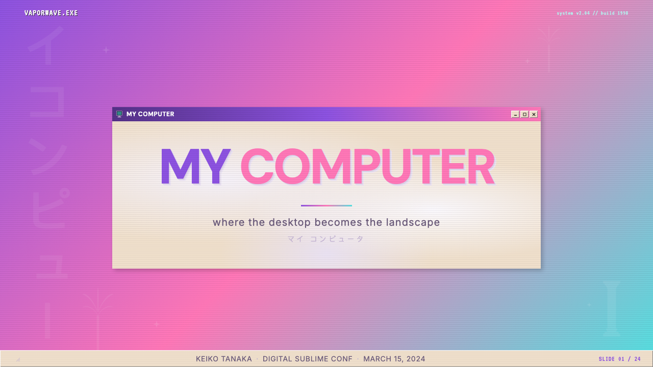
The defining structural element of this style is the raised, bevelled panel border derived directly from the Win32 graphical interface. Borders are rendered with a light edge on the top-left and a dark edge on the bottom-right, creating the illusion of a surface extruded slightly toward the viewer. This bevelling applies to buttons, window frames, scrollbars, and container elements alike. The effect reads as simultaneously functional and antique — a reminder that the third dimension was once something that had to be faked in software, pixel by pixel.这种风格最具决定性的结构元素,是直接取自Win32图形界面的凸起浮雕面板边框。边框以左上方浅色、右下方深色渲染,制造出表面向观看者略微突出的幻觉。这种浮雕处理同样应用于按钮、窗口边框、滚动条及容器元素。效果同时传递出功能性与古旧感——提醒人们,三维空间曾经是一种需要在软件中逐像素伪造的东西。
Gradient Palette渐变色板
The chromatic heart of the style is a gradient that sweeps from deep violet or indigo through magenta and rose pink toward electric cyan or turquoise. This palette originates in vaporwave's interpretation of Miami Vice aesthetics and 1980s consumer electronics advertising, transposed into a digital context. Against the neutral grey and cream of the Windows interface, the vaporwave gradient functions as an intrusion — the unconscious of the operating system bleeding through its institutional facade. Gradients are typically applied to skies, backgrounds, and decorative elements rather than to interactive UI components.这种风格的色彩核心,是一段从深紫罗兰或靛蓝穿过洋红与玫瑰粉渐变至电光青或蓝绿色的渐变。这套色板源自蒸汽波对《迈阿密风云》美学与1980年代消费电子广告的诠释,被转置于数字语境之中。在Windows界面的中性灰与奶油色之中,蒸汽波渐变发挥着一种入侵的功能——操作系统的潜意识穿透其机构性外壳渗漏而出。渐变通常应用于天空、背景与装饰性元素,而非交互式UI组件。
Bitmap Typography位图字体排印
Typography in this style is anchored by bitmap or bitmap-influenced type that recalls the screen-optimized fonts of late-1990s computing. Characters are rendered with visible pixel structure, aliased rather than smoothed, echoing the pre-antialiasing era of desktop interfaces. This low-resolution quality is treated not as a limitation but as a period marker — a timestamp encoded in the letterform itself. Katakana and other CJK characters occasionally appear as decorative elements, referencing vaporwave's engagement with Japanese consumer culture.这种风格的字体排印以位图或位图影响型字体为锚点,让人联想到1990年代末为屏幕显示优化的字体。字符以可见的像素结构渲染,使用锯齿化而非平滑处理,呼应桌面界面的前抗锯齿时代。这种低分辨率质感被视为时代标记而非局限——一种编码在字形本身之中的时间戳。片假名及其他CJK字符偶尔作为装饰性元素出现,呼应蒸汽波与日本消费文化的关联。
Classical Imagery and Digital Decay古典图像与数字衰变
A recurring motif is the juxtaposition of classical Western sculpture — marble busts, Roman columns, Venus figurines — with visible marks of digital compression and reproduction. JPEG artifacts, pixelation, and colour-banding appear not as errors to be corrected but as deliberate textural elements that locate the imagery firmly in the early internet era. The marble bust becomes a symbol for something timeless being dragged through a lossy compression algorithm — culture processed, degraded, and reposted.一个反复出现的母题,是西方古典雕塑——大理石半身像、罗马立柱、维纳斯雕像——与数字压缩及复制痕迹的并置。JPEG压缩伪影、像素化与色带不被视为需要纠正的错误,而是刻意运用的质感元素,将图像牢固地锚定于早期互联网时代。大理石半身像成为某种永恒之物被拖入有损压缩算法的象征——文化被处理、降质、再次转发。
CRT Textures and VGA DitheringCRT纹理与VGA抖动
Scanline patterns referencing cathode-ray tube monitors appear as overlays on images and backgrounds, adding horizontal striping that evokes the physical experience of viewing content on older display hardware. Alongside these, dithering patterns inherited from sixteen-color VGA palettes — where areas of solid colour are represented through alternating pixel grids — function as both historical reference and decorative texture. Together these elements mark the style as belonging to a specific hardware generation.呼应阴极射线管显示器的扫描线图案作为叠层出现在图像与背景上,添加水平条纹以唤起在旧式显示硬件上观看内容的身体性体验。与此同时,继承自十六色VGA色板的抖动图案——在那里纯色区域通过交替像素网格来表示——既作为历史参照,也作为装饰性纹理发挥作用。这些元素共同将这种风格标定为属于某一特定硬件世代。
Institutional Grey as Foil机构灰作为对照
The neutral grey of the Windows 98 interface is not merely a background — it is an essential chromatic foil. The style depends on the contrast between the operating system's deliberate blandness and the intrusive vividness of the vaporwave palette. Without the grey, the gradients lose their ironic charge; without the gradients, the grey is simply grey. The two registers work together to produce the style's central affect: the sensation of something beautiful erupting through something bureaucratic.Windows 98界面的中性灰不仅仅是背景——它是不可或缺的色彩对照。这种风格依赖于操作系统刻意的平淡与蒸汽波色板侵入性鲜活之间的对比。没有灰色,渐变就失去其讽刺性的张力;没有渐变,灰色就只是灰色。这两种语域协同运作,产生这种风格的核心感受:某种美丽之物穿透某种官僚性结构迸发而出的感觉。
Ironic Interface Quotation讽刺性界面引用
Unlike many retro aesthetics that evoke a general era, Windows 98 Vaporwave quotes specific interface elements with accuracy: the exact proportions of a title bar, the three-button window control cluster, the recessed text input field, the tabbed dialog panel. This precision of quotation is what separates the style from generic retro-computing nostalgia. The interface is treated as a found object — appropriated, reframed, and loaded with meaning it was never designed to carry.与许多唤起泛化时代感的复古美学不同,Windows 98蒸汽波以精确性引用特定界面元素:标题栏的精确比例、三按钮窗口控制群、凹陷式文本输入框、选项卡对话框面板。这种引用的精确性,是将这种风格与泛化复古计算机怀旧区分开来的关键。界面被当作现成品对待——被挪用、被重新框定、被赋予它从未被设计去承载的意义。
See the Windows 98 Vaporwave design system查看 Windows 98 Vaporwave 完整设计系统
Who shaped Windows 98 Vaporwave?谁塑造了 Windows 98 Vaporwave?
Ramona Xavier, performing under the alias Vektroid and releasing as Macintosh Plus, created Floral Shoppe in 2011 — the album whose artwork established the defining visual template for vaporwave. The image of a marble bust and Japanese characters against a digital background, rendered in a pink-to-purple gradient, became the visual reference point that subsequent artists, including those working in the Windows 98 subgenre, consistently returned to. Xavier's work demonstrated that the aesthetic could operate simultaneously as critique and as sensory pleasure.Ramona Xavier以Vektroid为艺名演出,以Macintosh Plus为名于2011年发布了专辑《Floral Shoppe》——这张专辑的封面设计确立了蒸汽波视觉的决定性模板。大理石半身像与日文字符置于数字背景前、以粉色至紫色渐变渲染的图像,成为后续艺术家(包括那些在Windows 98子流派中工作的艺术家)持续回归的视觉参照点。Xavier的工作证明,这种美学可以同时作为批判与感官愉悦而运作。
Daniel Lopatin, recording as Oneohtrix Point Never, is among the earliest artists to develop the musical and visual language of vaporwave. His 2010 work Eccojams Vol. 1 — loops of slowed, pitched-down consumer music — established the sonic vocabulary that the visual style would mirror: the uncanny, the institutional, the nostalgic. Lopatin's intellectual framing of the project as a meditation on late capitalism's affective residue gave the broader movement a theoretical underpinning that influenced how later artists, including those working in Windows 98 Vaporwave, articulated their own practice.Daniel Lopatin以Oneohtrix Point Never为名录音,是最早发展蒸汽波音乐与视觉语言的艺术家之一。他2010年的作品《Eccojams Vol. 1》——放慢、降调的消费音乐循环——建立了视觉风格将要镜像的声音词汇:诡异感、机构性、怀旧性。Lopatin将这一项目框架为对晚期资本主义情感残余的冥想,为这一更广泛运动提供了理论基础,影响了后来的艺术家(包括那些在Windows 98蒸汽波中工作的艺术家)如何阐明自身实践。
James Ferraro's 2011 album Far Side Virtual used the sounds of early smartphone interfaces, corporate hold music, and digital notification tones to construct a portrait of consumer-technological optimism on the verge of collapse. His approach to technology as both subject matter and sonic material anticipated the visual strategy of Windows 98 Vaporwave: treating the graphical interface as a readymade, full of embedded cultural assumptions waiting to be denaturalized. Ferraro's influence is felt in the style's emphasis on corporate iconography as a site of critique.James Ferraro的2011年专辑《Far Side Virtual》使用早期智能手机界面声音、企业候等音乐与数字通知铃声,构建了一幅消费-技术乐观主义濒临崩溃的画像。他将技术既作为主题又作为声音材料的方式,预示了Windows 98蒸汽波的视觉策略:将图形界面当作现成品,其中充满等待被去自然化的内嵌文化假设。Ferraro的影响体现在这种风格对企业图像志作为批判场域的强调上。
Active within the online communities where Windows 98 Vaporwave coalesced, Mary Bell was among the visual artists who worked explicitly at the intersection of operating system aesthetics and the vaporwave palette. Her work helped establish the specific vocabulary of the subgenre: the placement of classical sculpture within screenshotted interface elements, the use of gradient fills behind system dialog boxes, and the treatment of error messages and system prompts as found poetry. Bell's practice exemplifies the genre's origin as a genuinely grassroots, platform-native art form.活跃于Windows 98蒸汽波汇聚而成的网络社区,Mary Bell是明确在操作系统美学与蒸汽波色板交汇处工作的视觉艺术家之一。她的工作帮助确立了这一子流派的特定词汇:在截图界面元素中置入古典雕塑,在系统对话框后使用渐变填充,以及将错误提示和系统弹窗当作拾得诗歌处理。Bell的实践体现了这一流派作为真正草根性、平台原生艺术形式的起源。
How do you use Windows 98 Vaporwave today?今天怎么用 Windows 98 Vaporwave?
Windows 98 Vaporwave is a high-specificity style with strong tonal associations — irony, nostalgia, digital melancholy, and a particular strain of post-internet cultural criticism. Applied well, it signals cultural awareness and visual sophistication. Applied carelessly, it reads as pastiche or arbitrary retro decoration. The first discipline in using this style is understanding its register: it should feel like a deliberate and knowing quotation, not like a theme applied because it looks cool.Windows 98蒸汽波是一种具有强烈情感联想的高特异性风格——讽刺、怀旧、数字忧郁,以及一种特定的后互联网文化批判脉络。运用得当,它传递出文化自觉与视觉成熟度。运用不当,则显得像是模仿或任意的复古装饰。使用这种风格的首要纪律是理解其语域:它应当感觉像一种刻意而自知的引用,而非因为好看就贴上去的主题。
For presentation slides, the style works most powerfully when it commits fully to the interface metaphor. Cover slides benefit from treating the entire slide surface as a desktop: a bevelled window frame contains the title text, which is set in a bitmap-influenced typeface against a marble-cream or deep charcoal panel. The gradient — violet bleeding into rose pink — appears in a background sky element or as a dramatic full-bleed wash behind the window. Content slides should use the panel border system to organize information, with section titles set in a heavier, slightly compressed typeface and body content in a clean, readable weight. Data slides take on a particular power in this aesthetic: chart containers styled as Windows dialog boxes, with the chart itself rendered in the vaporwave palette against a grey or cream ground, produce a striking visual that holds information while maintaining the style's ironic frame.对于演示文稿,这种风格在完全投入界面隐喻时效果最为强大。封面页受益于将整个幻灯片表面作为桌面处理:一个浮雕窗口边框容纳标题文字,以位图影响型字体置于大理石奶油色或深炭黑色面板上。渐变——紫罗兰渗入玫瑰粉——出现在背景天空元素中,或作为窗口后方的戏剧性满幅底色。内容页应使用面板边框系统组织信息,章节标题以更重、略带压缩感的字体设置,正文内容以干净、可读的字重呈现。数据页在这种美学中呈现出特别的力量:以Windows对话框风格设计的图表容器,图表本身在灰色或奶油色底面上以蒸汽波色板渲染,产生一种视觉强烈同时维持风格讽刺框架的效果。
For web interfaces, this style is well-suited to products that want to position themselves as culturally aware, creatively independent, or nostalgically adjacent — independent music platforms, creative tool dashboards, portfolio sites, artist pages, and experimental digital publications. The approach: use panel borders and raised button elements for interactive components, reserve the gradient for hero sections and decorative backgrounds, and maintain neutral grey or cream for data-dense areas where legibility is paramount. Pricing pages can employ the style to great effect by styling each tier as a separate raised dialog box — the visual vocabulary of software installation wizards recontextualized as a commercial offering.对于网页界面,这种风格尤其适合希望将自身定位为具有文化自觉、创意独立或怀旧邻近的产品——独立音乐平台、创意工具仪表板、作品集网站、艺术家主页与实验性数字出版物。方法如下:对交互组件使用面板边框与凸起按钮元素,将渐变保留给英雄区域与装饰性背景,对信息密集的区域保持中性灰或奶油色以确保可读性。定价页面可以通过将每个等级设计为独立的凸起对话框来出色地运用这种风格——软件安装向导的视觉词汇被重新语境化为商业产品。
For editorial and marketing work, the style rewards restraint. A marketing campaign that overloads every element with gradients, marble busts, and scanline textures quickly becomes visually exhausting and loses the ironic distance that makes the style interesting. The most effective editorial applications use the style selectively: a bevelled panel framing a key quote, a vaporwave gradient sky behind a product photograph, a bitmap typeface headline with body text set in a clean contemporary face. The contrast between the nostalgic surface elements and functional contemporary typography preserves the style's wit.对于编辑与营销工作,这种风格奖励克制。一场在每个元素上都堆叠渐变、大理石半身像与扫描线纹理的营销活动,很快会在视觉上令人疲惫,并失去使这种风格有趣的讽刺距离。最有效的编辑应用是选择性地使用这种风格:一个浮雕面板框住一段关键引言,蒸汽波渐变天空置于产品照片之后,位图字体大标题搭配干净当代字体的正文。怀旧表面元素与功能性当代排版之间的对比,保留了这种风格的机智。
A common mistake when applying this style is treating the gradient as the whole aesthetic. Windows 98 Vaporwave derives its meaning from the tension between the corporate interface and the dreamy palette — without the structural quotation of the OS, the gradient alone becomes generic vaporwave. Similarly, accumulating too many period signifiers simultaneously — marble bust, scanlines, JPEG artifacts, VGA dithering, and a system font all in the same composition — produces visual noise rather than layered meaning. Effective application involves selecting two or three signature elements and allowing them to operate clearly against a restrained ground.应用这种风格时最常见的错误是将渐变当作整个美学。Windows 98蒸汽波的意义来自企业界面与梦幻色板之间的张力——没有对操作系统的结构性引用,渐变本身就变成了泛化的蒸汽波。同样,在同一构图中同时积累过多时代符号——大理石半身像、扫描线、JPEG伪影、VGA抖动,加上系统字体——产生的是视觉噪音而非分层意义。有效的应用涉及选择两到三个标志性元素,让它们在克制的底面上清晰运作。
See the Windows 98 Vaporwave design system查看 Windows 98 Vaporwave 完整设计系统
Windows 98 Vaporwave — FAQWindows 98 Vaporwave · 常见问题
Is Windows 98 Vaporwave the same as general vaporwave?Windows 98蒸汽波与一般蒸汽波是同一回事吗?
They share a palette and cultural attitude but differ in structure. General vaporwave draws freely from 1980s aesthetics, Miami Vice colour fields, Japanese consumer branding, and early internet imagery without committing to a specific graphical system. Windows 98 Vaporwave is more precise: it grounds the aesthetic in the particular interface language of a specific operating system, which introduces the bevelled panel, the bitmap system font, the grey-scale UI control, and the ironic corporate-functional framing that distinguishes the subgenre. Think of it as vaporwave with an anchor — a specific historical artefact that gives the dreamy palette something structural to push against.两者共享色板与文化态度,但结构上有所不同。一般蒸汽波自由借鉴1980年代美学、迈阿密风格色域、日本消费品牌以及早期互联网图像,不依附于特定的图形系统。Windows 98蒸汽波更为精确:它将美学扎根于某一特定操作系统的界面语言,由此引入了凸起面板、位图系统字体、灰阶UI控件,以及区分这一子流派的讽刺性企业功能主义框架。可以将其理解为带有锚点的蒸汽波——一件特定的历史文物,给梦幻色板提供了可以推压的结构性对照。
Does the style have to be ironic, or can it be used sincerely?这种风格必须带有讽刺性吗,还是可以真诚地使用?
The style's origins are ironic — the operating system as monument to late capitalism, the marble bust as victim of lossy compression — but contemporary application need not carry that theoretical weight explicitly. Many designers now use Windows 98 Vaporwave elements for their pure visual qualities: the warmth of the gradient palette, the tactile interest of bevelled panels, the legibility of bitmap type. Sincere application works best when the visual elements are chosen for their formal qualities rather than their cultural baggage, and when the composition does not overplay the period references to the point of parody. The irony can remain latent rather than foregrounded.这种风格的起源是讽刺性的——操作系统作为晚期资本主义的纪念碑,大理石半身像作为有损压缩的受害者——但当代应用未必需要明确承载这种理论重量。许多设计师现在使用Windows 98蒸汽波元素是出于其纯粹的视觉品质:渐变色板的温暖感、凸起面板的触感兴趣、位图字体的可读性。真诚的应用最有效的方式,是将视觉元素的选择基于其形式品质而非文化包袱,并且构图不将时代参照夸张到走向戏仿的程度。讽刺可以保持潜伏而非被置于前景。
How do I avoid making it look like a joke or a meme?如何避免让作品看起来像玩笑或表情包?
The difference between a thoughtful application of this style and a meme template lies in proportion and restraint. Meme versions pile on every signifier at once: marble bust, scanlines, deep-fried JPEG artifacts, system error box, gradient sky, all at maximum intensity simultaneously. Considered design work selects one or two primary elements — perhaps the bevelled panel system and the gradient palette — and lets them operate with clarity against a restrained, well-structured layout. Typography discipline matters particularly: a well-chosen, clearly-sized bitmap or bitmap-influenced typeface reads as intentional; multiple clashing period typefaces read as noise. Less simultaneity, more specificity.深思熟虑的风格应用与表情包模板之间的差别,在于比例与克制。表情包版本将所有符号一次性堆砌:大理石半身像、扫描线、过度压缩的JPEG伪影、系统错误对话框、渐变天空,全部同时以最大强度出现。经过考量的设计工作选择一到两个主要元素——或许是浮雕面板系统与渐变色板——并让它们在克制、结构良好的版面中清晰运作。字体纪律尤为重要:一个经过精心选择、尺寸明确的位图或位图影响型字体,读起来是有意为之的;多种相互冲突的时代字体则读起来是噪音。更少的同时性,更多的特异性。
What kinds of projects suit this style best?哪类项目最适合这种风格?
The style performs best for projects where the cultural associations of the aesthetic align with the product's values or audience. Independent music releases, creative tool landing pages, digital art portfolios, experimental editorial publications, gaming and entertainment brands with a culturally literate audience, and merchandise for communities that share the nostalgic reference point are all well-served. It is less appropriate for products requiring unconditional trust or warmth — healthcare, financial services, children's education — where the ironic register and conspicuous nostalgia may undermine credibility or approachability. The style's specificity is also a risk in contexts where the cultural reference will not be recognised by the primary audience.这种风格在美学的文化联想与产品价值观或受众相一致的项目中表现最佳。独立音乐发行、创意工具落地页、数字艺术作品集、实验性编辑出版物、面向具有文化素养受众的游戏与娱乐品牌,以及面向共享怀旧参照点的社区的商品,都适合这种风格。对于需要无条件信任或温暖感的产品,则不太适合——医疗保健、金融服务、儿童教育——在这些场景中,讽刺性语域与显著的怀旧感可能损害可信度或亲近感。在主要受众无法识别文化参照的场景中,这种风格的高特异性也是一种风险。
How does this style relate to Y2K aesthetic and other 2000s nostalgia trends?这种风格与Y2K美学及其他2000年代怀旧趋势有何关联?
Windows 98 Vaporwave, Y2K aesthetic, and related early-internet nostalgia trends share a common temporal territory — the late 1990s and early 2000s — but emphasize different aspects of that era. Y2K aesthetic tends toward the optimism of that period: chrome finishes, inflated forms, digital-native type, and a sense that technology was glamorous and new. Windows 98 Vaporwave is more melancholic and ironic, foregrounding institutional grey and corporate blandness as much as the vibrant gradient palette. Where Y2K aesthetic celebrates the era's utopian technological confidence, Windows 98 Vaporwave mourns it — or at least holds the mourning and the celebration in unresolved tension.Windows 98蒸汽波、Y2K美学以及相关的早期互联网怀旧趋势共享一个共同的时间领域——1990年代末与2000年代初——但强调那个时代的不同面向。Y2K美学倾向于那个时代的乐观主义:镀铬饰面、膨胀形态、数字原生字体,以及技术既迷人又崭新的感觉。Windows 98蒸汽波则更为忧郁与讽刺,将机构灰与企业平淡无奇与鲜活渐变色板同等置于前景。如果说Y2K美学庆祝那个时代的乌托邦式技术自信,Windows 98蒸汽波则为之哀悼——或者至少将哀悼与庆祝保持在一种未得解决的张力之中。
Related design styles相关设计风格
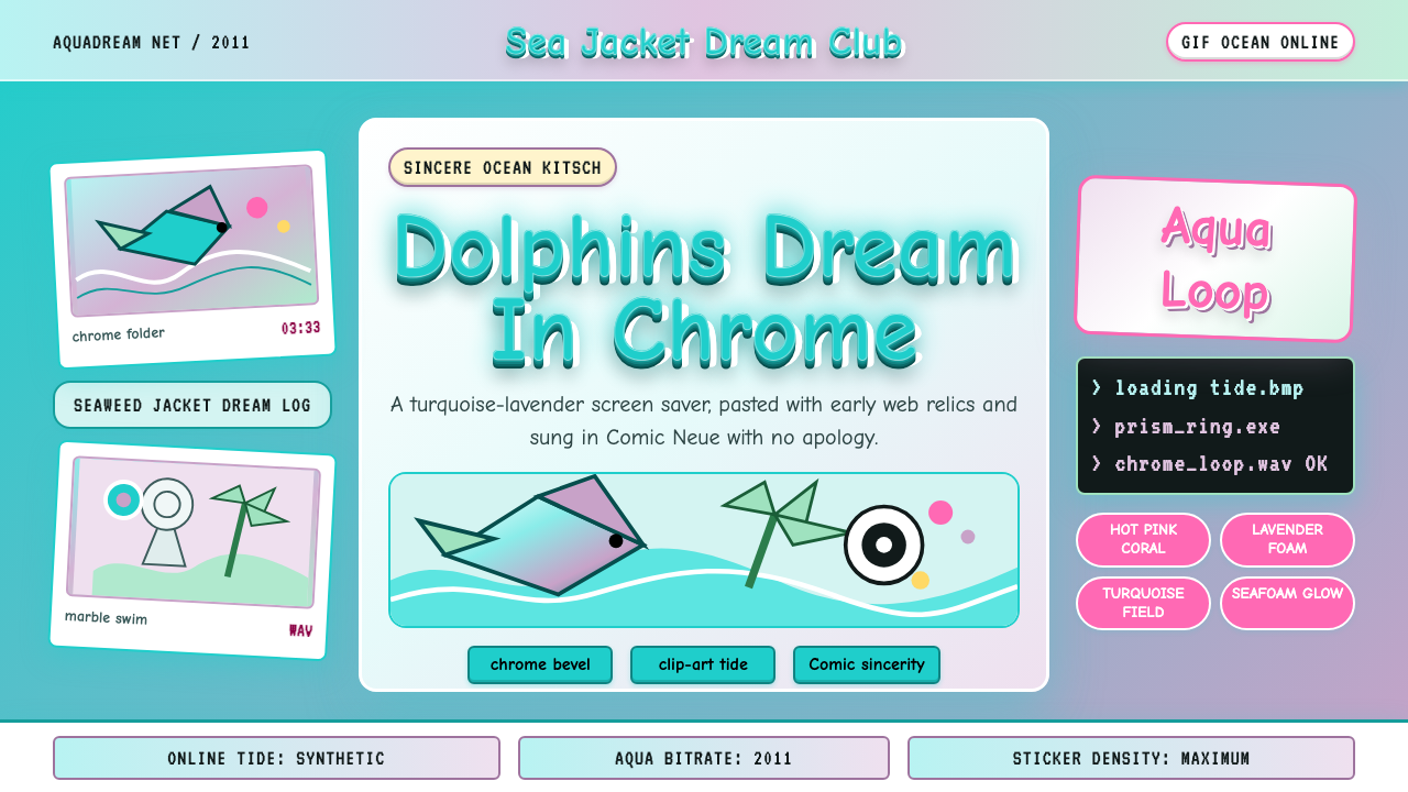 Seapunk 2011Sincere ocean kitsch. Turquoise gradients, Comic Neue chrome, and clip-art do…真诚的海洋俗艳:青绿渐变、Comic Neue 铬字与海豚剪贴画相撞。
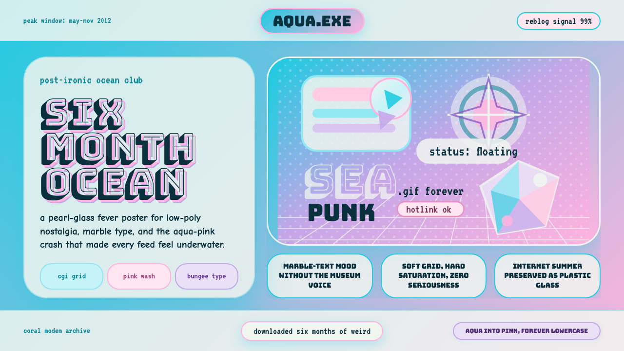 Seapunk Tumblr (2012)Burns bright then crashes. Aqua-pink wash, Bungee type, glassy CGI-grid colla…短暂燃烧后坠落。水蓝粉渐变、Bungee字与玻璃CGI网格拼贴。
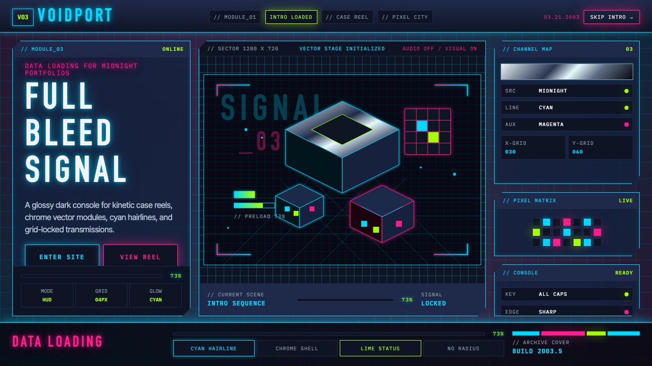 Flash Website Era (2003)A browser turned sci-fi console. Cyan HUD hairlines, chrome gradients, and 4p…浏览器变身科幻控制台:电光青描边、铬渐变与4px网格。
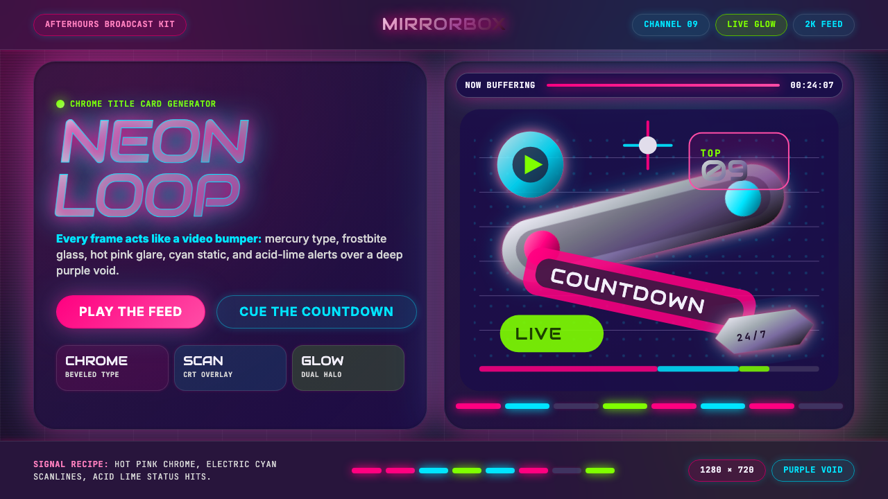 MTV Y2K (2000s)Maximum-volume Y2K. Hot pink chrome, cyan scanlines, and lime hits burn over…高音量千禧感:粉铬、青色扫描线与酸橙光烧过紫色虚空。
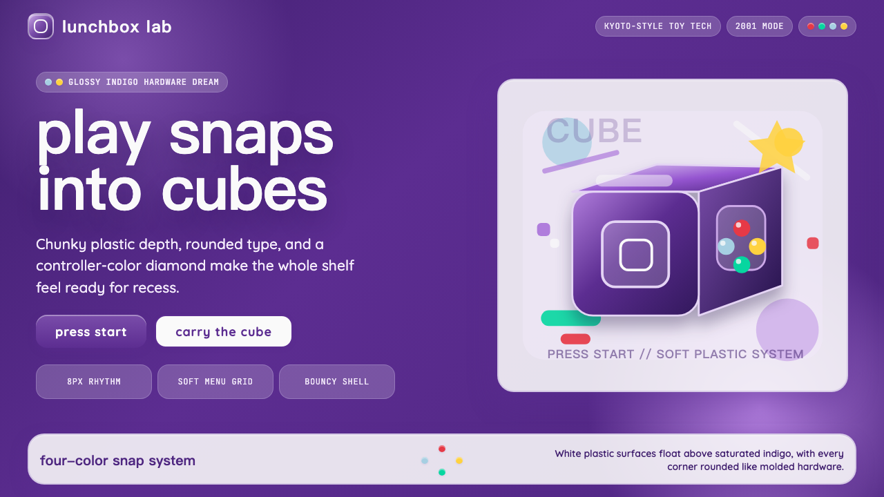 Nintendo GameCube (2001)Toy-tech refuses restraint. Indigo plastic, glossy cubes, and four-color butt…玩具科技拒绝克制:靛紫塑料、光泽立方与四色按钮传递快乐。
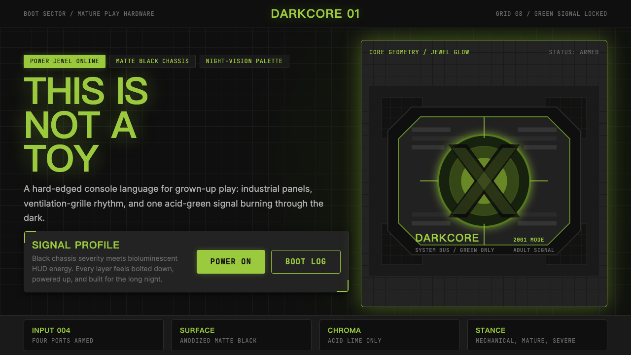 Xbox Original (2001)Not a toy. Acid green cuts matte black in a rigid grille-and-jewel hardware p…不是玩具:酸绿切开哑黑,以格栅与发光宝石构成硬件海报。