What is Xbox Original (2001)?什么是 Xbox Original (2001)?
A matte-black monolith with a glowing green jewel — the original Xbox declared that games were serious business and rewrote the visual grammar of console culture.一台哑光黑色的方形巨兽,中央嵌着一颗发光的绿色宝石——初代Xbox宣告游戏是一件严肃的事,并重写了主机文化的视觉语法。
Xbox Original (2001) in briefXbox Original (2001) 速览
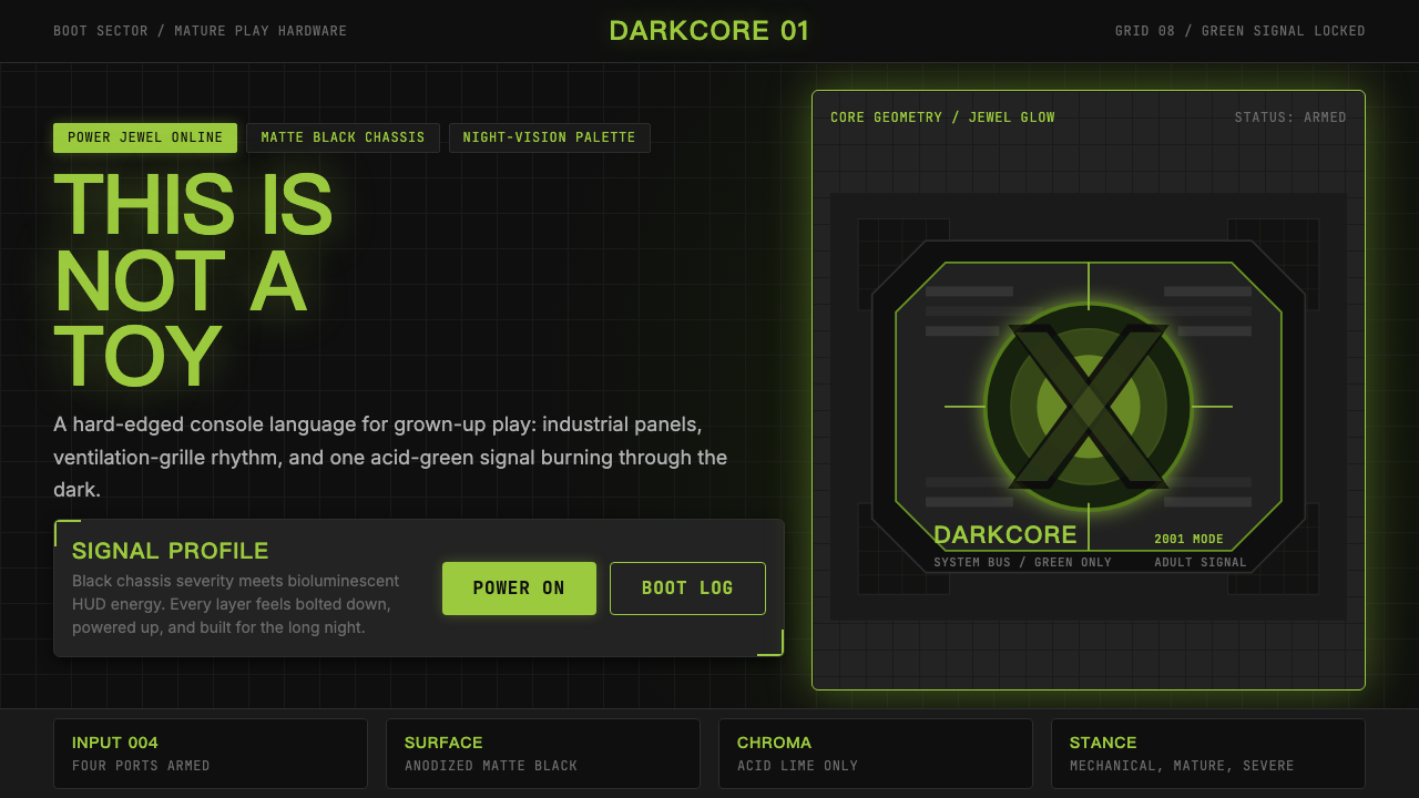
The Xbox Original design system is a visual language built on a single, absolute contrast: acid green against matte black. Every surface is dark and hard-edged, communicating industrial weight and mechanical precision. The lone accent color — a searing, bioluminescent lime — cuts through the darkness like a heads-up display readout, evoking night-vision optics, circuit-board traces, and the green-on-black terminals of early cyberpunk aesthetics.Xbox初代设计体系是一套建立在单一绝对对比之上的视觉语言:酸性绿对哑光黑。所有界面都是深色、硬边的,传递出工业分量与机械精度感。唯一的强调色——一种刺目的、如生物荧光般的酸橙绿——像抬头显示器的读数一样切割黑暗,唤起夜视仪光学效果、电路板走线,以及早期赛博朋克美学中标志性的绿-黑终端画面。
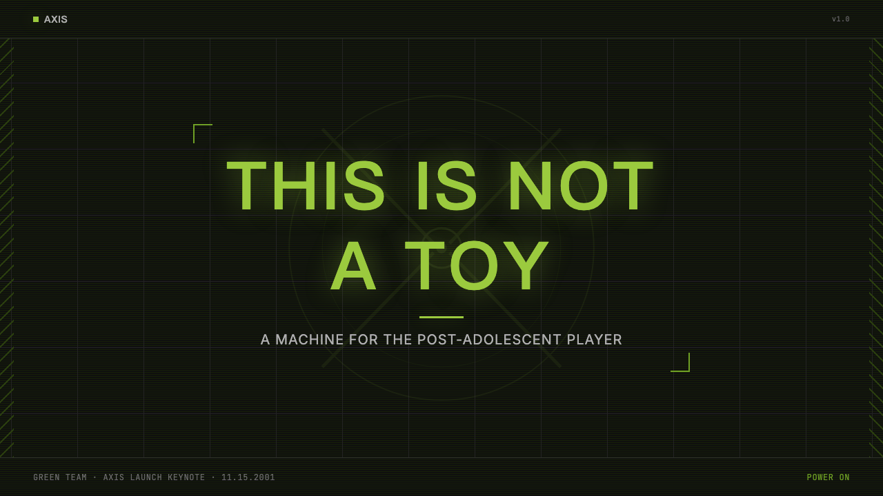
This is not a friendly or playful visual system. Where competitors leaned into bright primaries and rounded forms to signal approachability, Xbox Original announced itself as a machine for serious players. The design vocabulary is closer to a server rack or a piece of military hardware than to a toy — all grilles, chamfered edges, and purposeful geometry. The aesthetic was sometimes called 'black box brutalism' in contemporary gaming press.这不是一套友善或趣味性的视觉体系。竞争对手们用鲜亮的原色和圆润的造型来表达亲切感,而Xbox初代却宣告自己是一台供严肃玩家使用的机器。设计词汇更接近服务器机架或军用设备,而非玩具——全是格栅、倒角边缘和目的明确的几何形态。这种美学在当时的游戏媒体中有时被称为「黑箱粗野主义」。
Applied to digital surfaces, the system produces high-contrast compositions where green functions as a pure signal color: it marks action, progress, and interaction against a field of dark neutrals. Typography is set in heavy, bold letterforms with wide tracking, lending every headline the authority of a system readout. Imagery, when present, is treated with high-contrast processing that strips softness away, reinforcing the overall mood of controlled, technological intensity.应用于数字界面时,这套体系产生高对比度的构图,绿色作为纯粹的信号色发挥作用:在深色中性色调的底面上标记动作、进度与交互状态。排版采用粗重、大胆的字形,字距宽阔,赋予每个标题以系统读数般的权威感。图像(若出现)则经过高对比度处理,剔除一切柔软性,强化整体受控的、科技感强烈的氛围。
See the Xbox Original (2001) design system查看 Xbox Original (2001) 完整设计系统
Where does Xbox Original (2001) come from?Xbox Original (2001) 从何而来?
The original Xbox emerged from a skunkworks project inside Microsoft in the late 1990s, driven by four engineers — Seamus Blackley, Kevin Bachus, Ted Hase, and Otto Berkes — who worried that Sony's PlayStation 2 would become the dominant computing platform of the living room, displacing Windows from the center of home entertainment. Their internal pitch was as much a strategic business argument as a product proposal: if Microsoft did not build a console, it risked ceding the television screen permanently to a competitor.初代Xbox诞生于1990年代末微软内部一个秘密小组的项目,由四位工程师——西缪斯·布莱克利、凯文·巴克斯、泰德·哈斯和奥托·贝克斯——推动。他们担忧索尼的PlayStation 2将成为客厅计算平台的主导者,把Windows从家庭娱乐的中心挤出去。他们向高层提交的内部方案,与其说是一份产品提案,不如说是一份战略商业论证:如果微软不做主机,就有可能将电视屏幕永久拱手相让给竞争对手。
J Allard, a senior Microsoft executive who had championed internet strategy earlier in the decade, became the project's cultural architect. Allard's brief was precise and deliberately confrontational: the Xbox had to be the anti-Nintendo. Where Nintendo was colorful, cartoonish, and family-oriented, Xbox would be dark, angular, and adult. Where Sony's PlayStation aesthetic was sleek and consumer-electronic, Xbox would feel heavy, mechanical, and purposefully intimidating. Allard and designer Horace Luke developed the industrial language that became the console's identity — matte black surfaces, a prominent green jewel power button, and an 'X' motif deeply incised into the top face.J·阿拉德是微软的高级主管,此前曾主导公司的互联网战略,他成为了这个项目的文化设计师。阿拉德的定位精确而刻意地具有对抗性:Xbox必须是反任天堂的。任天堂是色彩丰富、卡通化、面向家庭的,那么Xbox就要是深色的、有棱角的、成人向的。索尼PlayStation的美学是圆滑的消费电子产品风格,那么Xbox就要显得厚重、机械,并有意令人感到敬畏。阿拉德与设计师霍勒斯·卢共同发展出了成为主机身份标志的工业语言——哑光黑色表面、醒目的绿色宝石电源按钮,以及深深刻入顶部面板的「X」字母造型。
The visual direction drew on multiple currents of late-1990s and early-2000s culture. The late Y2K period was saturated with cyberpunk imagery: The Matrix arrived in 1999 and flooded popular culture with green-on-black terminal aesthetics, bullet-time kinetics, and the idea of technology as something that could be either liberating or threatening. Industrial and military hardware design — matte black finishes, no-nonsense geometry, visible screws and vents — was being appropriated by consumer electronics brands attempting to project seriousness. The DirectX branding heritage, which the Xbox name directly referenced, contributed a software-engineering sensibility that treated the product as a piece of infrastructure rather than entertainment.这套视觉方向汲取了1990年代末和2000年代初多重文化潮流的养分。Y2K时代末期浸透了赛博朋克意象:《黑客帝国》于1999年上映,将绿色字符在黑色屏幕上流淌的终端美学、子弹时间运动感,以及「技术既可以是解放,也可以是威胁」的观念洪水般涌入大众文化。工业与军事硬件的设计语言——哑光黑色表面、简洁的几何造型、外露的螺丝与散热口——正被消费电子品牌大量借用,以传达严肃感。Xbox的名称直接来源于DirectX品牌传承,这为产品注入了一种软件工程师的感性——将产品视为基础设施而非娱乐设备。
The console launched in North America in November 2001, competing directly against the already-launched PlayStation 2 and the Nintendo GameCube. Its physical size — significantly larger than either competitor — was both a technical necessity (the hardware was built around a desktop-derived architecture including a standard hard drive) and a deliberate aesthetic choice: bigger read as more powerful in the imagination of the target audience. The original controller, nicknamed 'The Duke' by press and players, was similarly oversized. The launch campaign, developed with advertising agency McCann, emphasized the phrase 'It's good to play together' but the visual imagery was consistently dark, mechanical, and adult. The design system established in 2001 remained the foundation of Xbox brand identity for nearly a decade, evolving through the 360 era before being significantly lightened and consumerized.这台主机于2001年11月在北美上市,直接对抗已经发布的PlayStation 2和任天堂GameCube。其硕大的体型——明显大于两个竞争对手——既是技术必然(硬件基于桌面派生架构,内置标准硬盘),也是刻意为之的美学选择:在目标受众的想象中,更大意味着更强大。原装手柄——被媒体和玩家戏称为「公爵」——同样超出常规尺寸。由麦肯广告公司操刀的上市活动以「一起玩真好」为口号,但视觉形象始终是深色的、机械的、成人向的。这套2001年确立的设计体系在近十年内一直是Xbox品牌视觉识别的基础,历经360时代的演变,才在后来被大幅提亮并走向大众消费风格。
What defines the Xbox Original (2001) look?Xbox Original (2001) 的视觉特征是什么?
Color色彩
The palette is binary and absolute: near-black as the universal ground, and a single accent of acid green — a hue with a bioluminescent, almost toxic quality that reads instantly as digital and non-natural. The black is not glossy or reflective; it is matte and absorptive, suggesting mass and industrial finishes rather than consumer polish. The green appears only where it must signal action, life, or interaction — a power state, a progress bar, a selected element. Secondary neutrals, where they appear, are deep grey or charcoal, never warm. No tertiary colors are used; the system's emotional impact depends entirely on the severity of this single contrast.色板是二元且绝对的:近黑色作为普遍的底色,搭配单一的酸性绿强调色——这种色调具有一种如生物荧光、近乎毒性的质感,让人一眼就能感受到数字化与非自然性。黑色不是光滑或反光的;它是哑光且吸光的,传递出重量感和工业涂层质感,而非消费品的精致感。绿色只出现在必须传达动作、生命或交互的地方——电源状态、进度条、选中状态元素。次要中性色(若出现)是深灰或炭灰,绝无暖调。没有任何三次色;这套体系的情感冲击力完全依赖这单一对比的严峻程度。
Surface Texture表面质感
Matte and tactile surfaces are the rule. The black ground should read as a material — not a void or a canvas, but something with physical presence and controlled reflectivity. Grille patterns, cross-hatching, and mechanical perforations are appropriate textural motifs because they reference the console's own industrial hardware form. Gloss, specularity, and smooth gradients are antithetical to the system; any sheen undermines the sense of deliberate mechanical weight that distinguishes this aesthetic from generic dark-mode design.哑光与触感性表面是基本法则。黑色底面应当被理解为一种材料——不是虚空或画布,而是具有实体存在感和受控反光率的东西。格栅纹样、交叉影线和机械穿孔是恰当的质感母题,因为它们参照了主机自身的工业硬件形态。光泽感、镜面反射和平滑渐变与这套体系相悖;任何光泽都会削弱刻意制造的机械重量感——而这正是这种美学区别于泛用深色模式设计的核心所在。
Typography字体排印
Type is bold, wide-tracked, and assertive. Headlines carry the weight of system output — they do not invite; they inform. The preferred register is all-caps or near-all-caps for short display text, with generous letter spacing that prevents any sense of crowding. Body text, where present, is set in a clean, geometric sans-serif at a comfortable reading size but without warmth — precision is the quality to project, not friendliness. Green is reserved for active or interactive typographic states; neutral text is near-white or light grey on the dark ground.字体粗重、字距宽阔、态度强势。标题承载着系统输出的分量——它不是邀请,而是通告。短展示文字偏好全大写或近全大写,配以宽松的字母间距,杜绝任何拥挤感。正文(若出现)以干净的几何无衬线字体排列,字号舒适但无温度——要传达的品质是精准,而非亲切。绿色保留给活跃或可交互的排版状态;中性文字在深色底面上是近白或浅灰。
Form and Edge形态与边缘
The geometry is hard and angular with deliberate chamfering — edges that are cut or beveled rather than rounded. Where curves appear, they serve a mechanical function, like the barrel of a connector or the arc of a vent aperture. Soft, organic, or friendly curves have no place in the system. UI elements in this aesthetic are rectangular with tight corner radii or no rounding at all; buttons read more like hardware switches than software affordances.几何造型硬朗且有棱有角,带有刻意的倒角处理——边缘是被切削或斜切的,而非圆润的。若出现弧度,也服务于机械功能,比如接头的圆柱形或散热口的弧形开口。柔软、有机或友善的曲线在这套体系中没有位置。这种美学下的UI元素是矩形的,圆角半径极小或完全无圆角;按钮读来更像硬件开关,而非软件可交互区域。
Lighting and Glow光效与发光
The defining lighting motif is the contained glow — a source of green light that emanates from within a dark form, suggesting powered electronics and internal energy. This is not an ambient or atmospheric effect but a localized, purposeful one: the glow marks the active state of the system. In UI applications, this translates to luminous green elements — indicators, highlights, selection states — that appear self-illuminated against the dark ground rather than lit by an external source. The effect should feel like looking at a screen or a status LED in a darkened room, not like a decorative lighting scheme.标志性的光效母题是内敛的发光——一个从深色形态内部向外散发的绿色光源,暗示已通电的电子元件与内部能量。这不是环境光或大气效果,而是局部的、目的明确的光:发光标记系统的激活状态。在UI应用中,这转化为发光的绿色元素——指示灯、高亮、选中状态——它们在深色底面上呈现出自发光的效果,而非被外部光源照亮。这种效果应当让人感觉像是在暗室中凝视一块屏幕或一个状态LED灯,而非某种装饰性灯光方案。
Iconography and Motif图标与母题
The 'X' mark — used in both the brand logo and the cross-shaped controller button — is the system's primary symbolic motif. It reads simultaneously as a directional indicator, a hardware button, and an emblem of exclusion (this is not for everyone). Supporting motifs include grille patterns referencing the console's ventilation design, target or crosshair forms evoking gaming precision, and circuit-trace geometries suggesting the machine's internal architecture. Decorative illustration is absent; every graphic element either serves wayfinding or reinforces the mechanical-technological character of the system.「X」标记——出现在品牌标志与十字形手柄按钮上——是这套体系的核心象征母题。它同时被解读为方向指示符、硬件按钮和排他性徽章(这不是为所有人准备的)。辅助母题包括参照主机散热设计的格栅纹样、唤起游戏精准感的瞄准镜或准星形态,以及暗示机器内部架构的电路走线几何形。装饰性插图缺席;每一个图形元素要么服务于导航指引,要么强化这套体系的机械-科技特质。
Negative Space负空间
The dark ground functions as active negative space rather than passive background. Because the black field is the dominant visual mass, the placement and sizing of green and light elements must be considered with precision — a small green indicator isolated in a large black field carries enormous visual weight. This inverts the usual logic of light-background design, where white space signals air and breathing room; here, the black field is the air, and green is the mark that charges it with energy.深色底面作为主动的负空间发挥作用,而非被动背景。因为黑色底面是占主导的视觉质量,绿色与明亮元素的位置和大小必须精确考量——一个孤立于大面积黑色底面中的小绿色指示符承载着巨大的视觉分量。这颠倒了浅色背景设计的通常逻辑——在那里,白色空间传达通透感与呼吸空间;而在这里,黑色底面是空气,绿色是为其充能的标记。

See the Xbox Original (2001) design system查看 Xbox Original (2001) 完整设计系统
Who shaped Xbox Original (2001)?谁塑造了 Xbox Original (2001)?
A physicist and game developer who had shipped the technically ambitious Jurassic Park: Trespasser, Blackley became the internal evangelist who made the case to Microsoft leadership that the company could build a competitive gaming console. His credibility as someone who had shipped games — and understood the DirectX technology at the core of the proposal — gave the skunkworks pitch enough weight to survive early executive skepticism. Blackley's insistence on hardware performance as the non-negotiable design constraint shaped the machine's oversized form factor and in doing so inadvertently reinforced its imposing visual identity.物理学家出身的游戏开发者布莱克利曾推出技术雄心勃勃的游戏《侏罗纪公园:入侵者》,他成为微软内部的福音传播者,向公司高层论证微软有能力打造一款有竞争力的游戏主机。他作为一个真正发布过游戏、并深刻理解方案核心DirectX技术的人的信誉,让这个秘密项目的提案足够有分量,得以在高管的早期质疑中存活下来。布莱克利坚持将硬件性能作为不可妥协的设计约束条件,塑造了这台机器超大的体型,并在无意间强化了其令人印象深刻的视觉身份。
Allard was the strategist and cultural architect of the Xbox identity. He articulated the anti-Nintendo positioning that gave every visual decision its rationale — dark where competitors were bright, angular where they were rounded, serious where they were playful. His background in internet strategy (he had written an influential internal memo in 1994 urging Microsoft to embrace the internet) informed his belief that the Xbox was not just a game console but a platform play, and that the design needed to communicate platform-level seriousness rather than toy-category approachability. Allard later led the design of the Zune media player, applying a related set of dark, industrial aesthetic sensibilities.阿拉德是Xbox身份的战略师与文化设计师。他阐述了「反任天堂」的定位,为每一个视觉决定提供了根本依据——在竞争对手明亮的地方选择深色,在他们圆润的地方选择有棱角,在他们趣味化的地方保持严肃。他在互联网战略方面的背景(他于1994年撰写了一份颇具影响力的内部备忘录,敦促微软拥抱互联网)影响了他的信念:Xbox不仅是一台游戏主机,而是一个平台级的战略布局,设计需要传达平台级的严肃感,而非玩具类产品的亲切感。阿拉德后来主导了Zune媒体播放器的设计,运用了一套相近的深色工业美学感性。
Luke was the lead industrial designer responsible for translating the strategic positioning into hardware form. Working within the constraints of a large, hot-running PC-derived architecture, he developed the matte-black chassis, the green jewel power button, and the 'X' grille incised into the console's top face — three elements that together established the design language that would define Xbox visual identity for years. Luke's approach was to treat the console as a piece of designed technology rather than a consumer appliance, and to make its size and weight feel like strengths rather than compromises. He later became Chief Innovation Officer at HTC.霍勒斯·卢是首席工业设计师,负责将战略定位转化为硬件形态。在大体积、高发热量的PC派生架构约束下,他发展出了哑光黑色机身、绿色宝石电源按钮,以及刻入主机顶部面板的「X」格栅造型——这三个元素共同确立了将在未来多年定义Xbox视觉识别的设计语言。卢的方式是将主机当作一件经过设计的技术产品而非消费家电来对待,并让其体积和重量显得像是优势而非妥协。他后来成为宏达电(HTC)的首席创新官。
Berkes was the software architect whose DirectX expertise gave the original Xbox proposal its technical foundation. His insight — that the PC's DirectX graphics API could be adapted to run on dedicated console hardware, allowing Windows-developed games to be ported with relatively low friction — was the engineering argument that made the project viable. While his contribution was primarily architectural rather than visual, the project's naming (Xbox, from DirectX box) and its self-conception as serious technology infrastructure rather than a toy traces directly to Berkes's framing of the proposal.贝克斯是软件架构师,他在DirectX方面的专业知识为初代Xbox提案提供了技术基础。他的洞见是:PC的DirectX图形API可以被改造以在专用主机硬件上运行,使得以Windows平台开发的游戏能够以相对较低的摩擦成本移植——这一工程论点使整个项目在技术上成为可行。尽管他的贡献主要是架构层面而非视觉层面的,但这个项目的命名(Xbox,源自「DirectX box」)以及它将自身定位为严肃技术基础设施而非玩具的自我认知,都直接来自贝克斯对提案的框架建构。
Although not hardware designers, the team at Bungie — acquired by Microsoft in 2000, specifically to have a flagship title for the Xbox launch — shaped the Xbox visual identity through Halo: Combat Evolved. The game's aesthetic of dark, industrial military science fiction, rendered in green and olive tones against dark environments, perfectly harmonized with and reinforced the console's design language. Halo became so synonymous with Xbox that its visual sensibility — green armor, dark interiors, authoritative sans-serif typography — retroactively felt like it had informed the hardware rather than the reverse.尽管Bungie的团队并非硬件设计师,但这家于2000年被微软收购(专为Xbox上市提供旗舰游戏)的工作室,通过《光环:战斗进化》塑造了Xbox的视觉身份。这款游戏以深色工业军事科幻美学为基调,在深色环境中大量运用绿色与橄榄色调,与主机的设计语言高度契合并相互强化。《光环》与Xbox的关联之深,以至于其视觉感性——绿色装甲、黑暗内部空间、权威感强的无衬线字体——在回看时像是影响了硬件设计,而非相反。
How do you use Xbox Original (2001) today?今天怎么用 Xbox Original (2001)?
The Xbox Original aesthetic is a high-stakes design choice: it communicates power, seriousness, and technological authority without compromise, but it does so by eliminating warmth, approachability, and decorative pleasure entirely. Applying it well requires committing fully to its constraints — a partial application that retains rounded corners, soft shadows, or warm neutrals alongside the dark ground and green accent will read as confused rather than cool. The system rewards discipline.Xbox初代美学是一个高风险的设计选择:它毫不妥协地传达力量、严肃感和技术权威,但代价是彻底消除温暖感、亲切感和装饰性愉悦。正确应用它需要完全遵守其约束——一旦保留圆角、柔和阴影或暖调中性色与深色底面和绿色强调的共存,效果将是混乱而非酷感。这套体系奖励严格的自律。
For presentation slides, the design works most effectively as a full-bleed dark system — the slide background should be a rich, deep near-black with no gradient, and all slide content should respect a strict grid with generous margins. Cover slides benefit from a single large typographic treatment in wide-tracked, bold type, with a green accent element that isolates against the dark field. Content slides should lead with bold section labels in green, with body content in near-white or light neutral type. Data visualization fits the system well: charts and progress indicators take on a tactical, readout-like quality when rendered in green against dark grounds, with minimal grid lines and no decorative fill.在演示文稿中,这种设计作为全出血深色系统最为有效——幻灯片背景应该是浓郁的、深沉的近黑色,无渐变,所有幻灯片内容应遵守带有宽阔页边距的严格网格。封面幻灯片得益于单一大尺度字体处理,字距宽阔、笔画粗重,配以一个孤立于深色底面的绿色强调元素。内容幻灯片应以绿色的粗重章节标签开头,正文内容采用近白或浅色中性文字。数据可视化与这套体系契合良好:图表和进度条在深色底面上以绿色呈现时,具有一种战术性的、读数般的品质,配以最简化的网格线和无装饰填充。
For web UI, the aesthetic is particularly well-suited to dashboards, developer tools, and technology platform landing pages where the audience expects to be addressed as a technical peer rather than a casual consumer. Navigation bars should be dark and type-led, with minimal icon use. Cards and panels read as hardware-like components with hard edges and dark interior surfaces. Interactive states — hover, focus, active — are marked exclusively through green color shifts and brightness changes rather than motion or shadow. Pricing pages in this system convey confidence through restraint: tier names and key numbers set large, in near-white, with green reserved for the call-to-action tier.对于Web UI,这种美学特别适合仪表板、开发者工具和技术平台落地页——这些场所的受众期望被作为技术同行而非普通消费者来对待。导航栏应深色且以文字为主导,最小化图标使用。卡片和面板读来像是硬边且内部深色的硬件组件。交互状态——悬停、聚焦、激活——仅通过绿色颜色转换和亮度变化来标记,而非通过动效或阴影。这套体系下的定价页面通过克制传达信心:套餐名称和关键数字以大号近白文字显示,绿色保留给行动号召套餐。
For editorial and marketing applications, the design system scales well to event branding, gaming press materials, and technology product launches where the subject matter aligns with the aesthetic's values. A poster or social card built in this system leads with a large green typographic element against a field of matte black, with secondary information in smaller near-white type. Marketing email headers follow the same logic: dark ground, bold green feature headline, clean information hierarchy below. The style is less well-suited to lifestyle or fashion contexts, where its severity can feel imposing rather than aspirational.对于编辑和营销应用,这套设计体系在活动品牌、游戏媒体素材和技术产品发布中表现良好——这些场合的主题与这套美学的价值观相符。在这套体系中制作的海报或社交卡片,以一个大型绿色字体元素在哑光黑色底面上为主体,辅以较小的近白色二级信息。营销邮件标题遵循同样的逻辑:深色底面、粗体绿色主要标题、以下层级清晰的信息结构。这种风格不太适合生活方式或时尚场景,在那里其严肃性可能显得压迫性而非令人向往。
The most common mistake when applying this system is treating it as generic dark mode with a green accent added. Generic dark mode softens edges, uses layered dark greys to create depth, and relies on subtle drop shadows to separate components — all of which work against the Xbox Original aesthetic, which derives its character from flatness, hardness, and the shock of a single stark green against undifferentiated black. The second common error is over-using green: it is a signal color, not a fill color. If green covers more than a small fraction of the visible composition, it loses the contrast that makes it effective and the design loses the sense of controlled intensity that defines the style.应用这套体系时最常见的错误是将其视为加了绿色强调色的通用深色模式。通用深色模式会柔化边缘,使用分层的深灰色创造深度,依赖微妙的投影分离组件——所有这些都与Xbox初代美学相悖,该美学的性格来源于平面性、硬度,以及单一刺目的绿色在无差别的黑色上形成的冲击感。第二个常见错误是过度使用绿色:它是信号色,而非填充色。如果绿色覆盖了超过一小部分可见构图面积,它就失去了使其有效的对比感,设计也失去了定义这种风格的受控强度感。
See the Xbox Original (2001) design system查看 Xbox Original (2001) 完整设计系统
Xbox Original (2001) — FAQXbox Original (2001) · 常见问题
Is this style usable for a light-background product?这种风格可以用在浅色背景的产品上吗?
Technically yes, but it requires significant adaptation and the result will feel more like an Xbox-inspired design than an authentic application of the system. The defining power of the style comes from the contrast between a dominant dark field and a small area of luminous green — that relationship does not transpose cleanly to a light background. On white or light grey, the green loses much of its impact (it becomes a standard green accent rather than a glowing signal), and the overall mood shifts from authoritative to merely technical. If a light-background product needs to reference this aesthetic, confine the dark treatment to specific components — a hero panel, a navigation bar, a feature block — rather than inverting the full system.技术上可行,但需要大幅调整,且结果更像是受Xbox启发的设计,而非对这套体系的真实应用。这种风格的决定性力量来自占主导地位的深色底面与小面积发光绿色之间的对比关系——这种关系无法干净地转置到浅色背景上。在白色或浅灰底面上,绿色失去了大部分冲击力(它变成了一个普通的绿色强调色,而非发光信号),整体氛围从权威感转变为纯粹的技术感。如果浅色背景的产品需要参照这种美学,将深色处理限制在特定组件上——英雄区域面板、导航栏、特性模块——而非将整套体系倒置。
How does this style relate to general cyberpunk or dark-mode aesthetics?这种风格与一般的赛博朋克或深色模式美学有什么关系?
Xbox Original is a specific, historically grounded version of early-2000s cyber aesthetic that predates the diffusion of generic dark mode. The distinction is intentionality and restraint. Generic cyberpunk visual design often accumulates references — neon accents in multiple colors, rain-streaked textures, Japanese typography, lens flares — to signal the genre. Xbox Original is stripped of all such referential layering. It achieves its effect through subtraction: one color, one material, one contrast. It is cyberpunk distilled to a hardware object rather than illustrated as a scene, and that restraint is what makes it durable. Contemporary dark-mode interfaces, meanwhile, are typically designed for readability and perceived neutrality rather than attitude — they use layered greys and minimal color, which is structurally different from the stark binary of black and green.Xbox初代是千禧年初网络美学的一个特定的、有历史根基的版本,早于通用深色模式的泛化传播。区别在于意图性和克制性。通用赛博朋克视觉设计往往堆叠各种参照——多色霓虹强调、雨迹纹理、日语字体、镜头光晕——以传达这种类型风格。Xbox初代则剥去了所有这类参照性分层。它通过减法取得效果:一种颜色、一种材质、一组对比。它是将赛博朋克提炼为一件硬件物品,而非将其图示为一个场景,而这种克制正是它经久不衰的原因。当代深色模式界面则通常为可读性和感知中性而设计——它们使用分层的灰色和最小化的色彩,这在结构上与黑绿二元的鲜明对比截然不同。
Can the Xbox Original aesthetic work for brands outside gaming and technology?Xbox初代美学可以用于游戏和科技之外的品牌吗?
It can, but the style carries strong connotative baggage: matte black plus acid green reads as gaming, military, or industrial technology in most cultural contexts. Brands where those associations are assets — extreme sports, professional audio equipment, performance vehicles, cybersecurity products — can adopt the system with relatively low translation cost. Brands where those associations are liabilities — food, fashion, children's products, healthcare, hospitality — will find that the aesthetic works against their positioning. The deepest limitation is emotional: the Xbox Original system generates feelings of power and competence but not warmth, delight, or human connection. Any context where the latter emotions are central to the brand relationship is a poor fit.可以,但这种风格带有强烈的联想包袱:在大多数文化语境中,哑光黑色加酸性绿会被解读为游戏、军事或工业科技。对于那些认为这些联想是资产的品牌——极限运动、专业音频设备、性能车辆、网络安全产品——采用这套体系的转化成本相对较低。对于那些认为这些联想是负债的品牌——食品、时尚、儿童产品、医疗、酒店——这种美学将与其定位背道而驰。最深层的局限是情感层面的:Xbox初代体系产生力量感和能力感,但不产生温暖感、愉悦感或人文连接感。任何以后者情感为品牌关系核心的场景,都不适合这套体系。
How should green be used to avoid looking like a generic green-on-black terminal theme?如何使用绿色,以避免看起来像通用的绿底黑色终端主题?
The terminal aesthetic — common in retro-computing tributes and hacker-culture signaling — uses green type on black ground as its primary mode, with the green covering a large proportion of the visible surface and often using a monospaced, bitmap-influenced typeface. The Xbox Original system is structurally different: green is a mark on black, not a field on black. In practice, this means green should appear on less than a fifth of any given composition, concentrated in focal points — a button state, a header accent, a progress indicator — rather than spread across text or background regions. The typeface should be contemporary and bold rather than retro and monospaced. The overall impression should be industrial and authoritative, not nostalgic or countercultural.终端美学——在复古计算致敬作品和黑客文化信号中很常见——使用黑底绿字作为主要模式,绿色覆盖大部分可见表面,通常采用等宽的、受点阵字体影响的字体。Xbox初代体系在结构上截然不同:绿色是黑色上的标记,而非黑色上的底面。实际操作中,这意味着绿色在任何给定构图中应占不超过五分之一的面积,集中在焦点处——按钮状态、标题强调、进度指示——而非分散在文字或背景区域。字体应当是当代且粗重的,而非复古且等宽的。整体印象应当是工业化的和权威性的,而非怀旧的或反文化的。
What happened to the Xbox Original visual identity after the first console generation?初代Xbox的视觉识别在第一代主机之后发生了什么?
The Xbox 360, launched in 2005, marked a significant evolution: the hardware moved to a curved, white primary color option (alongside the black variant), signaling an attempt to broaden the audience beyond the core hardcore demographic. The design language became more consumer-friendly, with softer forms and greater color variety. The accent green persisted but became more domesticated — a brand color rather than a stark signal against darkness. By the time of the Xbox One launch in 2013, the visual system had been substantially redesigned around a flat, tile-based interface influenced by Microsoft's Metro design language, which was itself an evolution toward a different design tradition entirely. The original 2001 aesthetic exists now as a period piece — a crystallization of a particular cultural moment in gaming history — rather than a living design system.2005年推出的Xbox 360标志着一次显著演变:硬件增加了弧线造型的白色主色选项(与黑色版本并存),标志着试图将受众扩展到核心硬核玩家之外。设计语言变得更加面向消费者,形态更柔和,色彩更多样。绿色强调色得以保留,但变得更为日常化——成为品牌色而非在黑暗中的刺目信号。到2013年Xbox One发布时,视觉体系已围绕扁平的、磁贴式界面进行了实质性重新设计,这受到微软Metro设计语言的影响,而Metro本身又是朝向另一种完全不同设计传统的演进。2001年的原始美学现在作为一件时代作品而存在——对游戏历史上特定文化时刻的结晶——而非一套存活中的设计体系。
Related design styles相关设计风格
 Acidwave 3D RenderPsychedelia hits the render engine. Neon green, chrome orbs, and warped grids…迷幻被塞进渲染引擎:霓虹绿、液态铬球与扭曲网格灼烧黑底。
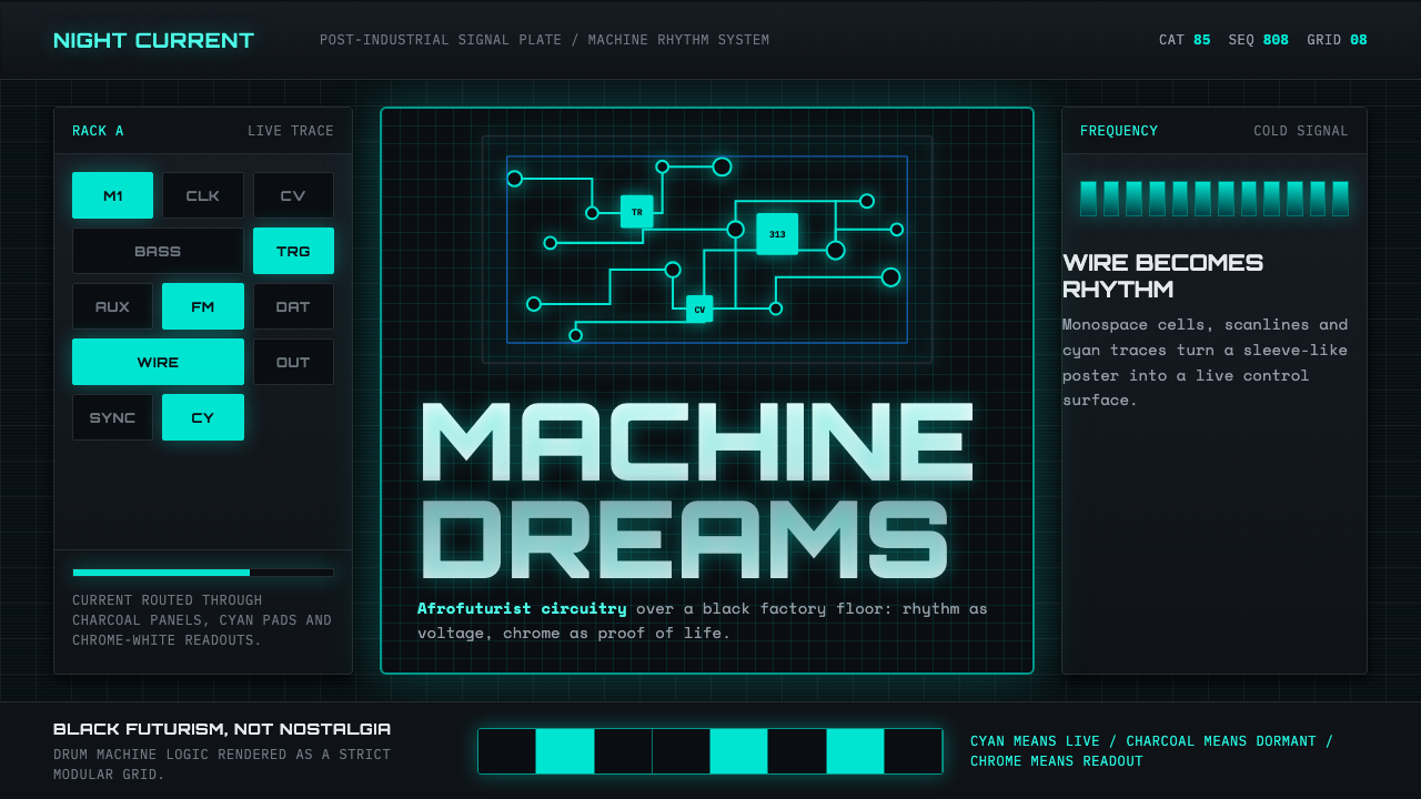 Detroit TechnoCold machines dream. Electric cyan circuits and chrome display type lock to a…冷机器在做梦。电青线路与铬感字形锁进黑色网格。
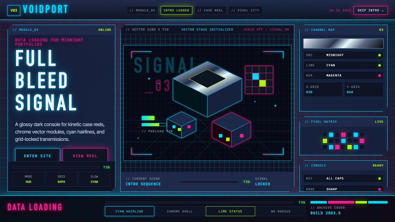 Flash Website Era (2003)A browser turned sci-fi console. Cyan HUD hairlines, chrome gradients, and 4p…浏览器变身科幻控制台:电光青描边、铬渐变与4px网格。
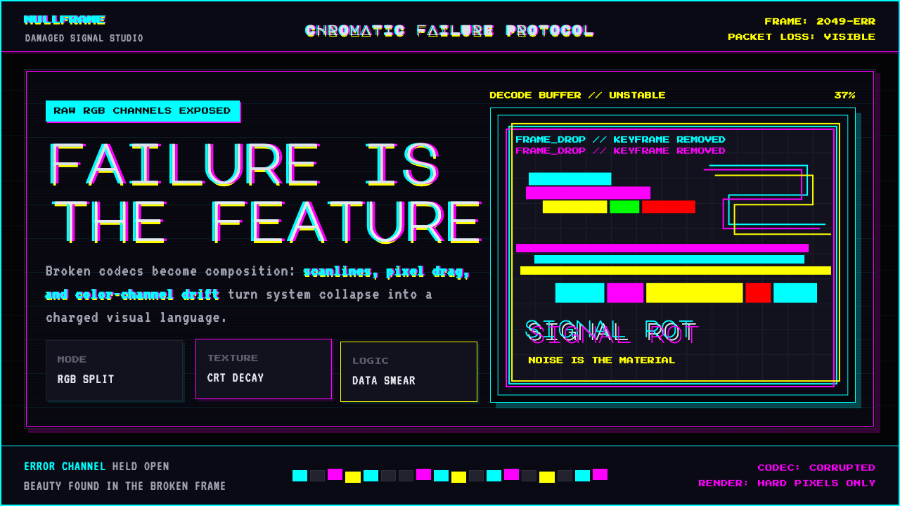 Glitch DatamoshErrors as composition. Corrupted JPEGs, RGB splits, scanlines — failure treat…把数字错误升华为视觉语言:损坏的 JPEG、RGB 色差偏移、扫描线、像素排序…
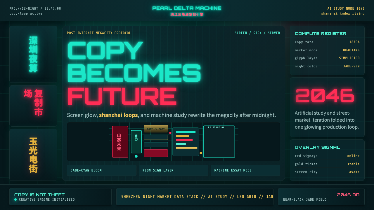 SinofuturismCopy becomes future. Jade-cyan grids, red signage, and Orbitron data stack th…复制成为未来。玉青网格、红色招牌与数据字叠起夜城。
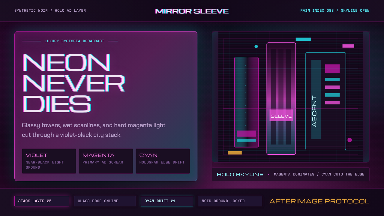 Altered CarbonNeon screams off noir. Magenta glass, cyan scanlines, and stacked vertical si…霓虹刺破黑夜:品红玻璃、青色扫描线与垂直招牌。