What is Acidwave 3D Render?
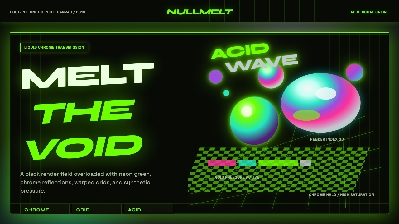
Acidwave 3D Render pushes psychedelia through a rendering engine — liquid chrome, iridescent orbs, and warped wireframe grids burning in neon green over a void of black.
Acidwave 3D Render in brief
Acidwave 3D Render is a digital-native design language born from the intersection of computer-generated imagery and revival psychedelic graphics. It imagines a near-black render canvas as an infinite void, populated by liquid-chrome blobs, iridescent metallic spheres, and viscous dripping type rendered as if made of molten metal, all lit by an overwhelming saturation of acid-green neon.
The style draws its texture and structure from two distinct lineages fused together: the optical trickery of op-art checkerboards and warped grids, and the rendering vocabulary of contemporary 3D software — reflective materials, chromatic aberration, and simulated depth. Where classic psychedelic poster art relied on hand-drawn distortion, this style achieves the same disorienting effect through digital rendering techniques, giving it a colder, more hyper-real edge.
Emerging from the late 2010s acid-graphics revival on design-sharing platforms, the aesthetic carries a self-aware, faintly cynical attitude — it knows it is excessive, and leans into that excess rather than softening it. Metallic reflections, holographic gradients, glitch-style lettering, and an eye-scorching green together produce a visual language built for maximum sensory intensity.

Where does Acidwave 3D Render come from?
The visual language now called Acid Design or Acidgrafix emerged in the late 2010s, roughly from 2018 onward, as a distinct current within online graphic-design communities on platforms like Dribbble and Behance. It arrived as a reaction against the clean, restrained flat-design conventions that had dominated interface and branding work through much of the decade, offering instead a deliberately excessive, maximalist alternative.
The style's name and much of its texture vocabulary reference 1960s and 1970s psychedelic poster art and acid-house rave graphics of the late 1980s and early 1990s — both movements built around warped, hallucinatory visuals meant to evoke altered states of perception. Acidwave translates that lineage into a specifically post-internet, computer-rendered form: instead of hand-drawn swirls and screen-printed posters, it uses 3D-rendering software to produce liquid-metal surfaces, chromatic gradients, and warped geometric grids with a hyper-clean, almost sterile precision that contrasts against its chaotic subject matter.
This 3D-rendering approach coincided with the wider democratization of consumer 3D software and real-time rendering tools in the late 2010s, which allowed individual designers — rather than only specialized studios — to produce glossy, reflective, physically-simulated surfaces at a scale and speed previously unavailable. Acidgrafix communities on design-sharing sites became the primary incubator and distribution channel for the style, with practitioners iterating rapidly on shared visual tropes: liquid chrome, checkerboard distortion, and neon-on-black palettes.
By the early 2020s the aesthetic had spread from niche design portfolios into broader digital culture — album art, streetwear branding, and internet-native visual identities — cementing its status as one of the defining 'post-internet' graphic movements of its moment, distinct from but related to vaporwave and its subsequent revivals.
What defines the Acidwave 3D Render look?
Color
An overwhelming acid-green neon dominates the palette, glowing against a near-black render canvas. Secondary iridescent and holographic gradients — shifting between pink, blue, and violet — appear on metallic surfaces to suggest reflectivity, but the green remains the signature, load-bearing color throughout.
Liquid Chrome Material
Blob-like forms rendered with a wet, liquid-metal surface quality are the style's central material motif — reflective, slightly distorted, and appearing to drip or ooze rather than sit static, evoking mercury or molten metal caught mid-motion.
Warped Grids
Wireframe grids and checkerboard patterns appear bent, curved, or folded through simulated 3D space rather than lying flat, creating an optical-illusion depth that recalls both classic op-art and psychedelic poster distortion.
Typography
Lettering is treated as a rendered 3D object rather than flat text — dripping liquid-metal type, glitch-distorted characters, or letters set back-to-front and layered experimentally, prioritizing visual texture over conventional legibility.
Void Ground
The background is treated as an infinite, near-black void rather than a bounded surface, giving floating elements a sense of weightlessness and letting the neon-green light appear to be the only thing generating illumination in the scene.
Digital Sheen and Glitch
Surfaces carry a hyper-clean, almost sterile rendered sheen — sharp reflections, precise chromatic aberration, subtle glitch artifacts — that contrasts deliberately with the chaotic, distorted subject matter, producing a tension between polish and disorder.
Op-Art Pattern Layering
Checkerboards, moiré-like repeating patterns, and high-contrast geometric textures are layered behind or around the central 3D forms, adding a secondary visual rhythm that keeps the eye moving rather than resting on any single focal point.

Who shaped Acidwave 3D Render?
The loosely organized collective of designers publishing under the Acidgrafix tag pioneered the specific liquid-chrome, neon-green rendering vocabulary that defines this style, iterating collaboratively across shared online portfolios rather than through a single named studio.
These design-sharing platforms served as the primary incubation ground where the acidwave visual tropes were developed, refined, and spread, allowing the style to evolve rapidly through direct peer visibility and iteration.
Commercial asset marketplaces curating and distributing acid-design texture packs and templates helped standardize and commercialize the style's visual vocabulary, extending its reach beyond individual designer portfolios into wider commercial use.
How do you use Acidwave 3D Render today?
Acidwave 3D Render is a maximal, high-intensity style best suited to contexts that want to feel cutting-edge, slightly rebellious, and unmistakably internet-native rather than corporate or restrained. Applying it well requires committing fully to the near-black void and letting the neon-green glow, rather than trying to balance it with calmer, more conventional design elements.
For presentation slides, this style is powerful on cover and section-divider slides, where a single large liquid-chrome form or warped grid can dominate the frame with the title set in glitch-influenced or dripping display type. Content and data slides should use the acid-green sparingly to highlight key figures against an otherwise dark, restrained ground — spreading the full effect across every slide produces fatigue rather than impact.
For web interfaces, the style suits music, streetwear, gaming, and experimental technology brands wanting an edgy, youth-oriented identity. Hero sections and landing pages benefit most from the full 3D-render treatment, while functional UI elements like forms, tables, and navigation should simplify to flat dark panels with green accents, since the fully rendered liquid-metal treatment does not translate well to dense, information-heavy interfaces.
For editorial and marketing work, the style works as event and album art, promotional key visuals, and social media graphics where visual shock value and scroll-stopping intensity matter more than long-form readability. It pairs well with short, punchy copy rather than dense text blocks, since the visual noise competes with extended reading.
A common mistake is applying the liquid-chrome and warped-grid treatment uniformly across an entire interface, including body text and dense data displays, which overwhelms usability. The style works best as a high-impact accent — hero visuals, key art, cover treatments — layered over a simpler, more restrained dark-mode foundation for everything else.

Acidwave 3D Render — FAQ
How is Acidwave 3D Render different from vaporwave?
Vaporwave centers on pastel pink-and-cyan gradients, Roman statuary, and nostalgic 1980s-90s consumer-tech imagery with a wistful, slowed-down mood. Acidwave instead centers on acid-green neon, liquid-chrome 3D rendering, and warped op-art grids with a more aggressive, high-energy, faintly cynical tone — it is louder, colder, and more explicitly tied to contemporary 3D-rendering technique rather than retro nostalgia.
Why is green the dominant color rather than other neon hues?
Acid-green carries specific associations with both acid-house rave culture and the toxic, radioactive connotations of the word 'acid' itself, giving it a more unsettling, chemical quality than pink or blue neon. It also reads with particularly high contrast against near-black, which is central to the style's void-and-glow visual mechanic.
Does this style require actual 3D rendering software to achieve authentically?
The signature liquid-chrome and reflective-material look does originate from 3D rendering, but the visual language can be approximated in 2D through gradient meshes, simulated reflections, and layered warped-grid illustrations, provided the near-black void, acid-green glow, and material sheen are all preserved.
Is this style appropriate for a calm, trustworthy brand?
Generally no. Its deliberate excess, aggressive contrast, and faintly chaotic energy work against qualities like calm, trust, or restraint. It is best reserved for brands or content in music, gaming, streetwear, or experimental technology that want to project edge and intensity rather than reassurance.
How much op-art grid distortion is too much?
If the warped grid pattern covers so much of the composition that it competes with the primary liquid-chrome form or headline for attention, it has gone too far. The distortion works best as a background or peripheral texture that frames the central 3D element, rather than as the dominant subject of the composition.
Related design styles
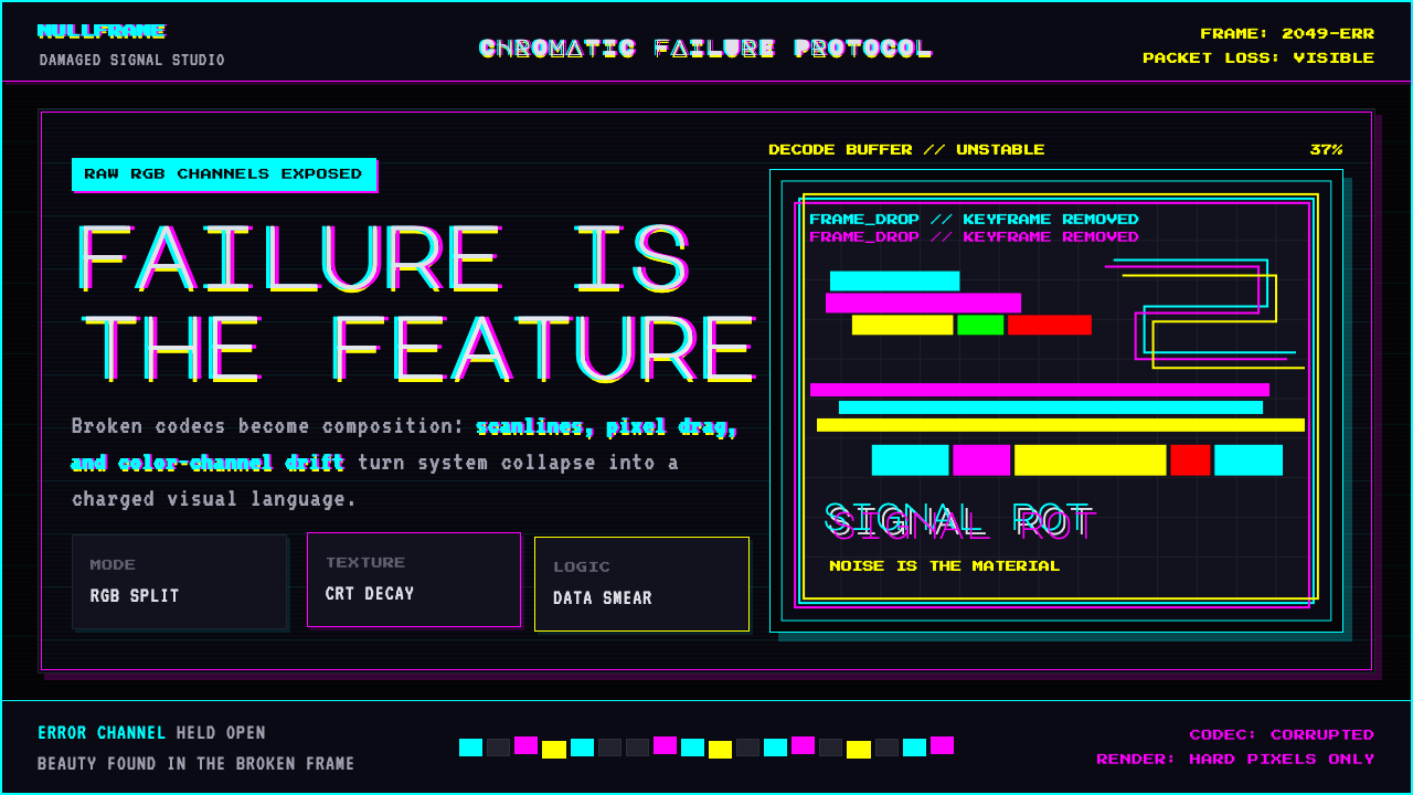 Glitch DatamoshErrors as composition. Corrupted JPEGs, RGB splits, scanlines — failure treat…
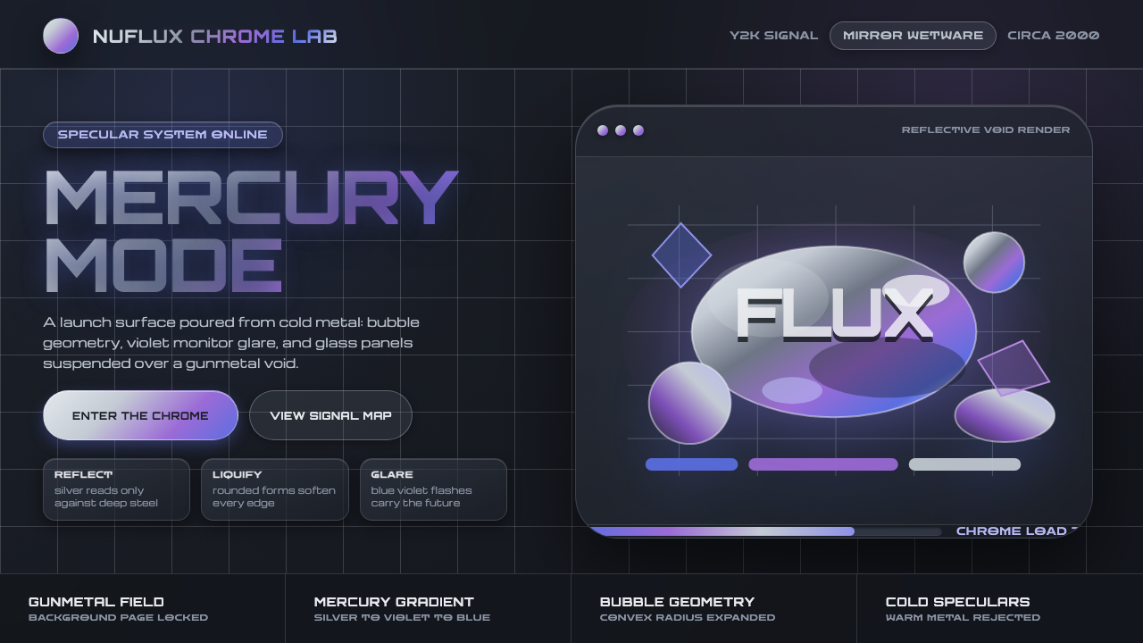 Liquid Chrome Y2KChrome needs darkness. Gunmetal voids make silver blobs and blue-violet glare…
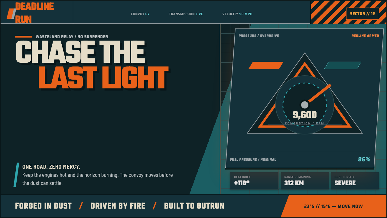 Mad Max Fury Road (2015)Built to roar. Molten saffron cuts through petrol teal, riveted grids, and ha…
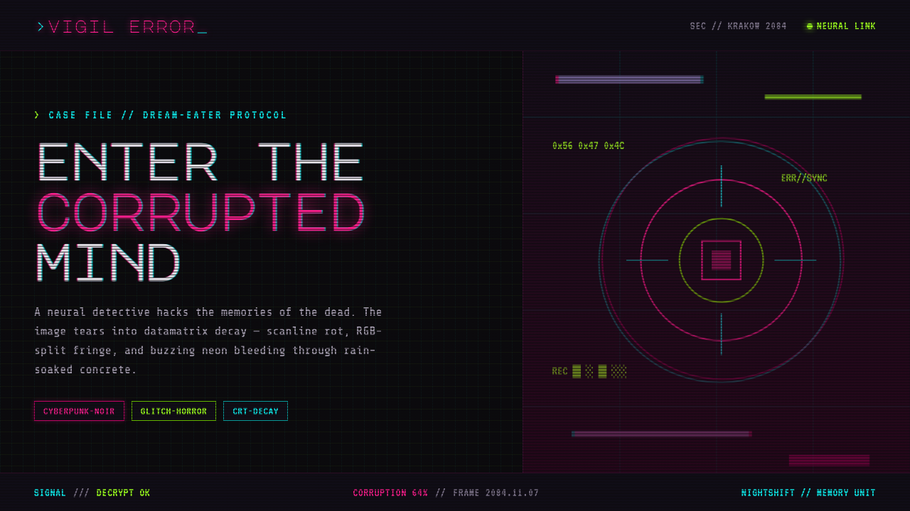 ObserverTech, but corrupted. Neon magenta and acid green tear through rain-black conc…
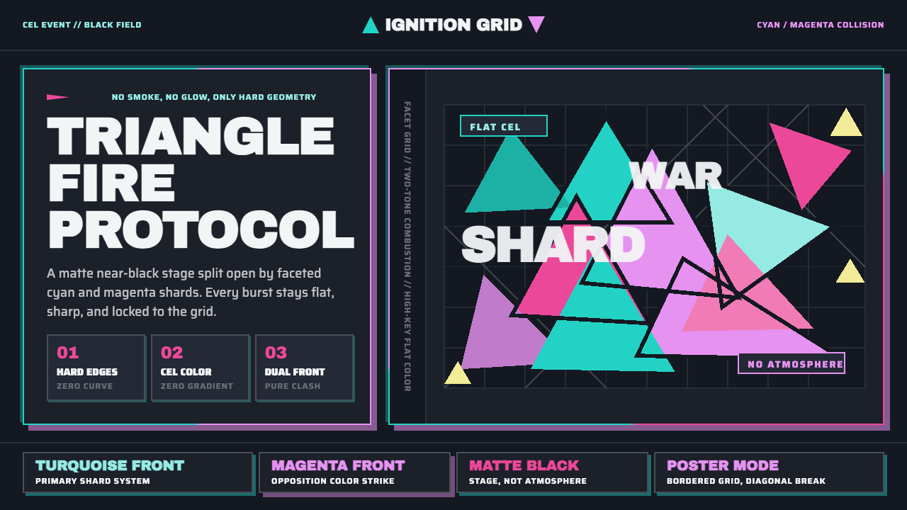 Promare Triangle FireFire becomes geometry. Cyan and magenta triangles collide on matte near-black.
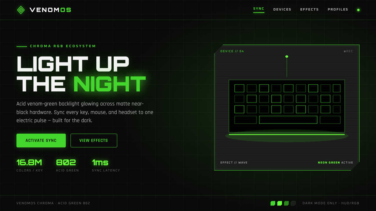 Razer Chroma GreenEsports gear at night. Acid Pantone-802 green burns on matte black via RGB gl…