What is Promare Triangle Fire?
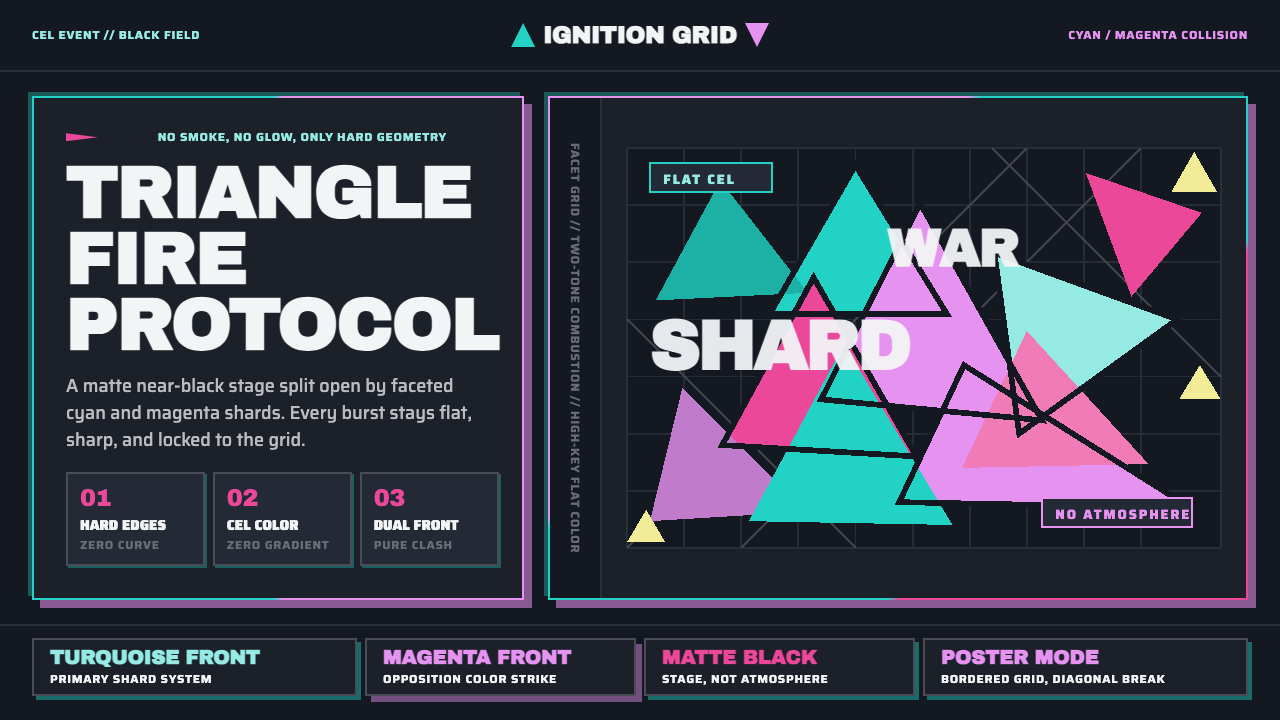
Promare Triangle Fire turns combustion into collision: cyan and magenta crystal-shards erupt across a matte dark field with the force of an alarm.
Promare Triangle Fire in brief
Promare Triangle Fire is the visual language associated with Studio Trigger’s 2019 theatrical film Promare, directed by Hiroyuki Imaishi with designs by Shigeto Koyama and Hiromi Wakabayashi. Its defining decision is radical and immediately legible: fire does not curl, smoke, flicker, or dissolve. It breaks into hard cyan and magenta triangles, faceted like shattered crystal and drawn in uncompromising flat cel color.
The style transforms an organic event into a geometric one. Flame is usually atmospheric, unstable, and difficult to contain; here it becomes an assembly of sharp planes with distinct silhouettes. The image does not ask the viewer to read heat through naturalistic light or texture. Instead, heat is communicated through directional force, visual density, collision, and the aggressive contrast between luminous color and an almost black stage.
Its apparent excess is carefully controlled. Cyan and magenta carry nearly all of the expressive load, while the dark ground makes them feel suspended in a space without ambient light. There is no misty transition between elements, no painterly residue, and no soft modeling to make the scene more natural. Every triangular edge is a boundary, every color field a deliberate impact.
Where does Promare Triangle Fire come from?
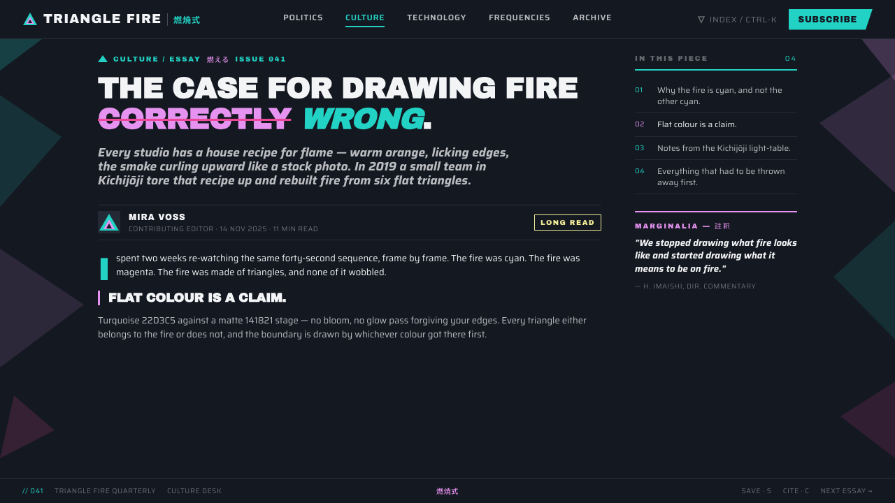
The language emerged from Promare, Studio Trigger’s 2019 theatrical release, produced between 2017 and 2019 in Tokyo. Its context is flat-cel, high-energy anime, but its treatment of action moves beyond conventional speed lines, smoke effects, or painterly fire. The visual system treats motion as a succession of polygonal ruptures: an event is not merely animated, but cut into forceful pieces.
Hiroyuki Imaishi, Shigeto Koyama, and Hiromi Wakabayashi are the named creative figures attached to this approach. Their shared design problem was not simply how to make fire spectacular. It was how to make it unfamiliar without making it unreadable. The answer was a vocabulary of hard turquoise-cyan and magenta triangles whose color contrast preserves instant recognition while their geometry denies naturalistic expectation.
The resulting language joins three supplied currents: flat-cel high-energy anime, geometric polygon abstraction, and dual-color-collision design. Flat cel treatment keeps each surface declarative rather than atmospheric. Polygon abstraction replaces fluid flame with faceted fragments. The two-color collision makes conflict visible before any narrative detail is processed. Together, those decisions make intensity feel constructed rather than painted.
The dark field is essential to that construction. It is not an empty background added after the fact, but the condition that lets the colored forms read as pure light-events. Against matte near-black, the cyan and magenta fragments can appear to advance, split, and strike without being softened by environmental detail. The system therefore has a theatrical logic: a dark stage, a constrained cast of colors, and geometry performing at maximum pressure.
What defines the Promare Triangle Fire look?
Two-Color Collision
Cyan and magenta are not decorative accents distributed evenly through the composition. They are opposing forces. Their encounter creates the image’s voltage, with each color becoming more intense because the other is present. A successful application lets the pair collide in concentrated zones, rather than diluting their relationship across a rainbow-like palette.
Triangular Flame
The triangle is the system’s primary unit of motion. It can point, split, cluster, radiate, or pierce, so it carries direction more aggressively than a soft or rounded form. Triangles should feel like facets produced by a violent break, not tidy decorative confetti. Variation in angle and scale creates the sensation of a fire event expanding through space.
Flat Cel Surface
Color appears as a clean, decisive plane. There is no gradual blend intended to imitate heat, volume, smoke, or reflected light. This flatness keeps the work graphic even at high intensity: the image remains readable as an arrangement of silhouettes and color blocks, not as an attempt to simulate a physical blaze.
Matte Dark Stage
The near-black ground acts as a matte stage for the bright forms. It should feel absorbing rather than glossy, atmospheric rather than empty. Its purpose is to remove competing visual information so the cyan and magenta geometry appears self-illuminating. Dark space is therefore active composition, not a neutral leftover.
Hard-Edge Energy
Edges are kept crisp because softness would turn the effect back into natural flame or diffuse atmosphere. The style communicates speed and force through abrupt intersections, visible corners, and decisive cropping. A fragment may disappear at the frame boundary or be cut by another plane, but it should never fade apologetically into its surroundings.
Maximal Energy, Restrained System
The composition can be explosive without becoming uncontrolled. Density comes from repeated fragments, strong directional flow, and concentrated clashes, while discipline comes from the limited palette, consistent flat treatment, and repeated triangular vocabulary. The style is most convincing when visual excess follows a small set of rules with absolute commitment.
Who shaped Promare Triangle Fire?
Imaishi is identified as Promare’s director and as one of the central figures behind its visual language. Within this system, the defining achievement is the refusal of naturalistic fire in favor of an action vocabulary built from hard, flat geometric rupture. The result makes visual force inseparable from stylization.
Koyama is named as a designer for Promare and as a key figure in Promare Triangle Fire. The supplied design language depends on an exact relationship between polygon abstraction, cyan-magenta contrast, and a dark stage. His place in the credited design team belongs to the construction of that highly controlled visual world.
Wakabayashi is named as a designer for Promare and among the key figures associated with the system. Promare Triangle Fire is not a single effect but a coherent set of decisions about shape, color, edge, and background. Her credited role belongs to a design process in which those elements operate as one language rather than separate embellishments.
How do you use Promare Triangle Fire today?
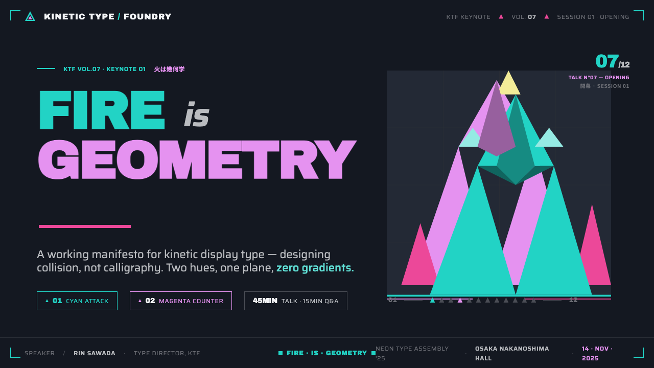
For presentation covers, use the dark field as a stage and build one decisive collision around the title. A large angled cyan plane can enter from one direction while magenta fragments answer from another, leaving the headline in a quiet pocket of negative space. The cover should feel like an event beginning, not like a generic dark slide decorated with colorful shards.
For content and data slides, reduce the visual temperature without abandoning the system. Keep explanatory text on stable dark areas, use triangular forms to establish section direction, and reserve cyan-magenta collision for transitions, key comparisons, or the focal takeaway. Charts should remain legible as charts first; the style can frame a data point through angular emphasis, but should not turn every bar, label, and axis into a spectacle.
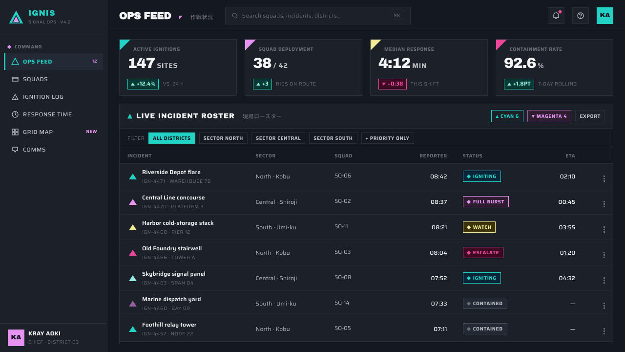
For web interfaces, the language is strongest in dashboards, launch surfaces, media experiences, and pricing pages that need a charged sense of motion. Treat the dark canvas as a field of focus, with clear text regions and interactive elements protected from busy fragment clusters. Cyan and magenta can distinguish active states, opposing categories, or premium moments, while angular geometry marks navigation, status, and directional change.
For editorial and marketing work, use triangular fire as an editorial device rather than a constant texture. An article opener can establish the collision, a campaign section can interrupt the page with a faceted burst, and a closing call to action can echo the opening direction. The surrounding copy needs moments of visual quiet; relentless fragmentation makes the style less urgent, not more.
The most common mistake is borrowing the cyan, magenta, and dark background while adding soft glows, rainbow accents, gradients, or arbitrary polygons. That produces science-fiction decoration rather than Promare Triangle Fire. Preserve the style’s logic: a limited color conflict, flat cel surfaces, sharp triangles with directional purpose, and darkness that makes the collision feel concentrated.
Promare Triangle Fire — FAQ
Is Promare Triangle Fire simply a neon cyberpunk style?
No. It shares a dark setting and vivid color contrast with some cyberpunk imagery, but its central logic is more specific. Promare Triangle Fire is built around geometric abstraction of flame, flat cel treatment, and a cyan-magenta collision. Neon atmosphere, reflective city surfaces, and broad multicolor lighting are not required and can weaken the system.
Why must the fire be triangular rather than fluid?
Because the visual idea depends on fire refusing its expected natural form. Triangles make heat appear as fracture, propulsion, and collision rather than combustion observed in air. Their points establish direction quickly, their facets create explosive density, and their hard edges keep the image within a graphic flat-cel language.
Can the style use more colors?
Additional color should be approached cautiously because the cyan-magenta relationship is structural, not incidental. The dark ground gives the pair room to confront each other, and a broad palette disperses that tension. If another color is necessary for information hierarchy, it should remain subordinate and should not compete with the central collision.
Does the style work for information-heavy interfaces?
Yes, if the energetic geometry is separated from reading and interaction zones. Dashboards and pricing pages can use the dark stage, sharp directional cues, and two-color distinction to make hierarchy vivid. Dense controls, long text, and data tables still need calm surfaces and predictable structure; visual impact should guide attention, not obstruct it.
What makes an application feel inauthentic to this language?
The usual failure is treating the style as a collection of isolated decorations. Soft haze, blended color, glossy atmosphere, rounded flame shapes, and undirected polygon patterns all contradict the supplied system. The language becomes convincing only when its dark stage, flat surfaces, hard edges, triangle-based motion, and cyan-magenta conflict reinforce one another.
Related design styles
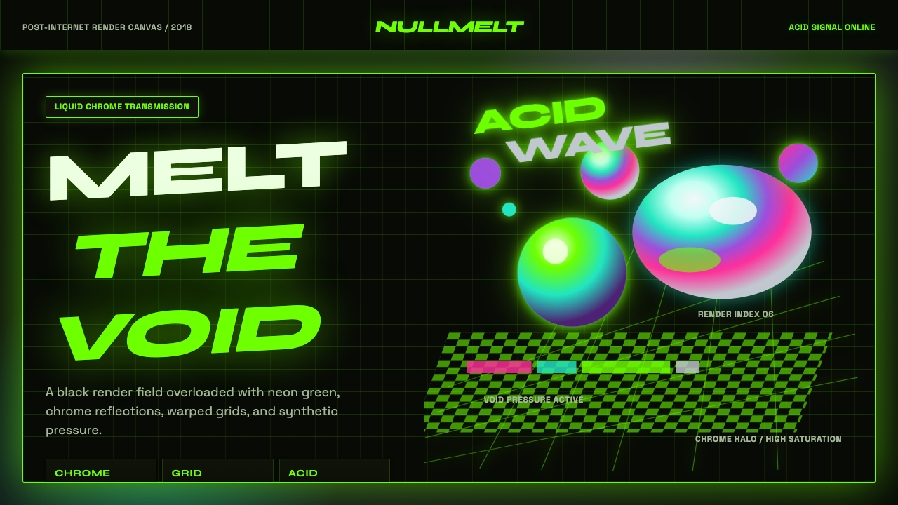 Acidwave 3D RenderPsychedelia hits the render engine. Neon green, chrome orbs, and warped grids…
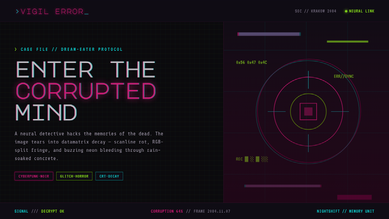 ObserverTech, but corrupted. Neon magenta and acid green tear through rain-black conc…
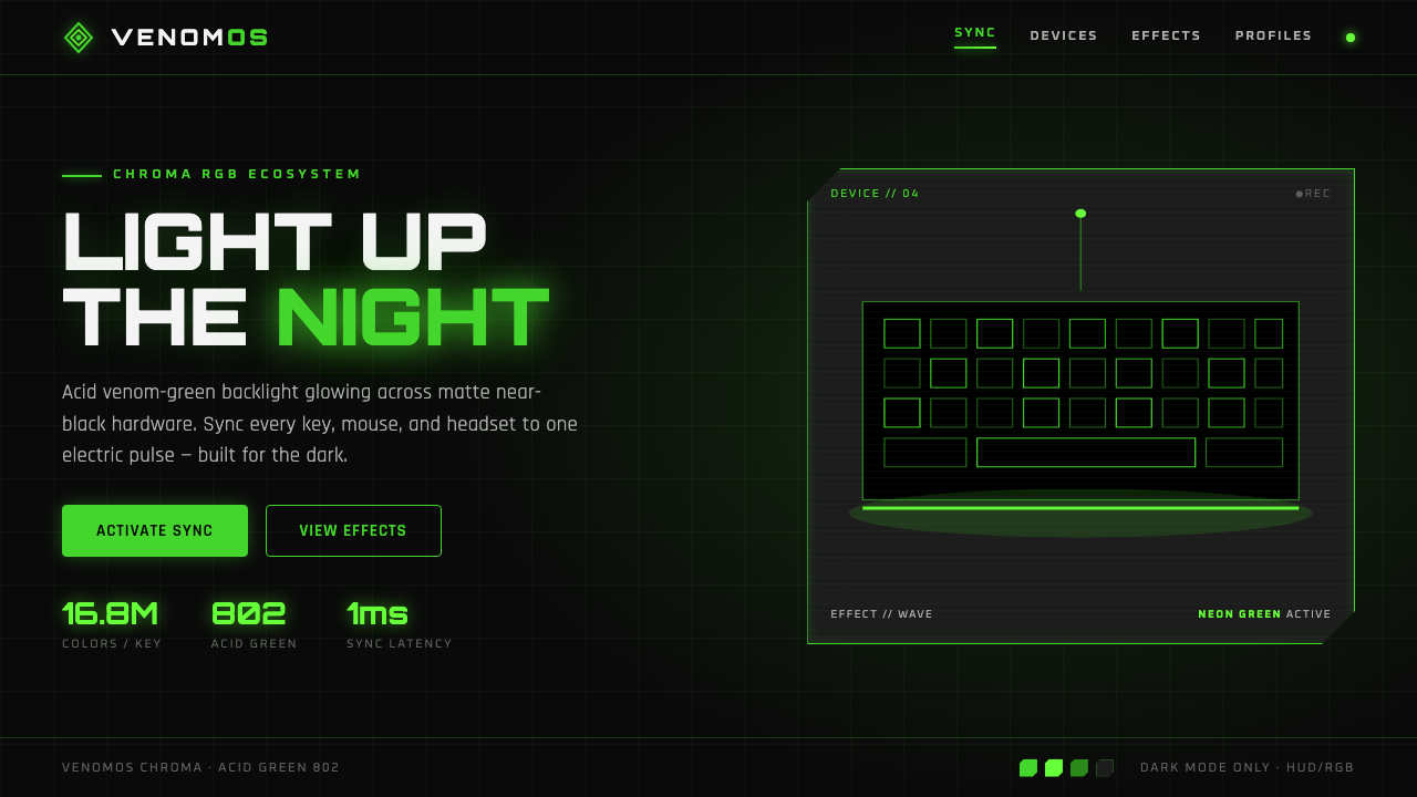 Razer Chroma GreenEsports gear at night. Acid Pantone-802 green burns on matte black via RGB gl…
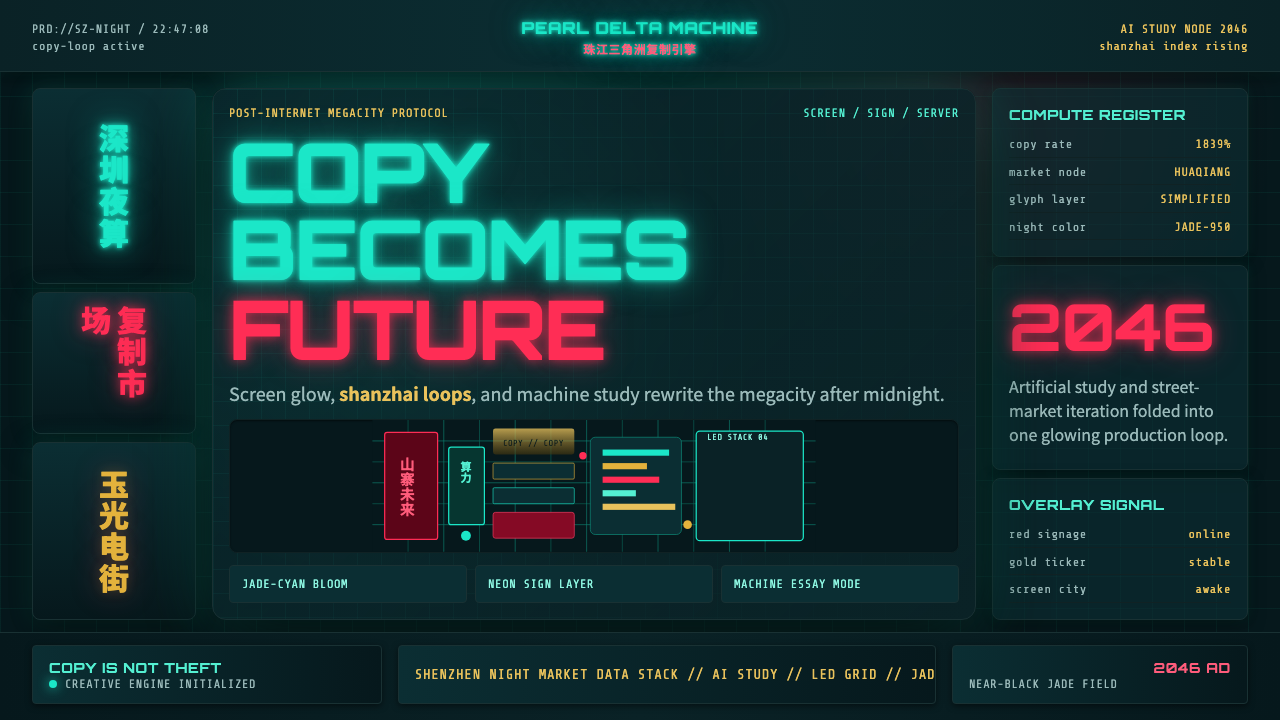 SinofuturismCopy becomes future. Jade-cyan grids, red signage, and Orbitron data stack th…
 Akira (Otomo)Cyberpunk at impact. Kaneda red, cyan kanji, halftone concrete, and diagonal…
 Edgerunners NeonNeon overload. Fluorescent yellow, cyan HUD grids, and magenta glitches burn…