What is Razer Chroma Green?
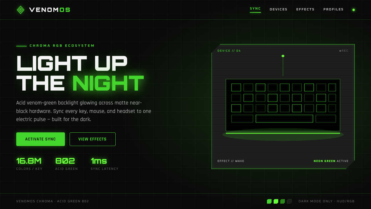
Razer Chroma Green turns gaming hardware into a nocturnal signal: acid green burning through matte black, with light treated as competitive energy rather than decoration.
Razer Chroma Green in brief
Razer Chroma Green is a dark-only visual language associated with Razer’s Chroma RGB ecosystem and the wider culture of esports hardware. Its central image is immediate and deliberately narrow: an acid, venom-like green appears to ignite against a universal near-black chassis. The triple-snake mark, illuminated keyboard legends, edge lighting, and interface accents all belong to the same scene—gaming gear active after dark. Rather than building identity through a broad palette or soft lifestyle photography, the system relies on the collision between an almost unlit field and one electrically bright signal.
The result reads like a high-contrast heads-up display translated into physical products, product pages, and interface surfaces. Headlines are typically uppercase and widely tracked, giving words the mechanical clarity of a label stamped onto equipment. Shapes favor sharp chamfers, angled cuts, thin outlined frames, and controlled linear divisions. The visual vocabulary feels engineered rather than illustrated: each edge suggests a component seam, an illuminated key, a targeting reticle, or a machine panel.
Light is the defining material. RGB glow halos replace the conventional role of soft shadows, making the green feel emitted rather than printed. Matte near-black absorbs surrounding detail so the illuminated element can appear more intense and more purposeful. There are no muddy midtones to soften the contrast and no light-mode counterpart to dilute it. Chroma Green depends on darkness because darkness gives the green its apparent heat, its legibility, and its sense of latent performance.
Where does Razer Chroma Green come from?
The supplied history places Razer Chroma Green in the period from the 2010s to the present, alongside the Razer Chroma RGB ecosystem. This timing matters because the look is inseparable from illuminated peripheral culture: keyboards, gaming hardware, and their visible lighting systems became carriers of identity, not merely functional devices. Chroma Green takes that hardware condition and gives it a singular visual point of view. The glow is not a generic technology effect; it is organized around one acid-green signal and a dark chassis that makes the signal unmistakable.
Its geographic frame spans Southeast Asia and the United States, specifically Singapore and San Diego. That dual setting is part of the approved origin record, as are the linked movements of esports and gaming-hardware branding, together with RGB-lit peripheral culture. The style therefore belongs less to a historical art school than to a product ecosystem: hardware, competitive play, identity marks, illuminated controls, and digital surfaces all reinforce one another. Its visual language is designed to hold together across those different touchpoints.
The esports connection gives the aesthetic its particular emotional temperature. It is not simply futuristic, and it is not simply cyberpunk. The near-black field evokes an active setup in a dark room, while the green reads as readiness, targeting, activation, and competitive intensity. Wide uppercase labels and sharp panel-like geometry make information feel operational. The system turns familiar gaming cues into a brand environment where every lit detail appears to be part of the same machine.
The source identifies Min-Liang Tan and Robert Krakoff as key figures associated with this origin context. Within the public material provided here, their significance is the connection of named people to the Razer Chroma Green theme and its ecosystem rather than a separate account of individual authorship. That is consistent with the style itself: Chroma Green is presented as a coordinated, ongoing platform language, shaped through an identity system of black surfaces, venom-green illumination, the triple-snake mark, and RGB-lit hardware.
What defines the Razer Chroma Green look?
Dark-Only Contrast
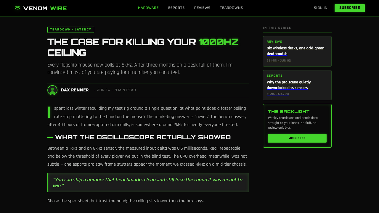
Near-black is not a background option; it is the condition that makes the entire system work. Matte darkness absorbs visual noise and lets acid green appear to burn forward. A pale field weakens that effect by turning the green into an ordinary accent. The composition should feel as though illumination has entered darkness, not as though dark ink has merely been placed on a neutral page.
Venom Green Signal
The green is used as an electric signal, not as a broad decorative fill. It marks the logo, an active state, a contour, a key detail, or a focused call to action. Because the surrounding field is restrained, even a narrow green line can carry substantial force. Its intensity comes from scarcity and contrast, so it should look concentrated, precise, and deliberately energized.
RGB Glow Halos
Glow replaces soft shadow as the principal depth cue. The halo should feel like emitted light spreading outward from a logo, keyboard backlight, outline, or interface control. It creates atmosphere without turning the layout into a naturalistic scene. The aim is not realistic illumination but a controlled sense that the object is powered, active, and visible in the dark.
HUD Typography
Headlines use wide-tracked uppercase letterforms to create the feeling of a hardware label or targeting readout. Typography is direct and exposed: it should scan quickly against black without relying on decorative treatments. Scale, spacing, alignment, and contrast establish hierarchy. Supporting text remains controlled and practical so the display language can stay sharp rather than becoming noisy.
Chamfered Geometry
Sharp chamfers and angled cuts keep surfaces from feeling generic or soft. They suggest equipment housings, control zones, and mechanical segmentation. Thin outlines can trace those forms and give them a lit perimeter, but the geometry should remain sparse. A few decisive angular elements are more convincing than a page crowded with ornamental sci-fi fragments.
Matte Hardware Surface
The black field should read as a matte chassis rather than as glossy luxury material. Its purpose is to recede, hold the composition together, and make luminous elements feel physically embedded. Large dark areas are useful rather than empty. They create the silence around the signal and preserve the night-time equipment mood that defines the style.
Who shaped Razer Chroma Green?
Min-Liang Tan is identified in the supplied origin material as a key figure for the Razer Chroma Green context. The approved material connects the theme to Razer’s ongoing Chroma RGB ecosystem, esports and gaming-hardware branding, and the Singapore–San Diego geographic frame. In this article, that association anchors the style in a named product and brand environment rather than treating it as an anonymous neon trend.
Robert Krakoff is likewise named as a key figure in the supplied origin record. The source does not assign a separate design credit or chronology, so the meaningful public connection is his inclusion in the Razer Chroma Green origin context. Alongside the wider ecosystem, that context emphasizes an identity built from a triple-snake logo, a black chassis, illuminated peripherals, and one highly concentrated green signal.
The Razer Chroma RGB ecosystem is the named platform through which this look is situated from the 2010s onward. It functions as the style’s most important collective figure: the place where RGB-lit keyboard backlight, near-black hardware, and acid-green brand recognition meet. Treating the ecosystem as a design actor clarifies why the aesthetic works across devices and screens—it is a connected language, not a one-off graphic treatment.
How do you use Razer Chroma Green today?
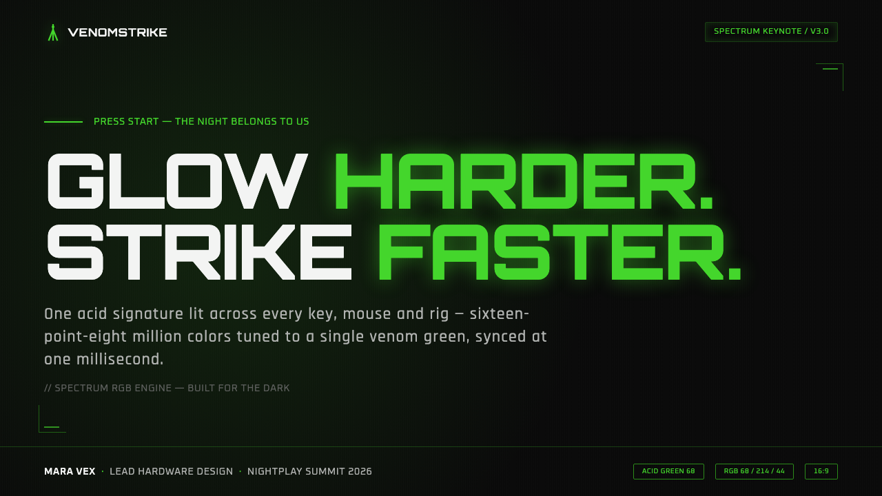
For presentation covers, Chroma Green works best when the page behaves like a powered device in a dark room. Use a broad matte-black field, one concentrated green focal point, and a sharply aligned uppercase title. A thin outlined frame, cropped diagonal, or restrained glow can suggest equipment architecture without illustrating a literal keyboard or gaming scene. Keep the message short enough that the tension between darkness and signal remains the cover’s main event.
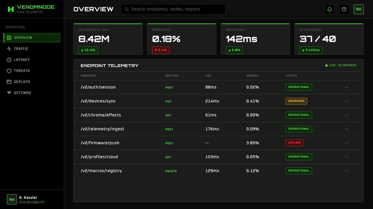
For content and data slides, treat the visual system as an operational HUD. Build hierarchy from black space, white or pale text, green active markers, and clear alignment. Data graphics should use green to identify the decision, the selected series, or the most important change, rather than turning every bar, point, and label luminous. Thin neon-like outlines can organize panels and comparison areas, while generous dark space prevents dense information from becoming visually exhausting.
For web interfaces, the style is especially effective for performance dashboards, gaming controls, hardware configuration views, and pricing pages aimed at an esports audience. Near-black surfaces create a stable environment for status readouts, controls, and tier comparisons. Green should identify what is live, selected, enabled, or strategically important. Cards should feel like panels or modules, with crisp borders and occasional controlled glow, not soft consumer-app containers floating over a light background.
For editorial and marketing work, use the style’s night-time product drama to frame launches, feature stories, and performance claims. A product image or mark can emerge from a large field of black, with one green contour or lit detail guiding the eye. Editorial layouts benefit from sharply separated information zones and prominent all-caps labels. Marketing pages can alternate dense dark feature areas with quieter black intervals, letting the luminous accent recur as a thread instead of flooding every section.
The most common mistake is treating Chroma Green as a generic neon palette. Adding many bright colors, broad glow everywhere, reflective black surfaces, or a light-background version breaks the system’s discipline. Another mistake is using green as a decorative wash rather than a signal with a job. The style succeeds when near-black remains dominant, green stays scarce and purposeful, angular geometry stays clean, and illumination feels connected to active hardware or meaningful interface state.
Razer Chroma Green — FAQ
Is Razer Chroma Green simply a neon cyberpunk style?
No. It shares darkness and emitted light with many cyberpunk references, but its language is more specific: matte near-black hardware, one acid-green signal, RGB-lit peripheral culture, sharp HUD geometry, and esports equipment at night. A generic cyberpunk treatment often adds multiple saturated colors, dense city imagery, haze, or retro-futurist decoration. Chroma Green becomes more recognizable when it removes those extras and keeps the focus on powered hardware and competitive clarity.
Can this style work on a light background?
The approved source describes it as dark-only, and that constraint is fundamental rather than incidental. The acid green is meant to glow from matte near-black; on a pale surface it loses the sensation of burning through darkness and becomes a conventional bright accent. If a project needs a light interface, it should use a different visual system rather than a weakened Chroma Green imitation.
How should green be distributed in a Chroma Green layout?
Use it as a signal with a defined role: the mark, a live state, a selected control, a key contour, or the principal call to action. Let near-black occupy most of the visual field so each green appearance feels earned. When every label, panel, and graphic is green, the eye loses hierarchy and the glow stops feeling like illumination. The visual power comes from concentration, not coverage.
What kind of typography fits the style?
The source points to wide-tracked all-caps headlines and a sharp HUD-like information tone. Typography should feel exposed, technical, and fast to scan against black. Use alignment and spacing to make labels feel like part of an interface or hardware surface. Avoid ornate display lettering, soft handwritten forms, or overly playful type treatments, because they conflict with the aesthetic’s disciplined, equipment-focused character.
Where does Chroma Green work best?
It is strongest where active performance, gaming hardware, configuration, competition, or nighttime equipment mood are central to the product story. Performance dashboards, device-control interfaces, esports-oriented pricing pages, launch presentations, and feature marketing all give the green signal a meaningful role. It is less natural for contexts that depend on daylight warmth, broad color variety, or soft domestic comfort, because the style’s authority comes from darkness, precision, and controlled activation.
Related design styles
 Mad Max Fury Road (2015)Built to roar. Molten saffron cuts through petrol teal, riveted grids, and ha…
 ObserverTech, but corrupted. Neon magenta and acid green tear through rain-black conc…
 Glitch DatamoshErrors as composition. Corrupted JPEGs, RGB splits, scanlines — failure treat…
 SinofuturismCopy becomes future. Jade-cyan grids, red signage, and Orbitron data stack th…
 Cybergoth RaveDarkness rules. Pure black PVC is split by one UV-green circuit glow.
 Detroit TechnoCold machines dream. Electric cyan circuits and chrome display type lock to a…