What is Mad Max Fury Road (2015)?
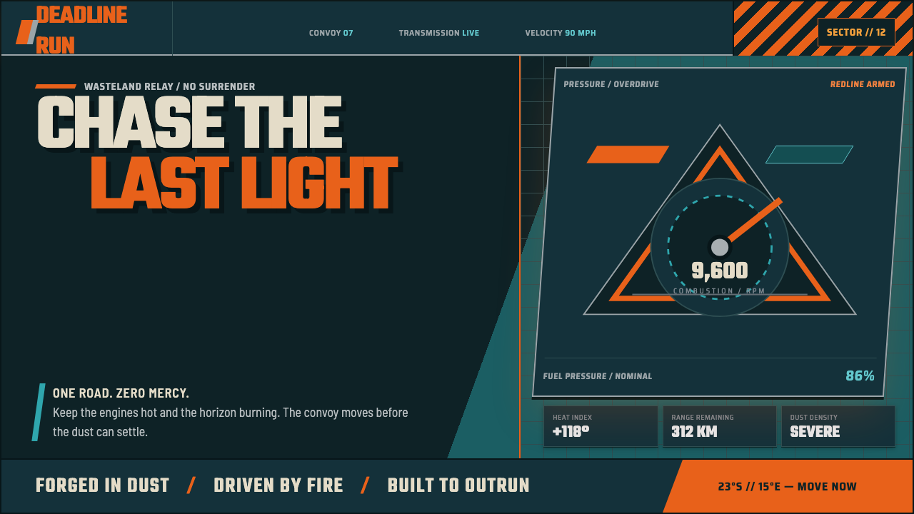
Built to roar: molten saffron tears through petrol teal, turning every interface surface into dusted armor in full pursuit.
Mad Max Fury Road (2015) in brief
Mad Max Fury Road is a dark, post-apocalyptic interface style drawn from the film’s aggressively graded visual world. Daylight burns in molten saffron; shadow sinks into petrol teal. Instead of treating that contrast as a decorative palette, the system uses it as dramatic geography: heat occupies exposed space, cool darkness holds recesses, and a single fiery accent can read as movement, danger, or command.
The material language is industrial and improvised. Panels resemble sandblasted gunmetal, cards read as riveted plates, chrome arrives as a spray-painted or welded accent, and dividers behave like hazard bars. Nothing should feel showroom-perfect. Surfaces carry dust, abrasion, grease, and the suggestion that they have survived vibration, heat, and impact.
Its composition is kinetic rather than orderly in a polite sense. Diagonal cuts, skewed framing, hard stencil lettering, and abrupt visual breaks imply a vehicle already in motion. The result is not merely rugged: it is theatrical, loud, and confrontational. Every major element should feel capable of carrying the style’s central challenge: witness me.
Where does Mad Max Fury Road (2015) come from?
The style belongs to Mad Max Fury Road, released in May 2015 after production spanning 2012 to 2014. Its identity is inseparable from a film built around action under extreme visual pressure: blinding day, deep shadow, dust, metal, flame, and relentless forward force. A design adaptation should preserve that pressure instead of reducing the reference to orange-and-teal decoration.
Its geographic source spans the Namib Desert in Namibia and Sydney, Australia. The desert setting matters aesthetically because it establishes exposure: vast dead sky, sand-scoured surfaces, heat, and a horizon with nowhere to hide. Against that terrain, teal shadow and metallic surfaces gain unusual force, while saffron reads less like warmth than combustion.
The source explicitly places the film within post-apocalyptic dieselpunk, practical-effects action cinema, and wasteland rust punk. Together those terms explain the visual system’s friction. Dieselpunk supplies engines, fuel, armor, and industrial mass; practical action supplies weight and collision; rust punk supplies erosion, repair, and material damage.
The named creative context includes George Miller, John Seale, Colin Gibson, Jenny Beavan, and Tom Holkenborg. For a public-facing design style, their importance is collective rather than separable: the reference is a coordinated world of image, vehicle-like structure, worn surfaces, costume-like silhouette, and forceful momentum. The interface should therefore feel assembled as one machine, not decorated by unrelated effects.
What defines the Mad Max Fury Road (2015) look?
Heat and Shadow
Molten saffron and petrol teal establish the central conflict. Saffron belongs to fire, exposure, urgency, and decisive actions; teal belongs to shadow, depth, cooled metal, and the space behind the action. Keep their meeting hard and deliberate. A muddy blend weakens the filmic charge.
Armored Surfaces
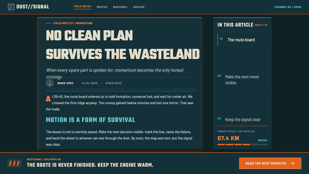
Containers are not soft cards; they are plates. Use framed, riveted, sandblasted, or scraped surfaces that suggest truck armor and field repair. Chrome can punctuate an edge or emblem, but its value comes from contrast with grime and gunmetal rather than polished luxury.
Stencil Typography
Type should feel cut through a roll-bar, fuel tank, or armored panel. Hard stencil forms give headings an engineered, utilitarian authority. Let hierarchy come from forceful scale, compression, and interruption. Decorative script, delicate serifs, and elegant editorial softness belong to another world.
Diagonal Momentum
The layout should imply pursuit. Angled bands, skewed cuts, and off-axis blocks create the sensation of dust, speed, and a chassis under strain. Use diagonals to direct reading and escalate a moment, not as wallpaper. Straight alignment remains useful where information needs to hold firm.
Hazard Structure
Dividers and boundaries should carry warning energy. Hazard-stripe bars, hard rails, exposed seams, and mechanical brackets organize information while keeping the interface hostile and alert. These details must clarify grouping or state; repeated without purpose, they become costume instead of structure.
No Softness
Nothing is clean and nothing is soft. Avoid plush depth, gentle diffusion, cheerful polish, and frictionless consumer gloss. A glow should behave like a flame gout; a highlight should feel like spray chrome; a damaged edge should make the interface look used, not unfinished.
Who shaped Mad Max Fury Road (2015)?
George Miller is named among the key figures attached to Fury Road. Within this style reference, the name anchors the film’s overall world: aggressive forward motion, extreme contrast, and a wasteland that never becomes visually passive.
John Seale is one of the named key figures. The style’s image language depends on the controlled tension between burning daylight and petrol-toned darkness, a contrast that should remain the interface’s most legible atmospheric cue.
Colin Gibson appears in the film’s key-figure list. For designers, the useful lesson is vehicular structure: interfaces can borrow the logic of armor, rivets, exposed seams, and assembled machinery without becoming literal vehicle illustrations.
Jenny Beavan is named as a key figure in the supplied material. The style’s worn, dusted, and survival-driven quality benefits from treating visual finish as something lived through rather than something freshly manufactured.
Tom Holkenborg is included among the key figures. In visual application, the relevant cue is intensity: bold accents and abrupt transitions should feel percussive, as if the page has an engine pulse rather than a neutral ambient rhythm.
How do you use Mad Max Fury Road (2015) today?
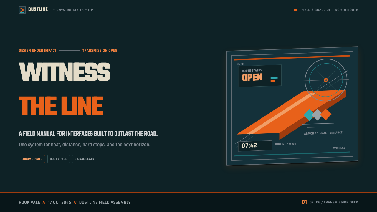
For presentation covers, treat the page as a chase-frame rather than a corporate title card. Place the title in hard stencil type against a dark gunmetal field, interrupt it with one saffron flare or diagonal hazard bar, and leave enough dark space for the composition to feel exposed. The cover should announce velocity before it explains the subject.
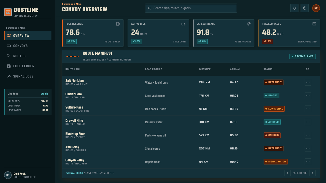
For content and data slides, make information behave like equipment mounted inside a vehicle. Use armored panels to group arguments, teal recesses to separate supporting material, and saffron only where the audience must make a decision. Charts should retain their clarity, but can gain force through hard outlines, direct labels, metallic framing, and a single highlighted data path instead of a rainbow of competing series.
For web dashboards and pricing pages, this style works best when the product already benefits from urgency, operational visibility, or a machinery-like sense of control. Navigation can read as a control rail, status modules as welded instruments, and primary actions as a contained burst of flame. Do not let distressed material treatment obscure account states, costs, comparisons, or accessibility.
For editorial and marketing work, use the style’s poster energy to stage a clear campaign message. A wide dark field, a severe headline, a saffron interruption, and a chrome-like accent can establish a memorable opening. Long-form reading needs calmer zones inside the spectacle: stable text blocks, clear section breaks, and restraint around textured imagery keep the page from exhausting its reader.
The common mistake is to mistake aggression for clutter. Filling every surface with rust, rivets, stripes, flames, skewed labels, and glowing accents produces visual noise rather than pursuit. Choose one dominant heat signal, one cool structural field, and a limited set of mechanical details. The style succeeds when its damage, metal, and danger all point toward a clear action.
Mad Max Fury Road (2015) — FAQ
Is this style only orange and teal?
No. Molten saffron and petrol teal are its most immediate visual signal, but the style depends equally on gunmetal surfaces, dust, chrome, riveted structure, stencil type, and directional momentum. Using the colors without the material and compositional logic creates a generic cinematic grade rather than a Fury Road-derived system.
Can it work for a light interface?
The supplied style is explicitly dark, and its strongest effects rely on darkness holding the petrol-toned recesses around fiery accents. A lighter adaptation can borrow dust, hazard structure, and stencil type, but it will lose much of the night-metal contrast that makes the original reference feel combustible.
When should diagonal composition be avoided?
Avoid it where stability, comparison, or prolonged reading matters more than pursuit. Dense tables, financial comparisons, legal content, and complex forms need a firm reading path. In those contexts, reserve a diagonal cut for a section transition or a single call to action, while keeping the underlying information aligned and calm.
How should texture be used without hurting readability?
Keep dust, scratches, and metal wear on broad background planes or nonessential framing, then give text and critical controls cleaner contrast fields. Texture should establish atmosphere at first glance, not compete with labels at reading distance. If a distressed treatment makes an action ambiguous, the action wins and the texture must retreat.
What makes a call to action feel authentic to the style?
A strong call to action should feel contained but dangerous: a hard-edged control, clear stencil-like label, and a concentrated saffron or flame-like glow against dark metal. Its energy should come from contrast and consequence, not from endless animation, decorative flames, or multiple competing alerts.
Related design styles
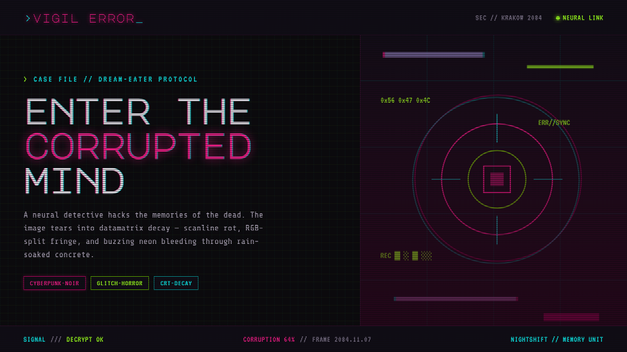 ObserverTech, but corrupted. Neon magenta and acid green tear through rain-black conc…
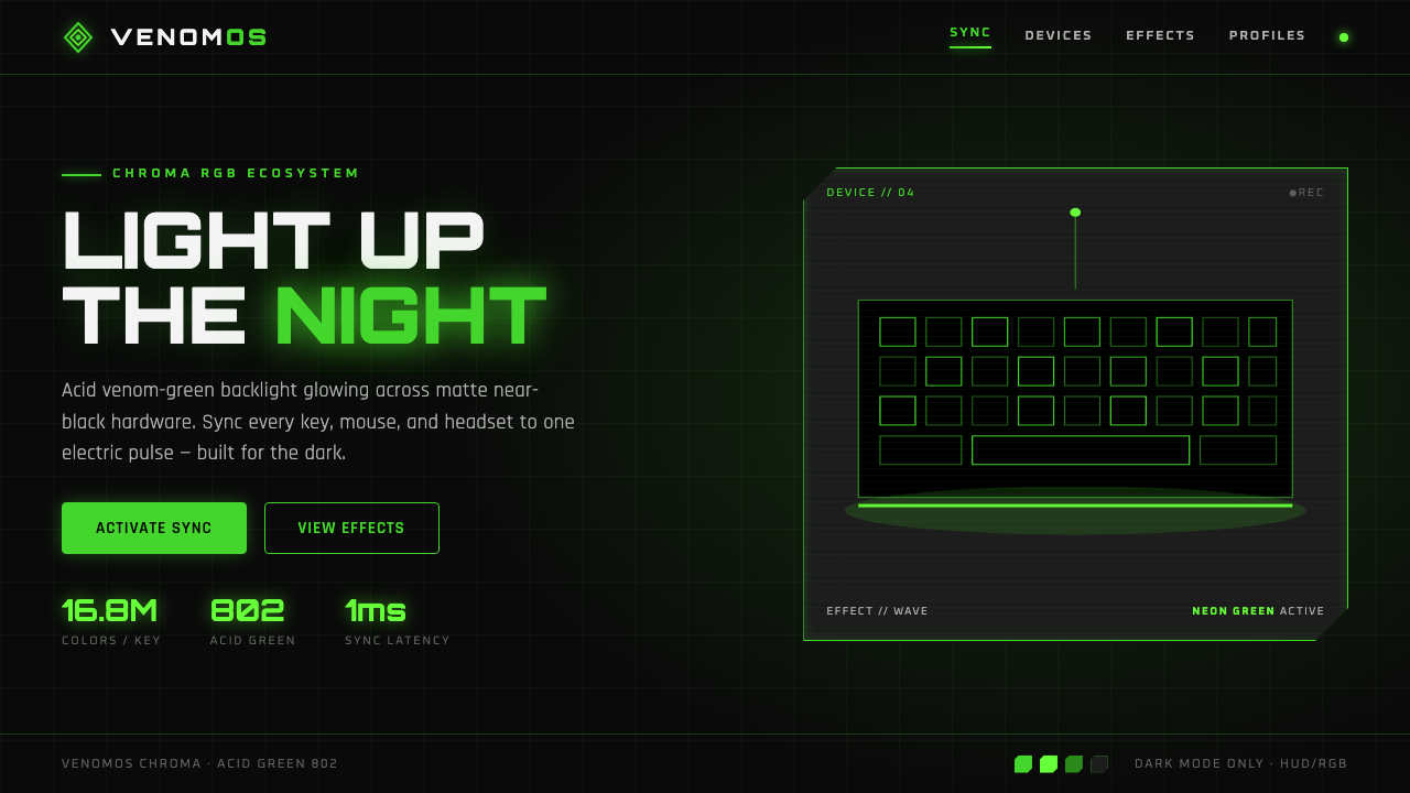 Razer Chroma GreenEsports gear at night. Acid Pantone-802 green burns on matte black via RGB gl…
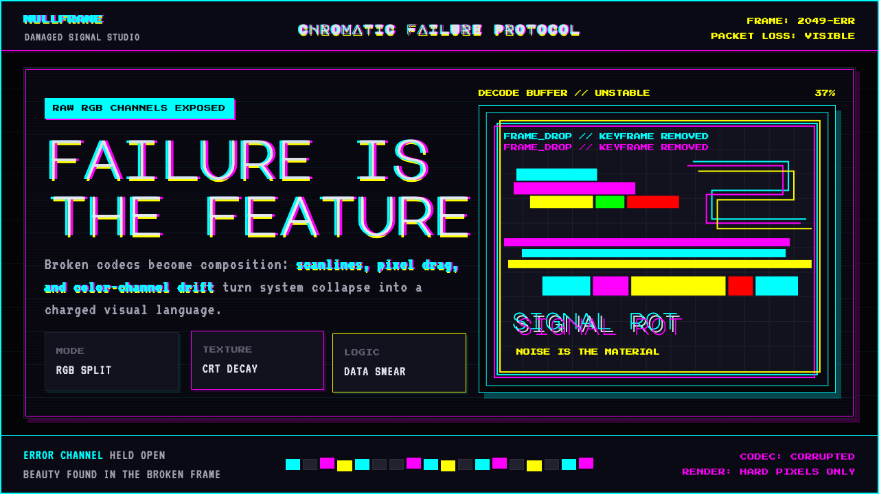 Glitch DatamoshErrors as composition. Corrupted JPEGs, RGB splits, scanlines — failure treat…
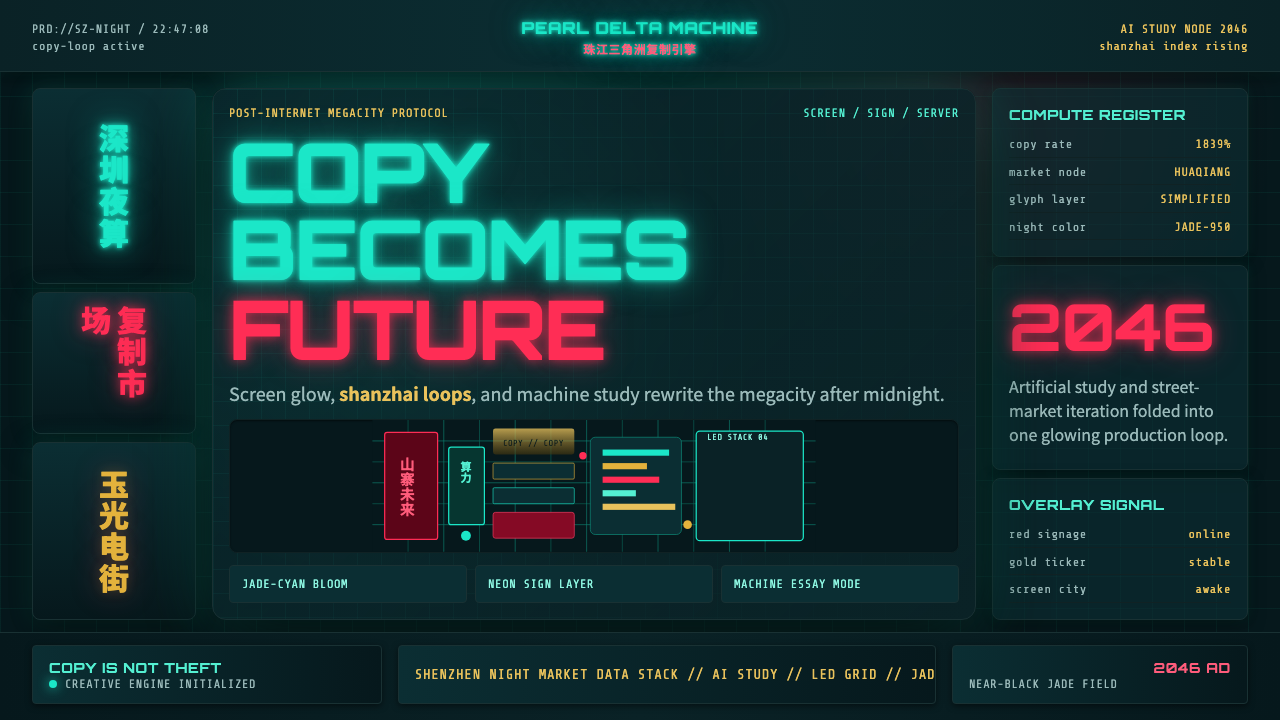 SinofuturismCopy becomes future. Jade-cyan grids, red signage, and Orbitron data stack th…
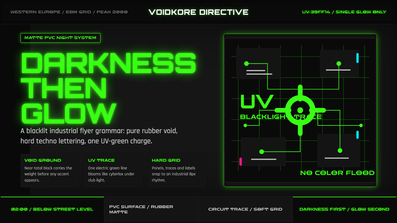 Cybergoth RaveDarkness rules. Pure black PVC is split by one UV-green circuit glow.
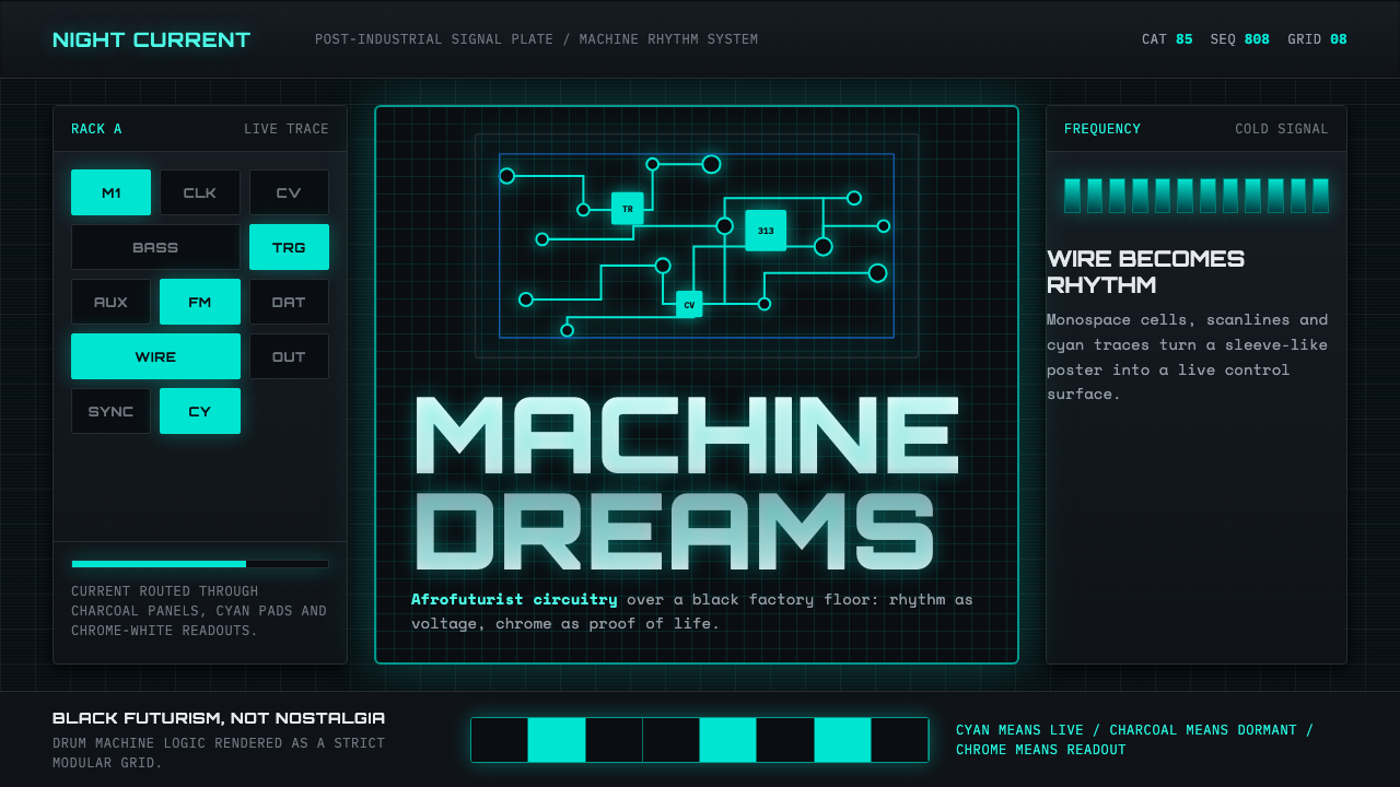 Detroit TechnoCold machines dream. Electric cyan circuits and chrome display type lock to a…