What is Observer?
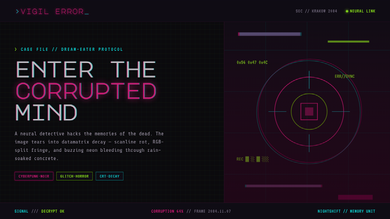
Observer turns cyberpunk technology into an infected atmosphere: neon magenta and acid green fracture across rain-black concrete, while every signal seems one failure away from collapse.
Observer in brief
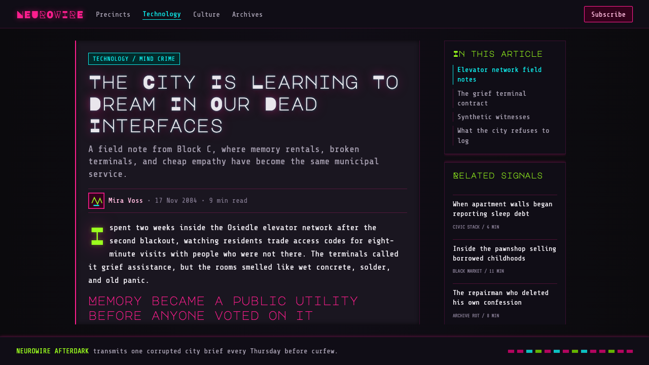
Observer is Bloober Team’s 2017 cyberpunk-noir psychological horror game, set in a dystopian Krakow in 2084. Its visual identity does not present technology as clean progress or sleek convenience. It presents technology as a damaged layer over an already hostile city: wet black tenement concrete, buzzing signs, dim interiors, and unstable displays that supply the only visible light.
The style is defined by a narrow, confrontational contrast. Near-black surfaces hold the composition together while neon magenta and acid green arrive as ruptures rather than decoration. CRT scanlines, electronic noise, color separation, and flickering signage make the screen feel less like a stable interface than a compromised signal being watched through failing hardware.
Its most distinctive shift occurs when entering a suspect’s mind. The image breaks into data-matrix corruption; chromatic aberration, scanlines, and split-color noise no longer sit at the edge of the experience but consume it. An Observer-derived design language therefore treats degradation as content. Glitches should suggest intrusion, memory damage, or technical dread, not merely add visual energy.
Where does Observer come from?
Observer belongs to a futuristic world released in 2017 but staged in 2084. That distance allows its technology to feel familiar enough to read and estranged enough to unsettle. Screens, signage, visual interference, and urban darkness are not neutral background details; they establish the terms through which the world becomes legible.
Its regional frame is Eastern European. Bloober Team is based in Poland, and the game places its dystopian future in Krakow. The city’s rain-soaked tenement concrete matters to the style because it gives cyberpunk imagery an architectural weight: neon does not float in an abstract digital void, but strikes damp, dark, worn surfaces.
The design language joins cyberpunk noir, psychological horror, and glitch or CRT aesthetics. Cyberpunk noir supplies the night-bound city, saturated artificial light, and technological unease. Psychological horror makes image failure emotionally consequential. CRT language gives that failure a material vocabulary: scanlines, noisy glow, unstable color, and a display that appears to be deteriorating while it is still in use.
The result is not simply a retro display treatment. Observer makes corrupted imaging part of the narrative atmosphere, especially when the protagonist enters another person’s mind. A useful reading of the style begins with that relationship: visual damage is a sign that perception itself has become unreliable.
What defines the Observer look?
Rain-Black Ground
The foundation is a near-black field that reads as wet concrete, unlit interior space, or a city after signage has gone dark. Darkness is dense rather than empty. It leaves room for isolated artificial light while making every bright interruption feel suspect.
Neon Rupture
Neon magenta and acid green should appear as hostile signals cutting through the dark, not as an evenly distributed palette. Their strongest role is to mark contamination, warning, unstable information, or a moment when the interface seems to lose control of itself.
CRT Degradation
Scanlines and screen glow give the image a physical display surface. The goal is not nostalgic comfort. The display should feel overworked, buzzing, and imperfectly held together, as though the image must fight to remain visible.
Chromatic Fracture
Color separation and chromatic aberration disturb the edge of objects and type. Rather than adding depth, they deny reliable focus. Forms seem to carry conflicting signals, as if the image has been pulled apart into incompatible channels and reassembled badly.
Corruption as Event
The glitch is most effective when it changes the meaning of the screen. Data-matrix damage, noise, and broken imagery should coincide with intrusion, fear, uncertainty, or mental instability. A continuous decorative glitch weakens the threat by making corruption ordinary.
Noir Illumination
Light comes from signage, screens, and electronic traces rather than broad ambient illumination. This creates a world of partial visibility: important information emerges from darkness, then risks disappearing back into it. The composition should feel observed, not comfortably presented.
Who shaped Observer?
Bloober Team created Observer and established the work’s Eastern European cyberpunk-noir frame. The studio’s contribution, within this source material, is inseparable from the game’s oppressive Krakow setting and its translation of psychological horror into corrupted screen imagery.
Rutger Hauer appears as Daniel Lazarski. His presence connects the style to its central point of view: the experience of moving through a dystopian city and entering suspect minds, where visual order progressively gives way to interference and corruption.
Daniel Lazarski is the character through whom Observer’s most destabilizing visual language is encountered. Entering a suspect’s mind turns perception into a damaged interface, making scanlines, split color, and image failure part of the act of investigation rather than detached surface styling.
How do you use Observer today?
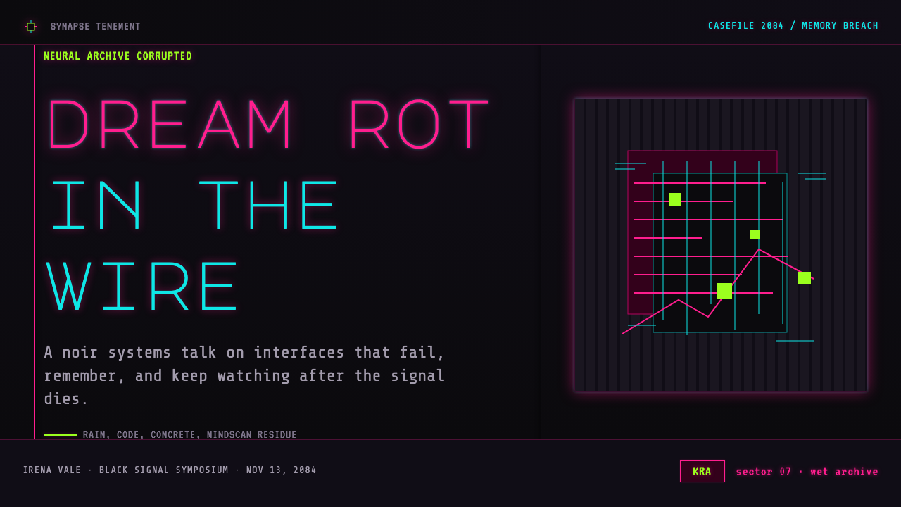
For presentation covers, use the Observer language as a controlled signal breach. Keep most of the field rain-dark and architectural, then let a single magenta or acid-green sign, distorted title fragment, or scanline-lit image interrupt it. The cover should feel like a message received from an unsafe system, while the title remains readable enough to anchor the composition.
Content slides need more restraint than covers. Use darkness to separate sections, with bright neon reserved for active labels, warnings, or the one statement that must be remembered. CRT texture can frame or lightly disturb a content region, but body copy should remain stable; the style works because unreadability feels exceptional, not because every line is degraded.
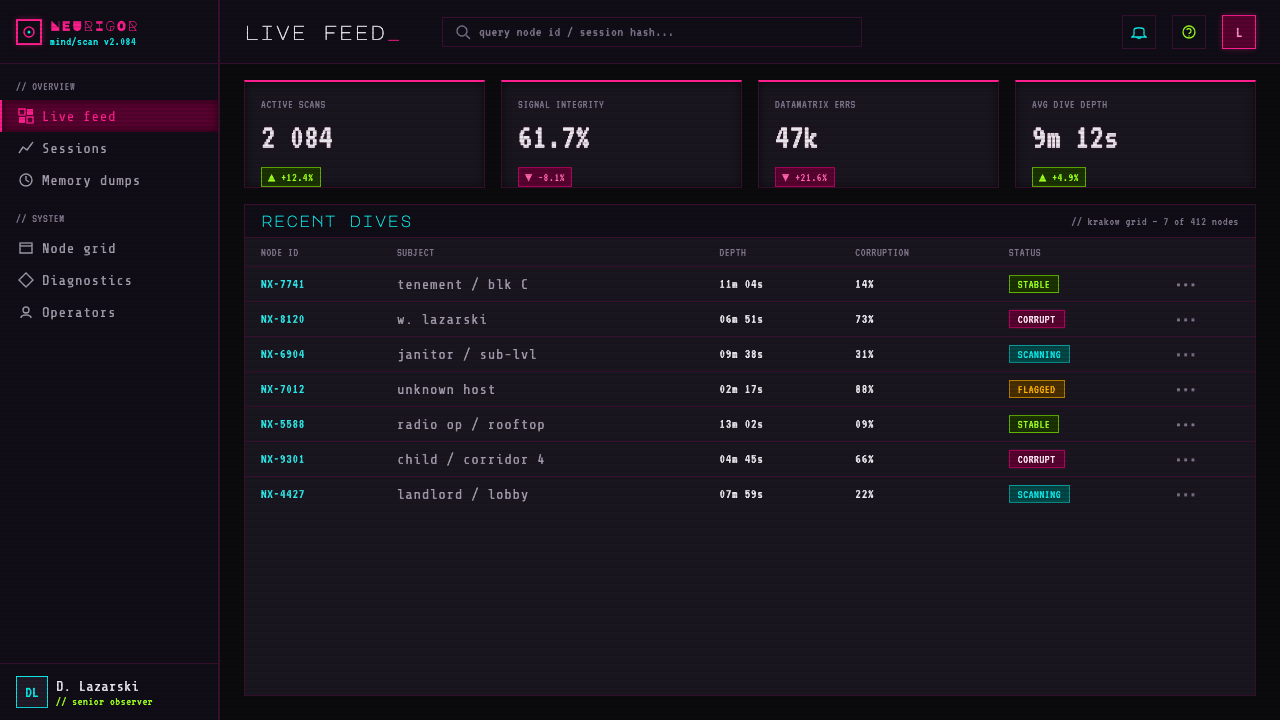
For data slides, treat charts as surveillance output or damaged diagnostics. A restrained dark grid can hold the information, while one neon color establishes the primary signal and the other marks anomalies or escalation. Avoid making every bar, line, and label compete at full intensity. The useful tension is between analytical order and the suspicion that the system reporting it may be compromised.
On the web, Observer is strongest in dashboards, monitoring interfaces, incident views, speculative technology projects, and narrative landing pages. Near-black panels, electronic dividers, alert-like color interruptions, and occasional distortion can establish the mood. Pricing pages can use the same contrast to distinguish plans or decisions, but the transactional content must remain dependable; horror atmosphere should never obscure price, action, or confirmation.
For editorial and marketing work, pair large dark image fields with concise, high-contrast messaging and allow noise or scanlines to occupy the margins rather than the reading path. The common mistake is applying magenta, green, scanlines, color separation, and glitches everywhere at once. That produces generic cyberpunk decoration. Observer works when dark quietness dominates and corruption arrives as a meaningful failure.
Observer — FAQ
Is Observer style simply generic cyberpunk?
No. Cyberpunk is one of its ingredients, but Observer is defined by the combination of cyberpunk noir, psychological horror, and CRT or glitch degradation. The city is not merely neon-lit; its screens and images appear psychologically and technically compromised. The horror lies in the instability of perception, not in neon alone.
Why are neon magenta and acid green so important?
They create the style’s sharpest contrast against rain-black concrete and near-black screens. More importantly, they behave as invasive electronic signals: they tear through the environment rather than harmonize with it. Used sparingly, they make the interface feel alert, contaminated, or close to breaking.
Should every Observer-inspired interface use glitches?
No. If corruption is constant, it stops communicating danger. Use it where the screen is meant to suggest intrusion, damaged memory, uncertainty, or a failing signal. Stable areas are essential because they give the corrupted moment something to disrupt.
Can the style work for practical dashboards and pricing pages?
Yes, if atmosphere remains subordinate to legibility. Observer’s harsh contrast can make state changes, alerts, selected data, and plan differences highly visible. The key is to keep essential reading, decisions, and confirmations stable, reserving visual degradation for context and emphasis rather than routine interaction.
Related design styles
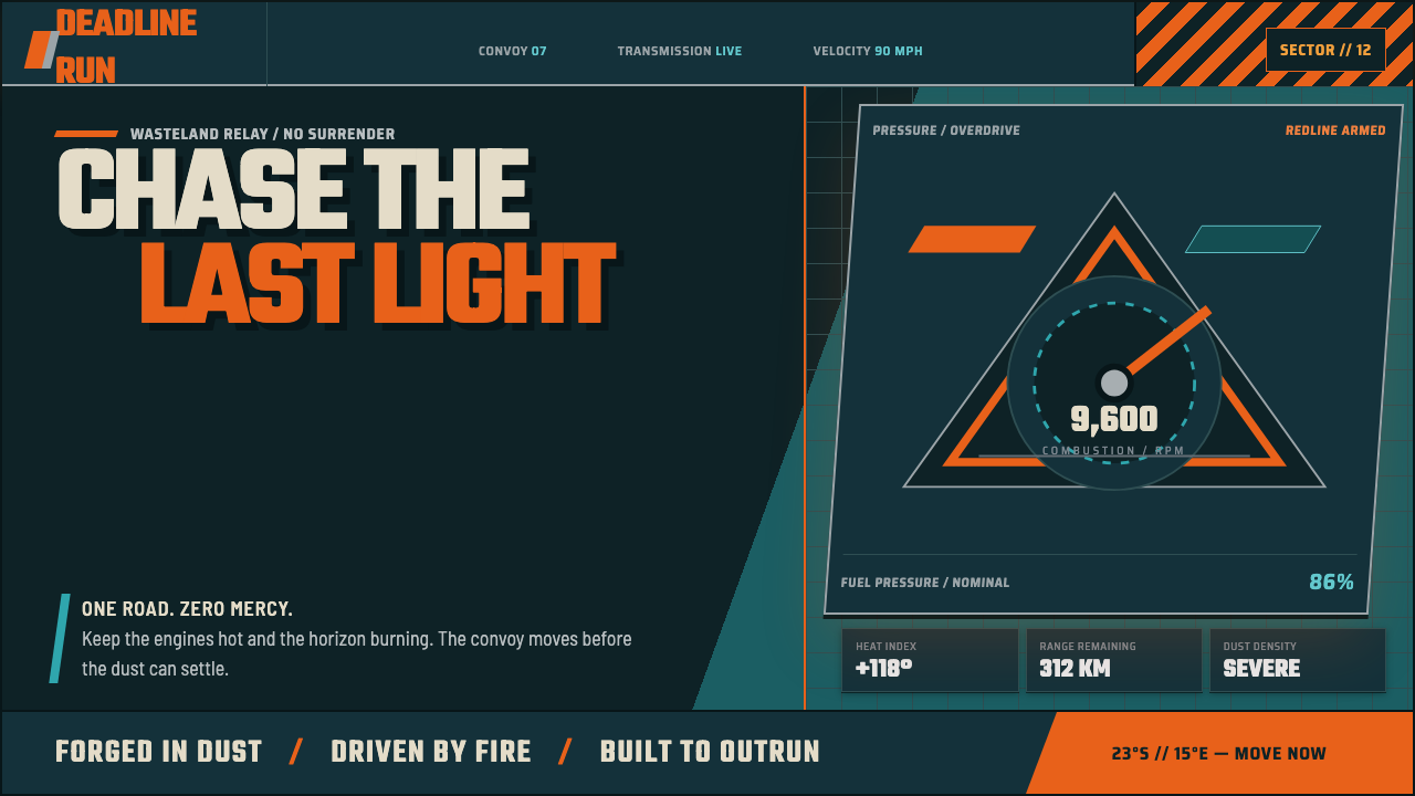 Mad Max Fury Road (2015)Built to roar. Molten saffron cuts through petrol teal, riveted grids, and ha…
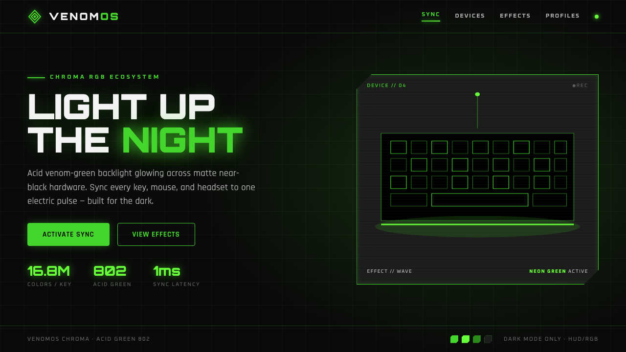 Razer Chroma GreenEsports gear at night. Acid Pantone-802 green burns on matte black via RGB gl…
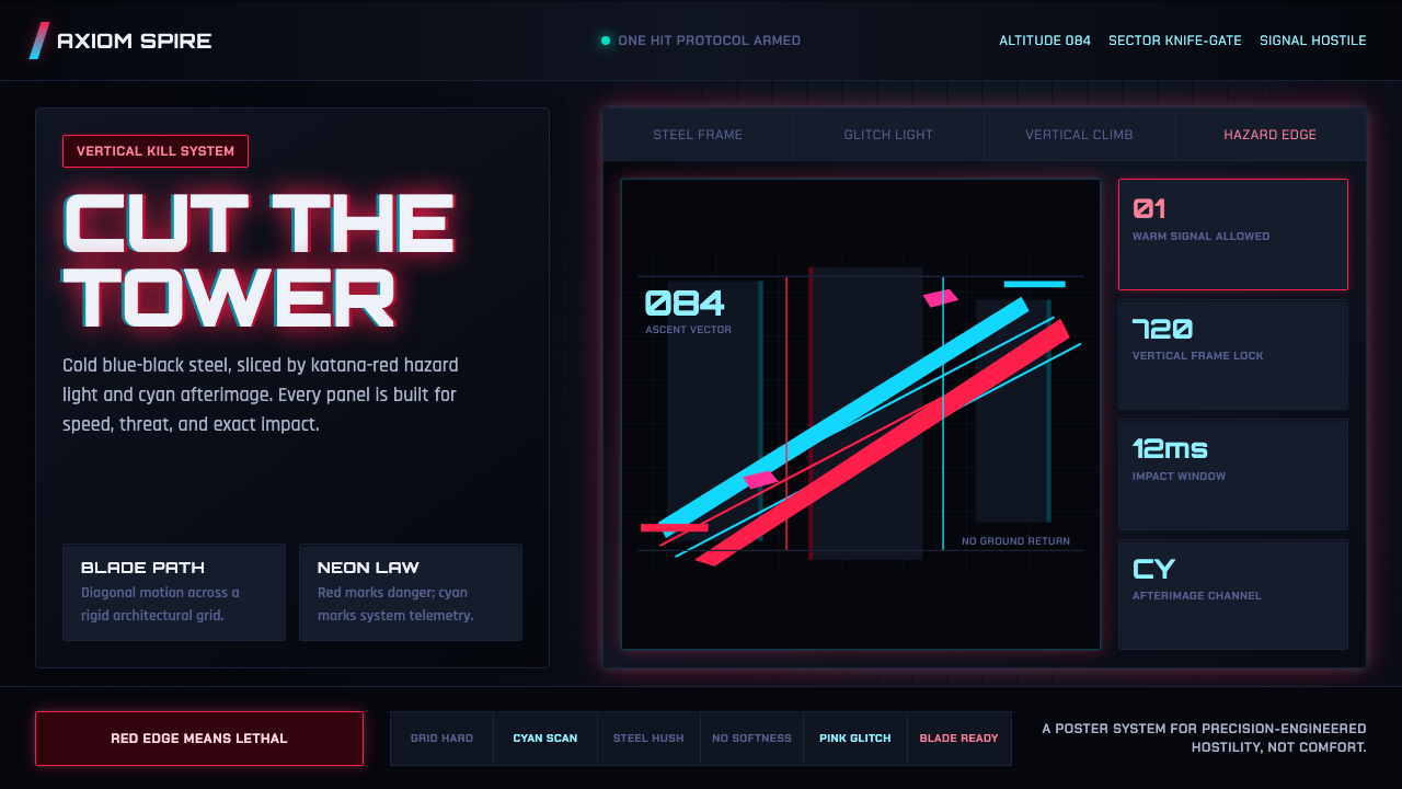 Ghostrunner Dharma TowerHostile precision at speed. Blue-black steel grids cut by red neon and cyan g…
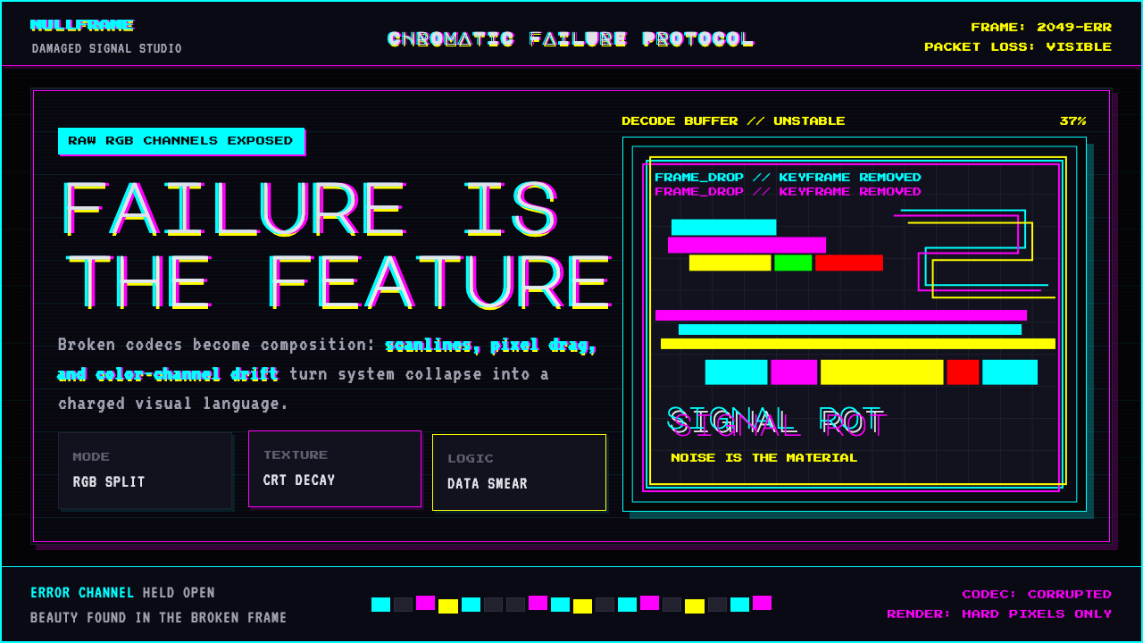 Glitch DatamoshErrors as composition. Corrupted JPEGs, RGB splits, scanlines — failure treat…
 SinofuturismCopy becomes future. Jade-cyan grids, red signage, and Orbitron data stack th…
 Cybergoth RaveDarkness rules. Pure black PVC is split by one UV-green circuit glow.