What is Ghostrunner Dharma Tower?
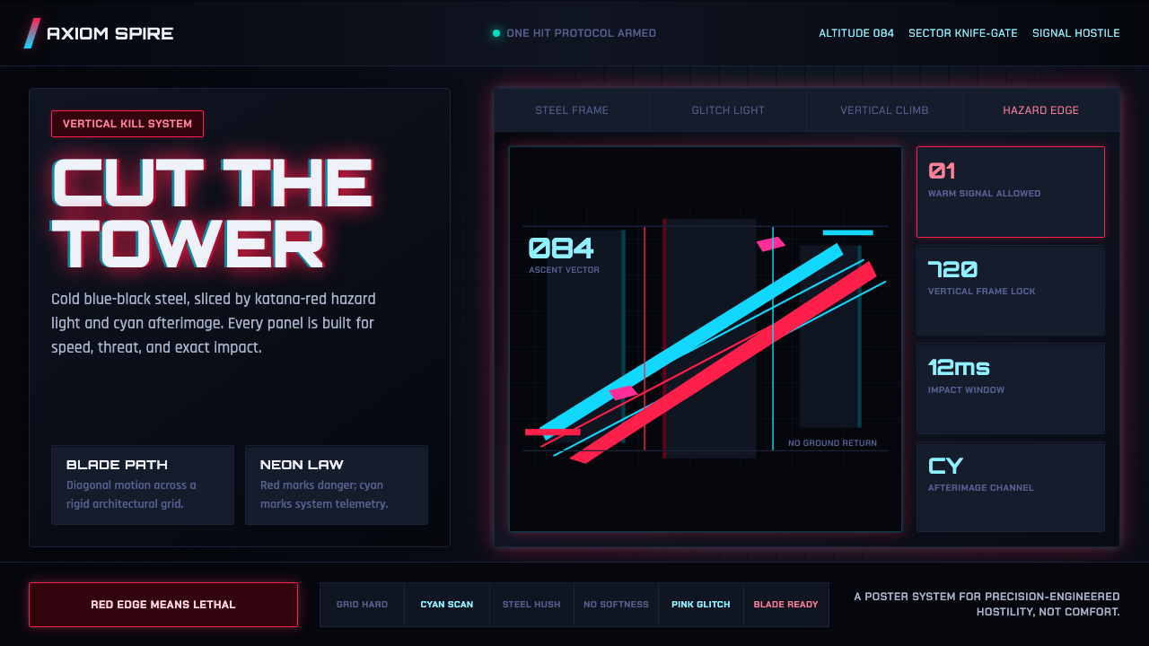
Ghostrunner Dharma Tower turns the interface into a hostile machine: blue-black steel, red neon, and cyan glitch light moving with the speed of a blade.
Ghostrunner Dharma Tower in brief
Ghostrunner Dharma Tower is a post-apocalyptic cyberpunk visual language built around a fictional megastructure where the ground has become a myth and survival depends on instantaneous precision. Its atmosphere is not a soft or decorative vision of the future. It is cold, vertical, industrial, and permanently alert — a city in the sky assembled from steel, concrete, warning systems, and failing light.
The system begins with dense near-black surfaces that establish pressure and depth. Against that dark foundation, katana-red functions as the only warm accent, while cyan and pink glitch light cut through the composition like electrical interference. The contrast is deliberately hostile. Color does not soothe, decorate, or create seasonal mood; it signals danger, direction, speed, and a world whose infrastructure is still operating under extreme stress.
The result suits interfaces that want to feel fast, severe, and engineered rather than welcoming. It can frame a dashboard as a tactical control surface, turn a pricing page into a hierarchy of risk and capability, or give an editorial page the atmosphere of a transmission recovered from a damaged tower. The essential quality is disciplined aggression: every bright element must feel like a signal breaking through darkness.

Where does Ghostrunner Dharma Tower come from?
The source style belongs to the 2020 post-apocalyptic cyberpunk era and is associated with Eastern Europe, specifically Wrocław, Poland. Its immediate creative context is Ghostrunner, a game that places the player inside Dharma Tower, a mile-high cyberpunk arcology suspended above a world that has lost its ordinary meaning. The tower is not merely a setting; it is the organizing idea behind the visual language.
Dharma Tower gives the style its vertical pressure. There is no comforting horizon, no ordinary ground to return to, and no visual suggestion that the built environment exists for relaxation. Steel grids, concrete masses, and dark architectural surfaces create a sense of enclosure even when the composition opens outward. The city appears elevated and exposed at once: protected by its structure, yet threatened by the instability visible in every warning light and damaged signal.
The Polish studio One More Level built the visual language around this collision between industrial order and hostile illumination. Cold blue-black steel and concrete provide the structural field; red and cyan neon break it open with the visual force of hazard signage in a dead city in the sky. The system therefore feels designed rather than naturally lit. Light arrives as an interruption, a command, or an emergency condition.
Its wider movement context combines first-person parkour, cyberpunk megastructure science fiction, and neon-noir action. Those influences explain why speed and precision are inseparable from the appearance of the world. Surfaces must feel engineered, pathways must remain legible, and flashes of color must sharpen attention rather than soften the scene. As a design system, Ghostrunner Dharma Tower carries that same logic into interfaces that need to communicate velocity, threat, and controlled intensity.
What defines the Ghostrunner Dharma Tower look?
Near-Black Ground
The foundation is a dense field of near-black blue, closer to armored steel and shadowed concrete than to neutral black. This ground should feel substantial and enclosing, allowing luminous elements to register as active signals. Large quiet areas are useful, but they should not feel empty or luxurious; the darkness carries industrial weight. Surfaces can be layered through subtle tonal changes, yet the overall impression remains compressed, cold, and resistant to warmth.
Steel Grid
Grid structure is not a decorative overlay; it is the architecture of the composition. Lines, panels, frames, and repeated divisions should suggest a tower assembled from engineered parts. The grid gives the interface a sense of calibration and makes irregular light feel more dangerous because it interrupts an otherwise controlled order. Use alignment to establish discipline, then allow selected signals or content blocks to cut across that discipline with purpose.
Katana Red
Red is the system's singular warm force. It should feel sharp, immediate, and dangerous, like a blade catching emergency light. Reserve it for moments that deserve attention: active states, critical alerts, primary actions, or a decisive visual interruption. Red loses its authority when spread evenly across the interface. Its power comes from scarcity and from the contrast between a warm strike and the surrounding blue-black mass.
Cyan and Pink Glitch
Cyan and pink provide the system's unstable illumination. Unlike red, they do not have to carry a single fixed meaning; they can indicate data activity, interference, transmission, or a momentary breach in the surface. Their light should appear cut, split, or displaced rather than smoothly atmospheric. Used with restraint, these colors make the interface feel alive under pressure. Used everywhere, they turn the system into visual noise.
Hazard-Signage Contrast
Contrast should behave like signage in a damaged city: it directs, warns, separates, and confirms. Bright text or light belongs to information that must be found quickly, while muted steel tones support context and structure. The strongest contrasts should form a readable route through the page. This is not contrast for theatrical beauty alone; it is a practical hierarchy shaped by urgency, precision, and the expectation that the user is moving fast.
Velocity and Precision
The style must imply motion without becoming chaotic. Sharp transitions between dark surfaces and luminous signals create the sensation of a blade passing through a narrow space. Content should feel tightly arranged, responsive, and ready to change state. Precision comes from clean boundaries and deliberate alignment; speed comes from how quickly the eye can identify the active path. The interface should feel capable of movement even when the screen is still.

Who shaped Ghostrunner Dharma Tower?
One More Level is the Polish studio from Wrocław identified in the source material as the builder of Ghostrunner's visual language. Its contribution is represented here through the collision of cold industrial structure, hostile neon, and high-speed precision: the tower feels engineered for movement while remaining visually severe. The studio is therefore central to understanding why this aesthetic reads as a designed system of pressure rather than a generic cyberpunk color treatment.
All in! Games is named in the approved source material among the key figures associated with Ghostrunner Dharma Tower. The material does not assign it a separate creative role, so this article does not attribute specific visual decisions to the company. Its inclusion records the broader production context around the theme while keeping authorship claims limited to what the source establishes.
505 Games is also listed in the source material as a key figure associated with this theme. No detailed role is provided in the approved material, so its significance here remains contextual. Together with the named studio and All in! Games, it places the visual system within the production and release ecosystem surrounding Ghostrunner without extending beyond the documented facts.
How do you use Ghostrunner Dharma Tower today?
For presentation slides, use the cover as a dark architectural threshold: a near-black field, a disciplined steel grid, and one red or cyan signal that establishes the threat immediately. Content slides should behave like tactical readouts, with strong alignment, compact information blocks, and clear separation between active data and supporting context. Data slides benefit from luminous marks against the dark ground, but every highlight should have a job. The visual route through the slide must be obvious at speed.
For web interfaces, the style is particularly effective for dashboards, monitoring tools, technical products, and pricing pages that want to communicate capability under pressure. Keep the main surface dark and structural, use red for decisive actions or critical states, and let cyan or pink indicate system activity and instability. Cards should feel like engineered panels rather than soft containers. Pricing tiers can be framed as escalating levels of access or risk, provided the hierarchy remains legible and the glow never replaces information.
For editorial and marketing work, Ghostrunner Dharma Tower creates a strong atmosphere for launches, game culture, technology, security, and performance-oriented subjects. Articles can use dark fields, hard divisions, signal-like callouts, and short bursts of vivid light to make the page feel transmitted rather than printed. Marketing pages can treat each section as a zone within the tower, shifting between dense structure and sudden illumination. The writing should remain direct and precise so that the visual hostility has a clear informational purpose.
Motion and interaction should suggest acceleration without covering the screen in constant effects. A state change can arrive as a brief cut of cyan, a red confirmation, or a momentary glitch in an otherwise stable grid. Hover and focus behavior should sharpen the active boundary rather than add ornamental spectacle. Even in a static implementation, the system can imply speed through compact grouping, decisive contrast, and a clear relationship between signal and response.
The common mistake is treating cyberpunk as permission to combine every neon color, glow, distortion, and dark surface at once. That approach destroys the precision that makes Ghostrunner Dharma Tower distinctive. Keep the blue-black structure dominant, make red scarce and purposeful, and let cyan or pink appear as controlled interference. Excessive glow weakens hierarchy; random glitching weakens trust; decorative darkness makes content harder to read. The style works when hostility is engineered, not when it is merely loud.

Ghostrunner Dharma Tower — FAQ
Is Ghostrunner Dharma Tower simply a neon cyberpunk style?
No. Neon is only the visible surface. The deeper system depends on the relationship between engineered darkness and controlled illumination. Blue-black steel and concrete create the structural pressure; red, cyan, and pink interrupt that structure as signals with different jobs. If the lights are added without the grid, hierarchy, and sense of speed, the result becomes generic cyberpunk decoration rather than the hostile precision of Dharma Tower.
Can this style work on a light background?
It can be adapted, but the central identity is dark. The source system is built around near-black surfaces, cold steel, and light cutting through shadow. A light version may preserve the grid, hazard-signage contrast, and red signal logic, but it will lose some of the enclosed pressure that makes the style distinctive. Use a light treatment only when readability or product context requires it, and keep the darker structural character visible through borders, panels, and strong contrast.
How should red, cyan, and pink be divided?
Red should remain the decisive warm accent, reserved for danger, action, or confirmation. Cyan and pink can carry the more unstable language of activity, interference, and transmission. They should not all compete for the same attention. Establish the dark structure first, give red the strongest moments of urgency, and use cyan or pink as secondary signal layers. The exact meaning can vary by product, but the scarcity and contrast should remain consistent.
Does the system require animation to feel fast?
No. Animation can reinforce the idea, but speed also comes from structure. Tight grouping, sharp boundaries, clear routes through information, and sudden contrast between dark surfaces and bright signals can make a static interface feel ready to move. When motion is added, it should clarify a state change or signal a response. Continuous distortion without meaning creates fatigue and undermines the precision the style is meant to communicate.
What kinds of products suit Ghostrunner Dharma Tower best?
It suits products that value speed, threat awareness, technical authority, and precision: monitoring dashboards, tactical tools, performance products, game interfaces, and stark technology launches. It is less suitable when the main promise is comfort, softness, organic warmth, or casual friendliness. The style asks users to stay alert. That can be powerful when alertness is part of the product's value, but alienating when the experience is supposed to feel restful or emotionally gentle.
Related design styles
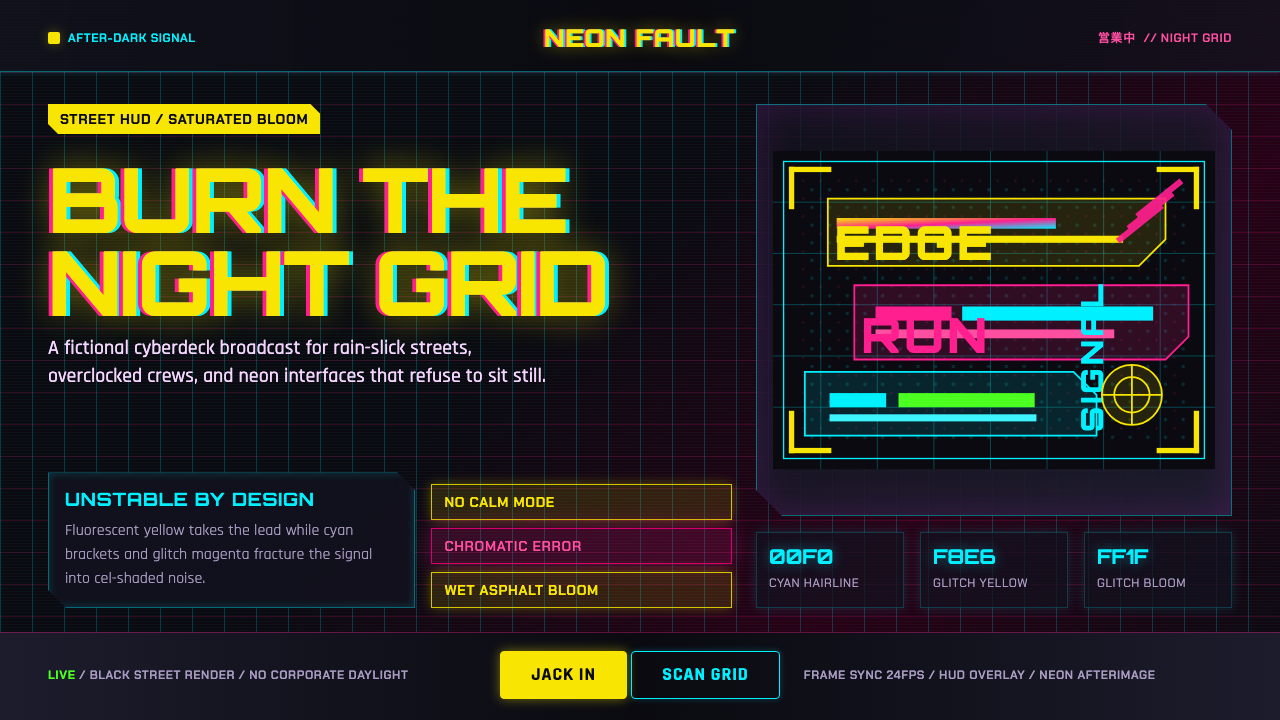 Edgerunners NeonNeon overload. Fluorescent yellow, cyan HUD grids, and magenta glitches burn…
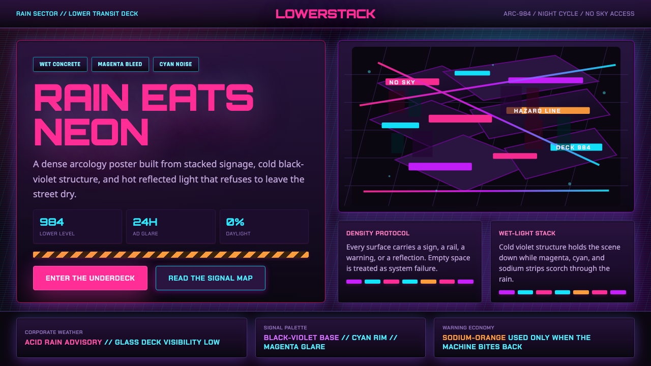 The Ascent ArcologyNeon suffocates the dark. Magenta and cyan signage stacks over wet black-viol…
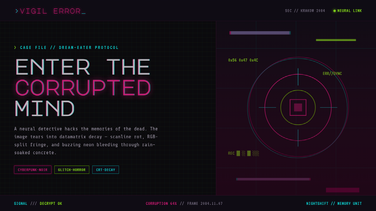 ObserverTech, but corrupted. Neon magenta and acid green tear through rain-black conc…
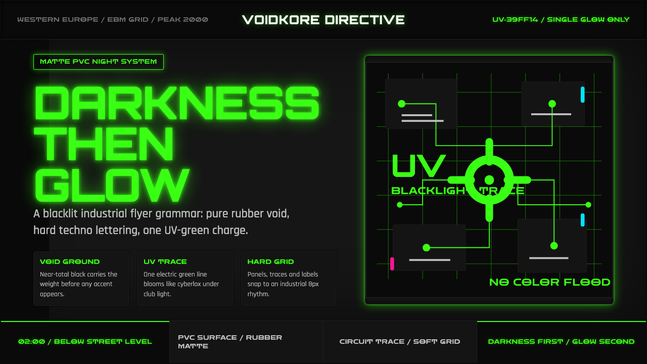 Cybergoth RaveDarkness rules. Pure black PVC is split by one UV-green circuit glow.
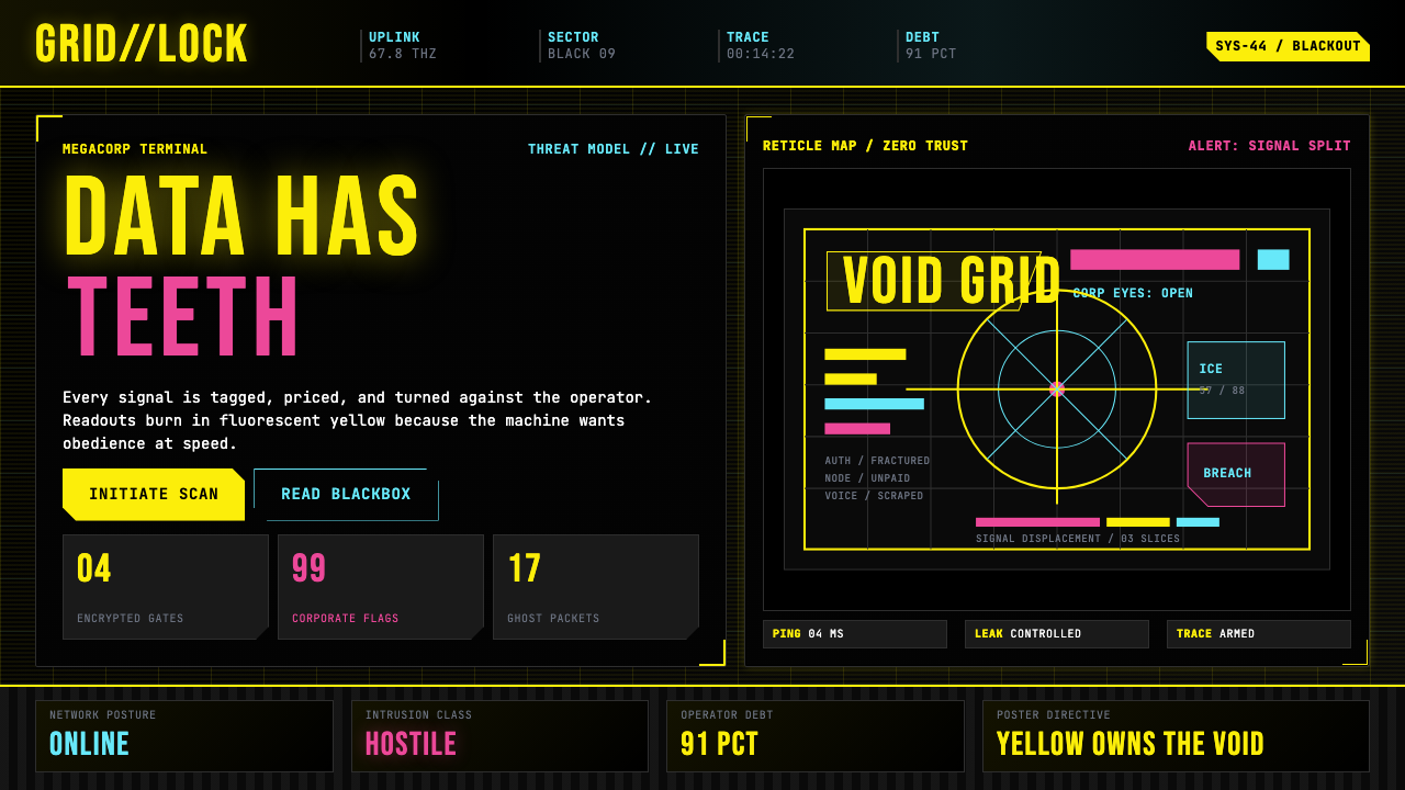 Cyberpunk 2077 (Screen UI)Weaponized terminals. Fluorescent yellow on black, scanlines and bracketed HU…
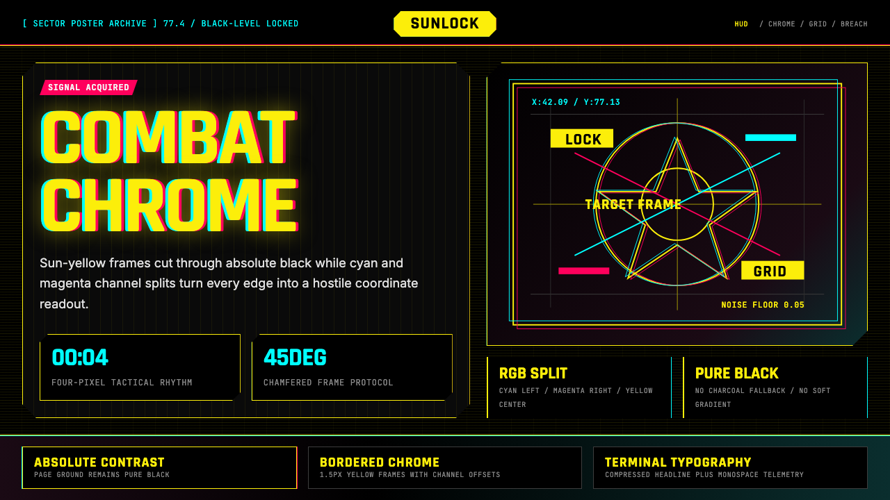 Cyberpunk 2077 Night City YellowCombat HUD on black. Sun-yellow chrome splits into magenta-cyan coordinate gr…