What is The Ascent Arcology?
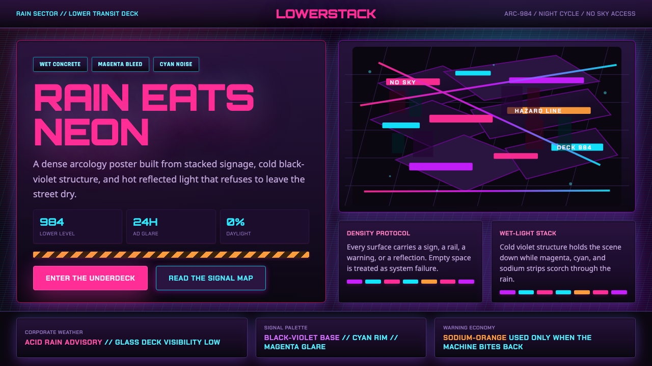
The Ascent turns cyberpunk density into pressure: neon signage, wet machinery, and stacked urban darkness leave no empty place for the eye to escape.
The Ascent Arcology in brief
The Ascent Arcology is the visual world of Veles Arcology, a near-future Western European megastructure rendered as a vertical slum of corporate excess. Its atmosphere is perpetual rainy night: wet black asphalt, grimy chrome, overloaded signs, warning strips, and dense isometric layers all compete within the same frame. The style does not use darkness as empty background. Darkness is an active material, a cold black-violet field that absorbs the city until neon makes selected surfaces flare into view.
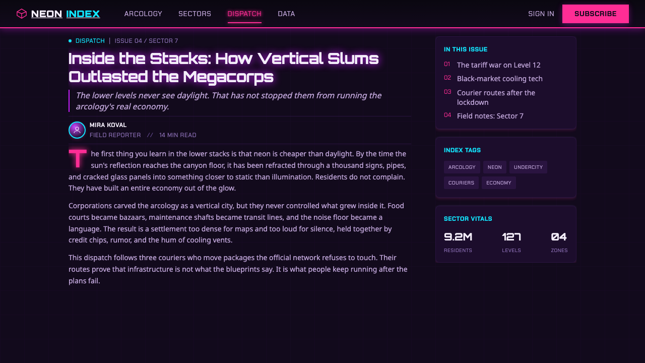
Its cyberpunk is intentionally unpolished. Rather than presenting a clean futuristic metropolis, it treats infrastructure as exhausted, overused, and permanently damp. Surfaces reflect, drip, corrode, or glitch. Chrome is not elegant luxury; it is a dirty conductor for colored light. Every sign appears to have been added because another tenant, merchant, system, or authority needed to occupy the same limited visual territory.
The defining visual tension is between cold structural darkness and overheated luminous interruption. Magenta and cyan signage fight for dominance, while sodium-orange warning strips puncture the composition with industrial urgency. These colors are not distributed evenly or politely. They stack, overlap, spill through mist and rain, and turn the city into a crowded field of competing signals. Clutter is not a failure of organization here; it is the aesthetic proof that Veles Arcology has exceeded any comfortable capacity.
Where does The Ascent Arcology come from?
The Ascent released in 2021 and places its visual identity inside a near-future dystopian setting. Its central environment is Veles Arcology, a Western European arcology whose scale is communicated less through distant skyline spectacle than through vertical compression. The viewer is placed among lower layers of the structure, where systems, commerce, housing, transport, and industrial remnants appear to have accumulated without release.
The setting was developed by the Swedish studio Neon Giant, with Curve Games named among its key figures. The world does not present cyberpunk as a neutral collection of futuristic props. Its central image is an inhabited megastructure shaped by corporate excess: a place where every available surface has become a carrier for signage, warning, grime, reflection, or technological malfunction.
Stylistically, The Ascent sits at the meeting point of isometric cyberpunk, arcology and megastructure science fiction, and neon-noir. The isometric perspective makes density legible by revealing stacked streets, platforms, interiors, signs, and service layers in the same visual field. Arcology science fiction supplies the enclosing vertical city, while neon-noir supplies the rain, darkness, luminous spill, and sense that illumination reveals danger as readily as it provides orientation.
Its Western European setting matters to the tone described by the material. The world is not a pristine future showroom; it is marked by squalor, crowded infrastructure, and industrial wear. That combination gives its neon a feverish quality. Light does not cleanse the environment or make it sleek. Instead, it exposes wet asphalt, grimy metal, saturated signage, and the ceaseless pressure of a city built upward because it can no longer spread outward.
What defines the The Ascent Arcology look?
Cold Dark Ground
The base is near-black and black-violet rather than empty pure darkness. This cold ground holds the composition together and gives bright signs something to push against. Large dark passages are allowed to remain materially present as asphalt, shadowed architecture, wet voids, or obscured infrastructure, so the illuminated areas feel earned rather than decorative.
Neon Competition
Magenta and cyan are treated as rival visual forces, not balanced accents. They occupy signs, reflections, haze, and metal edges with enough intensity to appear hot against the cold city. Sodium-orange warning strips introduce a different kind of light: less seductive than neon, more functional and alarming. The palette feels crowded because each luminous color demands attention at once.
Wet Reflective Matter
Rain is a compositional device as much as an environmental condition. Wet black asphalt and grimy chrome catch fragmented light, multiplying signage without adding clean graphic repetition. Reflections are broken by texture, moisture, dirt, and uneven surfaces. The result is not mirror-like polish but a smeared, unstable echo of the city above and around it.
Vertical Compression
The arcology is experienced as stacked occupation. Signage, routes, platforms, facades, cables, and enclosed spaces crowd across several apparent levels, making the city feel less like an open street and more like an urban machine whose internal layers are all exposed at once. There is little visual horizon and almost no architectural pause.
Isometric Density
The isometric viewpoint turns complexity into a layered map rather than a flat wall of noise. It lets the eye travel diagonally across streets, interiors, elevated structures, and signs, then discover another occupied layer behind them. This perspective supports the style’s central premise: Veles Arcology is too dense to be understood in a single glance, yet too exposed to offer privacy or relief.
Glitch and Industrial Wear
Glitching surfaces, grime, and damaged material behavior keep the future from becoming sterile. Visual disruption is embedded in the environment: a sign can flicker, a reflective surface can distort, and a metallic edge can carry residue instead of shine. These imperfections make technological abundance feel oppressive, because the city appears overloaded rather than advanced beyond maintenance.
Who shaped The Ascent Arcology?
Neon Giant is the Swedish studio identified as the developer of The Ascent. Through Veles Arcology, the studio establishes a world where cyberpunk scale is expressed through wet, crowded, vertically stacked urban infrastructure rather than clean futurist spectacle.
Curve Games is named among the key figures connected with The Ascent. Within the approved material, it belongs to the project context surrounding a visual world defined by arcology scale, neon-noir atmosphere, and dense isometric cyberpunk composition.
Veles Arcology is the setting that carries the style’s central idea. As a Western European arcology, it turns urban life into stacked pressure: corporate excess, signage, rain, dark infrastructure, and overfilled luminous surfaces occupy the same vertical system.
How do you use The Ascent Arcology today?
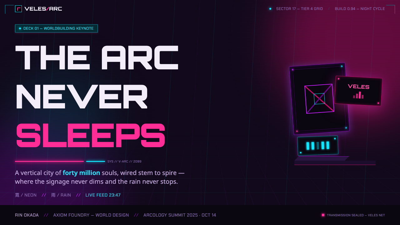
For presentation slides, use the style as a controlled atmosphere rather than an invitation to fill every inch with decoration. A cover can place a large title over a deep dark field, with a cropped neon-lit urban texture or a small stack of luminous sign-like labels near one edge. The goal is immediate pressure and hierarchy: the title must remain the strongest signal, while the surrounding visual field suggests a city that continues beyond the frame.
Content slides need more restraint than the source aesthetic might imply. Build each page as a dark information layer with a clear reading path, then use magenta, cyan, or warning-orange sparingly to distinguish categories, key figures, or active states. For data slides, make charts feel infrastructural rather than ornamental: dense linework, dark structural fields, and one luminous accent can suggest a control surface without sacrificing legibility. Avoid treating every series, label, and gridline as neon.
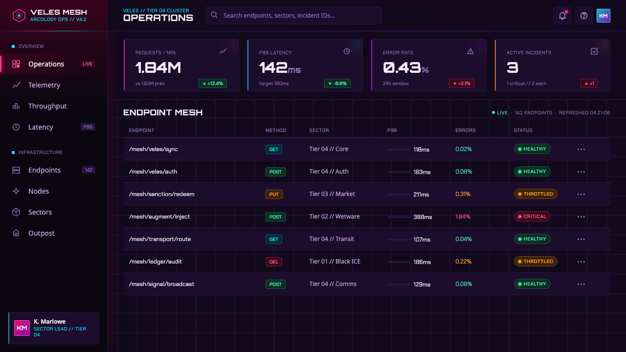
For web interfaces, the style suits dashboards, operational tools, monitoring environments, and pricing pages that benefit from an intense technological mood. Keep the interface foundation quiet enough for interaction to remain clear, then concentrate brightness around priority actions, system status, alerts, and selected sections. Layered panels, reflective image regions, constrained glow, and subtle signs of industrial wear can create an arcology-like environment without making forms, navigation, or account information difficult to read.
For editorial and marketing work, use vertical layering and visual crowding to tell a story of scale, urgency, or urban overload. A long-form page can alternate dark narrative sections with close reflective details, stacked labels, and diagonally organized metadata. Marketing pages can use the contrast between nearly black grounds and hot luminous accents to frame launches, product capabilities, or high-intensity campaigns. The copy should stay direct; the visual world already provides drama.
The common mistake is copying neon color while removing the conditions that make it meaningful. A smooth dark gradient, pristine chrome, isolated glowing icons, and generous empty space may look futuristic, but they do not produce The Ascent’s pressure. The style depends on cold darkness, wet material, overlap, vertical occupation, visible wear, and competing signals. Conversely, indiscriminate clutter also fails: density must still preserve a hierarchy, or the design becomes unreadable noise instead of an oppressive city.
The Ascent Arcology — FAQ
Is The Ascent Arcology style simply generic cyberpunk?
It belongs to cyberpunk, but its identity is more specific. The source material frames it through isometric cyberpunk, arcology and megastructure science fiction, and neon-noir. Its distinctive quality is not merely bright signs in darkness; it is the sense of a vertically overfilled Western European city where rain, grime, corporate excess, infrastructure, and luminous advertising are inseparable.
Why are magenta and cyan so effective against the dark environment?
The palette begins from a cold near-black and black-violet base, so magenta and cyan appear unusually hot and immediate by contrast. Their effectiveness also comes from competition: the colors do not calmly decorate a clean surface, but fight across signs, reflections, wet pavement, haze, and chrome. Orange warning strips then add industrial tension instead of simply broadening the palette.
Can this style work for readable product interfaces?
Yes, if the atmospheric layer remains subordinate to task clarity. Dark structural surfaces can carry the interface, while luminous colors identify priority actions, active states, alerts, and selected information. The useful lesson from The Ascent is controlled contrast and layered pressure, not the literal reproduction of every sign or reflective surface. Navigation, forms, and essential data still need a calm and reliable reading path.
What makes clutter intentional rather than poorly organized?
Intentional clutter has a governing pressure. In The Ascent, visual density supports the idea of a city where too many systems and claims occupy the same arcology. Layers overlap, but they remain tied to material logic: signage belongs to commerce or communication, reflections belong to rain and chrome, warning light belongs to infrastructure, and darkness binds the field. When elements lack such relationships or hierarchy, clutter becomes arbitrary.
Related design styles
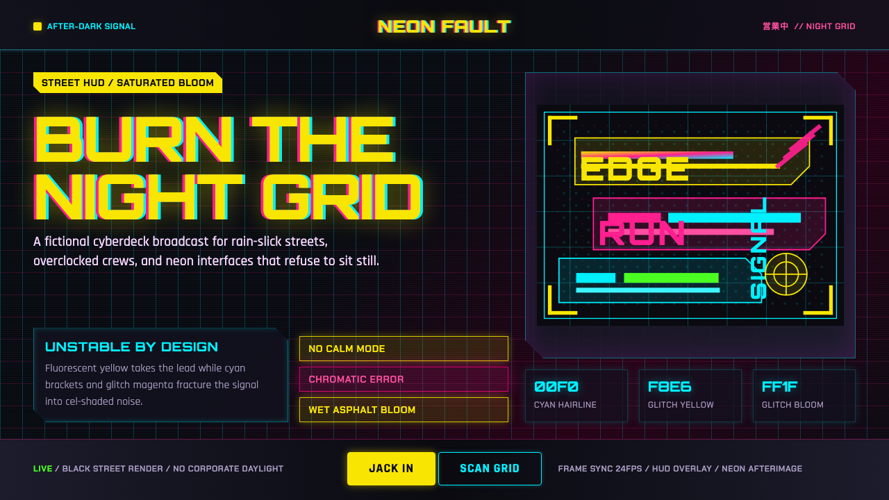 Edgerunners NeonNeon overload. Fluorescent yellow, cyan HUD grids, and magenta glitches burn…
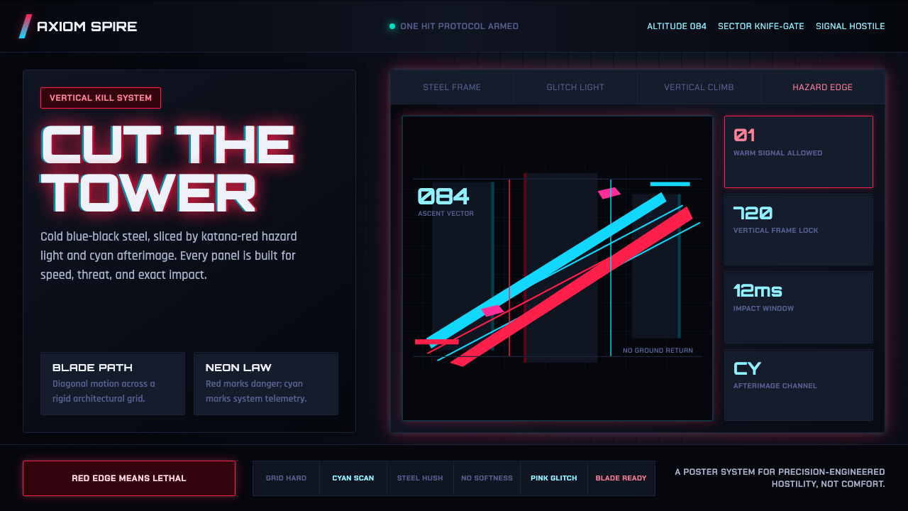 Ghostrunner Dharma TowerHostile precision at speed. Blue-black steel grids cut by red neon and cyan g…
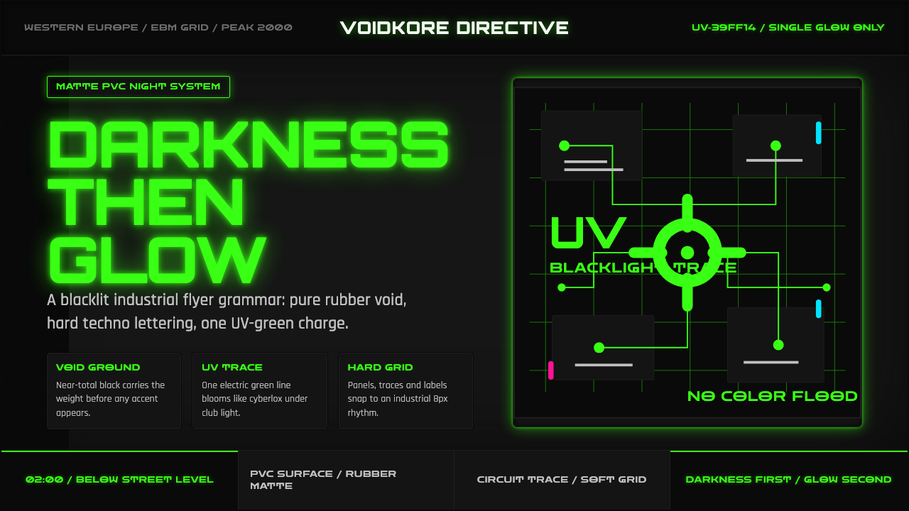 Cybergoth RaveDarkness rules. Pure black PVC is split by one UV-green circuit glow.
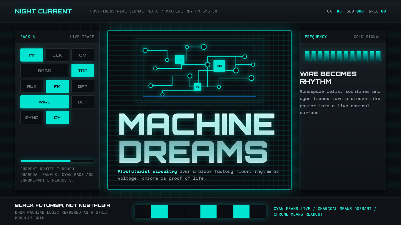 Detroit TechnoCold machines dream. Electric cyan circuits and chrome display type lock to a…
 Gundam Universal Century UIA war machine's eye. Phosphor wireframe and katakana telemetry glow inside a…
 ObserverTech, but corrupted. Neon magenta and acid green tear through rain-black conc…