What is Edgerunners Neon?
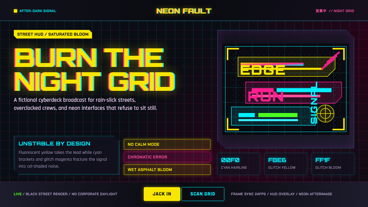
Edgerunners Neon is Night City the way a 2022 anime actually drew it — not a calm amber terminal, but wet black streets flooded with fluorescent yellow, glitching magenta, and cyan HUD light.
Edgerunners Neon in brief
Edgerunners Neon takes its signature from Cyberpunk: Edgerunners, the 2022 anime that Japanese studio Trigger built inside the world of the video game Cyberpunk 2077. Where the game's own interface leans toward a calmer amber-on-dark terminal look, the anime reinvents Night City through animation itself: hard-edged cel-shading instead of photorealistic rendering, wet black streets that hold reflected color like a mirror, and a lighting language that is loud, unstable, and constantly on the verge of breaking apart.
Cel-shading is the technical heart of the look — a rendering approach that paints light and shadow in a small number of flat, sharply bordered tonal steps rather than smooth photographic gradients, the way traditional hand-drawn cel animation always had to. That flatness is what lets the neon read as pure, saturated color rather than a softly lit glow: fluorescent yellow and glitching magenta don't fade at their edges, they stop abruptly, the way ink stops on paper. Cyan grid lines and bracket shapes float over scenes like an augmented-reality overlay, and chromatic-aberration-style distortion — the color channels of an image visibly separating and re-fusing — signals danger, malfunction, or a mind under strain.
The overall effect is deliberately maximal. Where a restrained system tries to say one thing clearly, Edgerunners Neon wants several things happening simultaneously — a HUD element, a glitch accent, a neon reflection, and a hard shadow all occupying the same frame — because that density is exactly what gave the anime's Night City its sense of a city running too hot, too fast, and too bright for anyone in it to feel safe.
Where does Edgerunners Neon come from?
The lineage begins well before the anime, with American game designer Mike Pondsmith, who created the tabletop role-playing game Cyberpunk in 1988 (later revised as Cyberpunk 2020), inventing Night City and the corporate-dystopian, body-modification-heavy setting that everything downstream of it still uses. Polish studio CD Projekt Red licensed that world decades later to build the video game Cyberpunk 2077, released in 2020 after a long and closely watched development, with Pondsmith himself consulting on the adaptation to keep the setting's internal logic intact.
CD Projekt Red then partnered with the Japanese animation studio Trigger — founded in 2011 by former staff of the influential studio Gainax, including Hiroyuki Imaishi — to produce an anime set in the same Night City, released on Netflix in September 2022 as Cyberpunk: Edgerunners. Trigger had already built a strong identity around hyperkinetic, exaggerated, boldly graphic animation in earlier shows, and that house style — rather than the game's own visual language — is what actually defines this look. The series was directed by Bahi JD, an animator who had worked his way up through key animation and storyboard roles at Trigger before taking on Edgerunners as his feature-length directorial debut.
The show's visual choices were a deliberate departure from the game's interface conventions. Cyberpunk 2077's in-game UI favors a comparatively restrained amber-and-dark palette closer to older analog computer terminals, but Edgerunners was drawing a different Night City: an animated, night-time, rain-slick city built from the vocabulary of cel-shaded anime, glitch art — the broader digital-art tradition of using deliberate visual corruption, torn frames, and misaligned color channels as an aesthetic in itself — and neon-noir cinema, the film tradition of night-lit cityscapes soaked in saturated color that had already shaped decades of cyberpunk visual culture on screen.
On release, Edgerunners was received as one of the most visually distinctive anime of its year, widely credited with driving a large surge of new players back to the original game months after its own rocky launch — a rare case of an adaptation's aesthetic feeding directly back into renewed interest in its source material. That reception is part of why this particular neon-on-black, glitch-and-HUD treatment of Night City, rather than the game's own quieter terminal look, became the version of cyberpunk visual language most associated with the story in the years since.
What defines the Edgerunners Neon look?
Color
A near-black, rain-wet ground carries three colors in active tension rather than one dominant accent: a hot fluorescent yellow that reads as the loudest, most aggressive signal in the system; a glitching magenta reserved for distortion, danger, or malfunction; and a cooler cyan used specifically for HUD grids and readouts. The three never blend into each other — each keeps its own job, and the friction between them is part of the point.
Cel-shading
Light and shadow are rendered in a small number of flat, hard-edged tonal steps rather than smooth continuous gradients, the way traditional cel animation was always constrained to work. This gives even brightly lit neon surfaces a graphic, ink-like quality — colors stop abruptly at a clean edge instead of fading out, so the whole scene reads more like a printed poster brought to motion than a simulated photograph.
HUD overlay
Angular brackets, grid lines, and readout-style marks float over content the way an augmented-reality display would float over a wearer's field of vision, always in the cooler cyan register rather than the hot yellow used for primary content. These overlays behave as information, not decoration — they suggest a system reading and annotating the scene in real time.
Glitch distortion
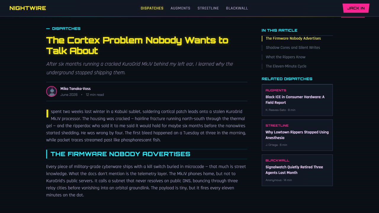
Deliberate visual corruption — color channels that appear to separate and re-fuse, edges that judder or momentarily displace — is used as punctuation rather than a constant condition. A glitch appears where something is meant to feel unstable, dangerous, or malfunctioning, then resolves, so its rarity is what keeps it legible as a signal rather than becoming background noise.
Density and layering
Compositions favor several things happening at once — a HUD readout, a neon reflection, a glitch accent, and a hard shadow can all sit in the same frame — rather than the single, quiet focal point favored by more restrained systems. This maximalism is intentional: the busyness itself communicates a city and a mind running at an uncomfortable, overloaded intensity.
Bloom and wet reflection
Bright neon sources spill outward into a soft halo rather than staying perfectly crisp, and dark ground surfaces — streets, glass, visors — hold and repeat that color back as a reflection. The combination of hard cel-shaded edges everywhere else with soft bloom specifically around light sources is what gives the system its sense of a genuinely wet, glowing night city rather than a flat graphic pattern.
Who shaped Edgerunners Neon?
The American game designer created the tabletop role-playing game Cyberpunk in 1988, later revised as Cyberpunk 2020, inventing Night City and the corporate-dystopian setting that every later adaptation — the video game and the anime alike — still builds on. He later consulted directly on the video game adaptation to keep its world consistent with his original design.
The Polish studio licensed Pondsmith's tabletop setting to build the video game Cyberpunk 2077, released in 2020, and subsequently partnered with Studio Trigger to commission the anime adaptation. The studio's own in-game interface favors a comparatively muted amber-and-dark terminal look, which the anime deliberately departed from.
Founded in 2011 by former staff of the influential animation studio Gainax, Trigger built its reputation on hyperkinetic, exaggerated, boldly graphic animation well before taking on Edgerunners. That house style — rather than any element carried over from the source game's own visuals — is what actually defines this design system's energy.
A co-founder of Studio Trigger, Imaishi helped establish the studio's signature high-energy, exaggerated visual identity across its earlier catalog. That identity is the direct house style Edgerunners was made within, even though the series itself was helmed by a different director.
An animator who rose through key animation and storyboard work at Trigger, Bahi JD directed Cyberpunk: Edgerunners as his feature-length directorial debut, shaping the specific rhythm of neon, glitch, and cel-shaded contrast that made the 2022 series visually distinctive.
How do you use Edgerunners Neon today?
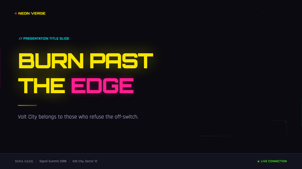
On a presentation cover, the style works best committing fully to the near-black ground with one hot yellow headline element and a thin cyan HUD-style frame or bracket marking the slide's edges, evoking a targeting readout more than a title card. Content slides should keep the busy, layered feel under control by giving each slide one glitch or bloom accent rather than several, while body text stays in a plain, legible tone against the dark field. Data slides suit anything meant to feel urgent or overloaded — a spiking chart rendered in hot yellow against cyan gridlines reads as an alert, which makes the style well suited to incident reports, security dashboards, or any data story about something going wrong fast.
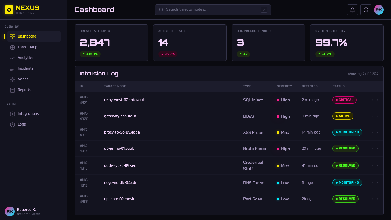
In web interfaces, the density this style is built for suits monitoring tools, live-status dashboards, and products that want to feel like they are watching something happen in real time rather than presenting a calm summary. A pricing page can use the hot yellow exclusively for the recommended tier and cyan HUD-style brackets to frame it, while keeping every other tier in quieter dark tones — the trick is using the busy visual vocabulary as hierarchy rather than letting every element compete for the same attention. Buttons and interactive states read well with a brief glitch-style flicker at the moment of interaction, echoing the source material's habit of using distortion specifically at moments of instability.
For editorial and marketing pages, the style suits content about technology, gaming culture, or anything wanting to feel electric and slightly dangerous rather than polished and corporate. A marketing hero section can commit to full density — HUD overlay, bloom, and glitch accent together — while an editorial layout should dial that density back for long-form reading, reserving the busiest effects for a single opening spread or pull-quote so body copy stays legible over the length of an article.
Photography and video work best when they already carry real neon and wet-surface reflection, since that is the physical condition the whole cel-shaded, bloom-heavy look is standing in for; evenly lit, daytime, or studio-clean photography will always look imported from a different system. A useful test is whether an image would hold color if it were raining at night — if not, it needs heavier stylization before it belongs in this system.
The most common mistake is treating every element as an opportunity for a glitch or a neon color, which flattens the hierarchy the style depends on. In the source material, distortion and hot color are reserved for moments and elements that are supposed to feel dangerous or unstable; everything else stays comparatively controlled so those accents still read as significant. A page where every heading glitches and every icon glows stops communicating danger — it just becomes noise, and the specific tension between calm density and sudden instability that gives Edgerunners Neon its identity disappears.
Edgerunners Neon — FAQ
Is this the same as the amber terminal UI from the Cyberpunk 2077 video game?
No, and the difference is deliberate. The video game's own interface leans toward a comparatively restrained amber-and-dark palette closer to older analog computer terminals. Edgerunners Neon instead comes from the 2022 anime adaptation, which Studio Trigger built in its own hyperkinetic, cel-shaded house style — fluorescent yellow, glitching magenta, and cyan HUD elements against wet black streets — rather than carrying the game's UI language over directly.
What exactly is cel-shading, and why does it matter for this style?
Cel-shading renders light and shadow in a small number of flat, hard-edged tonal steps instead of smooth photographic gradients — the technique traditional hand-painted animation cels always had to use, since blending paint smoothly frame by frame wasn't practical. It matters here because that flatness is exactly what lets the neon colors read as pure and graphic rather than softly glowing; edges stop cleanly instead of fading, giving the whole system its poster-like, ink-on-black quality.
How is this different from a generic 'neon cyberpunk' color scheme?
Generic neon-cyberpunk treatments often use a wide, evenly weighted rainbow of saturated hues glowing softly against dark backgrounds. This system is narrower and more disciplined: three specific colors with three specific jobs — hot yellow for primary energy, magenta reserved for glitch and danger, cyan reserved for HUD information — combined with hard cel-shaded edges rather than soft glow throughout. The restriction to specific roles, not just specific colors, is what keeps it legible rather than decorative.
Why are glitch effects used sparingly instead of throughout the whole system?
In the source anime, distortion signals a specific state — danger, malfunction, a mind under strain — rather than being a constant visual condition. If every element glitched all the time, the effect would stop meaning anything and would just read as noise or a technical error. Keeping glitch rare and deliberate is what lets it still function as a signal: something is wrong here, specifically, rather than everywhere.
Where does the 'Night City' setting itself come from?
Night City originates with American game designer Mike Pondsmith's 1988 tabletop role-playing game Cyberpunk, later revised as Cyberpunk 2020. Polish studio CD Projekt Red licensed that setting decades later for the video game Cyberpunk 2077, and Studio Trigger's 2022 anime Cyberpunk: Edgerunners is set within that same licensed world — but drew its specific visual language from Trigger's own house style rather than from the game's interface design.
Related design styles
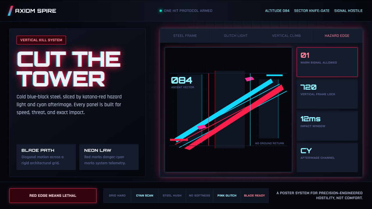 Ghostrunner Dharma TowerHostile precision at speed. Blue-black steel grids cut by red neon and cyan g…
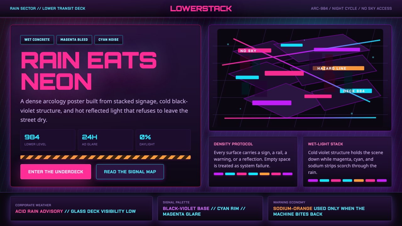 The Ascent ArcologyNeon suffocates the dark. Magenta and cyan signage stacks over wet black-viol…
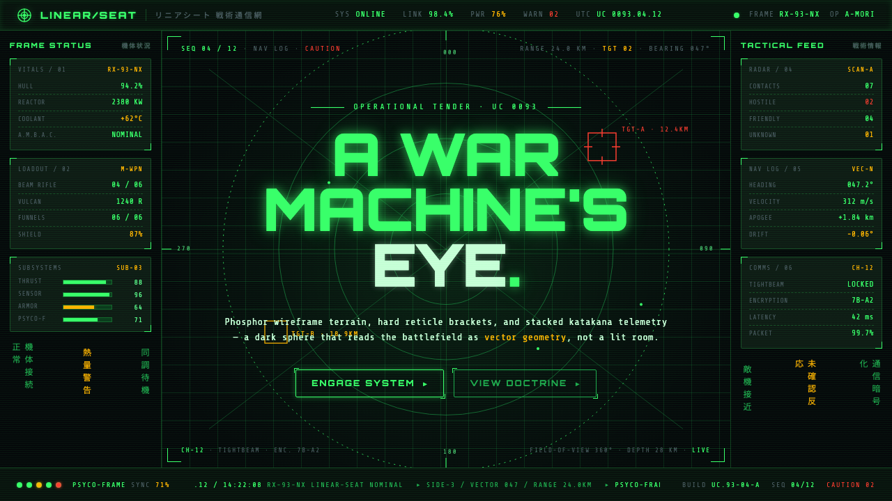 Gundam Universal Century UIA war machine's eye. Phosphor wireframe and katakana telemetry glow inside a…
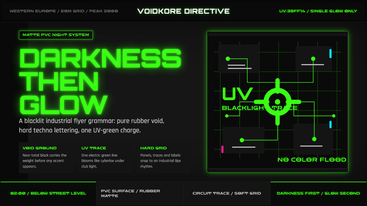 Cybergoth RaveDarkness rules. Pure black PVC is split by one UV-green circuit glow.
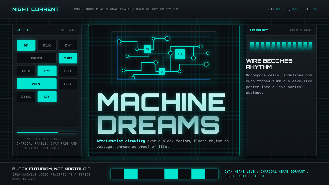 Detroit TechnoCold machines dream. Electric cyan circuits and chrome display type lock to a…
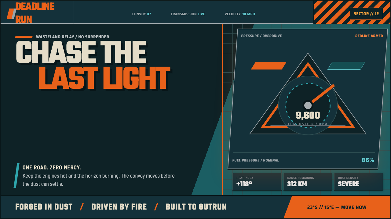 Mad Max Fury Road (2015)Built to roar. Molten saffron cuts through petrol teal, riveted grids, and ha…