What is Gundam Universal Century UI?
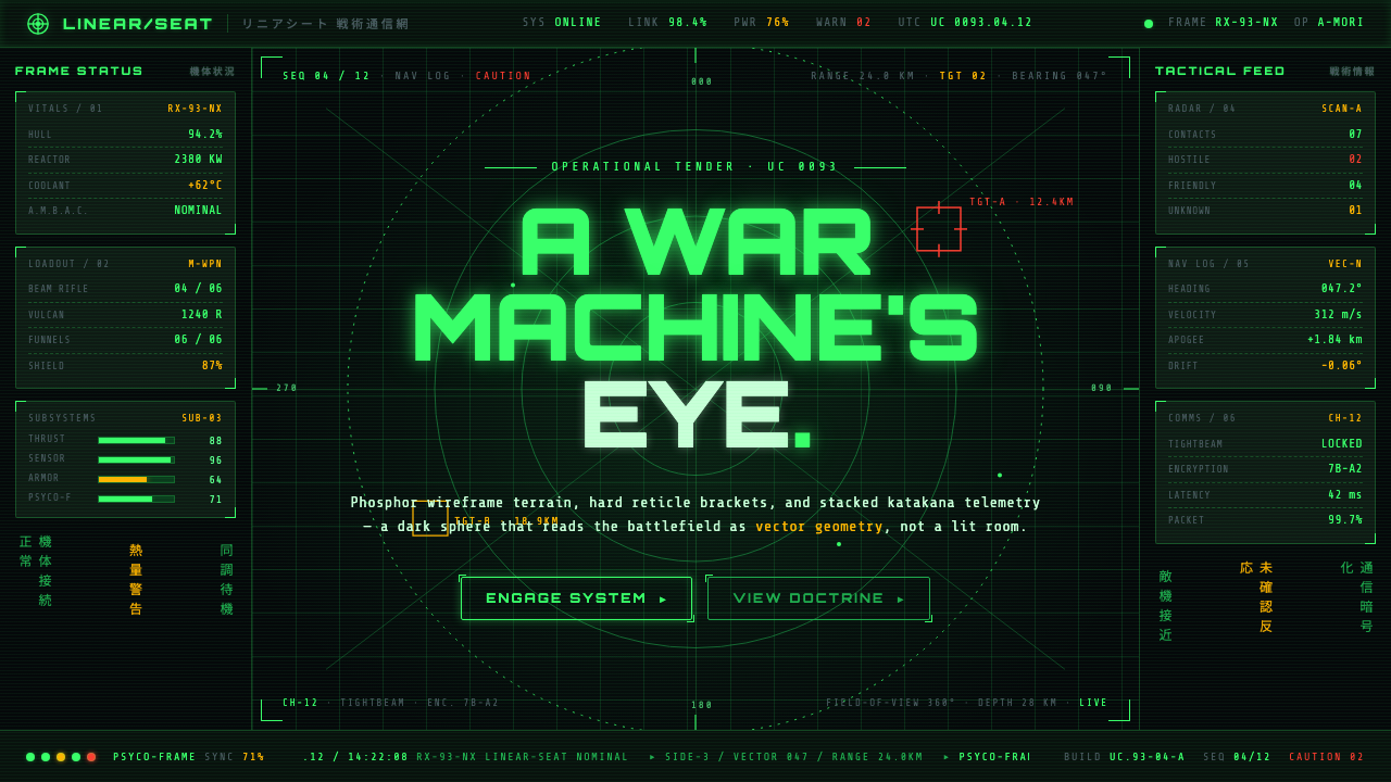
Gundam Universal Century UI turns the cockpit into a war machine’s eye — phosphor wireframes, katakana telemetry, and targeting marks glowing inside a spherical black void.
Gundam Universal Century UI in brief
Gundam Universal Century UI is the cockpit language associated with the real-robot future of Mobile Suit Gundam: a panoramic tactical display in which terrain, radar grids, coordinates, and machine status appear to float around the pilot. The surrounding field remains almost completely black, so the cockpit reads as an instrument that emits information rather than a room illuminated for comfort.
Its signature vocabulary is phosphor-green linework punctuated by restrained amber data and urgent red targeting graphics. Wireframe landscapes establish spatial orientation; circles and radial grids suggest radar; hard brackets isolate objects of interest; compact numerals and blocky katakana identify machines, vectors, and system states. Information is fragmented across the field, yet every fragment appears to belong to one continuous spherical sensor environment.
The style derives its force from controlled scarcity. Most of the screen is darkness, most marks are thin and geometric, and most color belongs to the primary green readout layer. Amber introduces secondary interpretation, while red is held back until the machine must warn, acquire, or attack. Scanline glow softens the otherwise severe geometry just enough to make the display feel electronic, active, and slightly unstable.
Where does Gundam Universal Century UI come from?
The style belongs to the Universal Century future-fiction developed by the Japanese studio Sunrise and later sustained through the wider Bandai franchise. Yoshiyuki Tomino, the Sunrise mechanical design team, and Kunio Okawara are the principal figures named in its creative lineage. Their shared context was Japanese real-robot mecha science fiction, a mode that treated giant machines less as magical heroes than as military hardware operated through procedures, sensors, and technical constraints.
The panoramic cockpit became standardized around the fictional Gryps Conflict, represented in anime from the mid-1980s onward. The RX-178 Mk-II linear-seat cockpit established the central model: the pilot sits inside a spherical monitor rather than facing a single forward window. This premise changes the interface fundamentally. Information can appear above, below, behind, or beside the pilot, and the black field becomes an enveloping sensor space rather than an ordinary rectangular screen.
That model continued through the cockpit-HUD lineage of Zeta, Char’s Counterattack, and Unicorn. Across those works, the exact density and polish may shift, but the governing hierarchy remains recognizable: green supplies the normal visual world, amber annotates or qualifies it, and red interrupts it with danger or targeting intent. Wireframe terrain and radar geometry translate an invisible battlefield into something the pilot can read at speed.
The resulting aesthetic is inseparable from the Universal Century’s view of technology. A mobile suit may be spectacular from the outside, but its interior language is disciplined and operational. Labels are terse, geometry is functional, and illumination is subordinate to combat awareness. The cockpit therefore communicates both fictional engineering and dramatic pressure: the pilot is surrounded by information, yet beyond that information lies only darkness.
What defines the Gundam Universal Century UI look?
Color Hierarchy
Green is the normal operating color, carrying terrain, grids, outlines, and routine telemetry against a void-black ground. Amber is secondary and interpretive, suited to supplemental data or changing conditions. Red is scarce and decisive, reserved for warnings, hostile attention, and targeting. The palette works because these roles remain unequal; turning every color into a loud accent destroys the cockpit’s command hierarchy.
Spherical Composition
The interface is conceived as an environment around the viewer, not a flat panel in front of one. Radial grids, curved horizons, off-center targets, and peripheral data imply that the display continues beyond the current field of view. Empty black regions are therefore active spatial intervals: they separate information while preserving the sensation of being suspended inside a panoramic sensor sphere.
Wireframe Space
Terrain and objects are reduced to luminous contours, coordinate meshes, and schematic silhouettes. The display does not attempt to reproduce the battlefield as a natural image; it extracts distance, direction, shape, and threat. This abstraction makes the world feel computational and military, while allowing dense spatial information to remain legible without filling the cockpit with pictorial detail.
Brackets and Reticles
Hard corner brackets, crosshairs, rings, and segmented reticles provide the interface’s clearest verbs. They indicate selection, tracking, alignment, and lock rather than merely decorating an object. Their geometry is sharp and incomplete: a target is surrounded by marks with open gaps, allowing the object and its trajectory to remain visible while the machine declares its changing relationship to it.
Telemetry Typography
Typography is compact, technical, and modular. Blocky katakana gives the interface a distinct mecha identity, while numerals and abbreviated labels suggest coordinates, system states, and machine identifiers. Text behaves like instrumentation rather than prose: short clusters sit close to rules, brackets, or diagrams, with hierarchy created through placement, repetition, and color instead of expressive lettering.
Electronic Glow
Scanline glow and phosphor-like persistence keep the display from feeling like clean contemporary vector graphics. The glow should remain narrow and controlled, preserving the hard structure beneath it. It suggests an active electronic surface and continuous sensor refresh, but it must never bloom so widely that neighboring labels merge or the void-black field becomes a general green haze.
Who shaped Gundam Universal Century UI?
Tomino is a central figure in the Universal Century lineage from which this cockpit language emerged. The world associated with his work frames mobile suits as machines embedded in military systems, making tactical displays, sensor dependence, and constrained pilot perception essential parts of the fiction. The interface is therefore not detachable decoration; it helps express how combat is experienced from inside the machine.
The Sunrise mechanical design team supplied the broader design context in which the panoramic monitor could operate as a coherent fictional system. Cockpit graphics, machine architecture, and pilot placement reinforce one another: the spherical display belongs to the same engineered world as the mobile suit surrounding it. This systems-level consistency is a defining strength of the Universal Century visual language.
Okawara stands among the key figures attached to the mechanical-design lineage behind Gundam. Within that lineage, the cockpit gains meaning through its relationship to the machine: identifiers, schematics, targets, and status readouts imply physical mechanisms beyond the screen. The UI inherits the same real-robot emphasis on constructed form, operational purpose, and credible military function.
How do you use Gundam Universal Century UI today?
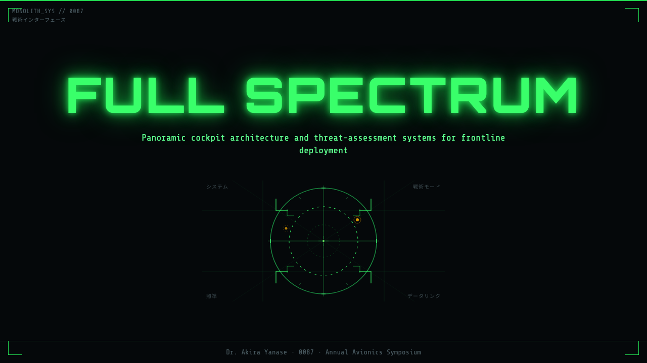
For presentation covers, treat the page as a dormant cockpit that has just detected something. Keep most of the field black, place one radar arc or wireframe horizon across a broad region, and let a red reticle or amber identifier establish the focal event. The title should behave like a mission label: compact, aligned to an instrument edge, and subordinate to the sensation of entering a tactical display.
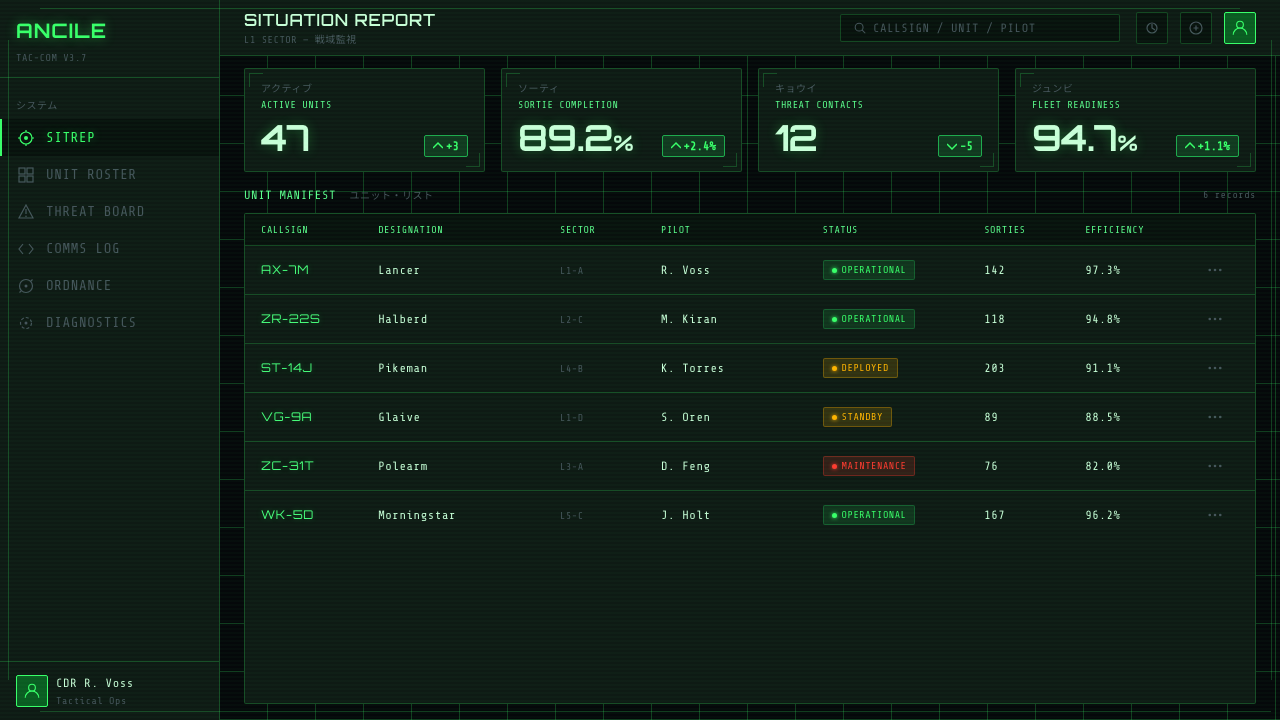
Content slides need a stable information hierarchy rather than a collage of HUD fragments. Assign green to ordinary text, diagrams, and section structures; use amber only for interpretation or comparison; reserve red for a conclusion that truly demands attention. Side brackets can frame a content zone, while small telemetry clusters carry metadata. On data slides, charts should resemble measured signals or radar geometry without disguising values behind fictional decoration.
For web dashboards and pricing interfaces, the style works best when actions are recast as operational states. Cards can become bounded instrument regions, navigation can resemble a system-mode selector, and live metrics can sit beside restrained wireframe diagrams. Pricing tiers may be differentiated through labels and status color, but red should not become the default purchase color if it already means danger. Ordinary reading still requires calm contrast and generous darkness around each cluster.
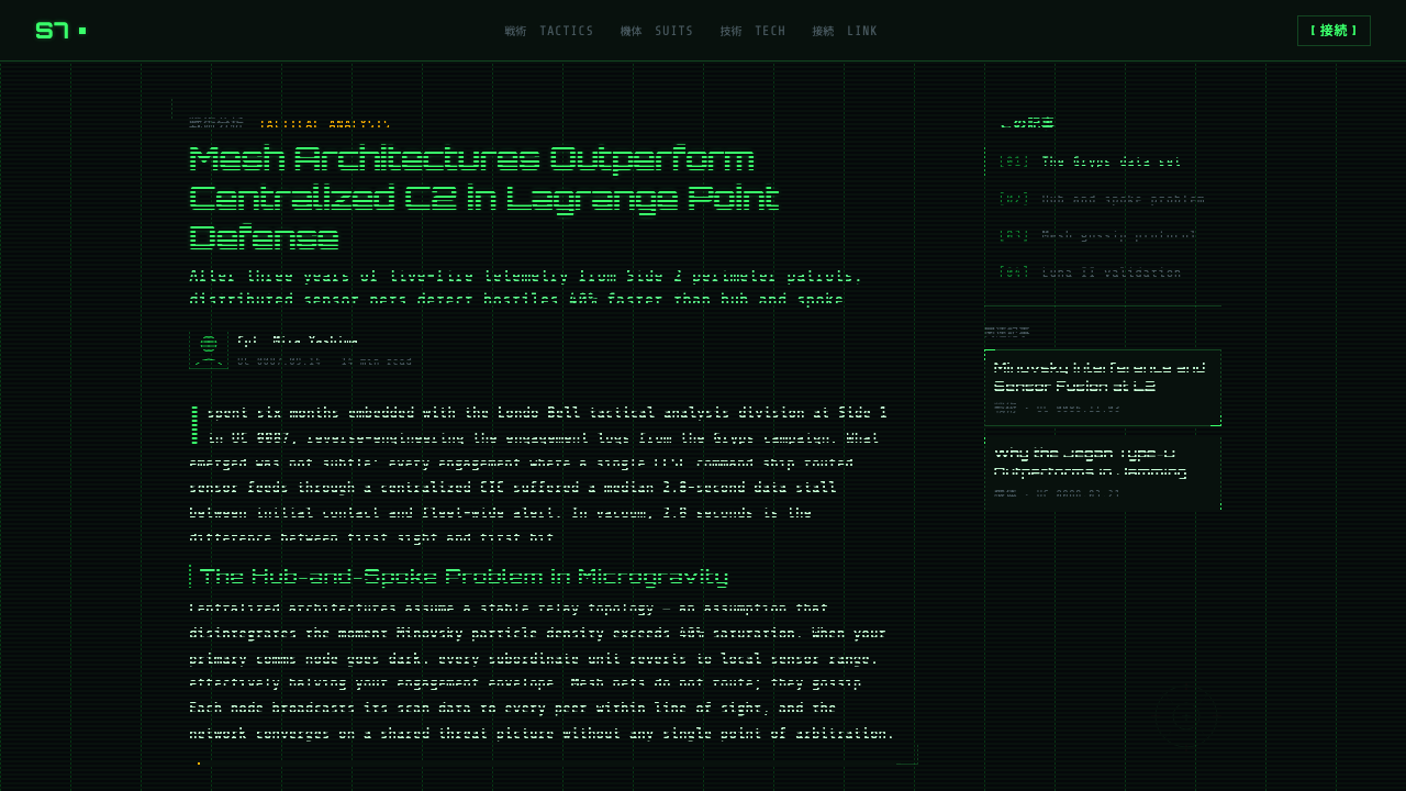
Editorial and marketing applications should use the cockpit language as a framing system. A feature article can open with a panoramic wireframe image, then move into narrow text regions linked by brackets and terse metadata. A campaign page can alternate quiet black fields with concentrated moments of radar, machine identification, and lock-on imagery. The strongest storytelling progression is detection, interpretation, and commitment, mirroring the logic of a pilot acquiring a target.
The most common mistake is filling every empty region with numbers, grids, warnings, and invented diagnostics. Universal Century UI depends on darkness to turn isolated signals into events. Excessive green glow reduces hierarchy, constant red removes urgency, and arbitrary pseudo-technical labels make the machine feel decorative rather than functional. Begin with the operational question each element answers; if a mark does not reveal location, identity, status, direction, or threat, it probably does not belong.
Gundam Universal Century UI — FAQ
Is Gundam Universal Century UI simply a generic sci-fi HUD?
No. A generic sci-fi HUD may combine neon color, floating panels, glass surfaces, and decorative data without a strict hierarchy. Universal Century UI is narrower and more tactical: a black panoramic sensor field, green wireframe information, restrained amber annotation, scarce red targeting graphics, and compact mecha typography. Its elements imply a pilot operating military hardware, not a spectator admiring futuristic technology.
Why is the background so consistently dark?
The darkness establishes the panoramic monitor as an enclosing space and gives luminous information immediate priority. It also separates the cockpit from the visual logic of an ordinary room: there is no ambient illumination competing with the display. Practically, black regions create intervals between clusters, making a small change in color or geometry feel consequential. The void is therefore part of the interface, not unused space.
Can blue, violet, or other neon colors be added?
They can be introduced in a loose reinterpretation, but they move the result away from the supplied Universal Century signature. The core system depends on green as the ordinary readout color, amber as secondary data, and red as warning or targeting. Adding several equally bright hues changes the display from a disciplined military instrument into a broader cyberpunk palette. If fidelity matters, preserve the original hierarchy.
How much katakana should an interface use?
Enough to establish mecha identity, but not so much that the interface becomes an unreadable texture. Katakana works best in short labels beside machine identifiers, targets, or system states. Longer explanations should remain in the audience’s reading language. The goal is not to simulate technical density through unfamiliar text; it is to make every label feel attached to a specific instrument function.
Where does this style work poorly?
It struggles wherever warmth, leisure, intimacy, or effortless reading is the primary value. The black field, warning colors, compressed labels, and targeting geometry naturally suggest vigilance and conflict. Those qualities suit tactical dashboards, technical presentations, gaming interfaces, and dramatic campaigns, but can feel hostile in wellness, family, hospitality, or long-form reading contexts. Use it when operational tension supports the message rather than contradicting it.
Related design styles
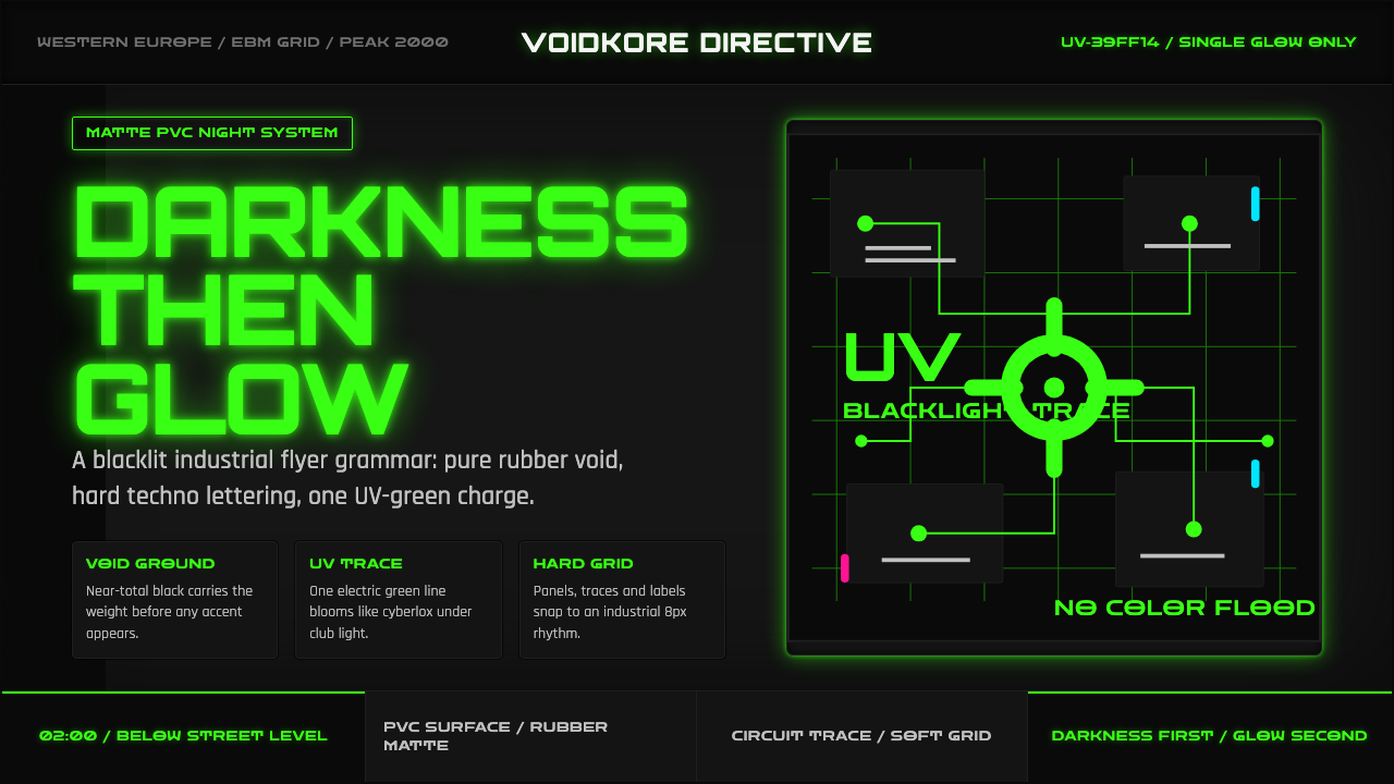 Cybergoth RaveDarkness rules. Pure black PVC is split by one UV-green circuit glow.
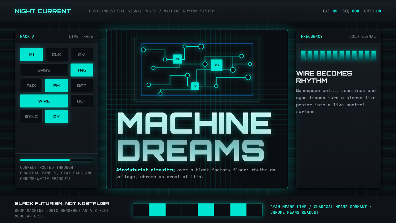 Detroit TechnoCold machines dream. Electric cyan circuits and chrome display type lock to a…
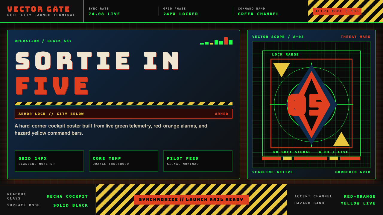 Neon Genesis EvangelionCockpit dread at launch. Tech-green grids, red-orange alarms, and hazard yell…
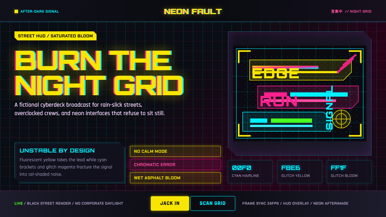 Edgerunners NeonNeon overload. Fluorescent yellow, cyan HUD grids, and magenta glitches burn…
 Akira (Otomo)Cyberpunk at impact. Kaneda red, cyan kanji, halftone concrete, and diagonal…
 Ghostrunner Dharma TowerHostile precision at speed. Blue-black steel grids cut by red neon and cyan g…