What is Cyberpunk 2077 (Screen UI)?什么是 Cyberpunk 2077 (Screen UI)?
Cyberpunk 2077's screen UI is four decades of dystopian fiction compressed into a single operating system — fluorescent yellow on void black, scanlines, HUD brackets, and the unsettling conviction that every surface is a corporate data terminal.《赛博朋克 2077》的屏幕界面是四十年反乌托邦小说压缩成的一套操作系统——纯黑虚空上的荧光黄,扫描线,HUD 方括号,以及每一个界面都是企业数据终端这一令人不安的信念。
Cyberpunk 2077 (Screen UI) in briefCyberpunk 2077 (Screen UI) 速览
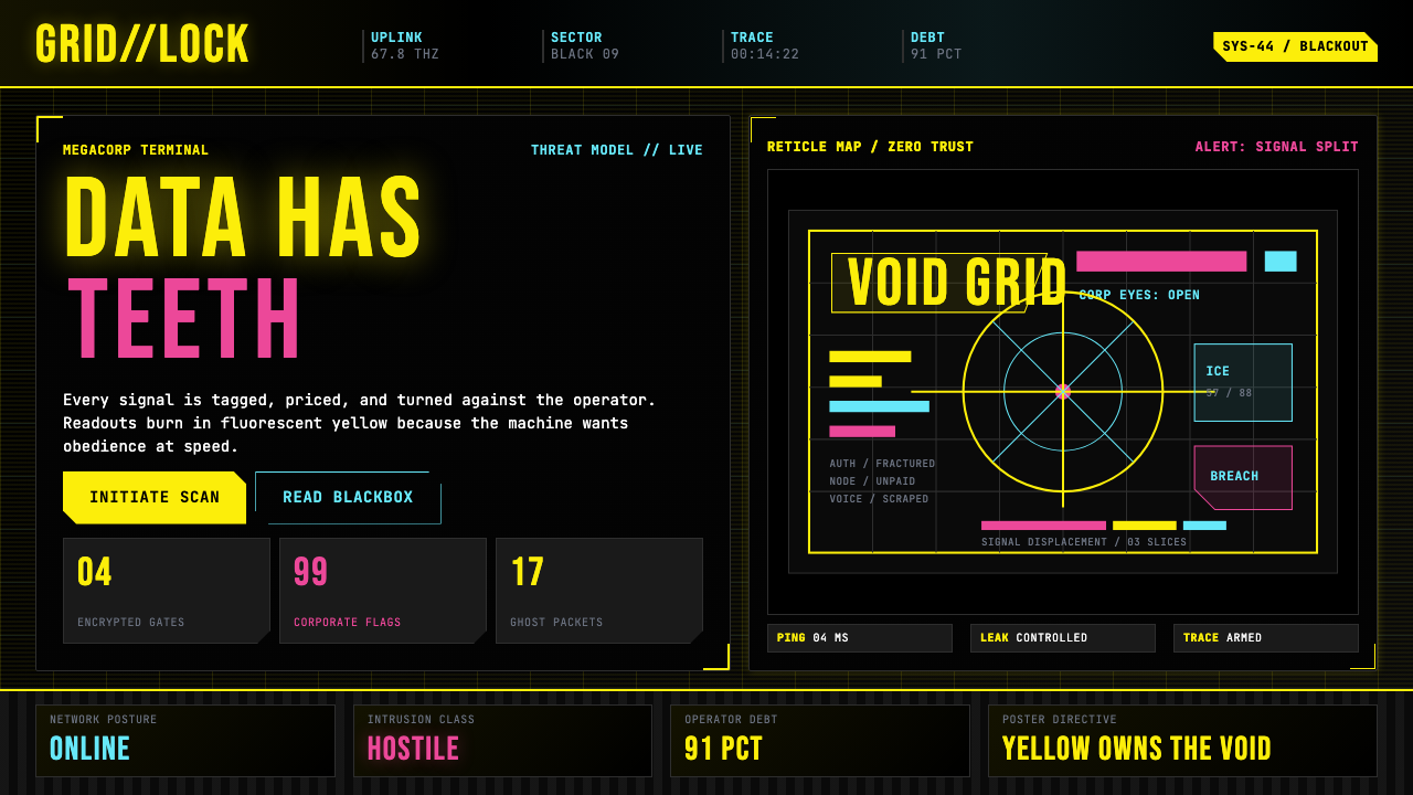
The Cyberpunk 2077 screen UI style is the visual language developed by CD Projekt RED for their 2020 open-world RPG set in the fictional Night City. It translates the cyberpunk literary and anime visual tradition into a functioning, navigable interface — one where the aesthetic is inseparable from the fiction it inhabits. The screen language is built on a handful of absolute choices: pure black backgrounds, fluorescent yellow as the dominant text and action color, hot magenta for alerts and danger states, cool cyan for network and system status, and a monospace typeface ruling almost every surface.《赛博朋克 2077》屏幕界面风格是 CD Projekt RED 为其 2020 年开放世界 RPG 开发的视觉语言,游戏背景设定在虚构的夜之城。它将赛博朋克文学与动漫的视觉传统转化为一套可运作、可导航的界面——在这里,美学与它所栖居的虚构世界不可分割。这套屏幕语言建立在几个绝对的选择上:纯黑背景、荧光黄作为主导文字与操作色、洋红用于警报与危险状态、冷青色用于网络与系统状态,以及等宽字体统治几乎每一个界面表面。
Visually, the style reads as a military targeting system crossed with a megacorporation advertisement. Panels are framed with L-bracket corner marks — partial borders that evoke weapon reticles and satellite overlays. Horizontal scanlines simulate the phosphor decay of cathode ray tubes, layering analog noise over digital content. A tall condensed display face descending from the Eurostile and Microgramma typefaces of 1960s science fiction film design stamps headlines at monument scale. A fixed-width monospace typeface handles every data readout, label, and body element — because in Night City the distinction between a human message and a system log is deliberately blurred.从视觉上看,这种风格读起来像军事瞄准系统与跨国企业广告的杂交体。面板以 L 形方括号角标框定——局部边框令人联想到武器瞄准镜与卫星叠加层。水平扫描线模拟阴极射线管的磷光衰减,在数字内容上叠加一层模拟噪点。一款脉承自 1960 年代科幻电影设计中 Eurostile 与 Microgramma 字体谱系的高耸压缩展示字体,以纪念碑级的尺度烙印标题。等宽固定字距字体处理每一条数据读出、标签与正文元素,因为在夜之城,人类信息与系统日志之间的界限被刻意模糊。
The compositional logic is density-first. Cyberpunk interfaces do not breathe — they fill every available pixel with information, status indicators, faction markers, and ambient data noise. The grid is tight, gutters are narrow, and negative space is treated as wasted real estate. This is intentional: the fictional world implies a society where attention is the primary commercial resource and every screen competes for it.构图逻辑以密度优先。赛博朋克界面不会呼吸——它用信息、状态指示符、派系标记和环境数据噪音填满每一个可用像素。网格紧凑,内边距狭窄,负空间被视为被浪费的地产。这是刻意为之的:虚构世界暗示一个注意力是主要商业资源、每块屏幕都在争夺它的社会。
See the Cyberpunk 2077 (Screen UI) design system查看 Cyberpunk 2077 (Screen UI) 完整设计系统
Where does Cyberpunk 2077 (Screen UI) come from?Cyberpunk 2077 (Screen UI) 从何而来?
The lineage begins in prose. William Gibson's Neuromancer (1984) imagined cyberspace as neon geometry inscribed on void — cowboys jacking into a consensual hallucination rendered as luminous data. That founding text established the genre's core visual tension: the beautiful and the dangerous are the same object, and both are legible as information. Gibson wrote about interfaces before most people had used one, and the visual vocabulary he invented on the page — glowing screens, corporate logos burned into retinas, data cascading like rain — became the genre's dominant metaphor.渊源始于文字。威廉·吉布森的《神经漫游者》(1984年)将赛博空间想象为刻印在虚空上的霓虹几何——牛仔们插入一场被呈现为发光数据的共识幻觉。这部奠基之作确立了这一类型的核心视觉张力:美丽与危险是同一个对象,两者都可以被读作信息。吉布森在大多数人还没用过界面之前就写出了界面,他在纸页上发明的视觉词汇——发光的屏幕、灼入视网膜的企业标志、如雨倾泻的数据——成为这一类型的主导隐喻。
The anime tradition translated Gibson's prose into moving images. Katsuhiro Otomo's Akira (1988) rendered Neo-Tokyo's motorcycle dashboards as dense, instrument-heavy HUD overlays; the panels of his manga are so information-saturated they read more like technical diagrams than comics pages. Mamoru Oshii's Ghost in the Shell (1995) gave the genre its canonical terminal aesthetic: phosphor characters cascading on black, network addresses resolving like falling water, the human nervous system treated as a hackable operating system. These films did not illustrate the literary tradition — they extended it, establishing the visual grammar that every subsequent cyberpunk screen designer would work within or against. Ridley Scott's Blade Runner (1982) contributed the neon-rain noir palette and the dystopian city-as-advertisement logic, where every surface is simultaneously shelter and commercial intrusion.动漫传统将吉布森的散文转化为运动影像。大友克洋的《阿基拉》(1988年)将新东京的摩托车仪表盘渲染为密集、充满仪器的 HUD 叠加层;他的漫画画格信息密度之高,读起来更像技术图纸而非漫画页。押井守的《攻壳机动队》(1995年)赋予这一类型以标准的终端美学:磷光字符在黑色底面上瀑布倾泻,网络地址如流水般解析,人类神经系统被视为可被入侵的操作系统。这些影片不是在图解文学传统——它们在延伸它,建立起此后每一位赛博朋克屏幕设计师都将在其中或顺从或抗拒地工作的视觉语法。雷德利·斯科特的《银翼杀手》(1982年)贡献了霓虹雨的黑色电影色板,以及反乌托邦城市即广告的逻辑——每一个界面同时是庇护所和商业入侵。
CD Projekt RED, working from Warsaw rather than Tokyo or Los Angeles, synthesized these reference points into a coherent design system for Cyberpunk 2077. The studio's color choice — a fluorescent near-chartreuse yellow as the dominant HUD accent — stamped a single chromatic identity onto the entire game world. Night City's megacorporations each have their own faction colors and typography, but the underlying screen language is unified: black void, yellow primary, bracket framing, mono type. The result is a game UI that reads simultaneously as a functioning corporate operating system and as a designed artifact explicitly commenting on its own genre history.CD Projekt RED 以华沙而非东京或洛杉矶为基地,将这些参照点综合成《赛博朋克 2077》的一套连贯设计系统。工作室的色彩选择——以一种荧光近黄绿色作为主导 HUD 强调色——将单一的色彩身份烙印到整个游戏世界。夜之城的各跨国企业拥有各自的派系色彩与字体,但底层屏幕语言是统一的:黑色虚空、黄色主色、方括号框架、等宽字体。结果是一套游戏界面,读起来同时是一个运作中的企业操作系统,也是一件明确在评注自身类型历史的设计物。
The canonical status of the game's visual language was reinforced by Studio Trigger's anime adaptation, Cyberpunk: Edgerunners (2022), which proved that the interface aesthetic could migrate from game HUD to screen-within-screen in animated storytelling without loss of coherence. By the time the game's visual language entered broad cultural circulation, it had become one of the most recognized dark-mode interface aesthetics in contemporary design — a benchmark reference for any project that needs to signal high-technology, urgency, and controlled danger simultaneously.这套游戏视觉语言的经典地位被 Studio Trigger 的动漫改编作品《赛博朋克:边缘行者》(2022年)所强化,证明了界面美学可以从游戏 HUD 迁移到动画叙事中的屏幕中的屏幕,而不失连贯性。当这套游戏视觉语言进入广泛的文化流通时,它已成为当代设计中最被辨认的深色模式界面美学之一——任何需要同时传递高科技感、紧迫感与可控危险性的项目的基准参考。
What defines the Cyberpunk 2077 (Screen UI) look?Cyberpunk 2077 (Screen UI) 的视觉特征是什么?
Color System色彩系统
The palette is adversarial by design. Pure black is not a dark-mode convenience — it is a declaration that the screen is off until data activates it. Fluorescent yellow functions as the dominant HUD text, primary action, and attention color: it is the color of weapon damage numbers, megacorp branding, and anything that demands immediate response. Hot magenta signals danger, corporate intrusion, and alert states. Cool cyan represents network health and system status. Every hue is synthetic and saturated — there are no earth tones, no warm neutrals, no soft gradients. The screen palette is engineered to be read at a glance in a chaotic environment, drawing on the same adversarial legibility logic as warning signage in industrial settings.这套色板在设计上具有对抗性。纯黑不是深色模式的便利选择——它是一个声明:屏幕在数据激活之前是关闭的。荧光黄作为主导 HUD 文字、主要操作色与注意力色发挥作用:它是武器伤害数字、跨国企业品牌,以及任何要求立即响应的事物的颜色。洋红标示危险、企业入侵与警报状态。冷青色代表网络健康与系统状态。每一种色相都是合成的、饱和的——没有大地色调,没有暖中性色,没有柔和渐变。这套屏幕色板被设计为在混乱环境中一瞥即读,借鉴了工业环境中警告标识同样的对抗性可读性逻辑。
Typography字体排印
Two typeface roles govern the entire system, and neither is neutral. The display role belongs to a tall, condensed, zero-weight-variation face set in all-caps with generous letter-spacing — referencing stenciled military markings and the title cards of 1960s and 1970s science fiction cinema. The body and data role belongs to a fixed-pitch monospace face that handles every readout, label, input, and UI chrome element, enforcing the fiction that all surfaces are data terminals. Uppercase defaults combined with tracked-out spacing create a specific tension between legibility and urgency that defines the style. There is no friendly typeface anywhere in the system — softness of form is treated as an admission that the interface is not serious.两种字体角色统治整个系统,且两者都非中性。展示角色属于一款以全大写、宽字距排版的高耸压缩、零字重变化的字体——呼应军用模板字与 1960 至 1970 年代科幻电影片名卡的传统。正文与数据角色属于一款处理每一条读出、标签、输入框与 UI 框架元素的固定间距等宽字体,强化所有界面都是数据终端的虚构设定。默认大写结合加宽字距,创造出定义这种风格的特定可读性与紧迫感之间的张力。系统中没有任何友好的字体——字形的柔和被视为界面不够严肃的承认。
Scanlines and CRT Noise扫描线与 CRT 噪点
A repeating horizontal stripe overlay at low opacity simulates cathode ray tube phosphor line decay, applied to full-page backgrounds and panel surfaces alike. The scanline effect performs two functions simultaneously: it reads as aging, damaged technology — screens that have survived a decaying future — and it adds a layer of visual texture that softens the otherwise stark digital geometry. The CRT noise is not cosmetic filler; it is the visual equivalent of ambient sound design, signaling that this interface exists in a specific time and world, not in the timeless void of flat design. Without it, the palette alone risks reading as a generic dark theme rather than as a lived-in artifact.一层低透明度的重复水平条纹叠加层模拟阴极射线管磷光线衰减,同时应用于全页背景和面板表面。扫描线效果同时执行两个功能:它读起来像是老化、受损的技术——在衰败未来中幸存下来的屏幕——同时它增加了一层视觉质感,柔化了否则会过于严酷的数字几何。CRT 噪点不是装饰性填充;它是氛围声音设计的视觉等价物,标示这个界面存在于一个特定的时间和世界中,而不是在平面设计的永恒虚空里。没有它,单纯的色板有可能读作普通深色主题,而非一件有历史痕迹的设计物。
HUD Bracket FramingHUD 方括号框架
Corner L-bracket marks — partial borders placed at the four corners of a panel rather than a continuous rectangle — are the style's most distinctive compositional device. They reference military targeting reticles, satellite image overlays, and the weapon acquisition HUDs of action film and game convention. The practical effect is that panels feel monitored, targeted, and under active data surveillance rather than simply contained. The brackets are rendered in fluorescent yellow at a thin hairline stroke, maintaining the overall line thinness that gives the style its etched, precision-instrument quality. Full rectangular borders are reserved for form inputs and data table cells; structural panels use only the corner marks.角落 L 形方括号标记——放置在面板四个角落的局部边框,而非连续矩形——是这种风格最具特色的构图装置。它们参照军事瞄准镜、卫星图像叠加层,以及动作电影与游戏惯例中的武器获取 HUD。实际效果是面板感觉被监视、被瞄准、处于主动数据监控之下,而不仅仅是被容纳。方括号以荧光黄细线描绘,维持整体的线条纤细度,赋予这种风格其蚀刻的、精密仪器的质感。完整矩形边框保留给表单输入框和数据表格单元格;结构性面板只使用角落标记。
Glitch and Displacement故障与位移
Glitch displacement — horizontal slice artifacts that suggest momentary data corruption or signal interference — appears primarily as a hover and transition effect. A panel or image element shifts into misaligned horizontal slices for a brief interval, then snaps back to coherence. The effect signals that the network is not fully stable, that data feeds can be interrupted, and that the interface itself is subject to the same fragility as the world it operates in. Glitch effects must be used sparingly: overuse collapses the effect from a meaningful instability signal into meaningless decoration, and excessive motion can trigger vestibular discomfort for sensitive users.故障位移——暗示瞬间数据损坏或信号干扰的水平切片伪影——主要作为悬停和过渡效果出现。面板或图像元素短暂地移位成错位的水平切片,然后弹回连贯状态。这种效果标示网络并非完全稳定,数据馈送可能被中断,界面本身与其运作其中的世界一样脆弱。故障效果必须节制使用:过度使用会将效果从有意义的不稳定性信号崩解为无意义的装饰,而过度运动也可能对敏感用户引发前庭不适。
Glow-Based Elevation基于发光的层级深度
Traditional drop shadows simulate a light source above the surface. In Night City, light sources are neon signs and holographic projections — objects emit light rather than cast shadows. Elevation and focus in the cyberpunk system are expressed through outward glow: fluorescent yellow emission at increasing intensities replaces the conventional shadow ladder for raised elements. Focus states use cyan glow rings rather than outline borders. The system produces depth through emitted light, surface layering from pure black through near-black to deep charcoal, and the convention that brighter elements are closer to the viewer. It is a depth logic built entirely from luminance rather than occlusion.传统投影模拟表面上方的光源。在夜之城,光源是霓虹招牌和全息投影——物体发光而非投下阴影。赛博朋克系统中的层级与焦点通过向外发光表达:荧光黄向外辐射以递增强度替代了传统的投影阶梯用于抬起元素。焦点状态使用青色发光环而非轮廓边框。该系统通过发射光、从纯黑经近黑到深炭灰的表面分层,以及更亮元素距离观者更近的惯例产生深度。这是一套完全从亮度而非遮挡关系构建的深度逻辑。
Sharp Geometry锐利几何
Border radius is absent throughout the system — every corner is a knife edge. Buttons are rectangular. Inputs are rectangular. Panels cut hard into the black void with no softening. This universal sharpness is the visual inverse of the rounded-rectangle paradigm that dominates consumer UI design. It communicates that this is not a product designed to feel friendly or approachable, but one designed to process information at high velocity without the friction of reassurance. The angularity is a functional argument: round corners signal safety and welcome; zero radius signals a system indifferent to whether you are comfortable using it.整个系统不存在圆角——每一个角都是刀刃。按钮是矩形的。输入框是矩形的。面板以锐利的边缘切入黑色虚空,没有任何柔化。这种普遍的锐利性是主导消费者 UI 设计的圆角矩形范式的视觉反面。它传达这不是一款被设计为感觉友好或平易近人的产品,而是一款被设计为以高速处理信息而不带安抚摩擦的产品。这种棱角感是功能性论点:圆角传达安全与欢迎;零圆角传达一个不在乎你是否感到舒适的系统。
See the Cyberpunk 2077 (Screen UI) design system查看 Cyberpunk 2077 (Screen UI) 完整设计系统
Who shaped Cyberpunk 2077 (Screen UI)?谁塑造了 Cyberpunk 2077 (Screen UI)?
The Warsaw-based studio behind Cyberpunk 2077, responsible for synthesizing four decades of cyberpunk visual culture into a coherent, production-grade UI design system. The studio's decision to use their own brand yellow — a fluorescent, near-chartreuse hue — as the dominant HUD accent color gave Night City's interface a singular chromatic identity distinguishable from any prior cyberpunk reference. Their UI team built a system legible at controller-distance on a television and at cursor-distance on a monitor, establishing benchmarks for dark-mode information density that influenced broader product design practice.《赛博朋克 2077》背后的华沙工作室,负责将四十年赛博朋克视觉文化综合成一套连贯的、达到生产标准的 UI 设计系统。工作室决定使用其自身品牌色——一种荧光、近黄绿的色调——作为主导 HUD 强调色,赋予夜之城界面一种可与任何先前赛博朋克参考区分的独特色彩身份。他们的 UI 团队构建了一套在电视上以手柄距离和在显示器上以光标距离都清晰可读的系统,建立了影响更广泛产品设计实践的深色模式信息密度基准。
The Canadian-American author whose 1984 novel Neuromancer founded the cyberpunk literary genre and established the visual vocabulary that all subsequent screen designers in the tradition have worked with. Gibson coined the term 'cyberspace' and described it as a 'consensual hallucination' — framing digital space as simultaneously a sensory environment and a corporate battleground. His vision of data as luminous geometry on black void, of corporate logos as retinal invasions, and of the hacker as a figure navigating hostile information architecture became the generative metaphor for an entire design tradition.加拿大裔美国作家,其 1984 年小说《神经漫游者》创立了赛博朋克文学类型,并建立了该传统中所有后续屏幕设计师所借鉴的视觉词汇。吉布森创造了「赛博空间」一词,将其描述为「共识幻觉」——将数字空间框定为同时是感官环境和企业战场。他对黑色虚空上发光几何数据的愿景、对作为视网膜入侵的企业标志的描述,以及对作为在敌意信息架构中导航的黑客形象的塑造,成为整个设计传统的生发性隐喻。
Manga artist and filmmaker whose Akira (1982 manga, 1988 film) established the anime side of the cyberpunk visual grammar. Otomo's dense, information-saturated panel layouts — motorcycle dashboards rendered as instrument-heavy overlays, urban environments designed as vertical accumulations of signage and cable — defined the compositional logic of data density that cyberpunk interfaces inherit. His influence on Night City's environmental visual design is direct, and the HUD framing conventions that appear in the game's interface trace directly to the manga's approach to depicting human-machine instrumentation.漫画家与电影导演,其《阿基拉》(1982年漫画,1988年电影)建立了赛博朋克视觉语法的动漫一侧。大友克洋密集的、信息饱和的画格布局——摩托车仪表盘被渲染为充满仪器的叠加层,城市环境被设计为招牌和电缆的垂直积累——定义了赛博朋克界面所继承的数据密度构图逻辑。他对夜之城环境视觉设计的影响是直接的,游戏界面中出现的 HUD 框架惯例直接可追溯至漫画中描绘人机仪器的方式。
Director of Blade Runner (1982), the film that established the neon-noir visual palette and the dystopian city-as-advertisement logic central to cyberpunk screen design. Scott's production designer Syd Mead coined the term 'retro-fitted future' for Blade Runner's visual approach — a world where advanced technology is overlaid on decaying infrastructure, where advertisements are projected onto rain-slicked surfaces, and where corporate branding is omnipresent and inescapable. This logic — every surface is simultaneously a screen and a sales pitch — runs directly through the Night City interface design.《银翼杀手》(1982年)的导演,该片建立了赛博朋克屏幕设计核心的霓虹黑色电影色板与反乌托邦城市即广告的逻辑。斯科特的生产设计师塞德·米德为《银翼杀手》的视觉方法创造了「改装未来」一词——一个先进技术覆盖在衰败基础设施上的世界,广告被投影到被雨水浸湿的表面,企业品牌无处不在且无法逃脱。这一逻辑——每一个界面同时是屏幕和销售话术——直接贯穿夜之城界面设计。
Director and studio behind Ghost in the Shell (1995), the film that gave cyberpunk its canonical terminal aesthetic: phosphor text cascading on black, network addresses resolving in real time, the human body itself depicted as a hackable hardware substrate. Production I.G's visual language — particularly the membrane-like translucency of holographic overlays and the clinical precision of network sequence animations — established the benchmark for how cyberpunk interfaces should render information as something simultaneously beautiful and threatening. The film remains a direct reference for any dark-mode interface invoking the genre.《攻壳机动队》(1995年)背后的导演与制作公司,该片赋予赛博朋克以标准的终端美学:磷光文字在黑色底面上瀑布倾泻,网络地址实时解析,人体本身被描绘为可被入侵的硬件基底。Production I.G 的视觉语言——尤其是全息叠加层类似薄膜的半透明性与网络序列动画的临床精确性——建立了赛博朋克界面应如何将信息呈现为同时美丽而威胁的事物的基准。这部电影仍然是任何援引这一类型的深色模式界面的直接参考。
How do you use Cyberpunk 2077 (Screen UI) today?今天怎么用 Cyberpunk 2077 (Screen UI)?
Applying the Cyberpunk 2077 screen UI style requires committing to its core tension: this is an interface that treats information as a weapon, not a service. Watered-down applications — black background with a few yellow accents and a monospace label here and there — produce pastiche, not cyberpunk. The style works when the entire composition submits to its logic: maximum information density, adversarial color, universally sharp corners, scanline or CRT noise texture, and HUD bracket framing at every structural decision point.应用《赛博朋克 2077》屏幕界面风格需要承诺其核心张力:这是一套将信息视为武器而非服务的界面。稀释的应用——黑色背景加几个黄色强调色和零星一两个等宽标签——产生的是仿作,而非赛博朋克。当整个构图服从于其逻辑时,这种风格才能奏效:最大信息密度、对抗性色彩、普遍锐利的圆角、扫描线或 CRT 噪点质感,以及在每一个结构决策点使用 HUD 方括号框架。
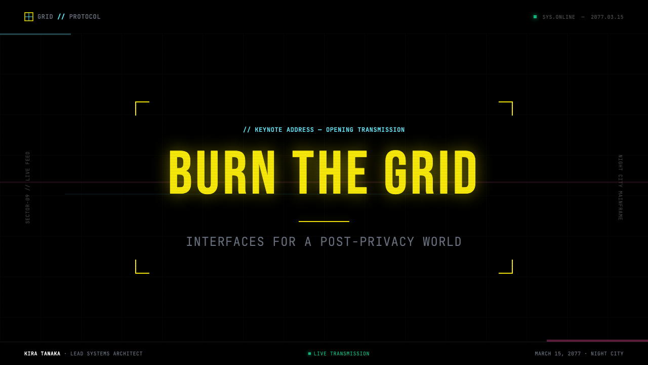
For presentation slides, the style is most effective on high-stakes technical or data-driven presentations — product launches, security briefings, data analyses, and concept demonstrations for technology products. A cyberpunk cover slide works as a full-bleed black field with a single condensed all-caps headline in fluorescent yellow at large scale, flanked by HUD bracket marks and a thin horizontal rule. Content slides should treat each panel as a terminal readout: monospace type for all text, cyan for data labels, yellow for emphasis, magenta for critical callouts. Avoid prose paragraphs — this style favors tightly packed lists, data tables, and isolated figures over flowing text.对于演示文稿,这种风格在高风险的技术或数据驱动演示中最为有效——产品发布、安全简报、数据分析,以及技术产品的概念演示。赛博朋克封面幻灯片作为全出血黑色底面,以大尺寸荧光黄全大写压缩标题为主体,两侧配以 HUD 方括号标记和一条细水平线。内容幻灯片应将每个面板视为终端读出:等宽字体用于所有文字,青色用于数据标签,黄色用于强调,洋红用于关键提示。避免散文段落——这种风格偏好紧凑的列表、数据表格和孤立数字,而非连续文字。
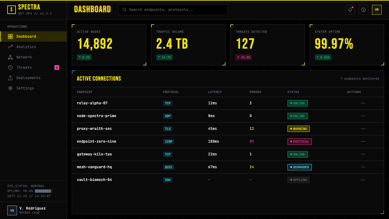
For web UI, the style is specifically suited to dashboards, monitoring interfaces, developer tools, cybersecurity products, and any platform where data density and urgency are legitimate values rather than stylistic impositions. The canonical pattern is a pure black page background, with near-black surface panels outlined in deep charcoal, fluorescent yellow as the primary action and heading color, and monospace type for all UI text. Interactive states use yellow glow intensification on hover and cool cyan glow rings on focus. Tables and data grids are where the style performs best — dense rows of fixed-width data on dark backgrounds, with colored status indicators in the appropriate semantic accent colors.对于网页 UI,这种风格特别适合仪表板、监控界面、开发者工具、网络安全产品,以及任何数据密度和紧迫感是合理价值观而非风格强加的平台。标准模式是纯黑页面背景,以深炭灰描边的近黑表面面板,荧光黄作为主要操作色和标题色,以及等宽字体用于所有 UI 文字。交互状态在悬停时使用黄色发光增强,在聚焦时使用冷青色发光环。表格和数据网格是这种风格表现最佳的地方——深色背景上固定字宽数据的密集行,以适当语义强调色的彩色状态指示符标注。
For editorial and marketing contexts, the style carries strong genre signaling: products using it position themselves as high-tech, high-stakes, and culturally fluent in the gaming and speculative fiction space. Effective marketing uses include event posters for gaming conferences, launch campaigns for developer tools or API products, and editorial design for publications covering technology and digital culture. The full-bleed black background with fluorescent yellow typography functions as a poster aesthetic — legible at distance, immediately recognizable in a crowded feed.对于编辑和营销场景,这种风格携带强烈的类型信号:使用它的产品将自己定位为高科技、高风险,并在游戏和科幻想象空间中具有文化流利度。有效的营销用途包括游戏大会的活动海报、开发者工具或 API 产品的发布活动,以及报道技术与数字文化的出版物的编辑设计。全出血黑色背景配荧光黄字体作为海报美学发挥作用——远距离清晰可读,在拥挤的信息流场景中一眼可辨。
The most common mistake is deploying the color palette without the compositional logic. Fluorescent yellow text on a black background alone does not read as cyberpunk — it reads as poor contrast execution or unfinished design. The style requires the full supporting vocabulary: scanlines, bracket framing, monospace type, zero border radius, and the density-first layout logic. A second common failure is using glitch effects as cosmetic decoration throughout the interface. Glitch signals instability; applied to every interaction, it reads as broken rather than intentional. Reserve glitch displacement for loading states, error conditions, and feature reveals where instability is semantically appropriate.最常见的错误是在没有构图逻辑的情况下部署色板。黑色背景上的荧光黄文字本身不会读作赛博朋克——它会读作糟糕的对比度执行或未完成的设计。这种风格需要完整的支撑词汇:扫描线、方括号框架、等宽字体、零圆角,以及密度优先的布局逻辑。第二个常见失败是将故障效果作为装饰性元素遍布整个界面。故障标示不稳定性;应用于每一次交互,它读起来像是故障而非刻意为之。将故障位移保留给加载状态、错误条件,以及不稳定性在语义上恰当的功能展示。
See the Cyberpunk 2077 (Screen UI) design system查看 Cyberpunk 2077 (Screen UI) 完整设计系统
Cyberpunk 2077 (Screen UI) — FAQCyberpunk 2077 (Screen UI) · 常见问题
Is the cyberpunk screen UI style the same as 'dark mode'?赛博朋克屏幕界面风格等同于「深色模式」吗?
No. Dark mode is a preference setting that inverts light surfaces to dark ones while preserving the underlying visual logic of a design system. The Cyberpunk 2077 screen UI is an entire compositional doctrine built ground-up for black voids: the color palette, typographic choices, elevation system (glow instead of shadow), corner treatment (universally sharp), and information density all proceed from that foundation. A dark mode version of a friendly SaaS product and a cyberpunk interface are as different as a photograph taken at night and a painting explicitly about darkness. One adapts a light system for dark conditions; the other treats darkness as the primary expressive medium.不是。深色模式是一种偏好设置,将浅色表面反转为深色,同时保留设计系统的底层视觉逻辑。《赛博朋克 2077》屏幕界面是一整套从头为黑色虚空构建的构图原则:色板、字体选择、层级系统(发光而非投影)、圆角处理(普遍锐利)和信息密度都从这一基础出发。一个友好 SaaS 产品的深色模式版本与一个赛博朋克界面的差异,就像夜间拍摄的照片与一幅明确关于黑暗的画作的差异。前者是将浅色系统适应深色条件;后者将黑暗视为主要的表达媒介。
How does the cyberpunk style differ from other sci-fi UI aesthetics like Star Trek LCARS or Mass Effect?赛博朋克风格与星际迷航 LCARS 或《质量效应》等其他科幻 UI 美学有何不同?
LCARS (Star Trek's Library Computer Access and Retrieval System, designed by Mike Okuda) is a utopian interface: warm amber and orange on black, rounded pill shapes, generous spacing, and a reading experience designed to feel cooperative and calm. It envisions a future of abundance where humans and machines are at peace. The Mass Effect interface uses a similar utopian legibility, with cool blue tones and architectural spaciousness. Cyberpunk is the inverse: adversarial color, zero rounded corners, maximum density, and the constant suggestion of system fragility. LCARS assumes you are authorized; cyberpunk assumes you are not. One is functional in the service of human comfort; the other is functional in the service of corporate extraction.LCARS(星际迷航的图书馆计算机访问与检索系统,由迈克·奥库达设计)是一个乌托邦界面:黑底暖琥珀与橙色,圆润的椭圆形,慷慨的间距,以及被设计为感觉合作与平静的阅读体验。它设想了一个人类与机器和平共处的富足未来。《质量效应》界面使用了类似的乌托邦可读性,搭配冷蓝色调与建筑式的宽阔感。赛博朋克是其反面:对抗性色彩、零圆角、最大密度,以及对系统脆弱性的持续暗示。LCARS 假定你已被授权;赛博朋克假定你没有。一个在服务人类舒适的框架下实现功能;另一个在服务企业攫取的框架下实现功能。
Can this style work for a consumer-facing product, or is it limited to gaming and developer contexts?这种风格能用于面向消费者的产品吗,还是仅限于游戏和开发者场景?
It can work for consumer products, but the product's own values need to align. Cyberpunk signals high-technology, urgency, controlled danger, and genre fluency. Products where these are genuine values — gaming peripherals, esports platforms, DJ software, security tools, VPN products, and certain music streaming interfaces — can use the style authentically. Where it fails is in products that need warmth, trust, or accessibility as primary values: healthcare, finance, children's products, e-commerce for general audiences. The cyberpunk aesthetic actively suppresses warmth and makes a visual argument that the user is navigating a hostile system — which is precisely the right message in some contexts and absolutely the wrong one in others.可以用于消费者产品,但产品自身的价值观需要与之对齐。赛博朋克传达高科技感、紧迫感、可控危险感与类型文化流利度。这些是真实价值观的产品——游戏外设、电竞平台、DJ 软件、安全工具、VPN 产品,以及某些音乐流媒体界面——可以真实地使用这种风格。它失败的地方是需要温暖、信任或可及性作为主要价值观的产品:医疗、金融、儿童产品、面向大众的电子商务。赛博朋克美学主动抑制温暖感,并以视觉论点表明用户正在导航一个充满敌意的系统——这在某些场景中恰恰是正确的信息,而在另一些场景中则绝对是错误的。
What is the biggest pitfall when implementing the glitch and scanline effects?实现故障和扫描线效果时最大的陷阱是什么?
For scanlines: the stripe overlay needs to be a non-interactive layer that sits above content visually but does not block pointer events — otherwise it will intercept clicks on interactive descendants. The stripe opacity must be kept low enough that it adds texture without significantly degrading contrast ratios below accessibility minimums. For glitch: the slice animation should be applied to contained child elements rather than to layout containers with many descendants, to avoid expensive repaints. Both effects must be disabled under a user's reduced-motion preference to satisfy accessibility requirements — glitch in particular, which can trigger vestibular discomfort, is a hard accessibility failure if it runs unconditionally for all users.对于扫描线:条纹叠加层需要是一个在视觉上位于内容之上但不拦截指针事件的非交互层——否则它会拦截对交互子元素的点击。条纹不透明度必须保持足够低,以便在增加质感的同时不将对比度比率显著降至无障碍最低标准以下。对于故障:切片动画应应用于包含的子元素而非具有许多后代的布局容器,以避免昂贵的重绘。两种效果都必须在用户的减少动效偏好下禁用以满足无障碍要求——故障尤其如此,它可能触发前庭不适,如果对所有用户无条件运行则是硬性无障碍失败。
How should the three accent colors — yellow, magenta, and cyan — be used without them competing?黄色、洋红和青色这三种强调色应如何使用,才能避免相互竞争?
The three colors serve strictly distinct semantic roles and should almost never appear at the same visual weight simultaneously. Fluorescent yellow is the primary action and attention color — it should be the first color the eye lands on in any given panel. Cyan is for system status, focus states, and secondary interactive elements; it reads as subordinate to yellow because it is cooler and less optically advancing. Magenta signals danger, alerts, and error states — it should appear only when something is actually wrong or critically urgent, meaning sparingly. A useful composition rule: in any given screen, one color should be dominant by area and saturation, the other two present only as small indicators or single-line accents. Treat the palette as a traffic light system — yellow means proceed with attention, cyan means informational, magenta means stop or warn.三种颜色服务于严格区分的语义角色,几乎不应该以同等视觉分量同时出现。荧光黄是主要操作色和注意力色——在任何给定面板中,它应该是视线首先落下的颜色。青色用于系统状态、焦点状态和次要交互元素;它读起来从属于黄色,因为它更冷、在视觉上更不前进。洋红标示危险、警报和错误状态——只有在真的出现问题或危急紧急情况时才应出现,这意味着要节制使用。一个有用的构图规则:在任何给定屏幕中,按面积和饱和度应有一种颜色占主导,另外两种仅作为小型指示符或单行强调色存在。将色板视为交通灯系统——黄色意味着带注意力前行,青色意味着信息性,洋红意味着停止或警告。
Related design styles相关设计风格
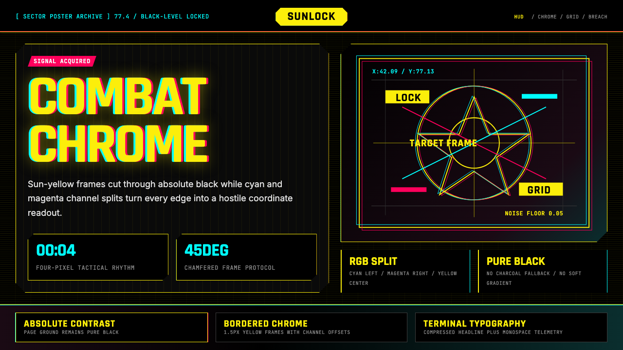 Cyberpunk 2077 Night City YellowCombat HUD on black. Sun-yellow chrome splits into magenta-cyan coordinate gr…黑底战斗HUD:太阳黄框架裂出品红与青色坐标网。
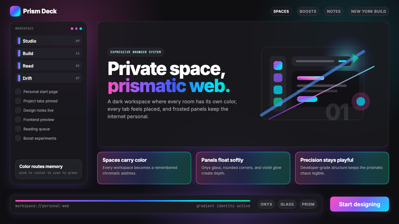 Arc Browser Prismatic (2023)Color is architecture. Pink-violet-cyan ribbons glow over onyx glass and roun…颜色即架构:粉紫青光带浮在黑曜石玻璃面板上。
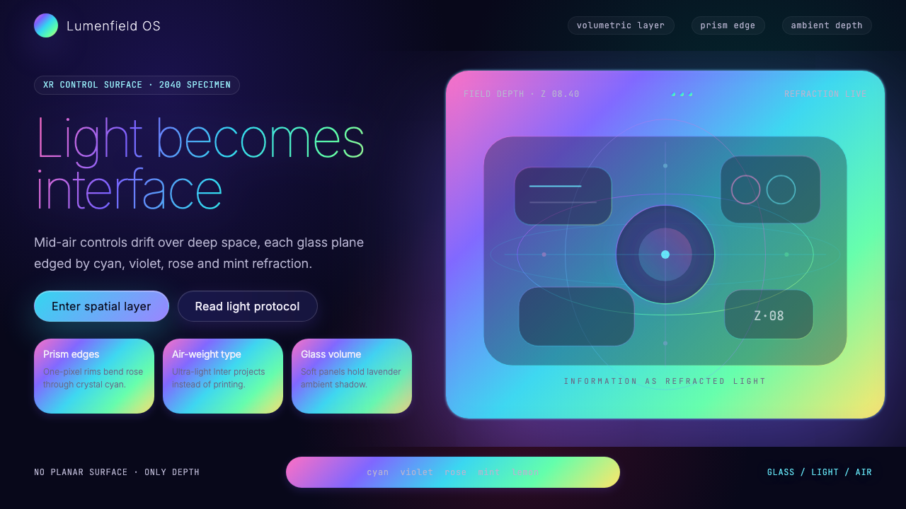 Holographic UI 2040Information made of light. Deep-space black, ultra-light Inter and prismatic…信息由光构成:深空黑、极细 Inter 与棱镜玻璃边缘。
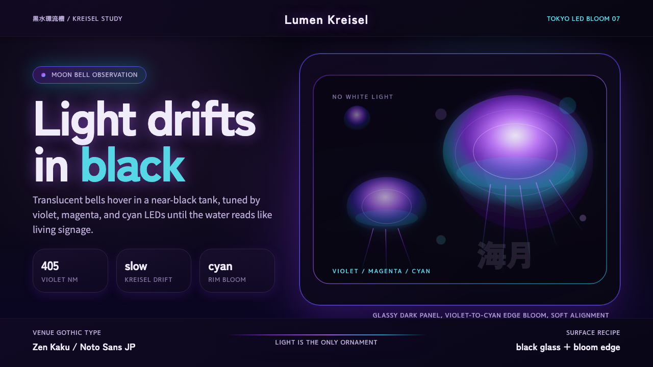 Jellyfish Aquarium StudyLight is the ornament. Violet-cyan glow floats in black glass with venue-goth…光是唯一装饰。紫青冷光漂浮于黑色玻璃,配日式哥特字。
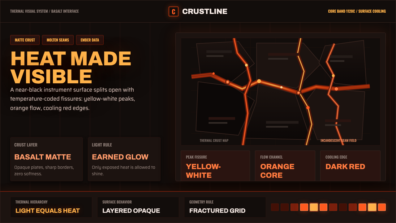 Kīlauea Lava FlowHeat earns its light. Matte basalt grid, molten orange fissures, ember teleme…光必须挣出亮度:哑光玄武岩网格、熔橙裂缝与余烬读数。
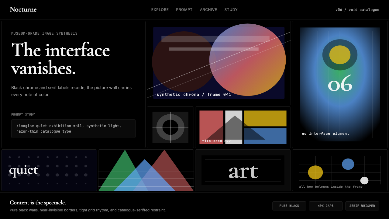 MidjourneyInvisible chrome, visible art. Pure black grid and Cormorant serif give color…界面隐身,图像发声。纯黑网格与细衬线让色彩只属于作品。