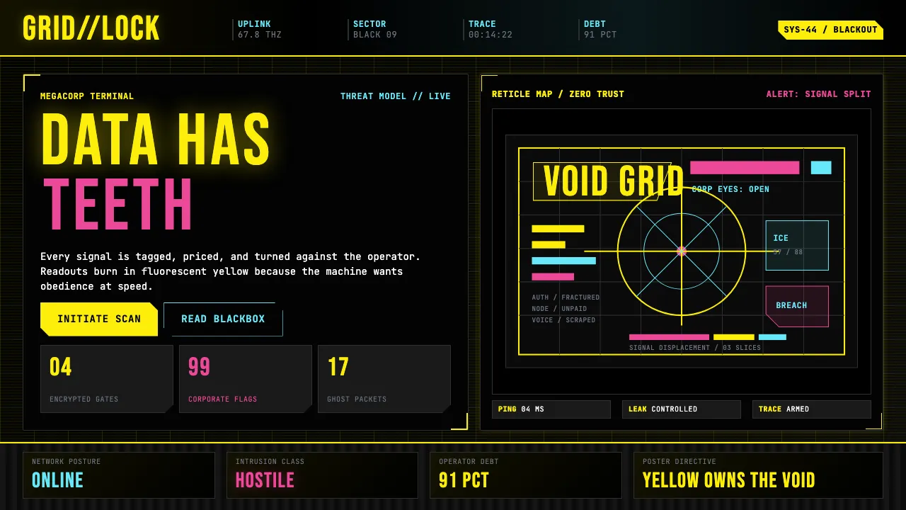
About Cyberpunk 2077 (Screen UI)
Cyberpunk 2077's interface is the most committed translation of 1980s cyberpunk fiction into a usable UI. Built on the lineage of Blade Runner holograms, Ghost in the Shell terminals, and Akira dashboards, the screen language stamps fluorescent yellow Eurostile-esque headlines onto pitch-black ground with scanline noise, HUD bracket framing, and glitch displacement artifacts.
This design system distills Night City's megacorp-terminal aesthetic into tokens: pure black backgrounds, CDPR fluorescent yellow as the dominant text and accent color, hot magenta for alerts, cyan for system status, and JetBrains Mono as the ruling typeface — because in Night City, every surface is a data readout.
- Origin
- Warsaw (CD Projekt RED); visual lineage from Tokyo, Los Angeles, and the cyberpunk literary tradition
- Era
- 2020 game launch; visual lineage from 1980s–90s cyberpunk literature & anime
- Key figures
- CD Projekt RED · William Gibson · Ridley Scott · Katsuhiro Otomo
- Movements
- cyberpunk literature · anime cyberpunk visual tradition · neon-noir · retrofuturism
Cyberpunk 2077 (Screen UI) design spec
Colors
Typography
The other 11 sections — buttons, cards, spacing, motion, techniques and more — open once you unlock. Download the DESIGN.md or send it to your AI in one click. Unlock once, yours forever.
Sign up nowStyles similar to Cyberpunk 2077 (Screen UI)
Also inspired by film, games & music, with a close feel.
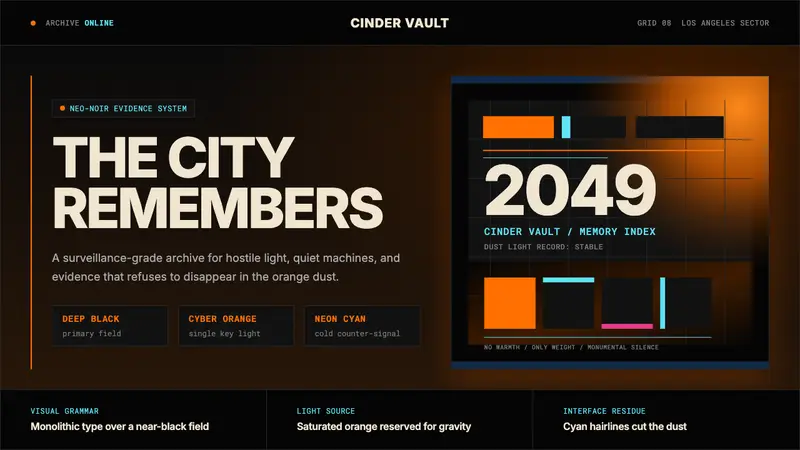 Blade Runner 2049Noir with tectonic weight. Orange dust, cyan hairlines, and monumental Inter on black.
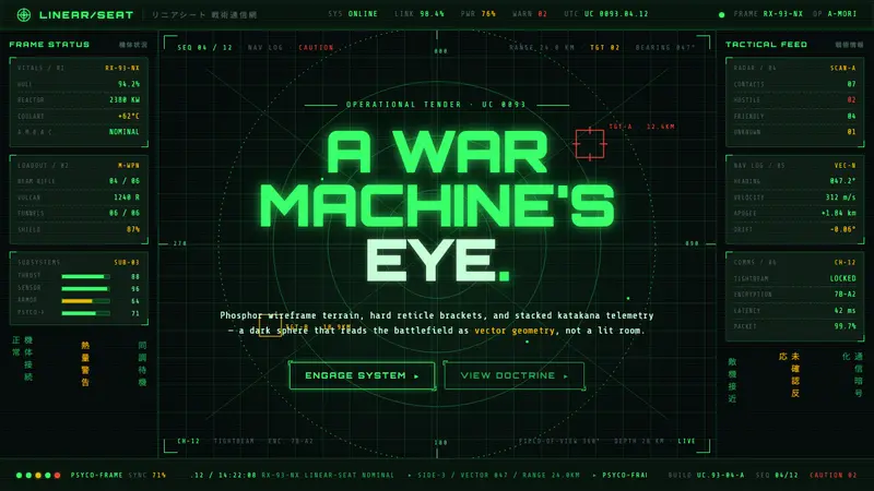 Gundam Universal Century UIA war machine's eye. Phosphor wireframe and katakana telemetry glow inside a void-black sphere.
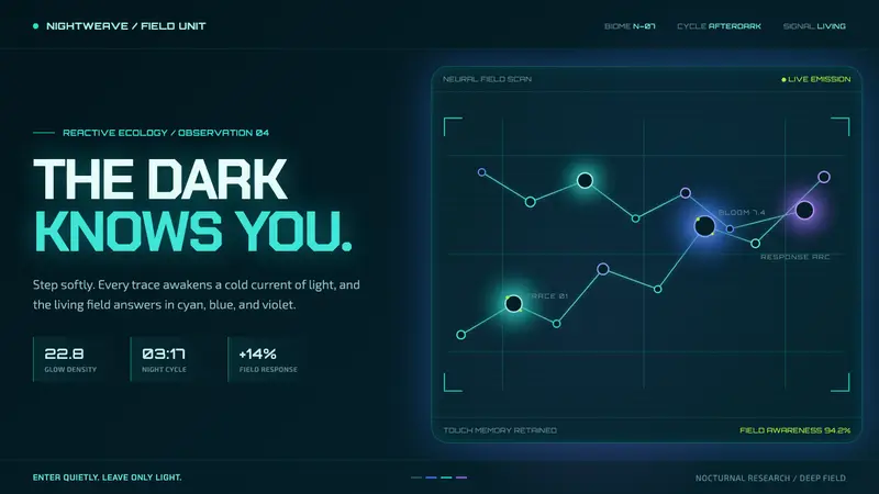 Avatar — Pandora Bioluminescence (2009)The forest knows you are there. Cyan light blooms across a deep-teal living field.
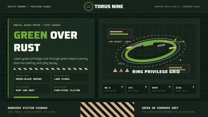 Elysium OrbitalClass divide made visible. Lawn green cuts through green-black plating and dust-tan grids.