Design style guide设计风格指南
What is Cyberpunk 2077 Night City Yellow?什么是 Cyberpunk 2077 Night City Yellow?
Cyberpunk 2077 Night City Yellow is a weaponized brand system — sun-yellow combat interfaces slicing through pure black, flanked by chromatic-aberration glitches that make every surface feel like a crumbling city's last warning signal.《赛博朋克2077》夜之城黄是一套武器化的品牌体系——太阳黄战斗界面切入纯黑底色,色差故障信号将每一个界面都变成这座崩溃城市最后的预警。
Cyberpunk 2077 Night City Yellow in briefCyberpunk 2077 Night City Yellow 速览
Cyberpunk 2077 Night City Yellow is the visual identity forged by CD Projekt Red for their 2020 role-playing game set in the dystopian megalopolis of Night City. Its defining grammar is stark: an aggressive sun-yellow dominates against a pure black ground, while magenta and cyan chromatic-aberration splits fracture every edge into a three-channel RGB glitch — the visual equivalent of signal corruption in a networked world where bodies are hardware and data is oxygen.《赛博朋克2077》夜之城黄是CD Projekt Red为其2020年角色扮演游戏所打造的视觉识别系统,背景设定于反乌托邦巨型都市夜之城。其定义性语法极为强烈:侵略性的太阳黄在纯黑底色上占据主导,品红与青色的色差分离将每条边缘撕裂为三通道RGB故障信号——这是一个身体即硬件、数据即氧气的联网世界中信号腐败的视觉等价物。
The aesthetic is built on the logic of the heads-up display. Every typographic element, every geometric frame, every data overlay is conceived as combat interface: angular chamfered corners cut across bounding boxes, monospace coordinate systems overlay background imagery, and scanline noise textures every surface with the grain of a cathode-ray monitor running too hot. The effect communicates that information is urgent, the environment is hostile, and the viewer is always one second from a threat.这套美学建立在抬头显示器的逻辑之上。每一个字体排印元素、每一个几何框架、每一个数据叠层,都被构想为战斗界面:斜切倒角横贯边界框,等宽坐标系统叠覆在背景图像上,扫描线噪点以过热阴极射线显示器的颗粒感为每一个表面增添质感。这种效果传达出:信息是紧急的,环境是敌对的,观看者距离威胁永远只有一秒之遥。
What distinguishes this system from generic neon-noir or vaporwave is its industrial precision. The glitch effects are not decorative noise — they are applied systematically to indicate hierarchy and state. The yellow marks primary information: interactive elements, health status, mission objectives. The chromatic splits mark instability: damaged states, corrupted data, enemy territory. The result is a visual language where every color decision is a functional signal rather than an atmospheric garnish.将这套体系与泛泛的霓虹黑色电影或蒸汽波区别开来的,是其工业化的精确性。故障效果并非装饰性噪声——它们被系统性地应用,以指示层级与状态。黄色标记主要信息:可交互元素、生命值状态、任务目标。色差分裂标记不稳定性:受损状态、被腐败的数据、敌方领地。结果是一套视觉语言,其中每一个色彩决定都是功能性信号,而非氛围性点缀。
See the Cyberpunk 2077 Night City Yellow design system →查看 Cyberpunk 2077 Night City Yellow 完整设计系统 →
Where does Cyberpunk 2077 Night City Yellow come from?Cyberpunk 2077 Night City Yellow 从何而来?
The intellectual lineage of Night City Yellow begins in 1988, when cyberpunk author William Gibson codified the genre's visual imagination: neon against rain-slicked black streets, corporate logos blazing above human misery, the body as site of technological modification. But it was tabletop game designer Mike Pondsmith who first crystallized this into a systematic visual and mechanical language. Pondsmith's 'Cyberpunk' rulebook, published in 1988 by R. Talsorian Games in Berkeley, California, introduced Night City as a setting and established a chromatic vocabulary that would persist for three decades: high-contrast yellow, electric blue, and the specific quality of artificial light against absolute darkness.夜之城黄的思想渊源可追溯至1988年。威廉·吉布森的小说《神经漫游者》问世,赛博朋克文学类型就此将其视觉想象定型:霓虹倒映在被雨水打湿的黑色街道上,企业标志在人类苦难上方熊熊燃烧,身体成为技术改造的场所。这一文学传统赋予了这套美学其哲学核心——企业权力与人类脆弱性之间的张力。但将其首次结晶为系统性视觉与机制语言的,是桌游设计师Mike Pondsmith。Pondsmith于1988年由加州伯克利的R. Talsorian Games出版的《赛博朋克》规则书,将夜之城作为游戏背景引入,并确立了延续三十年的色彩词汇:高对比度的黄色、电光蓝,以及人造光线映衬绝对黑暗时那种特定的质感。
CD Projekt Red, the Warsaw-based studio founded in 1994, acquired the license for a video game adaptation in 2012. The development team spent eight years building not just a game but a brand system capable of operating across in-world advertising, UI, packaging, and marketing simultaneously. The UI team, working under art direction informed by Blade Runner and Akira, developed pure black as the base field, sun-yellow as the primary signal color, and magenta-cyan for the chromatic aberration effect that became the style's most recognizable signature.1994年成立于华沙的CD Projekt Red于2012年获得了开发视频游戏改编版的授权,并于同年宣布了这一项目。开发团队花费八年时间,不仅构建了一款游戏,更打造了一套能够同时运作于游戏内广告、界面设计、包装、营销与周边产品的连贯品牌体系。UI团队在受《银翼杀手》、《阿基拉》及Pondsmith原著启发的美术指导下,开发出他们所称的「铬黄体系」:纯黑为基础底色,太阳黄为主要信号色,品红与青色则保留给色差效果——这一效果后来成为这种风格最具辨识度的标志。
The chromatic aberration motif has specific technical origins in analog video: when a lens fails to focus all wavelengths of light at the same point, the image splits into offset color channels, producing the fringe effect visible at high-contrast edges. The Night City system co-opted this artifact of optical failure as an intentional design element — signaling that the world of 2077 is always on the verge of breakdown, the interface between human perception and machine data perpetually unstable.色差故障母题具有特定的技术起源,来自模拟视频与胶片摄影。当镜头无法将所有波长的光聚焦于同一点时——即色差——图像会分裂为偏移的红绿蓝三个通道,在高对比度边缘产生标志性的色晕效果。夜之城视觉体系将这种光学与电子故障的伴生物挪用为有意为之的设计元素:它暗示2077年的世界永远处于崩溃边缘,人类感知与机器数据之间的接口持续不稳定。这将一种缺陷转化为品牌标志——这一技巧与1990年代兴起的故障艺术美学哲学产生了共鸣。
The game released in December 2020 to enormous cultural impact. The visual identity proved robust enough to sustain the 'Phantom Liberty' expansion in 2023 and the Netflix animated series 'Cyberpunk: Edgerunners', directed by Hiroyuki Imaishi at Studio Trigger in 2022. The animated series extended the visual language into hand-drawn form, demonstrating that the Night City aesthetic was a transferable graphic system capable of surviving translation across radically different production contexts while remaining instantly recognizable.这款游戏于2020年12月发布,尽管在部分平台上引发了最初的技术争议,却立即产生了巨大的文化影响。这套视觉识别系统足够强健,支撑起了2023年的大型扩展包《自由幻境》,以及由今石洋之执导、Studio Trigger制作的Netflix动画系列《赛博朋克:边缘行者》(2022年播出)。这部动画系列将视觉语言延伸至手绘形式,证明了夜之城美学并不依赖于照片级真实渲染,而是一套可移植的图形体系——一套能够在不同媒介与制作语境之间完成转译、同时保持即时可辨性的语言。
What defines the Cyberpunk 2077 Night City Yellow look?Cyberpunk 2077 Night City Yellow 的视觉特征是什么?
Color Structure色彩结构
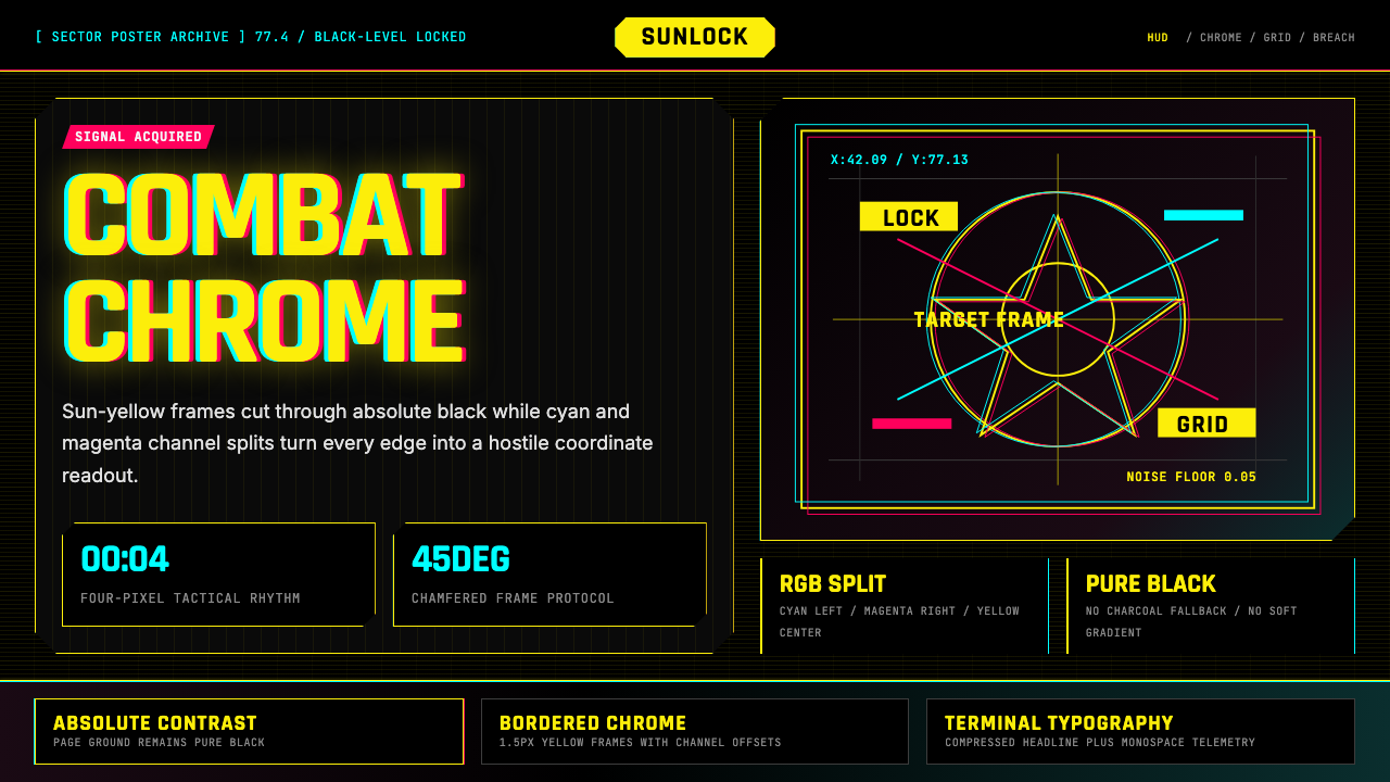
The palette operates on strict hierarchy: pure black serves as the absolute ground, sun-yellow functions as the primary signal and action color, and the magenta-cyan pair exists exclusively for the chromatic aberration effect. White and near-white appear for secondary text and fine coordinate lines. This tight constraint means color is never decorative — every hue assignment is a functional classification. Yellow means 'attend to this.' Cyan-magenta fringing means 'this edge is under stress.' Black means 'background, stand down.'色板运行于严格的层级体系之中:纯黑作为绝对底色,太阳黄充当主要信号色与行动色,品红-青色组合则专用于色差效果。白色与近白色用于次要文字与精细坐标线条。这种严格约束意味着色彩从不是装饰性的——每一种色相的指派都是功能性分类。黄色意味着「注意这里」,青色-品红色晕意味着「这条边缘正承受压力」,黑色意味着「背景,退后」。
Glitch and Chromatic Aberration故障与色差
The chromatic aberration split — offsetting the magenta and cyan channels at high-contrast edges — is the most distinctive signature of this system. It is applied asymmetrically: more intense on elements marked as damaged, corrupted, or dangerous; minimal or absent on stable, safe, or trusted information. This means the glitch effect is not randomized noise but a controlled semantic signal. The degree of fringing indicates the degree of system stress.色差分离——在高对比度边缘偏移品红与青色通道——是这套体系最具辨识度的标志。它被非对称地应用:在被标记为受损、腐败或危险的元素上更为强烈;在稳定、安全或可信的信息上则极弱甚至缺席。这意味着故障效果并非随机噪声,而是受控的语义信号。色晕程度指示系统压力的程度。
Angular Geometry and Chamfered Frames斜切几何与倒角框架
Bounding boxes and UI panels in the Night City system reject right-angle corners in favor of chamfered cuts — corners sliced at forty-five degrees, as though the interface were a piece of military-grade hardware manufactured for durability rather than elegance. This angular language pervades every frame, modal, and tooltip. The result is a geometry that reads as engineered rather than designed: functional, industrial, built to withstand.夜之城体系中的边界框与界面面板摒弃了直角,转而采用倒角切割——以四十五度角斜切的边角,仿佛界面是为耐用性而非优雅而制造的军用级硬件。这种斜角语言渗透于每一个框架、模态框与提示框之中。结果是一种读来像工程制造而非设计出来的几何形态:功能性的、工业化的、为承受压力而建。
Monospace Coordinate Overlays等宽坐标叠层
A defining textural layer is the coordinate-system overlay: fine grid lines, numerical readouts in monospace letterforms, and targeting reticles that impose the logic of a combat map onto any surface. Rendered at low opacity over background imagery, they function as a second layer of meaning: this space is being monitored in real time. The monospace typeface carries its own semantic weight — machine-generated output, not human-authored text.夜之城美学中一个决定性的质感层是坐标系统叠层:细密的网格线、以等宽字体呈现的数字读数,以及将战斗地图逻辑强加于任何表面之上的瞄准分划。这些元素通常以低不透明度渲染于背景图像之上,作为第二层意义功能化地说明:这个空间正在被实时监控、测量与评估。等宽字体自身承载着语义重量——它暗示机器生成的输出,而非人类撰写的文本。
Scanline Texture and Surface Noise扫描线质感与表面噪点
Every surface in the Night City system is read as a display — and in 2077, displays are aging monitors, degraded projection screens, corroded holographic panels. Scanline patterns and grain noise applied across backgrounds suggest a world where the infrastructure of information is perpetually worn and barely functional: industrial entropy made visible.夜之城体系中的每一个表面都被隐性地读作一块显示器——而在2077年,显示器是老化的阴极射线监视器、降质的投影屏幕与腐蚀的全息面板。因此,扫描线图案与颗粒噪点被应用于整个背景与图像区域,暗示一个信息基础设施永远磨损、勉强运转的世界。这赋予了这套美学一种工业熵变的品质:事物仍在运转,但仅此而已。
Typography as Interface Data字体排印即界面数据
Text in the Night City system is never neutral prose — it is always interface output. Headlines are treated as system alerts, set in condensed all-caps with wide letter-spacing that mimics military hardware display conventions. Secondary information runs in tight monospace. Hierarchy is communicated through brightness and weight contrast against black rather than color variation, keeping yellow reserved for the most critical calls to action.夜之城体系中的文字从不是中性的段落——它永远是界面输出。标题被视为系统警报或状态读数,以宽字符间距的压缩全大写字母排印,模仿军用硬件的显示惯例。次要信息以紧凑等宽字体处理。层级通过亮度与字重对比在黑色底面上传达,而非通过色彩变化,将黄色保留给最关键的行动号召。
Darkness as Foundation黑暗作为基础
Unlike systems that use dark backgrounds as a mode or option, the Night City system is constitutively dark: black is not a choice applied over a light-mode base, it is the ontological ground of everything. This absolute darkness makes sun-yellow appear to emit light rather than reflect it, and gives glitch effects a violence they would lack on any softer background. The darkness is the city.与将深色背景作为一种模式或主题的设计体系不同,夜之城体系在本质上就是黑暗的:黑色不是叠加于浅色模式之上的选择,它是一切事物的本体论基底。这种绝对的黑暗使太阳黄看起来像是在发光而非反光,并赋予故障效果一种在更柔和背景上所不具备的暴力感。黑暗就是这座城市——一个光线稀缺、人造且受控的地方。
See the Cyberpunk 2077 Night City Yellow design system →查看 Cyberpunk 2077 Night City Yellow 完整设计系统 →
Who shaped Cyberpunk 2077 Night City Yellow?谁塑造了 Cyberpunk 2077 Night City Yellow?
Pondsmith created the original 'Cyberpunk' tabletop roleplaying game in 1988, establishing Night City as a setting and defining the chromatic and thematic vocabulary that CD Projekt Red would later adapt. His vision — corporate dystopia, transhumanism, and the aesthetics of neon-lit noir — forms the philosophical and visual foundation on which all subsequent Night City design rests. He served as a creative consultant on the video game, helping ensure continuity between the 1990 canon and the 2020 adaptation.Pondsmith是居于伯克利的游戏设计师,于1988年创建了原版《赛博朋克》桌上角色扮演游戏,将夜之城确立为虚构背景,并定义了CD Projekt Red后来改编的色彩与主题词汇。他的愿景——企业反乌托邦、超人类主义,以及霓虹黑色电影的美学——构成了所有后续夜之城设计所建立于其上的哲学与视觉基础。Pondsmith担任视频游戏的创意顾问,协助确保1990年经典与2020年改编之间的连续性。
Mielniczuk served as lead UI designer on Cyberpunk 2077 at CD Projekt Red, responsible for translating Night City world-building into a coherent interface language. His team developed the 'chrome and yellow' system — chamfered geometry, coordinate overlays, and the chromatic aberration signature — into a design language operating consistently across the game's menus, combat overlays, dialogue systems, and environmental signage.Mielniczuk在CD Projekt Red担任《赛博朋克2077》的首席UI设计师,负责将夜之城的世界构建转译为连贯的界面语言。在他的指导下,UI团队将「铬黄体系」——倒角几何、坐标叠层与色差标志的精确应用——发展为一套设计语言,贯通地运作于游戏庞大的菜单系统、战斗叠层、对话系统与环境标牌之中。
Tomaszkiewicz worked as lead quest designer on Cyberpunk 2077, shaping the narrative environments that gave the Night City visual identity its cultural context. His work ensured that the aggressive yellow-black aesthetic was not merely a UI skin but a legible expression of the game's world — where corporate advertising, gang territory markings, and augmentation displays speak the same high-contrast language because Night City demands maximum visibility to survive.Tomaszkiewicz担任《赛博朋克2077》的首席任务设计师,塑造了赋予夜之城视觉识别其文化语境的叙事环境。他的工作确保了这套侵略性的黄黑美学不仅仅是UI皮肤,而是游戏世界的可读表达——在那个世界里,企业广告、帮派领地标记与个人增强显示都使用同一套高对比度视觉语言,因为夜之城本身要求为了生存而达到最大的可见度。
Imaishi directed 'Cyberpunk: Edgerunners' at Studio Trigger, the 2022 Netflix series that extended the Night City visual identity into hand-drawn animation. His frenetic, high-saturation direction proved the aesthetic could survive translation out of photorealistic rendering into a completely different medium, introducing the visual language to an audience that had never played the game and cementing it as a cross-media cultural identity.今石洋之是日本动画导演,执导了Studio Trigger制作的Netflix系列《赛博朋克:边缘行者》(2022年),将夜之城视觉识别延伸至手绘动画。他的执导风格——狂热、高饱和度、夸张的运动与爆炸性色彩——证明了夜之城美学能够在从照片级真实游戏渲染到完全不同制作媒介的转译中存活下来。这部系列将这套视觉语言介绍给了从未玩过游戏的受众,将其确立为跨媒介的文化身份。
Gibson's 1984 novel 'Neuromancer' established the literary foundation of cyberpunk aesthetics, coining the word 'cyberspace' and articulating the genre's core tensions: corporate omnipotence, biological modification, and the beauty of technology against human decay. Though Gibson had no direct involvement in Cyberpunk 2077, his influence permeates the Night City visual logic — information as visible danger, neon as the light of capital, the body as a designed object.吉布森1984年的小说《神经漫游者》确立了赛博朋克美学的文学基础,创造了「赛博空间」一词,并阐明了该类型的核心视觉与主题张力:企业全能、生物改造,以及科技映衬人类衰败时那种特定的美。尽管吉布森与《赛博朋克2077》没有直接关联,他的影响却渗透于夜之城体系的视觉逻辑之中——信息是可见的、危险的、无处不在的这一观念;霓虹是资本的光;身体已经是一个被设计的对象。
How do you use Cyberpunk 2077 Night City Yellow today?今天怎么用 Cyberpunk 2077 Night City Yellow?
Night City Yellow is a high-commitment style — its vocabulary is extreme enough that partial application produces incoherence. Using it effectively requires understanding its structural grammar: black is the only valid ground, yellow is the primary signal color, and glitch effects are semantic rather than decorative. Softening the system with warm grays or rounded corners does not produce a more accessible version — it produces a broken one.《赛博朋克2077》夜之城黄是一种高承诺的风格——其词汇足够极端,局部应用会产生不连贯而非精致的效果。有效运用它需要理解其结构语法:黑色是唯一有效的底色,黄色是唯一有效的主要信号色,故障效果是语义性的而非装饰性的。试图通过引入暖灰色、圆角或柔和投影来软化这套体系,不会产生更易接近的版本——只会产生一个被破坏的版本。
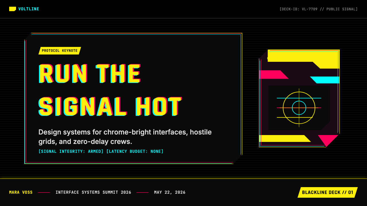
For presentation slides, this style excels at high-stakes technical briefings and product launches in gaming or technology. A cover slide uses full-bleed black with a single large yellow headline treated as a system alert — all-caps, condensed, wide-spaced — and a subhead in fine white monospace. Content slides treat data as combat intelligence: charts in yellow against black, with coordinate-style axis labels and a minimal grid overlay.在演示文稿中,这种风格在高风险技术简报、游戏或科技行业的产品发布,以及任何以紧迫感和权威性为期望价值的场合中表现出色。封面幻灯片适合采用全版黑色底色,配以单一大字号的黄色标题——全大写、压缩、宽字符间距——被视为系统警报处理,其下方以精细的白色等宽字体排印副标题。内容幻灯片应将数据视为战斗情报:黄色图表与指标映衬于黑色之上,附以坐标风格的轴标签与极简网格叠层。整套幻灯片应感觉像任务简报,而非企业演示。
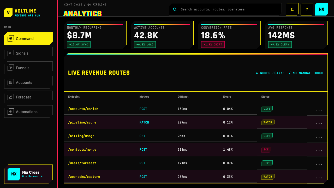
For web interfaces, Night City Yellow suits dark-mode dashboards, gaming peripherals, developer tools, and cybersecurity platforms. Commit fully to black as the only background; use yellow exclusively for calls to action and live status indicators; apply chromatic-aberration hover effects to image elements. Navigation and body text should use clean white or near-white — the eye needs rest areas to make yellow pop. Avoid yellow for large text blocks; the contrast becomes fatiguing at scale.在网页界面中,夜之城黄尤其适合深色模式仪表板、游戏外设、开发者工具与网络安全平台。方法如下:完全以黑色背景作为唯一背景色,仅将黄色用于行动号召与实时状态指示,对图像元素应用色差悬停效果以标示可交互性。导航与正文应使用清洁中性的白色或近白色——眼睛需要休息区域,方能使黄色信号跳脱出来。避免将黄色用于大段文字;在较大篇幅下,这种对比会令人疲惫而非振奋。
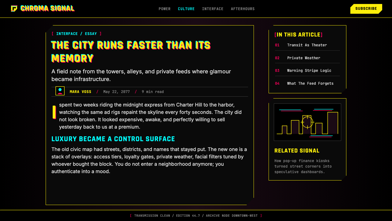
For editorial and marketing work, the style suits product announcements in technology, gaming, or streetwear. A full-spread layout uses black across the full bleed, a large yellow headline in the top third, and secondary information in tight white monospace. Photography takes high-contrast processing with a slight chromatic-aberration edge treatment rather than naturalistic color.在编辑与营销内容中,这种风格适合科技、游戏或潮牌行业的产品公告与品牌战役。这套体系下的全版杂志版面在满版出血处使用黑色底色,页面上三分之一处放置大号黄色标题,次要信息以紧凑的白色等宽字体排印。摄影作品采用高对比度处理,以轻微的色差边缘处理取代自然主义色彩。营销语气应与视觉语域相符:简短、命令式、技术性精确。
The most common mistake is treating glitch effects as decorative flourishes rather than semantic markers — applying chromatic aberration uniformly at equal intensity destroys the information hierarchy the system depends on. A second mistake is using yellow for body text: it is a high-attention signal, not a reading color. A third is introducing warm light sources — candle orange, amber glow — which clash with the cold, artificial, machine-generated quality of the Night City world.应用这套体系时最常见的错误是将故障效果视为装饰性点缀而非语义性标记。在所有元素上以均等强度统一应用色差,会摧毁这套体系所依赖的信息层级。第二个错误是将黄色用于正文——黑底黄字的组合是高注意力信号,而非阅读色彩,持续的正文用它排印会令读者精疲力竭。第三个错误是引入任何暖光源——烛光橙、琥珀暖光——这与夜之城世界冷峻、人造、机器生成的品质在视觉上不一致。
See the Cyberpunk 2077 Night City Yellow design system →查看 Cyberpunk 2077 Night City Yellow 完整设计系统 →
Cyberpunk 2077 Night City Yellow — FAQCyberpunk 2077 Night City Yellow · 常见问题
How does Night City Yellow differ from generic neon-noir or vaporwave?夜之城黄与泛泛的霓虹黑色电影或蒸汽波有何不同?
Neon-noir borrows the atmospheric quality of cyberpunk — night, rain, neon, moral ambiguity — but uses color decoratively and varies its conventions by project. Vaporwave is deliberately lo-fi and ironic, drawing on early digital consumer aesthetics with pastel colors and retro computer references. Night City Yellow is neither nostalgic nor ironic — it is a weaponized brand system with precise functional rules. Color assignments are semantic, geometry is consistent, and glitch effects are controlled signals rather than texture. That difference — quoting a visual tradition versus actually building a system — is the essential distinction.霓虹黑色电影借用了赛博朋克的氛围品质——夜晚、雨水、霓虹、道德模糊——但通常没有严格的结构语法:霓虹色彩被装饰性地使用,版面惯例因地而异,情感语域是怀旧或忧郁的。蒸汽波是刻意的低保真与反讽,取材于早期数字消费文化,以粉彩色和复古电脑美学为特征。夜之城黄既非怀旧亦非反讽——它是一套具有精确功能规则的武器化品牌体系。色彩指派是语义性的,几何形态是一致的,故障效果是受控信号而非质感。这种差别,是引用一种视觉传统与真正构建一套体系之间的差别。
Can this style work for a light-background product?这种风格能用于浅色背景的产品吗?
Not coherently. Every element of the Night City visual language is calibrated for a black ground. Sun-yellow reads as a luminous signal against black; against white, it reads as an ordinary accent with no particular urgency. The chromatic aberration effect requires high-contrast dark edges to be legible, and scanline textures lose their meaning on a light surface. Porting this system to a light-background product requires rebuilding almost every element from scratch — at that point you are no longer working with this style.不能做到连贯。夜之城体系在本质上是黑暗的——视觉语言的每一个元素都针对黑色底色进行了校准。太阳黄在黑色背景上读作发光信号;在白色或浅灰色背景上,它读作一种没有特别权威感或紧迫感的标准强调色。色差效果需要高对比度的深色边缘才能清晰可读。扫描线与噪点质感在浅色表面上完全失去其意义。试图将这套体系移植到浅色背景应用中,几乎需要从零重建每一个元素——那时你已经不再使用这种风格,而是在做其他的事情了。
How should body text and long-form content be handled in this system?在这套体系中,正文与长篇内容应如何处理?
Body text should always be set in clean white or near-white against black — never in yellow. Yellow-on-black is a short-burst attention signal for headlines and calls to action, not sustained reading. For longer passages, slightly reduced brightness — a cool medium-gray rather than pure white — reduces eye fatigue while maintaining the dark-mode register. Line spacing and measure should be generous: tight leading and narrow columns amplify the claustrophobic quality in ways that become oppressive in long-form contexts.正文应始终以清洁的白色或近白色设置于黑色底色之上——绝不使用黄色。黑底黄字的组合是一种短时注意力信号,为标题、标签与行动号召设计,而非为持续阅读设计。对于较长段落,略微降低亮度——向冷中灰转移而非使用纯白——能在保持深色模式语域的同时减少视觉疲劳。行距与行长应宽松:紧密的行距与窄栏宽会放大这套美学的幽闭特质,在长篇阅读语境中会变得令人压抑。
Is this style appropriate for mainstream consumer applications?这种风格适合主流消费者应用吗?
With care, and only for specific segments. Night City Yellow is well-received by audiences who identify with gaming culture and digital subcultures — they read it as a signal of authenticity and shared taste. For general consumer applications in health, finance, food, or lifestyle, it reads as aggressive, cold, and exclusionary. The same qualities that make it feel authoritative in gaming — its severity, its artificial quality, its suggestion of systemic threat — become liabilities wherever approachability and warmth are required.需谨慎,且仅适用于特定受众群体。夜之城黄在认同游戏文化、科技与数字亚文化美学的受众中反响良好——这些用户将这套视觉语言读作真实性与共同品味的信号。对于健康、金融、食品、育儿或生活方式类别的通用消费者应用,这种风格读来是攻击性的、冷漠的、排他性的。正是那些使它在游戏语境中感觉权威的品质——其严肃性、其人造感、其对系统性威胁的暗示——在需要亲近感与温度的语境中成为负担。
How does the chromatic aberration effect translate to print?色差效果如何在印刷品中呈现?
In print, chromatic aberration requires deliberate misregistration of color separations — shifting the cyan and magenta plates slightly out of alignment with the black plate at selected edges. This works well for posters and high-production packaging where the printer has precision to control it; at small scales or on low-quality stock, it turns muddy. Digital contexts offer more control: offset channels can be applied precisely and adjusted per-element, which is why the effect looks most resolved in screen-based work.在印刷品中,色差效果需要刻意的叠印技术或刻意的色版套印错位——在选定的边缘处将青色版和品红版略微偏离黑版对准位置。这是一种生产密集型方法,适用于海报、包装与高制作价值的附属材料,前提是印刷商有足够精度来控制它。在小尺寸或低质量纸张上,效果可能变得模糊而非清晰。数字环境提供了更多控制:偏移通道可以精确应用,并逐元素调整——这正是为什么这种效果在基于屏幕的作品中看起来最为完整。
Related design styles相关设计风格
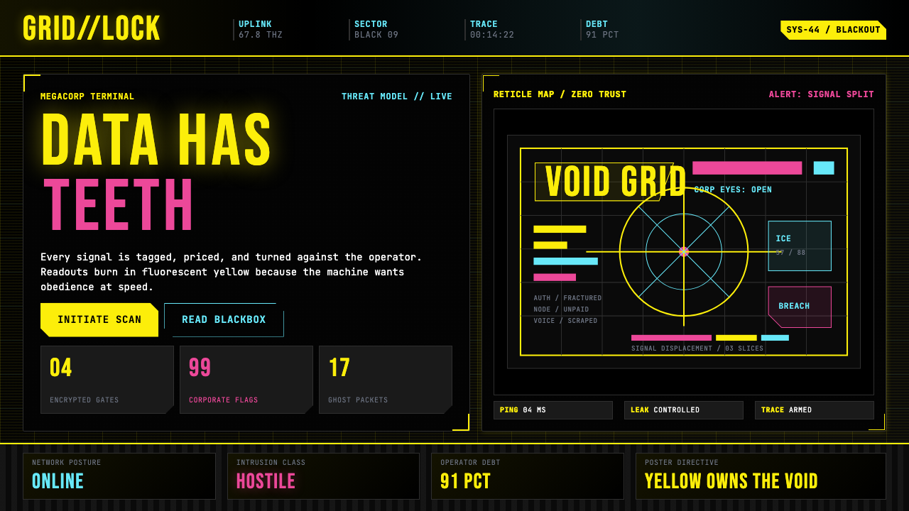 Cyberpunk 2077 (Screen UI)Weaponized terminals. Fluorescent yellow on black, scanlines and bracketed HU…被武器化的终端:黑底荧光黄、扫描线与HUD方括号网格。
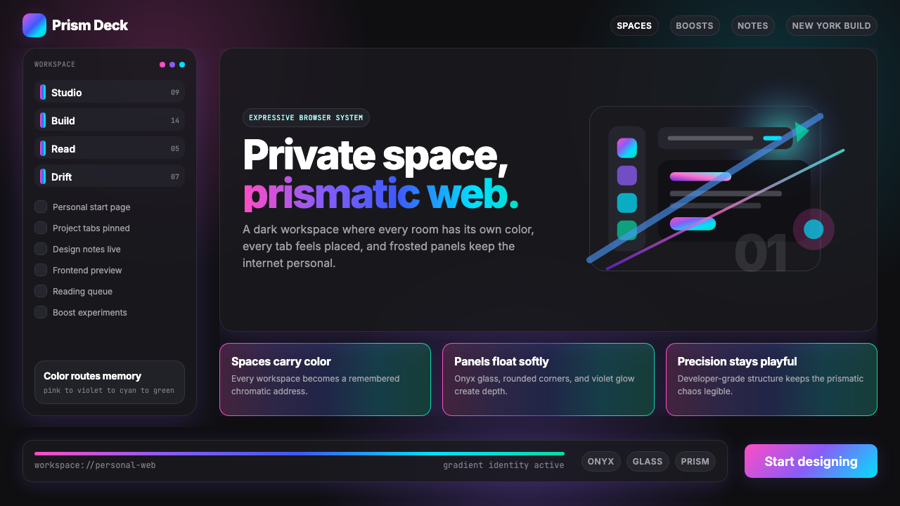 Arc Browser Prismatic (2023)Color is architecture. Pink-violet-cyan ribbons glow over onyx glass and roun…颜色即架构:粉紫青光带浮在黑曜石玻璃面板上。
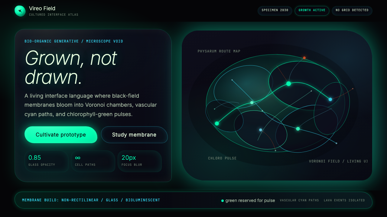 Bio-Organic GenerativeInterfaces feel cultured. Void black, Voronoi membranes, and neon chlorophyll…界面像被培育:黑场、维诺诺伊膜与叶绿素霓光一起呼吸。
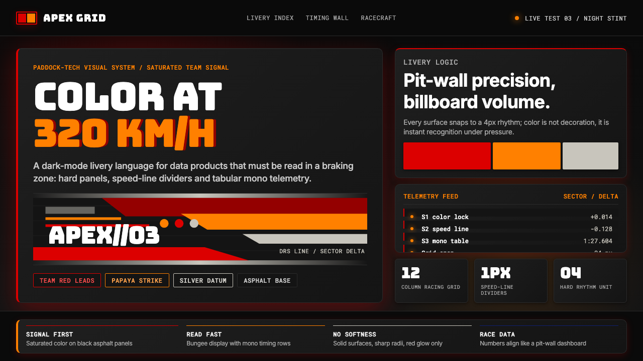 F1 Formula One LiverySpeed is legible. Ferrari red and papaya speed-lines cut through black teleme…速度清晰可读:红与木瓜橙速度线切开黑色遥测面板。
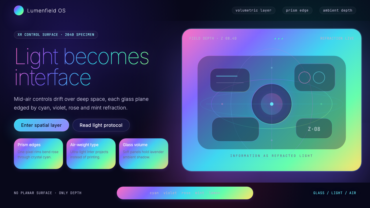 Holographic UI 2040Information made of light. Deep-space black, ultra-light Inter and prismatic…信息由光构成:深空黑、极细 Inter 与棱镜玻璃边缘。
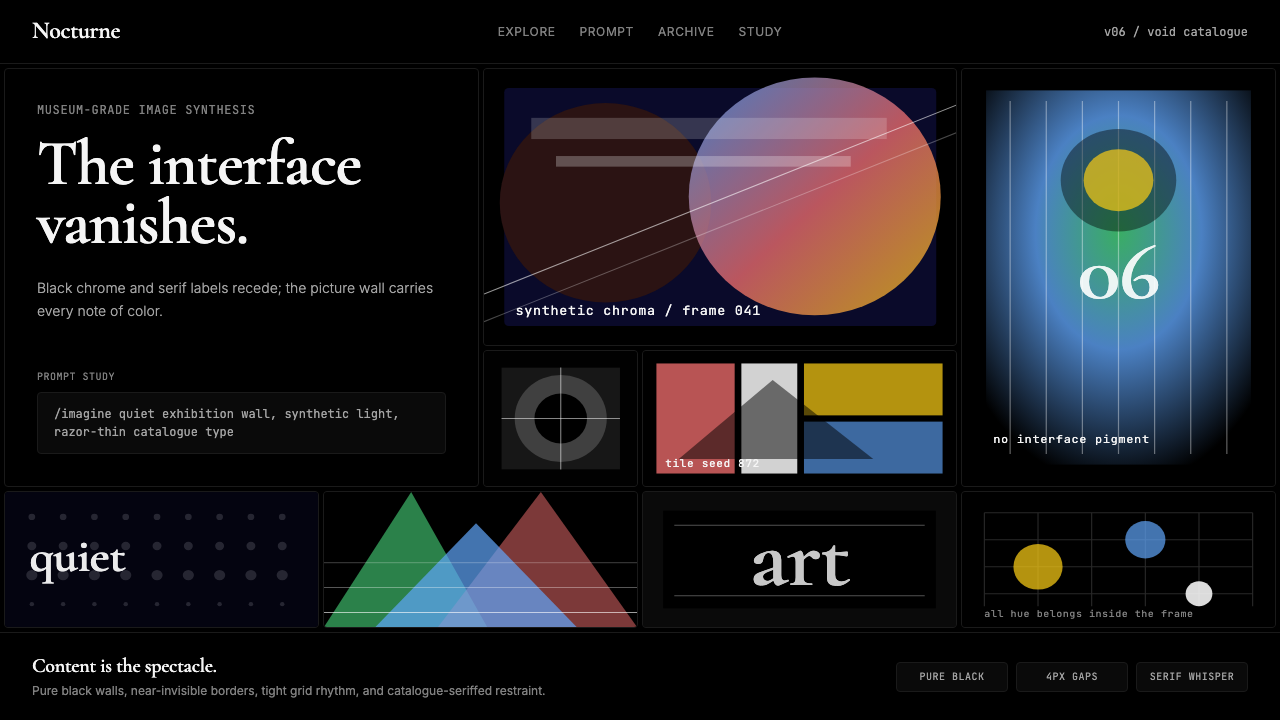 MidjourneyInvisible chrome, visible art. Pure black grid and Cormorant serif give color…界面隐身,图像发声。纯黑网格与细衬线让色彩只属于作品。