What is Bio-Organic Generative?什么是 Bio-Organic Generative?
Bio-Organic Generative imagines interfaces grown rather than drawn — Voronoi membranes, mycelium branches, and bioluminescent blooms rendered under the microscope of a machine.仿生有机生成想象的是被「生长」出来的界面,而非被「画」出来的——维诺诺伊膜、菌丝分形与生物荧光辉光,在机器的显微镜下成型。
Bio-Organic Generative in briefBio-Organic Generative 速览
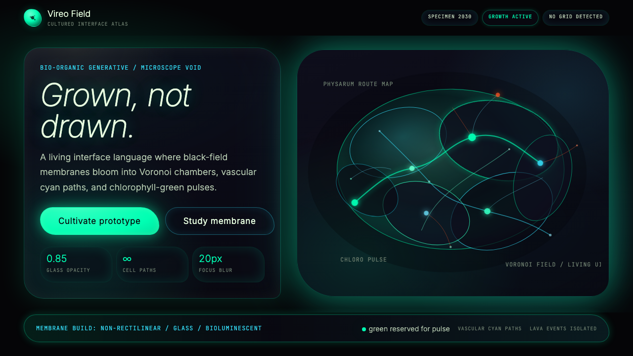
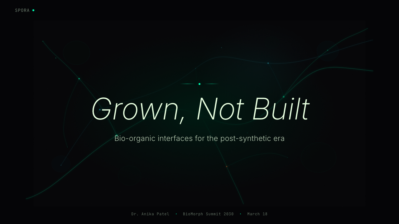
Bio-Organic Generative is a speculative design aesthetic oriented around the year 2030, born from the convergence of computational biology, generative artificial intelligence, and biomimicry architecture. Where conventional digital interfaces are built from rectangles, grids, and Cartesian logic, Bio-Organic Generative replaces that vocabulary entirely: surfaces become membranes, edges become growth paths, and every accent color mimics a living emission of light. The result is not a style that imitates nature photographically — it is one that imitates nature structurally, importing the underlying growth algorithms of organisms into the visual layer of a screen.仿生有机生成是一种以2030年为时间坐标的推测性设计美学,诞生于计算生物学、生成式人工智能与仿生建筑三条脉络的交汇处。传统数字界面建立在矩形、网格与笛卡尔逻辑之上,而仿生有机生成彻底替换了这套词汇:表面成为膜,边缘成为生长路径,每一个强调色都在模拟生命体的发光方式。这种风格并非以摄影方式模仿自然——它是在结构层面模仿自然,将生物体的底层生长算法引入屏幕的视觉层。
The aesthetic is characterized by deep, near-lightless backgrounds against which organic forms glow from within. Cell-like Voronoi tessellations tile surfaces the way tissue cells tile a biological specimen slide. Branching structures trace paths the way mycelium networks or river deltas do — never straight, always finding the most efficient organic route between two points. Accent colors draw from the bioluminescent spectrum: the cool chlorophyll green of algae under ultraviolet light, the electric blue of deep-sea creatures, the hot amber of volcanic vents. These colors do not merely decorate — they signal biological states: active, dormant, high-energy, terminal.这种美学以深邃、近乎无光的背景为底色,有机形态从内部发光。维诺诺伊镶嵌像生物切片标本上的组织细胞一样铺满表面。分支结构像菌丝网络或三角洲那样延伸——从不笔直,总是找到两点之间最高效的有机路径。强调色从生物荧光色谱中取材:藻类在紫外光下的冷冽叶绿素绿、深海生物的电弧蓝、火山热泉的灼热琥珀。这些颜色不只是装饰——它们传递生物状态信号:活跃、休眠、高能、终止。
Crucially, Bio-Organic Generative is defined by its generative origins. The forms that populate this aesthetic are not hand-crafted shapes inspired by nature — they are the literal output of procedural algorithms, physics simulations, and machine learning models trained on biological imagery. No human designer would plot these exact curves; that is the point. The aesthetic carries within it the visible trace of a non-human process, which is what gives it both its uncanny quality and its philosophical coherence as a vision of interfaces that are genuinely alive.关键在于,仿生有机生成由其生成式起源所定义。这种美学中的形态并非受自然启发的手工形状,而是程序算法、物理仿真和在生物图像上训练的机器学习模型的字面输出。没有任何人类设计师会绘制出这些精确的曲线——这正是重点所在。这种美学携带着一个非人类过程留下的可见痕迹,正是这种痕迹赋予了它那种令人不安的品质,以及作为「真正活着的界面」这一愿景的哲学连贯性。
See the Bio-Organic Generative design system查看 Bio-Organic Generative 完整设计系统
Where does Bio-Organic Generative come from?Bio-Organic Generative 从何而来?
The intellectual roots of Bio-Organic Generative reach back to the late twentieth century's collision between computation and biology. In 1990, Craig Reynolds published his Boids simulation, demonstrating that three simple rules — separation, alignment, cohesion — could generate the emergent flocking behavior of birds without any centralized choreography. Around the same time, researchers studying Physarum polycephalum (a single-celled slime mold) discovered that the organism could solve complex network optimization problems by growing and retracting its branching body. These biological discovery moments established a key proposition that would echo through the aesthetic decades later: nature already runs algorithms, and those algorithms produce forms of extraordinary visual complexity.仿生有机生成的思想根源可追溯至二十世纪末计算与生物学的碰撞。1990年,克雷格·雷诺兹发表了他的Boids仿真,证明三条简单规则——分离、对齐、聚合——无需任何集中编排,即可生成鸟群的涌现式群体行为。大约同一时期,研究多头绒泡菌(一种单细胞黏菌)的学者发现,这种生物能够通过生长与收缩其分支躯体来求解复杂的网络优化问题。这些生物学发现建立了一个关键命题,并在数十年后回响于这种美学之中:自然已经在运行算法,而这些算法产生了视觉复杂度极高的形态。
The architectural and material dimension of the aesthetic crystallized around the work of Neri Oxman at the MIT Media Lab, particularly through her Mediated Matter research group active in the 2010s. Oxman's silk pavilions — structural forms grown by silkworms onto algorithmic scaffolds — and her fabrication experiments layering biological and synthetic materials demonstrated that the boundary between the designed and the grown could be dissolved in physical space. Her concept of Material Ecology, which positioned computation, fabrication, and the living world as a single continuous design medium, became a foundational reference point for digital designers seeking to import similar logic into screen-based work.这种美学的建筑与材料维度,在麻省理工学院媒体实验室Neri Oxman的工作中结晶,尤其是她在2010年代主持的「媒介物质」研究组。Oxman的蚕丝穹顶——蚕在算法支架上编织而成的结构形态——以及她将生物材料与合成材料逐层叠加的制造实验,证明了被设计之物与被生长之物之间的边界可以在物理空间中消解。她的「材料生态学」概念——将计算、制造与生命世界定位为单一连续的设计媒介——成为数字设计师将类似逻辑引入屏幕作品的奠基性参照。
The visual breakthrough that gave the aesthetic its screen-ready identity came through the practice of Refik Anadol, the Istanbul-born, Los Angeles-based media artist whose Machine Hallucinations series (launched around 2018) used generative machine learning models trained on millions of photographs to produce large-scale data sculptures — fluid, cell-like, membrane-like formations that moved and breathed on building facades and gallery walls. Anadol demonstrated that generative AI could produce organic visual behavior at architectural scale. The moment that work entered broader cultural awareness — through museum retrospectives and viral documentation — it also gave the broader design community a new visual vocabulary: deep backgrounds, glowing cell structures, and forms that seemed to grow in real time.赋予这种美学屏幕就绪身份的视觉突破,来自Refik Anadol的实践——这位出生于伊斯坦布尔、工作于洛杉矶的媒体艺术家,其「机器幻觉」系列(约2018年发起)使用在数百万张照片上训练的生成式机器学习模型,制作大规模数据雕塑——流动的、细胞状的、膜状的形态,在建筑立面和画廊墙壁上运动与呼吸。Anadol证明了生成式人工智能能够以建筑尺度产生有机视觉行为。当这些作品通过博物馆回顾展和病毒式传播进入更广泛的文化视野时,也给更广泛的设计社群带来了一套新的视觉词汇:深邃的背景、发光的细胞结构,以及看似在实时生长的形态。
The speculative projection toward 2030 reflects converging technological and cultural pressures. As real-time generative AI becomes computationally affordable for consumer devices, and as climate urgency pushes design culture toward ecological themes, Bio-Organic Generative represents a plausible trajectory for interface aesthetics: interfaces that perform their ecological awareness visually, that use the language of biology to communicate machine intelligence, and that treat darkness and emission rather than flatness and reflection as their fundamental surface logic. The aesthetic also draws on the parametric architecture tradition associated with designers such as Marcos Novak and the fashion experimentation of Iris van Herpen and Patricia Urquiola, all of whom have worked at the intersection of computational process and organic form.对2030年的推测性投射,反映了技术与文化的双重汇聚压力。随着实时生成式人工智能在消费级设备上的计算成本日益降低,气候紧迫性将设计文化推向生态主题,仿生有机生成代表了界面美学的一条可信轨迹:界面在视觉上表演其生态意识,用生物学的语言传达机器智能,并以黑暗与发光而非平面与反射作为其根本的表面逻辑。这种美学还借鉴了以Marcos Novak为代表的参数化建筑传统,以及Iris van Herpen和Patricia Urquiola的时尚实验——他们都在计算过程与有机形态的交汇处工作。
What defines the Bio-Organic Generative look?Bio-Organic Generative 的视觉特征是什么?
Ground and Void底色与虚空
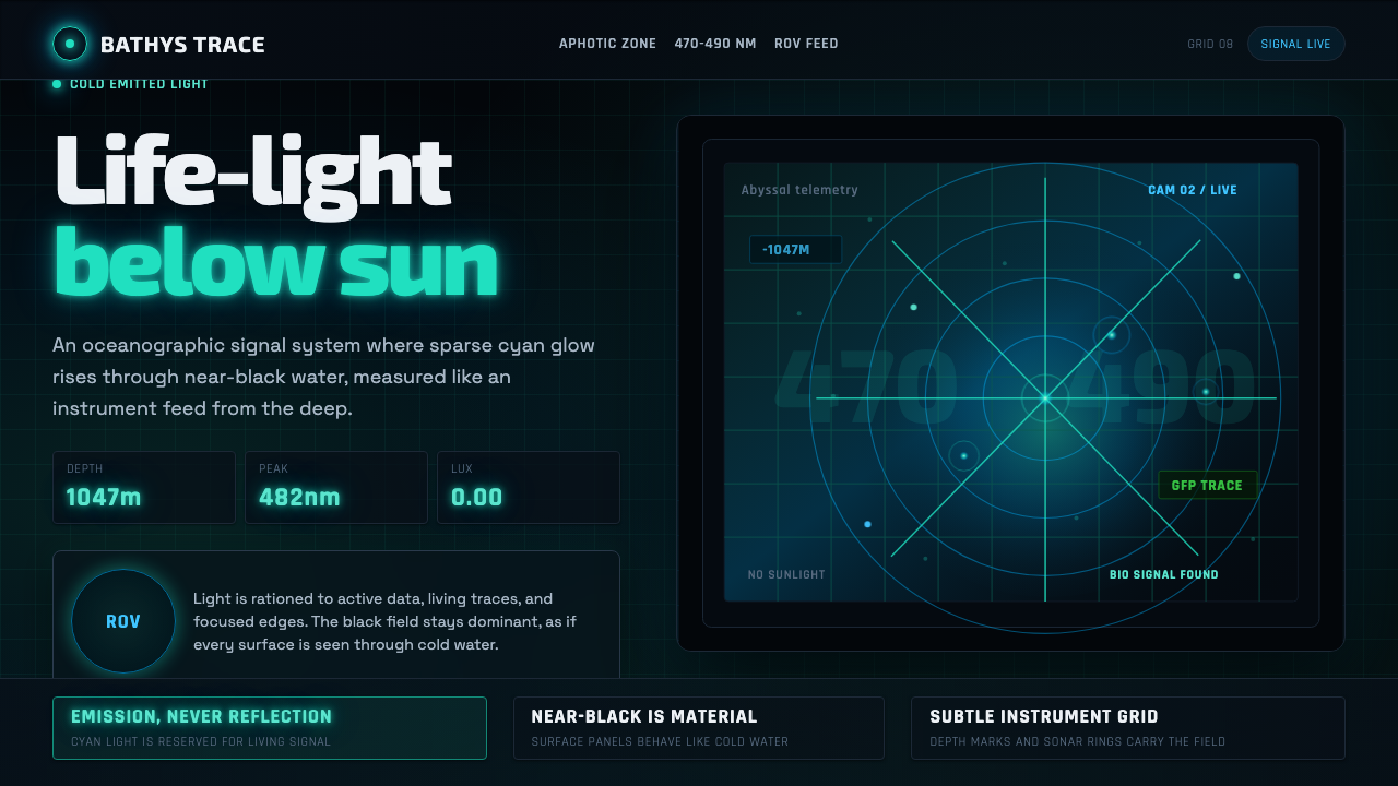
The background in Bio-Organic Generative work is not merely dark — it is intentionally void, evoking the lightless medium of a Petri dish, the interior of a deep-sea trench, or the space between stars. Against this void, every illuminated form takes on the quality of something that emits rather than reflects light. This ground-figure logic is inverted from most design conventions: the negative space is primary, and the positive forms are intrusions of luminosity into darkness. Depth is achieved not through layering or shadow casting but through the dimming and brightening of organic forms as they recede toward or emerge from the void.仿生有机生成作品中的背景不仅仅是深色——它是刻意的虚空,唤起培养皿无光的介质、深海沟壑的内部或星际空间。在这片虚空映衬下,每一个被照亮的形态都具有「发光」而非「反光」的品质。这种底-图逻辑与大多数设计惯例相反:负空间是主体,正形态是侵入黑暗的光度。深度不通过分层或投影来实现,而是通过有机形态在向虚空退去或从虚空浮现时的明暗变化来实现。
Voronoi and Cellular Tessellation维诺诺伊与细胞镶嵌
The Voronoi diagram — a mathematical partition of space into cells based on proximity to seed points — is the structural backbone of this aesthetic. Voronoi patterns appear in biological structures ranging from giraffe markings to dragonfly wings to the corneal endothelium of the human eye, which is why their use in Bio-Organic Generative work reads as genuinely cellular rather than merely geometric. The cells vary in size and shape in ways that suggest growth under pressure: some elongated and stretched as if pulled by neighboring cells, others compact and dense as if resisting compression. The cell edges themselves glow faintly, tracing the membrane logic that gives the aesthetic its living quality.维诺诺伊图——一种基于与种子点的临近关系将空间划分为单元格的数学分区——是这种美学的结构骨干。维诺诺伊图案出现在从长颈鹿纹路到蜻蜓翅翼再到人眼角膜内皮的各种生物结构中,这正是为什么它在仿生有机生成作品中看起来是真正的细胞状而非仅仅是几何形状。细胞的大小和形状以暗示在压力下生长的方式变化:有些被拉长,仿佛被相邻细胞牵拉;另一些紧凑致密,仿佛在抵抗压缩。细胞边缘本身微微发光,勾勒出赋予这种美学以生命品质的膜逻辑。
Bioluminescent Accent Palette生物荧光强调色板
Color in this aesthetic is not chosen from a brand palette or a trending gradient — it is selected from the narrow spectrum of colors that living organisms actually produce through bioluminescence. Chlorophyll green, the cold and highly saturated green of algae and leaves under intense light, serves as the primary life-signal accent. Electric cobalt blue, drawn from the emission spectra of deep-sea jellyfish and dinoflagellates, marks information flows and data states. Molten amber or lava orange signals high-energy events, stress states, or critical alerts — it is the color of bioluminescent distress. These colors glow against the dark ground rather than sitting flatly on a surface, achieved through diffuse bloom effects and subtle inner luminosity that evoke the actual optical quality of living light.这种美学中的色彩不是从品牌色板或流行渐变中选取的——它来自生命有机体通过生物荧光实际产生的那段窄谱。叶绿素绿,藻类和叶片在强光下那种冷冽而高度饱和的绿色,作为首要的生命信号强调色。电弧钴蓝,来自深海水母和腰鞭毛虫的发射光谱,标记信息流动和数据状态。熔融琥珀或熔岩橙则标志高能事件、压力状态或关键告警——它是生物荧光求救信号的颜色。这些颜色在深色底面上发光,而非平铺在表面,通过漫射晕染效果和微妙的内部光度来实现,唤起生命之光真实的光学品质。
Mycelium and Branching Networks菌丝与分支网络
Where Voronoi tessellation handles surface and area, branching network structures handle connectivity and flow. These structures draw their visual logic from mycorrhizal networks, vascular systems, lightning discharge patterns, and river delta formation — all governed by similar mathematical principles of minimum-path finding and resource distribution. In interface contexts, branching networks appear as navigation paths, data relationships, or structural connectors between modules. They are never drawn as straight lines or perfectly even curves; their credibility as organic forms depends on the visible irregularity that generative algorithms introduce: slight variations in branch thickness, asymmetric bifurcations, occasional dead ends.维诺诺伊镶嵌处理表面和区域,分支网络结构则处理连通性和流动。这些结构从菌根网络、血管系统、闪电放电模式和三角洲形成中汲取其视觉逻辑——所有这些都受相似的最短路径寻找和资源分配数学原理支配。在界面语境中,分支网络呈现为导航路径、数据关系或模块间的结构连接器。它们从不被画成直线或完美均匀的曲线;它们作为有机形态的可信度依赖于生成算法引入的可见不规则性:分支粗细的细微变化、不对称的分叉、偶尔的死路。
Membrane Motion and Pulse膜的运动与脉冲
Bio-Organic Generative is rarely a static aesthetic — motion is intrinsic to its meaning. Membranes breathe: they expand and contract on a rhythm that evokes respiration or heartbeat, with the timing deliberately irregular to avoid the mechanical feel of a looping animation. Cellular structures pulse with slow, asynchronous luminosity shifts, as if each cell has its own metabolism operating on a slightly different clock. Data flows move through branching networks like bioluminescent signals moving through a neural pathway. This motion is not decorative — it carries semantic weight, indicating system state, data activity, or processing load in ways that conventional icon-based status indicators do not.仿生有机生成很少是静态的美学——运动对其意义来说是内在的。膜在呼吸:它们以唤起呼吸或心跳的节奏扩张和收缩,节奏刻意不规则,以避免循环动画的机械感。细胞结构以缓慢、异步的光度变化脉动,仿佛每个细胞都有自己的新陈代谢,运行在略微不同的时钟上。数据流像生物荧光信号穿过神经通路一样在分支网络中移动。这种运动不是装饰性的——它承载语义重量,以传统基于图标的状态指示器无法实现的方式指示系统状态、数据活动或处理负载。
Generative Asymmetry生成式不对称
Every form in this aesthetic carries the mark of its algorithmic origin: no element is perfectly symmetrical, no two cells are exactly the same size, no branch bifurcates at a mathematically clean angle. This is the opposite of the controlled asymmetry of modernist grid design, where asymmetry is a deliberate compositional choice made by a human. In Bio-Organic Generative work, asymmetry is the natural output of procedural rules operating over time — growth, pressure, path-finding — and its authenticity depends on the designer resisting the impulse to manually correct or regularize the results. The irregularity is not noise; it is evidence of a living process.这种美学中的每个形态都带有其算法起源的印记:没有任何元素是完全对称的,没有两个细胞大小完全相同,没有任何分支以数学上干净的角度分叉。这与现代主义网格设计中受控不对称的情况相反,后者的不对称是人类刻意做出的构图选择。在仿生有机生成作品中,不对称是程序规则随时间运作的自然输出——生长、压力、路径寻找——其真实性取决于设计师抵制手动修正或规整结果的冲动。不规则性不是噪声,而是生命过程的证据。
Depth Without Shadow无投影的深度
Conventional digital depth cues — drop shadows, elevation overlays, layered blur — are absent in this aesthetic. Depth instead emerges from luminosity and scale: forms closer to the viewer emit more light or occupy more of the visual field, while forms receding into the background dim toward the ground color. This is the depth logic of bioluminescent environments — caves, deep ocean, microscope slide — where there is no external light source casting shadows, only intrinsic emission varying with distance and density. The result is a spatial quality that feels fundamentally different from material skeuomorphism or flat layering: it is atmospheric, like looking through a medium rather than at a surface.传统的数字深度线索——投影、高度叠加层、分层模糊——在这种美学中是缺失的。深度转而从光度和比例中浮现:距观者较近的形态发出更多光线或占据更大的视野,而向背景退去的形态则朝底色暗淡。这是生物荧光环境的深度逻辑——洞穴、深海、显微镜切片——在那里没有外部光源投射阴影,只有随距离和密度变化的内在发光。结果是一种从根本上不同于材料拟物主义或平面分层的空间品质:它是大气质感的,像是透过介质观看而非看向一个表面。

See the Bio-Organic Generative design system查看 Bio-Organic Generative 完整设计系统
Who shaped Bio-Organic Generative?谁塑造了 Bio-Organic Generative?
Neri Oxman founded the Mediated Matter research group at the MIT Media Lab, where her team developed fabrication methods that placed biological organisms — silkworms, bacteria, human cells — as co-designers in the production of architectural structures. Her Silk Pavilion project, in which 6,500 silkworms completed a structure initiated by robotic fabrication, became a widely cited example of computation and biology operating as a unified design medium. Her theoretical framework of Material Ecology, which dissolves the boundaries between the digital, biological, and physical, provided a conceptual foundation that digital designers later translated into screen-based visual language.Neri Oxman在麻省理工学院媒体实验室创立了「媒介物质」研究组,她的团队在那里开发了将生物有机体——蚕、细菌、人体细胞——作为建筑结构生产中共同设计者的制造方法。她的丝绸穹顶项目——6500条蚕完成了由机器人制造启动的结构——成为计算与生物学作为统一设计媒介运作的广泛引用案例。她的「材料生态学」理论框架消解了数字、生物与物理之间的边界,为数字设计师后来转化为屏幕视觉语言提供了概念基础。
Refik Anadol is a media artist and director whose Machine Hallucinations series, begun around 2018, used generative machine learning models trained on enormous photographic datasets to produce large-scale living data sculptures. Projected onto building facades and displayed in museum contexts, these works demonstrated that AI-generated organic form could operate at architectural scale and achieve genuine visual complexity indistinguishable from natural growth. Anadol's work provided the immediate visual precedent for Bio-Organic Generative's aesthetic of dark grounds, glowing cellular structures, and forms that appear to emerge and dissolve in real time.Refik Anadol是一位媒体艺术家和导演,其「机器幻觉」系列(约2018年开始)使用在庞大摄影数据集上训练的生成式机器学习模型,制作了大规模的活态数据雕塑。这些作品投影于建筑立面和博物馆空间,证明了人工智能生成的有机形态可以在建筑尺度上运作,并实现与自然生长无法区分的真实视觉复杂性。Anadol的作品为仿生有机生成的美学——深色底色、发光的细胞结构、看似在实时浮现和消融的形态——提供了直接的视觉先例。
Dutch fashion designer Iris van Herpen has worked at the intersection of science, technology, and haute couture since the early 2010s, collaborating with architects, scientists, and engineers to produce garments grown rather than sewn. Her collections have employed magnetic fluid dynamics, crystallization processes, and digital fabrication to produce forms that appear to be mid-transformation — caught between liquid and solid, between biological growth and technological process. Her work established that the aesthetic of biological becoming, visually expressed through organic form and material ambiguity, could carry cultural authority and aspirational value in premium design contexts.荷兰时装设计师Iris van Herpen自2010年代初便在科学、技术与高级定制时装的交汇处工作,与建筑师、科学家和工程师合作制作被生长而非被缝制的服装。她的系列作品运用了磁性流体动力学、结晶过程和数字制造,产生看似处于转变中途的形态——被捕捉在液态与固态之间、生物生长与技术过程之间。她的工作确立了生物蜕变的美学——通过有机形态和材料模糊性在视觉上表达——可以在高端设计语境中承载文化权威和向往价值。
Marcos Novak, a Los Angeles-based architect and theorist, coined the term 'liquid architecture' in the early 1990s to describe computational spaces that respond, transform, and behave according to algorithmic rather than static rules. His theoretical and built work explored the idea of architecture that is never finished — that grows, adapts, and mutates over time in response to its inhabitants and environment. This concept of designed form as ongoing process rather than fixed artifact became a philosophical underpinning for Bio-Organic Generative's treatment of interface as living system rather than static layout.洛杉矶建筑师和理论家Marcos Novak在1990年代初创造了「液体建筑」这一术语,描述根据算法而非静态规则响应、变换和运作的计算空间。他的理论与实践作品探索了从未完成的建筑理念——随时间根据居住者和环境而生长、适应和变异。这种将设计形态视为持续过程而非固定人工物的概念,成为仿生有机生成将界面视为活态系统而非静态布局的哲学基础。
Milan-based Spanish designer Patricia Urquiola has consistently worked at the boundary between organic form and industrial production, designing furniture, textiles, and interiors that reference biological structures — petal arrangements, woven cellular patterns, branching supports — while remaining entirely contemporary in their material and manufacturing logic. Her work demonstrates that organic visual language does not require a sacrifice of functional clarity or market viability, and her sustained influence across Milan's design culture helped normalize biological references as a serious design vocabulary rather than a decorative novelty.总部位于米兰的西班牙设计师Patricia Urquiola始终在有机形态与工业生产的边界上工作,设计参考生物结构的家具、纺织品和室内空间——花瓣排列、编织细胞图案、分支支撑——同时在材料和制造逻辑上保持完全当代性。她的工作证明了有机视觉语言不需要牺牲功能清晰度或市场可行性,她在米兰设计文化中的持续影响力帮助将生物学参考规范化为严肃的设计词汇,而非装饰性新奇事物。
How do you use Bio-Organic Generative today?今天怎么用 Bio-Organic Generative?
Bio-Organic Generative is among the most technically demanding styles to apply correctly, because its visual authority depends on the forms looking genuinely procedural — not hand-drawn approximations of organic shapes. Applying it well requires either working with actual generative tools (physics simulations, Voronoi generators, machine learning output) or sourcing assets that carry the visible irregularity of algorithmic origin. Surfaces and backgrounds should be developed with real depth: not flat dark colors, but layered atmospheric grounds with subtle luminosity variation that implies three-dimensional volume in the manner of a deep-sea environment or a microscopic slide.仿生有机生成是正确应用难度最高的风格之一,因为其视觉权威依赖于形态看起来是真正程序性的——而非手绘的有机形状近似。良好地应用它需要使用真正的生成工具(物理仿真、维诺诺伊生成器、机器学习输出),或采购携带算法起源可见不规则性的资产。表面和背景应当以真实的深度开发:不是平涂的深色,而是带有微妙光度变化的大气分层底面,以深海环境或显微镜切片的方式暗示三维体积。
For presentation slides, the aesthetic works most powerfully on cover and section-divider pages. A cover built in this style uses the full dark ground, places a single glowing organic form — a Voronoi membrane, a branching network, a pulsing cell cluster — as the dominant visual element, and sets the title in clean, light-weight type that reads against the dark field without competing with the organic form. Content slides require restraint: the complex background textures that work on covers will overwhelm body text and data. For content pages, reduce the organic texture to a subtle edge treatment or a faint background pulse, and rely on a clean typographic hierarchy. Data slides can adopt a diagrammatic version of the style: charts and graphs rendered with the bioluminescent accent palette against a near-black ground, with glowing nodes marking significant data points and thin branching lines connecting related series.对于演示文稿幻灯片,这种美学在封面和章节分隔页上发挥最强大的效果。以这种风格构建的封面使用完整的深色底面,将单一的发光有机形态——维诺诺伊膜、分支网络、脉动细胞群——作为主导视觉元素,并将标题设置为干净、轻盈的字体,在深色底面上清晰可读,而不与有机形态竞争。内容幻灯片需要克制:在封面上有效的复杂背景纹理会使正文和数据不堪重负。对于内容页,将有机纹理减少为微妙的边缘处理或淡淡的背景脉冲,依赖干净的字体层级。数据幻灯片可以采用这种风格的示意图版本:以生物荧光强调色板在近乎纯黑的底面上渲染图表,用发光节点标记重要数据点,用细分支线连接相关系列。
For web interfaces, the aesthetic is most naturally at home in contexts with high aspirational or speculative positioning: AI product dashboards, biotech company sites, climate data visualization platforms, generative art tools. Navigation and layout should still be functionally clear — the dark ground with its complex organic textures can make conventional text hierarchies difficult to read, so a disciplined typographic system is non-negotiable. Reserve the full organic treatment for hero sections and feature showcases; let utility surfaces (forms, data tables, settings panels) run cleaner, retaining only the dark ground and accent palette while simplifying the texture. Pricing pages work well when tier differentiation uses the bioluminescent palette: one tier glows in cool chlorophyll green, another in electric cobalt, the premium tier in the warmer amber register.对于网页界面,这种美学在具有高度向往或推测性定位的场景中最为自然:人工智能产品仪表板、生物科技公司网站、气候数据可视化平台、生成艺术工具。导航和布局仍应在功能上清晰——带有复杂有机纹理的深色底面可能使传统文本层级难以阅读,因此严格的排版系统是不可妥协的。将完整的有机处理保留给首屏区域和功能展示;让实用性表面(表单、数据表格、设置面板)保持更简洁,仅保留深色底面和强调色板,同时简化纹理。当等级差异使用生物荧光色板时,定价页面效果很好:一个等级在冷冽的叶绿素绿中发光,另一个在电弧钴蓝中,高级等级则在更温暖的琥珀色域中。
For editorial and marketing applications, the style carries strong associations with frontier science, speculative technology, and ecological futures. Long-form editorial layouts can use the aesthetic for chapter openers and pull-quote treatments — a branching network rendered in the background of a spread, or a Voronoi-textured section break that dissolves into clean white for body text. Marketing campaigns for biotech, sustainability-focused brands, or AI products can use the full visual vocabulary for launch imagery and social cards, where the short exposure time allows the complex texture to read as atmospheric richness rather than visual noise. Print applications require attention to ink behavior: the luminous glow effects that work on screen must be translated into careful ink density and spot-color choices to approximate the emission quality without literal light.对于编辑和营销应用,这种风格与前沿科学、推测性技术和生态未来有强烈的关联。长篇编辑版面可以将这种美学用于章节开篇和引文处理——在跨页背景中渲染分支网络,或以维诺诺伊纹理的章节分隔溶解为正文的干净白色。生物科技、以可持续发展为核心的品牌或人工智能产品的营销活动,可以将完整的视觉词汇用于发布图像和社交卡片,在那里短暂的曝光时间让复杂纹理被解读为大气质感的丰富度,而非视觉噪声。印刷应用需要注意油墨行为:在屏幕上有效的发光晕染效果必须转化为精心的油墨密度和专色选择,以近似发光品质而不依赖字面意义上的光线。
A common mistake when applying Bio-Organic Generative is treating it as an illustrative style — placing hand-drawn organic shapes or stock botanical imagery against a dark background and calling it done. The aesthetic's credibility depends entirely on the forms carrying algorithmic truth: irregular, asymmetric, never perfectly resolved. Hand-crafted organic shapes, even skillfully executed ones, read as decoration; algorithmically generated forms read as data. A second common error is saturating the entire composition with glowing accent colors, which destroys the ground-figure relationship that gives the aesthetic its depth. The bioluminescent accents should be used sparingly — they are signals, not fills — and the vast majority of the visual field should remain in the dark, near-void ground register.应用仿生有机生成时最常见的错误,是将其视为插图风格——在深色背景上放置手绘有机形状或库存植物图像,并认为大功告成。这种美学的可信度完全依赖于形态携带算法真相:不规则、不对称、从不完美收敛。手工制作的有机形状,即使是技艺精湛的,也会被读解为装饰;算法生成的形态则被读解为数据。第二个常见错误是用发光强调色使整个构图过度饱和,这会破坏赋予美学深度的底-图关系。生物荧光强调色应当节制使用——它们是信号,不是填充——绝大部分视野应当保留在深色、近乎虚空的底色域中。
See the Bio-Organic Generative design system查看 Bio-Organic Generative 完整设计系统
Bio-Organic Generative — FAQBio-Organic Generative · 常见问题
How do I tell genuine Bio-Organic Generative work from dark-background decoration that merely uses organic shapes?我如何区分真正的仿生有机生成作品和仅仅使用有机形状的深色背景装饰?
The clearest test is algorithmic authenticity: does the form carry the irregularity and complexity that only a generative process would produce? In genuine Bio-Organic Generative work, no two Voronoi cells are the same size, no two branch bifurcations occur at the same angle, and the overall system has the quality of something that was optimized by a process rather than chosen by a person. Decorative dark-background work typically uses symmetrical or nearly symmetrical organic motifs, softly glowing stock botanical imagery, or hand-crafted shapes with a regularity that betrays deliberate human control. The second test is whether the motion (where present) is genuinely asynchronous and biologically-paced, or whether it follows a mechanical loop that reveals its decorative intent.最清晰的测试是算法真实性:形态是否携带只有生成过程才能产生的不规则性和复杂性?在真正的仿生有机生成作品中,没有两个维诺诺伊细胞大小相同,没有两个分支分叉以相同角度发生,整个系统具有被过程优化而非被人选择的品质。装饰性深色背景作品通常使用对称或近乎对称的有机母题、柔和发光的库存植物图像,或带有规整性的手工制作形状——这种规整性暴露了刻意的人类控制。第二个测试是运动(若存在)是否真正异步且符合生物节奏,还是遵循揭示其装饰意图的机械循环。
Can Bio-Organic Generative work in a light or white-background context?仿生有机生成能在浅色或白色背景的场景中发挥作用吗?
Technically possible but structurally difficult. The aesthetic's depth and luminosity logic depends on the dark ground — without it, the bioluminescent accent colors lose their emission quality and read as ordinary saturated hues, and the Voronoi and branching forms lose their appearance of emerging from void. A light-ground adaptation would need to invert the figure-ground relationship entirely: organic forms rendered as delicate line work in muted biological tones against a near-white field, with accent color appearing only in concentrated focal elements. This produces a related but distinct aesthetic — closer to scientific illustration or botanical drawing than to the speculative bioluminescent identity that defines the style at its most characteristic. For contexts that require accessibility or light-mode compatibility, this inversion can be treated as a deliberate variant rather than a compromise.技术上可行,但结构上困难。这种美学的深度和光度逻辑依赖于深色底面——没有它,生物荧光强调色失去发光品质,被读解为普通的饱和色调,维诺诺伊和分支形态也失去从虚空中浮现的外观。浅色底面适配需要完全颠倒底-图关系:有机形态以柔和生物色调的精致线条在近乎纯白的底面上呈现,强调色仅出现在集中的焦点元素中。这产生了一种相关但不同的美学——更接近于科学插图或植物绘画,而非定义这种风格最典型特征的推测性生物荧光身份。对于需要无障碍性或浅色模式兼容性的场景,这种反转可以被视为刻意的变体而非妥协。
Is this style appropriate for products that have nothing to do with biology or AI?这种风格适合与生物学或人工智能毫无关联的产品吗?
The style carries strong semantic associations — biological intelligence, speculative technology, ecological depth, machine-generated complexity — and those associations will transfer to whatever product uses it, whether intended or not. For products in biotech, climate tech, AI tools, generative media, or premium scientific instruments, those associations are likely to reinforce positioning. For products in unrelated categories — retail, food service, children's education, conventional finance — the associations may feel incongruous or create expectation mismatches that undermine trust. The style is not wrong for these contexts in principle, but the cultural meaning it carries is specific enough that the designer should consciously decide whether that meaning serves the product's communication goals rather than treating the aesthetic as a neutral visual choice.这种风格携带强烈的语义关联——生物智能、推测性技术、生态深度、机器生成的复杂性——这些关联将转移到使用它的任何产品上,无论是否有意为之。对于生物技术、气候技术、人工智能工具、生成式媒体或高端科学仪器领域的产品,这些关联可能会强化定位。对于不相关类别的产品——零售、餐饮服务、儿童教育、传统金融——这些关联可能感觉不协调,或产生破坏信任的期望错位。这种风格在原则上对这些场景并无不当,但它所携带的文化意义足够特定,设计师应当有意识地决定这种意义是否服务于产品的传播目标,而非将这种美学视为中性的视觉选择。
How does Bio-Organic Generative relate to the broader dark-mode and glassmorphism trends of the 2020s?仿生有机生成与2020年代更广泛的深色模式和毛玻璃态潮流有何关系?
Dark mode and glassmorphism both use dark backgrounds and translucency, which gives them surface similarities to Bio-Organic Generative, but their underlying logic is different. Dark mode is an accessibility and battery-efficiency response that inverts conventional light-ground interfaces while maintaining their grid, typography, and geometric structure intact. Glassmorphism adds translucency and blur to create a sense of material depth, but the forms remain rectangular and human-authored. Bio-Organic Generative replaces the structural vocabulary entirely — the grid is gone, the rectangles are gone, and the forms are procedural rather than authored. Where dark mode and glassmorphism are modifications of existing interface paradigms, Bio-Organic Generative proposes a different paradigm entirely: one in which the interface grows rather than being built.深色模式和毛玻璃态都使用深色背景和半透明,这使它们与仿生有机生成在表面上相似,但其底层逻辑不同。深色模式是一种无障碍性和电池效率响应,在保持网格、字体和几何结构完整的同时反转传统浅色底面界面。毛玻璃态添加半透明和模糊以创造材料深度感,但形态仍然是矩形且由人类创作的。仿生有机生成则完全替换了结构词汇——网格消失了,矩形消失了,形态是程序性的而非人工创作的。深色模式和毛玻璃态是对现有界面范式的修改,而仿生有机生成提出了一种完全不同的范式:界面是被生长出来的,而非被建造出来的。
What are the most important things to get right when first attempting this aesthetic?初次尝试这种美学时,最重要的是把握哪些要点?
Three things matter most. First, the ground: invest the most design time in the background layer — it needs genuine atmospheric depth, subtle luminosity variation, and a sense of volume that makes the glowing organic forms feel like they are inside a medium rather than on a flat surface. A flat dark rectangle will immediately read as lazy. Second, the accent discipline: choose one primary bioluminescent accent color and use it with extreme restraint — it should appear in perhaps ten to twenty percent of the visual field, and primarily on the forms that carry the most semantic weight. Spreading accent color evenly collapses the figure-ground relationship and makes everything look like an undifferentiated glow. Third, the authenticity of the organic forms: if you cannot source or generate genuinely procedural forms, it is better to use a simpler, more restrained version of the aesthetic — clean dark background with a single glowing element — than to populate the composition with hand-crafted approximations that read as decorative rather than generative.三件事最为重要。第一,底面:将最多的设计时间投入背景层——它需要真正的大气深度、微妙的光度变化,以及让发光有机形态感觉置身于介质内而非平面上的体积感。一个平涂的深色矩形会立即被读解为懈怠。第二,强调色纪律:选择一种主要的生物荧光强调色,并以极度克制的方式使用它——它应当出现在大约百分之十到二十的视野中,主要出现在承载最大语义重量的形态上。均匀散布强调色会瓦解底-图关系,使一切看起来像无差别的光晕。第三,有机形态的真实性:如果你无法获取或生成真正程序性的形态,最好使用这种美学更简洁、更克制的版本——干净的深色背景配以单一发光元素——而不是用手工制作的近似形态填充构图,那些形态会被读解为装饰性而非生成性的。
Related design styles相关设计风格
 Abyssal BioluminescenceDark carries the signal. Electric cyan pins and Exo 2 readouts surface from a…黑暗承载信号。电青光点与 Exo 2 读数从声呐网格浮现。
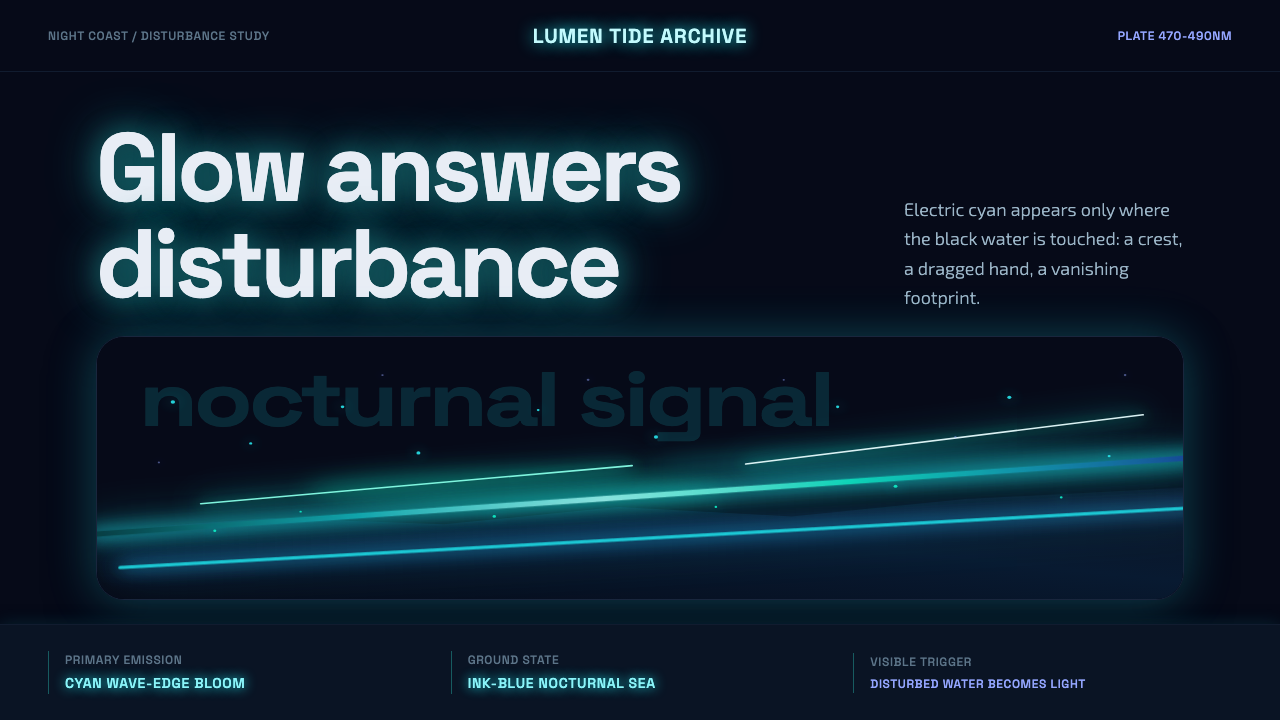 Bioluminescent ShoreDarkness becomes alive. Cyan wave-lines and specks ignite over an ink-blue se…黑暗被唤醒。青蓝浪线与光点在墨蓝海面燃起。
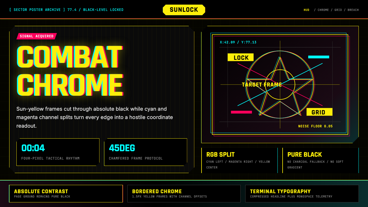 Cyberpunk 2077 Night City YellowCombat HUD on black. Sun-yellow chrome splits into magenta-cyan coordinate gr…黑底战斗HUD:太阳黄框架裂出品红与青色坐标网。
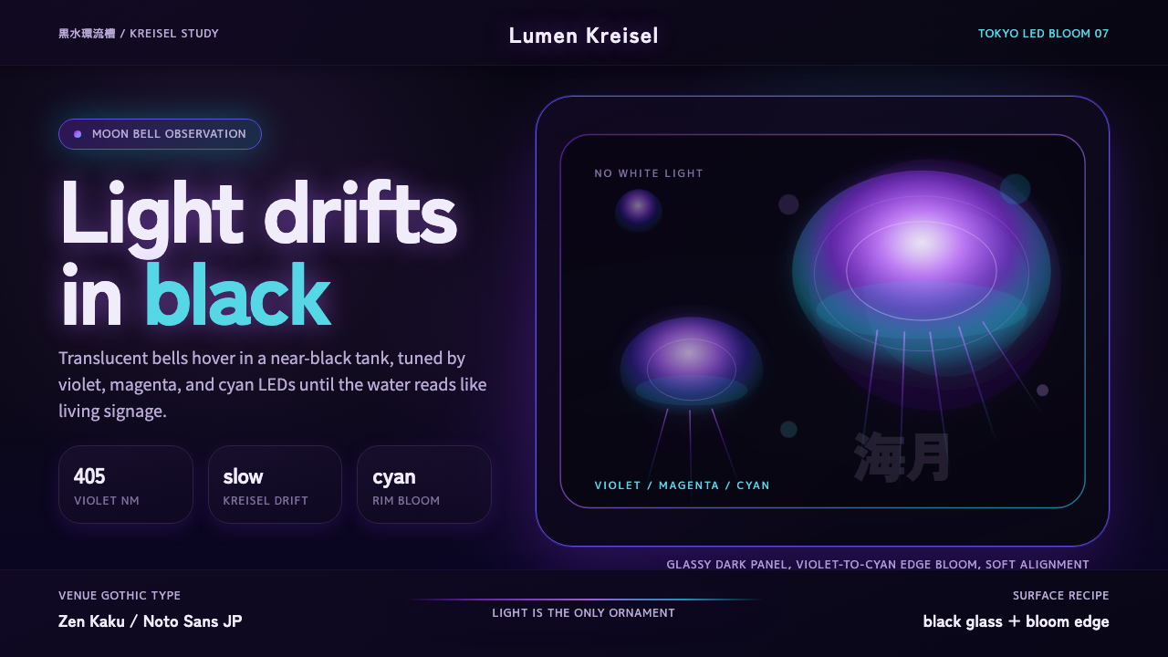 Jellyfish Aquarium StudyLight is the ornament. Violet-cyan glow floats in black glass with venue-goth…光是唯一装饰。紫青冷光漂浮于黑色玻璃,配日式哥特字。
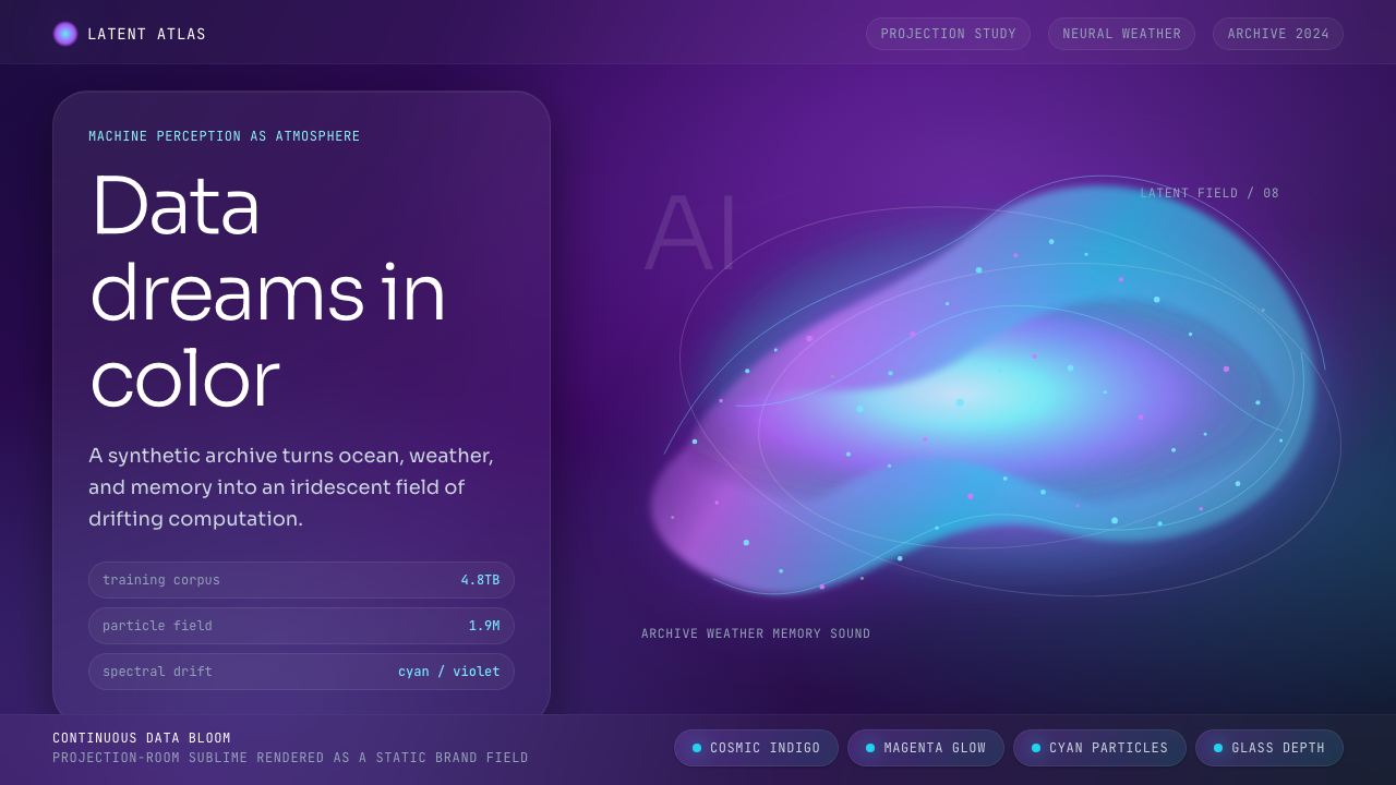 Generative AI Data Art (Refik Anadol era)Computational sublime. Indigo gradients and cyan-magenta particles make data…计算崇高。靛紫渐变与青品红粒子让数据有生命。
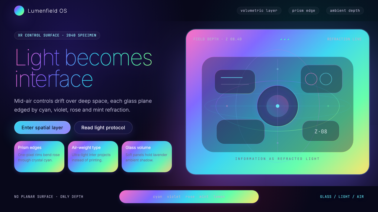 Holographic UI 2040Information made of light. Deep-space black, ultra-light Inter and prismatic…信息由光构成:深空黑、极细 Inter 与棱镜玻璃边缘。