What is Bioluminescent Shore?
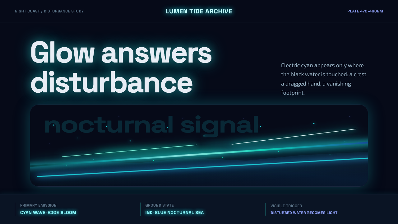
Bioluminescent Shore translates a living natural phenomenon — dinoflagellates igniting broken surf into rivers of electric blue — into a design system built entirely on glow, darkness, and the grammar of light disturbed.
Bioluminescent Shore in brief
Bioluminescent Shore is a dark, phenomenon-driven design style derived from the night-sea glow produced by dinoflagellate blooms — microscopic marine organisms that emit cold blue-green light when agitated by waves, footprints, or the drag of an oar. The system uses this biological spectacle as its sole organizing metaphor: every luminous edge, scattered speck, and wave-line exists because something disturbed the dark and was answered with light.
The visual language is deliberately minimal and atmospheric. A deep ink-blue field — never lightened, never graded toward morning — serves as the universal ground. Over it, cyan-tinted edges and sparse drifting specks describe motion and turbulence without ever filling the darkness. The effect is less decorative than phenomenological: you are not looking at an illustration of the sea; you are looking at the glow the sea makes when it is alive and moving.
Unlike dark styles that compensate with rich gradients, layered textures, or heavy chromatic variety, Bioluminescent Shore commits to restraint. Glow is the only ink; the ink-blue ground is the canvas it burns against. There are no secondary palettes, no warm accents, no competing light sources — only the cold, spectral luminescence of organisms doing what organisms do when disturbed.
Where does Bioluminescent Shore come from?
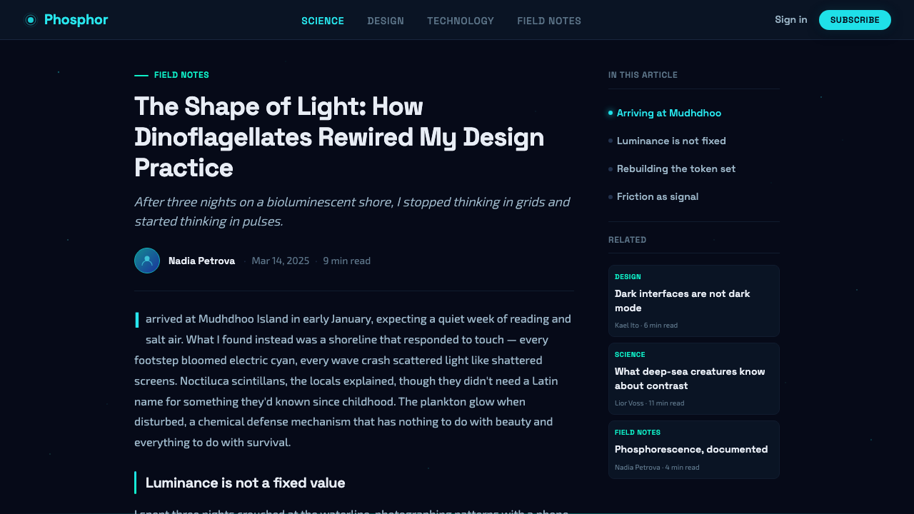
The natural phenomenon at the heart of this style — sea sparkle, or marine bioluminescence — has been documented for centuries. Sailors in the Indian Ocean and South China Sea wrote of phosphorescent water in logs dating to the sixteenth century; Charles Darwin described the effect in his journal during the voyage of the Beagle, marveling at how the ship's wake glowed blue-green in the South Atlantic darkness. The biological mechanism was not understood until the twentieth century, when biochemist Woodland Hastings and colleagues identified the luciferin-luciferase reaction responsible for bioluminescent emission in Noctiluca scintillans — the dinoflagellate species most commonly responsible for the most spectacular coastal blooms.
The most famous contemporary sites for bioluminescent shores are the beaches of the Maldives, Vaadhoo Island in particular, where calm conditions, high dinoflagellate density, and dark skies combine to produce photographs so extraordinary that they circulate repeatedly on social media. These images — long-exposure photographs showing electric-blue shorelines, lit footprints in the sand, and trails of light behind swimmers — established the visual vocabulary that Bioluminescent Shore as a design style inherits. The photography movement around this subject, associated with artists and documentarians like Therese Aceves and a global community of night-ocean photographers, codified the aesthetic: deep black-blue water, cyan glow concentrated at points of contact and disturbance, and sparse celestial-looking specks drifting across otherwise dark water.
As a designed aesthetic, Bioluminescent Shore belongs to a strand of contemporary visual culture that takes natural phenomena — rather than art movements or cultural traditions — as its organizing principle. It is adjacent to the genre of atmospheric naturalism popularized by night-sky and deep-ocean photography, and to the broader culture of long-exposure nature photography that emerged as digital cameras became capable of low-light capture in the 2010s. What distinguishes it from generic 'dark with glowing accents' aesthetics is the specificity of its reference: the light is always cold, always cyan-adjacent, always sparse and punctuated rather than diffuse, and always concentrated at the edge between stillness and disturbance.
The design system's emphasis on phenomenon over decoration places it in an unusual position in the history of dark-mode visual design. Where most dark interfaces reach for depth through gradient and texture, Bioluminescent Shore reaches for biological truth: organisms glow when disturbed, not uniformly, not continuously, and not in warm tones. This fidelity to the source phenomenon gives the style its distinctive restraint and explains why it resists the temptation to add color variety, ambient lighting effects, or decorative complexity.
What defines the Bioluminescent Shore look?
Ink-Blue Ground
The foundational surface is a single, unwavering deep blue — not navy, not black, but the specific blue of a nighttime sea that still carries color. It never lightens at the horizon, never transitions to purple or teal, and never admits gradient. This absolute flatness is what makes the glow elements read as light rather than simply as color: the ground is darkness, and darkness does not grade.
Cyan Luminous Edges
Where elements meet — where a wave breaks, where a line completes, where a boundary is crossed — a cold cyan glow appears. This edge-light is the visual grammar of biological disturbance: things glow where they are touched, not uniformly across their surface. Applied to interface and graphic design, this means reserving the luminous cyan for outlines, strokes, and active or interactive states rather than fills. The glow marks the contact zone, not the volume.
Sparse Light Specks
Drifting particles — small, irregular, cold-blue dots scattered across the dark ground — evoke the individual organisms that produce bioluminescence. Their distribution is never regular or grid-like; they cluster where motion is implied and thin out in still areas. In design applications they function as ambient atmosphere: texture that is subordinate to the composition rather than competitive with it. Too many specks become noise; too few lose the living quality that distinguishes this system from a generic dark background.
Wave-Line Vocabulary
The primary drawn element in this system is the luminous line that traces the crest of a breaking wave — sweeping, irregular, interrupted, and always cold in color temperature. These lines are not decorative curves in the conventional sense; they record the path of disturbance. They carry implied momentum: you know where the wave came from and where it is going. Translated into graphic design, this wave-line vocabulary appears as animated strokes, progress indicators, dividers, and any element where the concept of flow or threshold needs visual form.
Cold Monochrome Palette
The color system is severely constrained: deep ink-blue for the ground, cold cyan for glow, and nothing else. There is no warm accent — no gold, amber, or coral — because biological bioluminescence in the dinoflagellate context is chemically fixed at the cold blue-green end of the spectrum. This monochromatic discipline means that hierarchy, emphasis, and attention are managed entirely through luminosity — how bright something glows — rather than through hue contrast. It is a demanding constraint, but one that ensures internal coherence.
Darkness as Canvas
In most design systems, the background is neutral — white, off-white, a light gray — chosen to stay out of the way. In Bioluminescent Shore, the darkness is active. It is what the glow is defined against; without the depth of the ink-blue ground, the cyan edges would lose their luminous character entirely. Compositions are designed so that the unlit areas carry as much compositional weight as the lit ones. Negative space is dark space, and dark space is not empty — it is the sea.
Implied Motion
Bioluminescent glow in nature only appears when something moves. The design system carries this causal logic into its static compositions: every luminous element implies the motion that created it. Wave-lines sweep; specks drift; edges glow where something passed through the darkness. Even in a still image, the system suggests animation — a quality that makes it especially powerful when actual motion (transitions, microinteractions, loading states) is added. The style is, in a sense, always on the edge of becoming a film.
Who shaped Bioluminescent Shore?
The species most responsible for the spectacular coastal bioluminescent blooms that inspired this aesthetic. Noctiluca — Latin for 'night light' — is a non-photosynthetic dinoflagellate that consumes other organisms and accumulates in warm, nutrient-rich coastal waters. When agitated by wave action, it releases a flash of cold blue-green light lasting a fraction of a second. Dense populations produce the sheets and rivers of light photographed on Maldivian beaches. Its behavior is the visual grammar of the entire design system: light only when disturbed, concentrated at the point of disturbance, cold in temperature.
The biochemist whose decades of research into marine bioluminescence established the molecular basis for dinoflagellate light production. Hastings, working at Harvard from the 1960s onwards, identified and characterized the circadian regulation of bioluminescence in Gonyaulax polyedra (now Lingulodinium polyedrum), demonstrating that the organisms produce their glow on a biological clock tied to the tidal and day-night cycle. His work transformed bioluminescence from a maritime curiosity into a understood biological system, enabling the later scientific and visual culture that Bioluminescent Shore draws from.
One of the photographers and visual documentarians associated with the genre of bioluminescent shore photography that codified the aesthetic for a broad visual-culture audience. Long-exposure night photography of glowing surf and luminescent footprints — the genre Aceves and peers developed — established the specific visual conventions that Bioluminescent Shore as a design system directly inherits: the precise color temperature of the glow, the compositional relationship between dark ground and sparse light, and the wave-line as the primary drawn element.
The location most closely associated with the contemporary cultural dissemination of bioluminescent shore imagery. The combination of calm lagoon conditions, consistently high dinoflagellate populations, and the island's distance from light pollution makes Vaadhoo a recurring site for the long-exposure photographs that went viral in the early 2010s and established the aesthetic as a recognizable visual genre. As a landmark rather than a person, Vaadhoo represents the geographic specificity of the style's source: this is not a generic tropical beach but a particular ecological and optical configuration that only occurs under specific conditions.
The photographic movement — rather than a single figure — that translated bioluminescent shore phenomena into the visual vocabulary available to designers. Long-exposure photography, which integrates the light emitted over seconds or minutes into a single frame, is the only technique that makes sparse bioluminescent glow visible to human viewers in its full intensity. The aesthetic conventions of this photographic tradition — dark foreground water, lit crest lines, drifting specks, absence of any warm color — are the direct sources of the design system's visual grammar.
How do you use Bioluminescent Shore today?
Bioluminescent Shore is a high-specificity style: it creates a strong, immediate atmosphere but operates within a narrow range of applications. Its strengths are drama, distinctiveness, and the ability to make digital interfaces feel alive and dynamic without relying on explicit animation. Its constraint is the total commitment to darkness — any context requiring readability on a light background, or any brand requiring warmth or approachability, will fight the system rather than work with it.
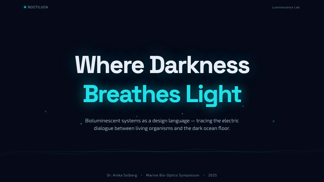
For presentation slides, the style is most powerful on title and transition frames rather than content-heavy pages. A full-bleed ink-blue cover with cyan wave-lines sweeping through the composition and a title in cold-white type creates an instantly memorable opening. For content slides, the approach requires restraint: white or very light type on the deep ground, with cyan used only for active data points, highlighted terms, or interactive callouts. Data visualizations work well when chart elements are rendered as luminous rather than filled — line charts with glowing strokes, scatter plots where each data point reads as a speck of bioluminescent light.
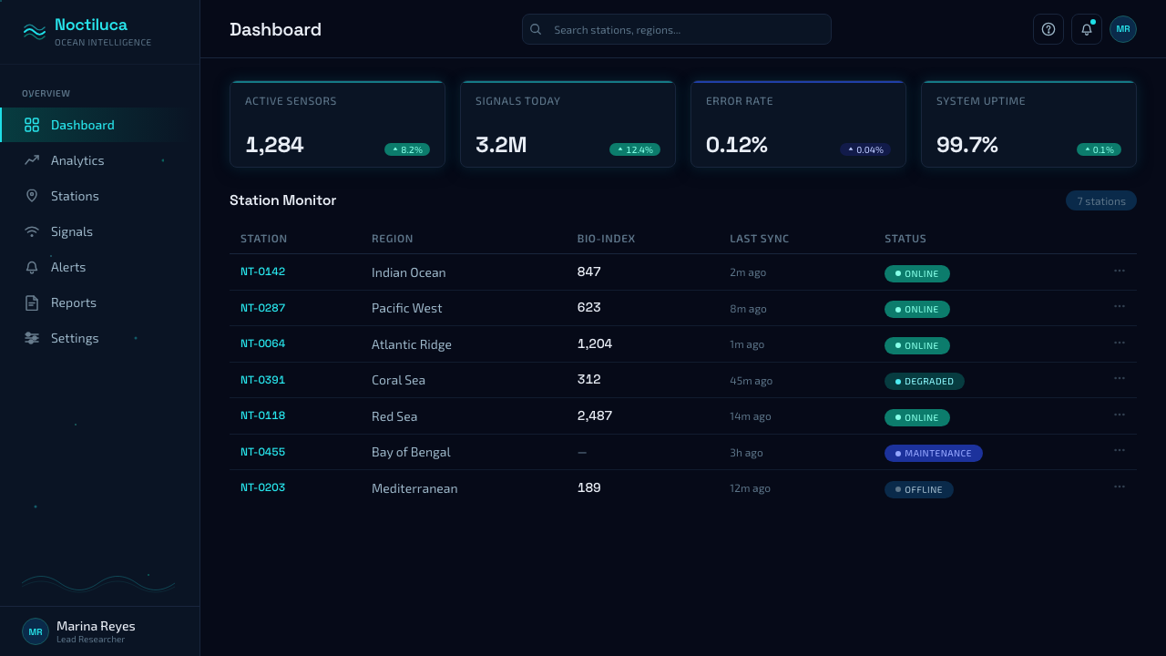
For web and app interfaces, Bioluminescent Shore is naturally suited to products that occupy conceptual territory adjacent to the ocean, night, science, exploration, or atmospheric environments: marine research tools, meditation and ambient sound applications, dark-mode productivity tools, space and astronomy interfaces, and generative or AI-facing products where a sense of emergent life is desired. In these contexts, interactive states — hover, focus, active — can be expressed as a brightening of the cyan edge glow, as if the user's touch is the disturbance that makes the element light up.
For editorial and marketing work, the style has a strong poster character. Full-bleed dark compositions with sparse cyan linework and a single large headline in a light, extended typeface produce materials that are immediately recognizable and resist the visual noise of competing content. Marketing campaigns benefit from the style's singularity: once established, the ink-blue plus cold-cyan system is distinctive enough to function as a brand signature across touchpoints.
The most common mistake in applying Bioluminescent Shore is brightness creep — adding warmth, lightening the ground, or introducing additional colors to make the interface feel more inviting. Each of these moves undermines the fundamental logic of the style: the dark must be genuinely dark, the glow must be genuinely cold, and the specks must be genuinely sparse. A background that is blue-grey rather than ink-blue, a glow that drifts toward white rather than staying cyan, or a particle density that is decorative rather than atmospheric — any of these reduces the system to generic 'dark mode with glowing accents', losing the phenomenological specificity that makes the style distinctive.
Bioluminescent Shore — FAQ
How is Bioluminescent Shore different from a generic dark UI with neon accents?
The difference is phenomenological specificity. Generic dark-neon interfaces use bright colors as decoration — they are chosen for contrast and visual energy without reference to any organizing logic. Bioluminescent Shore uses a single, cold, biologically accurate glow color because that is what the source phenomenon actually produces. The darkness is a specific ink-blue because that is what a nighttime sea looks like. The light concentrates at edges and disturbances because that is where dinoflagellates glow. These constraints, taken seriously, produce a visual system with internal coherence rather than arbitrary style. The practical test: if you can swap the neon accent for a different color without breaking the logic of the composition, you are looking at generic dark-neon. In Bioluminescent Shore, the cyan is not interchangeable.
Can this style work for a brand that is not ocean-related?
Yes, with appropriate framing. The style works when its emotional registers — discovery, emergence, latent life, the edge between stillness and motion, phenomena that only appear under specific conditions — align with what the brand is trying to communicate. A generative AI product that wants to convey latent intelligence becoming visible; a scientific or research brand that wants to emphasize discovery in darkness; a premium consumer tech product targeting a nocturnal, high-engagement audience — all of these can work with Bioluminescent Shore without any literal ocean connection. What makes it fail in non-ocean contexts is forced literalism: wave animations and marine imagery that underscore the source rather than the feeling. The feeling is transferable; the fish are not.
Does the style require animation to work, or does it function in static contexts?
It functions in static contexts, but its logic implies motion even when none is present. The wave-lines carry directional momentum; the scattered specks suggest drift; the edge glow implies a moment of contact. A well-composed static piece in this style creates a sense of suspended animation — a frame pulled from a film that is perpetually playing. When animation is added, it should not be gratuitous: the appropriate motion is the motion the source phenomenon actually makes. Specks drift slowly. Wave-lines sweep and dissipate. Edge glow pulses at the rhythm of something being touched. Rapid, chaotic, or warm-colored animation breaks the phenomenological logic and immediately reads as generic.
How should typography be handled in Bioluminescent Shore?
Typography in this system is primarily a carrier of light rather than a statement in its own right. The approach is to minimize typographic weight and complexity so that text sits within the dark field rather than fighting it. Light or thin weight typefaces in near-white or cold-white read as the quieter companions of the luminous graphic elements. Headlines can be large and confident, but they should maintain the cool neutrality of the palette — a warm serif or an expressive script will read as a foreign element. The glow treatment can be applied selectively to key words or data labels, treating them as edges caught in bioluminescent light, but this should be used rarely: over-glowing text becomes unreadable and loses the specificity that makes single glowing elements compelling.
Is Bioluminescent Shore appropriate for accessible design, given its reliance on a dark ground and low-contrast palette?
Accessibility in this system requires deliberate management. The ink-blue ground paired with pure cyan glow can produce luminance contrast ratios that fall below WCAG AA thresholds for body text, particularly in passages of small type. The solution is not to abandon the dark ground but to reserve the pure cyan treatment for graphical and decorative elements while ensuring that all text critical to navigation or comprehension is rendered in near-white at sufficient size and weight to pass contrast requirements. The deep ink-blue ground itself supports good contrast for light-colored text; the problem arises specifically when cyan — which is mid-luminance against the dark background — is used for textual content. Think of the cyan as the glow of the water, and the white type as the thing you came to read on the boat.
Related design styles
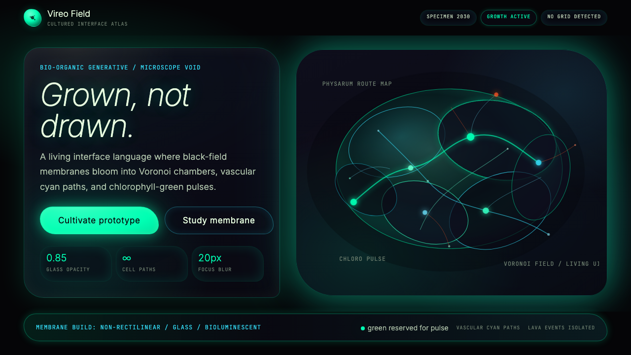 Bio-Organic GenerativeInterfaces feel cultured. Void black, Voronoi membranes, and neon chlorophyll…
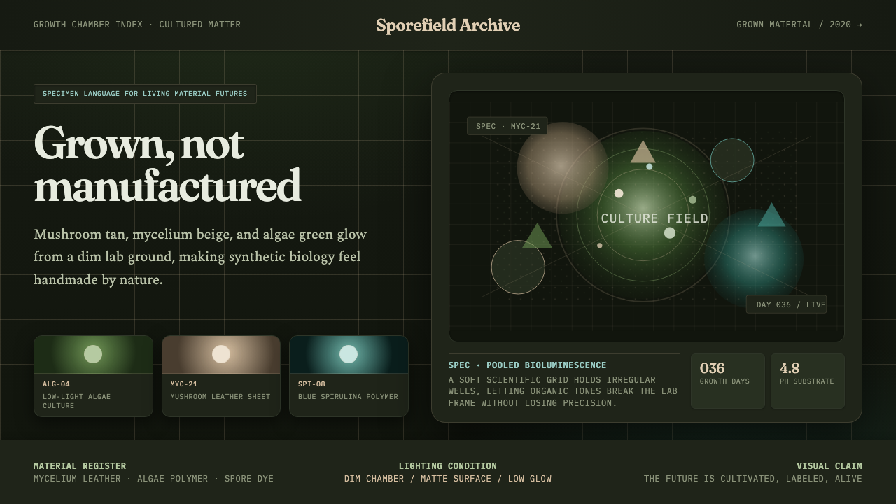 Biopunk GrownLife replaces industry. Algae green glows on chamber dark with serif voice an…
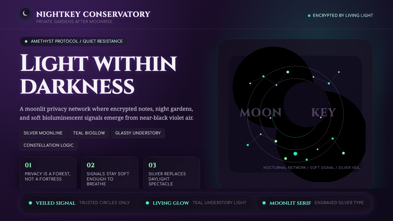 LunarpunkLight hides in darkness. Amethyst night, silver serif, and teal bioglow surfa…
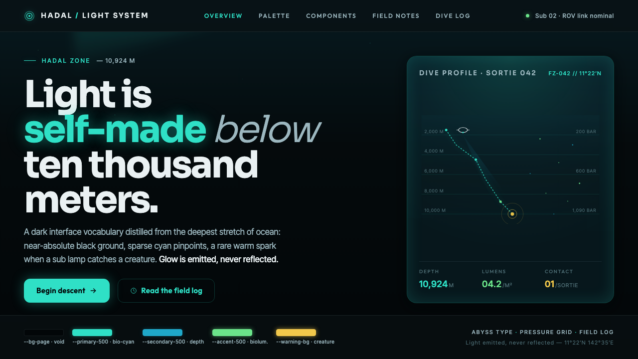 Mariana TrenchLight is self-made below ten thousand meters. Hadal-black ground, cyan pinpoi…
 Raised by WolvesBleached neo-religious silence. Ash-gray tundra, austere Cormorant serif, one…
 Salt Crystal EvaporiteCrystalline and cold. Salt-white cubes float over turquoise brine in a hard l…