What is Abyssal Bioluminescence?
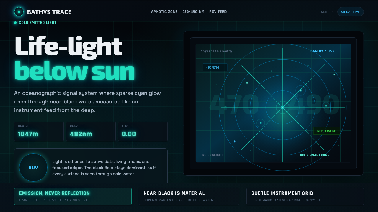
Abyssal Bioluminescence is a design language born in the deepest, darkest corners of the ocean — a system where darkness is the dominant material, light is precious and rationed, and every glowing element behaves as if it were emitted rather than reflected.
Abyssal Bioluminescence in brief
Abyssal Bioluminescence is a design aesthetic derived from deep-sea exploration imagery — the visual world captured by remotely operated vehicles (ROVs) and submersibles operating below 1000 metres, where no sunlight penetrates. In this zone, the only light is cold biological light: bioluminescent organisms emitting narrow-spectrum blue-green glows against an effectively infinite field of near-black water. The visual system transposes this phenomenon directly into interface and graphic design.
The aesthetic is built on a fundamental inversion of how most design systems work. Rather than placing dark type or marks onto a light background, bioluminescence places luminous marks — electric cyan pinpoints, soft halos, delicate lattice lines — onto a ground that is as close to absolute black as a screen or printed surface can achieve. Color is not applied over surfaces; it appears to radiate from within them. Glow is controlled, almost miserly: just enough to resolve a form, no more.
The design vocabulary is specific and sourced: sonar-grid overlays, depth-gauge readouts, instrument panel typography, the diffraction halos that form when bioluminescent pulses propagate through water. These are not decorative metaphors but structural references — the style's grammar is the grammar of oceanographic instruments and the organisms those instruments observe. The result reads simultaneously as scientific visualization and as a particular kind of cold, pressurized beauty.
Where does Abyssal Bioluminescence come from?
Marine bioluminescence has been observed and documented since the age of sail — sailors reported the ocean's surface igniting with cold blue fire at night, a phenomenon now understood as the bioluminescence of dinoflagellates. But the aesthetic as a designed visual language emerged with the deep-sea imaging programs of the late twentieth century. The development of remotely operated vehicles capable of operating at full ocean depth, beginning seriously in the 1980s with programs at NOAA Ocean Exploration and Woods Hole Oceanographic Institution, produced the first systematic visual record of the aphotic zone. These ROV camera feeds — low-light sensors recording against pure darkness, picking up the glow of anglerfish lures, jellyfish pulses, and bacterial colonies on hydrothermal vents — established the visual grammar that the design system inherits.
The bioluminescence of marine organisms is not incidental. It evolved under extreme selective pressure: in an environment where there is no ambient light, an organism that can produce its own light gains enormous advantages in predation, mate-finding, and communication. The specific wavelength of peak marine bioluminescence — concentrated in the blue-green portion of the visible spectrum at roughly 470 to 490 nanometres — is not aesthetic preference but physics. Blue-green light travels farther through seawater than any other visible wavelength before being absorbed, making it the optimal signal carrier for the deep. When designers borrow this color, they inherit a reason: it is the frequency that travels farthest through darkness.
Key organisms that have shaped the visual language include the jellyfish Aequorea victoria, whose bioluminescence led to the discovery of green fluorescent protein (GFP) and transformed biological imaging; the anglerfish, whose esca — the luminous lure dangling from a modified dorsal spine — represents perhaps the most dramatic example of light as predatory instrument; and the genus Malacosteus, a dragonfish capable of producing far-red light invisible to most deep-sea species, giving it a private communication channel in the darkness. These organisms do not merely inspire the aesthetic — they are its source documents.
The crossover into design culture accelerated with the popularization of dark-mode interfaces in the 2010s and the simultaneous public appetite for deep-sea documentary footage — driven by productions documenting exploration expeditions and deep-ocean ecosystems. The visual language of oceanographic science — glowing traces on dark monitors, sonar returns as arcs of light, depth profiles as illuminated curves — migrated into data visualization, science-communication design, and eventually into the broader visual culture of speculative and futurist interface design.
What defines the Abyssal Bioluminescence look?
Light Emission vs. Reflection
The defining structural difference between bioluminescent design and conventional dark-mode design is the nature of light. Conventional dark-mode places gray or white elements on a dark background — those elements appear lit by an ambient or directional source, the same way objects in a room appear lit. Bioluminescent design treats every glowing element as a light source in itself: the cyan trace on a graph line appears to radiate outward, not to reflect inward. Achieving this requires careful control of glow intensity — too much, and the surface looks like a neon sign; too little, and it collapses back into conventional dark-mode. The target is a level of luminosity that reads as biological: cold, faint, precise.
Color Economy
The palette is severely restricted by design, not by accident. Deep-sea bioluminescence is genuinely near-monochromatic: the overwhelming majority of organisms emit in the blue-green band, with rare exceptions producing red or violet. Accordingly, the design system uses one dominant emission color — a cold electric cyan — as its primary signal, with near-black as the ground and deep navy or dark teal as mid-ground. Secondary colors, when they appear, mark biological anomalies: the red channel for danger or warning, a warmer amber for thermal signals. A palette that uses several vivid colors simultaneously violates the logic of the system entirely — in the real abyss, multiple bright lights would indicate something extraordinary or threatening.
Glow and Diffusion
Biological light in seawater does not travel in hard, sharp rays — it diffracts, scatters, and forms soft radiant halos around its source. This physical behavior is the structural principle behind the style's treatment of light-emitting elements. Lines and points carry a soft outer glow: the core remains bright and precise, while the surrounding area falls off gradually into the dark ground. This diffusion must be calibrated — if the glow radius is too wide, the composition loses resolution and everything merges into an undifferentiated luminous fog. The discipline is to keep the central form sharply defined while allowing only a short, controlled diffusion zone around it.
Grid and Instrument Structure
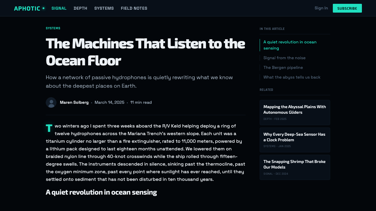
The structural skeleton of the aesthetic is drawn from oceanographic instrumentation — sonar displays, depth gauges, navigation grids, spectrometer readouts. These instruments share visual characteristics: fine orthogonal or radial grid lines rendered at very low luminosity, tick marks and scale numerals at regular intervals, primary data traces in a high-contrast emission color. In design terms, this translates to a grid system that is visible but recessive — present enough to organize the composition, quiet enough not to compete with the data it frames. Grid lines in this system are themselves tiny light sources, not dark rules on a bright field.
Depth and Layering
The deep-sea visual environment is one of extreme depth: there is distance between the observer and the light source, and that distance is filled with absorptive dark matter. Design using this aesthetic simulates depth not through geometric perspective but through luminosity gradation. Elements closest to the viewer — the most important, the most interactive — are most luminous. Deeper elements appear dimmer, absorbed by the surrounding darkness, as if observed through intervening water. This creates a hierarchy that is entirely atmospheric: brightness equals proximity equals importance. No drop shadows, no perspective grids — depth is encoded purely in how much light an element appears to emit.
Typography as Instrument Readout
Type in this system behaves like numbers on a depth gauge or sonar return label — functional, monospacial in feel if not in actual format, rendered in a cold light against pure darkness. Monospaced or geometric sans-serif letterforms are native to the aesthetic, as they carry the register of technical instrumentation without decoration. Type scale is used to distinguish signal from metadata: primary information appears at the maximum legible brightness, secondary data recedes toward the luminosity of the grid lines themselves. Running text at length is uncommon in the style — it belongs to interfaces that present discrete data points, not extended prose.
Restraint and Rarity of Light
Perhaps the most important discipline of the aesthetic is that light is rare. In the real abyss, a square kilometre of water might contain only a handful of bioluminescent flashes at any given moment. Design that applies glow to every element, or that allows the luminous color to dominate large continuous areas, misreads the source material entirely. True bioluminescent design is mostly dark — the darkness is the composition, and the light is the exception that gives the darkness meaning. This demands restraint from designers accustomed to filling space: the impulse to add another glowing element, another data trace, another gradient halo should be resisted in favor of letting the existing lights carry more weight by having more dark around them.
Who shaped Abyssal Bioluminescence?
The National Oceanic and Atmospheric Administration's Ocean Exploration program has operated ROV expeditions into the deep ocean since the 1980s, producing the most extensive publicly available archive of deep-sea imagery in the world. Its camera feeds — low-light sensors capturing bioluminescent organisms against pure black water — established the visual grammar that the design aesthetic inherits. NOAA made this footage available to the public, seeding deep-sea imagery into documentary culture, science communication, and eventually design practice.
The crystal jellyfish of the Pacific coast, Aequorea victoria, is the organism whose bioluminescence led to the isolation and characterization of green fluorescent protein (GFP) in the 1960s and 1970s. GFP became the most widely used molecular tag in biology, enabling scientists to make individual cells and proteins visible under fluorescent illumination. The jellyfish's own bioluminescence — a cold, precisely focused ring of blue-green light at the margin of its bell — is a precise visual archetype for the aesthetic: luminous, geometrically clean, and produced by a living organism rather than an electrical source.
The stoplight loosejaw dragonfish, Malacosteus niger, is one of the only deep-sea organisms capable of producing and perceiving far-red light — a wavelength invisible to most other species in the aphotic zone. This gives it a private optical channel: it can illuminate prey or communicate with conspecifics while remaining invisible to competitors. In design terms, Malacosteus represents the principle of frequency specificity — the idea that different channels of light carry different kinds of information, and that choosing the right frequency is a functional, not decorative, decision.
The Smithsonian Institution's Ocean Portal project assembled and publicly released one of the largest curated archives of deep-sea bioluminescence photography and video, including material from expedition partnerships with MBARI (Monterey Bay Aquarium Research Institute) and other oceanographic organizations. This resource accelerated the movement of deep-sea visual language into public design culture by providing high-quality, rights-cleared imagery to educators, science communicators, and designers. The Portal's visual framing — dark backgrounds, isolated organisms, clinical annotation — established conventions that design systems like this one extend into interface and graphic contexts.
Marine biologist Edith Widder developed the Eye-in-the-Sea — a deep-sea camera system designed to observe bioluminescent organisms without disturbing them using red light (which deep-sea organisms cannot see). Her research quantified what percentage of deep-sea organisms are bioluminescent — the answer turned out to be approximately 76 percent — transforming bioluminescence from a curiosity into a foundational ecological principle of the deep ocean. Widder's scientific photography and public communication work brought deep-sea bioluminescent imagery to wide attention, contributing to its entry into visual culture.
How do you use Abyssal Bioluminescence today?
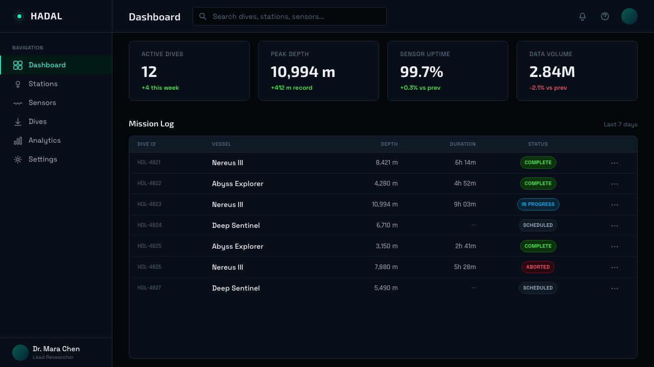
Abyssal Bioluminescence is most at home in interfaces and presentations where data is the primary content and atmosphere is a design objective. The style is well-matched to contexts that need to feel precise, technical, and quietly remarkable — monitoring dashboards, scientific data presentations, speculative technology demonstrations, and products that want to position themselves as operating at the frontier of something. Applying it begins with the ground: the background should be as dark as the context allows, avoiding the temptation to brighten it in the name of accessibility. Accessibility needs should be met by increasing the luminosity of text and interactive elements, not by lightening the background.
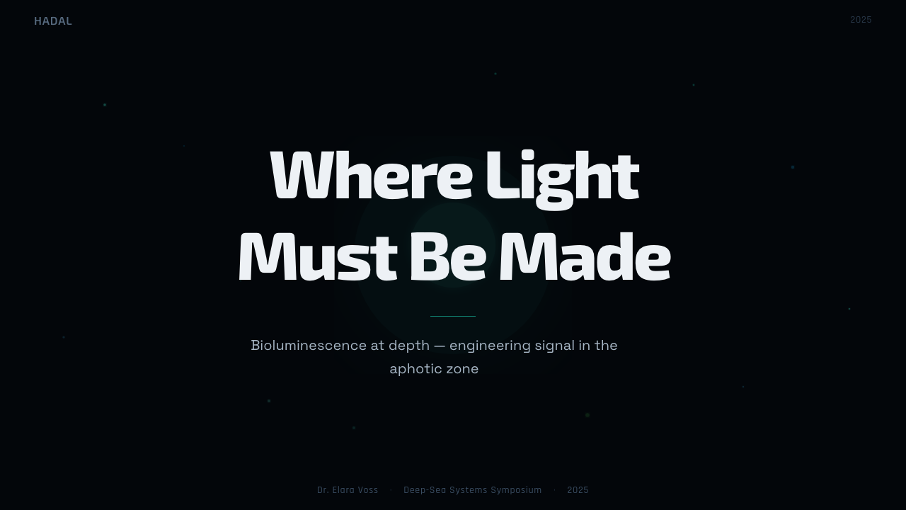
For presentation slides, the style works most effectively with sparse layouts. A cover slide benefits from a single large luminous element — a radial grid, a data arc, an isolated organism-like shape — set against the dark ground with the title in clean, cool-toned type. Content slides should carry only the information they need: one chart, one data visualization, one set of labels. Multiple competing glowing elements on a single slide produce visual noise that reads as the opposite of the deep-sea aesthetic's precision. Data visualizations are the style's strongest application — line charts become bioluminescent traces, scatter plots become fields of organisms, network graphs become neural or vascular systems lit from within.
For web and interface design, the style is suited to dashboards, command-line interfaces styled for mainstream audiences, dark-mode applications in technical or scientific domains, and marketing pages for products in space technology, oceanographic research, advanced medical imaging, or related fields. The grid structure should be visible but quiet — fine lines that organize without asserting. Interactive states should increase luminosity: a hovered button should appear to glow more intensely, not simply change color. Avoid using the style for consumer-facing emotional contexts: health and wellness applications, food and beverage brands, products for children, or anything where warmth and organic quality are core values. The style's coldness and precision will read as clinical or alienating in these contexts.
For editorial and marketing design — posters, covers, feature spreads — the aesthetic supports a sense of discovery and scientific authority. A magazine spread using the style might place a single glowing diagram in negative space on a dark page, with type that appears to float at depth. Marketing applications work best when they commit to the logic fully: a product page where every interactive element appears to emit rather than reflect, where the hierarchy is encoded entirely in luminosity, and where the large stretches of dark ground are left intentionally empty rather than filled.
The most common mistake when applying this style is adding too much light. Designers trained to fill space, to provide visual richness, and to reward the eye at every corner will instinctively increase the number of glowing elements, widen the glow radii, and brighten the mid-ground. Each of these moves undermines the style's fundamental principle: that light is precious because it is rare. A composition where 40 percent of the surface is luminous is not a bioluminescent composition — it is a neon sign. Authentic work in this aesthetic should feel like looking at something that is mostly dark, with a few specific, carefully placed lights doing all the work.
Abyssal Bioluminescence — FAQ
Is Abyssal Bioluminescence the same as a generic dark mode or cyberpunk aesthetic?
No, though they share the dark-background convention. Cyberpunk aesthetics typically use high-saturation neon colors across multiple hues — magenta, yellow, cyan — often simultaneously, with heavy glitch textures and urban visual references. Generic dark mode is simply a light-mode interface with the values inverted, making no particular claim about how light behaves. Bioluminescent design is distinguished by two things: a severe color restriction (one primary emission color, near-monochromatic) and a specific physical logic (light is emitted, not reflected; it halos, diffracts, and diminishes with distance through an absorptive medium). The underlying reference is science, not fiction, and the result is colder and more restrained than either cyberpunk or generic dark interfaces.
Can this style be used on a light background?
Technically possible but structurally contradictory. The entire logic of the aesthetic depends on the ground being dark: light is only precious, only rationed, only readable as emission rather than reflection when it appears against near-absolute darkness. On a light background, a glowing cyan element does not read as bioluminescent — it reads as a colored mark, like any other. The style loses its defining quality entirely. If a light-background application is unavoidable, the approach should be treated as a reference or allusion to the aesthetic — borrowing the sonar grid and the monospaced type — rather than a full implementation of it.
How is depth conveyed without drop shadows or perspective grids?
Through luminosity gradation. In the deep ocean, the closer an object is to your light source, the brighter it appears; as distance increases, absorption by the water column dims the light exponentially. The design system maps this physical behavior directly: the most luminous elements are closest, most important, most interactive. Elements that exist as supporting structure — grid lines, scale marks, metadata labels — appear at the lowest perceptible luminosity. This creates a layered depth field that is encoded entirely in brightness, without any simulated spatial geometry. The technique is more atmospheric than architectural — it creates a sense of depth that you feel rather than measure.
What typographic choices work best with this aesthetic?
The style is most legible and most authentic with typefaces that carry an instrument or technical register — geometric sans-serifs with consistent stroke width, or monospaced faces associated with terminal and scientific display contexts. High-contrast serifs and humanist sans-serifs both introduce warmth and organic quality that conflicts with the coldness of the aesthetic. Italic and oblique settings are generally avoided — they suggest motion and informality. Type should be set at conservative sizes with generous tracking, so that individual characters appear as precise, isolated marks rather than dense blocks. The palette discipline extends to type: body text and labels should sit at the lower end of the luminosity range, with only primary data callouts or headings at full emission intensity.
Does this style suit animation and motion design?
Exceptionally well, for specific kinds of motion. Bioluminescent organisms do not move randomly — they pulse, fade, trail, and propagate in ways that have biological purpose. The style's motion vocabulary follows the same constraints: pulses that emanate from a point source and fade radially outward, traces that draw themselves along a path and then dim, data that arrives in discrete beats rather than continuous streams. Motion that uses ease curves modeled on biological pulse patterns — fast attack, long decay — will feel native to the aesthetic. Motion that is rapid, jumpy, or uses springs and bounces is alien to the style. The deep ocean is slow, cold, and pressurized; its motion is deliberate.
Related design styles
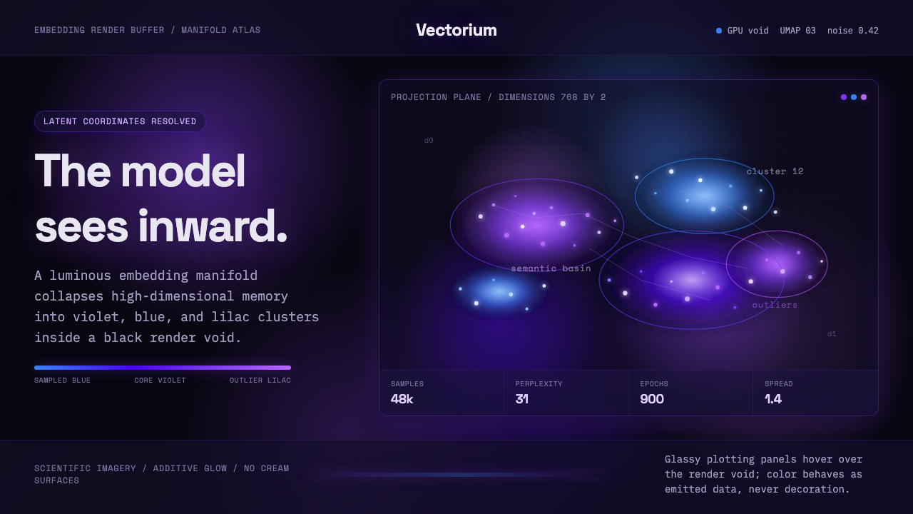 Latent SpaceSees the model from inside. Violet-blue point clouds glow on a black GPU void.
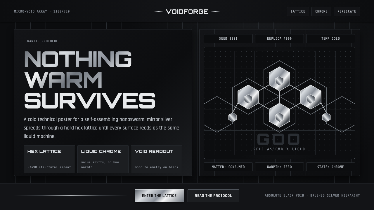 Nanopunk Grey GooColdness self-replicates. Chrome gradients and hex lattices spread across a b…
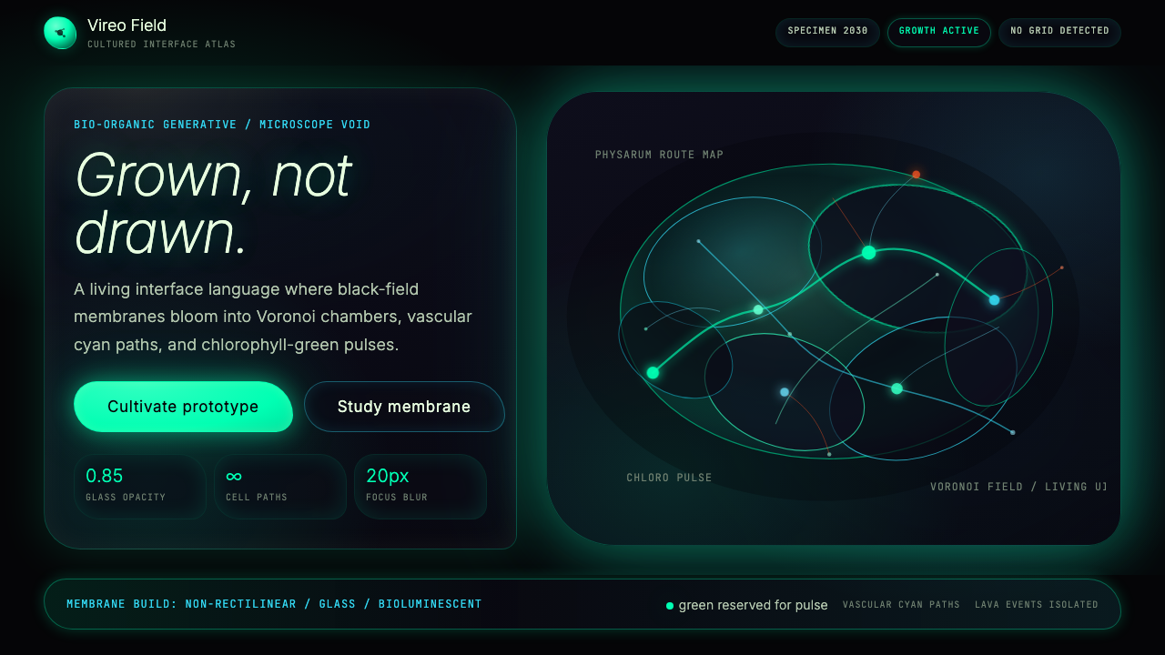 Bio-Organic GenerativeInterfaces feel cultured. Void black, Voronoi membranes, and neon chlorophyll…
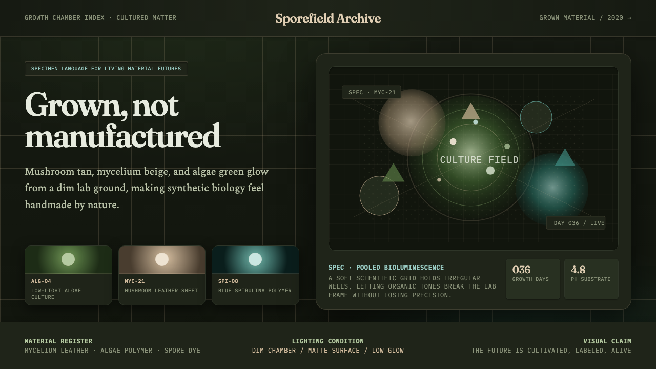 Biopunk GrownLife replaces industry. Algae green glows on chamber dark with serif voice an…
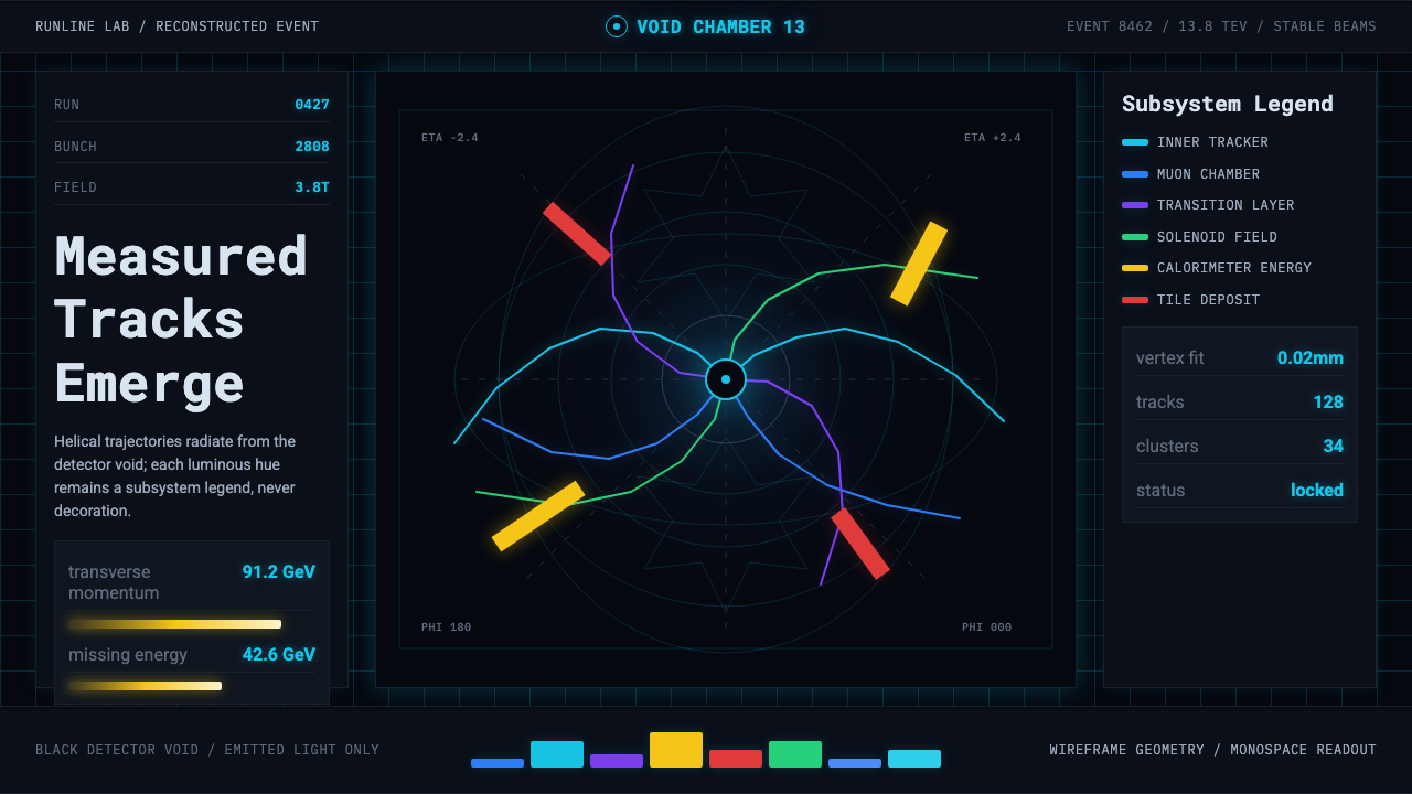 CERN CollisionData, not spectacle. Cyan tracks on black wireframes make every subsystem col…
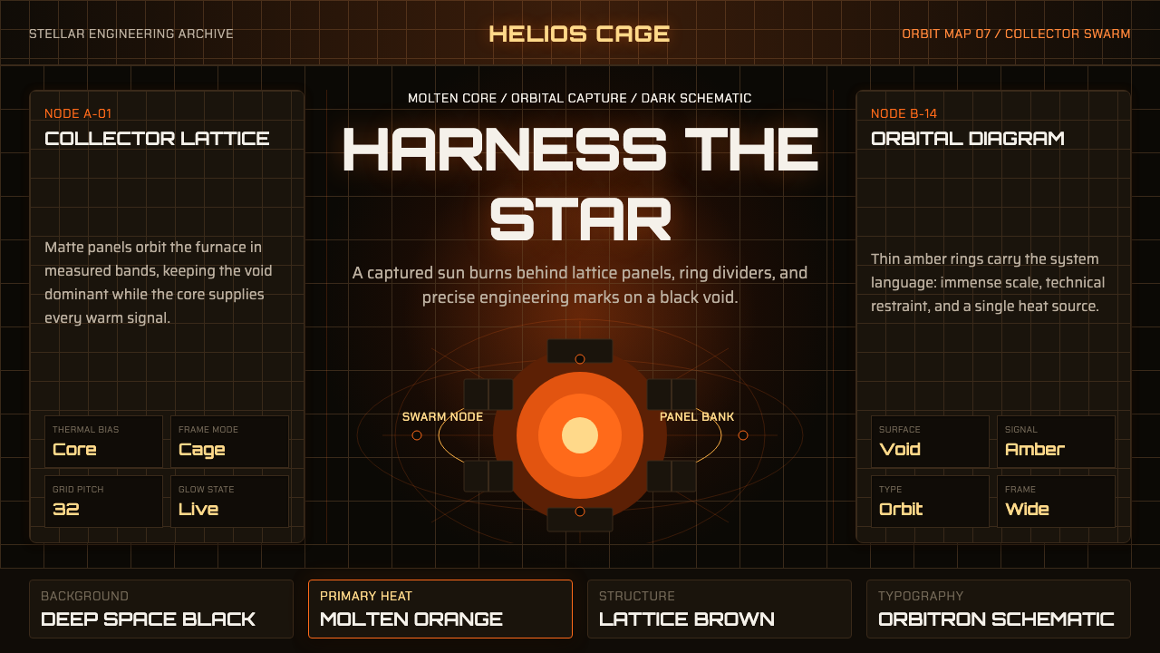 Dyson Sphere MegastructureCold void, captive heat. Molten orange core caged by brown lattice and orbita…