What is Mycelium Network?
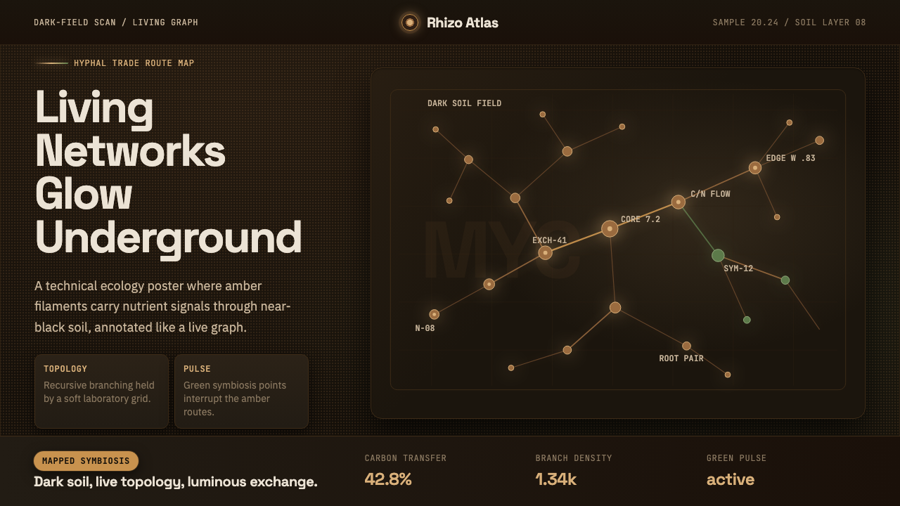
Mycelium Network turns the underground trade routes of forest fungi into a design language — glowing filaments, recursive branching, and node-labeled data reading like a living map instead of a nature photograph.
Mycelium Network in brief
Mycelium Network is a design system built from the visual logic of dark-field microscopy scans of mycorrhizal fungal networks — the branching filaments, known as hyphae, that fungi use to connect to and trade nutrients with tree roots beneath the forest floor. Rather than illustrating a mushroom or a forest scene, the style borrows the scan itself: a near-black ground pierced by luminous, thread-like structures that fork and rejoin in irregular, fractal patterns.
The aesthetic reads as scientific instrumentation rather than botanical illustration. Where a nature documentary would show bark, soil, and leaf litter, this system shows only the network — glowing lines against darkness, annotated with the clipped, monospaced labels of a lab dataset. The effect sits closer to a subway map of nutrient exchange, or a screenshot from a live sensor array, than to anything pastoral.
This makes it a natural fit for interfaces that are themselves about invisible networks: systems dashboards, dependency graphs, distributed infrastructure, financial flows, or any product whose core metaphor is nodes trading something through connective threads. The style communicates complexity and quiet intelligence without needing to say either word.
Where does Mycelium Network come from?
Mycelium as a subject of scientific fascination has deep roots, but the specific visual language this theme draws on is recent and technical. Mycorrhizal networks — the symbiotic partnerships between fungi and plant roots — have been studied by botanists and mycologists for well over a century, but it took modern imaging techniques to make the networks themselves visible as branching, glowing structures rather than abstractions described in text.
The decisive moment for this aesthetic came in 2024, when AMOLF researcher Loreto Oyarte Gálvez and colleagues published detailed dark-field scans mapping the growth and nutrient-trading behavior of mycorrhizal fungi in real time. The imaging technique captured fungal filaments as they extended across a dark growth medium, recording not just their shape but their activity — effectively rendering a living "trade network" as a time-lapse of light against black ground. Popular science coverage described these networks as something close to an underground internet for trees, a framing that has stuck in both scientific communication and design borrowing from it.
This scan-derived aesthetic sits at the intersection of two older lineages: fungal ecology, which has spent decades reframing mycelium from a decomposer footnote into a subject of network-scale intelligence research (popularized further by writers like Merlin Sheldrake and researchers like Toby Kiers, whose Society for the Protection of Underground Networks has pushed public attention toward mapping the planet's fungal networks); and network science and data visualization, the decades-old practice of rendering abstract relationships — social graphs, internet topology, neural connections — as glowing nodes and edges on dark backgrounds.
The design system deliberately departs from biological accuracy in one key way: living mycelium is typically whitish or cream in color, not amber. This theme keeps the dark-field scan's black ground but recolors the filaments into a warm, glowing amber, closer to bioluminescence or heat-map data than to a literal photograph. The choice signals that this is a designed interpretation of the science — a network visualization inspired by mycology — rather than an attempt to reproduce a lab photograph exactly.
What defines the Mycelium Network look?
Color
The ground is a near-black soil tone, deep enough to read as underground darkness rather than plain black. Against it, the primary accent is a glowing soil-amber — warm, saturated, and used for the filament lines themselves, as if lit from within rather than reflecting external light. A second, quieter accent appears as a faint symbiosis-green, used sparingly to suggest a second kind of signal moving through the same network — a status indicator or a different data channel — rather than competing with the amber for attention. White or near-white is reserved for text and fine annotation, never for large fields.
Line and Branching
The defining visual motif is the hypha itself: a thin, organic line that forks at irregular intervals into two or more thinner branches, which may fork again. Unlike a technical diagram's clean right angles, these branches curve and taper, thickest near their origin and thinning toward each tip, evoking growth rather than construction. The branching is recursive — the same forking logic repeats at every scale, from a single UI divider to a full network map — which gives the system a fractal, self-similar quality rather than a fixed decorative pattern.
Typography
Two typefaces do distinct jobs. A modern, geometric data-visualization sans carries headlines, labels, and body copy — clean and highly legible against the dark ground, the way a research dashboard's UI chrome would read. A monospaced companion face is reserved specifically for node identifiers, coordinates, counts, and other machine-generated-looking values, echoing the clipped precision of scientific instrument readouts. The contrast between the two — humanist sans for narration, monospace for data — is what keeps the system legible as an interface rather than an illustration.
Depth and Glow
Depth is created almost entirely through light rather than shadow. Filaments closer to the surface of the composition glow more intensely and sit at higher contrast against the black ground; filaments implied to be deeper or more distant fade toward the soil tone, their edges softening. This is the inverse of most design systems, which build depth with cast shadow on a light ground — here, brightness itself is the depth cue, consistent with the dark-field microscopy the style is drawn from, where illuminated structures appear to float in true darkness.
Node Markers
Where filaments meet, branch, or terminate, small glowing points mark the junction — the visual equivalent of a graph's vertices. These node markers are simple and unornamented: a soft circular glow, sometimes paired with a short monospace tag giving an identifier or value. Their placement is not decorative but structural, always sitting exactly at a genuine branch point, which is what allows the network to be read functionally, the way a real subway map's stations sit exactly on the line rather than floating nearby.
Composition
Compositions favor irregular, organic distribution over grid-locked symmetry — filaments spread across the frame the way a real fungal colony would colonize a growth medium, denser in some regions and sparse in others, with no obvious center of mass. This irregularity is deliberate: perfect symmetry would read as decorative pattern, while the uneven, exploratory spread reads as a record of actual growth and actual data, reinforcing the system's core claim to be a visualization of something real and living rather than a generic dark-mode skin.
Who shaped Mycelium Network?
A researcher at AMOLF, the Dutch institute for atomic and molecular physics, Oyarte Gálvez led the 2024 imaging work that mapped mycorrhizal fungal networks as dynamic, growing structures using dark-field scanning techniques. The resulting images — glowing branching filaments captured in the act of extending and trading nutrients — are the direct visual source this design system draws from, translated from scientific figure into interface aesthetic.
An evolutionary biologist and co-founder of the Society for the Protection of Underground Networks (SPUN), Kiers has spent her career studying how fungi and plants trade resources and helped drive the broader public framing of mycorrhizal networks as a kind of biological trading infrastructure — language and imagery that made the leap from academic mycology into popular science and, eventually, design.
A biologist and author whose popular science writing on fungal networks brought mycorrhizal ecology to a general readership, framing fungal networks in terms — trade, communication, cooperation — that map naturally onto network-diagram visual language. His work is part of why 'mycelium as network' became a familiar enough cultural idea to translate directly into a design system.
How do you use Mycelium Network today?
Mycelium Network is a style built for showing connection and exchange, so applying it well means finding the parts of a product that are actually about relationships between nodes — not simply adding a dark background and calling it done.
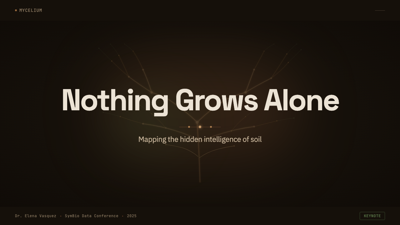
For presentation slides, the style is strongest on cover slides and any content slide framed around systems, networks, or growth. A cover benefits from a single dramatic branching filament crossing the dark field with the title set in clean sans type beside it, letting the glow do the visual work instead of decorative shapes. Data slides suit the style especially well: node-and-edge diagrams, org charts, or process flows can be redrawn directly as glowing branching networks rather than generic boxes and arrows, with monospace tags on key nodes standing in for labels or figures. Dense text slides should stay restrained — one glowing accent line at most, so the filament motif reads as a signature rather than noise competing with body copy.
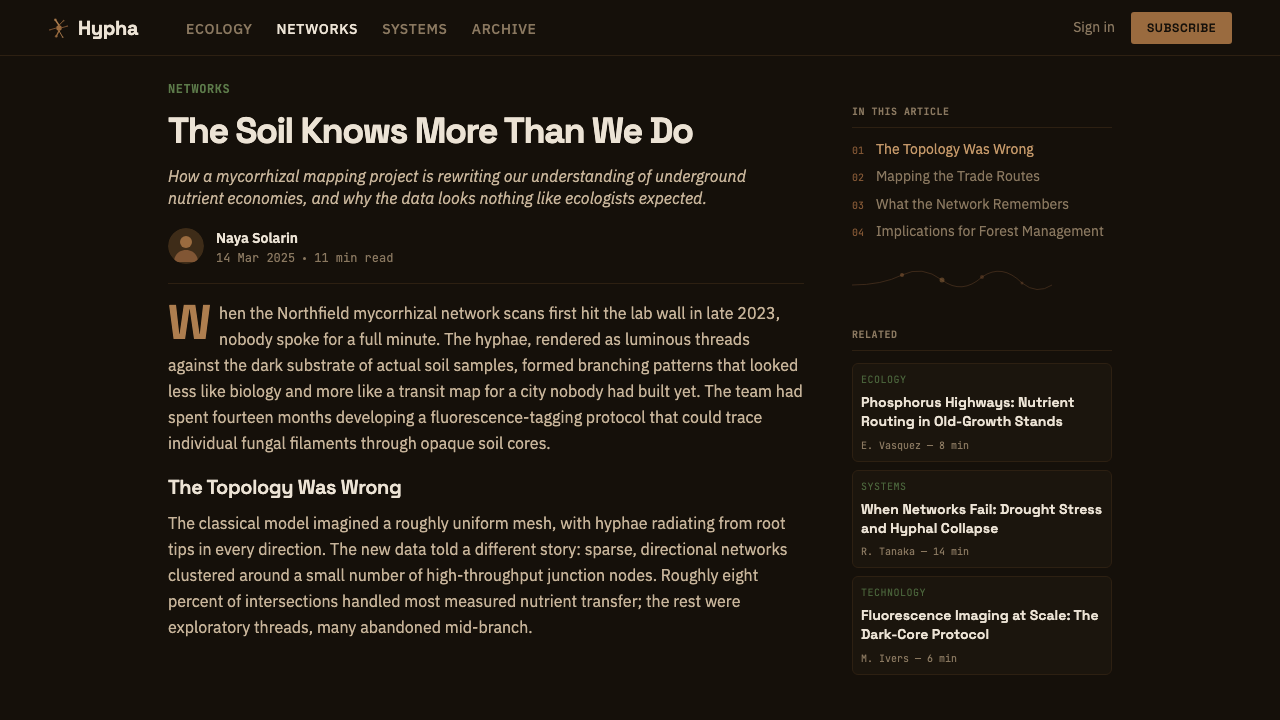
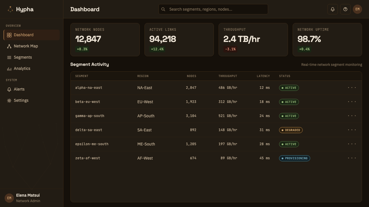
For web interfaces, this theme is well suited to dashboards that visualize distributed systems, infrastructure health, or any product whose core value is showing many small things connected into one whole — the amber-on-near-black palette reads immediately as a monitoring or control-room aesthetic. Pricing pages can use the branching motif structurally: a single filament forking into two or three paths works as a natural visual metaphor for tiers branching from one starting point, with the node markers doubling as plan-selection indicators. Card components should stay flat and glow-based rather than adopting soft drop shadows, which would fight the dark-field lighting logic the whole system depends on.
For editorial and marketing work, the style supports long-form science and technology storytelling particularly well — articles about networks, ecosystems, infrastructure, or emergent systems can use the branching filament as a running visual device between sections, with node markers standing in for pull quotes or key figures. Marketing pages for technical or infrastructure products benefit from the same logic: a hero section built around a glowing network diagram communicates complexity and reliability without needing dense paragraphs of explanation.
A common mistake is treating this as a generic dark-mode theme and populating it with straight lines, sharp right-angle diagrams, or stock circuit-board patterns. The system depends specifically on organic, tapering, irregularly forking lines that read as grown rather than drawn; substituting rigid geometric connectors collapses the mycelium metaphor into a generic tech-noir look and loses what makes the style distinctive. Similarly, overusing the green accent alongside the amber at equal weight muddies the palette — green should read as a rare second signal, not a co-equal color.
Mycelium Network — FAQ
Is Mycelium Network the same as a generic 'dark mode' or cyberpunk theme?
No. A generic dark mode simply inverts a light palette to a dark one, and cyberpunk styling typically relies on neon grids, hard right angles, and circuitry motifs. Mycelium Network is built on a specific visual source — dark-field scans of an organic, branching, growing structure — and its defining feature is irregular, tapering, recursive branching rather than rigid geometry. The palette is also more restrained than typical cyberpunk work: one dominant amber glow and a rare green accent, not a wide neon spectrum.
Why does the theme use amber instead of the whitish color real mycelium actually has?
The theme is a design interpretation of a dark-field scan, not a literal photograph. Choosing a warm, glowing amber over documentary white or cream serves the interface goal: amber against near-black reads immediately as 'active signal in the dark' — closer to a heat map or bioluminescence than to a lab specimen. A literal whitish-cream rendering on black would look more like an X-ray than a living network, and would lose the warmth that makes the system feel alive rather than clinical.
What kinds of products should avoid this style?
Products that need a light, airy, or highly approachable feel will fight this theme's fundamentals — the dark ground and glow-based depth are not easily softened into a friendly, casual register. It also struggles for products with no underlying network or systems metaphor to justify the branching motif; forcing glowing filaments onto a simple form or checkout flow will read as decoration without purpose. Consumer lifestyle, food, and children's products generally sit outside this style's natural range for the same reason Bauhaus does — the aesthetic communicates analytical intelligence, not warmth.
How should the branching filament motif be used at small sizes, like icons or buttons?
At small sizes, simplify to a single fork rather than a full recursive network — one thin line splitting into two, tapering toward each end, is enough to signal the motif without becoming an illegible tangle. The glow effect should shrink proportionally too; an oversized glow on a small icon reads as a blur rather than a light source. Node markers can stand alone as a minimal icon — a single soft glowing point works well for status indicators or notification dots, borrowing the motif's language without needing the branching line at all.
Does this style work well for financial or data-trading products, given the 'trade network' framing?
Yes, and this is one of its strongest fits. The underlying metaphor — resources moving between nodes along branching connective paths — maps directly onto financial flows, supply chains, or data-trading platforms. A transaction flow rendered as glowing filaments connecting account nodes, with monospace tags giving amounts or identifiers, uses the style's native logic rather than forcing an unrelated metaphor onto it. The main caution is the same as elsewhere: keep the branching organic and irregular, since overly clean, ruled connector lines undercut the metaphor and make the product look like a generic org chart instead.
Related design styles
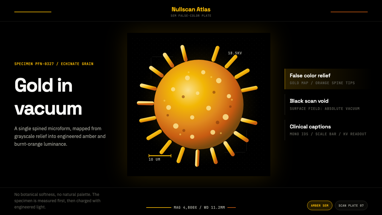 Pollen MicrographMeasured, then made luminous. Gold SEM grain floats in black with mono scale…
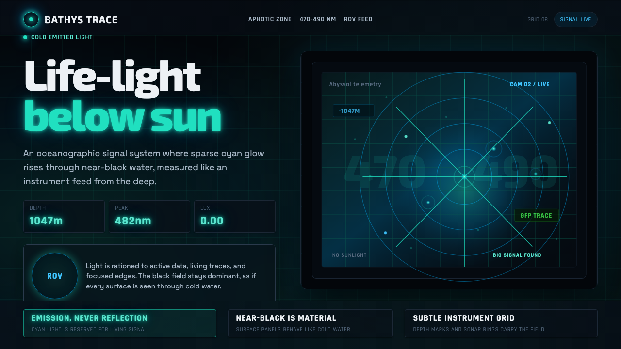 Abyssal BioluminescenceDark carries the signal. Electric cyan pins and Exo 2 readouts surface from a…
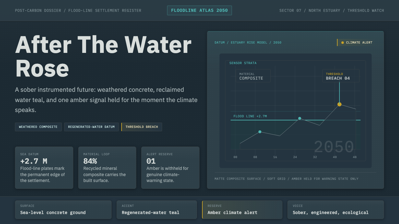 Cli-Fi 2050Pragmatic after the flood. Concrete blue-gray, muted teal, and one amber aler…
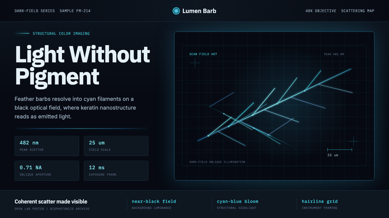 Feather MicroscopyPhysics glows in the dark. Cyan filaments and mono scale bars cut a black ima…
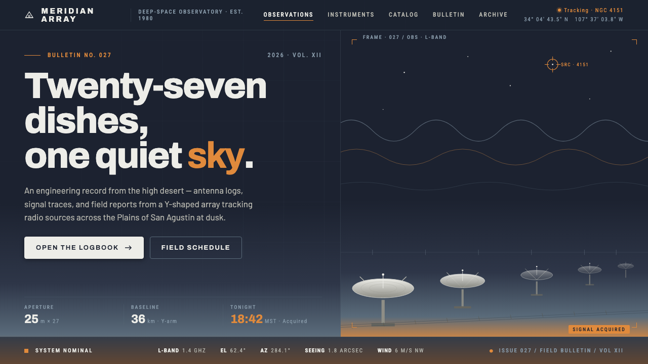 Radio Telescope ArrayEngineering at dusk. Steel-white dishes tilt against a twilight sky bleeding…
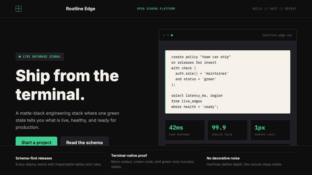 Supabase Postgres Green (2024)Midnight-terminal confidence. Matte black, Inter, mono code, and one electric…