What is Pollen Micrograph?
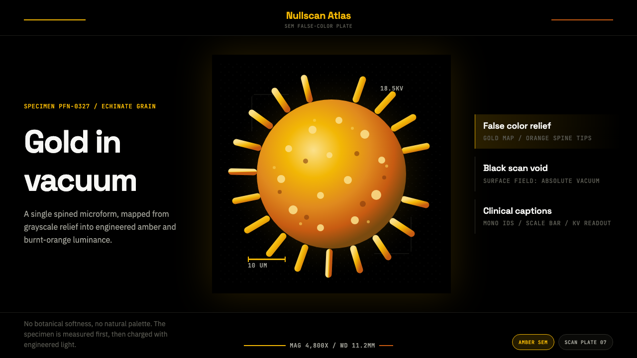
A single pollen grain, blown up past the limits of light itself and set on fire with color it never had in life — that is the whole style in one image.
Pollen Micrograph in brief
Pollen Micrograph takes its central image directly from the modern scanning electron microscope: a single spiky pollen grain, isolated and suspended in a field of pure, unbroken black. There is no environment, no context, no second specimen crowding the frame — just one echinate sphere, its surface a dense lattice of blunt spines, floating as if in vacuum. The classic read is unmistakable: a grain the color of hot amber or aged gold, its ridges catching light that seems to come from nowhere, ringed at the edge of the frame by a plain monospace scale bar and a clipped specimen identifier.
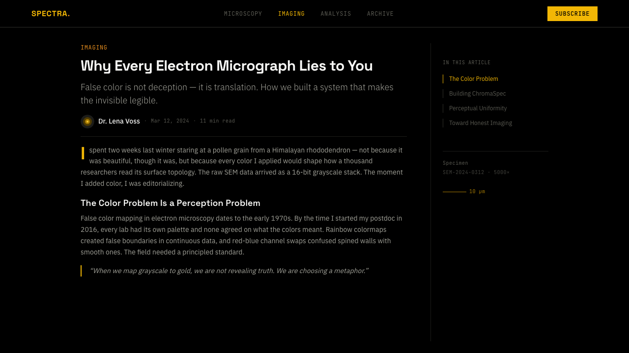
This is not botanical illustration, and the distinction matters. A botanical illustration renders a flower or seed the way a naturalist would describe it — soft, referential, often tinted toward the greens and browns the subject would show in life. Pollen Micrograph does the opposite: it starts from a genuinely colorless dataset, a surface-relief map built from scattered electrons rather than reflected light, and imposes color as an act of interpretation. The typography reinforces the split between subject and system — a geometric laboratory sans-serif carries the display voice (the specimen name, the section headers), while a clipped monospace face is reserved for anything that reads as measurement: captions, magnification notation, scale annotations.
Color itself is the real subject. Rather than reproducing anything true to the pollen's living pigment, the palette is engineered as a single continuous gradient — gray at the low points of the relief, warming through gold at the mid-tones, and finishing in a scorched, burnt-orange at the raised tips of each spine. Because the ground is pure black and the palette never breaks into a second hue family, the whole composition reads as luminosity rather than local color: the grain does not look painted so much as lit from within, glowing against a field of absolute nothing.
Where does Pollen Micrograph come from?
Pollen Micrograph belongs to a visual tradition barely a decade and a half old in its current form, though the underlying technology is much older. Scanning electron microscopy replaces the lens and light source of a conventional microscope with a finely focused beam of electrons, swept across a specimen's surface inside a vacuum chamber. The electrons that scatter back are read by a detector and reconstructed into an image of extraordinary depth and resolution — fine enough to resolve surface topology that is entirely invisible to any optical microscope, no matter how good its glass. A pollen grain, which looks like an undifferentiated speck of dust to the naked eye, resolves under an electron beam into an intricate architecture of ridges, pores, and spines — the exine wall that palynologists (scientists who study pollen) use to identify plant species.
Because an electron beam has no wavelength in the way visible light does, raw SEM data is inherently grayscale — it records intensity, not color. Every colored micrograph in this tradition, however striking, is therefore an act of deliberate reconstruction: a scientist or imaging specialist selects a palette and maps it onto the grayscale relief, usually to make different structures easier to tell apart, or simply to make an image legible and compelling to a non-specialist audience. This practice of false-coloring has old roots in scientific illustration generally, but it found a new life once electron-microscopy facilities began producing images explicitly for public communication rather than for peer-reviewed papers alone — turning a measurement into something closer to a portrait.
Artists and public-engagement programs pushed the practice further still. The artist Rob Kesseler is closely associated with this crossover, known for working directly with botanists and microscopists to turn scanning-electron scans of pollen and seeds into large-scale colored prints intended to be seen as artworks in their own right rather than as figures in a paper. University imaging facilities, including institutions such as the Dartmouth Electron Microscope Facility, produce and circulate this kind of pollen and specimen imagery as part of their public and educational outreach, supplying the raw material that later gets colorized for wider audiences. The Nanoscale Informal Science Education Network, a US museum consortium built around communicating very small-scale science to general audiences, belongs to the same lineage — using striking colorized micrographs to make invisible-to-the-eye phenomena feel immediate and worth looking at in an exhibit hall.
What began as a specialist tool for identification, and a fairly niche practice within scientific illustration, became, over the past decade and a half, a recognizable strain of internet visual culture in its own right — pollen grains, snowflakes, insect eyes, and diatoms rendered in saturated false color circulate widely because they deliver the specific pleasure of an alien-looking object that turns out to be real and measurable. Pollen Micrograph, as a design style, distills that pleasure into a repeatable visual system: one specimen, one void, one engineered gradient, and just enough clinical annotation to remind the viewer that what they are looking at was measured, not imagined.
What defines the Pollen Micrograph look?
False-Color Gradient
The palette is a single engineered gradient rather than a set of discrete colors: gray shadow at the low points of the surface relief, warming steadily through gold at the mid-tones, and finishing in a scorched burnt-orange at the raised, light-catching tips of each spine. Nothing in the palette references the pollen grain's actual living color — the gradient exists to describe surface height and light direction, the same way a topographic map uses color to describe elevation rather than to depict scenery.
The Black Void
The background is not merely dark — it is a flat, uninterrupted black meant to read as the vacuum chamber of the microscope itself, with no gradient, no texture, and no secondary tone to soften it. This absence is what makes the false color legible as glow rather than paint: on a mid-toned or textured ground, the same gradient would look decorative; on true black, it reads as light emerging from nothing.
One Specimen, Isolated
A single grain occupies the frame, generally centered or just off-center, with no companion specimens, no debris, and no environmental context. This isolation borrows directly from the convention of the specimen slide: the picture is not a scene, it is a measurement of one object, and every other element in the composition exists to support that single reading.
Two-Voice Typography
Display text — titles, specimen names, section headers — is set in a geometric laboratory sans-serif, chosen for its clinical, unornamented character rather than any warmth. Captions, magnification notes, and measurement callouts switch to a monospace face instead, borrowing the visual convention of instrument readouts and terminal output. The pairing itself carries meaning: one voice narrates, the other reports.
Scale Bar & Specimen ID
A plain monospace scale bar, rendered as a simple ruled line with a measurement label, and a clipped alphanumeric specimen identifier are treated as load-bearing design elements rather than afterthoughts. Their placement is deliberately unglamorous — tucked at an edge or corner — because their function is to certify that the image is documentary evidence of a real, measured object, not an invented illustration.
Echinate Relief
The signature surface texture is echinate — densely spiny, in the vocabulary palynologists use for this kind of pollen wall — rendered with the same crisp, high-contrast relief an electron beam produces: hard highlights, deep occlusion shadow between spines, and no soft blur anywhere. The texture is what carries all of the compositional interest, since color is applied uniformly across it rather than varying by anatomical region.
Who shaped Pollen Micrograph?
A British artist whose practice centers on collaborating with botanists and microscopists to turn scanning-electron images of pollen, seeds, and plant surfaces into large-scale colored prints, treating the false-colored micrograph as a finished artwork rather than a supporting figure for a scientific paper. His work is widely cited as a bridge between laboratory imaging and public-facing sci-art.
The electron microscope facility at Dartmouth College is one of many university imaging labs that produce and share this kind of specimen photography as part of research support and public science outreach, supplying the raw, grayscale pollen scans that later get colorized for wider audiences.
The Nanoscale Informal Science Education Network is a US consortium of museums and science centers built around communicating very small-scale science — including electron-microscope imagery — to general audiences, using striking colorized micrographs to make invisible phenomena feel immediate in an exhibit setting.
How do you use Pollen Micrograph today?
Pollen Micrograph transfers well to any brand or product that wants to claim scientific credibility without leaning on lab-coat cliché — biotech, diagnostics, materials science, climate and environmental tech, and any deep-tech company whose actual product is invisible to a general audience. The style's appeal is that it makes 'we measure things precisely' feel visually exciting rather than merely clinical, because the underlying image genuinely is a measurement, engineered into something that looks closer to art.
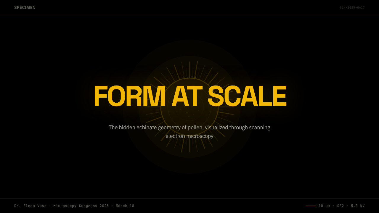
On a slide deck, the style works best as a cover treatment and as a small number of high-impact section breaks rather than as a background for every slide. A single glowing specimen on black, with a scale bar and a clipped label in the corner, makes an arresting title slide; content slides should mostly stay disciplined and text-forward, reserving the full-bleed glowing-specimen treatment for section dividers or a closing slide, where its density won't compete with data the audience needs to read.
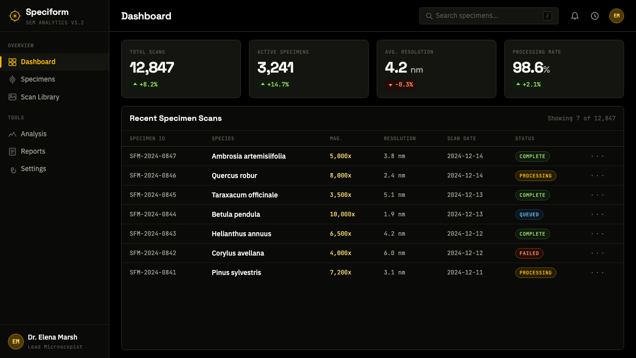
In web interfaces, the style suits dashboards and pricing pages that want an air of precision instrument rather than software product — a black or near-black canvas, a restrained gold-to-orange accent reserved for key numbers or the highlighted plan tier, and monospace type carried through for anything that resembles a reading: quotas, usage counters, timestamps. The geometric lab sans stays for headings and product language, keeping the same two-voice split the source imagery uses between display and measurement.
For editorial and marketing work, the style rewards restraint: one hero image per page or per section, generous black space around it, and copy set in a clean geometric sans with data points or specs pulled out in monospace, mimicking a caption. It works especially well for feature announcements, technical explainers, and behind-the-science content where the goal is to make precision itself the visual hook.
The most common mistake is treating the void as empty real estate and filling it — adding a second specimen, a background texture, or a decorative flourish that competes with the one glowing subject. The second most common mistake is reaching for naturalistic greens and browns because the source is botanical; the entire point of the style is that its color is engineered rather than observed, and a green-and-brown palette collapses it back into ordinary nature photography, losing the sense that this is data made luminous.
Pollen Micrograph — FAQ
Is this style the same as general 'microscopy' or 'sci-art' imagery?
It's a specific, narrower reading within that broader tradition. General microscopy or sci-art imagery can use many colors, multiple specimens, and busy compositions. Pollen Micrograph, as a design style, is disciplined down to one specimen, one void, and one gold-to-orange gradient — it borrows the credibility of the wider sci-art tradition but applies far more restraint than most real micrograph photography actually shows.
Why gold and burnt orange specifically, rather than the blues and purples common in other colorized microscopy?
Because the palette is meant to read as glow rather than as arbitrary decoration, and warm hues against pure black produce that effect more convincingly than cool ones — a cool blue-on-black composition tends to read as clinical, where a gold-to-orange gradient on black reads as something closer to an ember or a light source, which suits a design style built around luminosity doing all the work. Other palettes are used in real scientific imaging, but they don't carry this style's specific emotional register.
Can this style be used at a small scale, like an icon or app avatar, or does it need a large canvas?
It scales down surprisingly well because so much of its identity lives in just two decisions: a warm gradient against pure black, and a spiny silhouette. At icon size, the scale bar and monospace annotation should be the first things dropped — they only read at a size large enough to be legible as text — while the glowing spiny sphere on black can survive down to a very small footprint.
How literal does the pollen shape need to be? Could this style work with a different specimen entirely?
The style is really a treatment more than a subject requirement. Anything with the right kind of surface complexity — an insect eye, a seed coat, a snowflake, a diatom — can carry the same system of false-color gradient, black void, scale bar, and two-voice typography. What matters is that the object reads as genuinely measured rather than invented, so it should look like it came from an instrument, not from an illustrator's imagination.
Does this style require real scientific data, or can it be approximated with illustration or render tools?
It doesn't require an actual electron micrograph to work as a design system — the visual grammar (black void, single spiky specimen, engineered gold-to-orange gradient, scale bar, split typography) can be approximated with 3D renders or careful illustration. What can't be faked convincingly is the discipline: the moment the palette drifts into multiple hues, or a second specimen or background texture creeps in, the image stops reading as measured and starts reading as decorative, which breaks the style's core premise.
Related design styles
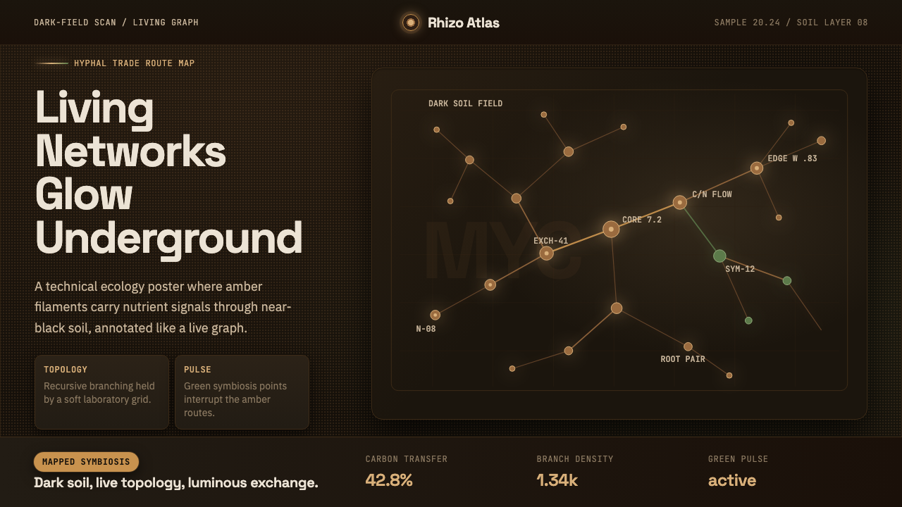 Mycelium NetworkUnderground intelligence glows. Amber hyphae branch over near-black soil with…
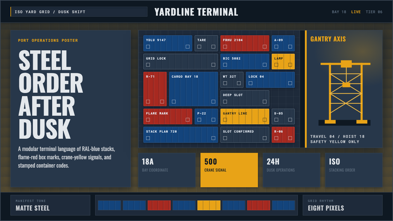 Container PortIndustrial dusk, standardized. Slate grid, RAL-blue stacks, and crane-yellow…
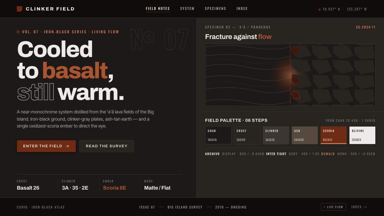 Hawaiian ʻAʻā Lava FieldIron-black, with one warm ember. Matte basalt char, clinker-gray plates, scor…
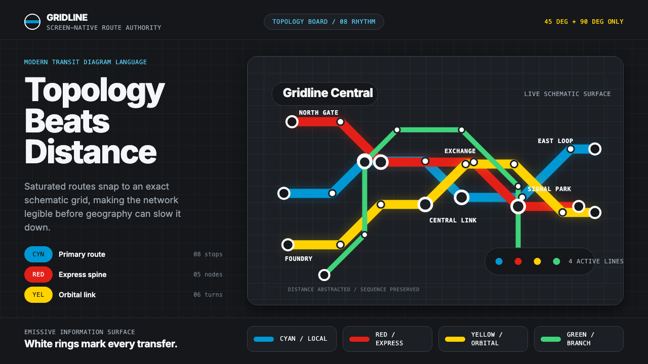 Transit Diagram (modern)Topology over geography. Cyan, red and yellow routes lock to 45-degree angles…
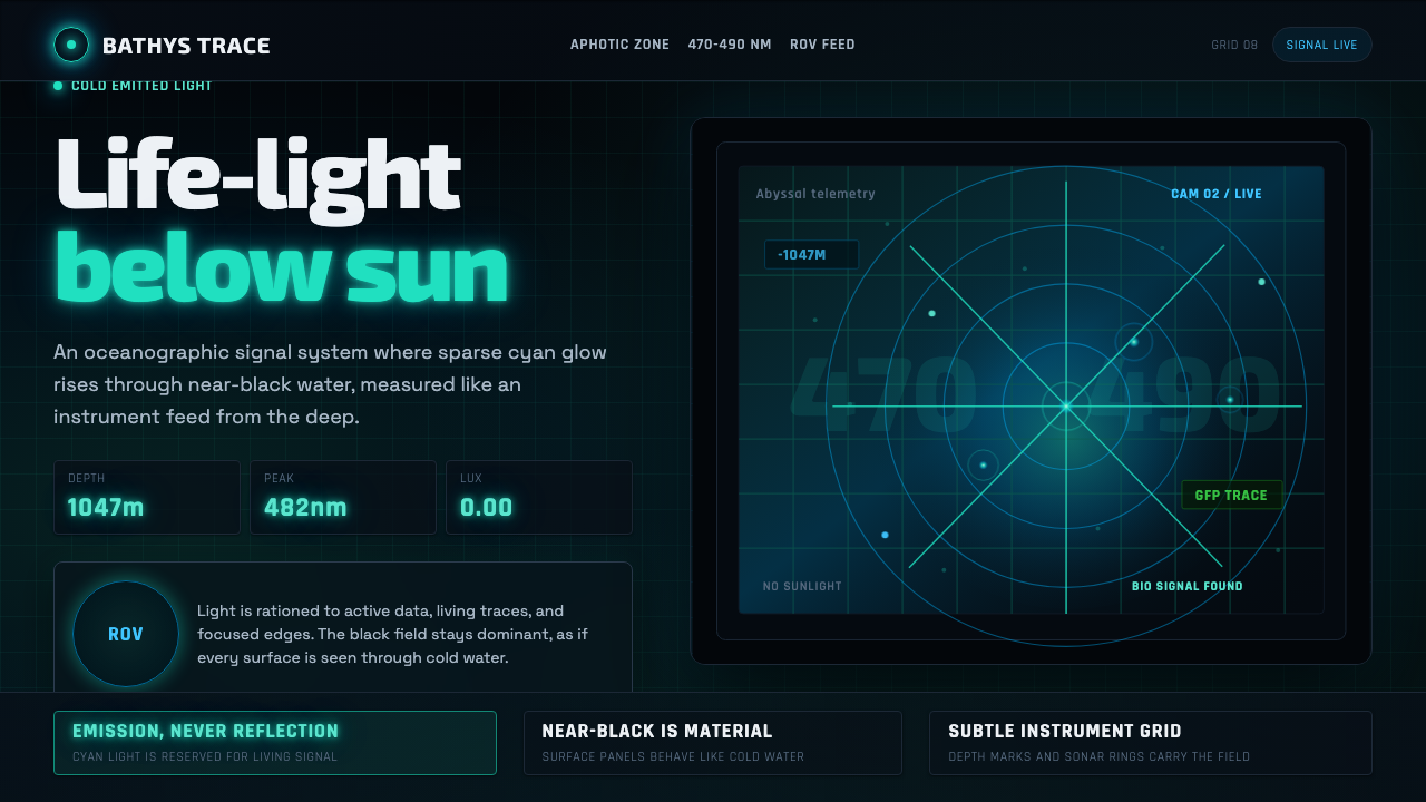 Abyssal BioluminescenceDark carries the signal. Electric cyan pins and Exo 2 readouts surface from a…
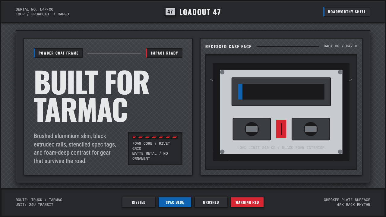 Aluminium Flight CaseRoadproof and exact. Diamond-plate gray, stencil type, black frames, blue-red…