What is Deep Space Observatory?
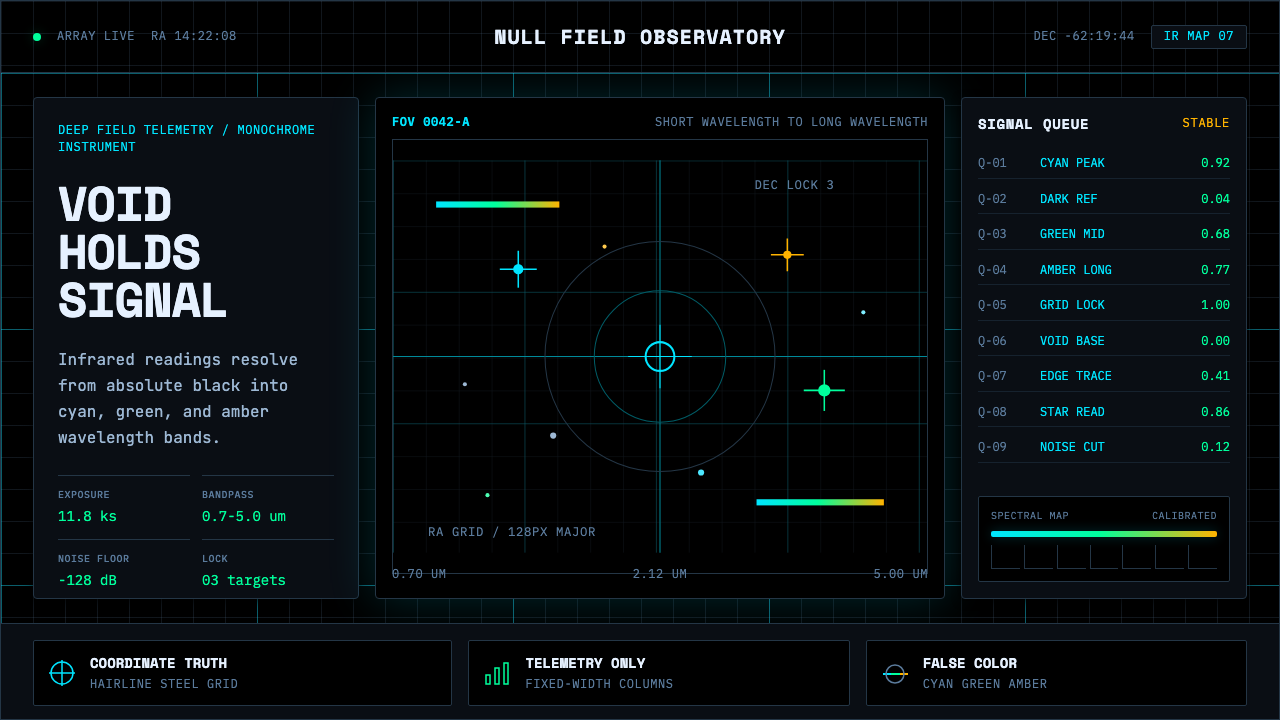
Deep Space Observatory turns the pure vacuum of a telescope's deep-field image into an interface — a void you trust precisely because it never tries to please you.
Deep Space Observatory in brief
Deep Space Observatory takes the absolute void-black of a deep-field telescope frame as its canvas. Over that void, monospace telemetry is laid out in fixed-width columns, crosshair coordinate markers pin down specific points of interest, and thin steel gridlines quietly organize the darkness into a legible instrument panel rather than an empty picture.
Its defining move is chromatic wavelength mapping: infrared data invisible to the human eye is translated into a readable color scale, with short wavelengths rendered in cool cyan and longer wavelengths shifted toward warm gold. This is the same convention astronomical imaging teams use to make invisible light visible — color here is not decorative, it is a unit of measurement, the same way a thermometer's red and blue carry temperature rather than mood.
Nothing in this system exists for the sake of appearance. Every color carries a reading, every line is a measurement, every label is a coordinate or a value rather than a flourish. The palette stays cold throughout — star-chart cyan, telemetry green, signal amber, and off-white labels, all suspended in that same void black — producing the aesthetic of a readout engineered for trust rather than charm.
Where does Deep Space Observatory come from?
The visual convention of mapping invisible wavelengths into readable false color has roots in radio astronomy going back to the 1930s, when Karl Jansky first detected radio emissions from the Milky Way and researchers needed ways to represent signals entirely outside the visible spectrum. Over the following decades, as space telescopes extended observation into infrared, ultraviolet, and X-ray bands invisible to the human eye, astronomers standardized a convention now called the 'Hubble palette' or chromatic ordering: shorter wavelengths mapped to cooler colors like blue and cyan, longer wavelengths mapped to warmer colors like red and gold, so a viewer could read physical properties of a nebula or galaxy at a glance without needing to understand the underlying physics.
This composite-imaging tradition reached a new level of public visibility with the James Webb Space Telescope, launched in December 2021 and delivering its first public images in July 2022. Webb's Near-Infrared Camera (NIRCam) instrument captures light entirely outside human visual range, and the imaging team at the Space Telescope Science Institute (STScI) — the organization responsible for translating raw telescope data into public-facing color composites — refined the wavelength-mapping process into an art form in its own right, producing images whose color and contrast decisions are simultaneously scientifically grounded and aesthetically composed.
In parallel, the aesthetic draws on an older visual tradition from mission control rooms — the banks of monospace telemetry, green-and-amber phosphor readouts, and gridded coordinate displays used at NASA's Johnson Space Center during the Apollo program of the 1960s and 1970s, under flight directors like Christopher Kraft. That control-room register — cold, technical, built entirely around trustworthy readouts rather than persuasion — became visual shorthand for scientific authority and precision long before it was paired with deep-space imagery.
The two traditions — false-color astronomical imaging and mission-control telemetry design — converged in the wake of Webb's public release, as designers began pairing the telescope's luminous, chromatically mapped nebula and galaxy imagery with the cold, instrumented visual language of mission control to produce a unified aesthetic: a void-black canvas that reads simultaneously as a scientific instrument and as a window onto the universe.
What defines the Deep Space Observatory look?
Void Black Ground
The base of every composition is an absolute, near-total black, echoing the vacuum of space itself. Unlike a typical dark UI theme, this black should feel infinite and empty rather than simply a dark neutral — there is no ambient warmth or texture in it, only the occasional pinpoint of light breaking the field.
Wavelength-to-Color Mapping
Color is assigned according to a consistent, meaningful scale rather than decorative preference — cooler tones for one end of a data range, warmer tones for the other. Applied outside a literal astronomical context, this becomes a principle: reserve color for values that actually vary, and keep everything else in the neutral void.
Monospace Telemetry Columns
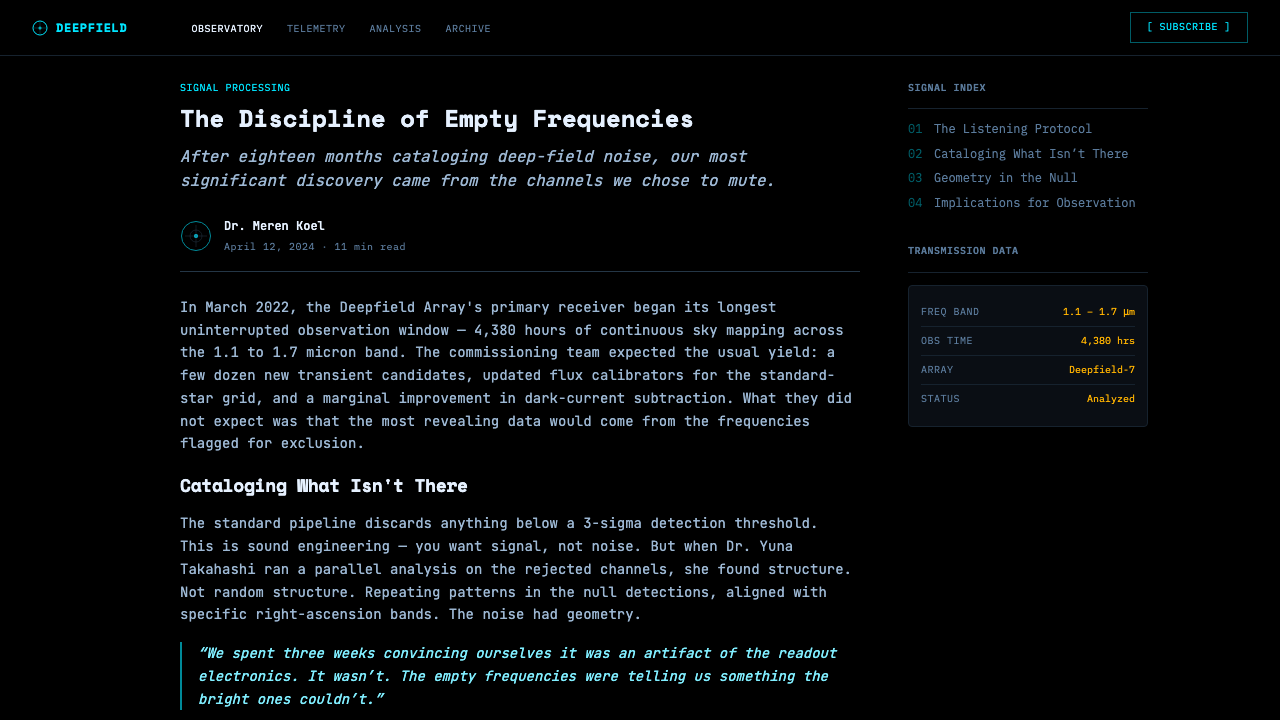
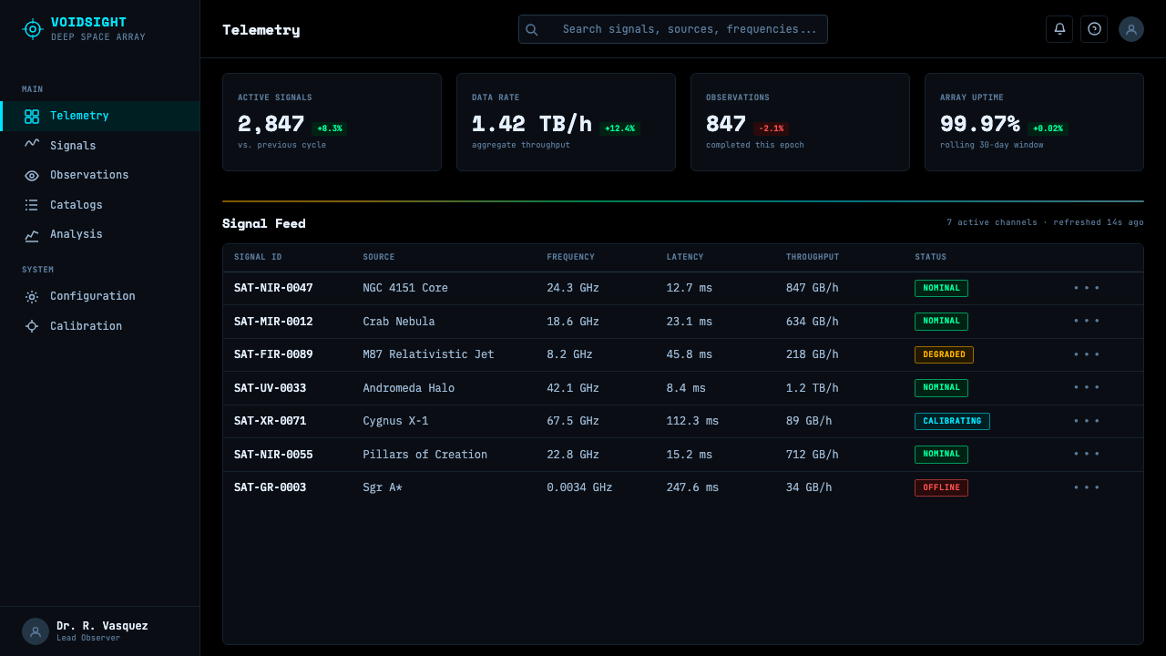
Data is set in fixed-width type arranged into strict columns, so that numbers align vertically and can be scanned at speed the way a technician reads a control panel. This is a functional choice before it is an aesthetic one — proportional type would make rows of numbers harder to compare at a glance.
Crosshair Coordinate Markers
Points of interest are marked with thin crosshair or bracket indicators rather than solid dots or arrows, echoing the way astronomical software pinpoints a specific object in a field of stars. These markers should feel precise and surgical, never bold or decorative.
Fine Steel Gridlines
A thin, low-contrast grid organizes the void without ever competing with the data or imagery sitting on top of it. The grid is present but recedes — its job is structural orientation, like the reticle etched into a telescope's eyepiece, not visual decoration.
Instrumented Restraint
Every visible element must justify itself as a reading, a measurement, or a coordinate — nothing exists purely for visual richness. This restraint is what separates the style from generic 'sci-fi UI' pastiche, which tends to add glowing ornament for its own sake; here, glow and color are always tied to an underlying value.
Off-White Labels
Text labels sit slightly below pure white, avoiding the harshness of stark white-on-black while still reading as high-contrast and legible. This restrained brightness keeps labels readable without letting them compete with the chromatic data they annotate.
Who shaped Deep Space Observatory?
Working at Bell Labs in the early 1930s, Jansky was the first to detect radio emissions originating from the Milky Way, establishing the foundational problem that this entire aesthetic responds to: how do you make a physically real signal, entirely invisible to human eyes, legible and trustworthy to a human observer.
The imaging scientists at the Space Telescope Science Institute responsible for processing Webb's Near-Infrared Camera data into the luminous, chromatically mapped public images released beginning in July 2022 refined wavelength-to-color mapping into a discipline that is simultaneously rigorous science and considered composition.
As the institution operating Webb's science and public-imaging pipeline, STScI standardized the process by which raw multi-filter telescope exposures are combined, color-mapped, and released to the public, making it the central authority behind the specific chromatic conventions this aesthetic draws from.
As NASA's first flight director during the Mercury, Gemini, and Apollo programs, Kraft helped establish the mission-control room's visual and operational culture — banks of monospace telemetry read by technicians trained to trust the readout over instinct — that this design system borrows its cold, instrumented register from.
How do you use Deep Space Observatory today?
Deep Space Observatory carries a register of technical authority and cold precision, which makes it a natural fit for products that want to feel data-driven and trustworthy, but a poor fit for anything that needs to feel warm, playful, or human-scaled.
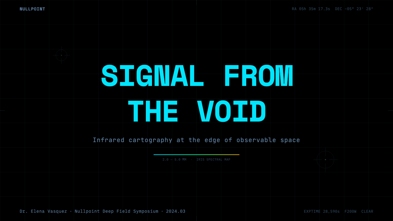
For presentation slides, the style is especially strong for cover slides and data reveals — a void-black field with a single chromatically mapped image or chart, framed by thin gridlines and monospace annotation, reads as authoritative before a single word is spoken. Content slides should keep the void-black ground but use the cyan-to-gold scale purposefully, tying color strictly to the metric being shown rather than decorating unrelated text with it.
For web interfaces, this aesthetic is an excellent match for dashboards, monitoring tools, and analytics products, where the mission-control register signals precision and where users already expect a dense, data-forward reading experience. Pricing pages can use it too, provided the chromatic scale is reserved for genuinely tiered information — plan levels mapped along the same cool-to-warm gradient — rather than applied as generic decoration.
For editorial and marketing content, the style works well for science communication, technology brands, and anything positioning itself at the frontier of precision engineering. A landing page hero can use a large void-black field with a single glowing, chromatically mapped focal image, but body copy should shift to a more neutral, highly legible typeface, since long-form reading in monospace telemetry type becomes fatiguing quickly.
A common mistake is treating this as generic 'sci-fi dark mode' and adding glow, color, and grid ornament indiscriminately across a layout. That undermines the style's core discipline — that every color and every line is a reading. A second mistake is defaulting to pure white-on-black for all text, which reads as harsher and less considered than the slightly warmer off-white the style actually calls for.
Deep Space Observatory — FAQ
Why use cyan and gold instead of colors that look more 'natural'?
Because the data being represented — infrared light — is entirely invisible to the human eye in the first place, so there is no natural color to be faithful to. Astronomers assign a consistent, meaningful color scale instead: shorter wavelengths mapped to cooler tones, longer wavelengths to warmer ones, so a viewer can read physical differences in the data at a glance. The cyan-to-gold scale in this style borrows that logic rather than aiming for photographic realism.
Is this style specifically tied to the James Webb Space Telescope?
Webb's 2022 public images brought this specific combination of void-black grounds and chromatically mapped nebula imagery to a mass audience for the first time, but the underlying conventions — false-color wavelength mapping and mission-control telemetry design — predate Webb by decades. The style draws on Webb as its most visible recent reference point, not as its sole origin.
Can this aesthetic work for products that have nothing to do with space or science?
Yes, provided the product genuinely benefits from a precision, data-forward register — monitoring dashboards, financial analytics, developer tools, and technical documentation all borrow the same underlying value of trustworthy readouts over persuasion. It struggles in consumer-facing contexts that need warmth or playfulness, since the style's entire logic is built around cold, instrumented restraint rather than emotional appeal.
What separates this from a generic dark-mode UI theme?
A generic dark mode simply inverts a light interface for reduced eye strain, with color choices made for comfort or brand consistency. This style is built around the opposite logic: color is never arbitrary, it is always tied to an underlying measurement, and the void-black ground is meant to feel infinite and instrumented rather than merely comfortable to look at in low light.
Does this style ever use bright, saturated colors, or does it stay muted throughout?
It can use genuinely saturated color, but only in small, purposeful areas tied to a specific reading — a bright cyan data point against the void, for instance — rather than as a broad wash across a layout. The overall field stays overwhelmingly dark and neutral so that these small, saturated accents carry maximum meaning and visual weight when they do appear.
Related design styles
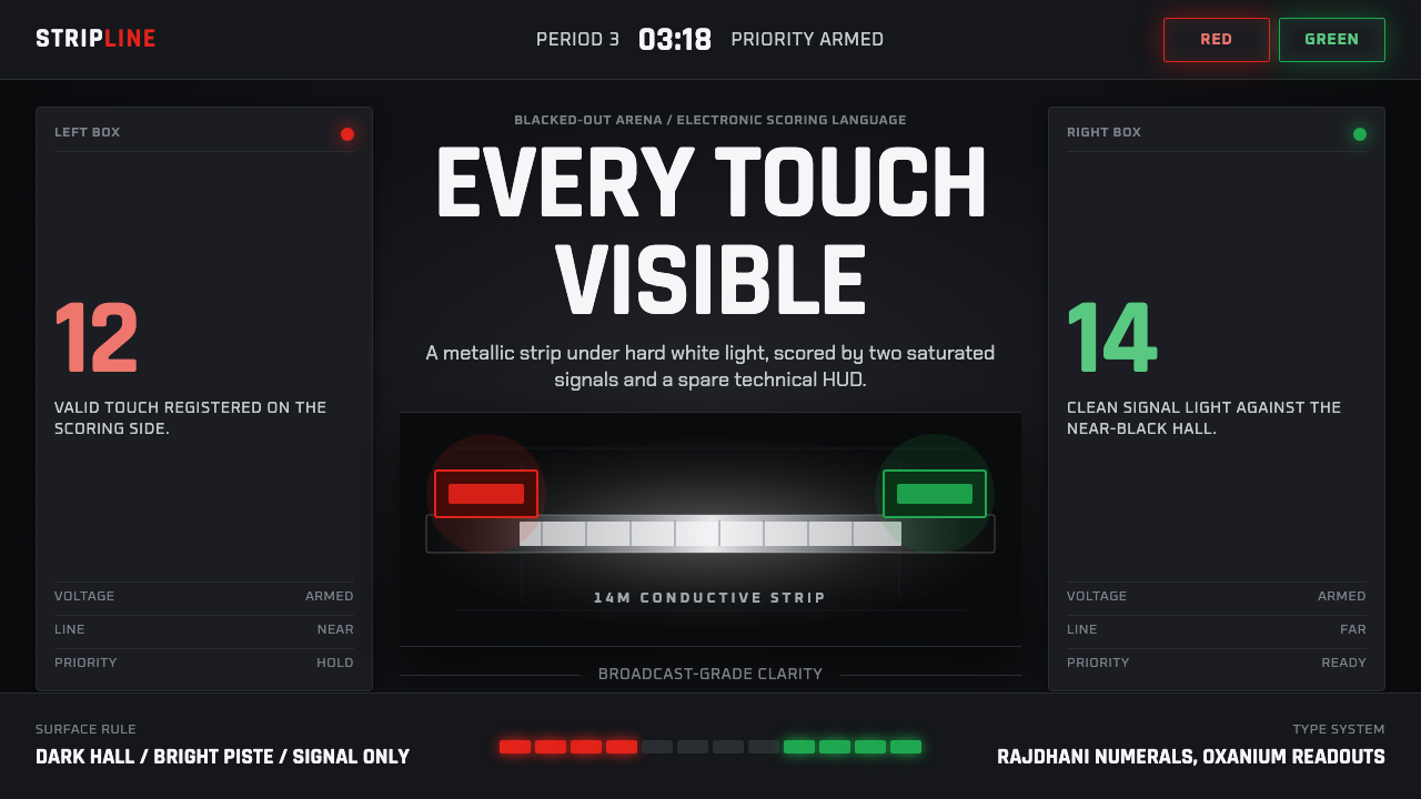 Fencing PisteTurns darkness into signal. Rajdhani HUD type frames a white piste and red-gr…
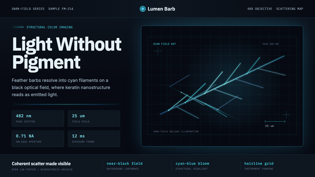 Feather MicroscopyPhysics glows in the dark. Cyan filaments and mono scale bars cut a black ima…
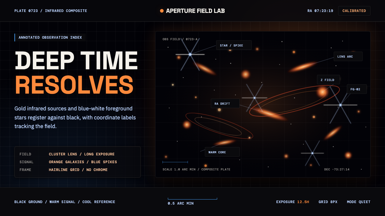 JWST Deep FieldPrecision in deep black. Orange galaxies, blue spikes, and DM Mono callouts m…
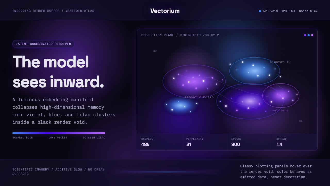 Latent SpaceSees the model from inside. Violet-blue point clouds glow on a black GPU void.
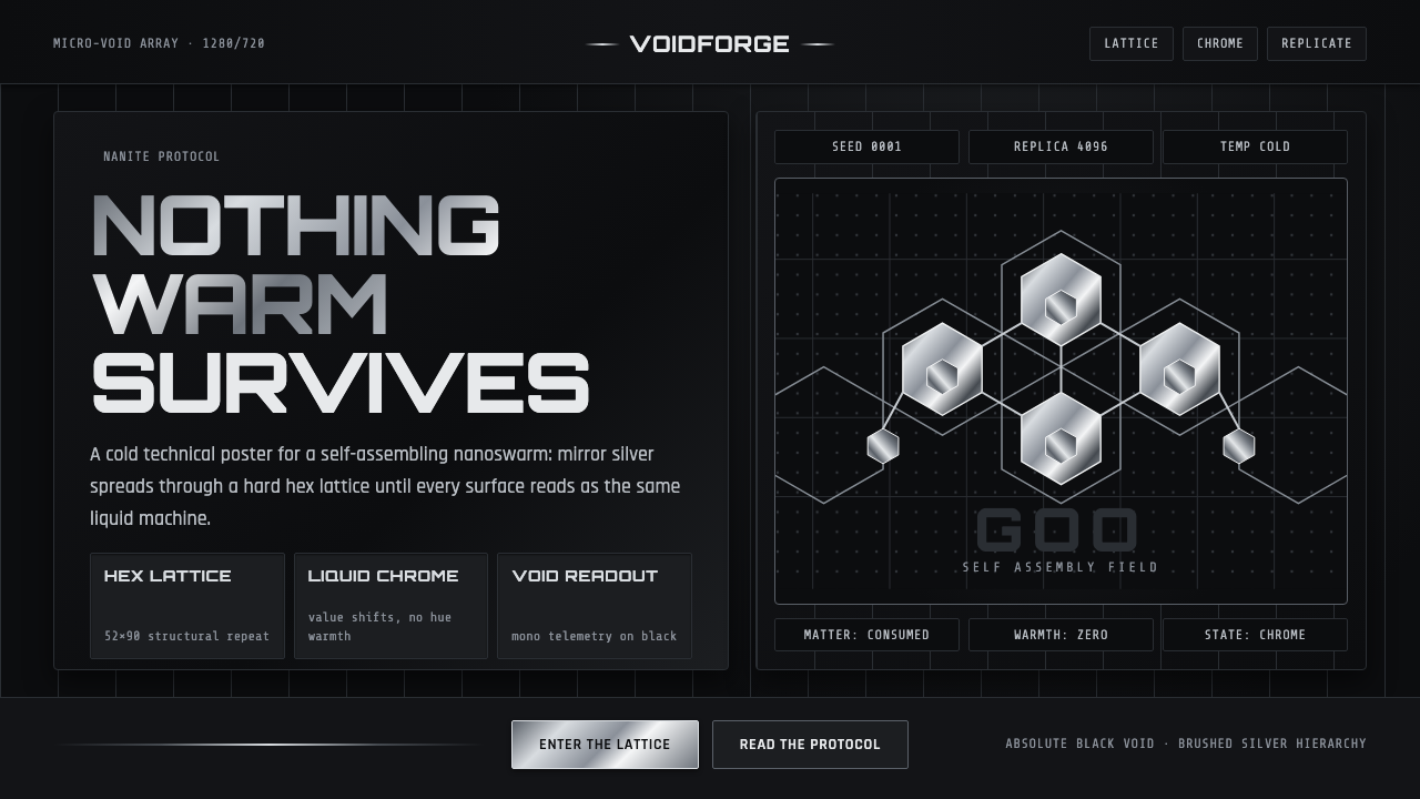 Nanopunk Grey GooColdness self-replicates. Chrome gradients and hex lattices spread across a b…
 Nanotech AssemblerNothing is illustrated. Grey micrograph fields and hairline measurement overl…