What is Holographic UI 2040?什么是 Holographic UI 2040?
Holographic UI 2040 treats information as made of light — every surface refracts, every edge bends a rainbow, and the screen as we know it dissolves into mid-air.全息 UI 2040 相信信息由光构成——每一个表面都折射,每一道边缘都弯折出彩虹,而屏幕本身消融于半空之中。
Holographic UI 2040 in briefHolographic UI 2040 速览
Holographic UI 2040 is a speculative design language that projects two decades beyond Apple Vision Pro's debut in 2024, imagining the visual grammar of an era when volumetric displays, prismatic light dispersion, and mid-air spatial computing have moved from laboratory curiosity to everyday interface. It asks a foundational question: if the display surface itself becomes three-dimensional light, what should the visual system that runs on it look and feel like?全息 UI 2040 是一套思辨性设计语言,将 2024 年 Apple Vision Pro 的问世再向前推演二十年——想象当体积显示、棱镜色散与半空间计算从实验室奇想演变为日常界面时,视觉语法将会是什么面貌。它提出了一个根本性的问题:如果显示面本身变成三维的光,运行其上的视觉系统应当呈现出怎样的感官质地?
The aesthetic draws from three natural phenomena — dichroic glass, the interference patterns of soap bubbles, and the iridescent wing-cases of beetles such as Plusiotis resplendens. These sources share a single optical principle: color is not a pigment applied to a surface but a property of light bending through or bouncing between thin layers. Holographic UI internalizes this principle completely. Deep-space black grounds anchor floating panels whose edges shimmer with prismatic gradients. Ambient shadows beneath each panel are tinted in soft lavender or crystalline cyan rather than neutral grey, as though the panels themselves emit a faint glow onto whatever lies beneath them.这套美学从三种自然现象中汲取语言——光学仪器中的二色玻璃、肥皂泡的干涉条纹,以及如玉虫般甲虫(如 Plusiotis resplendens)的鞘翅虹彩。这三种来源共享同一个光学原理:色彩并非涂抹于表面的颜料,而是光线穿透或在薄层间折射的属性。全息 UI 将这一原理彻底内化。深空黑作为主场地,承载漂浮的玻璃面板,其边缘以棱镜渐变微微闪烁。每块面板下方的环境投影染上柔和的薰衣草紫或水晶青蓝,而非中性灰——仿佛面板自身向其下方的一切散发出隐约的光晕。
Typography in this system is deliberately weightless. Ultra-light letterforms — airy, widely tracked, and almost transparent — feel suspended rather than placed. The contrast between the heavy darkness of the void background and the gossamer quality of the type is the system's primary expressive tension. Elements do not sit on a surface; they occupy a depth. Every interface gesture in this language implies that the viewer could reach through the screen and touch the information floating behind it.这套系统中的字体排印刻意追求无重量感。极细字重的字形——轻盈、宽松、近乎透明——给人悬浮而非被放置的感受。深邃黑暗的虚空背景与蛛网质感文字之间的对比,是整套系统最核心的表现张力。元素不是落在某个表面上,而是占据着一个深度维度。这套语言中的每一个界面手势都暗示着:观者可以伸手穿过屏幕,触碰漂浮在其后的信息。
See the Holographic UI 2040 design system查看 Holographic UI 2040 完整设计系统
Where does Holographic UI 2040 come from?Holographic UI 2040 从何而来?
The direct ancestor of Holographic UI 2040 is glassmorphism, the design trend that surfaced around 2020 in Apple's macOS Big Sur and quickly spread across the industry. Glassmorphism introduced frosted glass panels with translucency, blur, and delicate border highlights — a visual metaphor for windows into layered space. But glassmorphism was still bound to the flat screen: its depth was simulated, its translucency was an effect applied to a 2D surface. Holographic UI 2040 treats that metaphor as a literal departure point and asks what happens when the interface escapes the plane entirely.全息 UI 2040 的直接祖先是玻璃拟物风格(glassmorphism)——约在 2020 年随 Apple macOS Big Sur 浮出水面、并迅速席卷业界的设计潮流。玻璃拟物风格引入了半透明磨砂玻璃面板、模糊效果与精致的边缘高光,作为通往层叠空间之窗的视觉隐喻。但玻璃拟物依然被束缚于平面屏幕:它的深度是模拟的,它的半透明是叠加于二维表面上的效果。全息 UI 2040 将这一隐喻当作字面意义上的出发点,追问当界面彻底逃脱平面的束缚,将会发生什么。
The Looking Glass holographic display factory, which from the mid-2010s onward produced commercial light-field displays allowing true parallax without headsets, demonstrated that holographic computing was not purely science fiction. Simultaneously, spatial computing research at institutions like the MIT Media Lab — where Hiroshi Ishii's Tangible Media Group had since the 1990s advocated for computing that occupied physical space rather than rectangular screens — established the intellectual framework for thinking about interfaces as spatial objects. When Apple Vision Pro arrived in early 2024, it collapsed decades of speculative spatial UI research into a consumer product, and designers began extrapolating forward: if this was 2024, what would 2040 look like?Looking Glass 全息显示工厂从 2010 年代中期起陆续推出商业光场显示器,无需头显即可实现真正的视差效果,证明了全息计算并非纯粹的科幻想象。与此同时,麻省理工学院媒体实验室等机构的空间计算研究——尤其是 Hiroshi Ishii 的有形媒体小组,自 1990 年代起便主张将计算置于物理空间而非矩形屏幕中——为把界面理解为空间对象奠定了知识框架。2024 年初 Apple Vision Pro 的到来,将数十年的思辨性空间 UI 研究凝缩为一件消费产品,设计师们开始向前推演:如果这是 2024 年,那 2040 年将会是什么模样?
The visual language that emerged from this speculation drew heavily on existing post-glassmorphism experiments in dichroic and iridescent design. Dichroic glass — originally an aerospace material developed for satellite filters — had already entered high-end architectural and product design as a luxury material whose color shifts depending on viewing angle and light source. Designers like Karim Rashid were applying iridescent surfaces to consumer objects, while digital artists like Refik Anadol were using machine learning to generate fluid, light-based environments at architectural scale. Holographic UI 2040 synthesizes these threads: it is the visual language that would feel native to a world where Anadol's data sculptures are not gallery installations but everyday operating environments.从这一思辨中涌现的视觉语言,大量借鉴了后玻璃拟物时代关于二色与虹彩设计的既有实验。二色玻璃——最初作为卫星滤光片开发的航天材料——已经以奢华材料的身份进入高端建筑与产品设计领域,其色彩随观察角度与光源而变换。Karim Rashid 等设计师已将虹彩表面引入消费产品,而 Refik Anadol 等数字艺术家则在用机器学习在建筑尺度上生成流动的、以光为介质的环境。全息 UI 2040 将这些线索综合:它是这样一种视觉语言——在 Anadol 的数据雕塑不再是画廊装置而是日常操作环境的世界里,它会让人感到毫无违和。
The movement is geographically distributed in ways that mirror the global nature of speculative design itself. Its conceptual roots run through Cupertino, where vision-display hardware was engineered; through Brooklyn, where the post-glassmorphism design community developed its visual experiments; through Tokyo's Akihabara district, where a long tradition of light-saturated urban display culture provided visual precedents for immersive luminous environments; and through Helsinki, where human-computer interaction research institutions contributed rigorous thinking about how people actually inhabit spatial computing environments. Holographic UI 2040 is not a movement with a manifesto or a founding institution — it is a collective extrapolation, the design community's best shared guess at what visual grammar will feel inevitable in 2040.这场运动在地理上的分布,折射出思辨设计本身的全球属性。它的概念根系穿越库比蒂诺(视觉显示硬件在此被工程化)、穿越布鲁克林(后玻璃拟物设计社群在此发展其视觉实验)、穿越东京秋叶原(悠久的高饱和光感都市显示文化为沉浸式发光环境提供了视觉先例),也穿越赫尔辛基(人机交互研究机构在此贡献了关于人类如何真正栖居于空间计算环境的严谨思考)。全息 UI 2040 没有宣言,没有创始机构——它是一场集体外推,是设计社群对于 2040 年何种视觉语法将显得不可避免的最佳共同猜想。
What defines the Holographic UI 2040 look?Holographic UI 2040 的视觉特征是什么?
Deep-Space Grounds深空背景
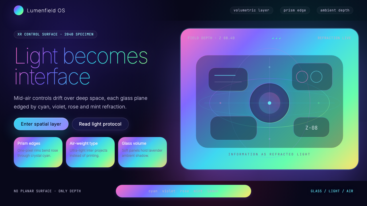
The foundational surface is a near-absolute black, closer to the void between stars than to any earthly dark tone. This depth of darkness is essential: it makes the luminous elements above it appear to emit rather than reflect light, reinforcing the illusion that panels and type are made of photons rather than rendered pixels. No warm undertone softens the ground; no texture interrupts it. The black is total, because space is total.基底表面接近绝对黑色,更近似星际虚空而非任何尘世的深色调。这种黑暗的深度至关重要:它使其上的发光元素显得像在发射光,而非反射光,强化了面板与文字由光子而非渲染像素构成的幻觉。没有任何暖调底色柔化这片底面,没有任何纹理打断它。黑色是彻底的,正如宇宙空间是彻底的。
Prismatic Edge Highlights棱镜边缘高光
Panel borders and card edges are defined not by a single color line but by a thin band of prismatic gradient — the full spectrum compressed into a thread of light. The effect references dichroic glass and soap-bubble thin-film interference, where color emerges from structure rather than pigment. These edge highlights do not merely outline a shape; they suggest that the panel is a physical object with optical depth, a slice of material through which light is bending on its way to the viewer's eye.面板边框与卡片边缘不以单色线条定义,而以一条细密的棱镜渐变光带勾勒——完整的光谱被压缩进一缕光线之中。这一效果参照二色玻璃与肥皂泡薄膜干涉:色彩源自结构而非颜料。这些边缘高光不仅仅是轮廓,它们暗示面板是具有光学深度的实体对象——一片光线在抵达观者眼睛途中发生折射的材料切片。
Chromatic Ambient Shadows色彩环境投影
Where conventional interfaces use neutral grey or darkened versions of the background for drop shadows, Holographic UI 2040 uses tinted ambient glows — soft blooms of lavender, cool cyan, or spectral violet pooling beneath each floating panel. These colored shadows reinforce the fiction that the panels emit their own light: the color spills down from the panel's edge highlights onto the surface below, as a luminous object would cast a colored pool of light onto a dark floor.传统界面以中性灰或加深的背景色作为投影,全息 UI 2040 则以色彩环境光晕取而代之——每块漂浮面板之下汇聚着柔和的薰衣草紫、冷调青蓝或幽灵紫罗兰。这些有色投影强化了面板自行发光的叙事:颜色从面板边缘高光向下溢出至其下的表面,正如一个发光体会在深色地板上投下一汪彩色光池。
Ultra-Light Typography极细字体排印
Type in this system is intentionally ethereal. The thinnest available weights of a geometric sans-serif serve as the primary voice — headlines and body text alike remain hairline-thin, wide-tracked, and luminous against the dark ground. The effect is the opposite of authoritative weight: these letterforms feel projected rather than printed, suspended in space rather than resting on a surface. Hierarchy is achieved through scale and tint rather than through weight contrast, because adding weight would undermine the weightless quality the system depends on.这套系统中的字体排印刻意追求飘渺感。几何无衬线字体最细的字重充当主要声部——标题与正文同样保持发丝般纤细、宽松字距,在深色底面上如发光体般存在。效果与权威感的粗重截然相反:这些字形感觉是被投影出来的,而非被印刷下去的,悬浮于空间中,而非静置于表面上。层级通过尺度与色调变化来实现,而非通过字重对比——因为增加字重会破坏这套系统赖以为生的无重量感。
Iridescent Glassmorphism Panels虹彩玻璃拟物面板
The panel is the primary compositional unit. Each panel combines a dark translucent fill — semi-transparent, allowing a dim impression of depth behind it — with a prismatic edge highlight and a subtle inner surface sheen that shifts between a cool teal and a warm violet depending on implied viewing angle. The combination reads as a physical slab of dichroic glass floating in space. Content within the panel is legible but the panel itself is never fully opaque: the viewer is always aware of the spatial depth the panel inhabits.面板是这套语言的基本构图单元。每块面板结合了深色半透明填充——半透明,让其后的深度隐约可感——与棱镜边缘高光,以及内表面的微妙光泽:这层光泽随暗示的观察角度在冷调青绿与暖调紫罗兰之间游移。这种组合读来像一块漂浮于空间中的二色玻璃实体。面板内的内容清晰可读,但面板本身从不完全不透明:观者始终能感知到面板所栖居的空间深度。
Spectral Accent Color光谱强调色
While the ground is absolute black and the panels are largely neutral-dark, interactive elements, data highlights, and calls to action are marked by single spectral hues pulled from the prismatic edge vocabulary — a pure cyan for primary actions, a violet for secondary states, a prismatic white-to-spectrum shift for hover or focus. These accents are never warm; all hues sit in the cool half of the spectrum, aligning the palette with the physics of short-wavelength light and the cultural association between blue-shifted light and technological precision.虽然背景是绝对黑色,面板基本保持中性深色,但交互元素、数据高光与行动号召以源自棱镜边缘词汇的单一光谱色调加以标记——纯净青蓝用于主要操作,紫罗兰用于次级状态,棱镜白至光谱的渐变用于悬停或焦点状态。这些强调色从不带暖意;所有色调都落在光谱的冷调半区,使整体色板与短波长光的物理属性以及蓝移光与技术精准之间的文化联想相呼应。
Spatial Layering and Depth空间分层与深度
Holographic UI 2040 organizes information across multiple perceived depth planes rather than on a single flat surface. Primary content panels float closest to the viewer; secondary information recedes behind them; contextual or ambient data drifts furthest back, nearly absorbed by the void. Scale, opacity, and the intensity of prismatic edge highlights all diminish with perceived distance. The result is a compositional logic borrowed from physical space rather than from the page — elements have a relationship to each other in depth, not just in horizontal and vertical position.全息 UI 2040 将信息组织在多个感知深度平面上,而非单一平面。主要内容面板漂浮在最靠近观者的位置,次要信息退落其后,情境或环境数据则漂浮于最远处,几乎被虚空吸收。尺度、透明度与棱镜边缘高光的强度,都随感知距离的增加而减弱。由此产生的构图逻辑借自物理空间而非页面——元素之间不仅在水平与垂直位置上相互关联,也在深度上彼此呼应。
See the Holographic UI 2040 design system查看 Holographic UI 2040 完整设计系统
Who shaped Holographic UI 2040?谁塑造了 Holographic UI 2040?
As Apple's design lead from 1997 through 2019, Ive presided over the hardware and software aesthetic that would eventually culminate in Vision Pro — the thin materials, precision machining, and commitment to the idea that technology should feel inevitable rather than assembled. His influence on the visual grammar of spatial computing is structural: the assumption that an interface should recede toward invisibility, allowing the content it presents to appear self-sufficient, runs directly through his tenure at Apple and resurfaces as a core principle in Holographic UI 2040.作为 1997 至 2019 年间苹果的设计总监,Ive 主持了最终演变为 Vision Pro 的硬件与软件美学——纤薄的材料、精密的加工,以及让科技感显得理所当然而非拼凑而成的执念。他对空间计算视觉语法的影响是结构性的:界面应当退向隐形、让其呈现的内容显得自足——这一假设贯穿他在苹果的任期,并作为全息 UI 2040 的核心原则重新浮现。
Ishii founded the Tangible Media Group at the MIT Media Lab in 1995 and has since spent three decades arguing, through working prototypes, that digital information should take physical form — that the gap between bits and atoms is a design failure waiting to be solved. His concepts of Radical Atoms and programmable matter imagined interfaces that exist in physical space and respond to human touch without the mediation of a flat screen. These ideas constitute the philosophical backbone of the spatial computing UI tradition that Holographic UI 2040 extrapolates.Ishii 于 1995 年在麻省理工学院媒体实验室创立有形媒体小组,此后三十年间持续通过可运行原型论证:数字信息应当具有物理形态,比特与原子之间的鸿沟是一个等待被解决的设计失败。他关于激进原子与可编程物质的概念,想象了一种存在于物理空间、无需平面屏幕中介便能响应人类触摸的界面。这些思想构成了全息 UI 2040 所外推的空间计算 UI 传统的哲学骨架。
Anadol, a Turkish-American media artist and designer, has since the mid-2010s produced large-scale data sculptures — immersive light environments generated by machine learning models trained on enormous image and environmental datasets. His work demonstrated, at the scale of buildings and public spaces, that digital information could be rendered as something that feels physically present and luminous rather than displayed on a flat panel. The aesthetic of his installations — flowing light fields, spectral color shifts, deep spatial depth — is a direct precedent for the ambient and architectural applications of Holographic UI 2040.土裔美国媒体艺术家与设计师 Anadol 自 2010 年代中期起创作大型数据雕塑——由经海量图像与环境数据训练的机器学习模型生成的沉浸式光环境。他的作品在建筑与公共空间的尺度上证明:数字信息可以被渲染为某种感觉实体在场且发光的存在,而非展示于平面面板之上。他的装置美学——流动的光场、光谱色彩的游移、深邃的空间深度——是全息 UI 2040 环境与建筑尺度应用的直接先例。
Eckler is a designer and writer who through his publication Particle has consistently mapped the intersection of emerging technology and speculative design aesthetics. His writing on post-glassmorphism and iridescent design trends articulated, earlier than most, the visual logic that would evolve into the Holographic UI 2040 language — the move from simulated translucency to true optical depth, from soft blur to prismatic edge definition, from flat tinting to spectral color behavior.Eckler 是一位设计师与写作者,通过其出版物 Particle 持续绘制新兴技术与思辨设计美学的交汇地图。他关于后玻璃拟物风格与虹彩设计趋势的写作,比大多数人更早地阐明了这套演化为全息 UI 2040 语言的视觉逻辑——从模拟半透明到真正的光学深度,从柔和模糊到棱镜边缘清晰度,从平面色彩染色到光谱色彩行为。
Rashid's industrial and product design work has long explored what he calls sensual minimalism — smooth biomorphic forms, iridescent surface treatments, and a conviction that designed objects should feel pleasurable and futuristic rather than merely functional. His use of dichroic and iridescent materials in consumer product contexts normalized the association between prismatic color-shift surfaces and a premium technological aesthetic, seeding the cultural readiness for the more extreme optical language of Holographic UI 2040.Rashid 的工业与产品设计长期探索他所谓的感性极简主义——流畅的仿生形态、虹彩表面处理,以及设计对象应当令人愉悦且具有未来感而非仅仅实用的信念。他在消费产品语境中对二色与虹彩材料的运用,使棱镜变色表面与高端科技美学之间的关联正常化,为全息 UI 2040 更极端的光学语言播下了文化就绪的种子。
How do you use Holographic UI 2040 today?今天怎么用 Holographic UI 2040?
Holographic UI 2040 is among the most context-sensitive styles available in contemporary design work. Its visual language is so specific — the dark void, the prismatic edges, the chromatic ambient glows — that it communicates an unmistakable set of values: technological precision, speculative ambition, and an aesthetic relationship with light and physics. Applying it correctly requires aligning those values with the product or content being designed, then executing the system with enough discipline that individual elements reinforce rather than compete with each other.全息 UI 2040 是当代设计实践中对场景最敏感的风格之一。它的视觉语言极为具体——深邃虚空、棱镜边缘、色彩环境光晕——传递着一组无法混淆的价值观:技术精准、思辨雄心,以及与光和物理学之间的美学关系。正确应用它,需要将这些价值观与被设计的产品或内容对齐,再以足够的自律执行这套系统,使各个元素相互强化而非相互竞争。
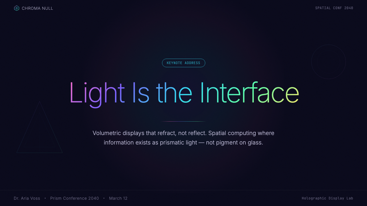
For presentation slides, the style is most powerful in covers and section dividers. A cover built in this language should commit fully to the dark ground: a single large floating panel with a prismatic edge occupies the center, while the title sits in ultra-light type with generous tracking. Avoid centering both the panel and the type — a slight asymmetry, with the panel drifting slightly off-axis, reinforces the spatial fiction that things are floating rather than placed. Content slides should be treated as depth compositions: primary text floats in the foreground panel, supporting data or annotations recede into a secondary layer behind it. Data visualizations — charts, graphs, timelines — take on the language's prismatic palette, with bars and line graphs rendered in spectral hues against the dark field rather than in conventional categorical colors.在演示文稿中,这套风格在封面与章节分隔页上最为有力。以这套语言构建的封面应当完全沉入深色背景:单块大型漂浮面板带棱镜边缘占据中心,标题以极细字重宽松字距的文字书写。避免将面板与文字同时居中——轻微的非对称,让面板略微偏离轴线,强化了事物是在漂浮而非被放置的空间叙事。内容页应当被当作深度构图处理:主要文字漂浮于前景面板,辅助数据或注释退落至其后的次级层级。数据可视化——图表、折线图、时间线——采用这套语言的棱镜色板,柱状图与折线以光谱色调呈现于深色场地之上,而非使用传统的分类色。
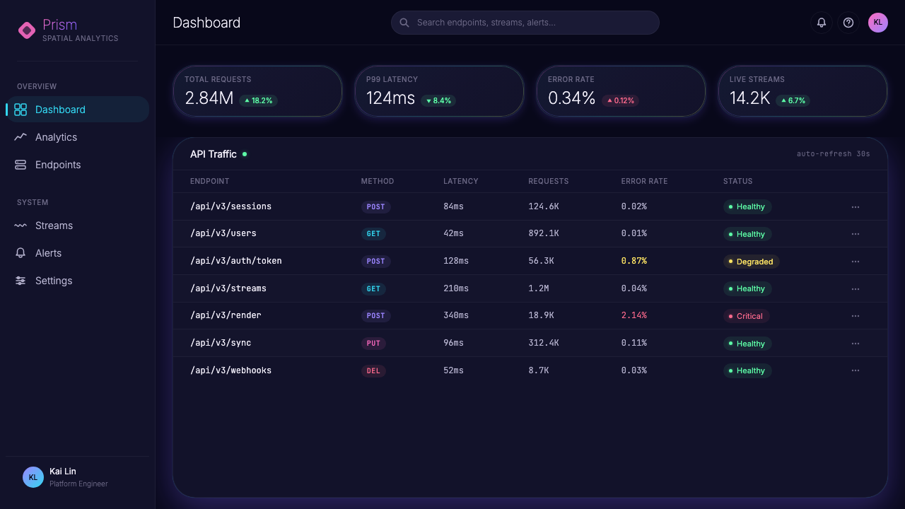
For web interfaces and dashboards, Holographic UI 2040 suits contexts that benefit from a strong sense of technological authority and spatial sophistication — fintech monitoring tools, developer consoles, data analytics platforms, and premium software products positioning themselves at the frontier of their field. The approach: treat the entire interface as a depth field rather than a flat page. Panel-based layouts with visible edge highlights define content regions more effectively than borders or background color changes alone. Navigation should be minimal and typographic; icon decoration, if present, should be limited to thin-line or outline forms that match the ultra-light type. Pricing pages built in this language can convey premium status effectively — a dark ground with one featured tier presented as a taller, brighter panel with more intense prismatic edge definition signals hierarchy without using size or color-badge shortcuts.对于网页界面与仪表板,全息 UI 2040 适合那些能从强烈技术权威感与空间精密感中获益的场景——金融科技监控工具、开发者控制台、数据分析平台,以及将自身定位于所在领域前沿的高端软件产品。方法如下:将整个界面视为深度场地而非平面页面。具有可见边缘高光的面板布局,比单纯依靠边框或背景色变化更有效地划定内容区域。导航应当极简且字体化;图标(若存在)应当限于与极细字体相配的细线或轮廓形式。以这套语言构建的定价页面能有效传达高端地位——深色背景上,以更高、更亮、棱镜边缘清晰度更强的面板呈现特色套餐,无需依靠尺寸或颜色标签即可传达层级信息。
For editorial and marketing work, the style supports a specific kind of forward-looking authority — the visual register of a technology report, a speculative product reveal, or a science-adjacent brand that wants to communicate that it is operating in genuinely new territory. Full-width image sections should use photographs or renders with strong dark tones and any existing iridescent or spectral elements amplified in post-processing. Pull quotes and section headers should be set in the ultra-light typographic voice, never at heavy or medium weight. Marketing pages benefit from restraint in color: the entire page might use only the spectral cyan as its single accent, with every call to action rendered in that one hue, rather than a varied palette that diffuses the system's coherence.对于编辑与营销内容,这套风格支持一种特定的前瞻性权威——科技报告、思辨产品发布会,或想要传达自身正在真正未知领域运作的科学相关品牌所适用的视觉档次。全宽图片区块应使用具有强烈深色调的照片或渲染图,并在后期处理中放大其中任何既有的虹彩或光谱元素。引用语与章节标题应以极细排印声部书写,绝不使用粗重或中等字重。营销页面在色彩上应保持克制:整个页面可能只以光谱青蓝作为唯一强调色,每个行动号召都以这一种色调呈现,而非以多样色板稀释系统的连贯性。
The most common mistake when applying Holographic UI 2040 is importing warm tones or adding ambient warmth in an attempt to make the interface feel more approachable. This breaks the system at a fundamental level: the entire aesthetic depends on the physics of cool, short-wavelength light — blue, cyan, violet, prismatic white. Introducing amber, orange, or warm white creates a perceptual contradiction, as though two incompatible light environments are occupying the same scene. A related error is over-applying the prismatic gradient effect to every element; in authentic executions, prismatic edges are reserved for panel borders and key interactive states, while the majority of the surface remains in the deep, unmarked dark. Abundance of prismatic detail reads as noise, not sophistication.应用全息 UI 2040 时最常见的错误,是引入暖色调或添加环境暖意,试图让界面显得更具亲和力。这会从根本上破坏系统:整套美学依赖于冷调短波长光的物理属性——蓝色、青蓝、紫罗兰、棱镜白。引入琥珀色、橙色或暖白色会制造感知上的矛盾,仿佛两种不相容的光环境占据着同一场景。另一个常见错误是将棱镜渐变效果过度应用于每一个元素;在真实的执行中,棱镜边缘保留用于面板边框与关键交互状态,而大多数表面保持在深邃、未经标记的黑暗之中。过量的棱镜细节读来是噪音,而非精密。
See the Holographic UI 2040 design system查看 Holographic UI 2040 完整设计系统
Holographic UI 2040 — FAQHolographic UI 2040 · 常见问题
Is Holographic UI 2040 only suitable for dark-mode interfaces?全息 UI 2040 只适合深色模式界面吗?
Essentially, yes. The system's entire visual logic depends on the deep void background: prismatic edges only shimmer against darkness, chromatic ambient glows only read against a near-black ground, and the illusion of self-luminous panels only holds when the surrounding field is dark enough to make glow plausible. A light-ground version of this aesthetic loses most of its distinguishing qualities — what remains tends to look like standard glassmorphism with iridescent border accents, which is a different and less distinctive system. If you need a light-background variant, treat it as a different design system inspired by the same references rather than a faithful application of Holographic UI 2040.本质上是的。这套系统的全部视觉逻辑都依赖深邃的虚空背景:棱镜边缘只在黑暗中才能闪烁,色彩环境光晕只在接近黑色的底面上才能被识别,而自发光面板的幻觉只在周围场地足够深暗、使光晕显得合理时才能成立。这套美学的浅色背景版本会失去大部分独特品质——剩下的往往像是加了虹彩边框强调色的标准玻璃拟物风格,这是一个不同且辨识度较低的系统。如果需要浅色背景变体,将其视为受相同参照启发的不同设计系统,而非全息 UI 2040 的忠实应用。
How is this different from glassmorphism?这与玻璃拟物风格有何不同?
Glassmorphism, as it emerged around 2020, is fundamentally a flat-screen technique: it uses blur, translucency, and border highlights to simulate the appearance of frosted glass panels layered on a flat surface. The depth it creates is an optical illusion within a 2D frame. Holographic UI 2040 extends that metaphor into a genuinely spatial logic — panels are understood as floating objects in a three-dimensional void, not as translucent layers stacked on a page. The color language also differs: glassmorphism typically uses neutral white or very lightly tinted glass with soft neutral shadows, while Holographic UI 2040 introduces prismatic spectral edges, chromatic ambient glows, and a systematic color palette that references the physics of light dispersion rather than frosted glass.约在 2020 年涌现的玻璃拟物风格,从根本上是一种平面屏幕技术:它以模糊、半透明与边框高光来模拟磨砂玻璃面板层叠于平面之上的外观。它所创造的深度是二维画框内的视错觉。全息 UI 2040 将那一隐喻延伸为真正的空间逻辑——面板被理解为漂浮于三维虚空中的物体,而非堆叠于页面上的半透明图层。色彩语言也有所不同:玻璃拟物通常使用中性白或极浅淡的着色玻璃配以柔和中性投影,而全息 UI 2040 引入了棱镜光谱边缘、色彩环境光晕,以及一套参照光色散物理属性而非磨砂玻璃的系统性色板。
Can this style work for consumer-facing products, or is it too cold?这套风格能用于面向消费者的产品吗,还是说太冷漠了?
It works for consumer products where the product's value proposition is itself technological, futuristic, or precision-oriented — consumer electronics, gaming, fintech, premium SaaS, or any product that wants users to feel they are interacting with something genuinely advanced. It struggles wherever warmth, tactility, or emotional softness are important — food, wellness, children's products, social applications built around human connection. The style's challenge in consumer contexts is that its aesthetic values read as inhuman precision rather than tool for human use. This is not a fatal flaw, but it requires the content and copy voice to compensate, bringing warmth through language rather than visual texture.它适用于那些产品价值主张本身就是技术性、未来感或精准导向的消费产品——消费电子、游戏、金融科技、高端 SaaS,或任何希望用户感受到自己正在与真正先进事物交互的产品。它在温暖感、触觉感或情感柔软性至关重要的场合则力不从心——食品、健康、儿童产品、以人际连接为核心的社交应用。这套风格在消费者语境中的挑战在于:其美学价值观读来是非人性的精准,而非为人所用的工具。这并非致命的缺陷,但需要通过内容与文案语气来补偿,以语言而非视觉质感带来温度。
How do you use this style without it looking like science fiction concept art?如何使用这套风格而不让它看起来像科幻概念艺术?
The line between a functional UI in this style and a science fiction prop is almost entirely a matter of restraint in the prismatic effects and commitment to actual information architecture. Concept art in this aesthetic tends to overload every surface with spectral detail — every edge glows, every panel has multiple overlapping gradients, glitch effects and particle systems fill negative space. A functional application of Holographic UI 2040 treats the prismatic edges as structural markers, not decoration: they appear on panel boundaries and key interactive states only. The dark field between panels remains genuinely empty. Typography follows a real information hierarchy rather than being arranged for visual drama. If the design would function as a readable, usable interface with the prismatic edges removed, you have probably struck the right balance.这套风格中的功能性 UI 与科幻道具之间的界线,几乎完全在于对棱镜效果的克制以及对真实信息架构的坚守。这套美学中的概念艺术倾向于将每一个表面都过载以光谱细节——每条边缘发光、每块面板叠加多层渐变、故障效果与粒子系统填满留白。全息 UI 2040 的功能性应用将棱镜边缘视为结构标记而非装饰:它们只出现在面板边界与关键交互状态上。面板之间的深色场地保持真正的空旷。字体排印遵循真实的信息层级,而非为视觉戏剧性而编排。如果去掉棱镜边缘后这套设计仍能作为可读、可用的界面运作,那么你大概已经拿捏好了这个平衡点。
What kinds of content are genuinely not suited to this style?哪类内容真正不适合这套风格?
Any content that depends on warm, organic, or natural visual associations will fight this style rather than benefit from it. Food and beverage brands rely on warm tones and photographic richness that the deep-space palette actively suppresses. Wellness and mental health products require the soft, rounded, and humanly warm qualities that the style's precision-coldness contradicts. Print and physical collateral presents a practical challenge: deep-space blacks and prismatic edge effects depend on backlit digital screens; they translate poorly to print, where the black is ink rather than void and the prismatic gradients lose their luminous quality entirely. If your primary deliverable is printed matter, choose a different system and use Holographic UI 2040 only for accompanying digital touchpoints.任何依赖温暖、有机或自然视觉联想的内容,都会与这套风格产生对抗而非从中获益。食品与饮料品牌依赖暖色调与摄影丰富感,而深空色板会主动压制这些品质。健康与心理健康产品需要柔软、圆润、人性温度的质感,而这套风格的精准冷感与之相悖。印刷与实体物料提出了一个实际挑战:深空黑与棱镜边缘效果依赖背光数字屏幕;它们在印刷中表现极差——黑色是油墨而非虚空,棱镜渐变则完全失去其发光品质。如果你的主要交付物是印刷品,请选择其他系统,仅将全息 UI 2040 用于配套的数字触点。
Related design styles相关设计风格
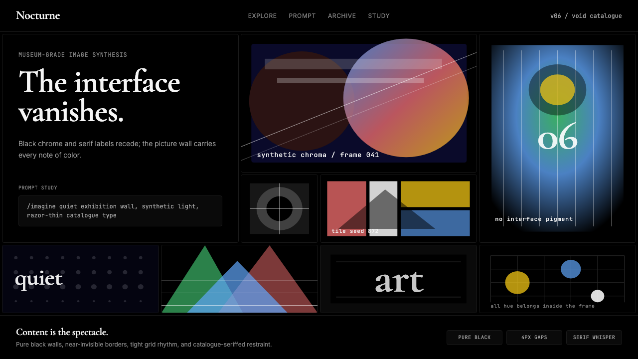 MidjourneyInvisible chrome, visible art. Pure black grid and Cormorant serif give color…界面隐身,图像发声。纯黑网格与细衬线让色彩只属于作品。
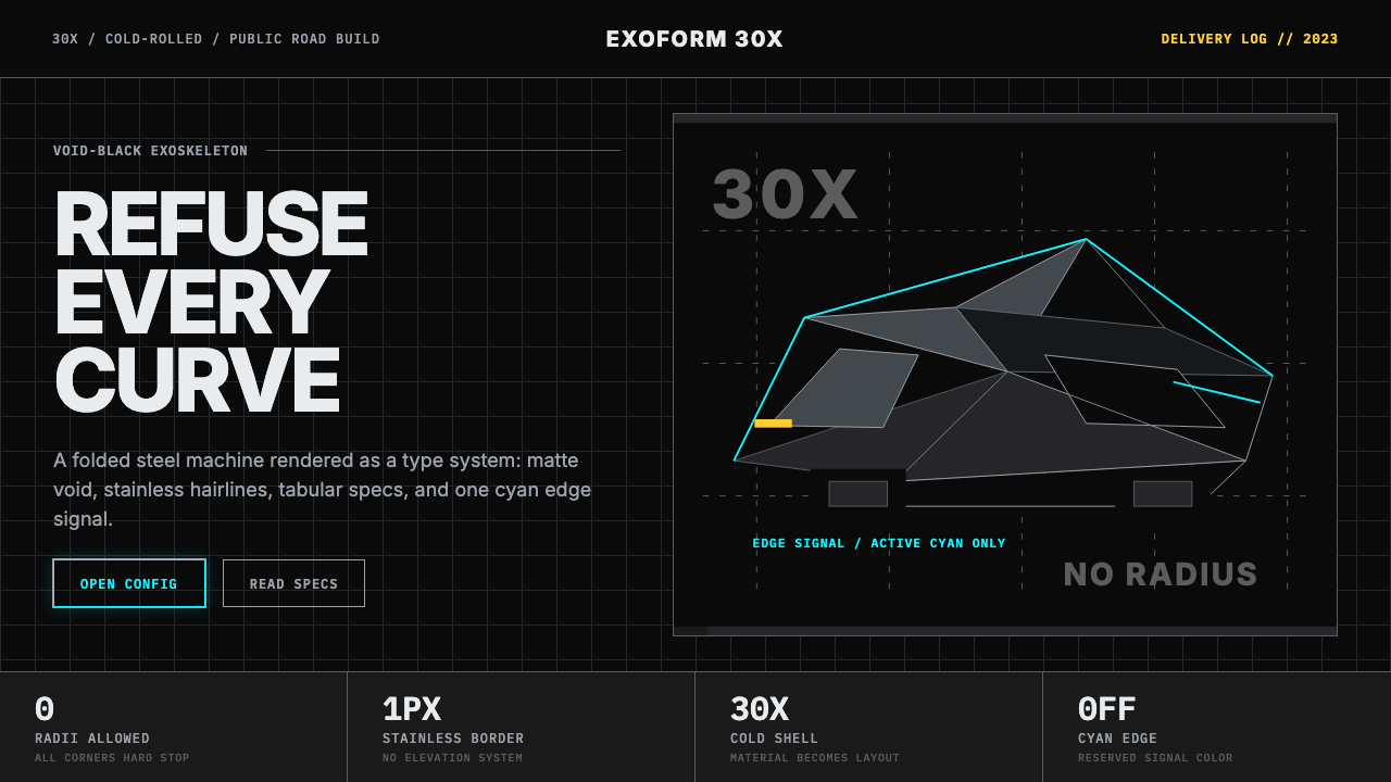 Tesla Cybertruck Stainless (2023)Refusal made material. Void black, stainless hairlines, cyan edges, faceted I…拒绝曲线:虚空黑、不锈钢发丝线、电子青边与棱面 Inter。
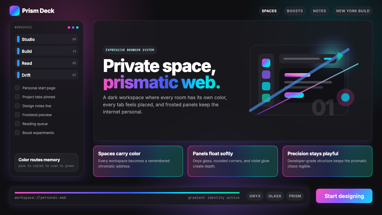 Arc Browser Prismatic (2023)Color is architecture. Pink-violet-cyan ribbons glow over onyx glass and roun…颜色即架构:粉紫青光带浮在黑曜石玻璃面板上。
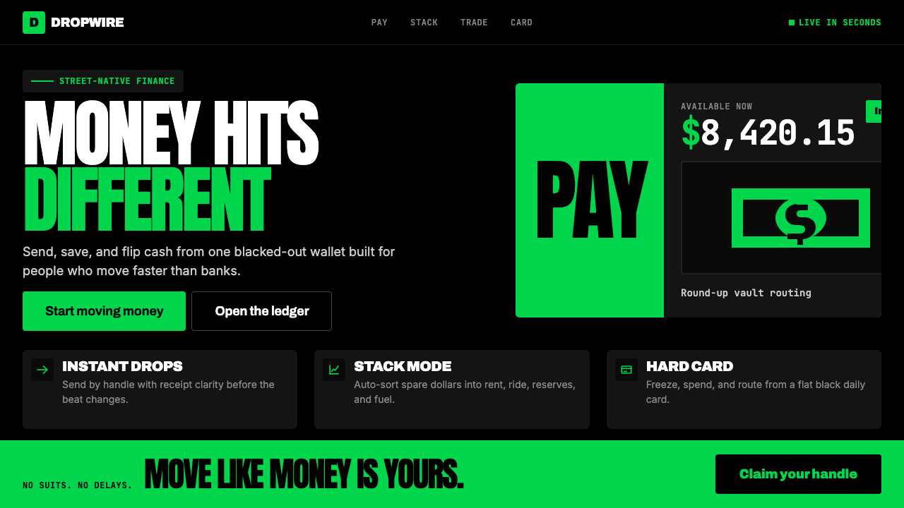 Cash App 2024Fintech that talks like a record label. Pure black, dollar-bill green, type a…像嘻哈厂牌的金融科技:纯黑底色、美钞绿、广告牌尺寸的超粗字体——不再是安全蓝衬…
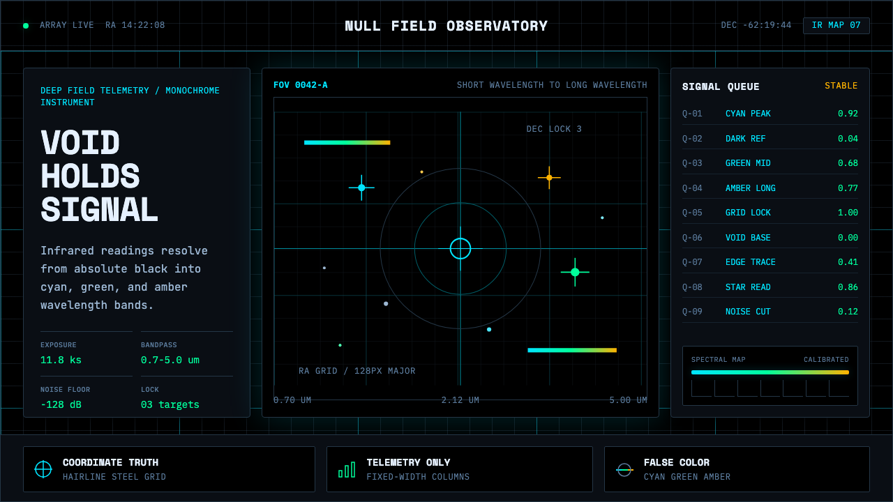 Deep Space ObservatoryTrust the void. Cyan telemetry and amber wavelength bars lock to a steel grid.信任虚空:青色遥测与琥珀波段锁定钢性网格。
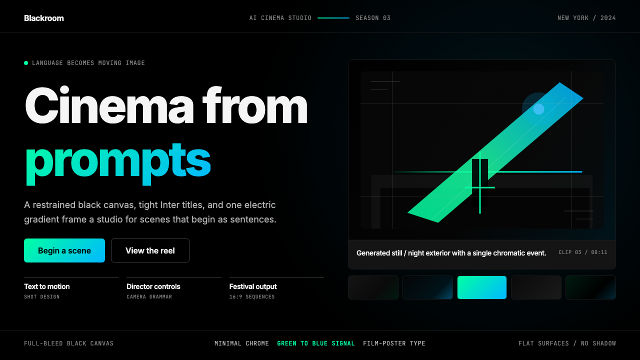 Runway MLCinema, not dashboard. Deep black frames tight Inter type and one green-blue…不是仪表盘,是电影感:纯黑画布、紧排 Inter 与绿蓝电光。