What is Midjourney?什么是 Midjourney?
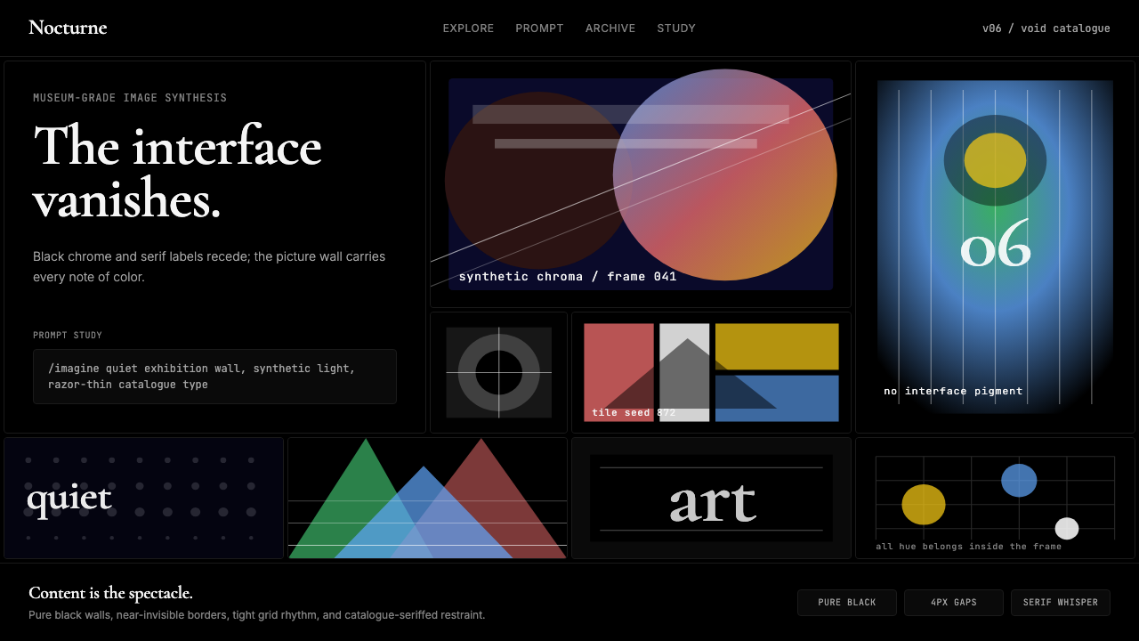
Midjourney made the interface invisible so the generated image could become the only spectacle — pitch-black canvas, razor-thin serif, zero chromatic branding.Midjourney 让界面彻底隐身,使生成的图像成为唯一的奇观——纯黑画布、纤细衬线、零色彩品牌。
Midjourney in briefMidjourney 速览
Midjourney is the AI image-generation platform that became a cultural-aesthetic force in the early 2020s. Its visual design philosophy is built on a single, radical premise: every pixel of color should come from the generated artwork itself, not from the interface surrounding it. The result is a system of pitch-black backgrounds, razor-thin serif letterforms, and an almost total absence of chromatic branding — a canvas that erases itself so the content can breathe.Midjourney 是2020年代初成为文化美学力量的 AI 图像生成平台。其视觉设计哲学建立在一个激进的前提之上:所有色彩都应来自生成的图像本身,而非包裹它的界面。结果便是一套纯黑背景、纤细衬线字形、几乎完全缺席品牌色彩的系统——一块自我消隐的画布,让内容得以呼吸。
The interface operates like a world-class contemporary art gallery with matte-black walls. In such a space, lighting, color, and spatial arrangement exist solely to frame and elevate the work on display — the architecture does not compete. Midjourney applies the same logic to software: the grid, the type, the controls, and the navigation are subordinated completely to the images they contain. This is sometimes called invisible-brand design — a philosophy in which the interface succeeds precisely when it is unnoticed.这套界面的运作方式如同一座拥有哑光黑墙的世界级当代美术馆。在这样的空间里,光线、色彩与空间布置的存在只为裱框和提升展出的作品——建筑本身不与作品竞争。Midjourney 将同样的逻辑应用于软件:网格、字体、控件与导航完全服从于它们所承载的图像。这有时被称为「隐形品牌」设计——一种界面恰好在被忽视时取得成功的哲学。
Visually, the style is immediately recognizable. Dense galleries of generated images float on near-total darkness. A single elegant serif typeface — delicate in weight, refined in proportion — provides all navigational and labeling information. Interactive elements are minimal: subtle outlines, restrained hover states, tonal variations that never introduce color of their own. The aesthetic is simultaneously austere and luxurious, museum-grade in its restraint yet alive with the chromatic energy of the images it frames.从视觉上看,这种风格辨识度极高。密集的图像画廊漂浮在近乎绝对的黑暗之上。一款细腻优雅的衬线字体——字重轻盈、比例考究——承担所有导航与标注信息。交互元素极为克制:若隐若现的轮廓、内敛的悬停状态、永不引入自身色彩的色调变化。整体美学既简朴又奢华,克制到博物馆级别,却又充溢着它所裱框的图像的色彩生命力。
Where does Midjourney come from?Midjourney 从何而来?
Midjourney launched in open beta in July 2022, initially operating entirely within Discord — the chat and community platform used by gamers, developers, and online communities. Users typed text prompts as Discord messages and received generated images in return. This unusual technical choice was not accidental: Discord's channel-and-thread structure created a publicly visible stream of prompts and outputs, turning every user's creative process into a shared spectacle. The platform grew virally not through advertising but through the curiosity generated by seeing other people's experiments in real time.Midjourney 于2022年7月以公开测试版形式推出,最初完全在 Discord 上运营——那个被游戏玩家、开发者与线上社区广泛使用的聊天平台。用户将文字提示作为 Discord 消息发送,系统返回生成的图像。这个不寻常的技术选择并非偶然:Discord 的频道与线程结构创造了一条公开可见的提示词与输出流,将每位用户的创作过程变成了共享的奇观。平台的病毒式增长不依靠广告,而依靠人们看到他人实时实验时所激发的好奇心。
The company was founded by David Holz, who had previously co-founded Leap Motion, a company that built hand-tracking hardware interfaces. Holz assembled a small, research-oriented team based in San Francisco, California. Unlike many AI ventures of the era, Midjourney operated without institutional venture funding for much of its early period, growing primarily through subscription revenue. This financial independence shaped the product's character: decisions were made on aesthetic and research grounds rather than by growth metrics or investor pressure.公司由戴维·霍尔茨创立,他此前曾联合创办 Leap Motion——一家开发手部追踪硬件界面的公司。霍尔茨在美国旧金山组建了一支规模精小、以研究为导向的团队。与同时代许多 AI 创业公司不同,Midjourney 在相当长的早期阶段没有机构风险投资,主要依靠订阅收入增长。这种财务独立性塑造了产品的性格:决策基于美学与研究考量,而非增长指标或投资者压力。
The visual identity of the platform evolved significantly between the Discord-only era and the launch of the full web interface in 2023 and 2024. In the Discord phase, the interface was almost entirely Discord's own — Midjourney contributed only the bot's response formatting and the grid layout of image options. When the web platform arrived, Midjourney's design team made a deliberate choice to build something that felt categorically different from mainstream SaaS products. Where most tools of the period used light backgrounds, rounded components, and colorful accents, Midjourney went dark, angular, and monochromatic.平台的视觉面貌在纯 Discord 时代与2023至2024年全网页界面发布之间经历了显著演变。在 Discord 阶段,界面几乎完全是 Discord 本身的——Midjourney 只贡献了机器人的响应格式和图像选项的网格布局。当网页平台到来时,Midjourney 的设计团队做出了一个刻意的选择:构建一种在本质上有别于主流 SaaS 产品的体验。当同期大多数工具采用浅色背景、圆角组件与彩色强调时,Midjourney 选择了深色、棱角分明与单色调。
The aesthetic lineage is not arbitrary. The pitch-black gallery wall is a convention borrowed from the physical art world, where dark wall colors became fashionable in contemporary and modern art museums precisely because they absorb rather than reflect ambient light, reducing visual competition with the works on display. The choice of a refined serif typeface — departing from the sans-serif conventions dominant in tech products since the 2010s — signals cultural alignment with editorial publishing, luxury fashion, and the fine arts rather than with Silicon Valley productivity software. Together, these choices position Midjourney not as a tool but as a cultural institution of sorts, a platform that takes visual seriousness seriously.这种美学渊源并非随意为之。纯黑的画廊墙面是从实体艺术世界借用的惯例——深色墙面在当代与现代艺术博物馆中流行,恰恰因为它们吸收而非反射环境光,减少了与展品的视觉竞争。选用精致的衬线字体——背离了2010年代以来在科技产品中占据主导的无衬线惯例——则传递出与编辑出版、奢侈时尚和纯艺术的文化归属,而非与硅谷生产力软件的归属。这些选择共同将 Midjourney 定位为一种文化机构而非工具,一个认真对待视觉严肃性的平台。
What defines the Midjourney look?Midjourney 的视觉特征是什么?
Background and Ground背景与底面
The defining visual decision is the near-absolute dark ground. Backgrounds are not merely dark gray — they approach true black, providing maximum contrast for images of any color temperature and saturation. This ground absorbs ambient color rather than reflecting it, ensuring that a cool-toned photographic image and a warm painterly one can coexist on the same screen without either distorting the other. The darkness is not decorative; it is functional, the equivalent of a professional printing press that does not introduce its own color cast.最具决定性的视觉选择是近乎绝对的深色底面。背景不仅仅是深灰色——它们接近真正的黑色,为任何色温和饱和度的图像提供最大对比度。这种底面吸收环境色而非反射它,确保冷调的摄影图像与暖调的绘画感图像能在同一屏幕上共存而互不干扰。这种黑暗并非装饰性的;它是功能性的,相当于一台不引入自身色偏的专业印刷机。
Typography and Typeface Character字体排印与字体性格
The typographic system uses a refined serif — one characterized by delicate stroke contrast, tapered serifs, and proportions associated with classical editorial publishing rather than with digital interfaces. The choice is a deliberate counterstatement to the tech-industry convention of geometric or humanist sans-serif typefaces. Serif type in this context signals cultural seriousness: it references the fine-art catalogue, the literary journal, the auction-house brochure. Type weight is kept light throughout, never competing visually with the images. Size hierarchies are subtle; the interface speaks softly so the work can speak loudly.排印系统使用一款精致的衬线字体——以细腻的笔画对比、渐细的衬线和与古典编辑出版而非数字界面相关联的比例为特征。这一选择是对科技行业惯用几何或人文无衬线字体的刻意反叛。在此语境下,衬线字体传递文化严肃性:它援引的是纯艺术目录、文学期刊、拍卖行手册。字体字重全程保持轻盈,从不在视觉上与图像竞争。字号层级微妙克制;界面轻声细语,让作品高声发言。
Grid and Gallery Logic网格与画廊逻辑
Images are presented in dense, tightly packed grids — a layout closer to a contact sheet or museum study room than to a conventional app gallery. The grid's tight spacing maximizes the number of images visible simultaneously, turning the screen into an immersive field of visual information. Aspect ratios within the grid are allowed to vary, giving the layout an organic rhythm that avoids the rigid uniformity of standard photo-grid UIs. The grid itself is invisible — no colored cell backgrounds, no borders, no separators — so the negative space between images is pure black, part of the ground rather than a design element.图像以密集、紧凑的网格呈现——这种布局更接近接触式印样或博物馆研究室,而非常规的应用程序图库。网格紧密的间距最大化了同时可见的图像数量,将屏幕变为沉浸式的视觉信息场。网格内的长宽比允许变化,赋予版面一种有机韵律,避免了标准照片网格界面的僵硬统一感。网格本身是隐形的——无彩色单元格背景,无边框,无分隔线——使图像之间的负空间呈现纯黑,成为底面的一部分而非设计元素。
Chromatic Restraint色彩克制
The interface introduces almost no color of its own. Navigation, labels, buttons, and controls are rendered in tones of near-white and dark gray. When color does appear in the UI — on a selected state, a loading indicator, or an interactive prompt — it arrives as a very faint tonal accent, never assertive. This chromatic discipline ensures that any image, regardless of its palette, reads as the dominant visual presence on screen. The interface is colorimetrically neutral so the art is never.界面几乎不引入自身的色彩。导航、标签、按钮与控件均以接近白色和深灰色的色调呈现。当色彩在界面中出现时——选中状态、加载指示符或交互提示——它以极为微弱的色调点缀抵达,从不强势。这种色彩自律确保任何图像,无论其色板如何,都能作为屏幕上最主导的视觉存在而被感知。界面在色度上是中性的,而艺术从来不是。
Spatial Depth and Elevation空间深度与层次
Depth is implied through darkness rather than through traditional shadow systems. Modal overlays, panels, and drawers darken the content beneath them rather than casting shadows over it — a technique that creates separation using the same visual language of tonal variation rather than introducing simulated three-dimensionality. Elevation is expressed through contrast with the ground rather than through shadow offsets. The overall visual effect is flat in the technical sense — no drop shadows, no glows — but perceptually rich because the deep ground provides inherent spatial resonance.深度通过黑暗来暗示,而非通过传统投影系统。模态覆盖层、面板与抽屉使其下方的内容变暗,而非在其上投射阴影——这一技术使用色调变化的同一视觉语言来制造分离感,而非引入模拟的三维感。层次通过与底面的对比来表达,而非通过阴影偏移。整体视觉效果在技术意义上是平面的——无投影,无发光——但感知上却是丰富的,因为深邃的底面本身提供了固有的空间共鸣。
Minimal Iconography极简图标体系
Icons and UI symbols are reduced to their geometric minimum — thin-stroked outlines, no fills, no decorative variations between icon families. Where text labels are possible, they are preferred over icons, reflecting the typographic primacy of the system. Interactive affordances rely on context and position more than on visual embellishment. This approach prevents the interface chrome from acquiring visual weight that might compete with the images; every mark on the screen that is not an image must earn its presence through strict functional necessity.图标与界面符号被精简至几何极限——细笔触轮廓,无填充,图标族之间无装饰性变化。在可以使用文字标签的地方,文字优先于图标,这反映了系统字体排印的主导地位。交互可供性更多依赖上下文与位置,而非视觉修饰。这种方式防止界面「铬合金」积累可能与图像竞争的视觉重量;屏幕上每一个非图像的标记,都必须以严格的功能必要性来证明自身存在的合理性。
Invisible Brand Identity隐形品牌身份
Perhaps the most distinctive and philosophically significant choice: Midjourney has no chromatic brand color. There is no signature blue, no corporate accent, no branded gradient to associate the platform with. The product's identity lives entirely in the structural and typographic choices — the dark ground, the refined serif, the gallery density — rather than in a proprietary color or mark. This is the inverse of conventional brand strategy, which typically relies on consistent color as a primary recognition device. The philosophy is that the generated images collectively constitute the brand's visual identity, a rotating, user-generated canvas that is always different and always unmistakably Midjourney.或许是最具独特性和哲学意义的选择:Midjourney 没有色彩品牌色。没有标志性的蓝色,没有企业强调色,没有与平台相关联的品牌渐变。产品的身份完全寄居于结构性与排印性选择之中——深色底面、精致衬线、画廊密度——而非一种专属颜色或标记。这与传统品牌策略恰恰相反,后者通常依赖一致的色彩作为主要识别手段。其哲学在于:生成的图像集体构成品牌的视觉身份,一块永远不同却永远无误地属于 Midjourney 的、由用户持续生成的旋转画布。
Who shaped Midjourney?谁塑造了 Midjourney?
Holz co-founded Leap Motion before starting Midjourney, and his background in human-computer interaction shaped the platform's unusual attention to how users experience the act of image generation — not merely as a technical transaction but as a creative and aesthetic encounter. His decision to launch via Discord rather than a conventional web app was a defining strategic and cultural choice: it embedded Midjourney inside an existing community infrastructure, made the creative process socially visible, and allowed the platform to grow through network effects rather than paid acquisition. Holz has spoken publicly about the importance of building for long-term aesthetic coherence over short-term engagement metrics, a philosophy visible throughout the platform's visual design.霍尔茨在创立 Midjourney 之前联合创办了 Leap Motion,他在人机交互领域的背景塑造了平台对图像生成体验的独特关注——不仅仅是一次技术交换,而是一次创造性与审美性的相遇。他选择通过 Discord 而非常规网页应用发布的决定,是一个具有决定意义的战略与文化选择:它将 Midjourney 嵌入现有的社区基础设施,使创作过程具备社会可见性,并允许平台通过网络效应而非付费获客增长。霍尔茨曾公开谈及为长期审美连贯性而非短期参与指标而构建产品的重要性,这一哲学在平台的视觉设计中处处可见。
Unusually for a company of its influence, Midjourney has operated with a very small team — reportedly under one hundred people for much of its high-growth period. The research team is responsible for the underlying generative models, including the progression from early versions to later iterations that dramatically improved photorealism, compositional control, and stylistic coherence. The aesthetic sensibility of the models — their tendency to produce images with painterly light, cinematic framing, and rich tonal depth — reflects deliberate training decisions made by the research team that are as much curatorial as they are technical.对于一家如此具有影响力的公司而言,Midjourney 以一支极小的团队运营——在其高速增长的大部分时期据报人数不足一百。研究团队负责底层生成模型,包括从早期版本到后续迭代的演进——这些迭代在照片真实感、构图控制力和风格一致性方面取得了显著提升。模型的审美感性——其倾向于生成具有绘画感光线、电影感构图与丰富色调深度的图像——反映了研究团队做出的刻意训练决策,这些决策既是技术性的,也是策展性的。
Discord's role in Midjourney's origin is so significant that it functions almost as a co-creator of the platform's early cultural identity. The chat platform's structure — public channels, visible conversation threads, real-time scrolling feeds — turned the prompt-and-generate workflow into a social performance. Users could see each other's prompts, learn from unexpected outputs, and develop a shared vocabulary of technique. This public creative environment shaped the aesthetics that users came to associate with Midjourney: exploratory, experimental, communal, and perpetually in motion. The eventual move to a private web interface retained the gallery density of the Discord grid while replacing its informal social energy with something closer to the contemplative quiet of a curated exhibition space.Discord 在 Midjourney 起源中扮演的角色是如此重要,以至于它几乎像是平台早期文化身份的共同创造者。这一聊天平台的结构——公开频道、可见的对话线程、实时滚动的信息流——将提示词-生成的工作流变成了一种社会性表演。用户可以看到彼此的提示词,从意外的输出中学习,并发展出一套共享的技术词汇。这种公开的创作环境塑造了用户与 Midjourney 相关联的美学:探索性的、实验性的、共同体性的,永远处于运动之中。最终迁移至私有网页界面,保留了 Discord 网格的画廊密度,同时将其非正式的社交能量替换为更接近精心策划的展览空间之沉思静谧的氛围。
The design of Midjourney's web interface draws explicitly on the visual conventions of contemporary art institutions — specifically the dark-walled gallery model that became widespread in international museums from the late twentieth century onward. Institutions including the Tate Modern in London, MoMA in New York, and the Centre Pompidou in Paris adopted dark or neutral mid-tone walls for contemporary and modern art displays, finding that this suppressed architectural noise and made the works' own light and color more legible. Midjourney applies this principle digitally, treating the interface as architecture in service of the work rather than as a designed object in its own right. The lineage connects the platform's visual character to a much longer tradition of art-world display practice.Midjourney 网页界面的设计明确借鉴了当代艺术机构的视觉惯例——具体而言是从二十世纪末起在国际博物馆中广泛流行的深色墙面画廊模式。伦敦泰特现代美术馆、纽约现代艺术博物馆与巴黎蓬皮杜中心等机构采用深色或中性中调墙面展示当代与现代艺术,发现这能抑制建筑噪音,使作品自身的光线与色彩更为清晰可读。Midjourney 将这一原则数字化,将界面视为服务于作品的建筑,而非自身即是设计对象。这一渊源将平台的视觉性格与一个更为悠久的艺术世界展示实践传统联结在一起。
How do you use Midjourney today?今天怎么用 Midjourney?
Midjourney's visual language is one of the most transferable dark-aesthetic systems in contemporary design — not because darkness is universally appropriate, but because the specific logic underlying it (interface erasure, chromatic neutrality, typographic restraint) is structurally sound and can be applied wherever the content itself is the primary visual experience. Understanding that logic is essential before applying the style: this is not simply a dark color scheme overlaid on a conventional layout, but a complete rethinking of which elements deserve visual presence.Midjourney 的视觉语言是当代设计中可移植性最强的深色美学系统之一——不是因为黑暗具有普遍适用性,而是因为其背后的具体逻辑(界面消隐、色度中性、排印克制)在结构上是严谨的,可以应用于任何以内容本身为主要视觉体验的场景。在应用这种风格之前,理解这一逻辑至关重要:这不仅仅是在常规版面上叠加深色配色方案,而是对哪些元素应当获得视觉存在感的全面重新思考。
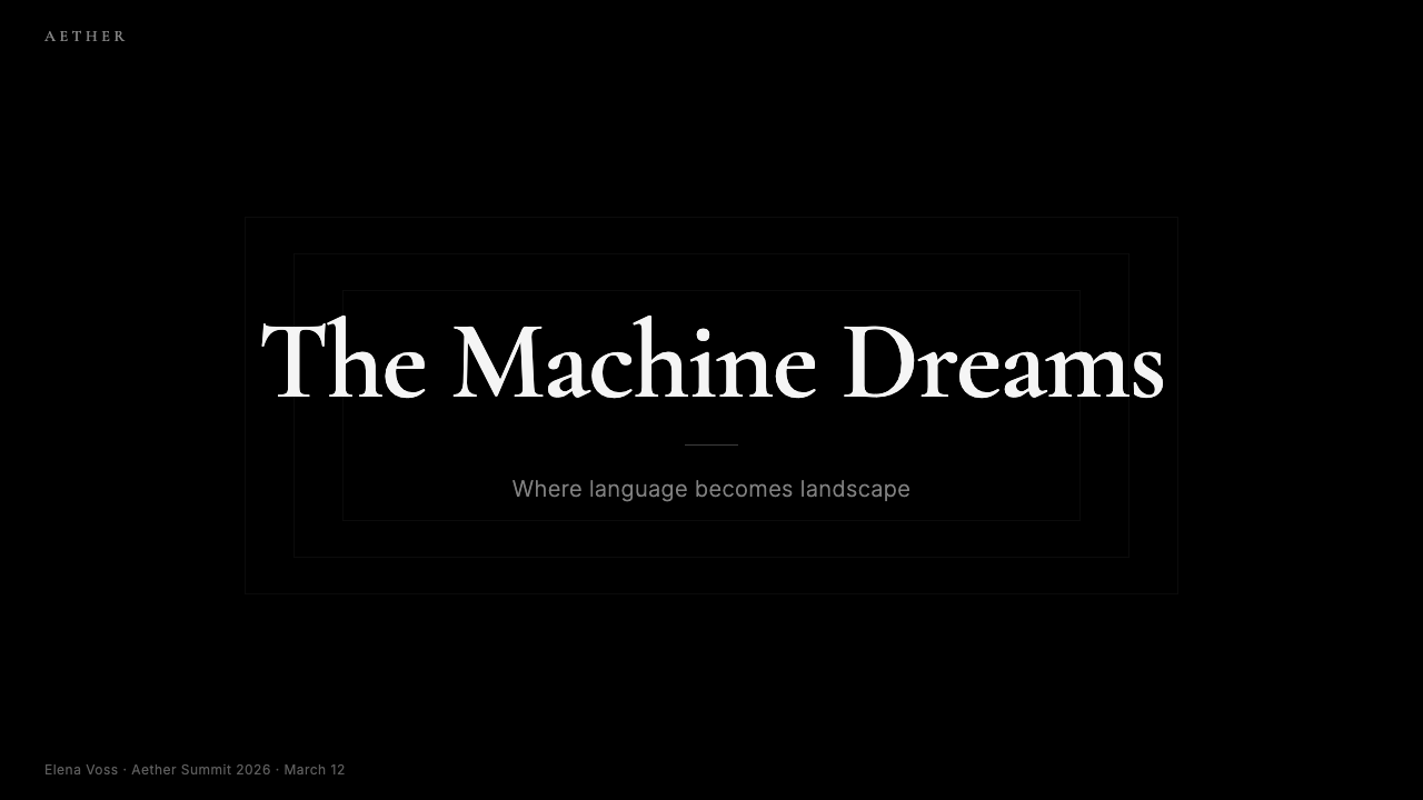
For presentation decks, the style works powerfully on both cover and section-break slides. A cover built in this register places a large, high-quality image — photographic, illustrative, or AI-generated — against near-total darkness, with a refined serif title in a very light weight occupying a corner or a narrow horizontal band. The title does not compete with the image; it anchors it. Content slides should maintain the dark ground and use type-only hierarchy: a light-weight serif heading, a body paragraph in a slightly smaller size, and nothing else. Data visualization slides translate naturally: charts and diagrams become bright objects against the dark field, their colors functioning as signal rather than decoration, the background giving them the visual equivalent of spotlighting.对于演示文稿,这种风格在封面页和章节分隔页上都能产生强烈效果。以这种方式构建的封面页将一张高质量图像——摄影的、插图的或 AI 生成的——置于近乎绝对的黑暗之中,以极轻字重的精致衬线标题占据一个角落或一条窄横幅。标题不与图像竞争;它锚定图像。内容页应维持深色底面,仅使用字体层级:轻字重衬线标题、稍小一号的正文段落,此外别无他物。数据可视化幻灯片自然转化:图表与示意图成为深色底面上明亮的对象,它们的色彩作为信号而非装饰发挥作用,背景赋予它们视觉上等同于聚光灯照射的效果。
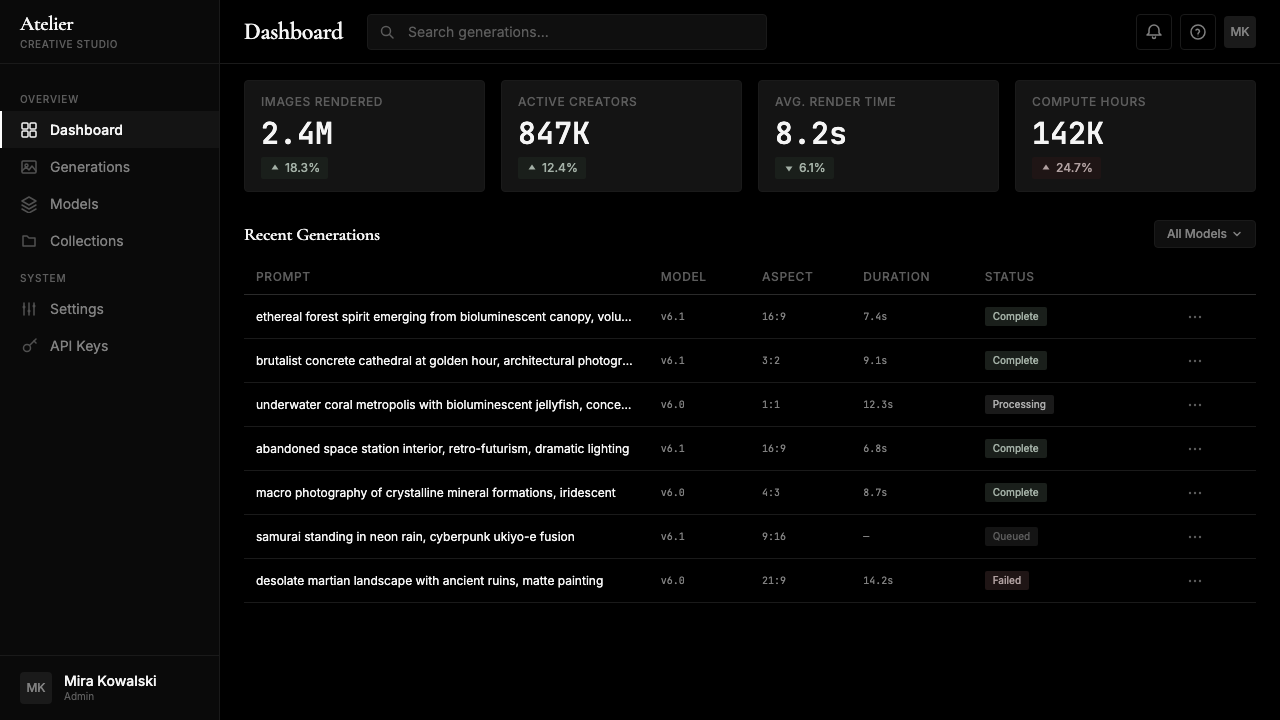
For web UI — dashboards, analytics tools, portfolio platforms, creative software interfaces — the system is particularly well-suited. The approach begins with the ground: a true near-black background establishes the container. Content cards and panels are distinguished from the ground through very slight tonal elevation rather than border or shadow — they are darker or lighter versions of the same ground color rather than differently colored surfaces. Interactive elements use the lightest tonal values available — near-white for primary text and buttons, mid-tones for secondary controls. Accent color, if introduced at all, should be drawn from the content domain itself rather than from a brand palette. For pricing pages within this system, tier differentiation is achieved through contrast and type weight rather than through colored headers or background tinting.对于网页界面——仪表板、分析工具、作品集平台、创意软件界面——这套系统尤为适合。方法从底面开始:接近真正黑色的深色背景建立容器。内容卡片与面板通过极为微弱的色调提升与底面区分——它们是同一底色的深一点或浅一点的版本,而非颜色不同的表面。交互元素使用最浅的色调值——接近白色用于主要文字和按钮,中间色调用于次级控件。如果引入强调色,应从内容领域本身而非品牌色板中汲取。在此系统中的定价页面里,等级区分通过对比度与字体字重来实现,而非通过彩色标题或背景色调。
For editorial and marketing contexts — editorial features, campaign landing pages, brand storytelling — the Midjourney aesthetic communicates cultural sophistication and creative credibility. A long-form editorial piece in this system uses a dark background with light body text set in a refined serif, generous vertical rhythm, and images that run edge-to-edge or bleed into the margin. Marketing pages use the same full-width image blocks and tonal alternation between slightly different dark values to create rhythm without introducing color. The serif typeface carries the page's sophistication; the images provide its emotional impact; the dark ground gives it weight and seriousness.对于编辑与营销场景——专题报道、活动落地页、品牌叙事——Midjourney 美学传递文化成熟度与创意可信度。在这套系统中,长篇编辑内容使用深色背景搭配浅色正文,以精致衬线字体排设,行间距慷慨,图像全出血至边缘或渗入页边距。营销页面使用同样的全宽图像区块,以略有差异的深色调之间的色调交替制造节奏,而不引入色彩。衬线字体承载页面的品位;图像提供情感冲击;深色底面赋予它重量与严肃性。
A common mistake when applying this system is treating it as simply a dark-mode version of a conventional light-background design. The Midjourney aesthetic is not achieved by inverting a light layout — it requires reconsidering every element from the ground up. Light-on-dark text demands tighter attention to type weight and size than dark-on-light, because the perceptual contrast is fundamentally different. Images need to be selected or created for dark-ground display: heavily vigneted images or those with very dark borders will disappear into the background; images that carry their own light will appear to float. The serif typeface choice must be genuinely refined — not any serif will work, because coarser or more utilitarian serifs will read as gothic or funereal rather than editorial and curatorial. The system rewards attention to detail and punishes casual application.应用这套系统时最常见的错误,是将其视为常规浅色背景设计的深色模式版本。Midjourney 美学不能通过反转浅色版面来实现——它要求从底面开始重新审视每一个元素。浅色文字在深色背景上对字体字重与字号的注意力要求比深色文字在浅色背景上更为严苛,因为感知对比度在根本上是不同的。图像需要针对深色底面显示进行选择或创作:大面积暗角或边缘极深的图像会消融进背景;携带自身光线的图像会呈现出悬浮感。衬线字体的选择必须是真正精致的——并非任何衬线字体都能胜任,因为粗粝或更功能性的衬线字体会呈现出哥特式或葬礼感,而非编辑性与策展性。这套系统奖励对细节的关注,惩罚草率的应用。
Midjourney — FAQMidjourney · 常见问题
Is the Midjourney aesthetic just dark mode with a serif font?Midjourney 美学只是加了衬线字体的深色模式吗?
No — though that description captures two surface elements, it misses the underlying logic entirely. Dark mode as implemented in most operating systems and apps is a light-background layout inverted for reduced eye strain in low-light conditions; it preserves the same compositional hierarchy, the same color accent systems, and the same design decisions as the light version. The Midjourney aesthetic is built from the ground up around a different premise: the interface is a display substrate for other people's images, and its job is to introduce as little visual information of its own as possible. This produces specific decisions — no brand color, no decorative elements, typographic weight kept low, spatial density high — that have nothing to do with dark mode as a comfort feature.不——尽管这个描述捕捉了两个表面元素,但它完全错过了底层逻辑。大多数操作系统和应用程序实现的深色模式是为了在低光环境下减少眼睛疲劳而将浅色背景版面反转;它保留了与浅色版本相同的构图层级、相同的色彩强调系统和相同的设计决策。Midjourney 美学从底面开始,围绕一个不同的前提构建:界面是他人图像的展示基底,其职责是尽可能少地引入自身的视觉信息。这产生了特定的决策——无品牌色、无装饰元素、字体字重保持低位、空间密度保持高位——这些与作为舒适功能的深色模式毫无关系。
Why use a serif rather than a sans-serif in a tech product?为什么在科技产品中选择衬线字体而非无衬线字体?
The sans-serif convention in tech UI design is a historical artifact, not a functional requirement. Sans-serifs became dominant in digital interfaces partly because early low-resolution screens rendered serif details poorly, and partly because the minimalist design movements of the 2000s and 2010s — influenced by Swiss International Style and later by flat design — established clean geometric sans-serifs as the neutral, modern default. Midjourney's serif choice is a deliberate departure from that convention, and it communicates something precise: this platform belongs to the cultural domain of fine art, editorial publishing, and luxury goods rather than to productivity software. The serif is doing the same work that a dark gallery wall does — it signals that what is being displayed here deserves a different level of attention and seriousness.科技界面设计中的无衬线惯例是一种历史产物,而非功能要求。无衬线字体在数字界面中占据主导,一方面是因为早期低分辨率屏幕对衬线细节的呈现效果不佳,另一方面是因为2000年代至2010年代受瑞士国际主义风格及后来平面设计影响的极简主义设计运动,将干净的几何无衬线字体确立为中性的现代默认选择。Midjourney 的衬线字体选择是对这一惯例的刻意背离,它传递了一个精确的信号:这个平台属于纯艺术、编辑出版与奢侈品的文化领域,而非生产力软件。衬线字体所做的工作与深色画廊墙面相同——它表明这里所展示的内容值得不同程度的关注与严肃对待。
Does this design system work for products that are not image-generation platforms?这套设计系统适用于非图像生成平台的产品吗?
Yes, but with important conditions. The core logic — minimal interface chrome, dark ground, chromatic restraint, content as the visual star — transfers well to any product where the primary content is rich and visual: portfolio platforms, photography tools, video editors, creative marketplaces, high-end e-commerce for visual goods, cultural institutions, and editorial publications. It is much less appropriate for products where the interface itself needs to guide action, communicate trust through familiar conventions, or support dense text-based interaction — accounting software, customer support tools, long-form reading apps, or products targeting audiences unfamiliar with fine-art or editorial aesthetics. The style assumes that users bring their own visual fluency to the experience; when that assumption fails, the restrained interface can feel cold, confusing, or incomplete.可以,但有重要前提条件。核心逻辑——最小化界面「铬合金」、深色底面、色彩克制、内容作为视觉主角——能很好地迁移至任何以丰富视觉内容为主要呈现物的产品:作品集平台、摄影工具、视频编辑器、创意市场、视觉商品的高端电商、文化机构和编辑出版物。它在界面本身需要引导行动、通过熟悉惯例传递信任或支持密集文字交互的产品中则明显不适合——会计软件、客户支持工具、长篇阅读应用,或面向不熟悉纯艺术或编辑美学受众的产品。这种风格假设用户自带视觉流畅度进入体验;当这一假设失效时,克制的界面可能令人感到冷漠、困惑或不完整。
How should color be introduced if the product needs it — for alerts, states, or branding?如果产品需要色彩——用于警示、状态或品牌——应该如何引入?
Sparingly and purposefully. The system's logic is not that color is forbidden — it is that color introduced by the interface always competes with the content's color, so every chromatic decision must be justified by clear functional necessity. Alerts and error states can use red or amber tones — functional color has a long-established semantic meaning that users will not misread as branding. Loading and progress states can use a very desaturated teal or blue — again, functional rather than aesthetic. If a brand color must be present, it should appear only at the smallest possible scale: a thin line, a dot, a typographic accent — never a filled button, never a colored header. The test for any color introduced is: does this color carry information that cannot be conveyed through size, position, or typographic contrast alone? If the answer is no, remove it.谨慎且有目的地引入。这套系统的逻辑不是色彩被禁止——而是界面引入的色彩总会与内容的色彩竞争,因此每一个色彩决策都必须以清晰的功能必要性为正当依据。警示与错误状态可以使用红色或琥珀色调——功能性色彩具有用户不会误读为品牌色的长期确立的语义意义。加载与进度状态可以使用极低饱和度的蓝绿色或蓝色——同样是功能性而非审美性的。如果品牌色必须出现,它应只在尽可能小的尺度上呈现:一条细线、一个点、一处字体性强调——绝不是填充按钮,绝不是彩色标题。检验任何引入色彩的标准是:这种色彩是否承载了无法仅通过尺寸、位置或字体对比来传达的信息?如果答案是否,则移除它。
What is the biggest risk of applying this style incorrectly?错误应用这种风格最大的风险是什么?
The biggest risk is producing a design that reads as pretentious or inaccessible — a dark interface that signals cultural seriousness without delivering it. This happens when the dark ground and refined serif are applied over a product whose content, function, or audience do not match the aesthetic's implied values. A task-management app styled like Midjourney will likely feel affected; a photography portfolio platform styled the same way will feel appropriate. The second major risk is accessibility: light text on a very dark background must meet contrast requirements, and the fine-stroked serifs that give the system its refinement can become illegible at small sizes on screens of ordinary quality. A typographically restrained system is not automatically an accessible one; the restraint must be balanced against legibility thresholds. The style succeeds when the aesthetic claim and the product reality are in genuine alignment.最大的风险是产出一套被解读为自命不凡或令人难以接近的设计——一套深色界面传递文化严肃性的信号却无法兑现它。当深色底面与精致衬线被应用于内容、功能或受众与这套美学所隐含价值观不匹配的产品时,这种情况就会发生。以 Midjourney 风格设计的任务管理应用很可能显得矫揉造作;以同样方式设计的摄影作品集平台则会显得恰如其分。第二大风险是可达性:极深背景上的浅色文字必须满足对比度要求,而赋予系统精致感的细笔触衬线字体在普通质量屏幕上以小字号显示时可能变得难以辨读。字体排印克制的系统不会自动成为一个无障碍的系统;克制必须与可读性阈值相平衡。当美学主张与产品现实真正对齐时,这种风格才能取得成功。
Related design styles相关设计风格
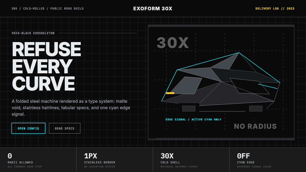 Tesla Cybertruck Stainless (2023)Refusal made material. Void black, stainless hairlines, cyan edges, faceted I…拒绝曲线:虚空黑、不锈钢发丝线、电子青边与棱面 Inter。
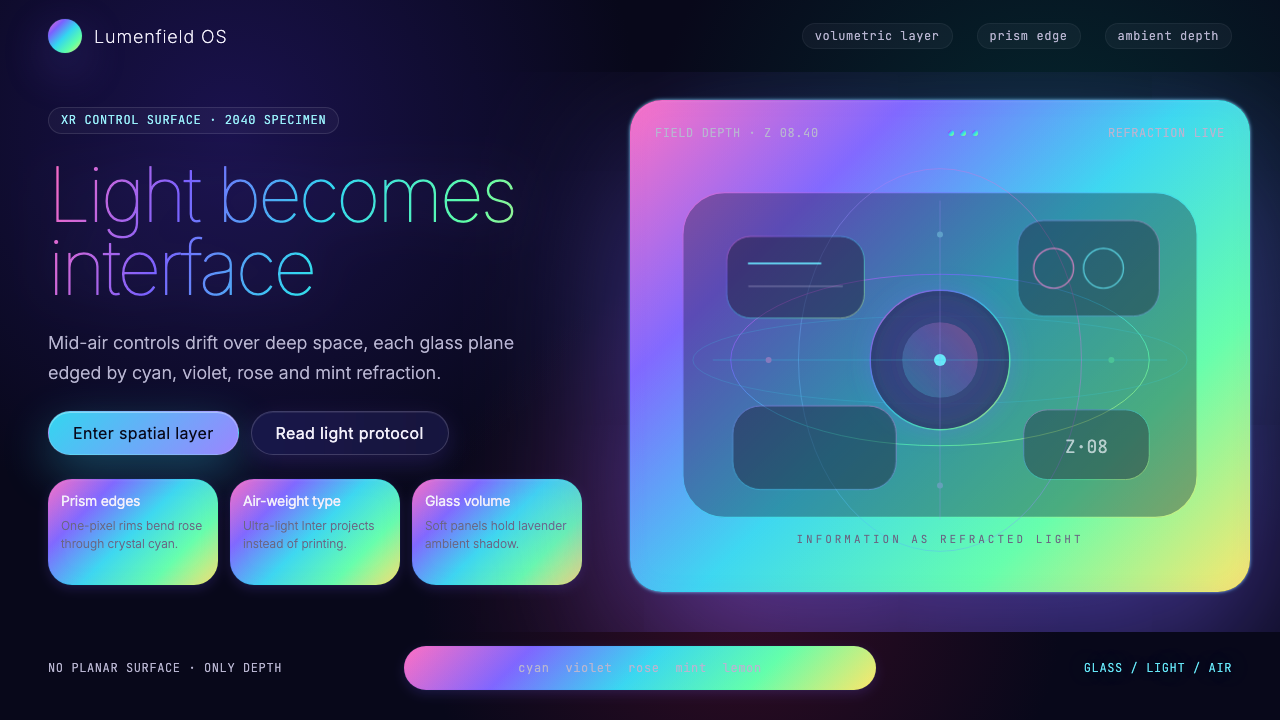 Holographic UI 2040Information made of light. Deep-space black, ultra-light Inter and prismatic…信息由光构成:深空黑、极细 Inter 与棱镜玻璃边缘。
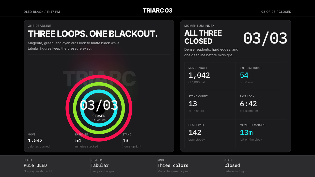 Apple Fitness Rings Closed (2024)Midnight feels exact. Magenta, green, and cyan rings lock onto OLED black.午夜像被校准。洋红、绿、青三环锁在黑底上。
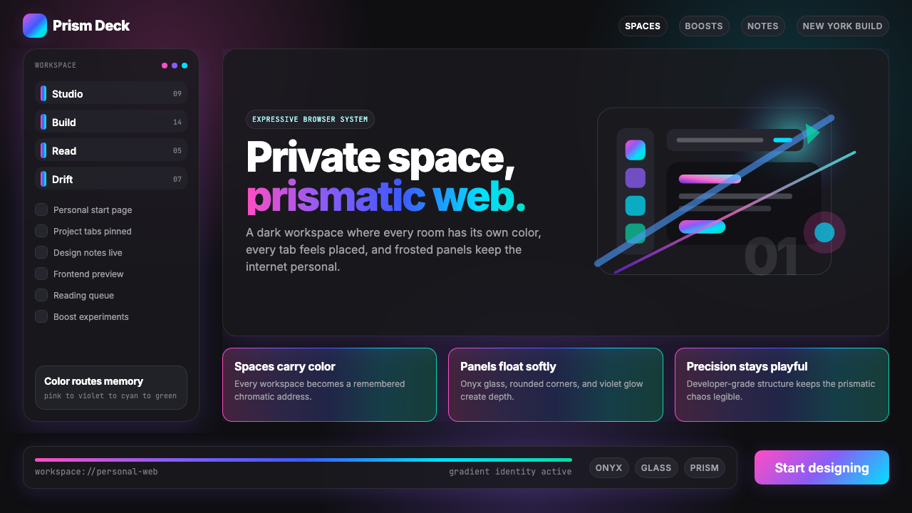 Arc Browser Prismatic (2023)Color is architecture. Pink-violet-cyan ribbons glow over onyx glass and roun…颜色即架构:粉紫青光带浮在黑曜石玻璃面板上。
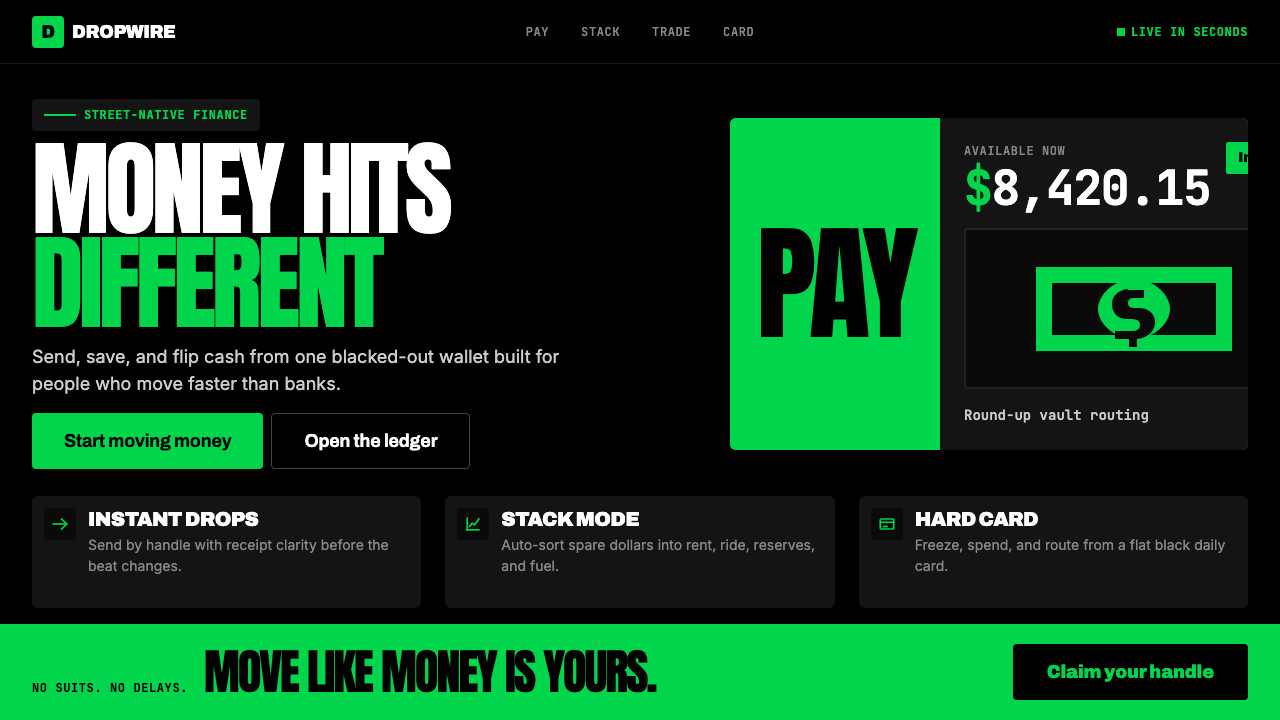 Cash App 2024Fintech that talks like a record label. Pure black, dollar-bill green, type a…像嘻哈厂牌的金融科技:纯黑底色、美钞绿、广告牌尺寸的超粗字体——不再是安全蓝衬…
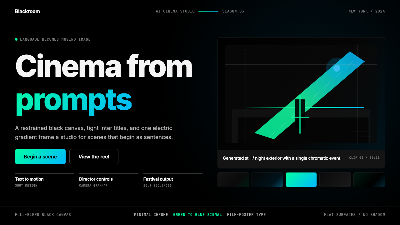 Runway MLCinema, not dashboard. Deep black frames tight Inter type and one green-blue…不是仪表盘,是电影感:纯黑画布、紧排 Inter 与绿蓝电光。