What is Salt Crystal Evaporite?
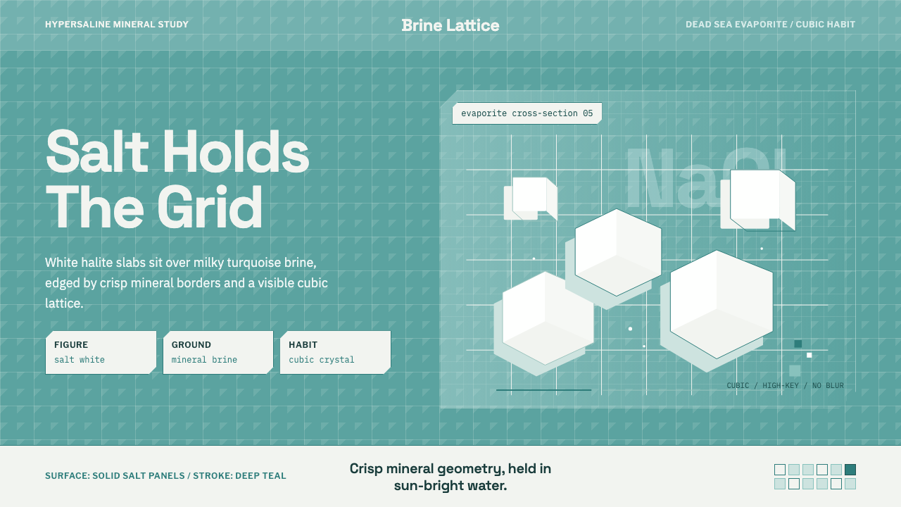
Salt Crystal Evaporite is the geometry the Dead Sea draws for itself — cubic white halite crystallizing out of turquoise brine into razor-edged shores with no soft edge anywhere in sight.
Salt Crystal Evaporite in brief
Salt Crystal Evaporite takes its entire visual vocabulary from a single natural process: evaporite mineral formation in a hypersaline body of water, most famously the Dead Sea, where mineral concentration is so extreme that dissolved salt can no longer stay in solution and precipitates directly out of the brine as solid crystal. Because the mineral doing the precipitating is halite, and halite's native crystal habit is cubic, everything that forms — crusts, drifting islands, shoreline deposits — comes out geometric rather than organic. Nature, in this one specific place, produces hard edges instead of curves.
The color relationship is equally specific and non-negotiable: white salt is always the figure, and a mid-toned turquoise mineral water is always the ground. This is not an arbitrary aesthetic choice — the turquoise comes from the particular mineral chemistry and depth of the brine itself, while the white comes from crystallized halite sitting at or near the surface. A composition in this style should always preserve that figure-ground relationship rather than treating white and turquoise as interchangeable accent colors.
The overall register is high-key, bright, and clean — closer to the clarity of strong sun on a mineral surface than to any muted or moody palette. Blur, softness, gradient transitions, and organic curved forms are all foreign to this system. Where another style might use a soft drop shadow or a rounded corner to feel approachable, this one holds a hard edge and a sharp facet, because that is simply what the underlying mineral geometry looks like.

Where does Salt Crystal Evaporite come from?
The Dead Sea sits at the lowest elevation of any point on Earth's land surface, at the border of Jordan and Israel in the Middle East, fed by the Jordan River with no natural outlet. Water leaves the basin only through evaporation, which over geological time has concentrated the lake's minerals to roughly ten times the salinity of ordinary seawater. At that concentration, sodium chloride can no longer remain fully dissolved, and it precipitates out as halite — visible as white crusts along the shoreline, drifting salt rafts on the surface, and, in shallow evaporation areas, thick geometric salt pans.
This phenomenon is not new — the Dead Sea's extreme salinity and mineral wealth have been noted since antiquity, and the region has a long history of mineral extraction — but the visual culture built specifically around its crystalline geometry is recent. Contemporary interest dates largely to the 2010s onward, driven by high-resolution satellite and aerial photography that could, for the first time, clearly render the scale and geometric precision of the salt formations from above, alongside ground-level photography capturing the same crystalline structures up close.
The Dead Sea's accelerating shrinkage — a consequence of upstream water diversion from the Jordan River and industrial mineral extraction — has intensified both the phenomenon and the interest in documenting it. As the sea recedes, it exposes new evaporation pans and produces dramatic new crystal formations at a pace previous generations never witnessed, giving the site a strange, ongoing visual urgency: the geometry visible today may look different within a few years.
Industrial mineral operations along the sea's southern basin, which manage large engineered evaporation ponds to extract potash and other minerals, have inadvertently become part of the visual record of this aesthetic — their pond systems, viewed from satellite altitude, display the same turquoise-water-and-white-crystal contrast at an engineered, geometric scale, echoing in industrial infrastructure the same figure-ground relationship that occurs naturally along the shore.
What defines the Salt Crystal Evaporite look?
Figure-Ground Contrast
White salt is always the foreground figure; mid-toned turquoise mineral water is always the ground. This relationship should be preserved as a strict rule rather than treated as two interchangeable accent colors — reversing or blending them erases the specific mineral logic the style is built on.
Cubic Crystal Habit
Every geometric motif in this system ultimately traces back to halite's cubic crystal structure — right angles, rectilinear facets, and stacked block-like forms rather than any other polygon family. Hexagonal or triangular ornamental motifs, common in other crystal-inspired styles, do not belong here; the geometry is specifically cubic.
Hard Edges and Facets
Surfaces and shapes are rendered with crisp, faceted edges rather than rounded corners or soft transitions. Any place a conventional interface might use a subtle border-radius or a diffuse shadow, this style instead uses a sharp angular cut, reflecting the way crystal facets actually catch and reflect light.
High-Key Brightness
The palette sits at a bright, sun-exposed intensity rather than a muted or moody one — think strong midday light on a white mineral surface. Dimming the palette toward dusk tones or adding heavy shadow contradicts the clarity this style depends on.
Lattice and Grid Structure
Underlying compositions are organized on a hard rectilinear grid or lattice, echoing the way crystal structures repeat in a fixed geometric arrangement. This gives even a busy composition an underlying orderliness — the grid is not decorative, it is the crystal's own logic made visible.
No Blur, No Organic Curves
Soft blur, gradient blending, and organic curved forms are actively excluded from this system. Where a designer might reach for a soft glow or a rounded blob shape to soften a composition, this style asks for a hard angular alternative instead — the mineral world it depicts simply does not produce soft forms.
Mineral Clarity
Surfaces read as crisp and clean rather than textured, weathered, or aged. This is a style of clarity, not patina — any implied age or wear should come through geometric accumulation (more crystal layers, more facets) rather than through grime, roughness, or organic texture.

Who shaped Salt Crystal Evaporite?
The American photographer Spencer Tunick is known internationally for large-scale nude installation photography, and staged a notable work at the Dead Sea in the early 2010s intended to draw public attention to the sea's accelerating shrinkage. His project placed the human body directly against the same crystalline salt shoreline and turquoise water this style depicts, helping bring international visual attention to the site's distinctive geometry at a moment when the sea's changes were becoming widely reported.
Dead Sea Works is the industrial mineral-extraction operation managing large engineered evaporation ponds along the sea's southern basin, primarily for potash production. Viewed from above, its pond systems display the same white-crystal-against-turquoise-water contrast found in nature, but rendered at an engineered, rectilinear scale — an industrial echo of the same evaporite geometry this style is named for.
Public satellite imaging programs, whose high-resolution passes over the Dead Sea basin became widely accessible online through the 2010s, played a central role in popularizing this aesthetic. Aerial views revealed the scale and precise geometric regularity of the salt formations in a way ground-level photography alone could not, and these images circulated widely as a distinct visual genre of natural mineral abstraction.
How do you use Salt Crystal Evaporite today?
This style rewards designers who are willing to commit fully to hard geometry and bright clarity rather than softening it toward a more conventional, rounded interface language — the aesthetic's power comes specifically from its refusal to compromise on sharp edges.
On presentation slide covers, the style works well when a large angular white crystalline shape sits against a saturated turquoise field, with title type set in a simple, geometric sans rather than anything with soft curves. Content slides should use hard-edged card panels with visible angular corners rather than rounded ones, and section dividers can borrow the lattice-grid motif as a literal background pattern. Data visualizations translate naturally into faceted bar or block charts, since the underlying cubic geometry already resembles a chart's rectilinear logic.
For web interfaces, this palette is well suited to clean, high-clarity dashboards and pricing pages, where the bright turquoise-and-white contrast can support strong visual hierarchy without needing heavy shadow or gradient effects to create depth — depth here comes from faceted edges and layered geometric blocks instead. It is a poor match for warm, cozy, or highly organic-feeling products, since introducing warm accent colors or soft rounded UI chrome directly contradicts the mineral clarity the style depends on.
In editorial and marketing contexts, this style produces striking full-bleed hero treatments — a wide turquoise water field interrupted by a sharp white crystalline formation, with a short line of type set well clear of the crystal shapes rather than overlapping them. Pull quotes and callouts read well as angular, faceted card shapes rather than simple rounded boxes, maintaining the geometric discipline throughout a layout.
A common mistake is treating the palette as simply 'turquoise and white' and applying it with soft gradients or rounded UI elements, which produces a beach or spa aesthetic entirely unrelated to this style's actual source. Another common error is adding warm accent colors like coral or sand to 'balance' the palette — this style is deliberately cool and mineral throughout, and warm accents undermine the specific chemistry the aesthetic is meant to evoke.
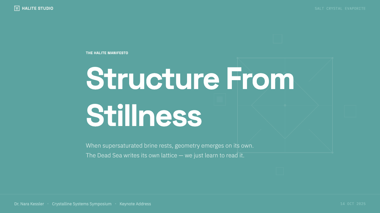
Salt Crystal Evaporite — FAQ
Is this the same as generic "crystal" or "geode" design trends?
No. Popular geode and crystal aesthetics typically favor rounded, organic clusters, jewel-toned purples and pinks, and soft glowing light effects. This style is the opposite in almost every respect — it is anchored to one specific mineral (halite), one specific crystal habit (cubic, hard-edged), and one specific color relationship (white salt on turquoise brine), with no soft glow, no purple or pink tones, and no rounded organic clustering.
Can this style use any blue-green color, or does the turquoise need to be specific?
The water color should read as a mid-toned mineral turquoise rather than a bright tropical cyan or a deep navy blue — both extremes shift the association away from mineral brine and toward, respectively, a beach-resort palette or a nighttime ocean palette. The safest reference point is the color of light passing through dense, mineral-rich water, which sits at a cooler, slightly muted intensity than typical tropical-water imagery.
How much organic or curved form can I introduce before it stops reading as this style?
Very little. The cubic crystal habit and hard-edged facet language are the load-bearing elements of this system, and introducing rounded corners, soft blur, or organic blob shapes undoes the specific mineral logic almost immediately. If a softer element is genuinely needed — for accessibility or usability reasons, for instance — it is better isolated to a single functional area (like a rounded button for tap targets) than blended throughout the composition.
Does this style work for dark-mode interfaces?
It is possible but requires care, since the style's high-key, sun-bright register is fundamentally a light-mode sensibility. A dark-mode adaptation should keep the white crystal facets as the brightest, most saturated element in the frame — essentially crystal catching light against a darkened mineral water field — rather than dimming the whites down to gray, which would erase the crisp mineral clarity the style depends on.
Is this style tied specifically to the Dead Sea, or can it represent salt flats generally?
This particular system is anchored specifically to the Dead Sea's hypersaline evaporite formations — the cubic crystal geometry, the turquoise brine, and the razor-edged shoreline are all specific to that environment's mineral chemistry. Other salt landscapes, such as the Salar de Uyuni's flat mirrored salt pan, produce a visually and conceptually distinct aesthetic built on atmosphere and flatness rather than crystalline geometry, and should be treated as a separate style rather than a variation of this one.
Related design styles
 Mariana TrenchLight is self-made below ten thousand meters. Hadal-black ground, cyan pinpoi…
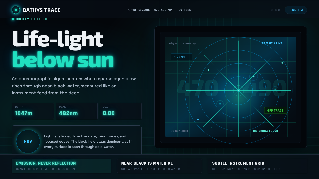 Abyssal BioluminescenceDark carries the signal. Electric cyan pins and Exo 2 readouts surface from a…
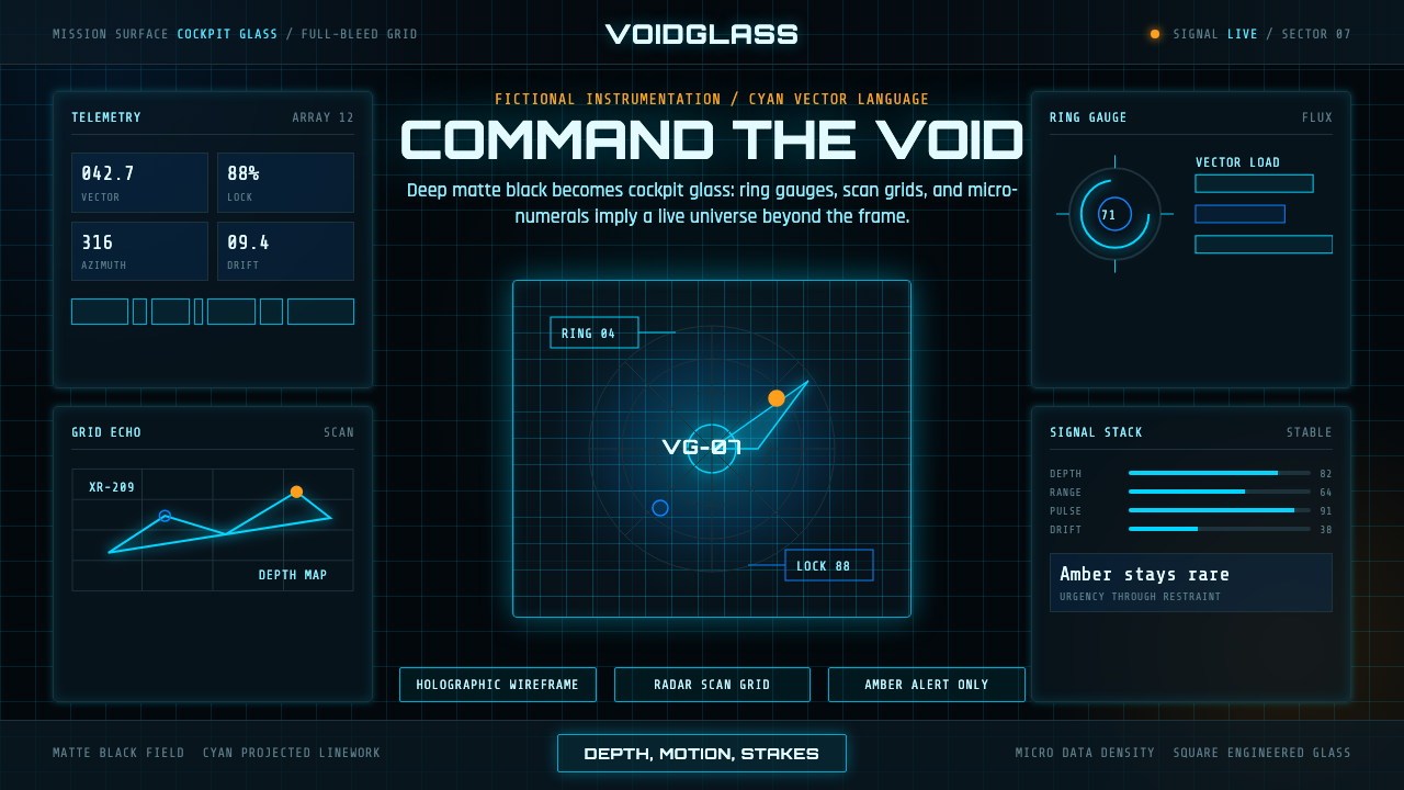 FUI Sci-Fi HUDBlack until it glows. Cyan wireframes, ring gauges, and radar grids sell live…
 James Webb Telescope (2022)Precision meets deep time. Mirror gold hexagons and cyan telemetry glow acros…
 Neural Interface ClinicalClinical restraint makes signals legible. Silver traces cross near-black; vio…
 Bio-Organic GenerativeInterfaces feel cultured. Void black, Voronoi membranes, and neon chlorophyll…