What is Glacier Ice Cave?
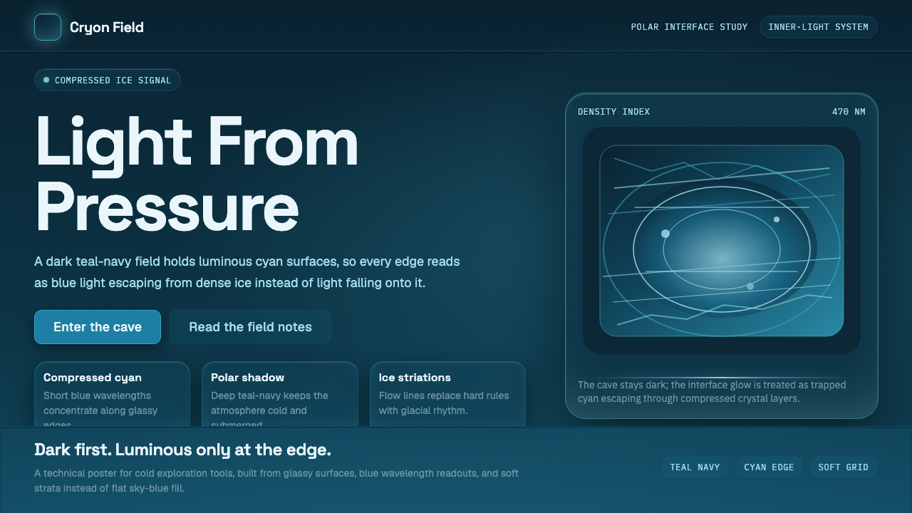
Glacier Ice Cave takes a single fact of physics — that compressed ice swallows every color of light except blue — and turns it into an interface that looks lit from within rather than lit from above.
Glacier Ice Cave in brief
Glacier Ice Cave is a dark, cold-luminous design language drawn directly from the optics of glacial ice. Step inside a real ice cave and centuries of compression have already done the art direction: the pressure squeezes trapped air out of the ice, and the resulting dense, bubble-free crystal absorbs long wavelengths of light almost completely, letting only the shortest blue wavelengths pass through or scatter back. The result is a chamber where the walls glow a saturated, compressed cyan while the surrounding air and shadow stay a near-black teal-navy. Nothing about that glow is decorative — it is a direct consequence of how thick, clear ice filters light, and the style treats that phenomenon as its entire premise.
The visual system built from this fact never uses a light page. Its ground is always a deep teal-navy, closer to the color of a moonless sky over open water than to any conventional 'dark mode' gray or near-black. Cyan is reserved for surfaces and accents that should read as sources of light rather than objects merely colored blue — a rail, a stat, a card edge, a data line. The distinction matters: in this style, cyan is never applied as flat decoration. It is applied where the composition wants the eye to believe light is escaping from underneath or behind the surface, the way it escapes from inside a wall of ancient ice.
Typographically and structurally, the style favors a clean, geometric, technical sans-serif — the kind of letterform associated with scientific instruments, expedition gear, and cold-climate signage rather than warm editorial serifs or handwritten scripts. Type sits with generous room around it, striation-like glow effects run behind key surfaces like the compressed light-bands visible in real ice, and elevation is communicated through luminosity and cyan intensity rather than through conventional drop shadows. The overall mood is precise, quiet, and slightly austere — closer to a research station's control room than to a travel brochure.

Where does Glacier Ice Cave come from?
Unlike design movements tied to a school, a manifesto, or a single design career, Glacier Ice Cave has no founder and no founding date beyond the physics itself, which is timeless — ice has scattered light this way for as long as glaciers have existed. What gives the style its contemporary shape is a much newer phenomenon: the rise, from roughly the 2010s onward, of accessible expedition and polar photography. Improvements in cold-weather camera gear, GoPro-style action cameras, and the growth of adventure tourism to genuinely remote ice formations meant that, for the first time, large audiences could see what a glacier's interior actually looks like, rather than encountering it only through painting or written description.
That photographic record turned out to have a distinctive, repeatable palette. Photographs and videos taken inside ice caves in Iceland, Alaska, the Alps, Patagonia, and the polar regions kept producing the same compositional result: a glowing cyan wall or ceiling against a body of the image that reads as deep shadow. Science communicators working for organizations like the U.S. National Park Service, along with polar expedition photographers documenting glacial retreat and remote ice formations, popularized and explained this look — connecting the visual spectacle directly to the underlying physical explanation of density, air-bubble loss, and selective light absorption, rather than leaving it as unexplained scenery.
This gives Glacier Ice Cave an unusual origin story among design styles drawn into a library like this one: it belongs to no single photographer, brand, or decade, but to a recognizable genre of image-making — call it cold-luminescence photography — that emerged once travel, equipment, and public curiosity about vanishing glaciers converged. The style sits alongside a broader, older visual habit of pairing ice and shadow for graphic effect, but its specific cyan-on-teal-navy signature, and the emphasis on light reading as emitted rather than reflected, is a product of that recent wave of expedition imagery becoming widely shared and studied.
Because the reference point is a natural phenomenon rather than a studio or a manifesto, there is no single canonical work to point to, and no committee of makers who codified rules the way a design school might. What exists instead is a strong, convergent visual consensus across thousands of independent photographs of the same physical process — which is precisely why the resulting design language reads as authoritative rather than arbitrary: every viewer who has seen a photograph of an ice cave recognizes the palette instantly, because the palette is not a style choice so much as an observed fact of nature.
What defines the Glacier Ice Cave look?
Ground Color
The base of every surface is a deep, desaturated teal-navy — dark enough to read as night, but with a cool blue-green undertone that keeps it from ever slipping into true black or warm charcoal. This ground is the 'shadow' half of the ice-cave contrast: it represents the cold air and unlit stone of the cave interior, and it never lightens toward gray the way a conventional dark-mode background might.
Glow Accent
Cyan is used sparingly and always with intent: it marks the surfaces, rails, and data points that the composition wants read as luminous rather than merely tinted. Because the entire premise of the style is light escaping from within compressed ice, cyan should never appear as a flat, evenly-lit fill — it reads correctly only when it is concentrated, brightest at an edge or core, and fading into the teal-navy ground the way real ice-cave light fades into surrounding shadow.
Striation and Glow Texture
Real glacial ice is banded — compression creates visible striations, layers of slightly different density and clarity that catch and channel light unevenly. The style echoes this with soft, elongated glow bands running behind key panels or backgrounds, never a uniform gradient. These bands should feel geologic rather than decorative: irregular in spacing, closer to the record of a slow physical process than to an evenly repeating pattern.
Typography
Letterforms lean geometric and technical — clean, even-width strokes without ornamental flourish, in the register of scientific instrumentation and cold-climate signage rather than warm editorial type. Body copy should stay a cool off-white or pale cyan-tinted gray rather than pure white, so it never competes with the glow accents for the eye's attention; headlines can push toward the brightest cyan the palette allows, functioning almost like a label on the ice wall itself.
Depth and Elevation
Instead of conventional drop shadows, elevation is communicated through changes in luminosity and edge glow: a raised card is not lifted by a shadow beneath it but by growing slightly brighter, its border catching a hint of cyan the way an edge of ice catches more light than the mass behind it. Recessed or inactive elements simply sink further into the teal-navy ground rather than darkening toward black.
Negative Space
Because the entire effect depends on contrast between vast dark and concentrated light, the style needs generous, unhurried negative space — the same way a real ice cave reads as dramatic partly because the glow is surrounded by so much unlit volume. Crowding a layout with too many simultaneously glowing elements collapses the effect into ordinary neon rather than compressed, filtered ice-light.
Iconography and Motion
Icons and small graphic marks stay linear and geometric, echoing crystalline facets rather than organic curves. Where motion is used, it should feel slow and ambient — a gentle pulse or drift in the glow bands, closer to the barely perceptible way light shifts inside real ice as a cave is entered, rather than the snappy, mechanical transitions common to conventional dark-mode interfaces.

Who shaped Glacier Ice Cave?
The style's visual grammar was popularized largely by photographers who traveled to genuinely remote ice formations in Alaska, Iceland, the Alps, and Patagonia to document glacial ice caves as improved cold-weather camera equipment made such expeditions increasingly feasible from the 2010s onward. Their images established the now-familiar composition — a glowing cyan ceiling or wall against a body of deep shadow — as a recognizable visual genre rather than an isolated curiosity.
Science communicators working within organizations such as the U.S. National Park Service have played a key role in explaining the phenomenon behind the imagery to broad public audiences — describing how compression removes air bubbles from ice, how the resulting dense crystal absorbs long wavelengths of light, and why only blue light survives to reach the eye. This explanatory layer matters to the style's credibility: viewers respond to the palette not as an arbitrary aesthetic but as a visualization of an explained physical process.
The growth of guided expedition tourism to glacier interiors — a commercial industry that scaled substantially over the 2010s — is what made ice-cave photography a shared, repeatable visual experience rather than a rare feat reserved for scientific expeditions. By making these formations accessible to a much wider range of travelers and photographers, tourism operators indirectly helped cement the cyan-on-teal-navy palette as a recognizable, widely reproduced visual signature.
How do you use Glacier Ice Cave today?
Glacier Ice Cave is a strong choice wherever a product wants to feel precise, cold-climate, and technically credible rather than warm or playful — but applying it well means respecting the physics behind the palette, not just copying cyan-on-dark-teal as a color scheme.
For presentation cover slides, the style rewards restraint: a mostly teal-navy field with a single glowing cyan band or shape positioned off-center, title type set in the clean geometric register described above, sitting just inside or beside the glow rather than on top of it. Content and data slides should let numbers and key figures sit directly inside the brightest cyan, with supporting text receding into the cooler off-white — so the slide reads, at a glance, like a wall of ice with one seam of light running through it. Charts translate well when a single data series is rendered in the glow cyan against a teal-navy plot area, rather than using multiple competing bright colors.
For web interfaces, dashboards are a natural fit: metric cards and active states can 'light up' with the glow treatment described earlier, while inactive or secondary panels sink into the ground color instead of using a lighter gray. Pricing pages benefit from reserving the brightest glow for the recommended or highlighted tier, letting the other tiers sit in dimmer, more shadowed card treatments — echoing the way only one wall of an ice cave might catch the strongest light while the rest recedes.
For editorial and marketing contexts — think outdoor gear, climate and conservation storytelling, science communication, or premium travel — the style supports large, immersive hero sections where a glow band anchors the page and body copy is kept narrow and quiet beneath it. Because the aesthetic reads as inherently 'cool' in tone, it pairs naturally with subjects related to remoteness, precision, or environmental urgency, and less naturally with anything meant to feel warm, human-scale, or handmade.
The most common mistake is treating cyan as a general accent color to be sprinkled everywhere a highlight is needed, which flattens the effect into ordinary neon-on-dark styling. The style only works when the glow is scarce and concentrated — most of any composition should remain in cold shadow, with light behaving as though it is escaping from one or two specific places rather than illuminating the whole scene evenly.

Glacier Ice Cave — FAQ
Is Glacier Ice Cave just a blue dark-mode theme?
Not quite. A generic dark mode simply inverts a light palette to save eye strain or battery; its dark background is a neutral gray or near-black with no particular story behind it. Glacier Ice Cave starts from a specific optical phenomenon — dense, compressed ice absorbing every wavelength except blue — and treats every glowing surface as evidence of light escaping from within the material itself. That distinction matters practically: it means cyan should be scarce, concentrated, and edge-focused, never spread evenly as a generic accent color the way a typical dark-mode theme might use its highlight color.
Why teal-navy rather than plain black as the base color?
Real ice-cave shadow is never a true, neutral black — the same dense ice and cold air that filter light toward blue also give the surrounding darkness a faint cool undertone. A plain black ground would read as an ordinary dark UI theme with no connection to the source phenomenon; the deep teal-navy keeps the shadow half of the composition visibly related to the glowing cyan half, so the whole palette reads as one continuous material rather than two unrelated colors placed next to each other.
Can this style work with light or high-saturation brand colors?
It resists them. The entire effect depends on a dark, cold ground with a narrow, disciplined range of glowing cyan — introducing a warm or highly saturated secondary color (orange, magenta, warm yellow) breaks the illusion that light is escaping from ice, because that phenomenon only ever produces blue light, never warm hues. If a brand color must appear, it works best treated as a rare, deliberately 'foreign' accent — used sparingly enough that it reads as an intentional exception rather than a second competing glow.
Does this style suit consumer-facing products, or only technical ones?
It suits both, but for different reasons. Technical and analytical products — dashboards, monitoring tools, scientific or research platforms — benefit from the precision and instrument-like typography the style carries naturally. Consumer products in outdoor, travel, climate, or premium adventure spaces benefit from the emotional resonance of the source imagery itself: audiences already associate glowing ice-cave photography with awe and remoteness, so the palette imports that feeling. It suits both audiences less well when the product wants to feel casual, warm, or playful, since the style's coldness and precision resist a relaxed tone.
How is depth communicated without traditional drop shadows?
Instead of a shadow implying a light source above the interface, elevation in this style is shown through luminosity itself — an element that needs to feel 'closer' or more important simply glows a little brighter, with its edge picking up a touch more cyan, the way an outer edge of ice catches more light than the mass behind it. Elements that are inactive or less important are not darkened toward black; they are allowed to sink further into the teal-navy ground, so the whole hierarchy reads as a gradient of light intensity rather than a stack of literal, physically lit objects.
Related design styles
 Mariana TrenchLight is self-made below ten thousand meters. Hadal-black ground, cyan pinpoi…
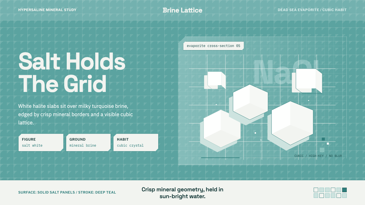 Salt Crystal EvaporiteCrystalline and cold. Salt-white cubes float over turquoise brine in a hard l…
 Bio-Organic GenerativeInterfaces feel cultured. Void black, Voronoi membranes, and neon chlorophyll…
 Bluesky AT Protocol 2024Open tech feels warm. Pale sky, cloud cards, Inter, and one cobalt accent car…
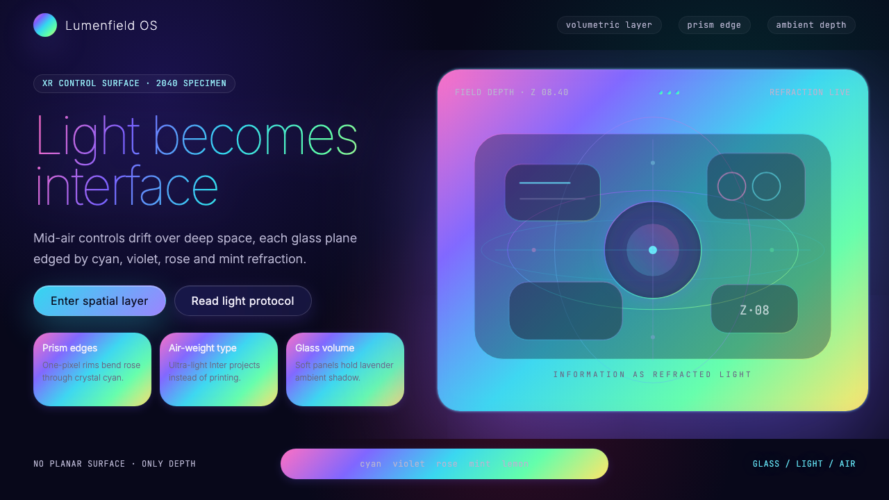 Holographic UI 2040Information made of light. Deep-space black, ultra-light Inter and prismatic…
 Mistral Le Chat French AIOpen science feels engineered. Navy panels, Inter grids, and coral stripes ke…